What is Half-Life?
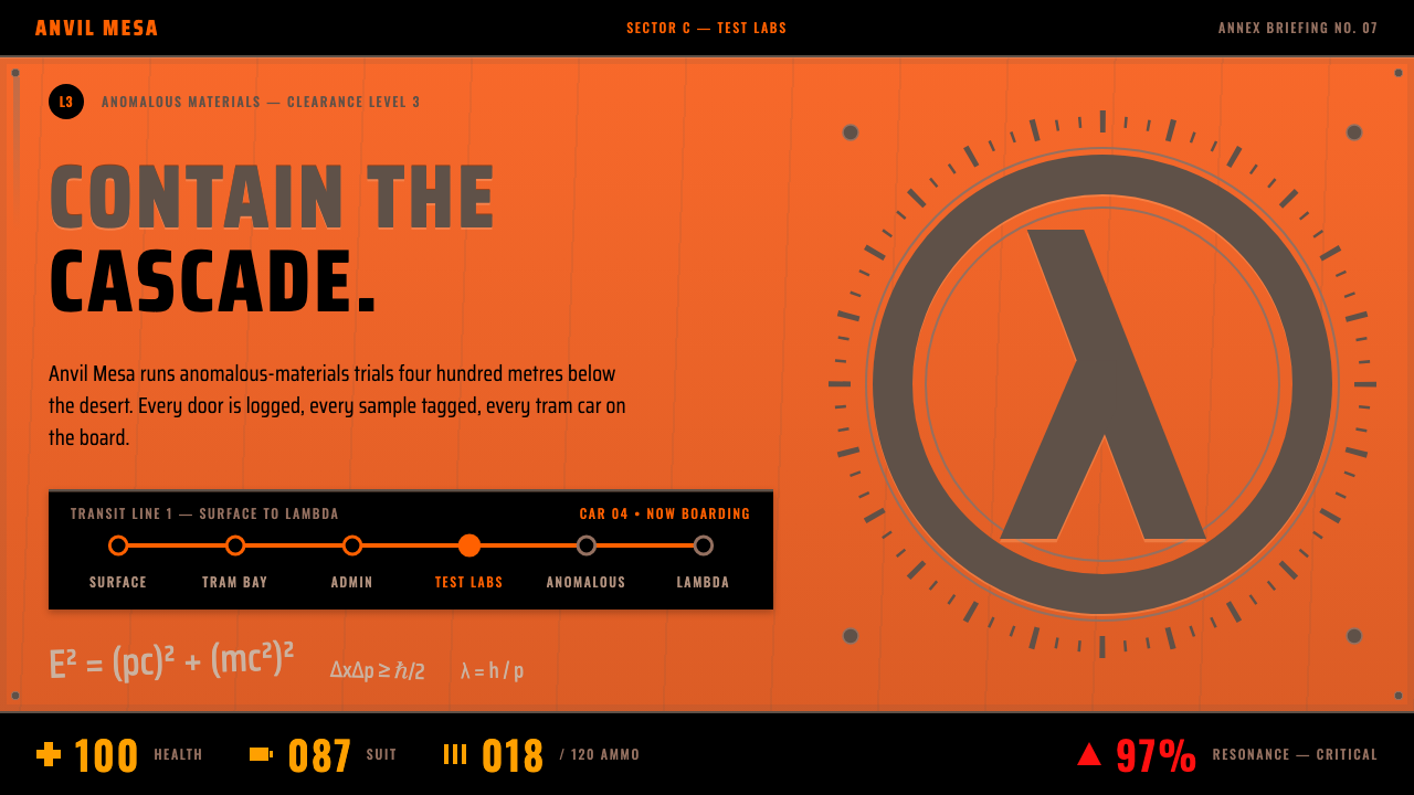
Half-Life's look is lab signage on rusted orange steel: grime-grey etching, black HEV panels and amber readouts from a facility that has just had a very bad day.
Half-Life in brief
The Half-Life style is drawn from the box front of the 1998 game: a sheet of orange-painted steel, rusted at the rivets, with the lambda etched into a grimy ring and the wordmark sprayed across it in stencil. Chalk physics equations run over the paint at loose angles, as if a scientist had scribbled them there in a hurry.
Everything in the system sits on that plate. Type is etched into grime and rust rather than printed on clean paper. Black Mesa sector placards and tram-line route boards organise the page like the signage of an underground research complex, while black HEV panels carry the amber health, suit and ammo readouts familiar from the game's heads-up display.
The overall impression is industrial, scientific and slightly damaged. It reads as lab signage from a facility that has just had a very bad day: functional labels, worn paint, stencilled marks and instrument readouts, all serving the feeling of a real place where something has gone wrong. It suits games, hard technology and industrial tools.

Where does Half-Life come from?
Half-Life was released for Windows in 1998 by Valve, a studio based in Kirkland, Washington. Its key figures include Gabe Newell, Mike Harrington, writer Marc Laidlaw and composer Kelly Bailey. The game was built on the GoldSrc engine and belongs to the generation of late-1990s first-person shooters that were pushing the genre beyond simple corridor combat.
What set it apart was scripted in-engine storytelling. Instead of cutting away to separate cinematics, the game told its story through the same first-person view the player always had: scientists speaking in corridors, events unfolding around you, a facility that felt like a coherent workplace. That choice shaped the visual identity too. The interface and the surrounding graphics needed to feel like part of the place itself, not like an overlay from outside.
The setting is the Black Mesa research facility, a sprawling underground complex. Its visual vocabulary draws on industrial facility signage and stencil marking: sector placards, route boards for the tram line, warning labels, and the HEV suit's readouts. These are the kinds of graphics people associate with real laboratories and military-industrial sites, built for function and legibility rather than beauty, and the game leans on that credibility to make its world believable.
The franchise continued with the expansions Opposing Force in 1999 and Blue Shift in 2001, which kept the same facility and the same visual language alive. Taken together, the box art, the in-game signage and the HUD formed a remarkably consistent graphic identity, and it is that identity, orange steel, grimy etching and amber readouts, that this design system distils.
What defines the Half-Life look?
Orange painted steel
The base of the system is a sheet of orange-painted steel, not a neutral white page. Rust creeps out from the rivets and the paint is worn at the edges. The plate itself is the layout: everything else is stamped, etched or mounted onto it, so the page feels like a physical object.
Etched grime type
Type looks cut into the surface rather than printed on it, rendered in grime grey and rust brown. Letterforms are blunt and industrial. The effect is that every word feels like a permanent label on a machine, not a line of editorial copy.
Stencil wordmark
The wordmark is sprayed through a stencil, with the characteristic gaps where a stencil's bridges hold the letter shapes together. Combined with the lambda in its ring, it gives the identity a mark that feels applied by hand on site rather than designed in an office.
Chalk equations
Physics equations in chalk drift across the paint at loose angles, like the scribbles of a hurried scientist. They are the one hand-made, human note in an otherwise institutional surface, and they quietly say that this is a research place.
Sector placards and route boards
Black Mesa sector placards and tram-line route boards organise the page. Content is grouped like signage in an underground complex: labelled zones, numbered sectors, directional arrows. It is a layout logic built on wayfinding rather than on editorial hierarchy.
HEV panels with amber readouts
Black HEV panels hold the numbers for health, suit and ammo, glowing in amber like instrument readouts. They are the only dark, luminous elements on an otherwise matte steel plate, so they pull attention to exactly the values a player cares about.

Who shaped Half-Life?
A key figure at Valve, the Kirkland, Washington studio that released Half-Life in 1998. His name is tied to the company's decision to build a first-person shooter around scripted in-engine storytelling.
Another key figure associated with the original Half-Life, working within the Valve team that shaped the game's late-1990s first-person approach on the GoldSrc engine.
The writer associated with the game, responsible for shaping the story and the in-world voice of Black Mesa. His writing helped make the facility feel like a believable workplace rather than a generic backdrop.
The composer associated with the original game. His music is part of the same overall identity that the visual system belongs to: industrial, tense and tied to the sense of a place gone wrong.
How do you use Half-Life today?
The Half-Life style is at its best where the subject is technical, industrial or game-related and where a worn, physical atmosphere helps rather than hurts. It communicates credibility through use: labels that look like they belong on real equipment. The key is to treat the surface as a physical plate and the content as marks applied to it.
For presentation slides, a cover can be a full sheet of orange steel with the title sprayed in stencil and a small lambda in a ring in one corner. Content slides can use placards: each section header looks like a sector marker, with body text etched in grime grey beneath it. Data slides suit black panels with amber numbers, so key metrics read like instrument readouts and everything else stays quiet.
For web interfaces, the style fits game sites, hard-technology products, developer tools with an industrial identity and monitoring dashboards. Use the steel plate as the page ground, keep text in grime and rust tones, and put critical numbers in black panels with amber text. Navigation can follow route-board logic, with labelled lines and stops, rather than conventional tabs.
For editorial and marketing work, the style is excellent for launches, behind-the-scenes features and anything about science, engineering or catastrophe. Pull quotes can look like stencilled warnings, and chalk-like scribbles can annotate images as if a researcher had been through them. Use the amber readout treatment for statistics so that numbers stand out from the surrounding texture.
A common mistake is making everything clean. Without wear, rust and uneven paint, the plate turns into an ordinary orange background and the identity collapses. The opposite mistake is overloading the page with grime so that text becomes unreadable; the etched type must still be legible, and the amber readouts should remain the clearest elements. Keep the number of effects small and let the signage logic carry the page.

Half-Life — FAQ
What is the Half-Life design style?
It is the look of the 1998 Half-Life box front and in-game signage: orange-painted steel with rust at the rivets, a lambda in a grimy ring, a stencilled wordmark, chalk equations, Black Mesa placards and black HEV panels with amber readouts.
Where does the style come from?
It comes from Valve's Half-Life, released for Windows in 1998 from Kirkland, Washington, on the GoldSrc engine. The graphics borrow from industrial facility signage and stencil marking, which suited the game's Black Mesa research complex.
What is the amber for?
Amber is the colour of the HEV suit's readouts for health, suit and ammo. In this system it is reserved for key numbers inside black panels, so that the most important values read like instrument readouts against a worn steel background.
Can it work for a non-game product?
Yes, if the product is technical or industrial: developer tools, monitoring dashboards, hardware or engineering brands. It is a poor fit for soft, friendly consumer products, because its signage logic and worn surfaces feel serious and slightly ominous.
How much wear is too much?
Wear should signal a physical surface without hurting legibility. Keep rust at edges and rivets, keep the etched type readable, and let the amber readouts be the clearest elements. If a viewer has to squint at the text, the grime is doing too much.
Related design styles
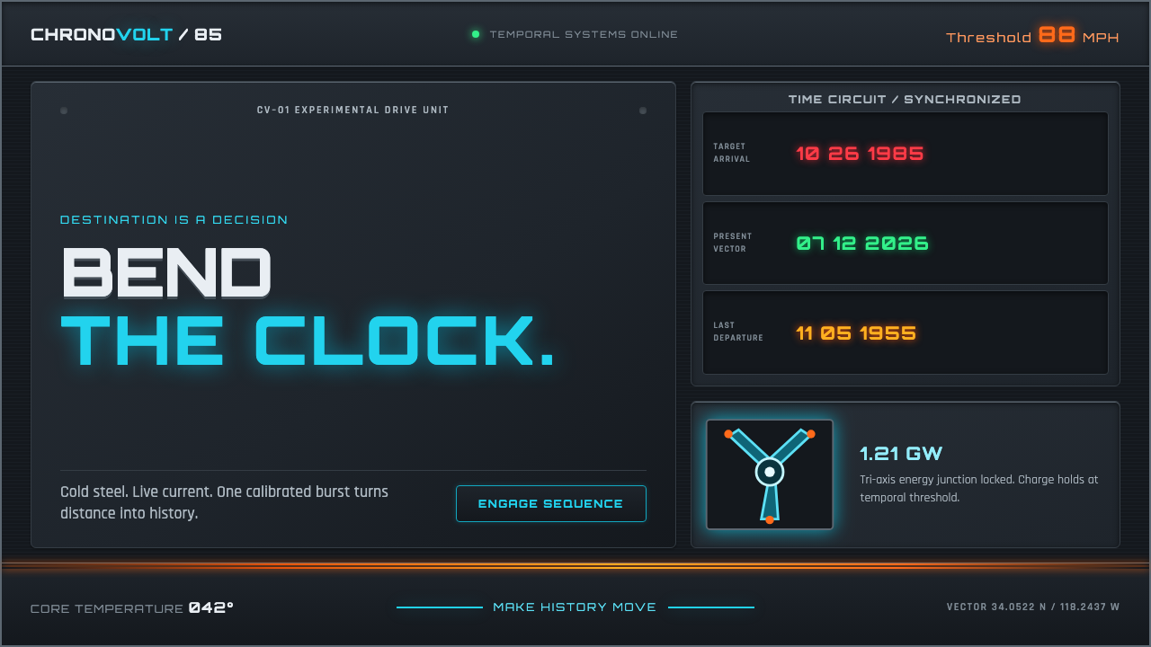 Back to the Future (1985)Cold steel, live current. Cyan circuits and orange trails turn the dashboard…
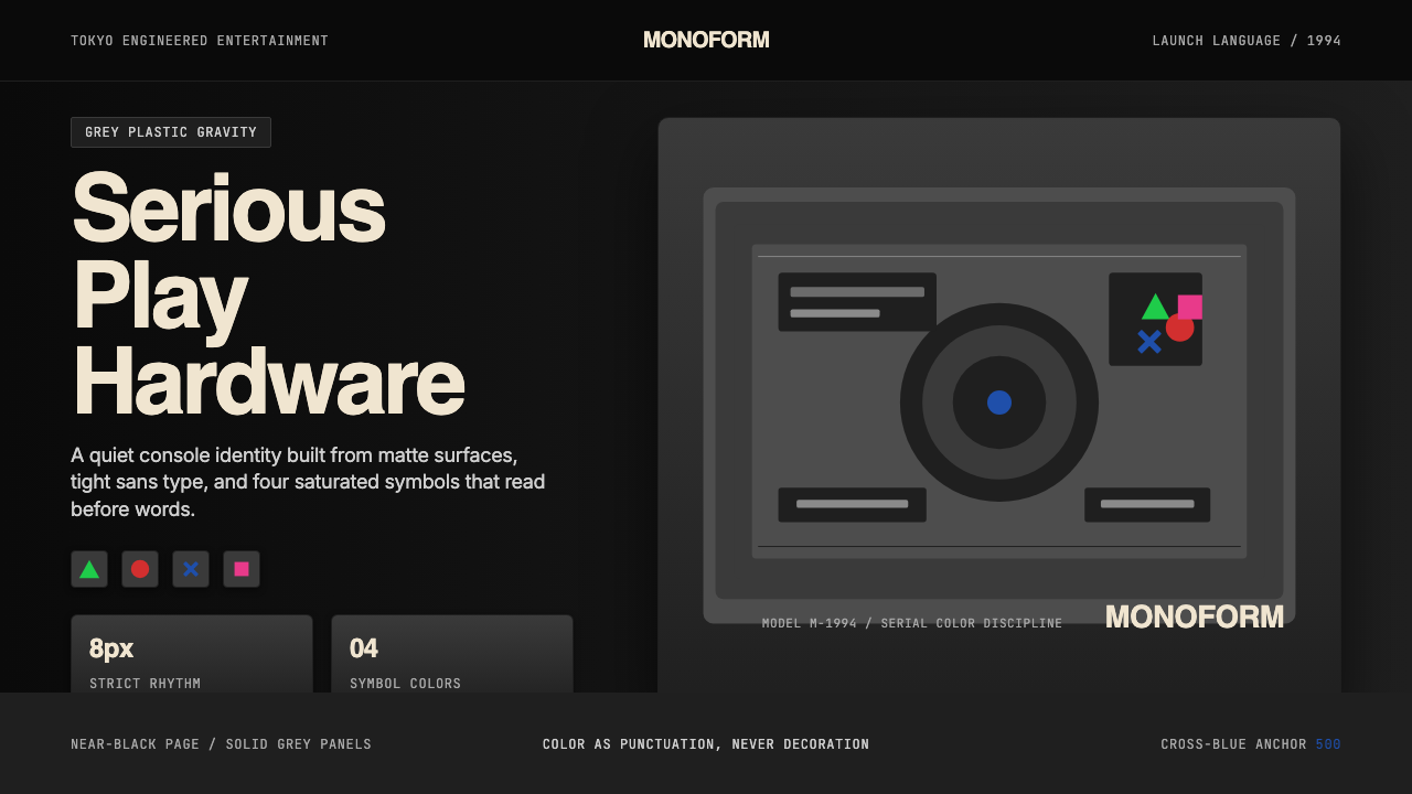 PlayStation (1994 Original)Quiet power, engineered. Grey plastic and four saturated symbols punctuate ti…
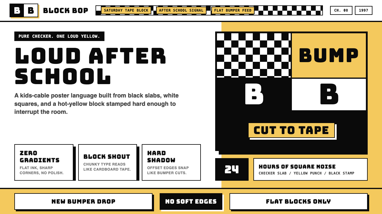 Cartoon Network 90s BlocksKids-cable noise, squared. Black-white checkerboards crash into hot-yellow Bu…
 Commodore Amiga WorkbenchBlue desktop gets hijacked. Acid-green bitmap type, white chrome, and copper…
 DC Comics Batman NoirGravity, not cheer. Black panels, Gotham blue, and one bat-yellow signal cut…
 Doom 1993 Toxic GreenRadioactive metal bites. Toxic green readouts glow over rust bevels and CRT g…