What is Habbo Hotel?
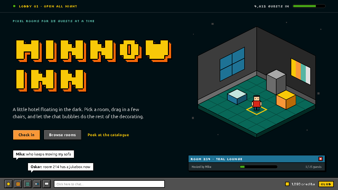
Habbo Hotel is a hotel of hard pixels adrift in a black void: teal isometric rooms, orange bevel buttons and bitmap type that never pretends to be anything softer.
Habbo Hotel in brief
Habbo Hotel is the visual language of an early-2000s browser virtual world, built in Helsinki and launched in August 2000 under the name Hotelli Kultakala, the Goldfish Hotel. Its signature image is a room seen from above at an angle: a diamond-tiled floor floating in a black void, furnished with chunky pixel furniture and populated by small blocky avatars who chat in white speech bubbles.
As a design style it is isometric pixel art married to the interface chrome of a Shockwave-era browser game. Rooms are drawn on a two-to-one isometric grid, so every floor tile is a flat diamond and every wall meets the floor at a shallow, readable angle. Around the room sits a thin layer of utility: a grey toolbar along the bottom, dialog windows with blue title bars, and buttons that glow in the orange and yellow of the hotel's own facade.
What defines the look is refusal. There is no frosted glass, no soft gradient and no rounded corporate friendliness. Type is bitmap, set only at whole-pixel sizes so every letter stays crisp. Each surface gets at most one or two steps of shading. The result is a world that feels handmade, slightly cramped and deeply nostalgic, a first online room for a whole generation.

Where does Habbo Hotel come from?
Habbo Hotel began in Helsinki in August 2000 as Hotelli Kultakala, the Goldfish Hotel. It was built by two people, Sampo Karjalainen and Aapo Kyrölä, and the company that grew around it became known as Sulake. Their idea was modest and very of its moment: a place on the web where teenagers could drop in as small avatars, rent a room, arrange furniture and talk to strangers, without needing to install anything beyond a browser plugin.
The look came directly from the constraints of that technology. The game ran in the browser on the Shockwave player, at a time when bandwidth was scarce and screens were small. Isometric pixel art was a practical answer: a fixed viewing angle meant artists could draw every piece of furniture once and place it anywhere on a grid, and small hand-placed pixels stayed readable on low-resolution monitors. The black void around each room kept the file sizes down and made the bright floor tiles glow.
The hotel metaphor gave the whole world its organising logic. Rooms were literally rooms in a building, the facade colours of orange and yellow became the colours of action buttons, and the furniture, called Furni, could be collected and traded. That tradeable pixel furniture turned a chat space into an economy, and the visual grammar of tidy, repeatable sprites made every item instantly legible to everyone.
After the launch in Finland, Habbo UK followed in 2001 and the hotel spread worldwide through 2008, becoming one of the defining teen social networks of the early 2000s. It sits in a lineage with other isometric pixel worlds and Shockwave-era browser games, and its classic client was revived as Origins in 2024, a sign of how strongly the original look is still remembered. For designers, Habbo Hotel is a record of how technical limits and a clear metaphor can combine into a style with real emotional weight.
What defines the Habbo Hotel look?
Isometric rooms
Every room is drawn from a fixed raised angle on a two-to-one isometric grid. Floors are flat diamonds, walls rise at a shallow slope, and furniture is drawn once and placed anywhere. The geometry is rigid and repeatable, which is what gives the world its tidy, dollhouse-like order.
Teal tiles on black
The room floats in an unbroken black void, and its floor is tiled in teal. The darkness around it is not decoration but a stage: it makes the tiles glow, hides empty space, and keeps the viewer's eye on the small lit platform where everything happens.
Bitmap type
Text is set in hard-edged bitmap faces at whole-pixel sizes only. Letters are never scaled to in-between values, because a fractional size would smear the edges and break the illusion of a screen built from individual pixels. The type reads as small, blunt and very clear.
Two-step shading
Each face of a block or object gets one or two shading steps and no more. A light side, a mid side and perhaps one darker edge are enough to sell the volume. There are no smooth gradients, so every shape reads as a cut-out of flat colour with crisp boundaries.
Grey toolbar, blue dialogs
Around the room sits a utilitarian layer: a grey toolbar anchored along the bottom edge and dialog windows topped with blue title bars. It looks like the chrome of a late-1990s desktop program, deliberately plain so that the colourful room stays the focus.
Facade orange and yellow
The warm orange and sign-board yellow of the hotel's exterior are reserved for actions and titles. Because they appear nowhere else, they work like a signal: a viewer learns quickly that anything in those colours is something to press or something that names the place.
Hard edges, no gloss
There is no frosted glass, no soft glow and no rounded corporate friendliness. Corners are square and edges are decided. The overall effect is handmade and slightly cramped, closer to a toy built from blocks than to a polished modern app.

Who shaped Habbo Hotel?
One of the two creators of the original hotel, who built Hotelli Kultakala in Helsinki in August 2000. His name is tied to the founding idea of a browser-based room where strangers could meet, and to the company that later became Sulake.
The other creator of the original hotel, working alongside Sampo Karjalainen on the first version in Helsinki. Together they turned a small experiment into a virtual world that spread to many countries over the following years.
The company that grew around the hotel and ran it as Habbo as it expanded from Finland to the UK in 2001 and onward worldwide through 2008. Its stewardship made the pixel hotel a defining teen social network of the early 2000s.
How do you use Habbo Hotel today?
Habbo Hotel is a very specific mood, and it rewards projects that want warmth through nostalgia rather than polish. It works best when the audience remembers early browser worlds or when the subject itself is playful, social and a little retro. Applied with care, it can make a product feel like a place rather than a screen.
For presentation slides, a cover can show a single isometric room floating in black, with the title set in bitmap capitals in the facade orange and a small grey toolbar strip along the bottom as a framing device. Content slides work as dialog windows: a blue title bar, a plain body and one orange button as the call to action. Data slides suit blocky isometric bars that look like stacked furniture, each face shaded with only one or two steps so the chart stays flat and legible.
For web interfaces, the style fits community products, game lobbies, onboarding flows and anything built around rooms, avatars or collectibles. Keep the page dark, give windows blue headers and square corners, and reserve the orange and yellow for buttons and titles only. Use bitmap type at whole-pixel sizes, and avoid transparency effects, blur or smooth transitions that would soften the hard edges the style depends on.
For editorial and marketing work, the isometric room is a strong hero image: a miniature stage that can hold a product, a team or a campaign scene. Campaign pages can borrow the hotel metaphor directly, with sections described as floors or rooms and badges that look like collectible furniture. The retro tone is a feature, so lean into it with short blunt copy and speech-bubble callouts rather than long polished paragraphs.
A common mistake is to soften the style: adding gradients, drop shadows with a blur, rounded pill buttons or an anti-aliased modern typeface. Each of these immediately breaks the pixel logic and makes the design look like a costume rather than a system. Another is spreading the facade colours everywhere; once orange and yellow decorate every surface, they stop signalling action and the interface loses its hierarchy.

Habbo Hotel — FAQ
What is the Habbo Hotel design style?
It is the look of an early-2000s browser virtual world: isometric pixel rooms floating in a black void, tiled in teal, with bitmap type, a grey toolbar, blue dialog headers and orange-and-yellow action colours. It keeps the pixels hard, with no gradients or frosted glass.
Where does Habbo Hotel come from?
It began in Helsinki in August 2000 as Hotelli Kultakala, the Goldfish Hotel, created by Sampo Karjalainen and Aapo Kyrölä. It grew into Habbo, reached the UK in 2001, spread worldwide through 2008, and had its classic client revived as Origins in 2024.
Why is the type always at whole-pixel sizes?
Bitmap letters are drawn pixel by pixel, so scaling them to an in-between size would smear the edges and blur the shapes. Whole-pixel sizes keep every letter crisp and preserve the illusion that the whole screen is built from individual pixels.
Can I use this style for a modern product?
Yes, especially for community, game and collectible-driven products where nostalgia and a sense of place are assets. It is a poor fit for serious financial or medical tools. Keep the hard edges and restrained shading so the retro charm does not turn into a costume.
How should I use the orange and yellow?
Reserve them for actions and titles, as the hotel's facade colours do in the original. When these warm colours appear only on buttons and headings, users learn quickly that they mean something to press or something that names a place.
Related design styles
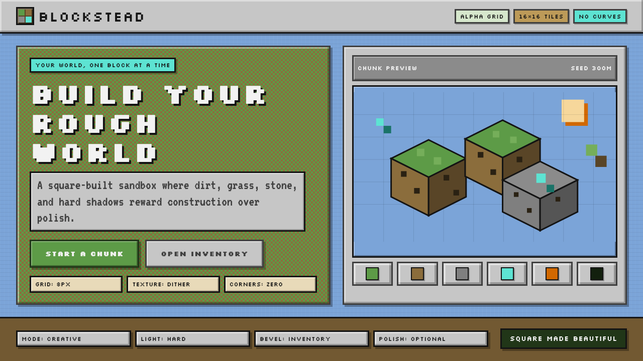 Minecraft VoxelUgly becomes buildable. Grass green, dirt brown, hard bevels, and 16×16 grids…
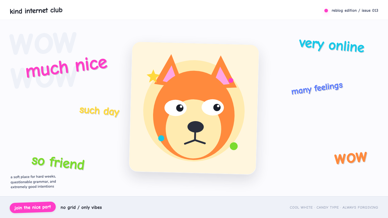 Doge Meme (2013)Anti-design becomes pure joy. Candy Comic Neue captions drift at lazy angles…
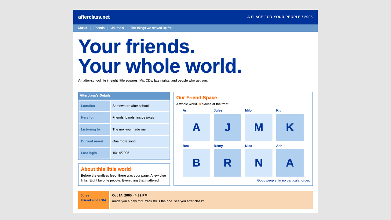 MySpace ProfileFriendship in eight squares. Deep blue, orange titles, and tiny type in hard-…
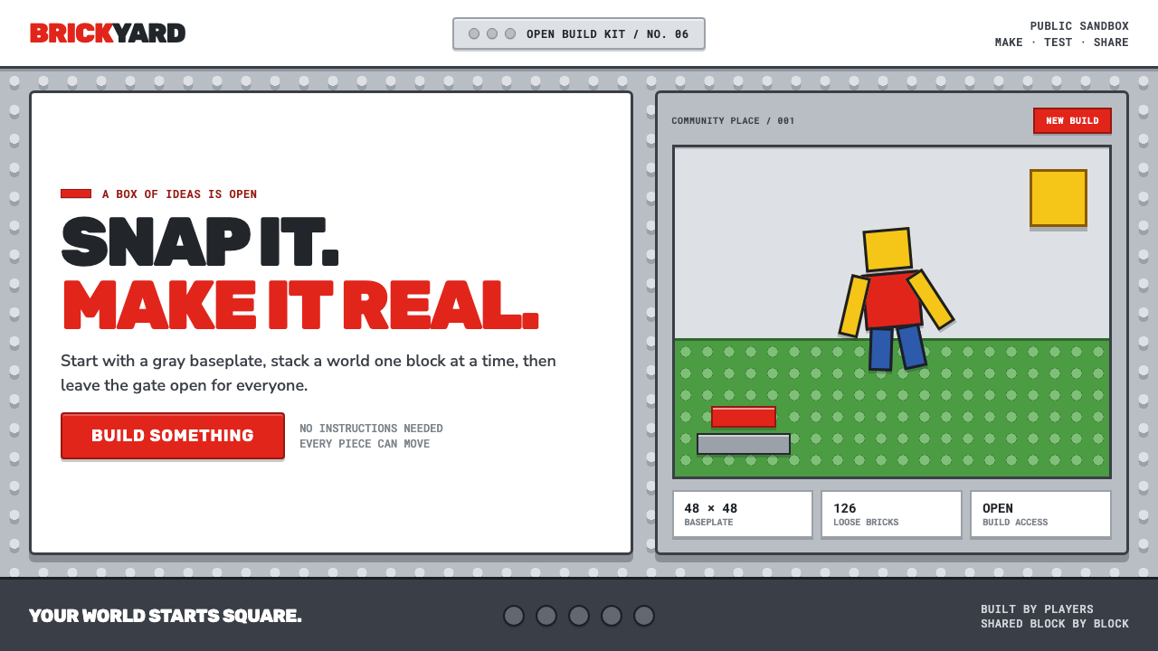 Roblox (2006)Play begins with a click. Fire-engine red cuts through a hard-edged gray stud…
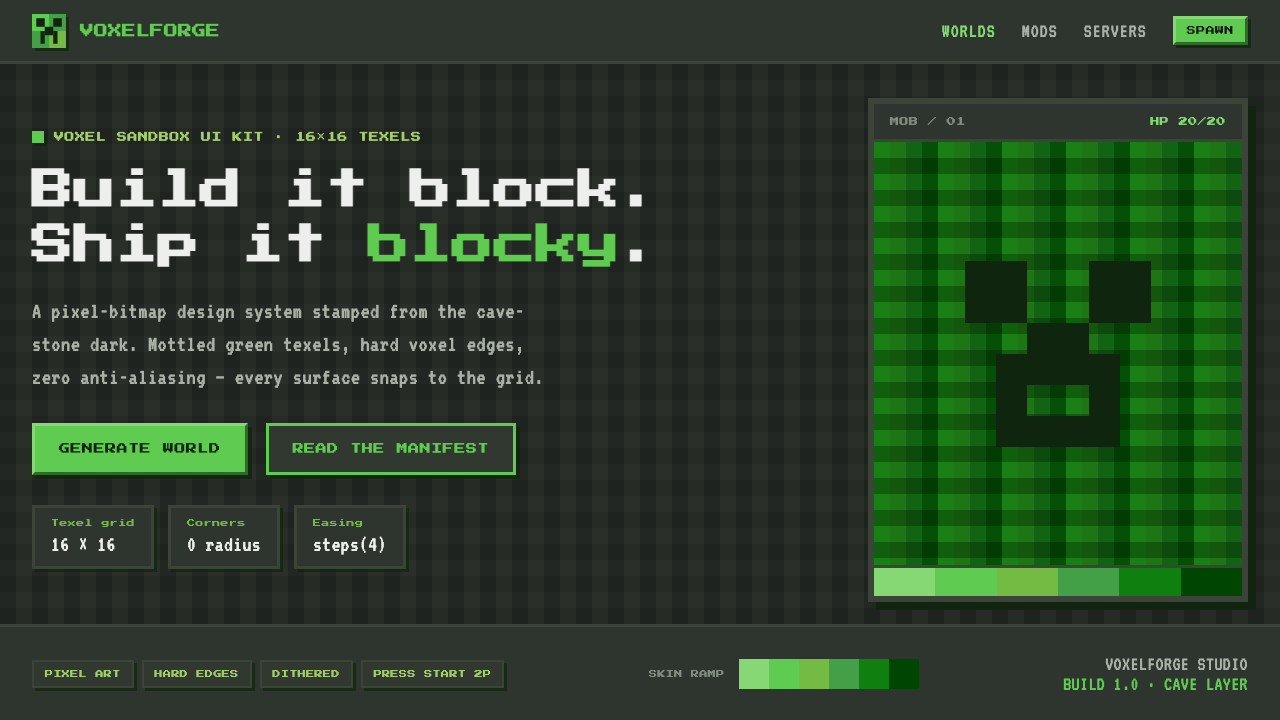 Minecraft CreeperBuild it blocky. Mottled lime texels on cave-stone gray, hard voxel edges, pe…
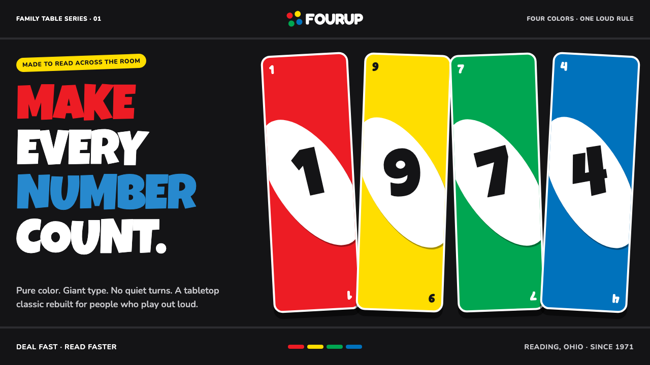 UNO (1971)Every number shouts. Four pure primaries punch through black with tilted whit…