What is Gould Hummingbird Plate?
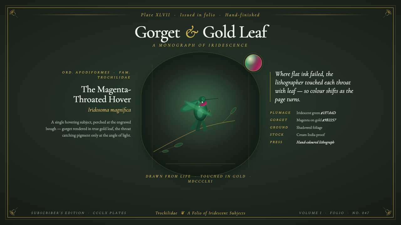
The Gould Hummingbird Plate turns natural history into nocturnal jewelry — emerald wings, magenta throats, and glints of gold suspended against the hush of a shadowed forest.
Gould Hummingbird Plate in brief
Gould Hummingbird Plate is a design style derived from John Gould's A Monograph of the Trochilidae, dated 1861: a monumental British ornithological publication containing 360 hand-finished lithographic plates. Created with Henry Constantine Richter and printed by Hullmandel & Walton, the plates present hummingbirds as both scientific subjects and precious visual objects, hovering alone or in pairs among dark, carefully staged foliage.
Its defining tension lies between observation and splendor. Plumage is rendered with enough specificity to suggest natural-history authority, yet color and finish elevate the bird beyond ordinary documentation. Iridescent greens emerge from deep forest grounds; magenta gorgets concentrate attention around the throat; touches of actual gold leaf imitate the flash of feathers that changes with the light. The result is informative illustration presented with the ceremony of a luxury plate book.
As a contemporary visual system, the style combines shadowed botanical depth, jewel-like focal color, metallic highlights, and refined old-style serif typography. Its darkness is not empty or severe: it behaves like dense foliage at dusk, allowing luminous feathers and gilded details to appear almost three-dimensional. The governing mood is cultivated wonder — nature studied closely, arranged theatrically, and reproduced with exceptional material care.
Where does Gould Hummingbird Plate come from?
The style originates in Victorian Britain and in the culture of the deluxe ornithological monograph. Such a publication joined scientific classification, close visual description, specialist drawing, lithographic printing, and extensive hand finishing. In Gould's hummingbird monograph, the abundance of 360 plates made the project more than an isolated series of bird portraits: it became a sustained visual world devoted to one spectacular family of birds.
John Gould supplied the monograph's central authorship and organizing vision. Henry Constantine Richter collaborated on the drawings, translating delicate bodies, spreading tails, hovering poses, and surrounding vegetation into images suitable for lithographic reproduction. Hullmandel & Walton printed the plates. These roles reveal the collective structure behind their apparent natural ease: observation, composition, drawing, printing, coloring, and finishing had to converge before a hummingbird could seem to float effortlessly on the page.
The dark-foliage vignette was essential to that illusion. Instead of isolating each specimen against a blank field, the plates placed hummingbirds within shadowed botanical settings. Leaves and branches established habitat, depth, and scale, while the surrounding darkness intensified the birds' luminous coloring. A hovering pose added a further paradox: a static printed plate attempted to preserve a creature known for rapid motion and unstable flashes of iridescence.
Gold leaf provided the most materially extravagant answer to that problem. Applied to the gorgets, it did not merely signify luxury; it helped imitate the optical behavior that ordinary pigment could not fully capture. As the page met changing light, the gilded surface could flash rather than simply depict flashing. The Gould Hummingbird Plate style inherits this union of scientific ambition and crafted illusion, using darkness, saturated feather color, and selective brilliance to evoke the experience of encountering an elusive living jewel.
What defines the Gould Hummingbird Plate look?
Color
The palette begins with deep forest darkness rather than neutral white. Blackened greens and shadowed foliage form a recessive ground from which emerald and iridescent plumage can emerge. Magenta is reserved for the gorget or another concentrated focal passage, while warm gold appears only where light must feel precious. Color should look accumulated through feathers, leaves, and hand finishing, not spread evenly across large decorative fields.
Typography
Refined old-style serif type gives the system its bibliographic authority. Letterforms should feel literary, composed, and suitable for the title page of a deluxe Victorian volume. Headlines benefit from graceful proportion and measured spacing rather than blunt weight. Supporting text remains restrained and highly readable, allowing typography to frame the natural spectacle without competing with the bird's intricate silhouette.
Iridescence
Iridescence is suggested through contrast, color shifts, and sharply placed highlights rather than smooth digital spectacle. A green feather may move visually from forest-dark to jewel-bright, with a sudden glint implying a surface that changes under light. The effect must remain selective. If every leaf and feather shines equally, the optical mystery disappears and the composition loses its hierarchy.
Botanical Depth
Foliage behaves as a vignette rather than a complete landscape. Some leaves are legible, others dissolve into darkness, producing a layered enclosure around the bird. Branches guide the eye and provide visual balance without becoming the principal subject. Negative space should feel like forest shadow: inhabited, atmospheric, and capable of concealing forms just beyond immediate view.
Gold-Leaf Highlight
Gold functions as an optical event, not a general luxury coating. Historically, actual leaf touched the gorgets so that the printed bird could answer changing light with a real flash. In contemporary applications, metallic emphasis should remain similarly localized: a throat, a fine rule, a title detail, or a small point of illumination. Scarcity gives the highlight its authority.
Composed Naturalism
The bird should appear convincingly alive while the scene remains visibly composed. Hovering bodies, turned heads, spreading tails, and paired arrangements create animation, but surrounding branches and leaves organize that motion into a stable plate. This balance separates the style from casual wildlife imagery: nature is neither diagrammed coldly nor shown as an accidental snapshot, but observed and staged with ceremonial precision.
Who shaped Gould Hummingbird Plate?
Gould provided the authorship and overarching vision for A Monograph of the Trochilidae. By devoting 360 plates to hummingbirds, he framed the family as a subject worthy of sustained scientific and aesthetic attention. The style associated with the book reflects that double ambition: individual birds remain objects of study, yet the complete publication surrounds them with the scale, finish, and visual ceremony of a luxury collection.
Richter collaborated with Gould on the drawings for the monograph. His role sits at the crucial passage between natural observation and printable image: fragile anatomy, feather pattern, suspended movement, and botanical setting had to become coherent lithographic compositions. The elegance of the plates depends on this disciplined translation, which makes scientifically attentive detail compatible with theatrical darkness and jewel-like finish.
Hullmandel & Walton printed the monograph's plates, giving physical form to the collaboration between Gould and Richter. Printing had to preserve fine contours, tonal foliage, and the clarity required for later hand finishing. Within the Gould Hummingbird Plate aesthetic, the firm represents the production intelligence behind apparent splendor: luxurious effect depends not only on illustration, but on controlled reproduction and a surface prepared to receive color and gold.
How do you use Gould Hummingbird Plate today?
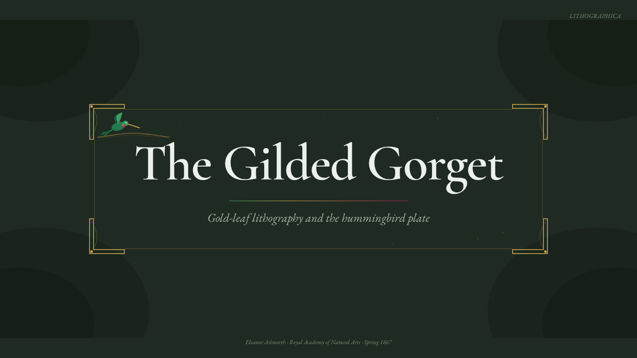
For presentation covers, the style works best as a single dramatic encounter. Place a hummingbird or a tightly cropped feathered silhouette against a field of shadowed foliage, then allow a restrained serif title to occupy the quieter region. A magenta throat or a minute gold accent can establish the focal point. Content slides should preserve the plate-book character through generous margins, composed text blocks, botanical framing used sparingly, and clear separation between descriptive information and visual evidence.
Data slides should borrow the monograph's logic of classification rather than imitate its illustration literally. Categories can be organized like specimens within a collection, with dark grounds supporting pale labels and selective jewel colors marking the information that matters most. Fine rules and small gilded cues may connect annotations to charts, but metallic effects should never cover large data areas. Legibility remains the scientific half of the style's identity.
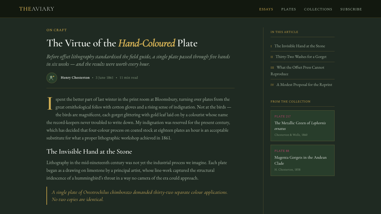
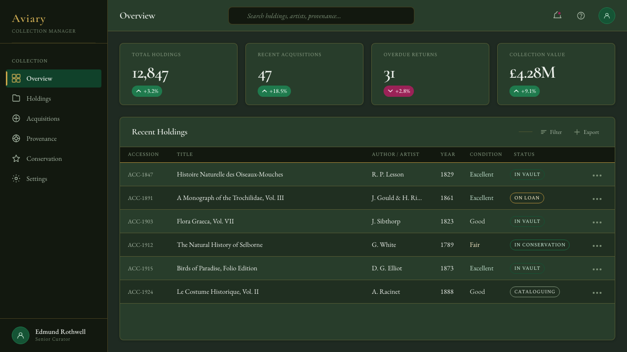
For web interfaces, Gould Hummingbird Plate suits premium dashboards, collection browsers, archival catalogues, and pricing pages that need cultivated drama. Panels can emerge from subtly differentiated forest-dark surfaces, while serif headings establish editorial authority and quieter text supports scanning. Emerald, magenta, and gold should communicate state or hierarchy through deliberate recurrence. Pricing tiers benefit from the language of rare specimens and curated plates, provided ornamental foliage does not obstruct comparison or interaction.
Editorial and marketing applications can treat each feature as a plate accompanied by a learned caption. Long-form articles benefit from dark opening spreads, luminous bird details, measured serif typography, and occasional botanical vignettes that mark transitions. Marketing pages can alternate immersive image-led passages with calmer reading sections, allowing moments of richness to breathe. The style is particularly persuasive when a product wishes to unite expertise, rarity, craft, and a sense of discovery.
The common mistake is equating Victorian luxury with continuous decoration. Filling every border with leaves, making every heading gold, or applying iridescence to every surface destroys the hierarchy that gives the original plates their magic. Darkness must remain spacious, the bird must remain dominant, and brilliance must arrive in concentrated flashes. A restrained composition with one unforgettable luminous detail is more faithful than a crowded imitation of antique abundance.
Gould Hummingbird Plate — FAQ
Is Gould Hummingbird Plate simply a dark botanical style?
No. Dark foliage is the stage, but the style's identity comes from the relationship among ornithological observation, hovering composition, iridescent plumage, old-style serif typography, and hand-finished luxury. A generic arrangement of leaves on black may reproduce the atmosphere without the intellectual structure. The bird should feel studied, the setting composed, and the brilliant details materially exceptional.
Why was gold leaf used on the hummingbirds?
Gold leaf helped imitate the changing brilliance of the gorget, whose iridescence could not be fully conveyed through ordinary flat pigment. Because the metal responds directly to surrounding light, the printed surface can flash as the viewing angle changes. The technique therefore joins representation with physical behavior: it depicts luminosity while also producing a real luminous event on the page.
Can the style work without an illustration of a hummingbird?
It can, but the remaining elements must preserve the same hierarchy. Iridescent green, a concentrated magenta accent, selective gold, shadowed botanical depth, and refined serif typography can evoke the plate-book world without showing a complete bird. Feather fragments, throat-like color fields, or a hovering arrangement of small forms may carry the association. Without those relationships, the result will drift toward generalized Victorian luxury.
How should photography be treated in this aesthetic?
Photography should be composed like a hand-finished plate rather than presented as casual wildlife documentation. Favor a clearly isolated bird or botanical detail, controlled darkness, legible feather structure, and a focal highlight that feels rare. Cropping may create the intimacy of close study, while surrounding shadow provides theatrical depth. Excessively bright environments or visually busy habitats weaken the jewel-like concentration.
What kinds of products are poorly matched to this style?
The style struggles where extreme neutrality, casual friendliness, or dense operational speed is the primary requirement. Its dark grounds, serif authority, and precious highlights naturally suggest contemplation, rarity, and ceremony. A highly utilitarian interface can borrow its palette or editorial refinement, but extensive foliage and theatrical contrast may slow scanning. It is strongest when the experience benefits from discovery and curation, not when every surface must disappear behind rapid task completion.
Related design styles
 Kana Waka CalligraphyQuiet luxury in ink. Indigo ryoshi, Kaisei serif, scattered kana, and gold fl…
 Beetle Specimen CabinetGreen burns in darkness. Emerald elytra grids glow under brass keylines and b…
 Bird of Paradise MonographTheatrical plate-book darkness. Flame plumes blaze from a bordered forest-bla…
 Carnivorous Pitcher PlantBotanical danger glows. Crimson traps and gold rims float on jungle-dark gree…
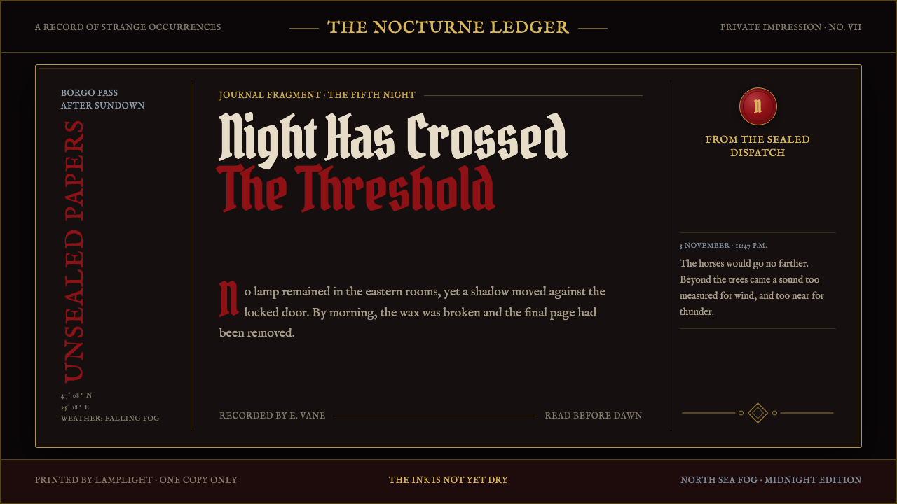 Dracula Gothic (1897)Victorian dread after dark. Blood-red initials and tarnished gilt haunt coffi…
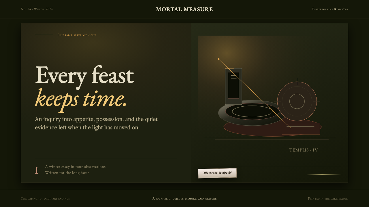 Dutch VanitasTime waits at the table. Olive-black depths, earth-brown type, and one candle…