What is Google Maps?
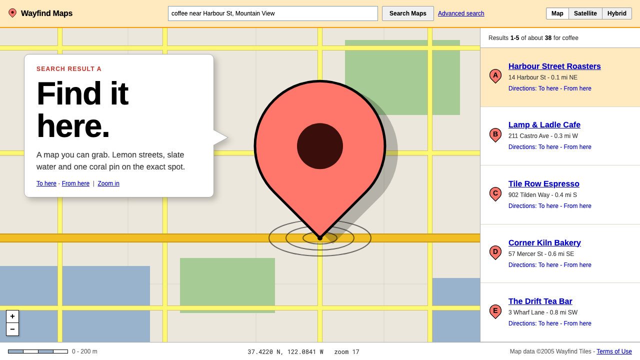
Google Maps in 2005 made the map something you could grab, and gave it a single coral teardrop pin to say exactly where you were looking.
Google Maps in brief
The early Google Maps look is a utilitarian, colour-coded cartography designed for screens. Land is a grey-beige, local streets are lemon yellow, freeways are amber, water is slate blue and parks are a soft green. A result is marked by a coral-red teardrop pin with a black outline and a dark centre, whose point sits on the exact coordinate. Clicking opens a speech-bubble window rising from the pin, and almost all text is set in a small Arial-style sans serif.
What made the product famous in 2005 was an interaction rather than a style. Square raster tiles slid under the cursor as you dragged the map, with new tiles filling in without a page reload. That made it the demo everyone used to explain AJAX, and the visual design had to support it: tiles needed to be calm and neutral enough to be stitched together endlessly, and the interface chrome had to stay small so that the map filled the screen.
The page around the map was equally plain. A results list sat in a column on one side, a panning control with direction arrows and a zoom slider sat in the upper left, and small tabs switched between map and satellite views. It is the practical, helpful face of early Web 2.0, and its restraint is what the later system preserves.

Where does Google Maps come from?
Google Maps launched in February 2005 from Mountain View, California. It was built on the work of Where 2 Technologies, a company in Sydney, Australia, whose mapping technology Google acquired, and the project was led by people including Lars Rasmussen and Jens Eilstrup Rasmussen, with Bret Taylor among the key figures. Its origins in a small Australian start-up explain some of the product's agility: it treated the map as software rather than as a printed object.
The technical backbone was the slippy map, a tile pyramid in which the world is cut into square images at multiple zoom levels. The browser requests only the tiles it needs and stitches them as you move, which is what allowed the smooth dragging that startled users in 2005. The classic raster tile style remained largely recognisable from 2005 to around 2012, a long life for a visual design on the web.
A second ingredient was satellite imagery from Keyhole, a company Google had acquired. Letting users switch from a stylised street map to photographic views made the product feel richer, and its tile system could hold both. In 2007 Street View added a third mode, in which the pin and the panel patterns established in the early design continued to apply.
The movement context is AJAX and Web 2.0, a period in which browsers began to act like applications. The visual language of the map reflects that moment: friendly, functional and fast, with soft colours and small type that stay out of the way. The interface was not trying to be beautiful in the sense of a printed atlas. It was trying to be immediately useful.
What defines the Google Maps look?
Color
The base map uses calm, low-saturation hues so that thousands of tiles can sit side by side without clashing: grey-beige for land, lemon yellow for local roads, amber for freeways, slate blue for water and soft green for parks. A coral red is reserved for the result pin, so it is the strongest colour on the screen and the eye lands there first.
The pin
The teardrop pin is the signature. It has a rounded top, a point at the bottom that sits on the exact coordinate, a black outline and a dark circle in the centre. Its shape tells you where the location is without hiding it, and it is simple enough to be recognised at a glance and reproduced at any size.
Info window
Clicking the pin opens a speech-bubble window with a tail pointing back to the pin. Inside it, a title, an address and a few small links are laid out in plain type on a white ground. The bubble belongs to the pin and moves with the map, which keeps information attached to place instead of hiding it in a separate panel.
Typography
Type is a small Arial-style sans serif almost everywhere: street labels, result titles, links and controls. Links are blue and underlined, as on the rest of the early web. Nothing is decorative. The type is there to give names to things, and it stays small so that the map remains the main event.
Controls and layout
A results column sits on one side, the map fills the rest, and a compact pan control with direction arrows and a zoom slider sits in the upper left. Small tabs switch between map and satellite. The controls are modest in size and sit above the map without a heavy frame, keeping the interface subordinate to the tiles beneath.
Tone
Helpful, practical and a little amazed at itself. The design does not try to impress with decoration. Its pleasure comes from the fact that the map moves and the pin lands where it should. That quiet confidence in function is the core of the style.

Who shaped Google Maps?
Rasmussen is one of the engineers most associated with the creation of Google Maps and with the Sydney-based Where 2 Technologies, whose work formed the base of the product. His name is part of the story of how a small Australian mapping start-up became the core of a global web service.
Jens Eilstrup Rasmussen is also credited among the people behind the mapping project, in the context of Where 2 and its move into Google. His involvement is part of the technical lineage that produced the drag-and-pan tile approach at the centre of the style.
Taylor is named among the key figures of the early Google Maps team. His association with the project places the product in a lineage of web applications that were beginning to behave like desktop software, a shift that shaped the whole visual approach.
How do you use Google Maps today?
On slides, the style suits location-focused content: store finders, route overviews, regional comparisons and travel plans. Use a muted beige and slate-blue base with the coral pin as the single accent, and let a speech-bubble callout carry the key fact. For a cover, a large map crop with one pin and a short title in plain sans serif is enough. For data slides, use the lemon, amber and green as category colours only where distinction is genuinely needed.
In web interfaces, it suits maps, store locators, delivery trackers, listings, travel and real-estate products and anything where a result must be tied to a place. Keep the base calm, make the result marker the strongest colour, let information open in an anchored bubble and keep controls small. A dashboard can reuse the pin and bubble pattern for any item that has a location, and the base-map palette for neutral chrome.
In editorial and marketing work, the pin is a powerful single symbol. A campaign, an event page or an infographic can use it to say here, with a short bubble containing an address or a date. The early-web restraint gives it a friendly, practical, honest character that suits community, local and travel content.
The most common mistake is to over-style the base. Heavy gradients, glossy buttons, strong shadows or saturated land colours compete with the pin and make the map hard to read. Another is to colour everything with the pin's coral: it works only because it is rare. A third is to let the info window grow into a full card with images, ratings and buttons; the original bubble is small and carries only what is needed.
A practical rule is to treat colour as hierarchy: calm tones for the ground, a warm accent for the answer, and plain type for the labels. If a screen has more than one strong colour fighting for the eye, the map has lost its job.

Google Maps — FAQ
What is the early Google Maps design style?
It is a practical, screen-first cartography: grey-beige land, lemon local roads, amber freeways, slate-blue water and soft green parks, with a coral-red teardrop pin that has a black outline and a dark centre, a speech-bubble info window and small Arial-style type. Everything is designed to keep the map calm and the answer obvious.
When and where was Google Maps launched?
It launched in February 2005 from Mountain View, California, built on the work of Where 2 Technologies in Sydney, Australia. People associated with it include Lars Rasmussen, Jens Eilstrup Rasmussen and Bret Taylor. Street View followed in 2007, and the classic raster tile style remained recognisable until around 2012.
Why was Google Maps connected to AJAX?
Because tiles loaded and moved under the cursor without reloading the page, which was a striking demonstration of what browsers could do in 2005. The visual design supported that by using calm, stitchable tiles and small interface controls, so the map filled the screen and updated smoothly.
How should the pin color be used?
Treat the coral red as the one strong colour on the screen, reserved for the result marker. Keep the base map in calm, low-saturation tones so the pin stands out, and avoid using the same red for buttons or headings, which would weaken its meaning.
Which products suit this style?
Maps, store locators, delivery trackers, listings, travel and real-estate products, and any interface where a result must be anchored to a place. It also works as a friendly, practical look for local and community content. It is less suited to products that need a strongly branded or highly decorative surface.
Related design styles
 Isometric IllustrationComplexity feels weightless. Violet gradients and blue blocks rise on a preci…
 Dropbox ModernFriendly SaaS gets loud. Electric blue and Sharp Sans drive a structured geom…
 Facebook 2004Dorm-web austerity. Original blue, 980px grid, 1px borders, tiny Lucida Grand…
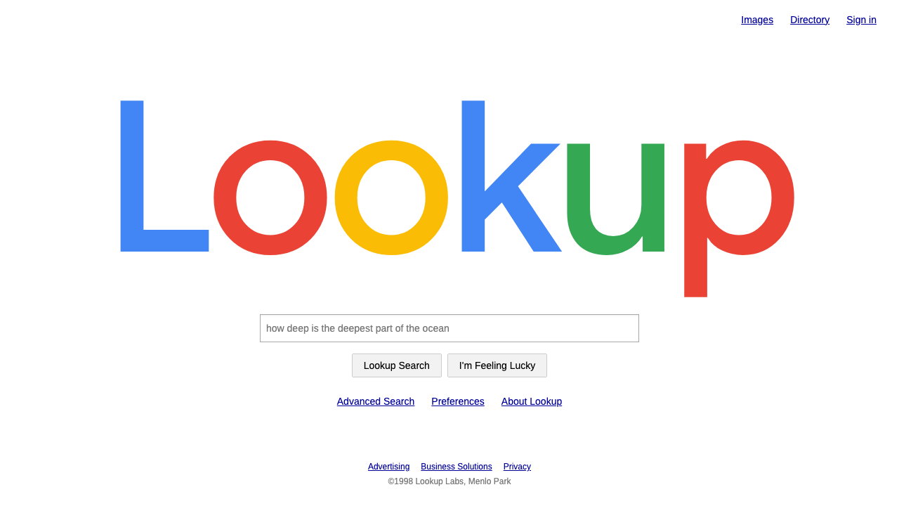 Google SearchA white page and a box to type in. Giant four-colour wordmark, Arial text, no…
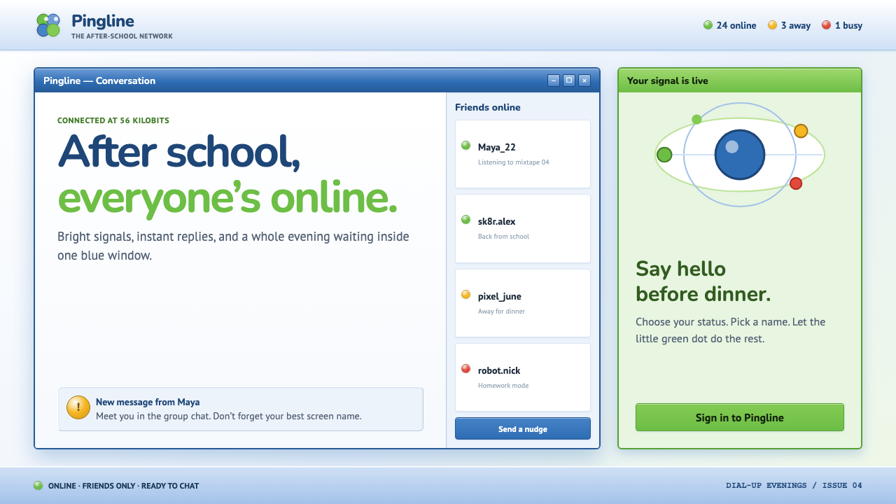 MSN Messenger (2001)Dial-up optimism, online. Luna-blue chrome and bright status dots keep every…
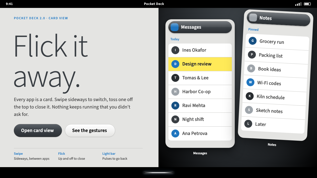 Palm webOSEvery app is a card you flick away. Charcoal gloss pills and blue labels on g…