What is Ghana Movie Poster?
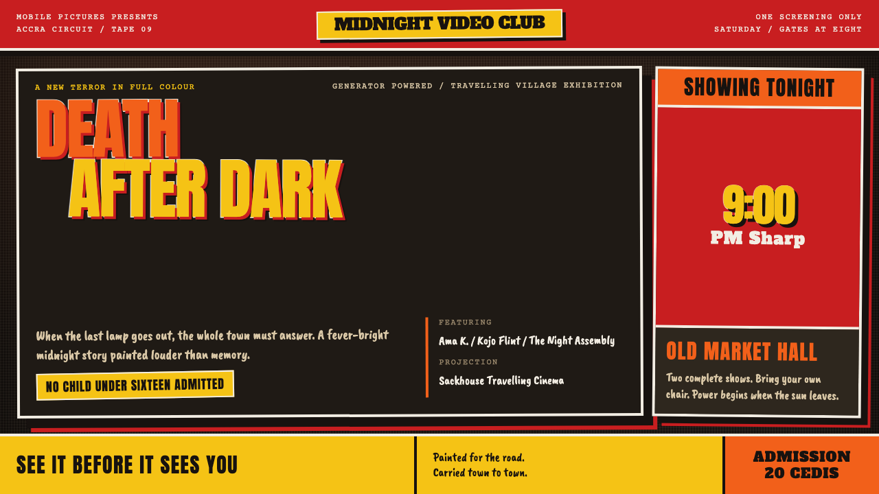
Ghana's painted movie posters turned a flour sack into a billboard — hot enamel, oversized eyes and blades, and double-outlined titles lettered from memory, crowding every edge.
Ghana Movie Poster in brief
The Ghanaian hand-painted movie poster is a form of commercial painting that flourished from the mid-1980s until around 2000, with its peak in the 1990s. Artists worked oil and enamel paint onto stitched sacks that had once held 50kg of flour or rice, and the finished canvases advertised films shown by mobile video clubs — travelling operators who carried a generator, a television and a VHS deck from village to village. The look is unmistakable: hot gloss colour on a dark ground, hand-lettered titles wrapped in a double outline, and imagery pushed far beyond natural scale.
These posters were not souvenirs and not catalogue illustrations. They were announcements made by hand, for audiences who had often not seen the film and sometimes not seen the star. Their job was to promise a night out: danger, spectacle, a monster, a hero with an improbable weapon. So the painter enlarged whatever sells a screening — eyes, hands, teeth, blades — and filled the remaining space with colour and lettering. Quiet negative space is almost absent; an empty patch on a sack was a patch that was not selling anything.
Curio's rendering of the tradition keeps that pressure. Every surface behaves like a painted panel, every headline carries a brushed outline, the weave of the sack shows through the paint, and the picture runs right to the border with no polite white margin. It is advertising with no restraint in it — and holding that lack of restraint consistently, from one panel to the next, is the discipline.

Where does Ghana Movie Poster come from?
The form begins with a practical problem. In the mid-1980s Ghana's mobile video clubs had no printing works to turn to, so they commissioned paintings instead. A club operator would arrive in a village with a generator, a television and a VHS deck, set up a screening, and needed something to tell people it was happening. Artists answered with oil and enamel on stitched flour and rice sacks — tough, ready-made cloth that could be sewn into a large panel and, crucially, rolled up. When the film was over the poster was rolled away and carried to the next stop, so the same canvas advertised each night in turn.
The painters did not invent their craft from nothing. The tradition sits within West African sign-writing and shop-front painting — the hand-painted boards and façades that announced shops and services — and it carried that sign painter's instinct into a new job: lettering bold enough to read across a street, outlines that lift letters off a busy picture, flat bright enamel that holds its colour. The second pillar was the VHS video-club economy, which supplied both the product, a steady stream of imported films, and the audience that gathered to watch them.
The circuit that carried the posters ran through cities such as Accra and Kumasi and out into the villages beyond. What the surviving posters show is a painter working largely from memory and imagination. Hollywood titles were lettered from recollection, misspellings and all. The ghouls were invented, going well beyond anything that appeared on screen. Hands and eyes grew until the picture felt like an event rather than a still. The job was not to document a film but to sell an evening that was about to happen in the village.
Several names recur in accounts of the tradition — Joe Mensah, D.A. Jasper, Mr Brew, Alex Boateng and Heavy J — and the span in question is short: roughly fifteen years, from the mid-1980s to 2000, with the 1990s as the high point. Because the work was made for the street rather than the gallery, it never fitted neatly into fine-art categories, which is why it is often filed under the loose heading of outsider poster art. For a design system that outsider position is exactly the point: the style is a record of how much visual force can be generated with a brush, enamel paint and a sack.
What defines the Ghana Movie Poster look?
Hot enamel colour
Colour arrives as glossy, saturated enamel: hot reds, oranges and yellows, flesh tones pushed toward the lurid, all laid against a dark ground. The palette is not harmonised for calm. Contrast is the organising principle — bright shapes cut out of darkness so the subject reads from across a crowd — and neighbouring hues are allowed to clash rather than blend.
Dark ground, edge to edge
The base is a thick dark enamel worked right out to the borders. There is no white margin and no framed picture sitting politely on a page; the painting simply continues until the sack ends. Beneath the paint the weave of the sack still shows, which keeps the surface physical — a made object, not a screen.
Double-outlined lettering
Headlines are hand-lettered and wrapped in a brushed double outline, an inner and an outer line that lifts each letter off a busy picture. The letterforms are heavy, slightly irregular and very large. Titles of Hollywood films were written from memory, so misspellings are part of the record rather than a flaw to be corrected.
Scale without proportion
Hands, eyes and blades are drawn far past scale. Proportion is a tool of emphasis, not of realism: whatever carries the threat or the promise of the film grows until it fills the panel, and everything else shrinks to make room. Hierarchy comes from exaggeration rather than from a tidy ladder of sizes.
Invented creatures, crowded edges
The ghouls are the painter's own invention, going well beyond anything shown in the film, and they share the panel with heroes, weapons and title in a dense overlapping crowd. Every edge is occupied. The composition has no resting place; the eye is meant to be pulled across a street full of competing signs and stopped.
A painted panel, not a graphic
Every surface reads as a brushed panel. Edges are hard where the brush stopped, strokes remain visible, and shapes are filled with flat enamel rather than the smooth gradients of digital polish. The object is the evidence of the hand: stitched seams, brush marks and the sack beneath. Nothing blurs, glows or fades.

Who shaped Ghana Movie Poster?
Joe Mensah is one of the artists named in connection with the Ghanaian video-club poster. Whatever the particular hand, the lesson attached to the circuit's best-known painters is the surface itself: a poster is a performance on a sack, made at working speed, where the brush decides the edge.
D.A. Jasper is another name that recurs in accounts of the tradition. The part of the work most easily learned from the circuit is its lettering: titles written large from memory, wrapped in a double outline, with misspellings left standing as part of the record.
Mr Brew is named among the artists of the circuit, and the name reads like a trade handle, as several in the list do. It is a useful pointer to the tradition's invented creatures: ghouls that went well past anything in the film, drawn to sell the evening rather than to illustrate the plot.
Alex Boateng is one of the names tied to the poster circuit. His place in the list is a reminder that these posters belonged to an economy: a painter, a club operator, a generator and a rolled-up sack that travelled with the show from village to village.
Heavy J completes the list of names the tradition is associated with. Like the others, the name stands for a way of working rather than a single picture: heavy enamel, heavy outline, and a willingness to fill the panel completely.
How do you use Ghana Movie Poster today?
The Ghana Movie Poster style is built for attention. It suits work whose message is an event, a launch, a screening, a night out — anything that has to stop someone on a busy street. It is loud by design, so the craft of using it lies in controlling the loudness: one dark ground, one family of hot colours and one lettering treatment, repeated until the noise becomes a system.
For presentation slides, the cover is where the style earns its keep. Fill the slide with a dark ground to the edges, push a single subject — an eye, a hand, an object — well past natural scale, and set the title in large double-outlined letters. Content slides work best as one painted panel per idea, with the outline doing the work that boxes and dividers usually do. Data slides can treat each chart as a poster object: oversized numerals, thick bars in flat enamel colour, and labels in outlined lettering, with fine gridlines left out entirely.
For web interfaces, the style fits launch pages, event and ticketing sites, cultural programmes and campaign microsites far better than dense dashboards. On a pricing page, give each plan its own painted panel with a heavy outlined heading. Body copy still needs a calm place to sit, so set it on a solid plate with strong contrast rather than directly over the busiest part of the picture. The energy belongs to the headline and the imagery; the paragraph should stay readable.
For editorial and marketing work, the style belongs on posters, flyers, covers and hero banners — film nights, club nights, festivals, game releases, album campaigns. Crop aggressively, let the picture bleed off every edge, and keep the title unmistakably hand-made in feel. Print versions suit large formats seen from a distance, which is exactly the condition the original posters were made for.
The most common mistake is to treat the style as a distressed-texture filter. Scattering random grime over a clean layout misses the point, and so does the opposite error of tidying it up with white margins, thin type and soft shadows. The roughness is structural: it comes from enamel, brush, outline and sack. A second mistake is to fake misspellings in real copy. In the original, errors were a by-product of lettering from memory; copying them on purpose turns evidence into costume.

Ghana Movie Poster — FAQ
Why were the posters painted on flour and rice sacks?
Because the video clubs could not print, so they painted. Stitched flour and rice sacks of the 50kg kind gave painters a large, tough, ready-made cloth that could be sewn into a big panel and rolled up. That last property mattered most: the clubs travelled from village to village, and the poster was rolled away after the film and carried to the next stop.
Why do the posters show monsters that are not in the film?
The posters were not documentation. The painter worked largely from memory and imagination, and the aim was to sell the evening, not to illustrate the plot. The ghouls were invented and went well beyond anything shown on screen, because a more frightening picture brought more people to the screening. The style keeps that logic: imagery exists to promise, not to explain.
Should I copy the misspelled titles?
No. In the originals, Hollywood titles were hand-lettered from memory, misspellings and all, so the errors are evidence of how the posters were made. What the style asks you to keep is the hand-made quality of the lettering — heavy, large, irregular, wrapped in a double outline. In real copy, spell correctly and let the brushed look carry the character.
Does this style only work on dark backgrounds?
It is built on a dark enamel ground, and the hot colours read as they do because they are cut out of darkness. A light inversion loses the contrast that the whole look depends on. If your product needs a light page, keep the poster language inside dark panels, hero blocks or covers rather than inverting the entire system, and keep body text on a plain high-contrast plate.
How is this different from a grunge or retro horror poster look?
Grunge and retro looks usually simulate wear: scratches, grain and faded print laid over a polished layout. This style is not weathered; it is freshly painted, hot and glossy, and its irregularity comes from the brush, the enamel and the sack. It also has a different job. It was commercial advertising for a travelling screening, so everything on the panel is working to bring a crowd in.
Related design styles
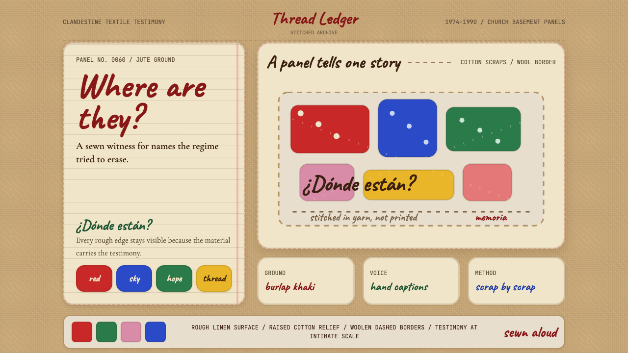 Chilean Arpillera (Pinochet Resistance)Witness sewn, not spoken. Burlap khaki, Caveat captions, and red cotton block…
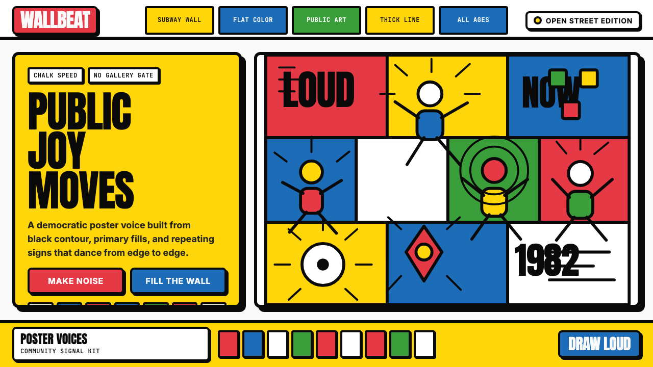 Keith Haring PopJoy refuses the gallery. Thick black contours pack primary color into a danci…
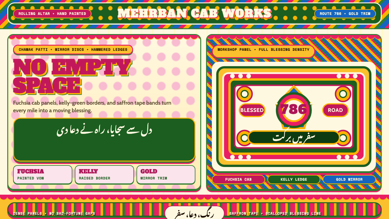 Pakistani Truck ArtBlessing crowds every inch. Fuchsia, kelly green, and gold stack into scallop…
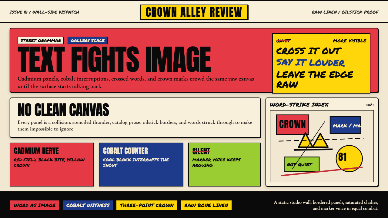 Basquiat Neo-ExpressionismExplodes off raw linen. Cadmium red, cobalt blue, Anton blocks, and struck ma…
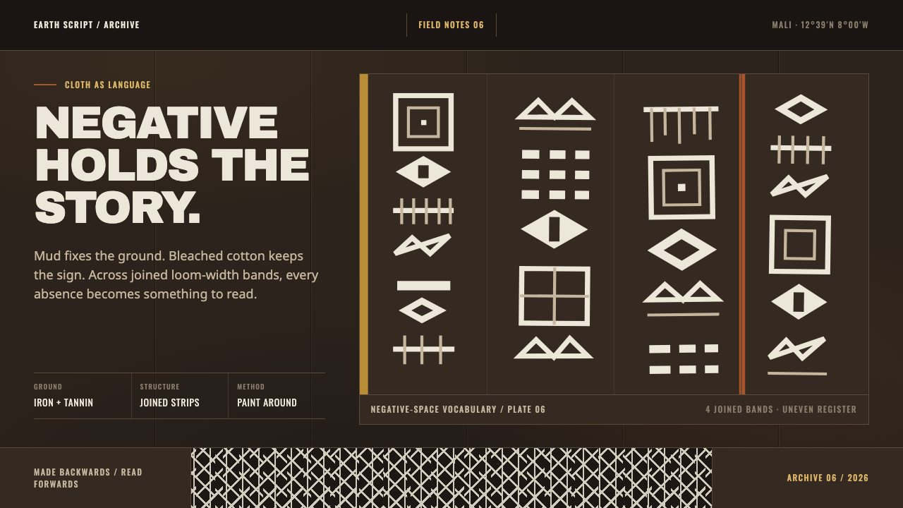 Bogolanfini MudclothAbsence becomes language. Warm iron-black bands hold uneven bleached-cotton s…
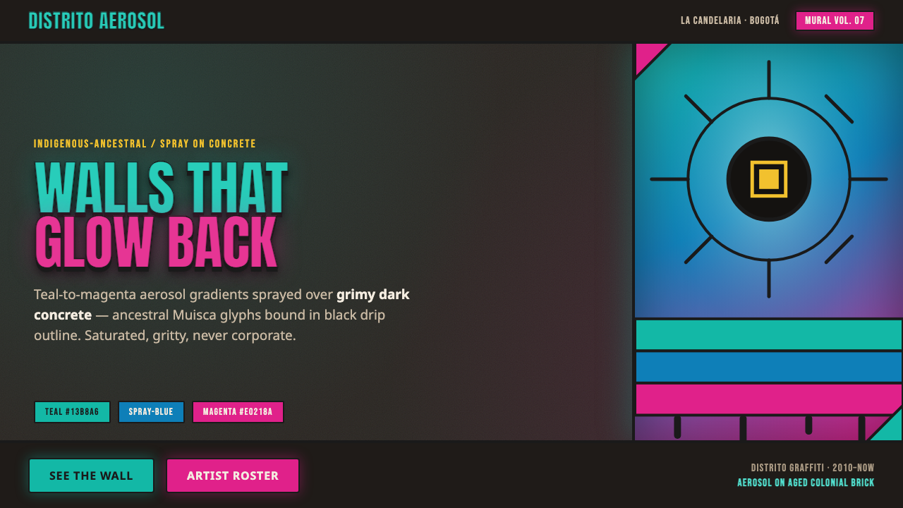 Bogotá Street MuralismNeon spray glowing off the wall. Teal-to-magenta aerosol on grimy concrete, i…