What is Getty Center Travertine White?
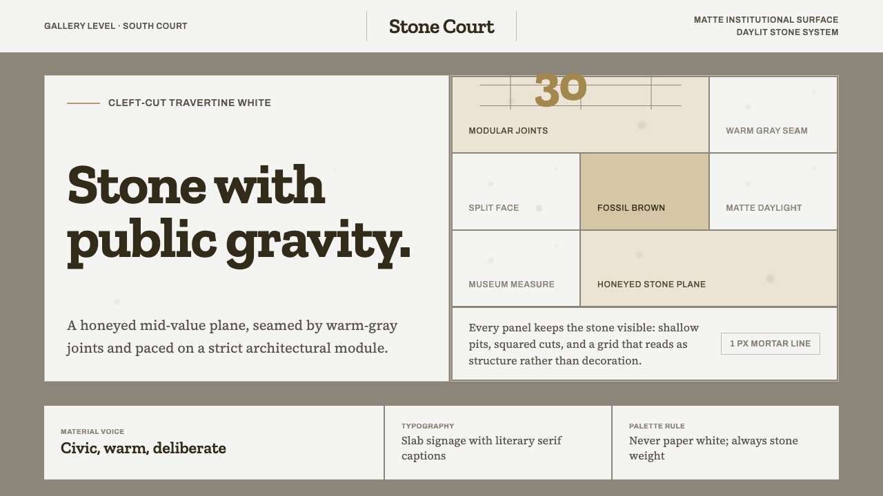
Stone has gravity — honeyed travertine, warm-gray seams, and daylight disciplined into an architectural system.
Getty Center Travertine White in brief
Getty Center Travertine White translates the material presence of Richard Meier’s Getty Center into a visual system for digital work. The source is the hilltop museum opened in Los Angeles in 1997, whose architecture is clad in Italian travertine split rather than sawn. The result is not a generic white style: it is a matte, honeyed stone plane, marked by warm-gray modular seams and shaped by daylight.
The surface matters because every visual decision begins with material evidence. Cleft-cut stone exposes fossilized leaves and gas-bubble voids, so the cladding carries time, irregularity, and weight within an otherwise rational structure. In the digital interpretation, that tension becomes the central character: ordered planes remain calm and institutional, while restrained variation prevents the system from becoming sterile.
This is a light-ground style, but its lightness is architectural rather than paper-like. Backgrounds should feel mineral, warm, and substantial; lines should read as joints rather than decoration; and typography should sit with quiet authority inside the grid. The overall impression is bright without being delicate, refined without becoming luxurious, and modern without losing contact with the physical world.

Where does Getty Center Travertine White come from?
The system comes from the Getty Center, Richard Meier’s hilltop museum in Brentwood, Los Angeles, opened in 1997 under the stewardship of The Getty Trust. Its setting is part of the character: a civic and cultural institution lifted above the city, where architecture, landscape, light, and circulation are understood as a coherent whole. Getty Center Travertine White retains that sense of composed elevation while reducing the building to its most transferable visual ingredients.
The decisive material choice was Italian travertine. The stone was cleft-cut, split instead of sawn, so each block preserved a face with fossilized leaves and gas-bubble voids. The surface therefore carries geological memory without needing printed texture or ornamental simulation. Its honeyed mid-value tone gives the system warmth, while the regular joint lines return the irregular material to an ordered architectural field.
Historically, the style belongs to the context of American late modernism and the architectural current associated with The Whites and humanist rationalist architecture. Its whiteness is not an absence of color in the abstract. It is a disciplined field of pale stone, animated by daylight and interrupted by seams. That distinction explains why the system feels more grounded than a conventional white interface.
The Getty Trust and Richard Meier represent complementary forces within the system. The institution supplies the civic seriousness, permanence, and cultural purpose; Meier supplies the rational organization and insistence on a legible architectural order. Together they produce a language in which material irregularity is not hidden, but contained by modular structure. The surface can show its age and origin while the whole remains controlled, bright, and exact.
What defines the Getty Center Travertine White look?
Travertine Color
The dominant field is honeyed travertine: a warm, mid-value stone tone that remains pale without becoming cream or paper-white. Warm gray belongs to the seams, rules, and secondary surfaces. Color should feel absorbed into mineral matter rather than laid on top as a graphic coating. The palette is quiet, sunlit, and civic, with warmth coming from stone rather than from saturation.
Cleft-Cut Surface
The surface is matte and materially legible. Cleft-cut treatment suggests a face that has been split open, allowing fossilized leaves and gas-bubble voids to remain visible. In digital work, this does not require a literal stone photograph everywhere. It means preserving a sense of grain, variation, and quiet imperfection while keeping the overall field calm and usable.
Modular Seams
Warm-gray seams are the organizing device. They divide the stone into repeated architectural planes, making structure visible without turning the layout into a decorative pattern. Lines should remain steady, restrained, and subordinate to content. Their purpose is to reveal alignment, establish rhythm, and give large pale areas a sense of measured construction.
Daylight and Matte Depth
Depth comes from daylight, plane changes, and the contrast between stone and joint rather than from glossy effects. Surfaces should feel softly illuminated but not luminous, with a diffuse calm that supports reading. A restrained shadow may clarify separation, but the visual language should remain architectural: planes meet, recede, and align instead of floating as glossy cards.
Institutional Typography
Typography should be clear, measured, and quietly authoritative. Neutral letterforms, generous breathing room, and strong alignment allow the stone field to remain present without competing with language. Headings can carry architectural weight, while body text should stay composed and highly legible. Decorative type, theatrical display effects, and overly soft hierarchy weaken the material seriousness of the system.
Measured Restraint
The style is refined through limitation. Large fields of stone, a narrow family of supporting tones, visible modular order, and carefully placed accents create authority through consistency. Nothing should look ornamental merely because space is available. The desired impression is permanence: a design that seems built, maintained, and intended to remain useful over time.

Who shaped Getty Center Travertine White?
Richard Meier is the architect whose 1997 Getty Center provides the source structure for this style. His role in the system is expressed through rational order, modular organization, pale architectural planes, and the disciplined relationship between solid material and daylight. Getty Center Travertine White treats those qualities as a transferable language rather than as a literal reproduction of the museum.
The Getty Trust represents the institutional dimension of the style. Its presence connects the material system to a museum context: civic, durable, culturally serious, and designed for sustained public use. In an interface or editorial layout, this influence appears as composure, clarity, and a refusal of disposable visual novelty.
Italian travertine is the material figure at the center of the system. Because it is cleft-cut rather than sawn, its face preserves fossilized leaves and gas-bubble voids. It supplies warmth, age, and irregular evidence to a rational architectural field, making the style feel grounded rather than abstract.
The modular grid is the structural figure that keeps the stone from becoming an undifferentiated field. It turns seams into alignment, repetition, and rhythm. In digital applications, it should govern the placement of type, cards, imagery, and data so that the interface feels assembled from architectural parts.
How do you use Getty Center Travertine White today?
For presentation slides, use the stone field to establish a calm cover with a strong architectural title and a visible seam or alignment cue. Content slides should keep text within clear measures and let modular divisions organize sections. Data slides benefit from the same discipline: charts, labels, and annotations should sit on the grid, with warm gray carrying structure and the travertine field providing continuity. The result should feel like an institution presenting knowledge, not a deck decorating information.
For web interfaces, the style suits museum platforms, cultural archives, analytical dashboards, and pricing pages that need trust without corporate gloss. Use the honeyed stone tone as the primary environment, warm gray for boundaries and inactive states, and darker neutral type for reading. Cards should feel like architectural panels with quiet separation. Pricing tiers can be distinguished through placement, seam logic, and restrained tonal shifts rather than bright badges or aggressive color blocks.
For editorial and marketing work, the system creates a useful balance between authority and sensory materiality. Long-form articles can pair a composed reading column with broad stone margins, modular rules, and occasional documentary imagery. Marketing pages can use large stone fields for statements, with travertine texture or geological detail appearing selectively as evidence. Calls to action should be direct and institutionally worded, allowing the material atmosphere to provide character.
The common mistake is treating the style as a beige luxury theme or as a blank white minimalism. Both readings miss the source. The stone must retain weight, the seams must perform structural work, and the pale ground must remain distinctly mineral rather than creamy or paper-like. Adding excessive texture, glossy effects, decorative serif display type, or unrelated accent colors turns a disciplined architectural system into surface styling.

Getty Center Travertine White — FAQ
Is Getty Center Travertine White simply a white theme?
No. Its defining ground is honeyed travertine, a warm mid-value stone tone that is deliberately neither cream nor paper-white. The style is light because it is daylit and architectural, not because it removes material character. Warm-gray seams, matte surfaces, and visible modular order are essential to the identity.
Must a digital design use literal photographs of travertine?
No. Literal photography can be useful when geological evidence is part of the content, but the system does not depend on photographic texture. What matters is a matte mineral field, restrained variation, and the feeling that planes are materially grounded. Repeating a decorative stone image everywhere would make the interface heavier and less legible.
Can the style work on a dark background?
It can be adapted, but a dark inversion works against the source character. Getty Center Travertine White depends on a pale, daylit field and the contrast between stone and seam. If a darker application is necessary, preserve the modular logic, matte restraint, and mineral warmth rather than replacing them with glossy black surfaces or dramatic lighting.
How should the modular seams be used in an interface?
Treat seams as alignment and rhythm. They can establish content edges, connect related modules, or give a large background a sense of construction. They should remain subordinate to text and interaction, with enough restraint that users read them as structure rather than decoration. Every visible line should clarify how the interface is assembled.
Related design styles
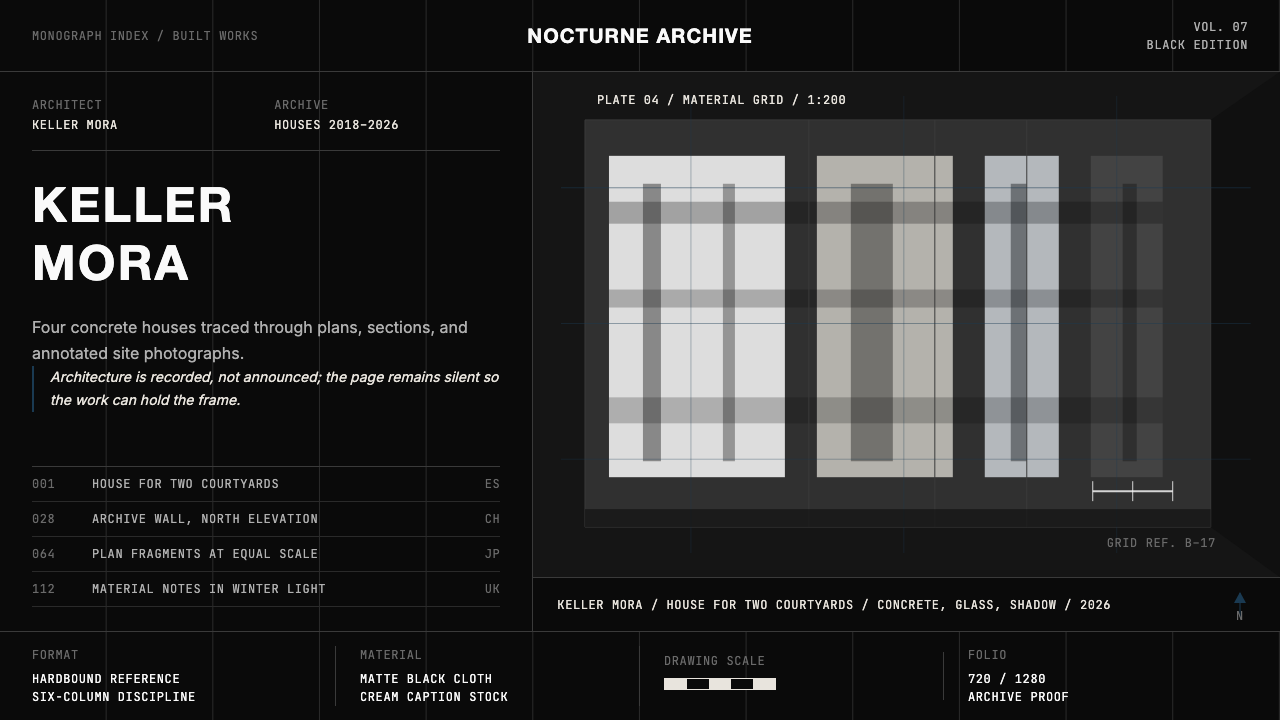 Architect Monograph (Black Edition)Architecture stays sovereign. Matte black, Helvetica caps, hairline grids, bl…
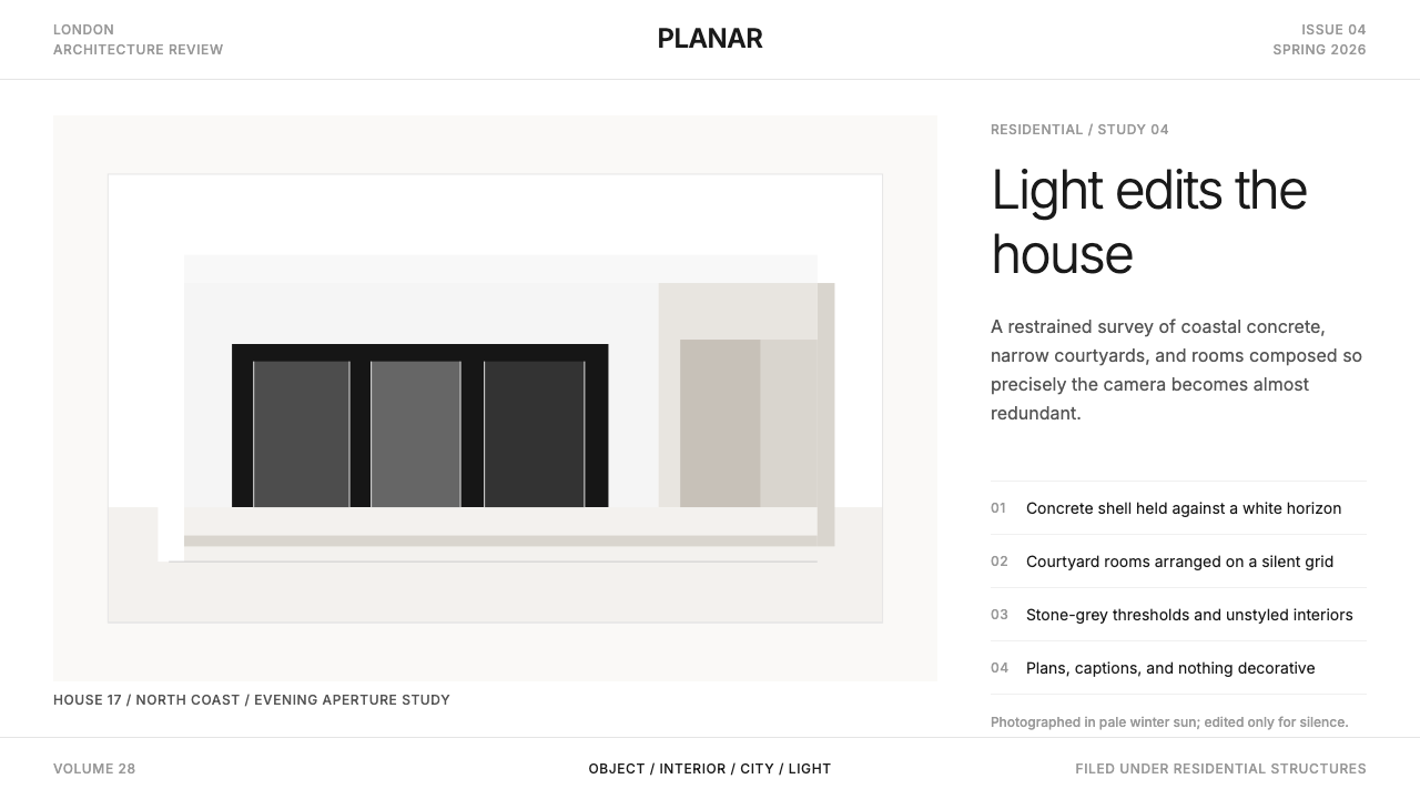 Wallpaper* ArchitecturePhotography does the speaking. Gallery-white grid, Inter captions, and hairli…
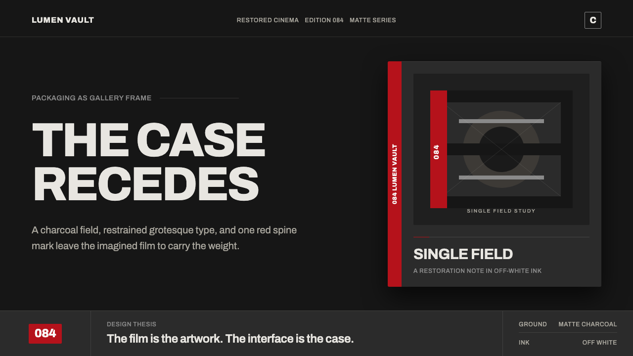 Criterion ArthouseThe case disappears. Charcoal field, off-white Archivo, hairline rules, one r…
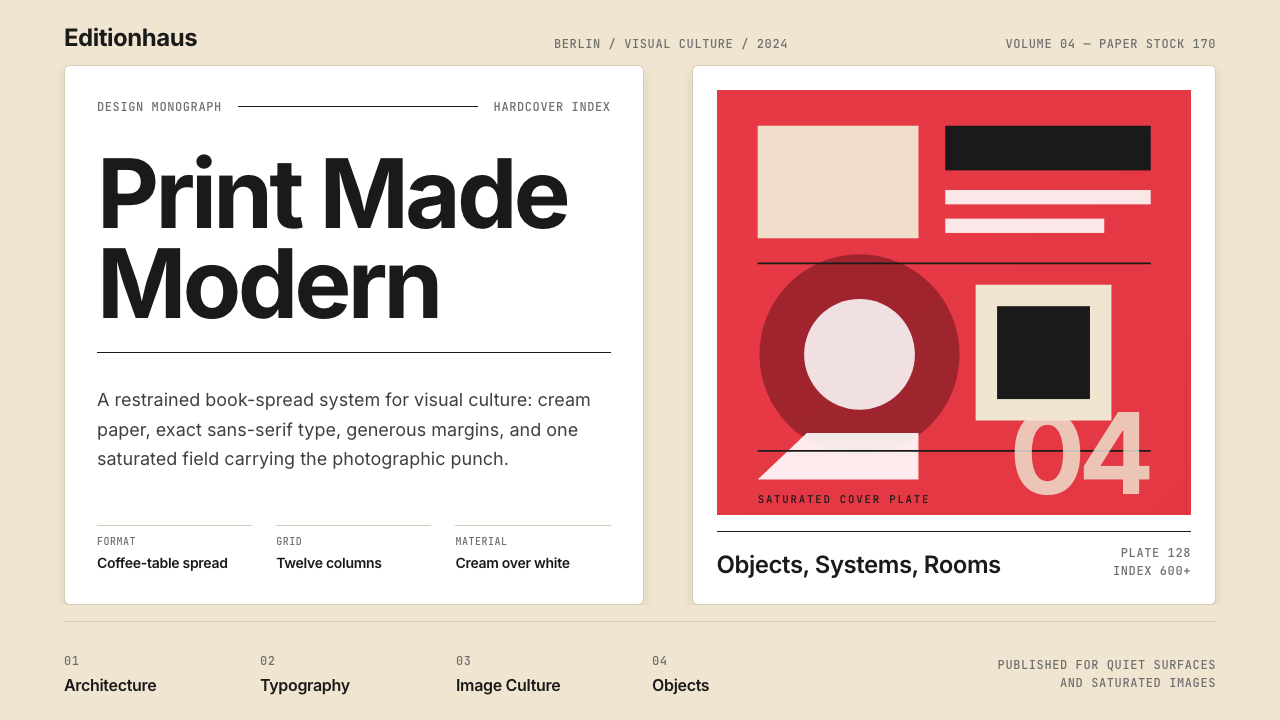 Gestalten Design BookCoffee-table calm. Cream paper, tight sans, one saturated block, and a strict…
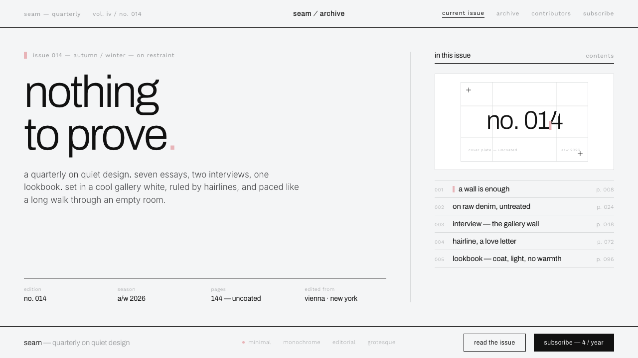 Helmut Lang MinimalismNothing to prove. Cool gallery white, 1px black hairlines, lowercase Archivo…
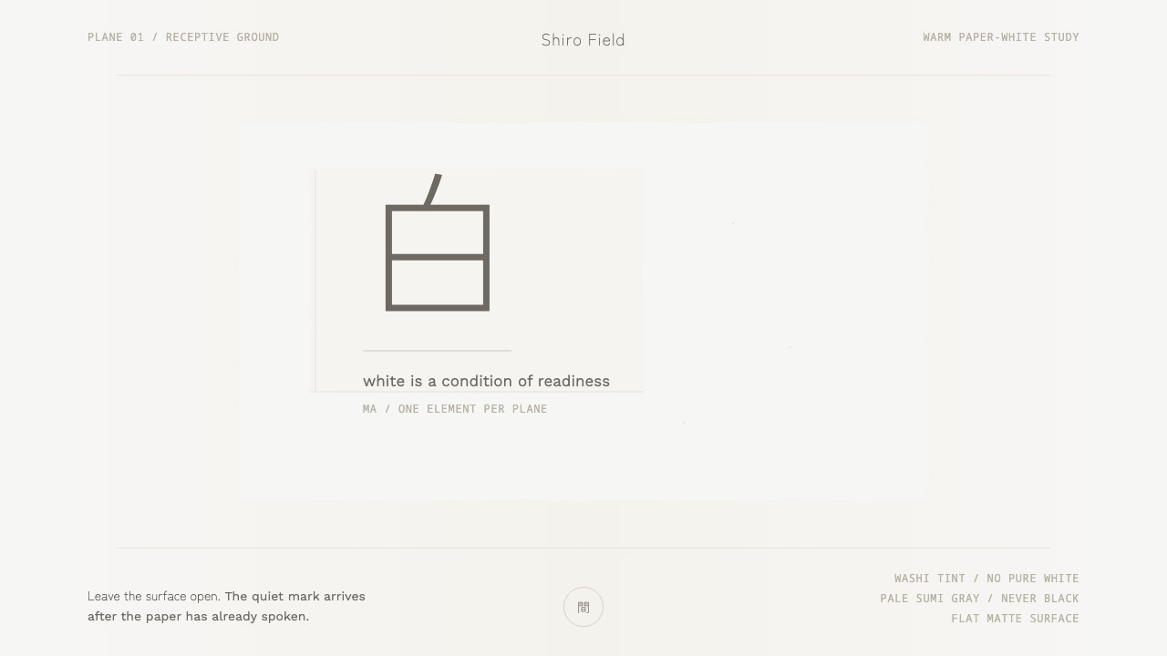 Kenya Hara «White»Emptiness is the subject. Warm washi white holds one pale sumi-gray mark.