What is Mattel Gak Slime (Nickelodeon 1992)?
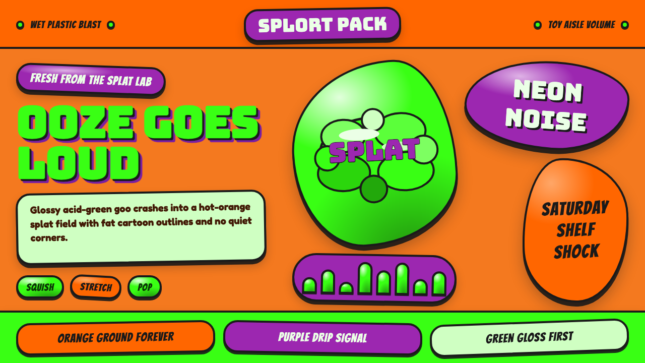
Gak turned slime into a visual event — acid-green gloss, hot-orange splats, purple drips, and the unapologetic noise of a 1992 toy aisle.
Mattel Gak Slime (Nickelodeon 1992) in brief
Mattel Gak Slime is a toy aesthetic rooted in the July 1992 collaboration between Mattel and Nickelodeon. Its central image is glossy acid-green ooze compressed into a clear plastic Splat container, surrounded by the hot-orange burst shapes and hot-purple accents associated with Nickelodeon graphics of the period. The result is wet-looking, fluorescent, tactile, and deliberately loud.
Unlike design systems that begin with a neutral ground and add color as decoration, Gak begins with collision. Orange, green, and purple compete for attention; splats replace orderly frames; drips interrupt clean edges. The visual language treats mess as identity. Bulges, puddles, stretched forms, and irregular silhouettes communicate squishiness before the product is touched.
In digital form, the style depends on preserving that physical character. Display lettering should feel inflated, squeezed, or partially melted rather than merely rounded. Surfaces appear slick and freshly disturbed. Composition favors concentrated bursts of energy over calm balance, creating the impression that the interface has been struck by a flying mass of neon slime.
Where does Mattel Gak Slime (Nickelodeon 1992) come from?
Gak launched in North America in July 1992 through Mattel and Nickelodeon. The timing placed it squarely inside Nickelodeon's peak splat era, approximately 1990 to 1995, when the channel's identity embraced irregular bursts, intense color, and comic disorder. Gak did not merely borrow that environment for packaging; the slime itself behaved like the brand graphics made tangible.
The product joined two complementary forms of expertise. Mattel's toy division shaped Gak as a physical play object, while Nickelodeon's brand team supplied a recognizable world of splats, excess, and child-centered irreverence. The clear Splat container made the acid-green material visible and turned storage into display. Product, vessel, and surrounding graphic field therefore operated as one visual proposition.
Its appearance belongs to early-1990s toy maximalism, when shelf presence depended on immediate sensory force. Gak answered that demand through fluorescent contrast and a suggestion of uncontrolled movement. The hot-orange field did not sit quietly behind the product; it appeared to burst outward. Purple functioned as an additional jolt, while green remained the wet focal mass.
The style survives as a concentrated record of the 1992 toy aisle rather than as a general-purpose version of 1990s nostalgia. Its specificity matters: this is Nickelodeon splat graphics joined to a Mattel slime product, not a broad collection of period motifs. The lasting design lesson is that a product's material behavior can become the organizing principle for its entire visual identity.
What defines the Mattel Gak Slime (Nickelodeon 1992) look?
Color Collision
Acid green, hot orange, and hot purple form the essential palette. Green represents the slime and carries the strongest sense of wetness; orange supplies the explosive field; purple acts as a sharp secondary interruption. These colors should feel confrontational rather than harmoniously blended. Neutral space is scarce, and muted versions weaken the toy-aisle intensity.
Gloss and Wetness
Surfaces look slick, swollen, and freshly handled. Highlights follow bulging forms and make the green mass appear soft enough to press. The goal is not polished luxury but comic liquidity: a shine associated with ooze, puddles, and plastic containment. Dry, powdery, or paper-like textures contradict the material premise.
Splat Geometry
The defining silhouette is an irregular central mass surrounded by lobes, droplets, and outward-reaching arms. It suggests impact without becoming a realistic fluid simulation. Shapes remain bold enough to read as graphic emblems. Repetition should vary scale and contour so that the system feels unruly without becoming visually accidental.
Bubbly Display Type
Headlines favor fat, rounded, all-capital letterforms that appear inflated or squeezed. Counters are compact, strokes feel soft and heavy, and selected edges may sag into drips. Body copy should remain simpler and more readable, allowing the display voice to supply personality without forcing every sentence to behave like a logo.
Compressed Energy
Layouts feel packed and pressurized. Large forms push against edges, lettering overlaps splats, and empty regions become short pauses between bursts. The composition can be asymmetric, but it should retain a clear focal mass. The effect resembles a container barely holding its contents rather than a loose collage of unrelated decorations.
Clear-Plastic Framing
The original clear Splat container creates a useful secondary language of visibility and enclosure. Transparent or glass-like framing can reveal green content while preserving an irregular outer silhouette. This framing should feel toy-like and sturdy, not delicate or atmospheric. It exists to display the slime and emphasize containment.
Who shaped Mattel Gak Slime (Nickelodeon 1992)?
Mattel's toy division was the physical-product side of the July 1992 Gak launch. Its role is visible in the transformation of slime from an abstract comic idea into a contained play object. The clear Splat vessel made color, gloss, and deformability immediately legible, allowing the material itself to dominate the product's appearance.
Nickelodeon's brand team supplied the surrounding visual culture: hot-orange splat bursts, hot-purple accents, graphic irreverence, and the conviction that mess could function as a recognizable identity. Gak became especially memorable because it appeared native to that world, as though the channel's graphic splat had been filled with physical green ooze.
Gak itself is the central design figure because its material behavior determines every surrounding choice. Its acid-green color establishes the focal hue; its gloss demands wet-looking highlights; its ability to squish encourages swollen lettering and unstable silhouettes. The identity does not depict slime from a distance — it attempts to behave like slime.
How do you use Mattel Gak Slime (Nickelodeon 1992) today?
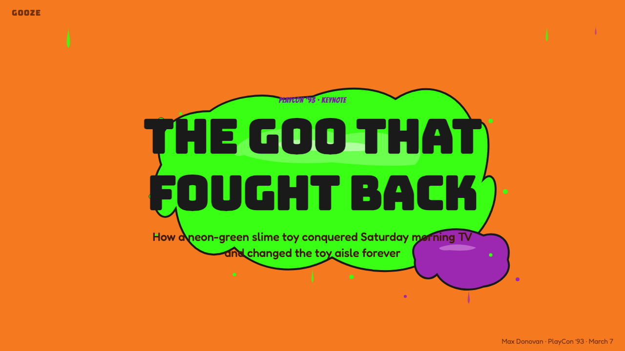
For slide covers, concentrate the style into one overwhelming encounter: a hot-orange splat field, a large acid-green mass, and a short title in swollen display lettering. Content slides need more restraint. Keep paragraphs in readable blocks and let drips, purple interruptions, or small splats mark sections rather than covering every available region.
Data slides can translate quantities into blobs, puddles, or contained green masses, provided comparisons remain easy to read. Use orange as the energetic ground and purple to distinguish a secondary category or exception. Avoid disguising precise information beneath decorative splatter; the slime vocabulary should establish hierarchy, not obscure it.
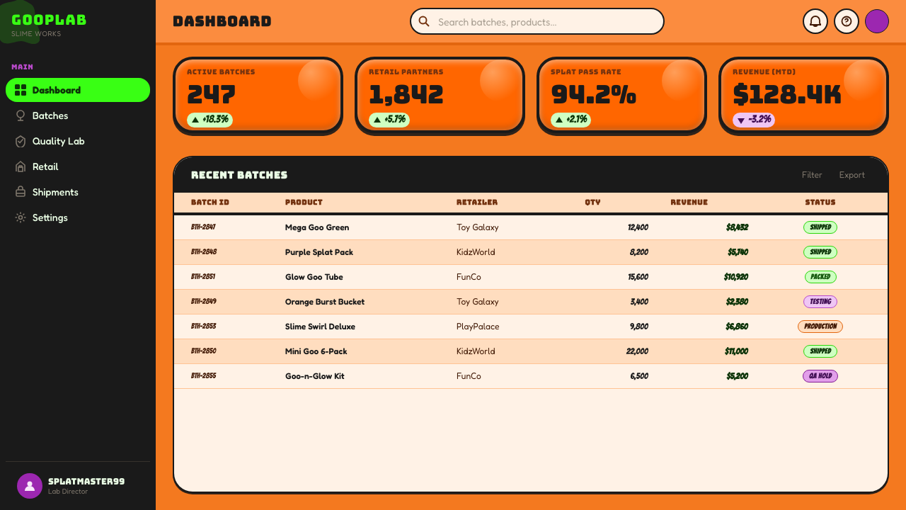
In web interfaces, the style is best suited to playful dashboards, promotional panels, or pricing pages that benefit from conspicuous tier differentiation. Cards can resemble clear containers holding colored content, while selected states appear fuller, wetter, or more compressed. Navigation and body information should remain steady so that the splat treatment signals action rather than making the entire interface unstable.
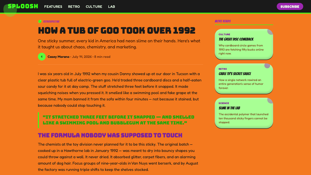
Editorial and marketing layouts can use Gak as a framing device for launches, youth-oriented features, or retrospective stories about early-1990s toy culture. A large splat can carry a headline, while green callouts interrupt orange article fields. Campaign sequences should repeat a recognizable slime silhouette so that the work feels like a coherent product world rather than generic neon nostalgia.
The common mistake is to combine every loud period reference at once. Checkerboards, unrelated doodles, competing typefaces, and arbitrary retro symbols dilute the specific Gak identity. Begin with the product facts: glossy green ooze, the clear Splat container, orange burst graphics, and purple accents. If an added motif does not reinforce wetness, impact, containment, or toy-like excess, it probably does not belong.
Mattel Gak Slime (Nickelodeon 1992) — FAQ
Is the Gak look simply a general 1990s style?
No. It belongs to a specific early-1990s intersection of Mattel toy design and Nickelodeon splat graphics. General period motifs may create nostalgia, but they do not automatically create Gak. The identifying combination is glossy acid-green slime, a clear Splat container, a hot-orange burst field, hot-purple accents, and swollen lettering that appears physically affected by the material.
Can the style use a white or neutral background?
A neutral background can be used for functional breathing room, but it should not become the dominant visual identity. The source aesthetic specifically places Gak inside a screaming hot-orange splat field rather than presenting it clinically on white. If a restrained application needs neutrality, preserve a concentrated orange-and-green focal zone so the product still feels explosive rather than catalogued.
How much dripping is too much?
Drips become excessive when they interfere with reading or make every element share the same silhouette. Gak needs a strong central slime gesture, not uniform melting across the entire composition. Reserve the most distorted drips for headlines, focal containers, and transitions. Supporting labels and longer text should remain stable enough to contrast with the mess.
Does the style work for serious information?
It can frame serious information, but its emotional voice remains playful, noisy, and toy-like. It works best when that contrast is intentional, such as an energetic educational introduction or a retrospective about design culture. It is less suitable when neutrality, solemnity, or institutional authority must dominate. In mixed contexts, confine Gak styling to covers, section openings, and emphasis moments.
What separates convincing Gak styling from generic neon slime?
Convincing Gak styling preserves the whole relationship among material, container, and brand field. The slime is acid green and glossy; the container is clear and splat-shaped; the surrounding energy is hot orange with purple interruption. Generic slime often isolates a green drip on an unrelated background. Gak is more integrated: every element appears to have been shaped by the same impact.
Related design styles
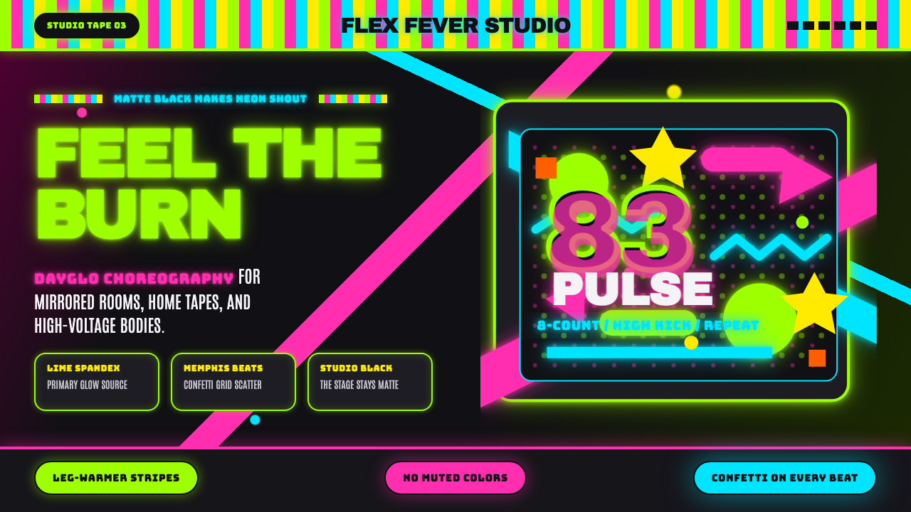 80s Aerobics Fluoro SpandexNeon refuses restraint. Lime spandex, pink-cyan confetti, and black-stage typ…
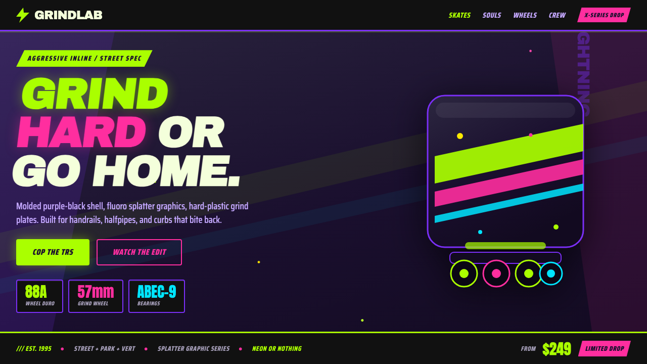 90s Aggressive Inline SkateX-Games attitude in plastic and paint. Fluoro lime and magenta slash across m…
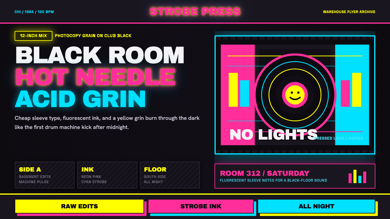 Chicago HouseDarkness starts the track. Neon pink, yellow and cyan hit black like Xerox st…
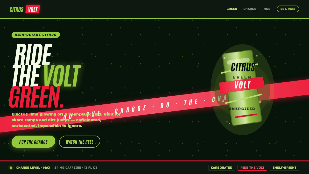 Mountain Dew Citrus GreenDo the Dew, loud. Electric lime glows off a near-black can field, slashed by…
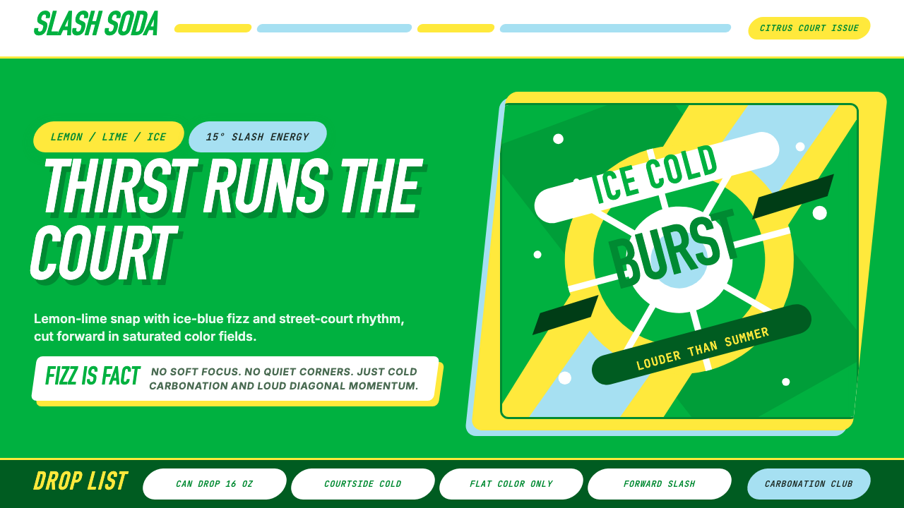 Sprite — Obey Your ThirstCitrus hits like asphalt heat. Saturated green, lemon yellow, and 15° slashes…
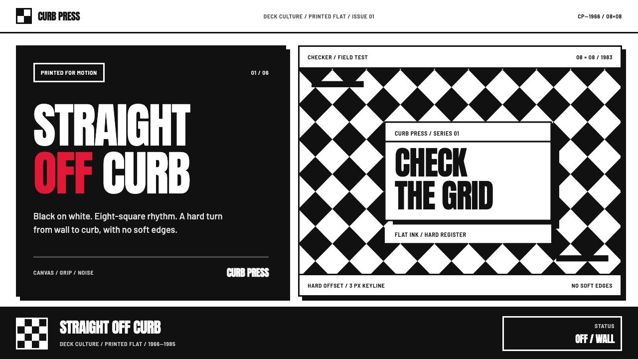 Vans Checkerboard (1966)Built to hit hard. Anton type, black-white checkers, one sanctioned red mark.