What is Frozen Ice Palace (2013)?
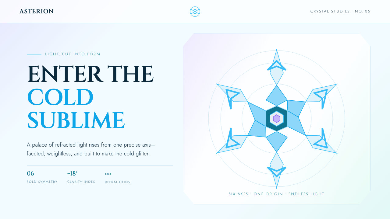
Frozen Ice Palace makes cold feel architectural: cyan facets, crystalline symmetry, and refracted light rise into a palace that gleams instead of comforts.
Frozen Ice Palace (2013) in brief
Frozen Ice Palace is a visual system derived from the ice-palace sequence identity associated with the 2013 film release. Its central image is a stamped snowflake expanded into architecture: six-fold symmetry becomes plan, elevation, ornament, and motion. Faceted translucent surfaces turn glacial cyan light into a structural language, so a page or composition appears less like a decorated winter scene than a chamber carved from illuminated ice.
The style rejects two familiar interpretations of winter. It is neither cozy and hearth-like nor gently muted in a Nordic manner. Instead, it chooses height, coldness, brilliance, and precision. Pale ice-white fields create an open frozen atmosphere; frost cyan establishes the dominant structure; aurora violet and mint arrive as rare, luminous disruptions. These accents do not warm the composition. They suggest distant atmospheric light moving through a colder world.
Its visual logic is crystalline rather than soft. Edges behave like cut crystal, corners split into fractal-like facets, and transparent walls imply depth through refraction rather than haze. The intended sensation is upward-looking and monumental, as though the viewer stands below an icebound spire. Nothing should feel padded, rustic, weathered, or domestic. Even when the composition is bright, it remains sharp, reflective, and remote.
Where does Frozen Ice Palace (2013) come from?
Frozen Ice Palace belongs to the 2013 film-release context and specifically to the visual identity of its ice-palace sequence. Its origin is located at Walt Disney Animation Studios in Burbank, California, where the sequence’s imagery brought architecture, snowflake structure, and digital light into a single fantasy environment. The palace is not merely a setting within that identity; it is the organizing metaphor from which the wider system takes its rules.
The source vocabulary joins CG animation crystallography with Nordic-romantic fantasy design. Crystallography contributes the sense that repeated geometry can generate complex form: a small snowflake-like unit can imply vaults, spires, walls, and ornamental fields. Nordic-romantic fantasy contributes the sense of a vast, wintry landscape, but the result does not settle into naturalism. Ice is treated as designed material—faceted, translucent, reflective, and capable of carrying luminous color.
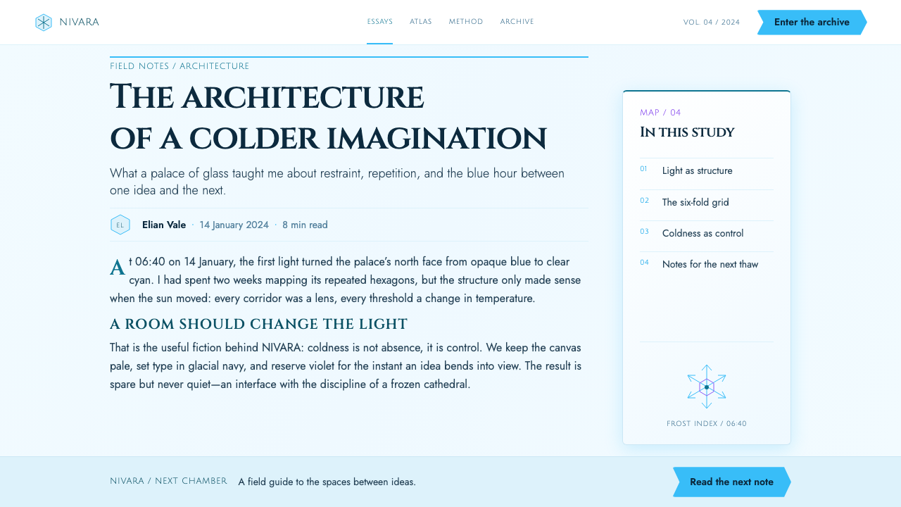
Snowflake-symmetry motion graphics completes the system. Six-fold organization provides an underlying discipline for radial marks, transitions, framing devices, and decorative growth. Symmetry is not used simply to make compositions pretty. It makes the visual world feel governed by an internal frozen physics, where forms seem to crystallize outward from a central point and light appears to travel through their planes.
The listed key figures are Chris Buck, Jennifer Lee, Michael Giaimo, David Womersley, and Lisa Keene. Together with the Burbank studio context and the three named design movements, these names define the approved frame for understanding the style: a film-sequence visual identity shaped through animation, crystalline construction, romantic fantasy scale, and snowflake-derived motion.
What defines the Frozen Ice Palace (2013) look?
Glacial Palette
Pale ice-white acts as the atmospheric field, while frost cyan carries the main structural burden. Aurora violet and mint appear as infrequent ribbons or refracted highlights, never as cozy decorative color. The palette should feel illuminated from within a frozen material: bright, clear, and cold enough to preserve distance between the viewer and the scene.
Six-Fold Symmetry
The stamped snowflake is the system’s generative device. Radial organization, repeated arms, and mirrored facets establish a disciplined geometry that can scale from an emblem to an entire architectural composition. Symmetry should feel structural and inevitable, as if the page has crystallized according to a stable internal law.
Faceted Surfaces
Planes replace soft volume. Walls, panels, ornaments, and graphic containers are read as cut crystal, with each facet catching or redirecting light differently. A form should appear assembled from decisive angular planes rather than rounded transitions. This gives the system its monumental clarity and makes every edge feel intentional.
Refracted Transparency
Depth comes from translucent layering and glacial light traveling through walls, not from mist or softness. Overlapping planes can suggest chambers behind chambers, while pale fields preserve openness. Transparency is a means of making ice feel architectural: the viewer senses thickness, distance, and internal light without losing the graphic sharpness of the composition.
Fractal Corners
Corners do not resolve into gentle rounding. They break, branch, or repeat into smaller crystalline decisions, echoing the snowflake’s recursive character. This detail prevents the style from becoming merely clean or minimal. It introduces an intricate, frost-grown complexity while keeping every component within the same angular material world.
Monumental Cold
The emotional register is tall, gleaming, and remote. It avoids domestic warmth, rustic texture, and muted restraint in favor of a palace-scale sense of exposure. Cold is not presented as dullness or emptiness; it is made spectacular through light, symmetry, and reflective facets. The result should feel majestic before it feels comfortable.
Who shaped Frozen Ice Palace (2013)?
Chris Buck is listed among the key figures associated with the Frozen Ice Palace visual identity. Within the approved account of the style, his name belongs to the film-release and ice-palace-sequence context from which the system takes its monumental frozen architecture, sharp crystalline surfaces, and fantasy scale.
Jennifer Lee appears in the approved list of key figures for the ice-palace sequence identity. Her inclusion anchors the style in the 2013 film-release context rather than treating it as a detached winter decoration. The system’s dramatic cold, upward spatial feeling, and luminous palace metaphor should therefore remain inseparable from that narrative visual setting.
Michael Giaimo is named as a key figure in the approved source frame. The associated aesthetic is defined by CG animation crystallography, Nordic-romantic fantasy design, and snowflake-symmetry motion graphics: a combination that turns ice from a passive landscape material into an active language of planes, light, and architectural growth.
David Womersley is included among the key figures connected to the sequence visual identity. In practical stylistic terms, that identity is best understood as a tightly related system rather than a collection of isolated icy motifs: snowflake symmetry organizes form, facets organize surfaces, and glacial cyan light organizes atmosphere.
Lisa Keene is named among the source material’s key figures. Her inclusion sits within the Burbank, California studio context and the ice-palace sequence identity. The enduring lesson of that identity is that fantasy richness need not come from softness or warmth; it can emerge from disciplined repetition, translucent geometry, and cold light made monumental.
How do you use Frozen Ice Palace (2013) today?
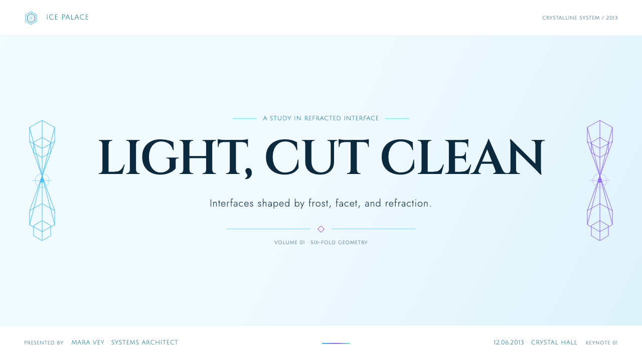
For presentation covers, Frozen Ice Palace works best when the composition feels like a single frozen structure entering a pale field. Let one large six-fold snowflake form, faceted spire, or translucent crystalline mass establish the focal point, then place the title with enough open space to retain the sensation of altitude. Content slides should preserve the same architectural discipline: use repeated angular containers, frost-cyan rules, and clear hierarchy, allowing the body material to sit inside a quieter ice-white chamber rather than competing with spectacle.
Data slides can use the style’s crystalline logic especially well. Treat charts as faceted constructions rather than generic interface furniture: divisions can echo radial snowflake organization, categories can be separated by translucent planes, and the most important finding can receive an aurora-like violet or mint interruption. The goal is not to disguise data as decoration. It is to make structure visibly legible, as though information has frozen into a precise geometric form.
For web interfaces, the style suits dashboards, analytical spaces, premium plans, and immersive product pages that benefit from a strong sense of system and distinction. Pale grounds maintain readability, while frost cyan can organize navigation, sections, and selected states. Use translucent panels sparingly so they suggest ice walls rather than ordinary glass cards. Pricing layouts can distinguish offerings through faceted framing and controlled atmospheric accents, while preserving a direct reading path through names, benefits, and actions.
In editorial and marketing work, use the style to make an announcement, launch, or feature story feel ceremonial and otherworldly. A wide pale field with a crystalline image field can create a striking opening; section transitions may appear as snowflake-derived dividers or refracted ribbons rather than soft decorative flourishes. Keep copy clear and grounded against the visual drama. The frozen architecture should frame the message, not force readers to search for it.
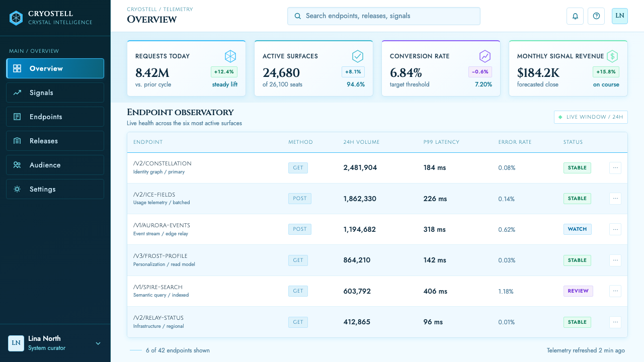
The common mistake is to reduce Frozen Ice Palace to generic winter imagery: pale blue backgrounds, scattered snowflakes, blurred glow, and friendly seasonal decoration. That loses its defining tension. This system depends on six-fold order, cut facets, translucent architectural depth, and cold light that gleams with intent. Avoid warm accents, rounded comfort, rustic snow texture, and indiscriminate sparkle. A successful application feels like entering a crystalline palace, not opening a holiday card.
Frozen Ice Palace (2013) — FAQ
Is Frozen Ice Palace simply a winter or holiday style?
No. Winter is its material atmosphere, not its complete design logic. The style is defined by the ice-palace sequence identity: stamped snowflake structure, six-fold symmetry, faceted translucent surfaces, and glacial cyan light. A seasonal layout can borrow snow imagery without becoming Frozen Ice Palace. The style appears only when cold is made architectural and light is made crystalline.
Why is six-fold symmetry so important here?
Six-fold symmetry connects the system directly to its single stamped snowflake origin. It provides more than a decorative motif: it offers a repeatable way to organize emblems, architectural silhouettes, motion, framing, and internal facets. Without that underlying symmetry, a composition may still look icy, but it loses the crystallographic discipline that makes the style feel like a coherent world.
Can the style use warm colors?
Warmth conflicts with the system’s central emotional decision. Its approved palette language begins with pale ice-white and frost cyan, then introduces aurora violet and mint as luminous atmospheric accents. A warm accent can quickly turn the palace into a cozy winter scene and weaken its remote, monumental cold. If contrast is needed, use changes in translucency, facet direction, and light intensity rather than importing warmth.
How should translucency differ from a generic glass interface?
Generic glass interface design often uses transparency as a soft atmospheric layer. Frozen Ice Palace uses it as ice architecture. Panels should imply thickness, faceted boundaries, and refracted glacial light, as though they belong to walls within a palace rather than floating over a background. The desired effect is precise and mineral, not soft, blurry, or weightless.
Where does Frozen Ice Palace work poorly?
It struggles when a product needs domestic warmth, tactile rusticity, casual friendliness, or muted quietness as its primary emotional signal. The style is deliberately cold, tall, gleaming, and formal. It is strongest when a project benefits from spectacle, structural clarity, fantasy scale, or a premium sense of distance. Applying it to an intimate or comforting context can make the message feel emotionally misaligned.
Related design styles
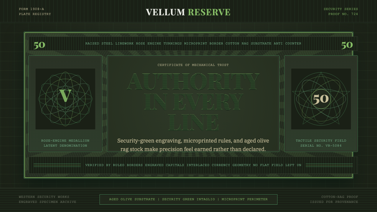 Banknote GuillochéMoney as precision. Security green guilloche frames aged olive rag stock.
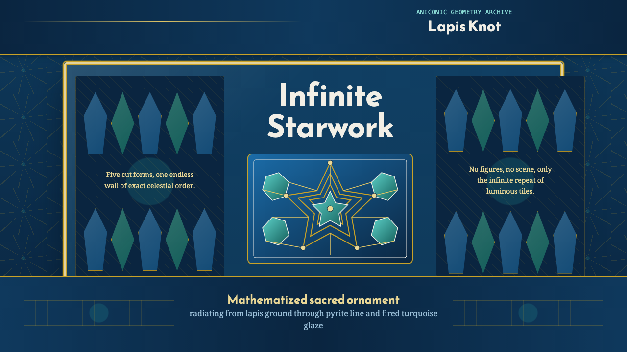 Islamic Girih TilesSacred geometry glows. Cobalt tile, turquoise stars, and gold strapwork repea…
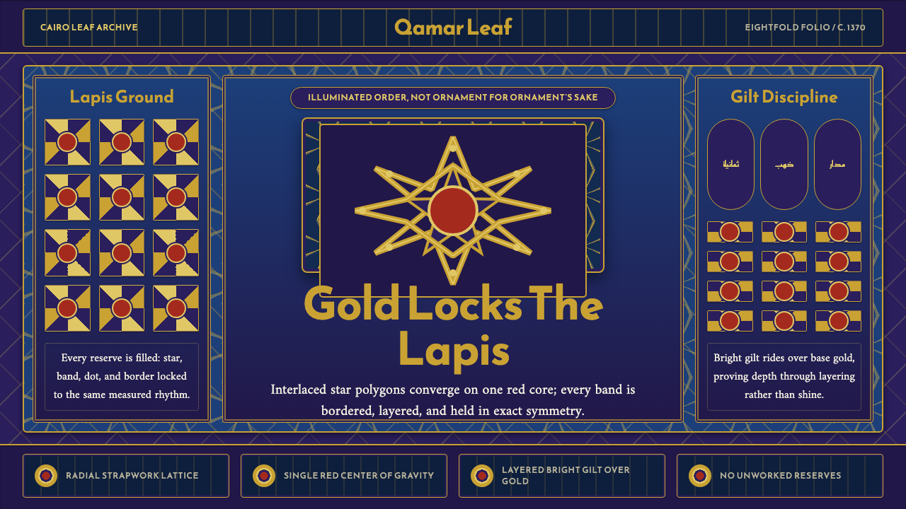 Mamluk Quran IlluminationGilded density rules. Lapis ground, eightfold gold strapwork, and one red cor…
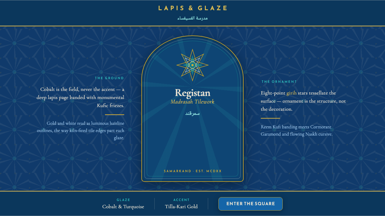 Registan Madrasah TileworkCobalt is the ground, not the accent. Gold girih stars tessellate deep lapis…
 Deus Ex: Human RevolutionDystopia wears gold. Near-black panels glow with amber bevels and hex motifs.
 Prey (2017)Luxurious horror in orbit. Gold Deco sunbursts glint out of near-black Typhon…