What is Flipkart?
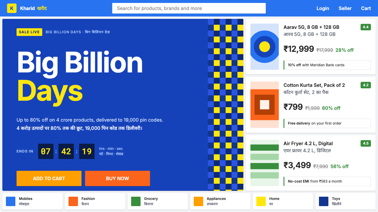
Flipkart puts a sale in every row: a solid blue header, white cards on a cool blue-grey ground, struck prices, and Hindi set at exactly the size of the English beside it.
Flipkart in brief
Flipkart is India's best-known online marketplace, and its interface is a study in catalogue depth rather than calm. The page is built from a solid blue bar carrying a yellow shopping-bag mark, then white product cards dropped one after another onto a cool blue-grey gutter. Nothing in it tries to feel like a gallery or a magazine. It feels like a shelf, and a very long one.
The details that matter are the commercial ones. Original prices are struck through, the discount is shown as a percentage in green, and two buttons, Buy Now and Add to Cart, almost always appear as a pair. Every October the Big Billion Days sale loads this same grid with countdown cells, bank-offer strips and percentage badges, while the base layout stays exactly where it was.
Language is part of the design. Hindi is set at the same size as the English next to it, never as a smaller translation underneath. The visual idea is that a shopper in India should be able to scan, compare and decide in whichever language is faster for them, with every price and every offer visible at once. It is a style for volume, comparison and trust, not for quiet.

Where does Flipkart come from?
Flipkart began in 2007 in an apartment in Bangalore, selling books. Its co-founders, Sachin Bansal and Binny Bansal, started with the simplest possible catalogue, one product category sold online to people who had few good ways to find or buy it. The company then grew, category by category, into the storefront through which most of India shops. That growth path is why the interface looks the way it does: it is the visual result of a catalogue that kept expanding, and a layout that had to absorb every new kind of product without redesigning itself.
The design belongs to a genre of its own, the Indian e-commerce marketplace interface. Where many Western retail sites trade on whitespace and a few carefully lit products, a marketplace has to present enormous choice from many sellers at many prices. The answer is a regular grid of white cards on a tinted ground, each card holding an image, a name, a rating, a struck price, a current price and a discount. The shopper is invited to compare, and the page is built to make comparison fast.
The second tradition is mega-sale event design. The Big Billion Days sale has run every October since 2014, and the interface has learned how to carry an event without being rebuilt for it. Countdown cells show how long a deal lasts, bank-offer strips announce card-linked discounts, and percentage badges mark savings on the product cards. The key idea is that the sale does not replace the layout; it saturates it. The page that serves an ordinary Tuesday is the same page that serves the biggest day of the year, only louder.
The third tradition is multilingual Indic interface typography. Hindi is written in the Devanagari script, whose letters hang from a continuous horizontal line and carry marks above and below the line, so it needs different vertical spacing from Latin type. Flipkart's solution is equality: Hindi and English are set at the same size, aligned side by side, with no hierarchy of prestige between them. The current visual language dates from roughly 2020 to 2025, and Kalyan Krishnamurthy is among the key figures associated with the company's leadership in that later period.
What defines the Flipkart look?
Solid Blue Header, Yellow Bag
The top of the page is a solid blue bar that carries navigation and search, with a yellow shopping-bag mark as the brand's single point of warmth. The blue is saturated and unambiguous, signalling trust and utility rather than fashion. Because the bar is solid and the page below is pale, the header works as a fixed anchor that the shopper can always find, however deep the catalogue scroll goes.
White Cards on Blue-Grey
Product cards are plain white rectangles placed on a cool blue-grey ground. The gutter between them is tinted so that each card reads as a separate shelf item, and white keeps product photography clean. There is little decoration on the cards themselves; the structure of image, name, rating, price and offer does the work. The result is rigorous, repeatable and easy to extend.
Catalogue Depth Over Calm
The page is designed for many items at once. Cards sit close together, rows follow rows, and carousels and category strips stack down the page. White space is used to separate, not to hush. This is the opposite of a boutique, and it is deliberate: in a marketplace, the feeling of abundance is itself a message. A shopper should feel that whatever they want is somewhere on this shelf.
Struck Prices and Green Discounts
The pricing grammar is fixed. The original price is crossed out in a muted tone, the current price is set large and dark, and the discount appears as a percentage in green, the colour of savings. The three always sit together, so that a shopper can read the value of a deal without doing any arithmetic. It is a compact piece of persuasion built entirely from typography and one colour.
Paired Actions
Add to Cart and Buy Now appear together as a pair of large buttons, one for the shopper who wants to keep browsing and one for the shopper who has decided. The pair is visually distinct, with different fills, so there is never doubt about which does what. The same pairing logic recurs across the interface wherever there is a decision to be made.
Sale Furniture
During Big Billion Days the page picks up a set of event components: countdown cells that tick down to the next deal, bank-offer strips that announce card discounts, and percentage badges that sit on product images. These are laid on the existing grid rather than replacing it. They add urgency and density but keep the structure shoppers already know, so the sale feels like an intensified version of the normal store.
Hindi at Equal Size
Hindi and English are typeset at the same size and aligned beside each other, so neither language reads as the translation of the other. Devanagari needs more vertical room than Latin for its marks above and below the line, so line spacing is generous enough to keep both scripts comfortable. The point is respect: a shopper who reads Hindi first sees a product page designed for them.

Who shaped Flipkart?
A co-founder of Flipkart, associated with its beginning in a Bangalore apartment in 2007, when the company sold only books. His name stands for the origin of a marketplace that grew from one category into the storefront most of India shops through, and therefore for the pressure of catalogue growth that shaped its dense, shelf-like interface.
The other Flipkart co-founder, with whom Sachin Bansal started the company. The pair's story is the story of a bookshop turning into a general marketplace, and of a layout that was extended again and again rather than redesigned. That practical, accumulative approach is still visible in a page that values reliability and breadth over visual novelty.
A senior executive listed among the key figures of Flipkart's current-visual era, roughly 2020 to 2025, and associated with the company's leadership in its later years. His place in the story is a reminder that the interface is now a mature, large-scale system, in which Big Billion Days and multilingual presentation are managed as a standing capability, not a one-off campaign.
How do you use Flipkart today?
The Flipkart style suits marketplaces, deal sites, ticketing and travel booking, and any product where the shopper is comparing many options against price. It asks for one discipline above all: make every row earn its place, and make the sale visible without making the page chaotic.
For presentation slides, a cover can be a solid blue field with one yellow mark and a bold, plain title. Content slides work as grids of white cards on a pale blue-grey ground, which suits product lineups, pricing tiers and comparison tables. Data slides should show the value story directly: old figure struck through, new figure large, change shown in green. Keep to the family of blue, yellow and green; they are the system's whole vocabulary.
For web interfaces, build the page as a stack of shelves. A solid header carries search and navigation, product cards repeat in a regular grid, and a pair of clear action buttons sits on every detail page. Reserve green for savings and positive change, use blue for navigation and trust, and use yellow only as a small accent. Event components such as countdowns and offer strips should be added on top of the existing grid, with the same spacing, so the page does not need to change layout when a sale starts.
For editorial and marketing work, think in terms of campaign banners, offer strips and festival-season landing pages. A bold headline, a bank or brand offer and a clear call to action should fit in a single band. If the audience reads more than one language, set the languages at the same size and let the shopper choose; do not treat the second language as a footnote. Photography should be bright, plain and product-first.
The most common mistake is to copy the density without the discipline. Without consistent card structure, a fixed price grammar and a limited palette, a dense page quickly becomes noise. A second mistake is applying the style to products where calm is the selling point, such as luxury or wellness brands, where volume and discount cues work against the message. A third is to demote Hindi or another second script to small print, which defeats the system's purpose.

Flipkart — FAQ
Why is the page so dense compared with most modern storefronts?
Because the job of a marketplace is to show choice. A shopper arrives with a budget and a comparison in mind, and every extra item visible without scrolling is a possible match. The density is organised through regular cards, a fixed price grammar and a limited palette, so it stays readable. Calm is not the aim; confidence in the breadth of the catalogue is.
What do the colours mean?
Each has a job. Solid blue is the frame: navigation, search and trust. Yellow is the brand's small spark, used for the bag mark and similar accents. Green is the colour of savings, reserved for discount percentages. The pale blue-grey ground exists to set white cards apart. Keeping each colour to its job lets the shopper read the page almost without thinking.
How should Hindi and English be set together?
Set them at the same size and align them side by side so that neither reads as the translation of the other. Devanagari has marks above and below the line, so allow enough vertical space for both scripts and choose typefaces that match in weight and colour. Test with real copy, since Hindi strings often run longer than their English counterparts, and make sure buttons and cards can absorb the difference.
Can the style be used outside India or outside e-commerce?
Yes. Any product that benefits from fast comparison and visible value can borrow the grid of white cards, the solid header and the price grammar: travel booking, ticketing, fintech offers, event microsites and classifieds. Its multilingual approach is useful anywhere a product serves readers of more than one script. What does not transfer is the assumption of a large catalogue; a product with few items will look empty in this system.
Does it suit premium or minimalist brands?
Generally not. The style communicates volume, savings and speed, and premium brands usually want space, restraint and a sense of scarcity. If you want to borrow only part of the system, take the structure of the cards or the pairing of actions, and leave the sale furniture and the dense rows behind.
Related design styles
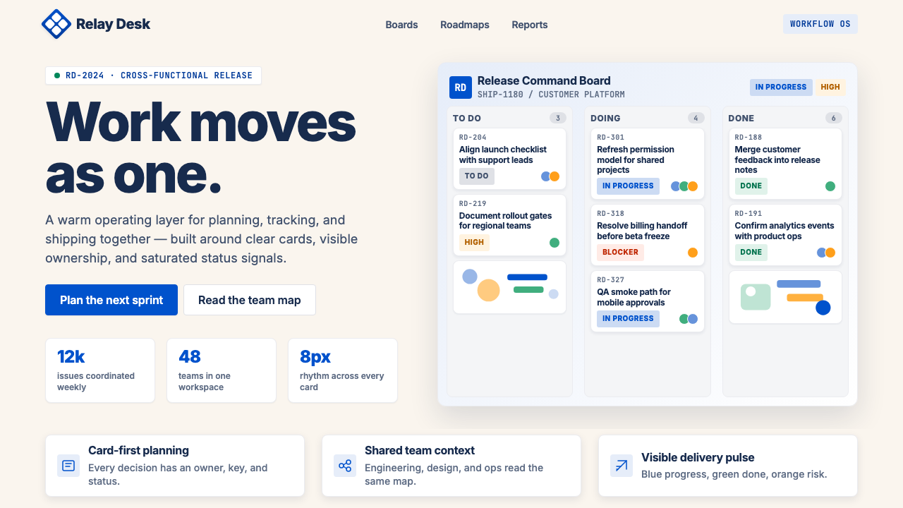 Atlassian Jira BlueWarm enterprise teamwork. Saturated blue cards on cream make status feel huma…
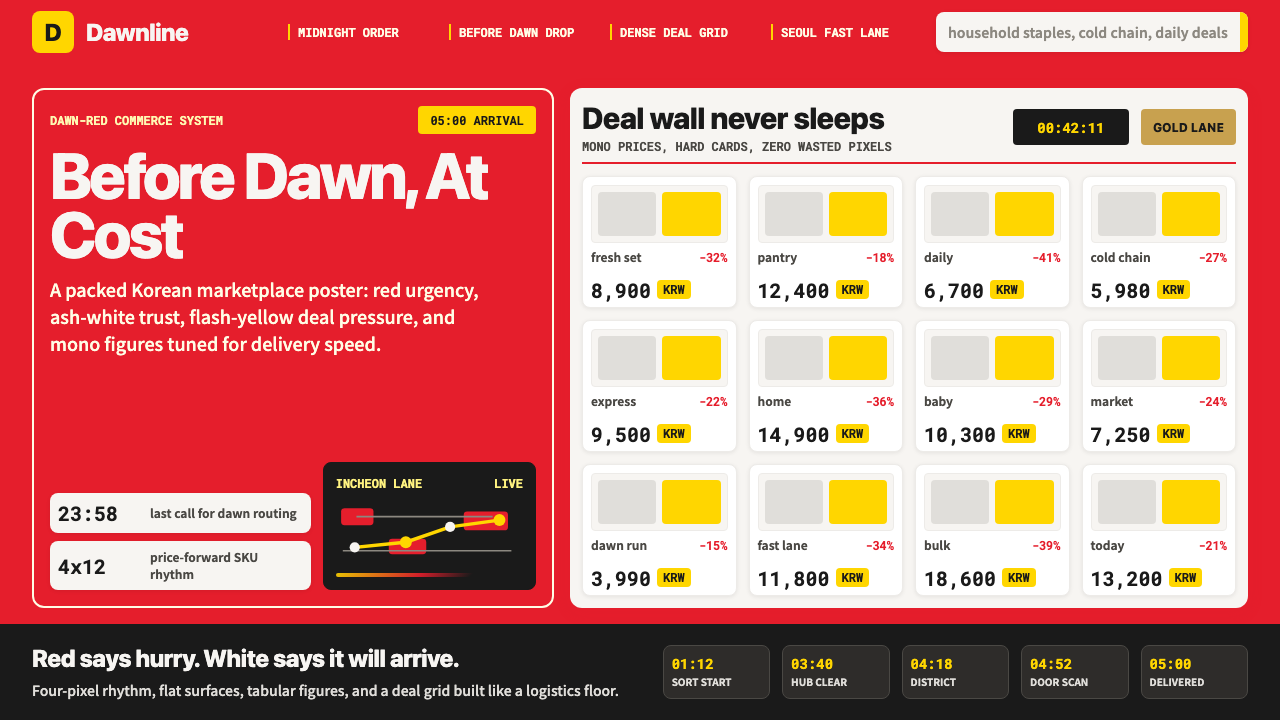 Coupang Rocket DeliveryUrgency made trustworthy. Rocket red, flash yellow, mono prices and packed gr…
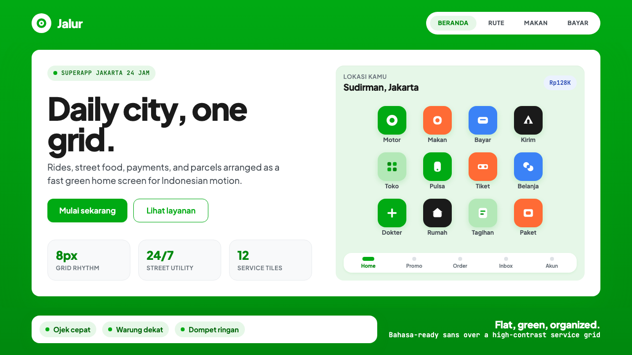 Gojek SuperappCity speed, ordered. Electric green tile grid turns rides, food, and pay into…
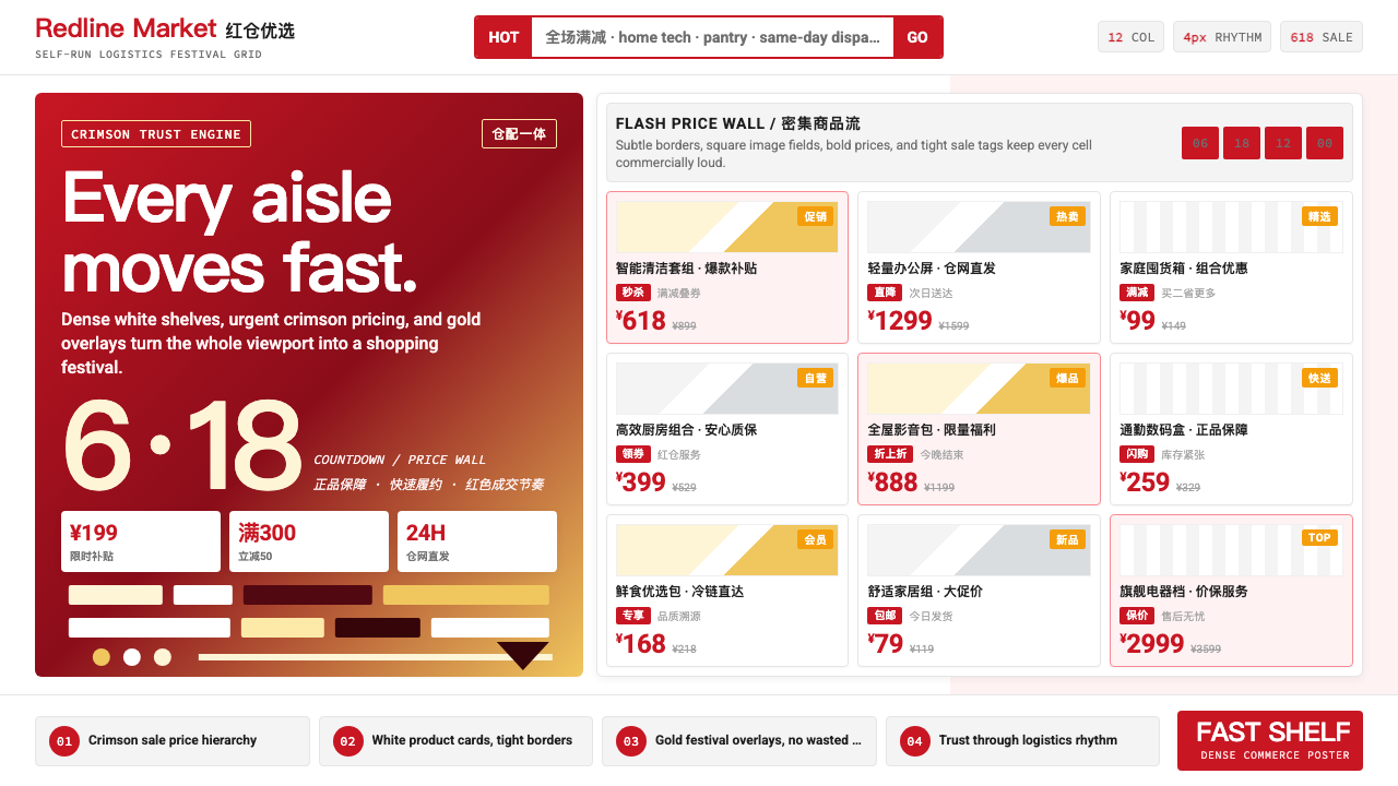 JD.com (京东)Urgency earns trust. Deep red prices pack a white 12-column grid with gold fe…
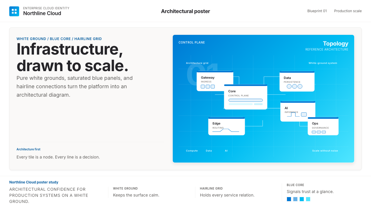 Microsoft AzureEnterprise calm, sharply diagrammed. White ground, saturated blue, hairline l…
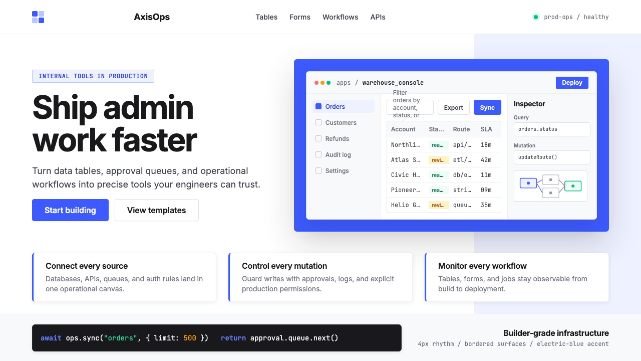 Retool Internal-Tools RedPrecision ships fast. Electric blue panels, Inter type, and bordered UI mocku…