What is Flappy Bird?
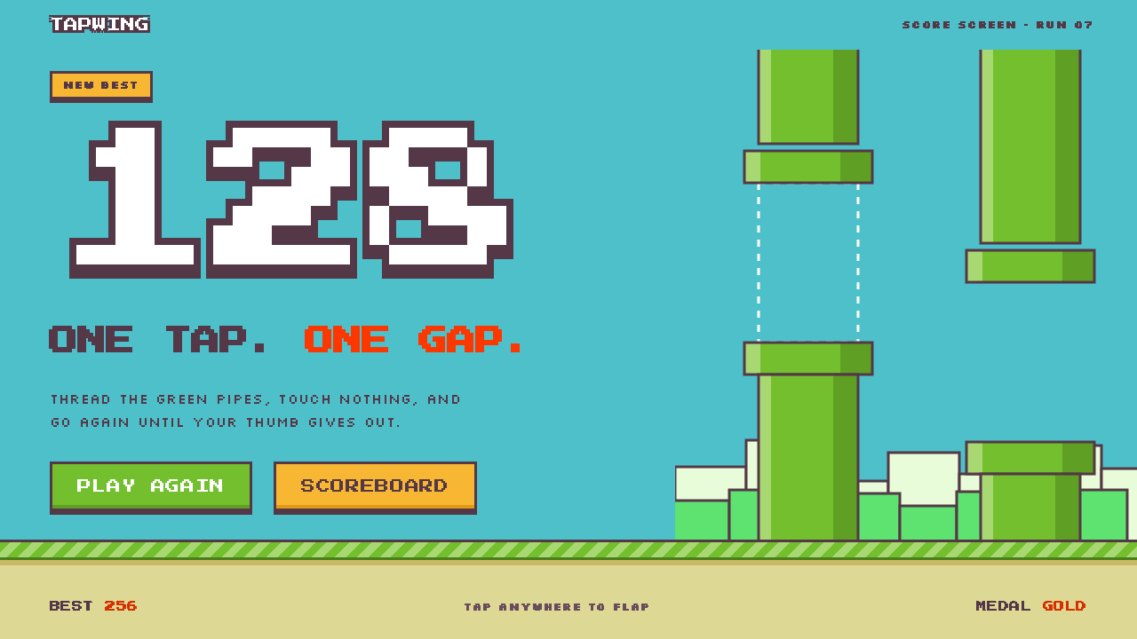
Flappy Bird proved that a whole visual identity can fit on one tap: a flat cyan sky, a plum-outlined pipe and a number large enough to read from across the room.
Flappy Bird in brief
Flappy Bird is a mobile game released in 2013 by Dong Nguyen, working alone at .GEARS Studios in Hanoi, Vietnam. Its visual style is a deliberately small system: a flat cyan sky, a striped strip of grass and sand along the bottom, soft green bushes and a city silhouette in the distance, one small yellow bird, and green pipes that arrive in pairs with a single gap between them. Almost everything is a tiny sprite scaled up to fill the screen.
The look belongs to the lineage of 8-bit and 16-bit Nintendo-style pixel art, but it is not a faithful retro pastiche. Edges stay hard and unsmoothed, every object is wrapped in a thick plum-brown outline, and fills use only a few shading steps, so that a pipe or a bird reads as a clear shape even at a glance. The score is the one place where typography becomes a feature: a large white numeral sits at the top of the screen in a pixel typeface, readable against any part of the sky.
The gameplay and the graphics are one idea. One tap makes the bird flap upward, gravity pulls it down, and the only task is to slip through the gap. Because the mechanic is so legible, the interface can be almost bare. This is what makes the style attractive for other products: it signals immediacy, humor and a slightly nostalgic hand-made feel, without a single decorative flourish.

Where does Flappy Bird come from?
Flappy Bird came out in May 2013 on iOS, made by Dong Nguyen alone at .GEARS Studios in Hanoi. An Android version followed in January 2014. For months it was an unremarkable release. Then, in January and February 2014, it went viral worldwide, and the little yellow bird and its green pipes became a shared reference point far beyond the gaming audience.
On 10 February 2014 the author pulled the game from the app stores himself. That decision turned a successful hyper-casual game into a legend of mobile history: people remembered it not only for its difficulty but for the abruptness of its disappearance. The visual identity, already simple, became associated with the moment itself, and has been imitated, parodied and recreated ever since.
The art is rooted in a recognizable lineage. It draws on the pixel art of 8-bit and 16-bit Nintendo games, with the green pipes echoing the classic plumbing of platform games, and it sits within the endless-runner arcade tradition in which a single player input drives a never-ending, increasingly demanding loop. Yuji Oshimo is an artist associated with that Nintendo pixel-art lineage, and his name is often invoked when people trace where this style comes from.
It also belongs to the family of hyper-casual one-tap mobile games, which treat the phone as a device for short, intense sessions rather than long play. In that context, restraint is functional. A screen with no menus to read, one color for the sky and a score you can see from a distance is a design that works in a bus queue, in bright sunlight, and on any phone, which is a large part of why the look spread so widely.
What defines the Flappy Bird look?
Color
The palette is simple and saturated. A flat cyan sky fills the background; soft green shades make the bushes and the pipes; sand and striped grass form the ground; a warm yellow bird provides the single focal point. Plum-brown is used for every outline, which unifies the scene and keeps shapes crisp against the bright sky. There are no gradients to blur the edges, and color is used to identify objects, not to create atmosphere.
Pixel edges
Every element is a small sprite enlarged to full size, and the enlargement is not smoothed. Corners stay stepped and edges stay hard. This is what gives the image its handmade, slightly retro feel. The pixel grid is a visible part of the aesthetic, not something to hide.
Outline and shading
A thick plum-brown outline wraps every object, from the bird to the pipes to the ground. Fills are flat with only a few shading steps: a highlight along one edge of a pipe, a darker underside on a bush. The style avoids soft shadows entirely. Where a shadow is needed for depth, it is solid and offset, like a printed cutout, never blurred.
Typography
Type is rare and purposeful. The score is a large white numeral in a pixel typeface at the top of the screen, outlined in the same plum-brown so it stays legible over sky or pipes. Labels, where they exist, share the same blocky pixel letterforms. The scale of the number is the main typographic gesture: big enough to feel like the point of the game.
Layout
The composition is horizontal and layered: sky above, a skyline and bushes in the middle distance, a striped ground strip at the bottom, and the play area in between. Pipes enter from the side, always as a matched pair with a gap. Nothing in the interface competes with the play area, and the score sits above it in a clear top band.
Tone
Playful but unfussy. The style is cheerful without being childish, and nostalgic without being a museum piece. It says that something can be easy to understand and still be a challenge. The tone is also deliberately humble: the whole thing looks like it could have been made by one person, which in fact it was.

Who shaped Flappy Bird?
Nguyen is the Hanoi-based independent developer who made Flappy Bird alone at .GEARS Studios and released it in 2013. He decided to remove the game from the app stores on 10 February 2014, at the height of its fame. His decisions as both designer and developer, to keep the art tiny, the mechanic single and the interface almost empty, are the source of the whole visual system.
Oshimo is an artist connected to the Nintendo pixel-art lineage that Flappy Bird visibly draws on. His name appears in discussions of where the game's pipe-and-sky imagery comes from, as a reference for the classic 8-bit and 16-bit look that the style echoes without copying.
The small Hanoi studio under which Nguyen published the game. Its significance for the style is the scale it implies: a one-person production, where the limited resources are visible in the choices and become a strength, not a weakness.
How do you use Flappy Bird today?
On slides, the style is a natural fit for playful covers and section dividers. Use a flat cyan field, a thick plum-brown outline on any shape, one small yellow accent and a pixel-style title. Content slides should stay simple: white or sky-blue background, a single message and a large numeral where a number is the point. For data slides, treat the big score numeral as the model and highlight one key figure at the top, with the supporting chart kept flat and outlined.
In web and app interfaces, it is well suited to games, onboarding flows, educational tools, kids' products, community sites and retro-flavored brand pages. Use hard-edged buttons with a thick outline and a flat fill, put the main call to action in the bird's yellow, and keep the sky color as the background. Dashboards can use the pixel numeral for headline metrics and flat colored bars for categories, as long as shadows stay solid and offset rather than soft.
In marketing and editorial work, the style signals immediacy and humor. A launch announcement, a social campaign or a poster can use a single pipe pair and a gap as a visual metaphor for a narrow opportunity, with one bold numeral for the result. Because the visual vocabulary is so well known, a little goes a long way: a bird and one pipe may already be enough.
The most common mistake is to smooth it. Anti-aliasing the pixels, blurring the shadows or swapping the plum outline for a hairline makes the style look like a generic cartoon. A second mistake is overloading the screen with copy: the whole premise is that one action and one number explain everything. A third is overusing pixel type for long text, because the pixel face works for scores and short labels but quickly becomes tiring in paragraphs.
A good working rule is to keep the system small. Choose one sky color, one outline color, one accent and one numeral treatment, and repeat them everywhere. If a screen needs more than that to be understood, the problem is probably in the content, not in the style.

Flappy Bird — FAQ
What is the Flappy Bird design style?
It is a flat, pixel-based style taken from Dong Nguyen's 2013 mobile game. Key features are a flat cyan sky, thick plum-brown outlines, green pipes, a striped ground strip, hard unsmoothed pixel edges, solid offset shadows and a large white pixel score at the top. It is meant to feel immediate, playful and a little nostalgic.
Who made Flappy Bird and when?
Dong Nguyen made it alone at .GEARS Studios in Hanoi, Vietnam. It was released on iOS in May 2013, followed by Android in January 2014. It went viral in January and February 2014, and Nguyen removed it from the app stores on 10 February 2014.
Is the style the same as generic retro pixel art?
It is related but more specific. It borrows from 8-bit and 16-bit Nintendo-style pixel art, but adds a signature thick plum outline, a flat cyan sky and very few shading steps. The result is lighter and simpler than most retro pixel art, and it is built around readability at a glance.
Where does the style work best?
It works best where immediacy and humor matter: games, onboarding, educational and kids' products, playful landing pages and campaigns with a single clear message. It is less suitable for formal, data-heavy or luxury contexts, where the cartoon tone would clash with the content.
What are the most common mistakes when using it?
Smoothing the pixels, blurring shadows, removing the thick outline, crowding the screen with copy, and using the pixel typeface for long paragraphs. Each of these removes the clarity and hard-edged charm that define the look. Keep the palette small and the interface almost bare.
Related design styles
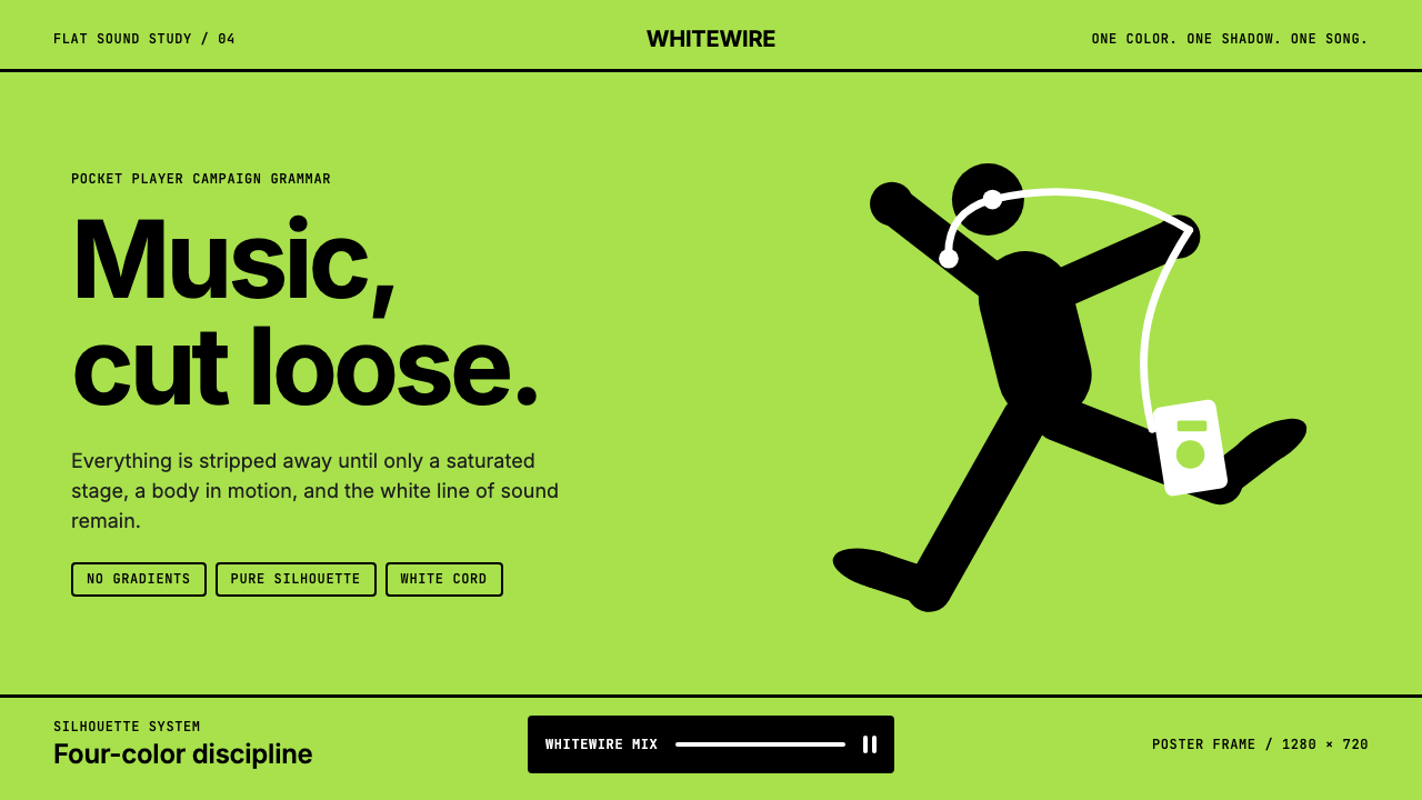 iPod Silhouette 2004Discipline dances. Lime flat-field, black silhouette, and one white cord carr…
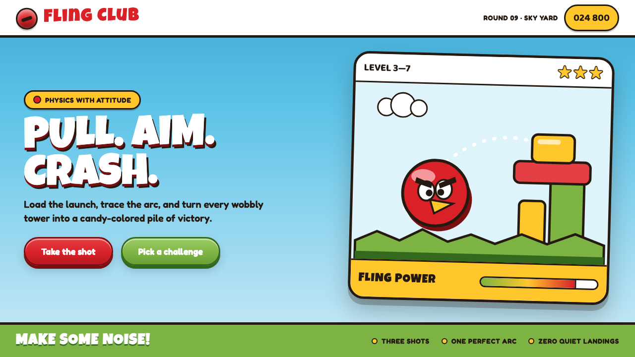 Angry Birds (2009)Adorable aggression takes flight. Candy primaries, chunky outlines, and a dot…
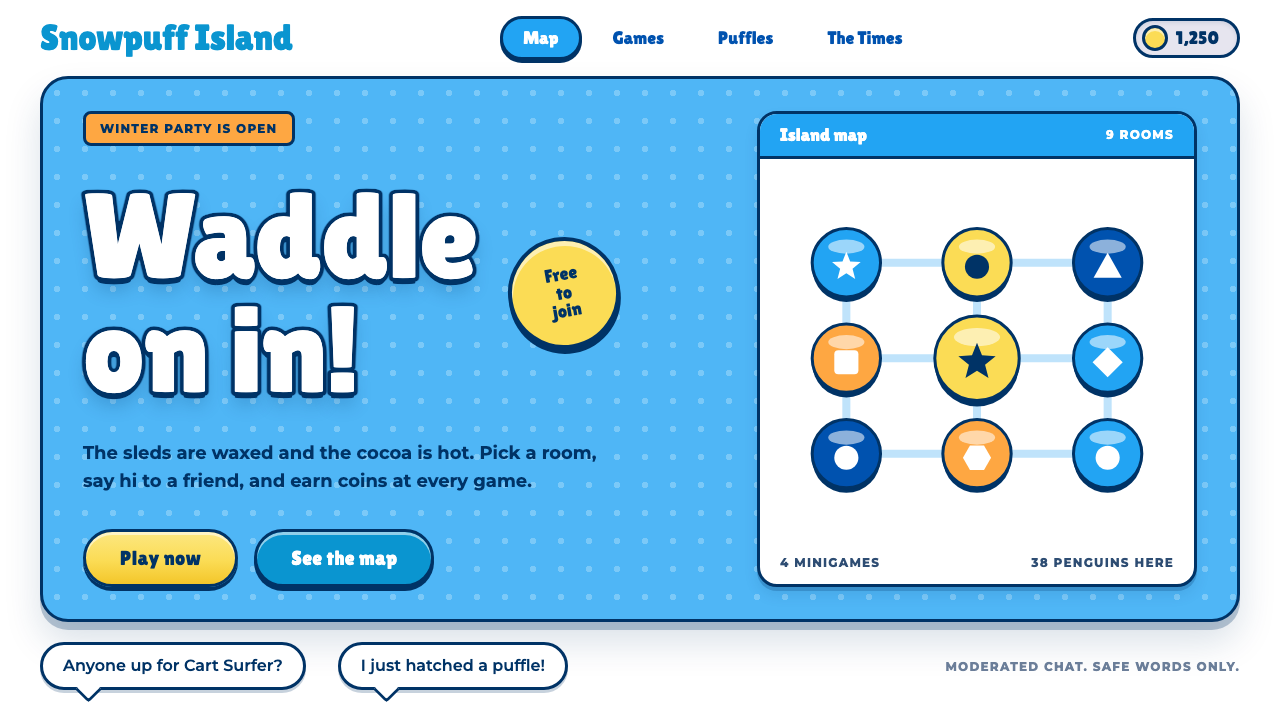 Club PenguinA snow-white island that talks like a kid. Sky-blue panels, navy outlines on…
 KartRiderCheerful, full-throttle nostalgia. Rounded Jua, blue panel frames and yellow…
 Katamari DamacySmall to huge in one roll. Cyan sky, green lettering ringed in white, one fac…
 Tetris (1984)Arcade gravity, pixel exact. Black grid, Bungee type, seven saturated blocks.