What is Final Fantasy Crystal (1987)?
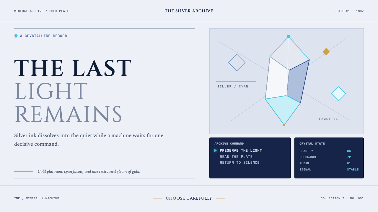
Final Fantasy Crystal joins silver fantasy illustration to the uncompromising logic of an early console command screen.
Final Fantasy Crystal (1987) in brief
Final Fantasy Crystal is a design language built from a deliberate collision. Its atmospheric half draws on Yoshitaka Amano’s spidery watercolour line work: luminous crystal forms, silver figures that seem to evaporate into open paper, and rare flashes of gold across a cold mineral field. Its functional half borrows the visual grammar of an early console role-playing game: deep navy command panels, white beveled borders, hard corners, compact lists, and a triangular cursor poised beside a choice.
The result should not feel like fantasy art placed behind a generic interface. The command window is part of the story’s emotional machinery. It interrupts the fragile illustration with the certainty of a game system, turning an ethereal gallery image into a moment of decision. The visual tension comes from that contrast: hand-drawn uncertainty against ordered selection, dissolving ink against framed information, mythic crystal against machine instruction.
It is a light-ground style, but not a warm one. Silver, ice blue, cyan, white, and navy establish a mineral atmosphere, while gold appears only as a scarce glint. Large areas of negative space give Amano-like forms room to disappear at their edges. Over them sit opaque or nearly opaque command windows whose sharp geometry makes the background feel even more weightless.
Where does Final Fantasy Crystal (1987) come from?
The style begins with Final Fantasy’s 1987 NES and Famicom release, created in Tokyo at Square and Squaresoft. Its origin is inseparable from Japanese role-playing game design, where menus are not incidental utility but the visible place where exploration, inventory, and action become readable choices. The command window therefore supplies more than retro decoration: it supplies the style’s sense of consequence.
Yoshitaka Amano provides the opposing visual language. The source material describes his continuing cover art from the late 1980s into the 1990s as a meeting of Nihonga-like sensibility and Art Nouveau illustration. Fine watercolour marks, crystalline forms, silver figures, and generous unmarked paper create images that appear less constructed than summoned. Their beauty depends on incompletion as much as detail.
The early console interface introduces a contrary discipline. Navy fields enclose text and choices; bright beveled edges separate the command layer from the illustrated world; hard corners refuse the softness of the watercolour beneath them. The visual system makes a productive distinction between atmosphere and operation: one layer suggests a world, while the other tells the player what can be done within it.
Hironobu Sakaguchi, Nobuo Uematsu, and Kazuko Shibuya belong with Amano among the key figures named by the source material. In this design interpretation, they frame an origin shaped by game direction, image-making, sound-world, and interface typography. Final Fantasy Crystal does not attempt to reproduce a single screen or cover; it reuses the collision between those cultural forces as a coherent contemporary visual vocabulary.
What defines the Final Fantasy Crystal (1987) look?
Mineral Light
Silver and pale blue establish the dominant atmosphere, with cyan adding a sharper crystalline note. Gold is exceptional rather than abundant, appearing like a small preserved glint within an otherwise cold field. The palette should feel reflective, airy, and distant rather than luxurious or festive.
Dissolving Illustration
Illustrated forms are thin, fluid, and incomplete at their edges. Crystal, figure, and line should appear capable of drifting into the surrounding paper. Negative space is active material here: it gives the image its breath and prevents the fantasy layer from becoming dense spectacle.
Command Windows
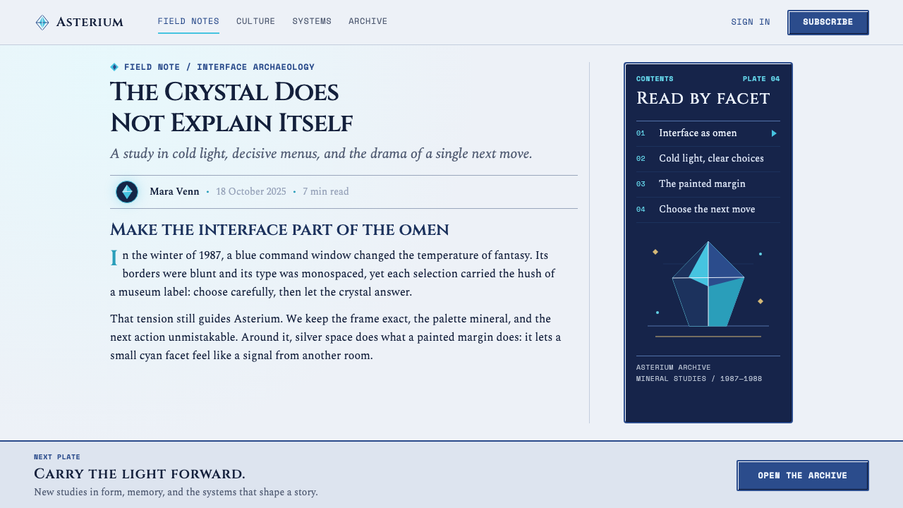
Deep navy panels sit above the illustration with clear authority. Their role is to organize choice, status, and hierarchy, not to imitate glass or create atmospheric depth. The window should feel like an operational overlay from a machine that remains visibly separate from the fantasy world beneath it.
Hard Bevels
Bright beveled borders give panels their early-console identity. They are crisp, mechanical, and directional, making the command layer appear assembled rather than painted. Against loose watercolour lines, this precision becomes a visual statement: the interface has rules even when the world looks dreamlike.
Cursors and Lists
A triangular cursor and compact option lists are small but decisive motifs. They should direct attention through selection rather than decoration. Repeated rows create a calm procedural rhythm, while the cursor introduces the possibility of movement, hesitation, and consequence.
Layered Contradiction
The style succeeds when neither side absorbs the other. The illustration must remain fragile and open; the UI must remain hard and legible. Softly blending the panel into the artwork removes the central idea. Their seam is where the design becomes recognizably Final Fantasy Crystal.
Who shaped Final Fantasy Crystal (1987)?
Sakaguchi is named in the source material as a key figure in the 1987 Final Fantasy origin. Within this style, his association anchors the command-driven role-playing game framework: a fantasy world presented through choices, lists, and consequential interface moments.
Amano supplies the silver gallery layer: spidery watercolour crystals, dissolving figures, cold paper, and occasional gold. His Nihonga-meets-Art-Nouveau illustration is essential because it keeps the fantasy side lyrical, thin-lined, and unresolved rather than conventionally heroic.
Uematsu is identified by the source material as a key figure. In a visual interpretation, his presence usefully reinforces the style’s sense of an epic game world rather than a static art print: the interface and illustration imply a larger dramatic system beyond the visible frame.
Shibuya is listed among the key figures connected to the original release. Her inclusion helps locate the style in the discipline of 8-bit UI typography, where labels, borders, spacing, and repeated commands must remain immediately legible inside a tightly organized game interface.
How do you use Final Fantasy Crystal (1987) today?
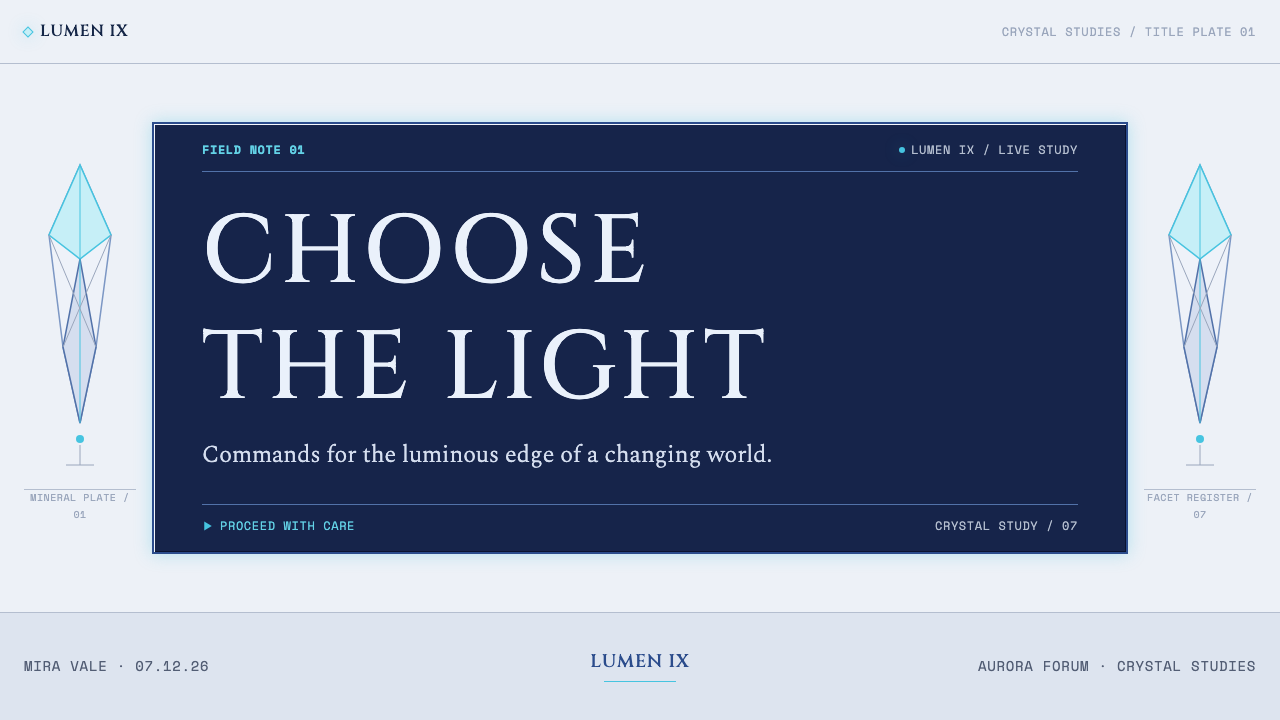
For slides, use the cover as a confrontation between one airy illustrated crystal field and one decisive command window. Let the title occupy the UI layer or sit beside it as a selected command, while the illustration remains spacious and partially absent. Content slides should preserve the same distinction: narrative imagery stays quiet in the background, while headings and points are housed in ordered navy containers.
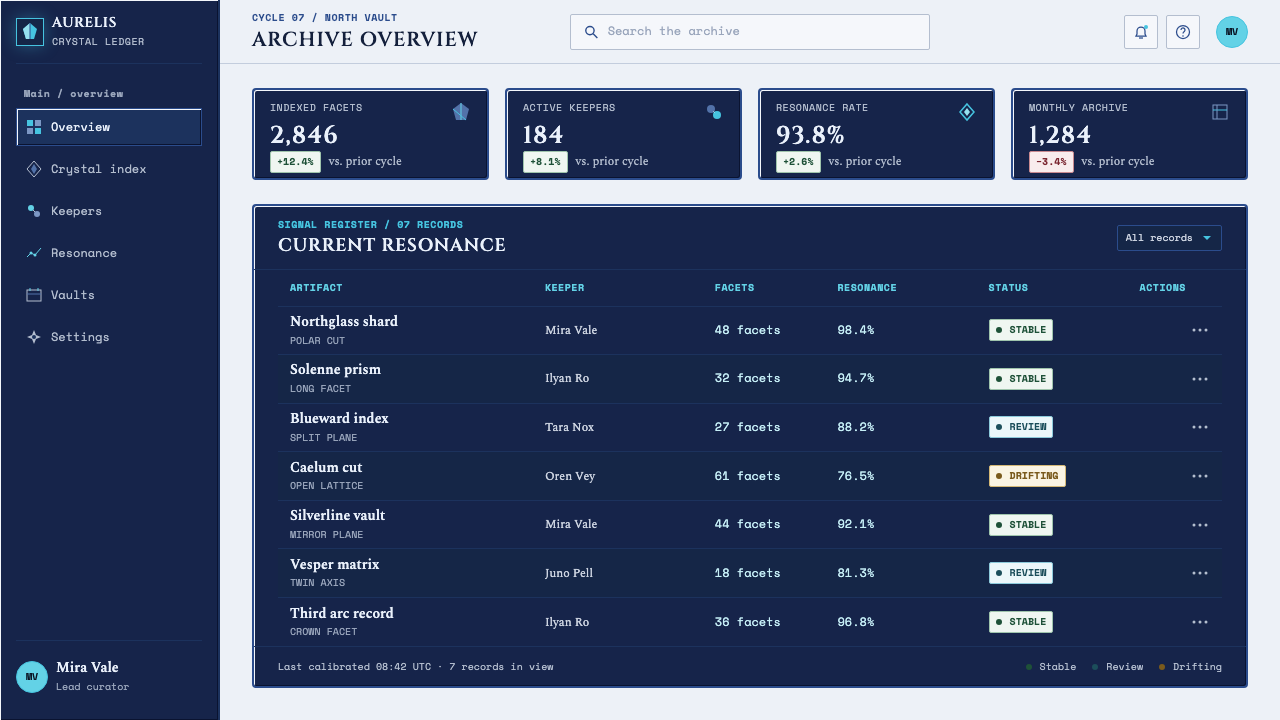
Data slides work best when they treat information as a menu system rather than a floating infographic. Use framed status blocks, short labeled rows, and a visible cursor-like indicator to establish reading order. Charts should remain spare and mineral-toned, with the command window handling labels and interpretation. The goal is not nostalgic decoration; it is to make data feel like a consequential choice within a game world.
For web interfaces, this language suits dashboards, inventories, account summaries, and pricing pages where structured comparison is useful. Navy panels can organize plan differences, current status, or navigation, while silver illustration appears as an atmospheric layer around the interface rather than inside every component. Keep operational text direct and highly legible so the fantasy layer never compromises actual use.
Editorial and marketing layouts benefit from the style’s museum-plate quality. A long-form feature can use a pale field, sparse crystal illustration, and framed metadata or pull quotes that resemble command windows. Marketing pages can alternate between expansive silver sections and compact information panels, creating a rhythm of wonder followed by instruction. Reserve gold glints for genuinely important moments such as a featured release or final call to action.
The common mistake is making every element both ornate and retro. Dense fantasy art, decorative type, rounded translucent panels, and abundant metallic effects erase the intended collision. Another mistake is treating the navy window as mere nostalgia. It must carry real hierarchy and action; if it does not organize content, it is only a costume. Preserve the separation between delicate illustration and hard interface.
Final Fantasy Crystal (1987) — FAQ
Is Final Fantasy Crystal simply a retro game style?
No. Early-console UI is only one half of the system. The other half is Amano’s silver, watercolour-driven fantasy illustration. A convincing result depends on maintaining their disagreement: structured commands must sit over fragile, spacious imagery instead of being absorbed into a uniformly retro surface.
Should the interface look soft and glass-like because crystals are involved?
Usually no. Crystal belongs primarily to the illustrated layer, where it can glow, dissolve, and remain ambiguous. The command layer gains its power by being navy, framed, hard-cornered, and mechanically clear. Making both layers soft removes the intended contrast.
How should gold be used in this style?
Use it as a rare interruption in the cold silver field. Gold works best as a small glint within an illustration or a restrained signal of importance. When it becomes a dominant finish across panels, type, and borders, the mineral restraint gives way to generic fantasy luxury.
Can photography replace the illustrated crystal layer?
Photography can support the atmosphere only if it preserves the same sparse, cold, and fragmentary role. A fully descriptive photographic scene tends to overpower the command windows. The essential quality is not the medium itself but the sense of silver forms dissolving into open space.
Where does Final Fantasy Crystal work poorly?
It struggles where warmth, casual friendliness, or dense real-world information must dominate. The cool distance of the illustration and the severity of the command window can make everyday consumer flows feel ceremonial. It is strongest when a product benefits from atmosphere, clear choices, and a sense that each selection matters.
Related design styles
 Los Angeles LakersShowtime royalty. Forum Blue and metallic gold turn varsity type into arena g…
 American Express CenturionInstitutional luxury. Deep navy, parchment panels, and gold rules feel engrav…
 Flamsteed Atlas CoelestisMeasurement wears mythology. Ivory engravings and gilt stars cross a deep ind…
 Prey (2017)Luxurious horror in orbit. Gold Deco sunbursts glint out of near-black Typhon…
 Shanghai Bund Art Deco RevivalNight-black Deco luxury. Rose-gold lines, jade accents, and broadsheet type s…
 Shanghai Calendar 1930Old Shanghai glows softly. Cream paper, dusty rose, jade panels, and gold Dec…