What is Everything Everywhere All at Once?
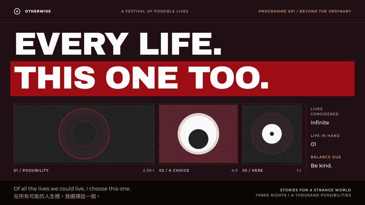
A design system built from a googly eye, a black bagel and a stamped tax receipt: cosmic chaos, wine-black ground, a deep-red band and a very human heart.
Everything Everywhere All at Once in brief
The Everything Everywhere All at Once style is a design language drawn from the props and posters of the 2022 film by Daniels. The objects it borrows are deliberately mundane and absurd: a googly eye stuck to a forehead, an everything bagel that swallows the universe, an IRS receipt with a stamped total. The style takes this mix of the cosmic and the clerical and makes it a visual system.
The ground is the near-black wine of the film's payoff poster, lit by a deep red band, with off-white type on top. Titles are set in a very heavy display face and stacked tightly; supporting text uses a clean geometric sans in the manner of film credits; and dialogue-like lines use a Traditional Chinese sans, a nod to the family at the centre of the story.
What makes the style distinctive is its editing logic. Layouts change shape the way the film changes universe. One section may be wide, the next standard, the next square. The page behaves less like a document and more like a cut sequence, but the palette and typography stay steady enough that the viewer never loses the thread.

Where does Everything Everywhere All at Once come from?
The film Everything Everywhere All at Once was written and directed by Daniel Kwan and Daniel Scheinert, working together as Daniels. It premiered at SXSW in March 2022 and went on to win seven Academy Awards in March 2023. It tells a story about a family and a laundromat that collides with the multiverse, and it did so with a handmade, collage-like energy that made it a landmark of American independent cinema in the A24 era.
Its visual culture is as important as its plot. The poster and title treatments used heavy black lettering, collaged elements and a dark, saturated palette, and the artist James Jean is one of the names associated with the film's illustrated imagery. The result was a look that felt homemade yet confident: part sci-fi, part martial arts, part family drama, and never polished in the glossy blockbuster way.
The movement this system belongs to is a cluster of three currents. First, A24-era American independent cinema, with its taste for distinctive poster design and a brand-like studio identity. Second, multiverse genre storytelling, where stories jump between versions of the same characters. Third, collage-style film poster design, which stacks mismatched images and type into a single crowded composition.
As a web and presentation style, it translates those currents into a few reusable rules: a dark red-tinted ground, an off-white text colour, heavy stacked titles, credit-like captions, and aspect-ratio shifts between sections. It fits subjects that want a bit of strangeness, such as festival pages, independent film promotion and narrative-driven content.
What defines the Everything Everywhere All at Once look?
Wine-black ground
The canvas is not pure black but a very dark wine, taken from the film's payoff poster. The warmth gives the darkness a theatrical, slightly feverish quality.
Deep-red title band
A band of deep red cuts across the layout and carries titles or key moments. It acts like a stripe of stage light and separates one universe from the next.
Off-white like an eye
Text is set in a soft off-white, close to the white of a googly eye. It is bright enough to read on the dark ground yet softer than pure white, which keeps the page from glaring.
Stacked heavy titles
Headlines use a very heavy display face and stack line upon line, tightly spaced. They read like a poster rather than a heading, giving every section a loud entrance.
Credit-style captions
Secondary text uses a clean geometric sans in small, orderly lines, like the credits at the end of a film. The contrast between roaring titles and calm credits is the rhythm of the system.
Traditional Chinese for dialogue
Lines of family dialogue and the laundromat signage are set in a Traditional Chinese sans. It brings a second script into the page and roots the chaos in a particular household.
Aspect ratio as a universe switch
Each section may change its frame: wide, standard, then square. The shift tells the viewer they have jumped to another branch, the way a film does when it changes screen shape.

Who shaped Everything Everywhere All at Once?
Co-writer and co-director of the 2022 film, one half of the duo known as Daniels.
Co-writer and co-director of the film, working alongside Daniel Kwan as Daniels.
Lead actress of the film, whose performance was central to its awards success in March 2023.
Artist associated with the illustrated imagery connected to the film's poster culture.
How do you use Everything Everywhere All at Once today?
In slides, this style suits a pitch for something unusual, a festival programme or a talk that wants to mix humour and seriousness. A cover can be a wine-black slide with a stacked heavy title and a single red band. Content slides can alternate between wide, standard and square frames to mimic universe jumps. For data slides, keep the chart legible in off-white on the dark ground and use red only for the one figure that matters.
On the web, it works well for film and festival landing pages, indie studio sites, interactive stories and event pages. Use full-width red bands as section dividers, stack the heading, and put the supporting information in a credit-style block. The page should feel edited, with sections that change proportion, rather than a uniform column of cards.
In editorial and marketing material, the style suits posters, newsletters, case studies about unconventional campaigns and behind-the-scenes features. The collage logic means you can layer an image, a heavy title and a stamped detail in one composition, as long as the palette stays limited to the dark ground, the deep red and the off-white.
It also works as a mood board for narrative interfaces such as a story-driven onboarding or a game-like tutorial. The humour comes from pairing a grand heading with a tiny ordinary object, such as a receipt or a bagel, so use that contrast deliberately.
The common mistake is to treat chaos as permission to ignore structure. The style works because the colour, type and caption system stay consistent while the frames change. If every element also changes colour or typeface, the page stops feeling like one film and becomes noise. Another mistake is lightening the ground to pure black or grey and losing the wine warmth.

Everything Everywhere All at Once — FAQ
What is the Everything Everywhere All at Once design style?
It is a design language inspired by the 2022 film: a wine-black ground, a deep-red band, off-white text, heavy stacked titles, credit-style captions and layouts that change aspect ratio from section to section.
Who made the film?
It was written and directed by Daniel Kwan and Daniel Scheinert, known together as Daniels. It premiered at SXSW in March 2022 and won seven Academy Awards in March 2023.
Why does the layout change shape between sections?
It borrows the film's editing. Each change of aspect ratio signals a jump to another universe, so the page reads like a cut sequence rather than a single uniform column.
Is it a dark theme?
Yes, but a particular one. The ground is a near-black wine rather than neutral black, and the deep red band and off-white text give it a theatrical warmth that generic dark themes lack.
What kind of project suits it?
Film festivals, independent film promotion, narrative landing pages, creative studio sites and any content that wants a quirky, story-driven tone with a human centre.
Related design styles
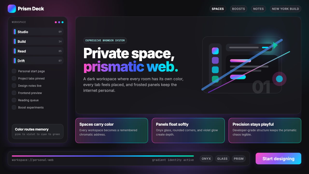 Arc Browser Prismatic (2023)Color is architecture. Pink-violet-cyan ribbons glow over onyx glass and roun…
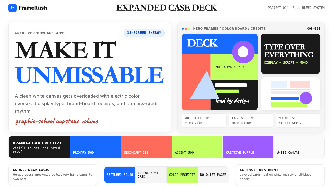 Behance Maximalist PortfolioPortfolio volume at max. Electric blue, coral and lime stack into a full-blee…
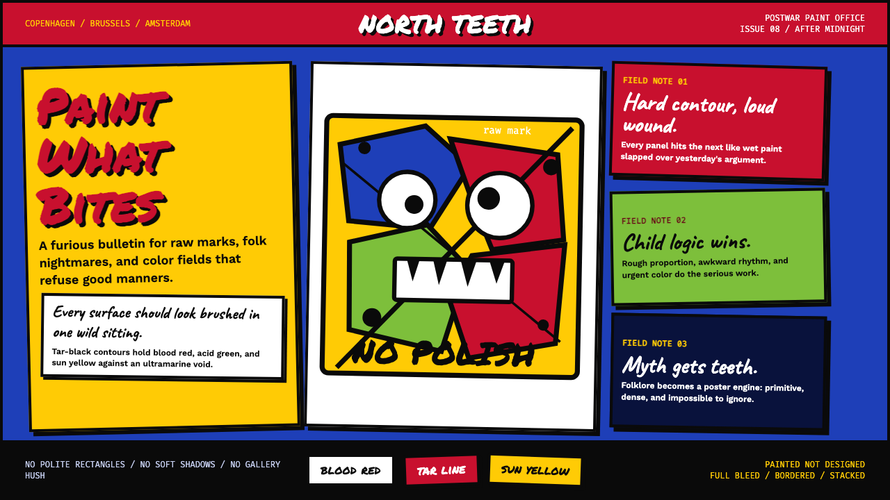 CoBrA (Asger Jorn, 1948)Paint refuses polish. Ultramarine ground, blood red slabs, and marker type th…
 Hyperpop 100 gecs (2019)Cute chaos detonates. Blacklight candy, Bungee type, and pixel trash collide.
 Jellyfish Aquarium StudyLight is the ornament. Violet-cyan glow floats in black glass with venue-goth…
 Rick Owens DarkstarRestraint has gravity. Charcoal concrete, bone type, and one ochre drape hold…