What is Euphoria?
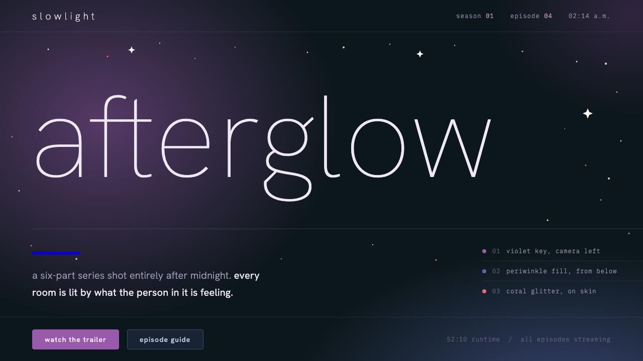
Euphoria turns a television night into an interface: a blue-black ground, faces cut out by violet LED light, and type so thin it barely stays on the screen.
Euphoria in brief
Euphoria, as a design style, is the visual language drawn from the night frames of HBO's series of the same name, which premiered in June 2019. Its core is a dark, blue-tinted black ground, saturated violet and periwinkle light that falls on faces and surfaces, a scatter of glitter that catches the eye like sparks, and hairline lowercase type that echoes the show's slender title.
The guiding idea comes from the cinematographer Marcell Rév, who described the lighting as emotional realism. Light in these frames does not tell you what time it is or where the lamp is; it tells you how a character feels. The color of the light is the emotional content of the scene, and the design system carries that principle over to screens: color is mood first and decoration never.
In practice the style reads as cinematic, nocturnal and intimate. Pages are mostly empty darkness, with one lit subject at a time. Glitter and bloom provide the only sparkle, and everything else holds back so that the glow has something to push against. It suits products that sell a feeling, such as film promotion, music, beauty and any night-flavored content.

Where does Euphoria come from?
The style begins in Los Angeles, with a television series created and written by Sam Levinson that premiered in June 2019. Its second season followed in January 2022. The show quickly became known as much for how it looked as for what it said, and its look was a deliberate break from the flat, evenly lit habits of teenage drama on television.
Cinematographer Marcell Rév built that look with practical LED and panel lighting rather than conventional film lamps, letting saturated purples, blues and pinks wash across faces and rooms. This sits in a tradition of emotional-realist color cinematography, in which the world is shown as it is felt rather than as it is measured. The darkness around the light is as important as the light itself, because it is what makes the color feel like a mood instead of a filter.
The second strand is cultural. The show's makeup, associated with Doniella Davy, drew on a Gen Z glitter-and-rhinestone makeup culture: gems at the corners of the eyes, sparkle on the cheekbones, color used as a statement of self. That detail is why a design system based on the show carries glitter at all. It is not a decorative flourish added afterward, but the one place where the show's lighting and its beauty culture meet.
Season two changed the palette. Where the first season leaned on violet, the second was shot on Ektachrome reversal film, and the light warmed toward tungsten orange. The design system keeps that shift as a possible second chapter: when a page needs to turn the page emotionally, violet gives way to warm orange, and the same thin type and generous darkness carry on unchanged. The cast, led by Zendaya, gave these images a face the audience came to associate with the look.
What defines the Euphoria look?
Color
The ground is a blue-tinted black, never a neutral one, so every light that enters feels cold and electric. Violet and periwinkle are the signature light colors, used as glow rather than as flat fills. A warm tungsten orange is held in reserve as a second chapter. Color describes how a scene feels, so it should arrive as light on a subject instead of as a uniform surface.
Typography
Type is a hairline. A thin grotesque in its lightest weights, always lowercase and widely tracked, mirrors the slender title of the show. It is meant to look like it might vanish, which is exactly why it feels cinematic. Because it is so delicate, it needs a dark ground and generous size to stay legible, and it should never be set in bold alongside it.
Light and bloom
Light is the main material of the style. Soft bloom surrounds bright points, edges of faces and objects are cut out by colored glow, and shadows are allowed to stay deep. The effect is like an LED strip seen through a camera lens. Used with restraint, the glow draws the eye to one place; used everywhere, it turns the page into a fog.
Glitter
Glitter is the style's only sparkle, drawn from the rhinestone and shimmer makeup that defines the show's look. It should appear as small scattered points catching light on a cheekbone, a corner, an edge. It is accent, not texture: scatter it thinly on one element and leave the rest of the page dark and quiet.
Layout
Layouts behave like one long take. A screen tells one thing, the next screen tells the next, and large areas are left black. Content is centered on a subject, not distributed across a dense grid. Scrolling feels like a camera drifting from one lit face to another, so spacing between moments is generous and deliberate.
Mood and tone
The tone is intimate, nocturnal and slightly feverish. The style does not shout; it glows. Copy is short, lowercase and quiet, and the interface should feel like a late-night scene rather than a product page. That makes it expressive for entertainment, but a poor fit for anything that needs dense information or a sober, daytime tone.

Who shaped Euphoria?
Levinson created and wrote the series. His commitment to a heightened, subjective view of adolescence is the reason the show could justify such an expressive visual language in the first place.
The cinematographer who described the show's lighting as emotional realism. His use of saturated LED and panel light is the direct source of the violet and periwinkle glow that this design system borrows.
Associated with the show's makeup, which brought glitter and rhinestones from youth beauty culture onto screen as a form of character expression. Her work is the origin of the sparkle in the system.
The lead performer, whose presence gave the series' images a recognizable face. Her association with the show helped the look reach a wide audience and become a reference point for later nocturnal, glitter-lit styles.
How do you use Euphoria today?
On slides, the style works best for covers and section breaks. Put a single lowercase title in the thinnest type on a near-black blue ground, and let one soft violet glow sit behind or beside it. Content slides should keep to one idea each, with text kept short and large; anything that needs a paragraph or a dense table belongs in an appendix, because hairline type cannot hold small-size reading.
For data slides, resist the urge to fill the dark space. Show one chart or one figure per slide, let a single glowing accent color mark the number that matters, and keep gridlines and labels almost invisible. The dark ground makes a bright line feel dramatic, so a plain line chart with one lit series can carry more feeling than a crowded dashboard.
On the web, the style is natural for entertainment landing pages, album and film promotion, beauty and fashion launches, and nightlife products. A hero section of dark space, a lowercase headline and a pool of violet light will communicate the mood immediately. Pricing pages and dashboards are harder; if you must use it there, keep the controls in plain, readable type and reserve the glow for the one call to action.
In editorial and marketing work, think of each section as a scene. Give each one a single lit subject, whether a portrait, a product or a quote, and let the black space do the pacing. Full-bleed imagery with colored light works well, while stock photography with flat daylight will break the spell. A second chapter in warm orange is a useful way to signal a change of tone mid-story.
A common mistake is using the glow everywhere and calling it atmosphere. When every surface bleeds violet and every button shines, nothing is lit because everything is. The opposite error is setting body text in the hairline weight: it looks elegant in a mockup and becomes unreadable on a real screen. Keep the thin type for headlines, give reading text a sturdier weight, and let the light fall on only one thing at a time.

Euphoria — FAQ
What is the Euphoria design style?
It is a visual language based on the night scenes of HBO's Euphoria: a blue-black ground, violet and periwinkle LED-style light, glitter accents and hairline lowercase type. It treats color as emotion, in the same way the show's cinematography does, and uses large amounts of darkness so that a little light can feel intense.
What does emotional realism mean here?
Marcell Rév used the term for the way light in the show reflects how a scene feels, not what time of day it is. A violet face does not mean there is a purple lamp nearby; it means the character is in a certain emotional state. In design terms, color is chosen for mood, and it is applied as light on a subject.
Why is the type so thin and lowercase?
The thin lowercase echoes the delicate wordmark of the show's title. It also fits the mood: a slender, quiet voice against a dark field feels intimate rather than commanding. The trade-off is legibility, so the style asks for large sizes and a dark ground, and should not be used for long reading text.
Can I use it for a corporate or data-heavy product?
It is a poor default for those. The style depends on large empty areas, one subject per screen and very light type, which conflicts with dense tables and long forms. If you do use it, limit the effect to the brand surface, such as a landing page or a login screen, and keep the working interface plain.
How do I use the second-season orange?
Treat it as a second chapter. The second season was shot on Ektachrome reversal film, and its light warmed toward tungsten orange. In a design, switch from violet to orange at a clear narrative turn, such as a new section or a different product line, and keep everything else, including the type and the darkness, the same so the change reads as a shift in feeling.
Related design styles
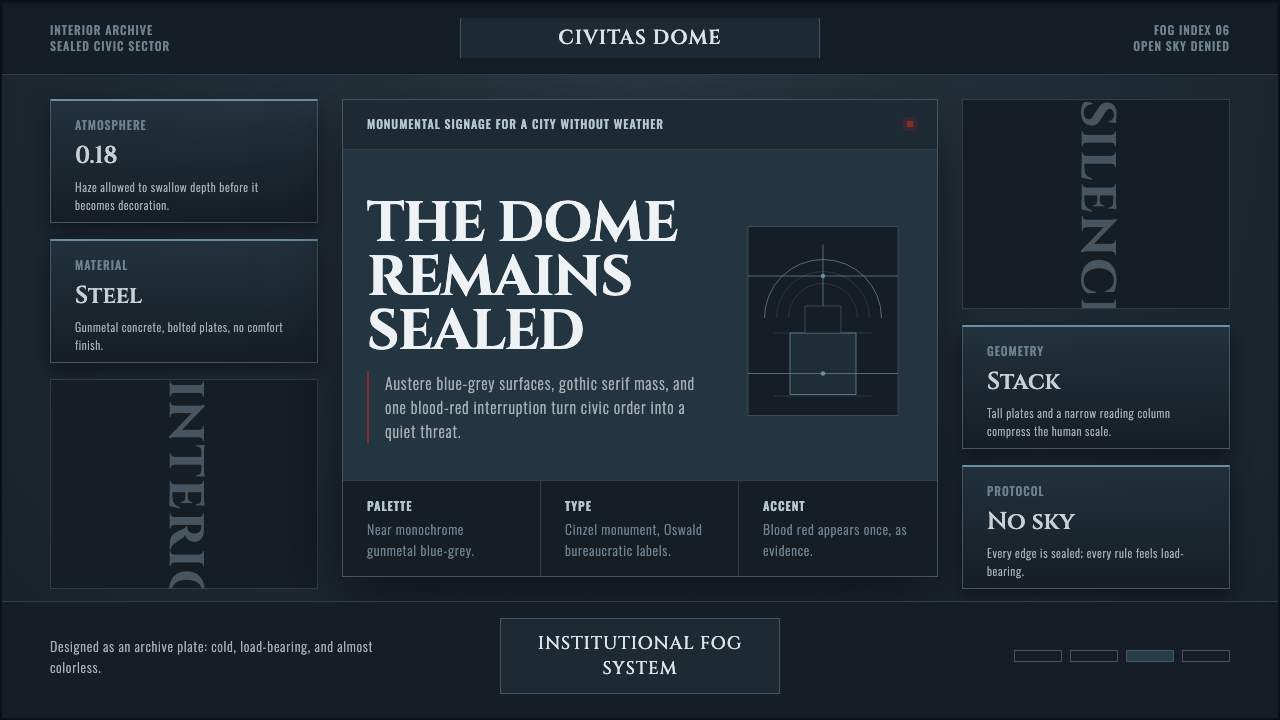 Ergo Proxy Romdo DomesCold order becomes dread. Gunmetal fog, gothic serif mass, one blood-red mark.
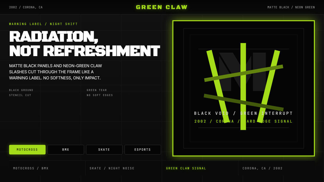 Monster Energy Claw (2002)Aggression, not refreshment. Matte black and neon-green claw slashes cut the…
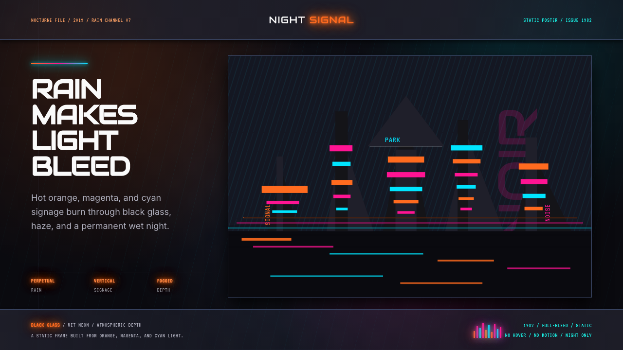 Blade Runner 1982 Neon NoirRain-soaked noir. Orange, magenta, and cyan neon cut black glass.
 Paprika Dream ParadeDreams detonate in color. Neon pink and electric violet stack into a glassy p…
 Akira (Otomo)Cyberpunk at impact. Kaneda red, cyan kanji, halftone concrete, and diagonal…
 Annihilation (The Shimmer)Beautifully wrong. Dusk black carries pink, teal, and lilac refraction throug…