What is Campana Brothers Design?
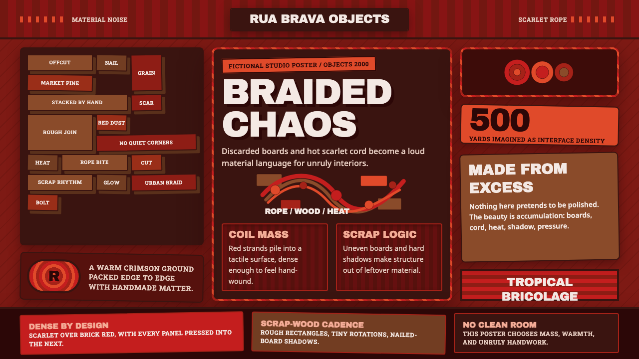
Campana Brothers design turns the improvised abundance of São Paulo into a language of scarlet rope, scrap wood, visible labor, and joyous disorder.
Campana Brothers Design in brief
Campana Brothers design is the tropical bricolage language developed by Fernando and Humberto Campana in São Paulo. It transforms ordinary, discarded, or visually unruly materials into expressive furniture: rope becomes upholstery, market wood becomes structure, and accumulation replaces the polished unity expected of conventional luxury. Its chaos is not accidental. Repetition, handwork, and a strong underlying frame hold the abundance together.
Two works define the vocabulary. The Favela armchair, created in 1991, is assembled from irregular pieces of scrap fruit-market wood, producing a dense surface that resembles improvised masonry. The Vermelha chair, created in 1993, wraps 500 yards of hand-braided red rope around a steel frame. One builds through stacking and nailing; the other through looping and entanglement. Both preserve evidence of how they were made.
Translated into graphic or digital design, the style becomes a dark, crowded field of warm scarlet, braided lines, scrap-brown blocks, coarse edges, and emphatic display type. Components should feel gathered, tied, nailed, or layered rather than silently aligned. The goal is not random mess but cultivated excess: a composition that feels immediate and handmade while remaining legible enough to use.
Where does Campana Brothers Design come from?
The style emerged in São Paulo, Brazil, within the brothers' close observation of a city shaped by density, improvisation, commerce, and material reuse. Rather than treating the street as something design should refine away, Fernando and Humberto made its collisions productive. Uneven fragments, saturated color, repeated knots, and visibly assembled surfaces became carriers of place. Their work presents Brazil not as a smooth decorative theme but as an active material condition.
The Favela armchair of 1991 established the scrap-material side of this approach. Pieces of discarded fruit-market wood are joined into an irregular body whose identity depends on variation. No single strip supplies the image; the chair becomes recognizable through the collective pressure of many modest parts. The name connects this accumulation to the improvised urban fabric that informed the brothers, while the construction turns scarcity and reuse into a deliberate formal language.
The Vermelha chair of 1993 developed the same logic through line rather than block. A steel frame provides discipline, but the visible experience comes from 500 yards of red rope braided and coiled by hand. The rope crosses itself so frequently that it becomes both drawing and volume: an energetic red network with depth, gaps, knots, and shadows. Its scarlet intensity made exuberance inseparable from the labor required to produce it.
Between 1990 and 2010, the period identified with Estudio Campana's peak, these ideas formed a recognizable Brazilian design position and entered the context of Edra furniture. The important transition was not from humble material to disguised luxury; it was from overlooked material to heightened attention. Scrap remained visibly scrap, rope remained rope, and irregular assembly remained central. International recognition therefore did not erase the work's São Paulo origin but amplified the local conditions embedded in every surface.
What defines the Campana Brothers Design look?
Scarlet Heat
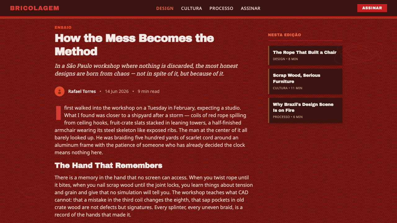
Warm scarlet is the emotional center of the system. It should arrive as rope, knot, stroke, or concentrated field rather than as a polite accent. Dark crimson grounds deepen its heat, while scrap-wood browns prevent the palette from becoming synthetic. The result is tropical and bodily: color feels handled, stretched, and accumulated.
Bricolage Assembly
Form is produced by joining what appears available rather than by imposing a seamless shell. Blocks may vary, lines may overlap, and adjacent pieces need not match perfectly. Coherence comes from repetition and pressure: enough fragments gathered closely begin to behave as one object. Irregularity is therefore structural evidence, not decorative distress.
Rope as Drawing
Braided and coiled lines function like three-dimensional drawing. They cross, loop, tighten, and loosen, creating rhythm through changing density. In two-dimensional work, this can become tangled rules, woven borders, or repeated paths that partially reveal the ground beneath. The line should feel continuous and physically plausible, never like a generic decorative squiggle.
Scrap-Wood Masonry
Brown fragments are stacked like improvised masonry: short beside long, rough beside smoother, narrow seams beside crowded joints. Their power comes from collective texture rather than from an individually perfect tile. Digital panels can echo this logic through clustered cards or staggered content blocks, provided the underlying reading order remains dependable.
Visible Handwork
Connections should be legible. Knots, joins, overlaps, seams, and changes of direction reveal that a surface was made through repeated action. Polishing away every discrepancy would remove the style's human scale. The strongest applications preserve variation while preventing it from obscuring essential labels, controls, or information.
Heavy, Crowded Type
Display type is broad, weighty, and unwilling to retreat. Headlines behave like material blocks pressed into the composition, often competing productively with rope and wood textures. Body text needs a calmer face and clearer spacing so the page remains readable. Typographic hierarchy comes from mass, placement, and contrast rather than refinement or delicacy.
Who shaped Campana Brothers Design?
Fernando Campana was one half of the São Paulo partnership that converted urban disorder and material reuse into collectible furniture. His significance lies in the shared practice: the work refuses a clean separation between concept, material, and making. Through Estudio Campana, discarded wood and braided rope became the basis of an internationally recognizable Brazilian vocabulary.
Humberto Campana developed the studio's language alongside Fernando, grounding expressive form in repeated manual assembly. The partnership treated overlooked matter as a source of structure rather than a substitute for better material. That stance gave the work its distinctive tension: humble components could remain visibly humble while the finished object became extravagant and commanding.
Created in 1991, the Favela armchair is the clearest statement of the brothers' scrap-wood method. Irregular pieces from fruit-market waste are nailed into a compact, layered body. The chair demonstrates how accumulation can generate both structure and image: what first appears chaotic resolves into a forceful whole without concealing the difference between its parts.
Created in 1993, the Vermelha chair turns 500 yards of hand-braided red rope into an enveloping surface over a steel frame. It condenses the Campana vocabulary into one object: disciplined support beneath exuberant entanglement, intense scarlet joined to visible labor, and an everyday material transformed without losing its identity.
How do you use Campana Brothers Design today?
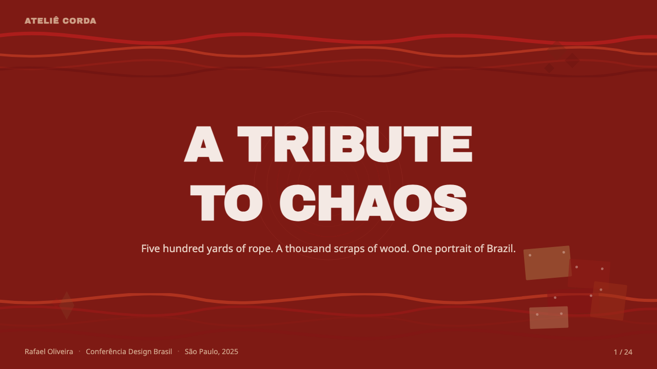
On presentation covers, use one dominant act of accumulation: a scarlet rope network crossing a dark crimson field, or a compact wall of scrap-brown fragments supporting a large title. The title should feel embedded in the material rather than placed above it. Content slides need more restraint. Keep one dense crafted zone at the edge and reserve a quieter field for explanation, allowing the contrast between abundance and calm to organize the page.
Data slides should translate information into stacking, binding, and clustering without sacrificing comparison. Categories can appear as wood-like blocks gathered into visible groups, while connections can be drawn as braided routes. Use scarlet for the decisive series or conclusion and brown for supporting context. The handcrafted metaphor must follow the data; arbitrary variation in block size or line density will imply differences that do not exist.
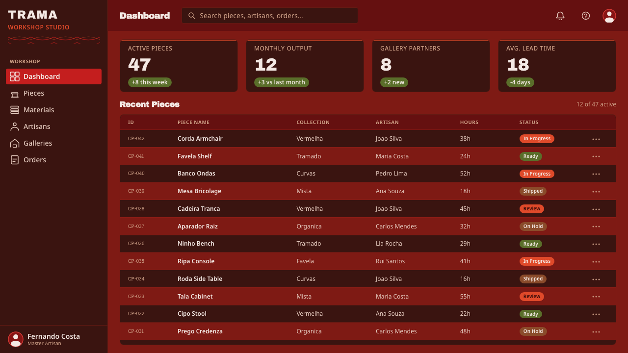
For dashboards and pricing pages, preserve a dependable underlying grid while allowing the surface to feel assembled. Panels may overlap slightly, alternate between deep red and scrap-brown fields, or carry woven separators. Primary actions can use the hottest scarlet, but routine controls should remain quieter. Pricing tiers work best as distinct constructions with different material density, not as a row of identical cards covered in random texture.
Editorial and marketing layouts benefit from the style's narrative intensity. Open with a large, tactile image or rope-like gesture, then move into calmer columns interrupted by fragment clusters, pull quotations, and emphatic headings. Product stories can organize sections around material, process, and assembly. The style is especially effective when reuse, Brazilian identity, craft, or expressive production is central to the message rather than a borrowed visual costume.
The common mistake is to equate Campana design with unrestricted clutter. Filling every gap with rope, wood grain, loud red, tilted blocks, and heavy type destroys the tension that makes the work persuasive. A steel frame stabilizes the Vermelha chair, and repeated joining stabilizes the Favela armchair; digital work needs an equivalent discipline. Establish reading order first, then concentrate disorder where it communicates material, energy, or emphasis.
Campana Brothers Design — FAQ
Is Campana Brothers design simply recycled design?
No. Reuse is important, especially in the Favela armchair, but the defining principle is transformation through accumulation and hand assembly. Scrap wood is not merely selected because it is discarded; its irregularity becomes the chair's structure and image. The Vermelha chair makes the distinction even clearer: rope is ordinary rather than necessarily discarded, and its expressive force comes from braiding, repetition, and entanglement.
How can a digital layout feel handmade without becoming illegible?
Separate the structural layer from the expressive layer. Navigation, reading order, labels, and data relationships should remain stable. Variation can then enter through clustered edges, overlapping rope motifs, uneven fragment shapes, and visible seams. Concentrating texture in selected zones is more faithful to the furniture than distributing noise everywhere, because the apparent chaos always depends on an organizing frame.
Must every Campana-inspired design use scarlet?
Scarlet is central to the Vermelha-derived digital vocabulary and provides its immediate emotional heat, but the deeper logic lies in material density, repetition, and visible joining. A composition led by scrap browns can still express the style if it behaves like assembled wood rather than a generic rustic palette. When scarlet is used, it should feel integral and energetic, not added as a fashionable accent.
What distinguishes controlled chaos from random decoration?
Controlled chaos grows from a repeatable construction rule. In the Favela armchair, fragments are repeatedly joined into a load-bearing mass; in the Vermelha chair, rope repeatedly crosses a supporting frame. Random decoration borrows the appearance of irregularity without such necessity. In graphic work, every cluster should reinforce hierarchy, direction, grouping, or material narrative. If removing it changes nothing, it is probably ornament rather than structure.
Where does this style work poorly?
It struggles when neutrality, visual silence, or rapid scanning across large amounts of uniform information is the overriding requirement. Dense rope motifs and fragment fields can compete with forms, long tables, or highly repetitive controls. It is better suited to expressive covers, focused dashboards, pricing stories, cultural editorial work, and brands whose values genuinely include craft, reuse, abundance, or Brazilian identity.
Related design styles
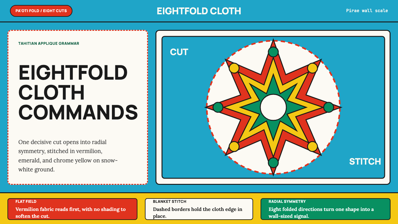 Tahitian Tifaifai (Appliqué Quilt)Flat fields command the room. Vermilion radial applique sits on Pacific cyan…
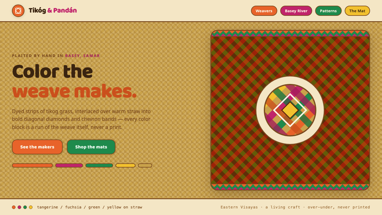 Banig Pandan MatHandwoven Filipino joy. Tangerine, fuchsia and green strips plaited into diag…
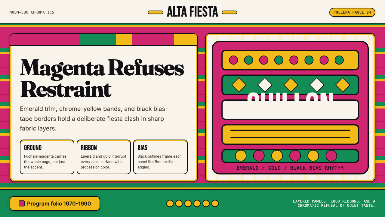 Bolivian Pollera Fiesta MagentaChromatic defiance. Magenta ground, emerald bands and black outlines clash li…
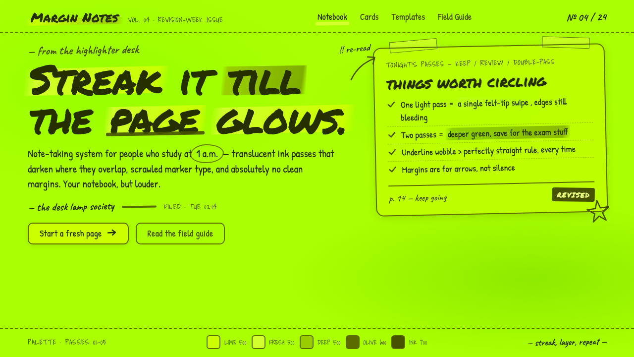 Fluorescent HighlighterStudy notes at 1am, made into a system. Translucent lime ink layered until th…
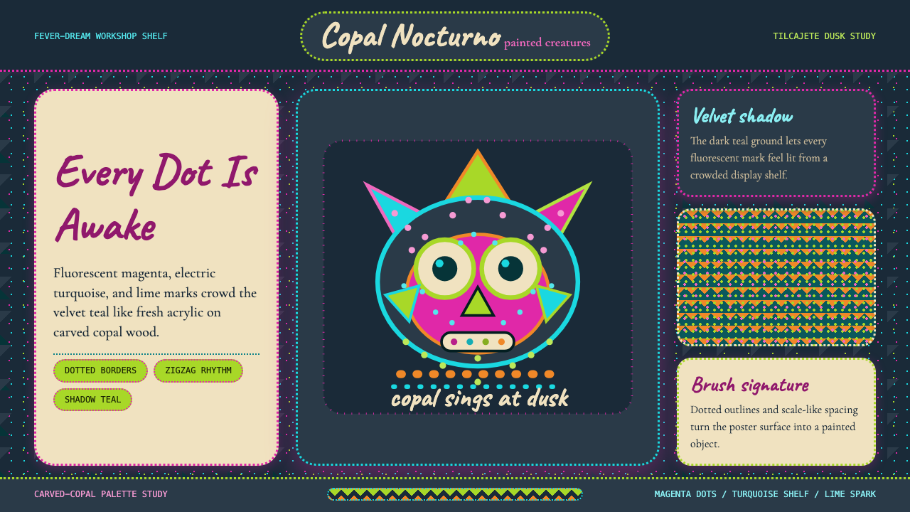 Mexican Alebrije Oaxaca (Linares 1936)Fever craft glows. Velvet teal carries magenta dots, turquoise zigzags, and C…
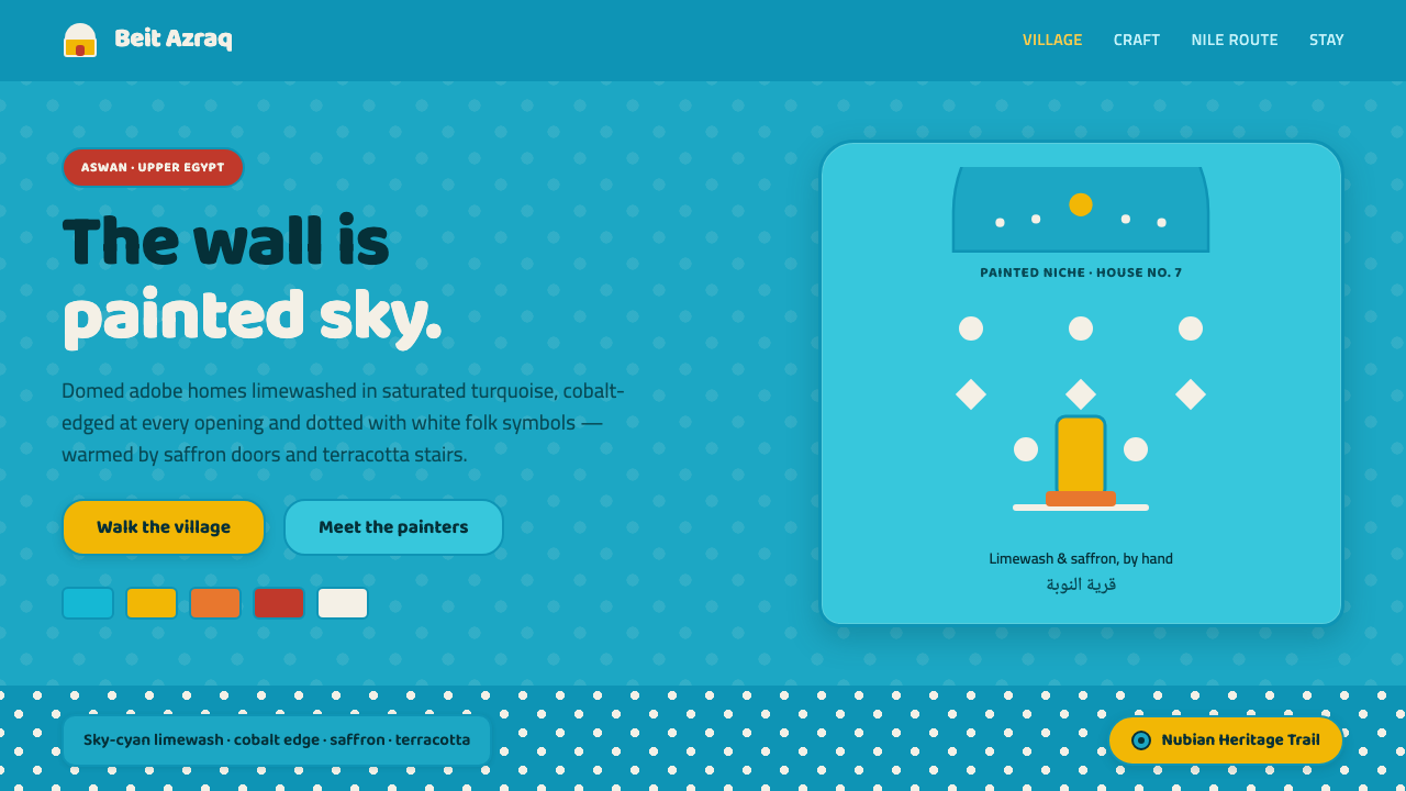 Nubian House BlueThe wall is the page. Sky-cyan limewash, cobalt-edged niches, white folk dots…