What is Edo Fireman's Banten?
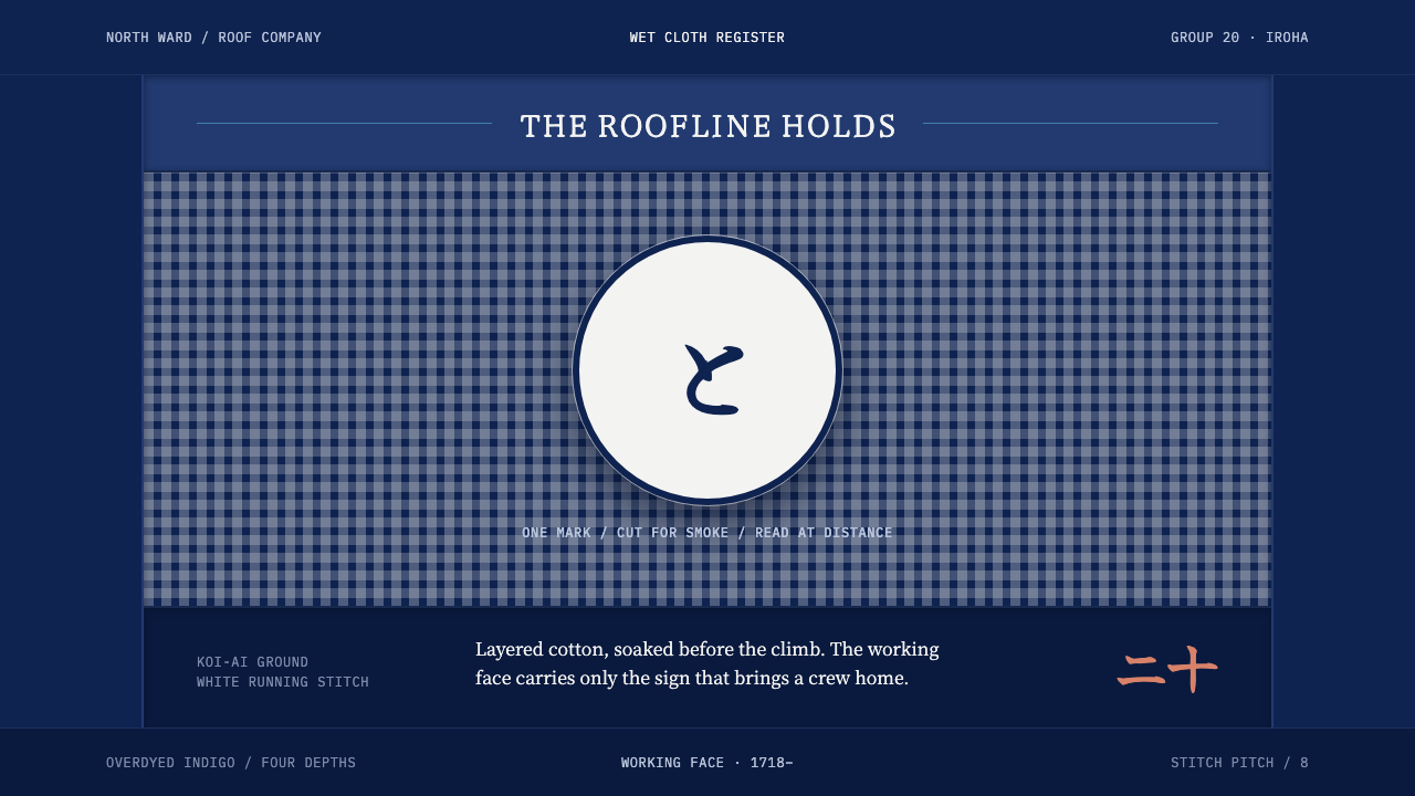
The hikeshi banten is a soaked, indigo-black working coat with one crest large enough to read through smoke, and a painted lining hidden inside for the day the fire is out.
Edo Fireman's Banten in brief
Edo Fireman's Banten is a design style drawn from the hikeshi banten, the half-coat of the town firefighters of Edo, as Tokyo was then called. The coat is made of layers of cotton overdyed to a near-black indigo and quilted together with white sashiko running stitch. Before a man went up on a roof, the coat was soaked in water. The cloth is heavy, absorbent and deliberately unbeautiful on its working face.
The whole graphic argument is one mark. A brigade crest, together with its iroha syllable, is cut thick enough to be read through smoke from across a rooftop, and sits centred on the back panel. That is the one thing the coat has to say, and it says it at a scale that leaves no room for anything else. Turn the coat inside out and the hidden lining is a painted scene in mineral pigment, the face reserved for reward.
As a design system it takes two faces from one garment: a wet, dark indigo working surface, framed by white stitch lines and holding one oversized crest, and a vivid hidden interior that is used sparingly. It is built to be seen through noise, in poor conditions and from a distance, which makes it a style about legibility under pressure rather than about prettiness.
Where does Edo Fireman's Banten come from?
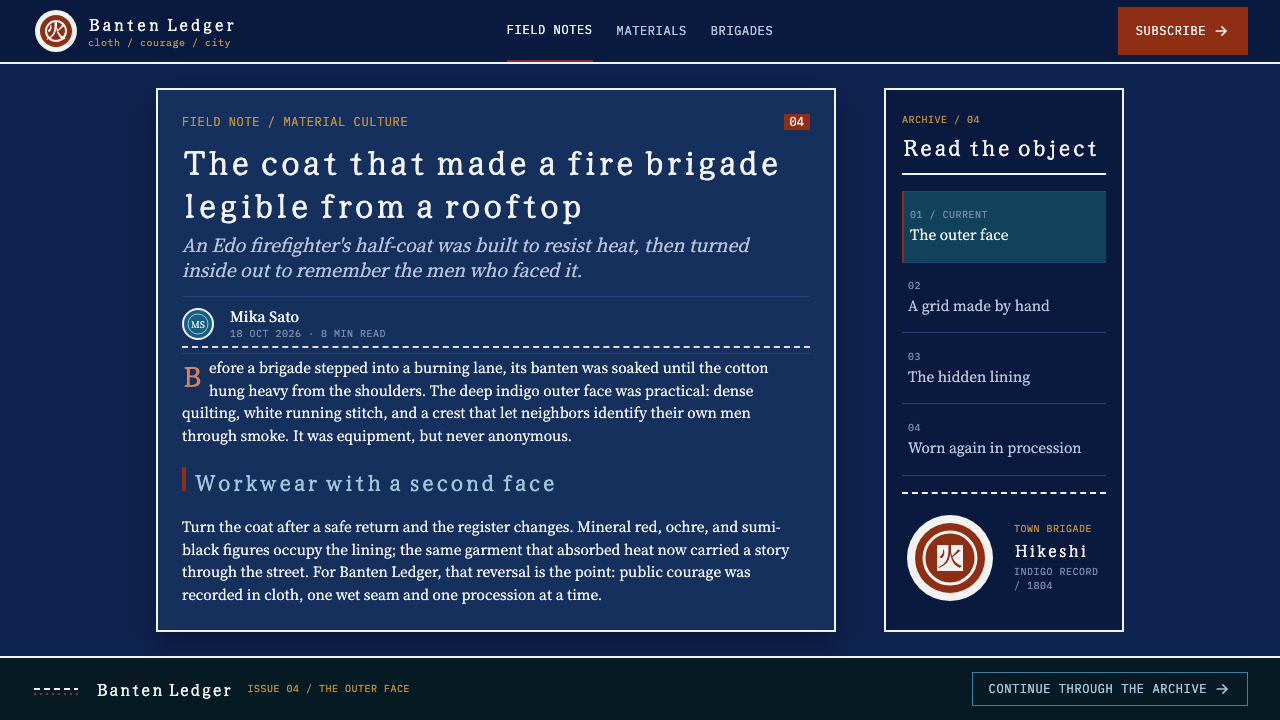
The hikeshi banten belongs to the Edo period and to the firefighting culture of Edo, today's Tokyo. The lineage dates the legal organisation of the machi-bikeshi, the town brigades, to 1718, and notes that the iroha numbering of brigades ran through the nineteenth century. Each brigade carried a name taken from the iroha, the traditional ordering of Japanese syllables, and a crest; the coat carried both. The name of Ōoka Tadasuke is attached to that organisation.
The coat's materials are an argument about work. Thick cloth soaks up water so that it can stand the heat. Indigo is applied again and again until the cloth is close to black. The quilting is sashiko, a running stitch in white thread that holds the layers together and leaves the surface covered in fine, regular lines. Water does the rest. A coat that had to be soaked before use is meant to be heavy, and the look of the working face follows from function: it was never meant to be pretty, and the soaking was a matter of survival.
Three strands run through the lineage: hikeshi firefighting culture, sashiko stitching and Edo moji lettering. The first supplies the purpose and the social order of the brigades. The second supplies the white line work that gives the dark surface its structure. The third, the heavy, confident lettering of Edo, helps explain why the crest and the syllable are cut so thick.
The inside of the coat completes the story. After a fire the man turns the coat inside out, and the lining shows a scene painted in mineral pigment and outlined in ink: warriors, dragons, kabuki figures. That reverse is the reward face, brought out at the triumphal parade. A single garment therefore has two faces with different jobs, one that works and one that is honoured, and the design style keeps that division. Working surfaces are sober, and the colour is saved.
What defines the Edo Fireman's Banten look?
Wet indigo
The ground is indigo overdyed to near-black, and it should look wet: dense, saturated, slightly lustrous where it has taken on water. The blue barely reads as blue; it reads as depth. This is a dark theme with a cloth-and-water character, heavy and absorbent, and not a neutral charcoal.
White sashiko stitch lines
White running stitch quilts the layers together. Visually it is a field of fine white dashed lines laid over the dark, giving the surface structure, rhythm and a handmade, quilted quality, a texture made of line rather than of tone. The stitching frames the crest instead of competing with it.
One oversized crest
A single brigade crest and its iroha syllable, centred on the back panel and cut thick enough to read through smoke. It is the entire graphic argument. In layout terms this means one dominating mark per composition, centred, at a scale that feels almost too large, with nothing of comparable weight beside it.
Heavy, legible lettering
Edo moji lettering is thick, confident and built to be read at a glance from a distance. Letterforms are bold and compact, with strokes that stay solid even when the sign is seen through haze. The lettering behaves more like a sign than like running text, and it works best with very few characters.
Working face and reward face
The exterior is deliberately unbeautiful: heavy, absorbent, plain. The lining, painted in mineral pigment with ink outlines and showing warriors, dragons and kabuki figures, is the vivid face, kept hidden until the work is done. The design implication is to keep the main surface sober and reserve vivid colour and illustration for earned moments.
Legibility through smoke
Because the crest had to read through smoke, contrast is built for degraded conditions: a pale mark against a deep dark, big shapes, few details. The style assumes a viewer who is far away, distracted or under stress. Anything that needs a close look to be understood does not belong on the working face.
Who shaped Edo Fireman's Banten?
The Edo magistrate whose name the lineage attaches to the organisation of the town brigades. His role ties the coat to a formal civic institution rather than a casual custom: the brigades were legally organised in 1718, and the coat's standardised crest and iroha naming belong to that order.
The town brigades, each identified by a crest and an iroha syllable, were the wearers of the coat and the reason for its graphic logic. Because a brigade had to be recognised from a distance, in smoke, at work, its identity was reduced to one oversized mark, which the design style takes as its central device.
The makers who quilted the layered cotton with white running stitch gave the coat its structure and its surface line work. Their craft is the reason the dark field is never empty: it carries a rhythm of fine white lines, and that rhythm is what the design style borrows for borders, dividers and texture.
The lettering tradition of Edo, thick and assertive, underlies the way the brigade crest and syllable are cut. It is a tradition of making marks that carry across a street or a rooftop. The style inherits its respect for solid strokes and for a handful of characters doing the work of a whole sentence.
How do you use Edo Fireman's Banten today?
Edo Fireman's Banten is a style for products and presentations that have to be seen under pressure: a dark, wet-looking surface, a field of fine white lines and one huge mark. It is bold and graphic, but its strength is function, not showiness. Used well it makes a single idea impossible to miss.
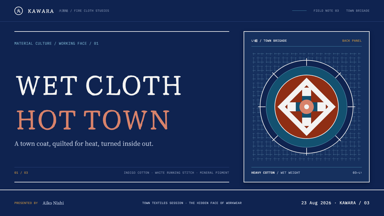
For slides, a cover works as a deep indigo-black field with one very large crest-like mark centred, a texture of white stitch lines around it and a short title in heavy lettering beneath. Content slides keep the dark ground, use thin white dashed rules as dividers, set text in pale type and give each page one large numeral or mark as an anchor. Data slides should show one hero number or one bar in white at a very large scale and keep the supporting figures small. The reward face can be saved for the closing slide, a fully coloured illustrated page that arrives after a run of plain ones.
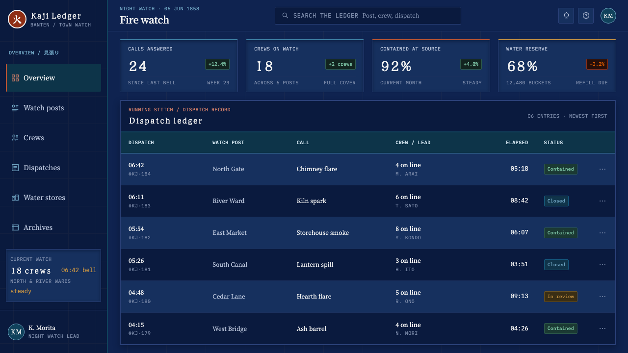
For web interfaces, the style fits tools that must feel reliable: monitoring, incident response, security, logistics and anything dealing with emergencies. A dashboard can show incident status as a large mark on a dark indigo ground, with white dashed lines as card outlines. A pricing page can carry one oversized tier name. The vivid face is best used for earned states, such as a completed deployment or a cleared queue, where an illustrated celebration appears only after the work is done. Avoid soft shadows and glass effects, since the style is damp and dense, not airy.
In editorial and marketing work, posters and packaging suit one crest-like mark at a huge scale with heavy lettering, and the hidden-lining idea translates directly into inside covers, box lids and unboxing flaps printed with the vivid illustrated face. Workwear, bags and banners are natural carriers. The principle throughout is plain outside, rich inside.
The usual mistakes are making the crest small and surrounding it with other marks, stitching lines so dense that they compete with the crest, shifting the indigo to a bright blue so that it stops reading as near-black, and using the vivid reward colours everywhere, which destroys the difference between the working face and the honoured one. The lettering must also stay legible: decorative scripts and thin strokes are the wrong tool, because the whole point is to be read through smoke.
Edo Fireman's Banten — FAQ
What exactly is a hikeshi banten?
It is the half-coat worn by the town firefighters of Edo. It is made of layers of cotton dyed deep indigo and quilted with white sashiko stitching, then soaked in water before the wearer climbed onto a roof. The outside carries a brigade crest and an iroha syllable; the inside lining is painted. The design style is based on this one garment and its two faces.
Why is the crest so large?
Because it had to be read through smoke, from a rooftop, by people who needed to know which brigade was where. At that distance a small mark is no mark at all. The style turns that necessity into a principle: one mark per composition, at a scale that feels slightly excessive, and with nothing beside it that competes.
What is sashiko, and how does it appear in the design?
Sashiko is a running stitch worked in white cotton thread, used here to quilt layers of cloth together. In the design it appears as fine white dashed lines over the dark indigo ground, used for borders, dividers and surface texture. It should be regular and quiet, a rhythm that gives the dark field structure while leaving the crest as the only loud element.
Is this a dark theme, and how dark should it be?
Yes. The ground is indigo overdyed until it is close to black, so it should read as very dark with a faint blue depth, not as a mid blue and not as pure neutral black. The intended look is wet and heavy, as if the cloth has taken on water. Keep the blue subtle enough that it reads as depth, and let the white stitching and crest provide the contrast.
How do I use the hidden lining idea in an interface?
Treat the vivid, illustrated look as a reward, not a default. Keep everyday screens sober, and bring in the colourful face when something has been earned: a finished task, a completed milestone, a first success. It can also live in places the user has to open or turn over, such as an expanded card, a back panel or a printed inside cover.
Related design styles
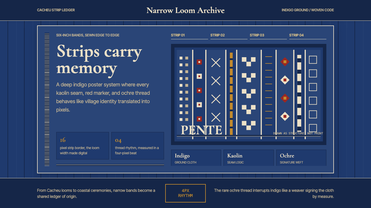 Bissau-Guinean Pano de PenteIndigo remembers. Narrow bands and kaolin seams turn weave grammar into pixel…
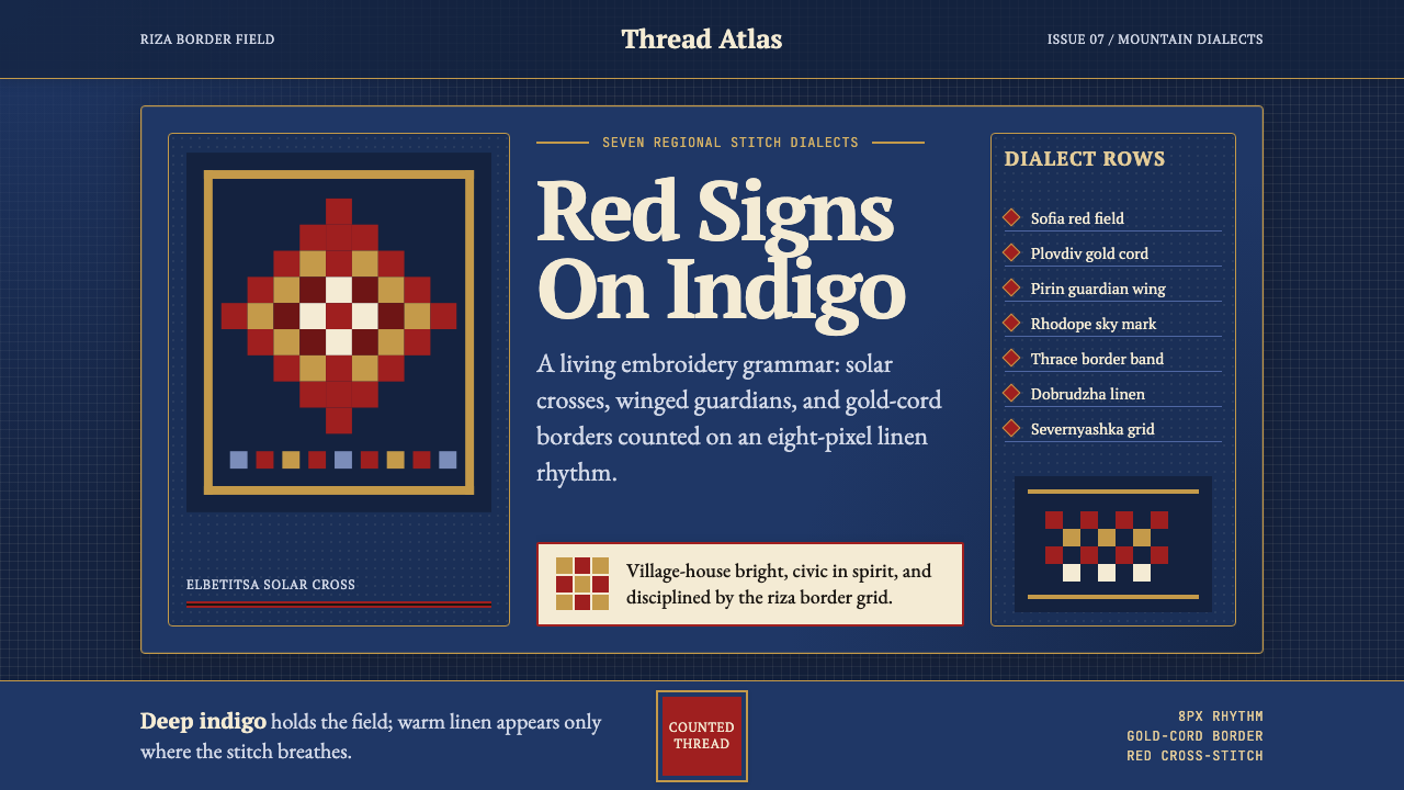 Bulgarian Shevitsa Folk EmbroideryVillage-bright code. Deep indigo carries shevitsa red crosses and gold-cord b…
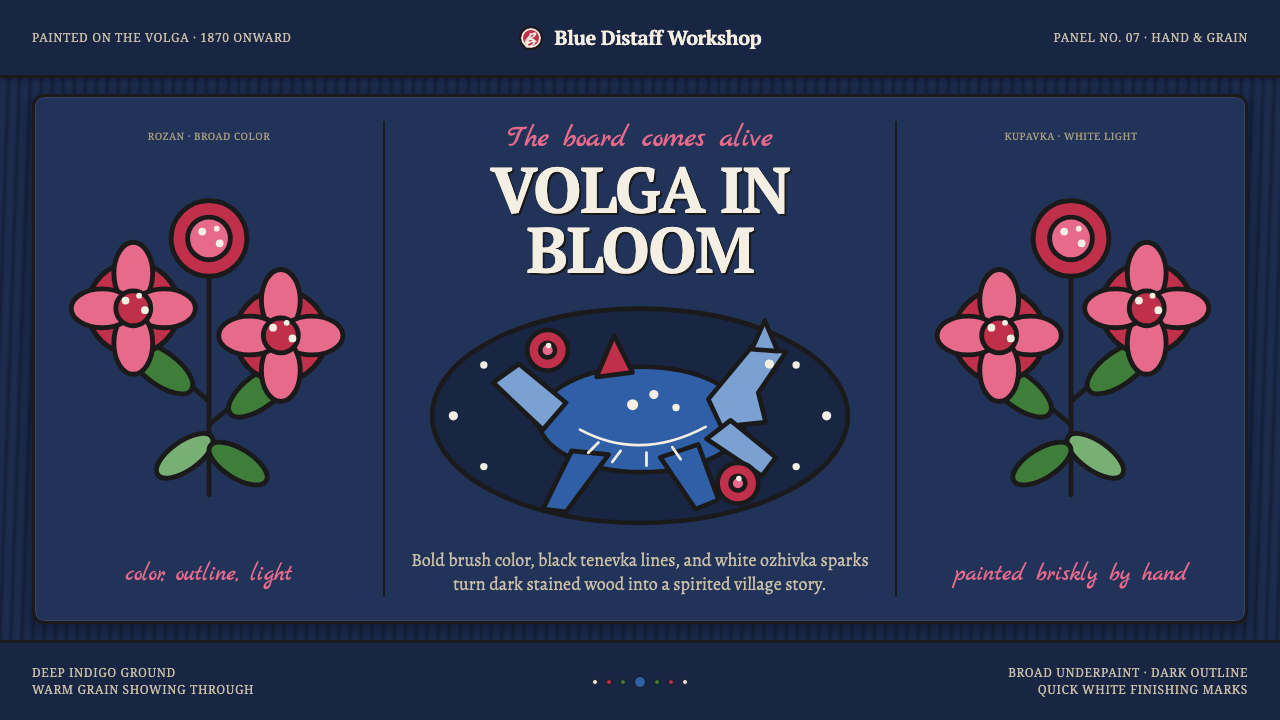 Gorodets Folk Panel PaintingFolk color moves at a gallop. Blue forms, red roses and white dots spark on i…
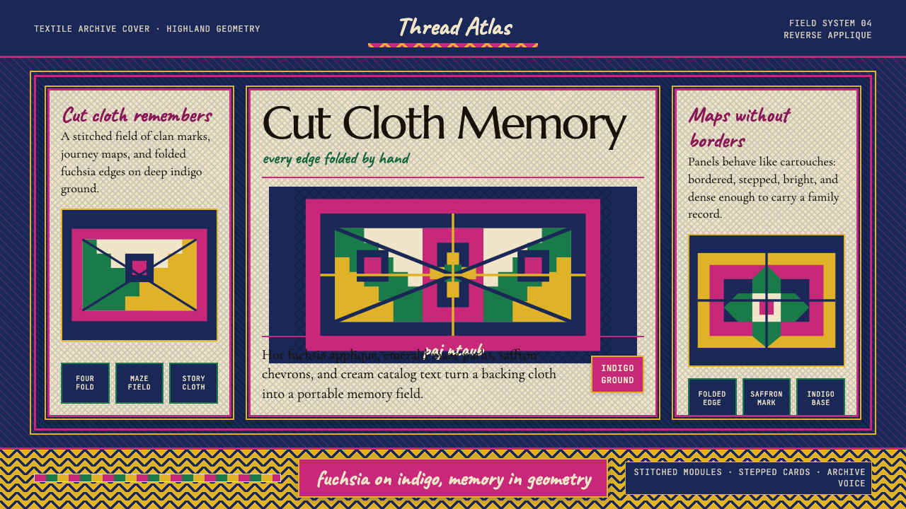 Hmong Paj Ntaub (Flower Cloth)Memory is geometric. Fuchsia applique on indigo forms stepped maze panels.
 Lao Luang Pho (Bun Bang Fai Rocket)Festival thunder rises. Cobalt sky, Caveat banners, orange rosettes, and gold…
 Mexican Día de Muertos (Marigold Ofrenda)Joy outruns mourning. Marigold orange and magenta lattice blaze on velvet pur…