What is Dynamic Island?
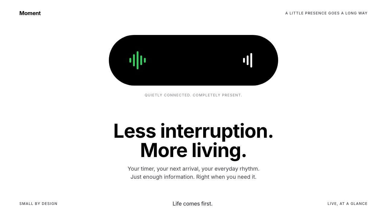
Dynamic Island turned a camera cutout into a living surface: one true-black capsule on a white screen, changing shape to say what is happening right now.
Dynamic Island in brief
Dynamic Island is the black pill Apple placed at the top of the iPhone 14 Pro in September 2022. Instead of treating the camera cutout as a hole to hide, the software wrapped it in a capsule and let that capsule act as an interface. It stretches sideways for a timer, shrinks to a dot when two activities compete for space, and drops into a large rounded card for music or a phone call.
As a design style, it keeps the iOS Light screen white and makes the capsule the only solid black object on it. Inside the island, type is white on black and colour comes only from small system glyphs. The idea is presence without interruption: information is available at a glance, and it never covers the page the person is actually using.
Motion is part of the visual identity, not an add-on. Every change of shape rides a spring, so the island feels like a soft physical object that bounces and settles rather than a rectangle that appears and disappears. Corner radii stay concentric with the screen of the phone, which is why the capsule looks like it belongs to the hardware.

Where does Dynamic Island come from?
Dynamic Island was announced on 7 September 2022, alongside the iPhone 14 Pro and iOS 16, at Apple's headquarters in Cupertino, California. The hardware story behind it is simple: the front camera and sensors needed a cutout in the display, and the cutout was smaller and more pill-shaped than the older, wider notch. A shape that could not be hidden became a shape that could be designed.
The software idea was to blend hardware and software at that exact spot. Rather than darken the area around the cutout and leave it as dead space, the interface treats the cutout and the black pixels beside it as one object that can grow and shrink. Apple's design leadership at the time, including Alan Dye, and its chief executive Tim Cook were the public faces of the product launch in which this approach was introduced.
A second ingredient arrived shortly afterwards. Live Activities opened to apps in iOS 16.1 in October 2022, giving third parties a way to show glanceable, continuously updating information such as a delivery's arrival time or a sports score. The island became the natural home for the compact form of those activities, and the lock screen carried the larger form.
In 2023 the whole iPhone 15 line adopted the island, which ended its status as a feature of the premium model alone. By then the pattern belonged to three currents in interface design at once: shape blending between hardware and software, glanceable live information, and fluid, spring-based motion. The system described here borrows from all three.
What defines the Dynamic Island look?
One true-black capsule
The island is the only solid black object on a white screen. Its black merges with the camera cutout, so the capsule reads as part of the device rather than a graphic laid on top.
White ground, light mode
The surrounding screen follows iOS Light: white, quiet, uncluttered. The strong contrast with the black capsule is what makes the island feel like a deliberate focal point.
White type, tiny colour glyphs
Inside the island, text is white on black, and colour appears only as small system glyphs. Orange suggests a timer, green a call, blue navigation and red a recording. The colour is a code, not a decoration.
Shape as information
The capsule stretches, splits into a dot, or opens into a card. The change of shape itself tells you how many things are happening and how important each one is, before you read any text.
Spring-driven motion
Every transformation overshoots slightly and settles. The bounce gives the island a sense of weight and softness, and it makes state changes feel continuous rather than abrupt.
Concentric corners
The curvature of the capsule and its cards follows the curvature of the phone screen. Matching curves is what makes software shapes feel manufactured together with the hardware.
Content avoids the centre
Because the camera sits in the middle of the island, content is arranged to the left and right of it. Leading and trailing elements balance each other around an empty centre.

Who shaped Dynamic Island?
Apple design leader at the time of the launch, associated with the human-interface direction in which the island appeared.
Apple's chief executive, who presented the iPhone 14 Pro line in September 2022.
How do you use Dynamic Island today?
In slides, Dynamic Island works as a device-first style for product launches, app walkthroughs and mobile feature announcements. A cover can be a plain white slide with a single black capsule holding the title in white. Content slides can use the capsule as a recurring header that changes width with the topic. For data slides, treat the capsule as the live number: a single metric inside the black shape, with the supporting chart in quiet greys beneath it.
On the web and in apps, the style suits status and notification surfaces: a timer, a download, a ride or delivery tracker, a now-playing control. A compact pill that expands on interaction is more useful than a banner that covers the page. Keep the surrounding interface white and calm, and let the pill be the only strong black element so that people always know where to look.
In editorial and marketing work, the style fits hardware-adjacent stories, such as explainers about live information, glanceable design or motion. Use the capsule as a recurring graphic device, animating from small to large as the story moves from headline to detail. Because the visual vocabulary is so reduced, a single well-made capsule can carry a whole campaign page.
For motion design, the style rewards restraint. Use spring easing with a little overshoot for expansion and contraction, and keep durations short enough that the interface feels responsive. Animate the shape, not a flurry of decorations around it.
The usual mistake is to multiply the black. If cards, buttons and headings all adopt the island's solid black, the capsule loses its role as the one unique object, and the page turns into a generic dark theme. Another mistake is adding colour beyond the small status glyphs; the more colour fills the capsule, the less it reads as a calm signal.

Dynamic Island — FAQ
What is Dynamic Island?
It is the pill-shaped black area at the top of the iPhone 14 Pro, introduced in September 2022. The software turns the camera cutout into a live interface that expands for timers, music and calls and shrinks when it is not needed.
When did it launch?
It was announced on 7 September 2022 with iOS 16. Live Activities opened to third-party apps in iOS 16.1 in October 2022, and the whole iPhone 15 line adopted the island in 2023.
Why is the capsule pure black?
The black merges with the camera cutout, so the capsule looks like part of the hardware. Keeping it the only solid black object on a white screen also makes it an unmistakable focal point.
How should colour be used in this style?
Sparingly and as code. Text inside the island is white, and colour appears only in small glyphs: orange for timers, green for calls, blue for navigation and red for recording.
What is the biggest mistake when copying it?
Spreading the black across cards and buttons, or removing the spring motion. The capsule works because it is unique on the page and because its changes feel soft and continuous.
Related design styles
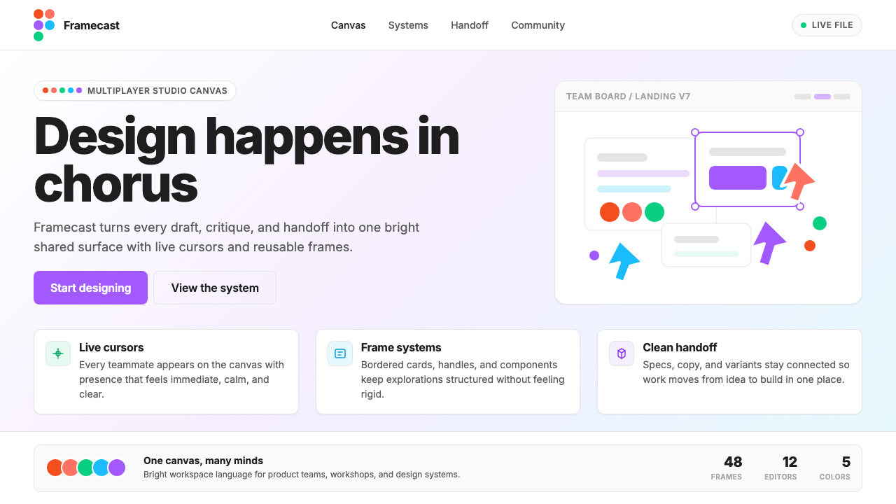 Figma 2024A brand that looks like its canvas. Five dots scatter like cursors, soft card…
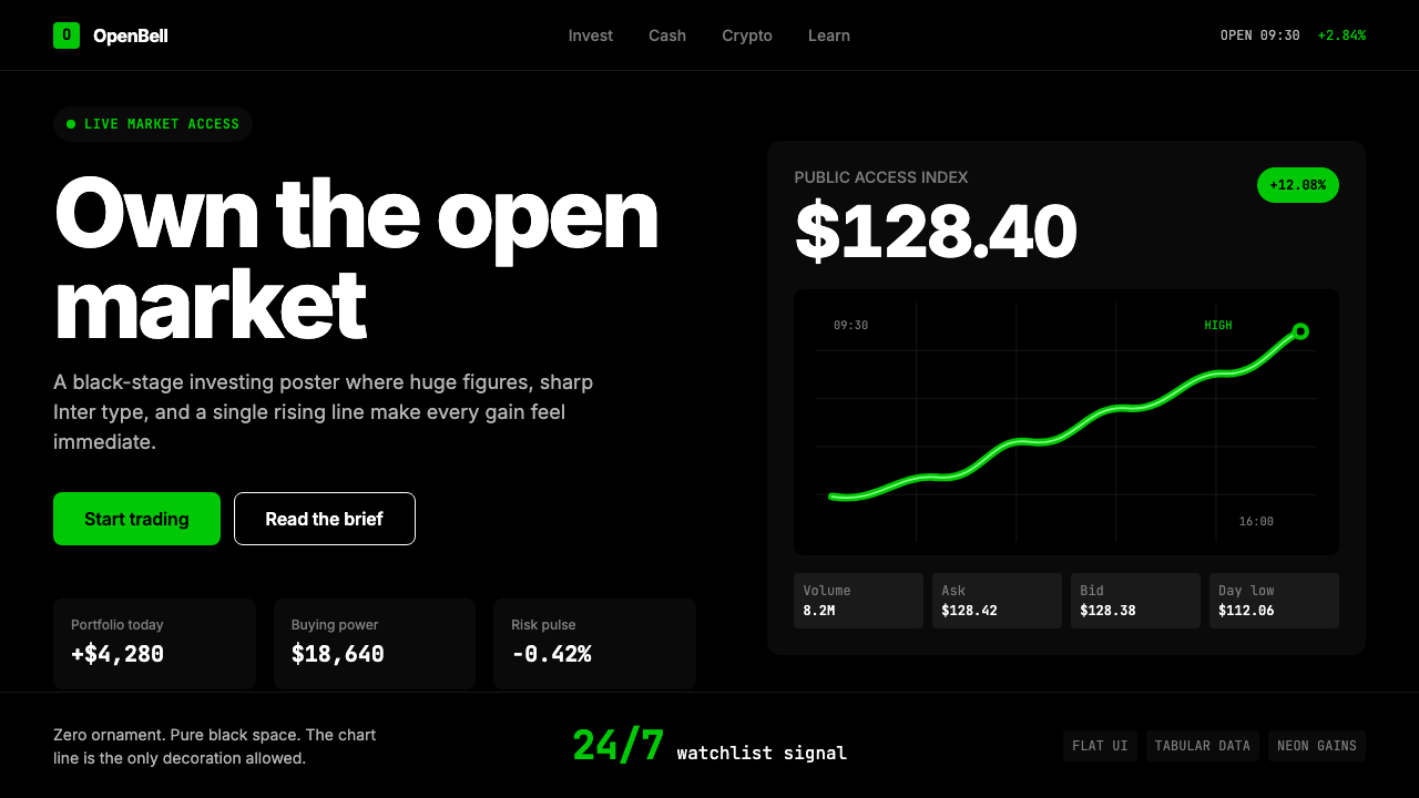 Robinhood 2023Markets feel immediate. Pure black, Inter numbers, and one neon-green line do…
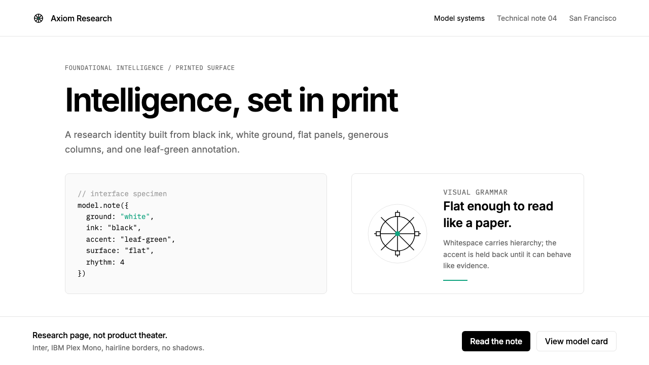 OpenAI 2024Research-grade restraint. Black-on-white Inter, flat code panels, one leaf-gr…
 Tailwind UIOne indigo button, nothing else loud. Slate type on white, with cards lifted…
 Threads (Meta)Restraint is the brand. Black Inter type, narrow feed, thin connectors, white…
 Twitter (Classic Bird)Text takes the stage. Sky blue actions, white feed stack, and hairline divide…