What is Drone Light Show?
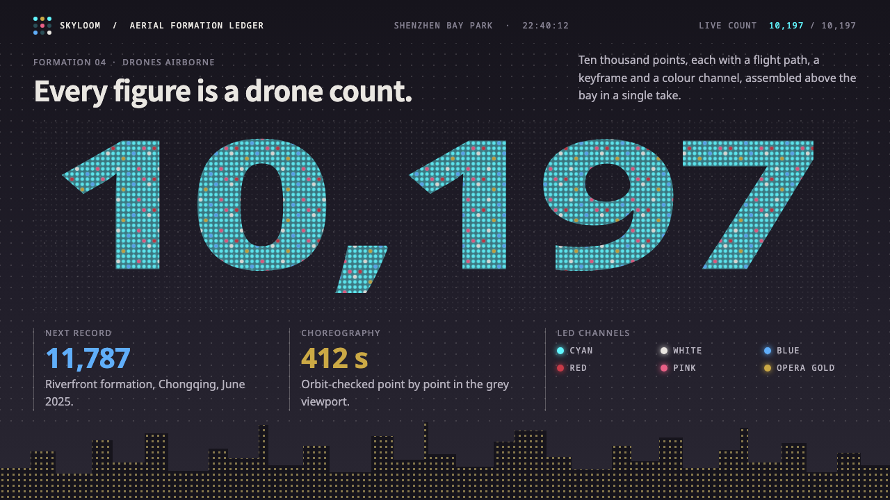
The drone light show style builds everything out of dots: every letter, face and number is a cloud of LED points hanging in a city night sky.
Drone Light Show in brief
This is a design system built from dots. Every figure, letter and number is rendered as a cloud of LED points, in the way thousands of drones draw opera masks and characters in the sky above Shenzhen Bay and the Chongqing riverfront. Instead of lines, fills and outlines, the form is made of discrete lit points that only read as a whole from a distance.
Its colour logic is that of stage lighting. LED cyan leads, and white, blue, red, pink and opera gold are assigned like the colour channels of a drone fleet, each category of information taking its own light. The ground is a dark night sky, but not a starfield: it is a purple-grey sky lifted by the glow of a lit skyline that sits along the bottom of the frame.
The system also draws the production tool into the picture. Behind the spectacle sits a flat grey Blender viewport where every point has a flight path, a keyframe and a count. This pairing of luminous spectacle and neutral preview window gives the style two registers: the dazzling output and the sober workspace that makes it possible.

Where does Drone Light Show come from?
The visual idea comes from the large-scale drone shows staged in Chinese cities in the 2020s. The background of the style names two record events: a show over Shenzhen Bay on 26 September 2024 with 10,197 drones, produced by DAMODA, and a show above the Chongqing riverfront in June 2025 with 11,787 drones. Each time the record was broken, the shows became a reference for what a swarm could draw.
The movements listed for this style describe three overlapping practices: drone swarm choreography, point-cloud aerial imagery, and night-time city light festivals. Choreography here means designing the motion of thousands of individual points so that they move together; point-cloud imagery means that the picture is not drawn but assembled from positions in space; and the light festival tradition supplies the setting, which is the city at night with its buildings lit.
The key names associated with the style are DAMODA, which staged the Shenzhen Bay record show, and CollMot Robotics. The presence of both organisations in the background reflects that the form depends on specialist technical teams, ones that plan flight paths and light colours as carefully as a film crew plans shots.
What makes this a design language rather than only a spectacle is the way it treats resolution. A drone show has a fixed number of points, so every image is a negotiation between what you want to draw and how many dots you can afford. That constraint shaped the look: simplified, bold shapes, a limited palette of light colours, and an appreciation for the moment when scattered points snap into a recognisable face or word.
What defines the Drone Light Show look?
Color
LED cyan leads the palette. White, blue, red, pink and opera gold are assigned the way drone colour channels are assigned, each one carrying a category rather than serving as decoration. The effect is of coded light: colour tells you what kind of thing a cluster of dots is, in the same way a stage lighting cue tells you what part of the show you are in.
Dot-matrix form
Every letter, figure and number is a cloud of separate points rather than a continuous stroke. The gaps between the dots are part of the look. Large numerals built from dots become the main graphic device, and they read both as numbers and as a texture of light.
Sky and skyline
The background is a purple-grey night sky lifted by city light, not a dark starfield, with a lit skyline sitting at the bottom of the frame. This grounds the floating dots in a real place and gives the composition a horizon, so the points feel like they are hanging above something rather than in empty space.
Typography
Type behaves like the show it describes. Display text is built from points, and supporting text stays plain and legible so it can be read against a dark ground. The contrast between the glowing dotted headline and the quiet working text mirrors the distance between a performance and its control room.
Tool as subject
The flat grey Blender viewport appears as part of the design language. It shows that each point has a flight path, a keyframe and a count. Including this neutral grey workspace beside the glowing spectacle makes the system honest about how the image is made and gives data-heavy screens a place to sit.
Scale and count
The idea of count is built in. Ten thousand points make one sky, so numbers such as the drone count are treated as content and as graphics at once. Interfaces in this style tend to celebrate quantity, with large figures and dense point fields that suggest crowds acting as one.

Who shaped Drone Light Show?
DAMODA produced the Shenzhen Bay show on 26 September 2024 that set a record with 10,197 drones. The show is one of the two reference events behind this style, and the organisation stands for the technical and creative teams who turn flight paths and light colours into images.
CollMot Robotics is listed among the key names connected to the style. Its presence in the background points to the specialist robotics and swarm-control side of the field, which sits behind the visible spectacle.
How do you use Drone Light Show today?
On slides, the style suits event decks, city and tourism presentations, launch announcements and anything that benefits from a sense of scale at night. A cover can place a giant numeral built from cyan dots over a purple-grey sky with a lit skyline along the bottom. Content slides can keep the dark ground and use white for body text, while data slides turn single big figures into dot-built numerals and let supporting charts sit in the neutral grey of the preview window.
In web interfaces, it fits ticketing and performance pages, city festival sites, big-screen data displays and campaign pages. A ticketing page can use cyan for primary actions and gold for premium categories, with white and blue for neutral information, and red and pink reserved for alerts or highlights. Data dashboards benefit most from the colour-channel idea: assign each series its own light colour and keep the background dark and quiet.
In editorial and marketing, it works for stories about technology and culture, especially those where a crowd of small units forms a large image. Because the point-matrix look is so recognisable, a single dotted numeral or word can carry a whole poster. It also works naturally for celebration, countdowns and anniversaries.
The most common mistake is to fill the page with dots until nothing can be read. Dots are the display language, and body text still needs to be plain and legible. A second mistake is to treat it as a starfield theme; the sky here is lifted by city light and has a skyline, which is what gives the image a place. A third is to use every colour at once, which defeats the idea of assigning colour channels to categories.
A good check is distance: squint at the page or look at it small. If the dotted forms still resolve into a clear figure while the working text beneath remains easy to read, the balance is right. If the figure dissolves or the text starts to glow, there are too many points or too little contrast.

Drone Light Show — FAQ
What is the drone light show design style?
It is a dark, dot-based visual language in which letters, figures and numbers are drawn as clouds of LED points over a purple-grey city night sky with a lit skyline. It is modelled on large drone shows in Shenzhen and Chongqing.
Which events inspired it?
Two record shows are named in its background: a Shenzhen Bay show on 26 September 2024 with 10,197 drones, produced by DAMODA, and a Chongqing riverfront show in June 2025 with 11,787 drones.
Why does the design include a grey Blender viewport?
Because the system shows both the spectacle and the tool behind it. In the viewport every point has a flight path, a keyframe and a count, and the flat grey workspace gives a neutral place for data, controls and detail beside the glowing output.
What colors does it use and what do they mean?
LED cyan leads. White, blue, red, pink and opera gold are assigned like drone colour channels, so each colour marks a category of information. The sky is a purple-grey lifted by city light.
Where does it work best?
It suits ticketing and performance pages, city festivals, big-screen data displays, launch events and any interface that wants a sense of many small points forming one image.
Related design styles
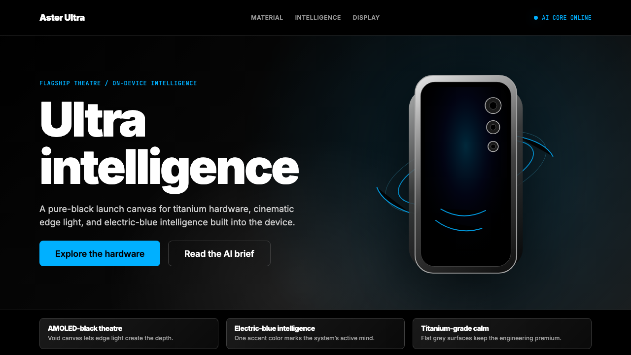 Samsung GalaxyTech-luxury goes black. Electric blue cuts through AMOLED void and titanium-g…
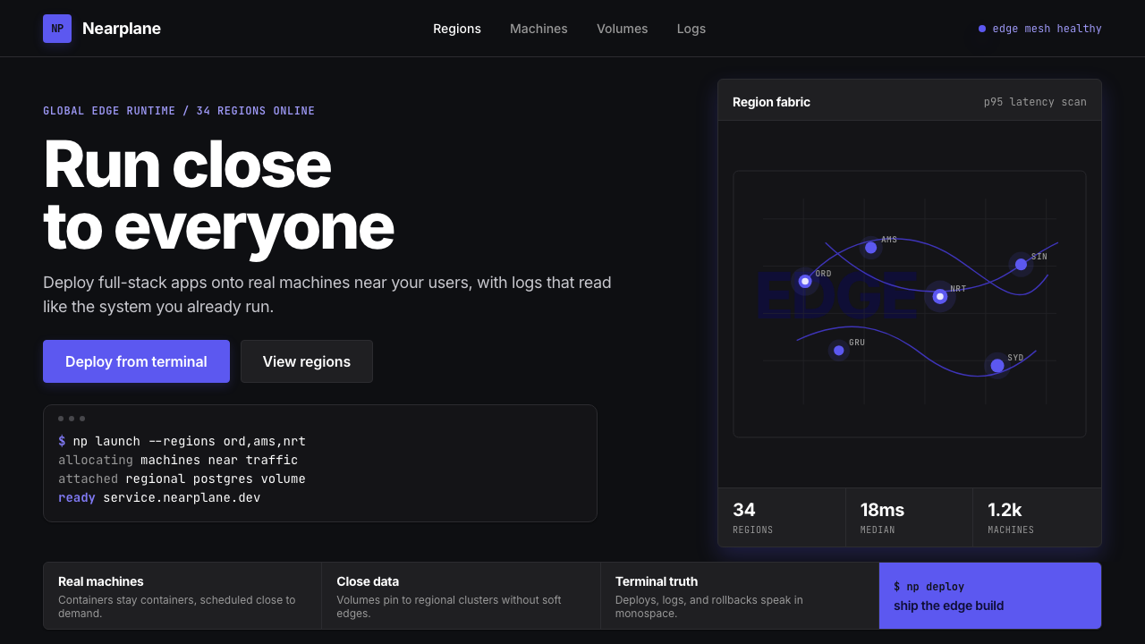 Fly.io Edge-Compute PurpleEdge-cloud with discipline. Electric purple nodes, Inter type, and terminal b…
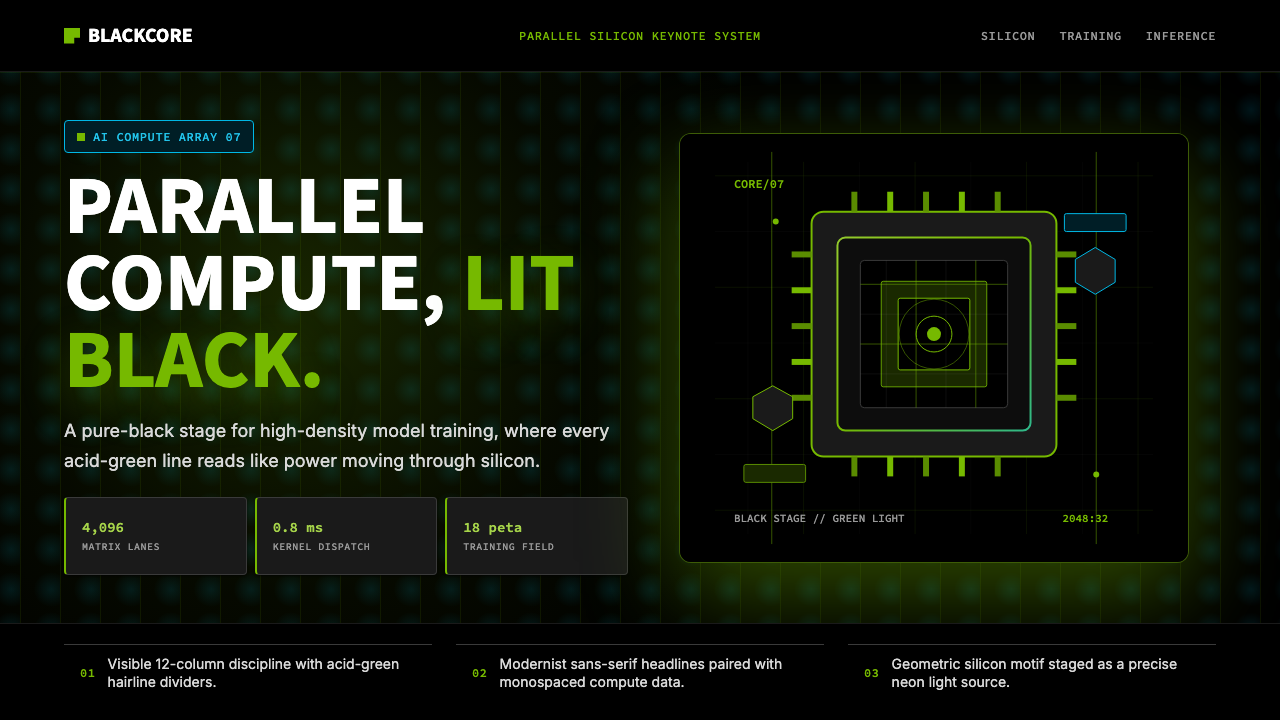 NVIDIA GPU Green-BlackPure black turns compute theatrical. Acid green hairlines and chip geometry s…
 Edgerunners NeonNeon overload. Fluorescent yellow, cyan HUD grids, and magenta glitches burn…
 GlassmorphismDepth becomes the texture. White glass blurs violet, magenta, and electric bl…
 TenetTime runs both ways. Slate concrete split by a turnstile axis: red flows forw…