What is Drone Delivery Dispatch?
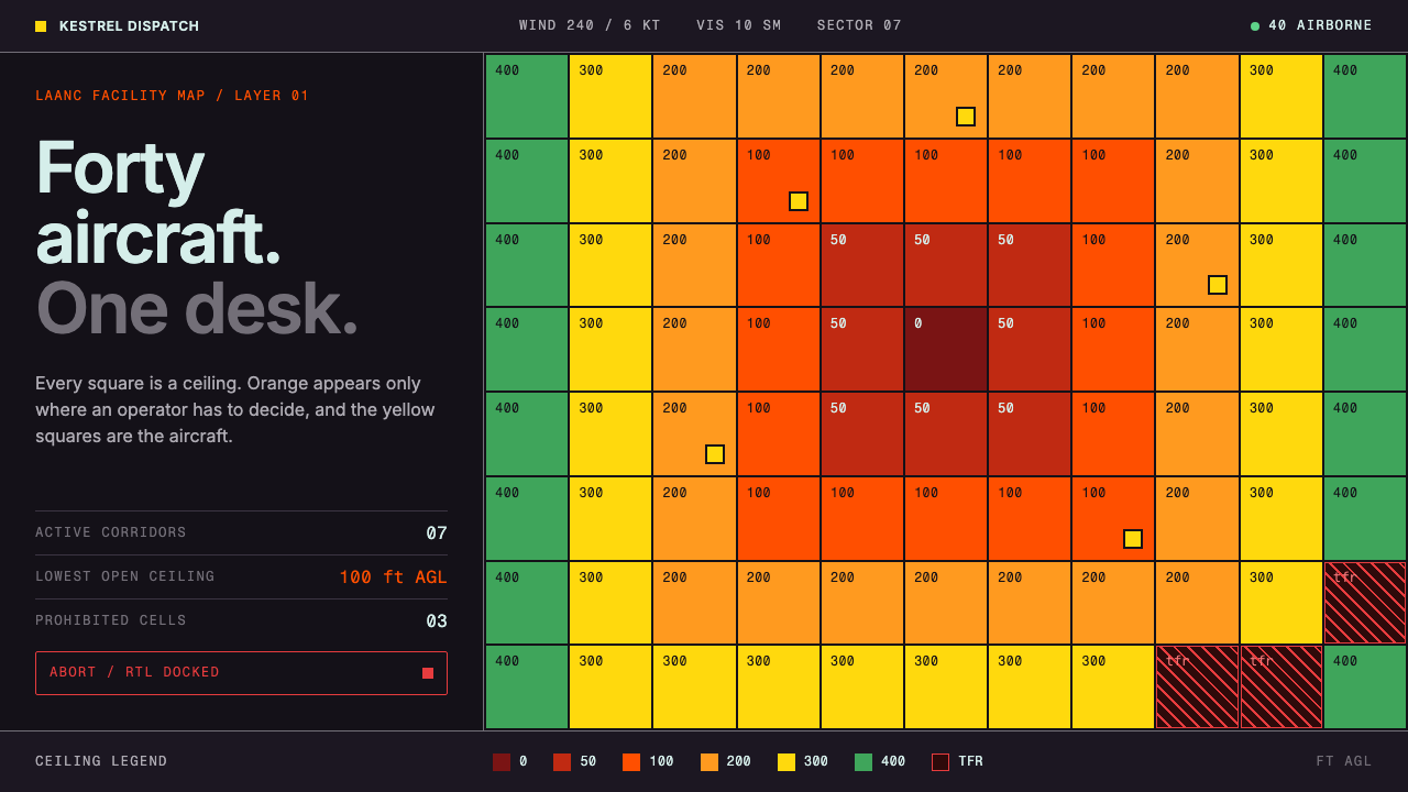
Drone Delivery Dispatch is a design for the person watching forty aircraft at once: a plum-black operations console where the airspace ceiling grid is the map and orange is reserved for human decisions.
Drone Delivery Dispatch in brief
Drone Delivery Dispatch is a speculative interface style: the desk a city operator sits at when forty aircraft are airborne at once. It is a dark, instrument-like console built on a plum-black ground, with aircraft marked in an aircraft yellow, the ceiling grid of the US Federal Aviation Administration’s UAS Facility Map laid underneath as the basemap, and International Orange reserved for anything that needs a human to decide. It is a projection to a 2035 city dispatch desk, assembled from sources dated 2014 to 2023.
The central idea is that this is instrumentation, not marketing. Most delivery interfaces show a customer one parcel and a progress message. This one shows an operator many aircraft and a set of obligations. There are no little parcel icons and no reassuring order-on-its-way sentences. The page exists so that someone can see what is flying, what airspace it is flying through, and what is waiting on a person to approve or refuse.
The layout reads like a control room. On the left, a fleet table in a monospaced face lists aircraft row by row. In the middle, an airspace map with stacked layers can be switched on and off one at a time, with a legend in feet above ground level. On the right, a mission panel shows the selected flight and an authorisation block modelled on a request for low-altitude airspace approval. The emergency abort control is set apart from every other control, so it can never be mistaken for one of them.

Where does Drone Delivery Dispatch come from?
The style assembles its sources from roughly a decade of real drone-delivery history. Wing, whose roots lie in the 2014 Project Wing programme, gives it the plum-black ground, and aviation’s own convention of a bright aircraft yellow marks the machines. The Federal Aviation Administration’s Low Altitude Authorization and Notification Capability, known as LAANC and introduced in 2017, gives it the logic of the authorisation panel: a request to fly in a given block of airspace is approved or refused against a published ceiling. OpenSky in 2021 and the scaling of flights beyond the operator’s line of sight in 2023 complete the timeline and explain why dispatch, rather than piloting, became the central task.
Two kinds of operator stand behind the look. Wing flies in the United States, Australia and Finland, and Zipline flies in Rwanda, Ghana, Nigeria and the United States. The geographic spread matters because it shows that the problem is not local. Wherever an aircraft carries a parcel, someone has to decide whether the sky above a given street is free, whether a flight is within its permitted height, and what to do when something goes wrong. The interface is the common answer, abstracted from any single country’s rules but shaped by the American airspace maps that supply its basemap.
The visual language comes from an older discipline. Aviation operations rooms have a long tradition of dark surfaces, monospaced readouts and colours that mean something rather than decorate something. The theme also draws on the high-visibility colour standards used in American aerospace finishes, which is where International Orange and aircraft yellow come from. Orange has been the colour of things that must be seen and acted on in aviation for decades, and the style uses it with that same discipline: orange means that a person needs to look.
The 2035 in the name is deliberate. The theme is not a screenshot of a product that exists today, but a design extrapolation of what a city-scale dispatch desk would need once many aircraft share the sky above ordinary streets. The question it answers is practical: when flights are routine, what does the interface look like for the human who remains responsible? The answer is calm and dense, with few colours and a clear rule for when each appears.
What defines the Drone Delivery Dispatch look?
Plum-Black Ground
The page sits on a deep plum-black rather than a neutral black. The slight warmth, borrowed from Wing’s own web presence, keeps long shifts easy on the eyes and sets the console apart from the cold blue-black of generic dark dashboards. Surfaces step up from the ground in small increments, so panels read as layers of the same instrument rather than as separate cards.
The Ceiling Grid
The basemap is the FAA’s UAS Facility Map: a patchwork of square cells, each shaded by the maximum height at which an aircraft may fly there. Shading moves from a dark red where the ceiling is at ground level, through the intermediate heights, to green at the 400 ft limit. The grid is both map and legend. A viewer learns the sky’s rules just by looking at the colour of the cell beneath an aircraft.
Colour Means Something
Aircraft are marked in aircraft yellow. International Orange is reserved for what a human has to act on: dispatching a new order, the route currently selected, and airspace below the lower ceiling band. Because orange is never used for decoration, the eye learns to treat any orange element as a prompt. A page full of orange would be useless, so the system’s main discipline is how sparingly it is used.
Monospaced Fleet Rows
Aircraft are listed in rows set in a monospaced face, so identifiers, altitudes and statuses line up in columns that can be scanned vertically. A row is one aircraft; a column is one question. The monospacing is not a nostalgic gesture but a practical one: when forty items change at once, alignment makes the changes visible without reading each number.
Stacked Airspace Layers
The central map is built from layers that can be toggled one by one: ceiling grid, active routes, aircraft. A legend states heights in feet above ground level, the unit pilots and regulators use. Layers are stacked with a clear order so that turning one off never leaves the others unreadable. The operator controls the amount of information, not the system.
The Authorisation Panel
On the right, the authorisation block mirrors the structure of a LAANC request: where, how high, for how long, and with what outcome. It reads like a form that has already been filled in, awaiting a decision, with approval and refusal as clear alternatives. By borrowing the shape of a real regulatory request, the interface makes the regulatory step feel like part of the workflow rather than an obstacle outside it.
The Isolated Abort
The emergency abort control is placed well apart from everything else and is never grouped with routine buttons. Distance, not colour alone, is what protects it from accidental use, and it is also what makes it findable when a person is under stress. The principle comes from aviation panels, where the controls that matter most are separated, guarded and unambiguous.

Who shaped Drone Delivery Dispatch?
A name tied to the Project Wing period, the 2014 effort that gave this style its plum-black ground and aircraft yellow. Project Wing established that a small aircraft could carry an ordinary parcel to an ordinary address, and with it came the question that dispatch interfaces now try to answer: who supervises the aircraft, and with what tools? He appears here as a representative of the engineers who turned delivery by drone from a demonstration into a system.
Co-founder of Zipline, whose aircraft operate in Rwanda, Ghana, Nigeria and the United States. Zipline’s presence in the record is a reminder that drone delivery at scale did not begin only in wealthy suburbs. Operating a fleet across several countries and regulators makes dispatch the real work, and it is the kind of operation this console imagines: many aircraft, many authorities, one desk.
Co-founder of Zipline alongside Keller Rinaudo Cliffton. With him the story of drone delivery acquires its second strand, a logistics operation built around reliability and scale. In design terms that strand explains the console’s emphasis on rows, status and exceptions: when a fleet is reliable most of the time, the interface must make the rare problem unmistakable among hundreds of normal flights.
The US regulator whose UAS Facility Map supplies the basemap and whose LAANC system supplies the logic of the authorisation panel. Not a designer in any ordinary sense, but the author of the grid on which the entire interface is drawn. The style treats the regulator’s map not as an obstacle to hide but as the most truthful picture of what the sky allows, and builds everything else on top of it.
How do you use Drone Delivery Dispatch today?
Drone Delivery Dispatch is an operations style. It suits any interface in which a person supervises many moving things, answers to a regulator or an operations manager, and must be able to find the one item that needs attention. It is not a consumer style, and applying it to a customer-facing parcel tracker misses the point of the system.
For presentation slides, the style works well for logistics, infrastructure and aviation topics, and for any talk about operations at scale. A cover can show a dark field with a single ceiling-grid fragment and a short title in a monospaced face. Content slides should use dense but ordered layouts: a table on the left, a map or diagram in the middle, a short list of decisions on the right. Data slides benefit from the colour discipline: use the grid ramp for height or risk, aircraft yellow for the thing being measured and orange only for the item that needs a decision.
For web interfaces, it is the natural choice for operations dashboards, fleet monitoring, observability tools, incident consoles and internal admin panels. Use a dark ground, monospaced tables, a map or schematic with toggleable layers, and a side panel for the selected item. Keep a visible, separate place for destructive actions. Pricing pages and marketing sites are a poor fit, though a restrained developer-facing landing page can use the same palette to signal seriousness.
For editorial and marketing work, the style supports technical explainers, white papers and conference materials about aviation, robotics and logistics. A feature article can present diagrams of airspace layers in the grid palette, with captions in a monospaced face and orange used for a single annotated decision point. Product marketing for B2B operations software can borrow the palette and layout language while writing in plain, specific sentences about what the operator can see and do.
The most common mistake is to use orange as a general accent. Once orange appears on decorative buttons, tags or headings, it stops meaning decision and the whole system loses its logic. A second mistake is to add friendly consumer touches: parcel icons, progress bars with encouraging text, rounded and playful illustrations. The tone is operational, and warmth works against it. A third is relying on the red-to-green ceiling ramp alone to carry meaning; always pair it with a height label so that colour-blind users and printed copies are not left guessing.

Drone Delivery Dispatch — FAQ
Is this a real product or a real company’s interface?
No. It is a design extrapolation, a projection to a 2035 city dispatch desk built from public sources dated between 2014 and 2023. It borrows ideas from Wing, Zipline, the Federal Aviation Administration’s maps and the LAANC authorisation model, but it is not an official interface of any of them. Treat it as a way of thinking about operator tools, not as a copy of anyone’s software.
Why is orange only for decisions?
Because an operator watching many aircraft must be able to find, in a glance, whatever needs a human. If orange marks only the next dispatch, the selected route and the lowest airspace band, then a patch of orange anywhere on the screen means someone should look. Using it for anything else would turn an alert into a decoration and slow the one thing the console is meant to make fast.
Why is the interface dark?
Dark surfaces come from the long tradition of aviation operations rooms, where screens are watched for hours and coloured marks must stand out against the background. A deep plum-black ground keeps eye strain low and lets a small amount of yellow, orange and the grid’s colours carry meaning. A light version is possible but loses the sense of an instrument panel, and the colour ramp would need to be rebalanced.
Can I use it for a consumer delivery-tracking page?
It is not designed for that. A customer wants reassurance about one parcel, and this style deliberately avoids parcel icons and friendly progress language. It is built for the person responsible for many aircraft. If you want a consumer tracker, take only the underlying principles, such as sparing colour and a clear status vocabulary, and choose a warmer visual style for the surface.
How should I handle accessibility with a red-to-green ramp?
Never let colour carry the meaning alone. Pair every shaded cell with a height label or pattern, keep the legend visible, and give statuses text labels in the fleet table. The ceiling grid is useful partly because it is quick to read, but a colour-blind operator should be able to get the same information from the numbers. The monospaced tables are what make this practical.
Related design styles
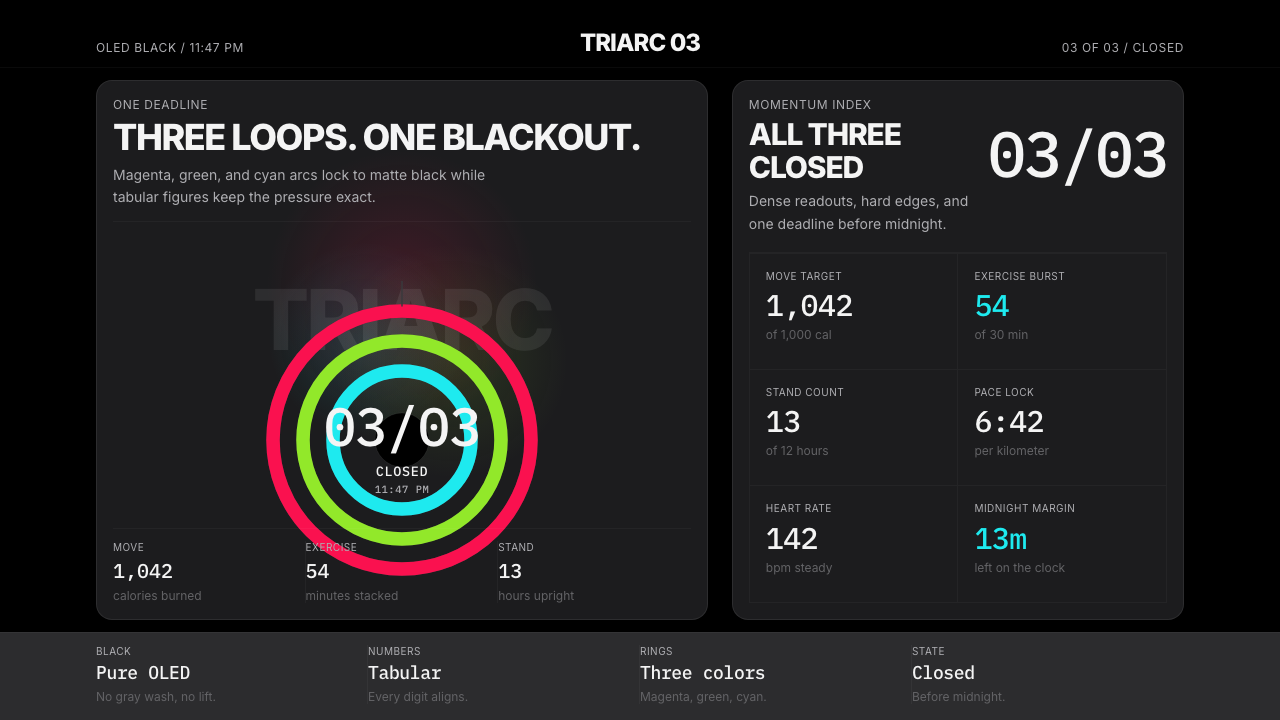 Apple Fitness Rings Closed (2024)Midnight feels exact. Magenta, green, and cyan rings lock onto OLED black.
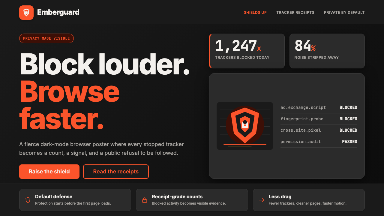 Brave Browser Lion OrangePrivacy gets loud. Lion-orange counters and shield geometry cut through warm…
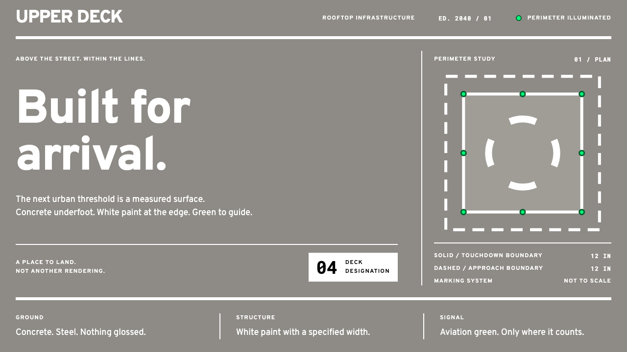 eVTOL VertiportEvery mark has a purpose. Wide white paint on concrete grey; aviation green s…
 F1 Formula One LiverySpeed is legible. Ferrari red and papaya speed-lines cut through black teleme…
 Fly.io Edge-Compute PurpleEdge-cloud with discipline. Electric purple nodes, Inter type, and terminal b…
 NVIDIA GPU Green-BlackPure black turns compute theatrical. Acid green hairlines and chip geometry s…