What is Dan Flavin?
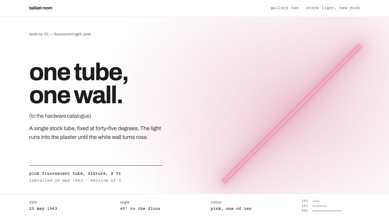
Dan Flavin's style lights one tube on one white wall: a pink halo around a diagonal bar, lowercase grotesque titles and typewriter captions that read like a gallery certificate.
Dan Flavin in brief
The Dan Flavin style is a design language drawn from the American artist's fluorescent light works. In 1963 he fixed a single gold fluorescent tube to a wall at a diagonal and titled it the diagonal of May 25, 1963. For the next three decades he worked almost entirely with standard commercial fixtures in a small range of stock colours, and made the light itself, not the object holding it, the artwork.
Translated to a screen, the page becomes the white gallery wall. Each view is carried by one coloured line, a hard straight bar of light, whose glow spreads softly into the margins and corners so that the white around it looks tinted. Typography is minimal: lowercase titles in a plain grotesque, often with a dedication in parentheses, and dates, dimensions and edition numbers in a typewriter face, like the certificate that accompanies an artwork.
The overall effect is restrained, quiet and a little ceremonial. White space is more important than ornament, and each screen has exactly one event. Nothing competes with the line, and the page feels like a room rather than a poster.

Where does Dan Flavin come from?
Dan Flavin worked in New York, and his first fluorescent piece dates from 1963. The tube he used was bought as ordinary hardware and left unaltered. By choosing a mass-produced object, he joined a wider move in the 1960s away from the hand-made gesture and toward the industrial readymade, an approach that stripped authorship down to selection and placement. Through the 1960s he named works as dedications, often to friends and artists, which gave a cold, impersonal material a personal and elegiac tone.
His peers and influences shaped the language. Donald Judd, a fellow Minimalist and close friend, shared his belief that a work should be a plain fact rather than a representation. Jasper Johns, whose art repeatedly used familiar objects and flags, belonged to the same moment of questioning what counted as art. From 1964 Flavin made a series of monuments for the Russian constructivist Vladimir Tatlin, using tubes arranged like an ascending tower in homage to Tatlin's unbuilt monument to the Third International.
The movement behind the work was Minimalism, together with the broader New York scene of light and space in the 1960s. These artists made work in which the room, the viewer's position and the quality of light mattered as much as the object. In Flavin's pieces, the glow is the real material. It falls on the wall, floor and ceiling and leaves the viewer standing inside a coloured atmosphere.
Flavin continued working until 1996. Later projects included the large permanent installation in Marfa, Texas, completed in 2000 at the Chinati Foundation, and a church project at Bridgehampton on Long Island. Those late works show the same discipline as the first tube: a standard fixture, a clean line, a space transformed. That consistency is what the design style translates into a screen, where one line of colour on a white page can still feel like a whole room.
What defines the Dan Flavin look?
Color
The ground is plain gallery white. A single saturated colour, here a soft pink, appears as the line and as a faint halo that spreads across nearby surfaces. Because there is only one hue per screen, colour reads as light rather than as paint. Other screens can switch the hue, but never mix several in one view.
The line
A hard, straight bar sits at a diagonal, often leaning from the lower left toward the upper right. It has no taper, no texture and no ornament. It is the only graphic event on the screen, so its position and angle carry the whole composition.
Glow
Light spills from the tube across the wall and into the corners, tinting the white. The glow is soft and wide while the tube stays sharp, and that contrast of hard line and diffuse light is the signature effect of the style.
Titles
Titles are set in lowercase in a plain grotesque sans-serif, with a dedication in parentheses. The lowercase and the dedication together give a modest, personal voice that feels like a gallery label rather than a headline.
Captions
Dates, dimensions, edition numbers and credits use a typewriter face, as on an artwork certificate. This documentary layer gives the page an archival, authentic quality and balances the lightness of the visual.
Space
Margins are generous and layouts are almost empty. Only one element is allowed to be active at a time. The silence of the white page is a core ingredient, not an absence.

Who shaped Dan Flavin?
American artist who from 1963 made works only from stock fluorescent fixtures and coloured light.
Minimalist artist and close friend whose belief in plain, factual objects shaped Flavin's context.
Contemporary artist whose use of familiar objects belonged to the same 1960s questioning of what art could be.
Russian constructivist honoured in Flavin's series of monuments from 1964.
How do you use Dan Flavin today?
In slides, the style suits art, architecture, design-studio and cultural-institution presentations. A cover slide can show a single pink diagonal bar with a soft halo on a white page and a lowercase title below. Content slides should keep one idea each, with a short headline in lowercase and a typed caption underneath. Data slides work when a single figure or a single chart line is allowed to be the light, with the rest of the page left white.
In web interfaces it fits portfolio sites, gallery and museum pages, architecture practices, boutique brands and any product that wants calm. The light line can serve as a hero element, a scroll progress bar or a divider, with its halo as a gentle hover state. Keep navigation minimal and typographic. The typewriter face is good for dates, prices, specifications and edition details.
In editorial and marketing work, the style is ideal for exhibition announcements, catalogues, invitations and quiet luxury brand pages. Each spread can have one luminous line and one caption. The dedication-in-parentheses device is a lovely way to name a collection or an issue and give it a personal voice.
The common mistake is to add more light. Several tubes, several colours or multiple glows make the page look like a nightclub rather than a gallery, and destroy the one-event rule. The second mistake is to fill the white: stock photography, borders and decorative icons break the quiet. The third is raising the glow too high; it should tint the white slightly, never turn it into a coloured background.

Dan Flavin — FAQ
What is the Dan Flavin design style?
It is a minimalist style based on Dan Flavin's fluorescent light works: a white wall-like page, a single coloured diagonal line with a soft glow, lowercase titles and typewriter captions.
When did Flavin begin using fluorescent tubes?
In 1963 he mounted a single gold tube at a diagonal on a wall, and he continued working with standard fluorescent fixtures until 1996. His permanent installation at Marfa was completed in 2000.
Why does each screen have only one line?
The rule of one event per view recreates the experience of a single tube in an empty gallery. It keeps attention on the glow and the white space, which are the real subject of the style.
Which projects suit it?
Art, architecture and museum sites, design-studio portfolios, exhibition invitations and quiet luxury or boutique brands. It is less suited to dense, busy or promotional layouts.
Can I change the colour of the line?
Yes. Flavin worked with several stock colours, so you can change the hue from screen to screen, but keep one hue per view so the colour continues to read as light.
Related design styles
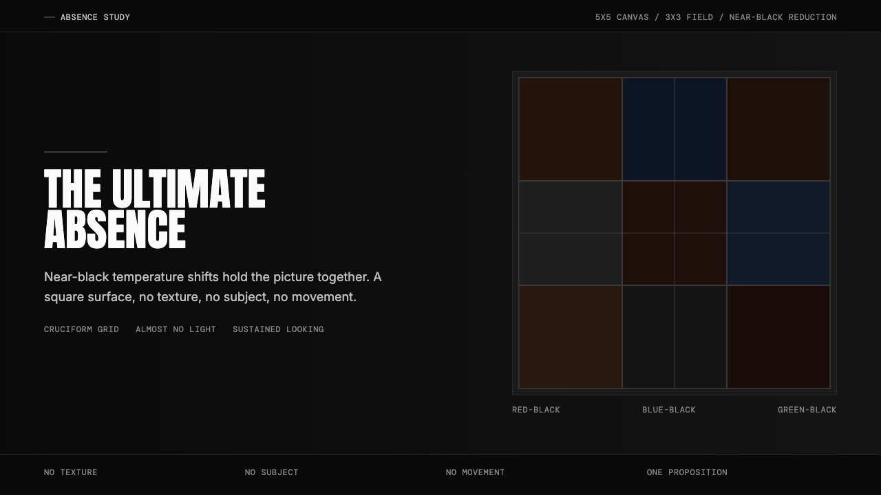 Ad Reinhardt Black Painting (1953)Austere absence. Near-black grid shifts reveal structure on sustained looking.
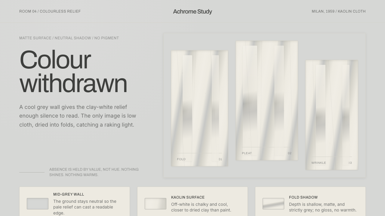 Piero Manzoni AchromeColour withdrawn. Kaolin off-white reliefs on mid-grey cast cool fold-shadows.
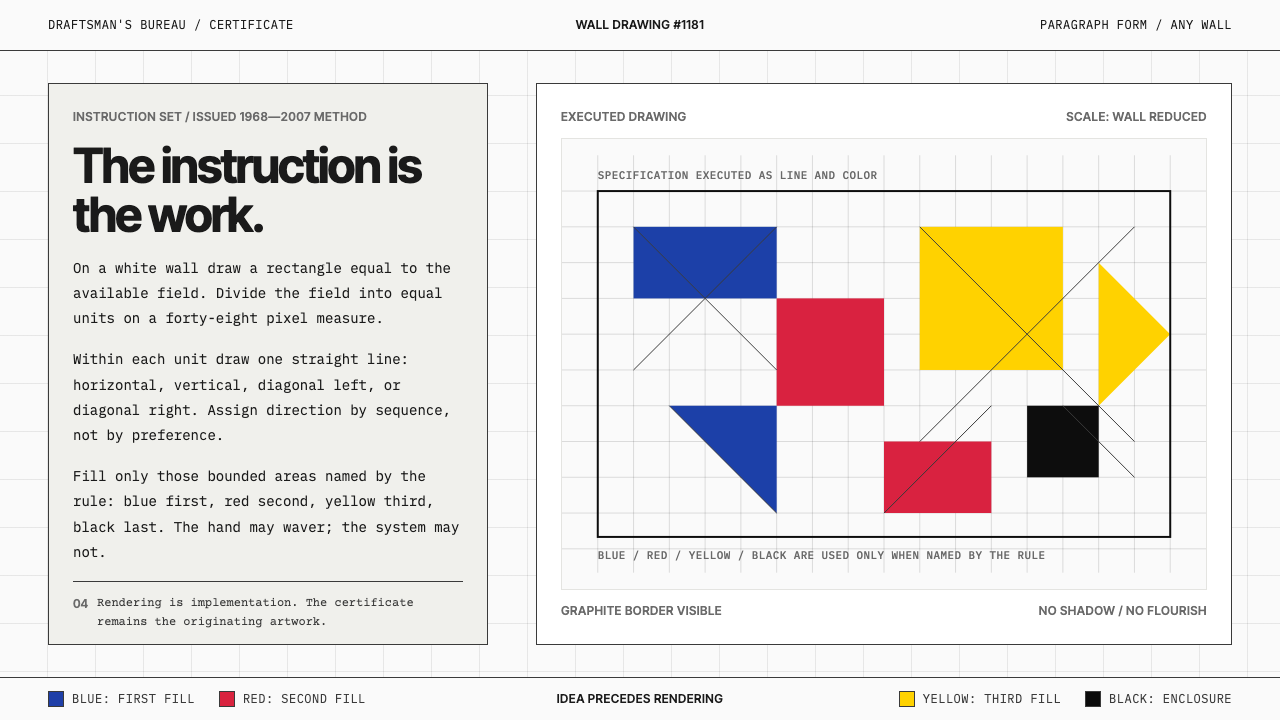 Sol LeWitt ConceptualInstruction becomes art. Mono certificates face wavering graphite grids in fo…
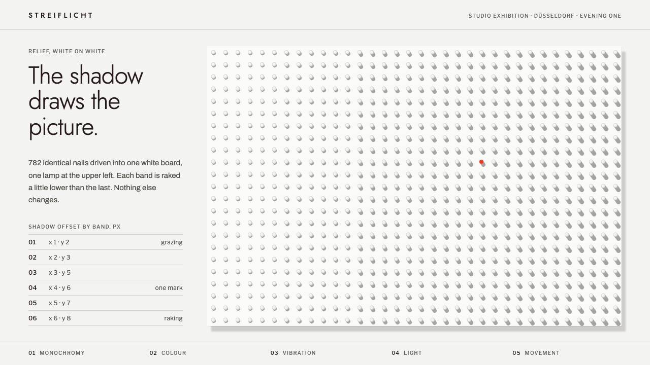 ZERO GroupShadow draws the picture. White nail field raked by one lamp, one vermilion m…
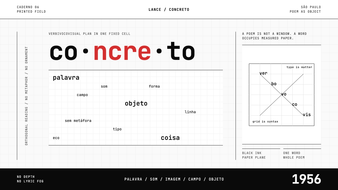 Brazilian Concrete PoetryWords become objects. Monospace cells, black-white paper, one cadmium red rup…
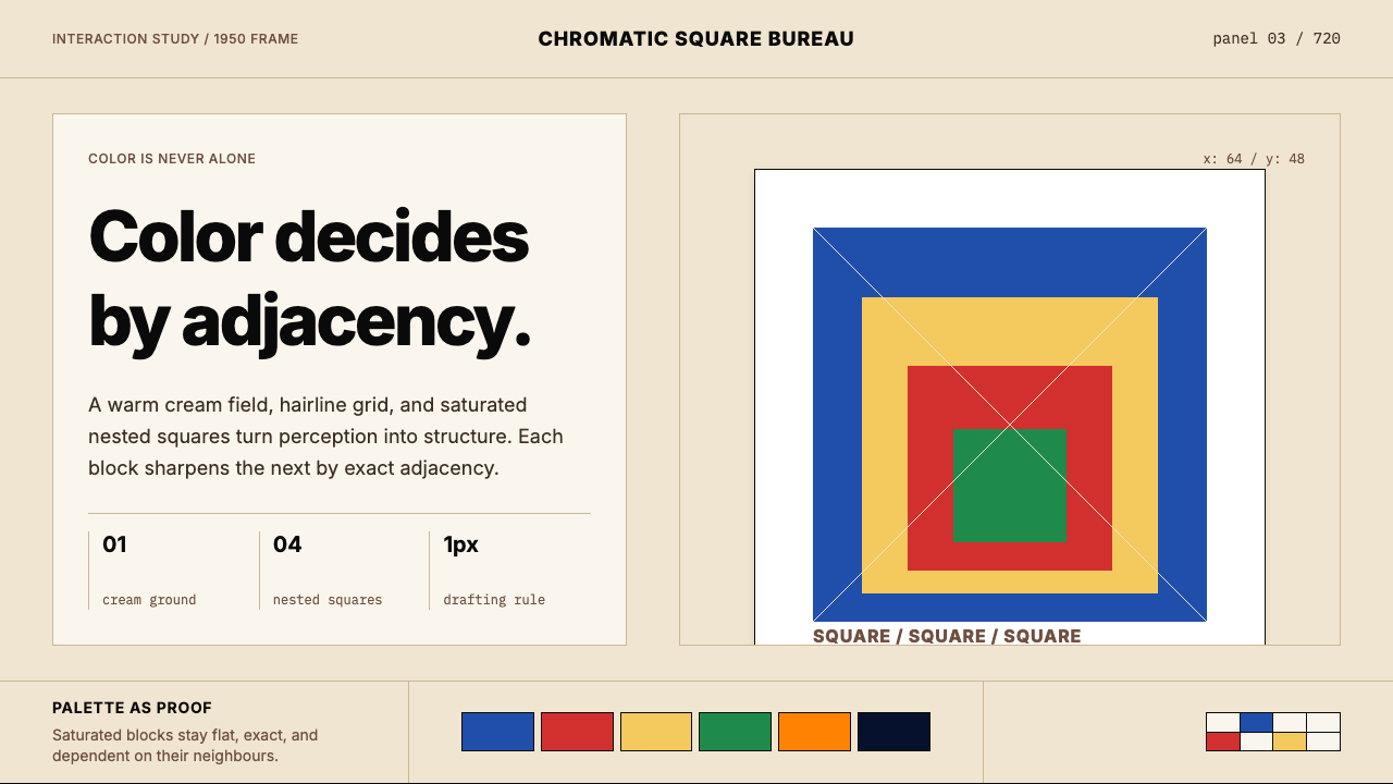 Josef Albers — Homage to the SquareColor becomes event. Warm cream, cobalt-red-yellow nested squares, exact hair…