What is Velodrome Track?
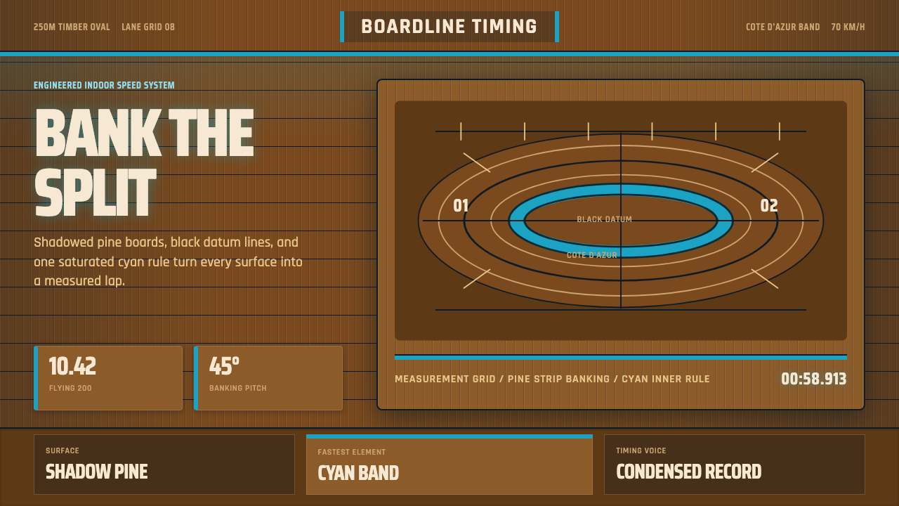
Velodrome Track takes the modern indoor cycling track — steep shadowed-pine bankings, one cyan measuring band, black datum lines — and turns speed itself into something engineered, measured, and drawn.
Velodrome Track in brief
Velodrome Track is built from the physical anatomy of the modern indoor cycling track: a steeply banked oval assembled from thousands of thin strips of dense pine, its timber deepened by shadow and repeated use into a warm, muted tone rather than a raw, pale wood look. Running near the inside rail is a single band of saturated cyan — the track's traditional measurement line, informally nicknamed for its resemblance to the blue of the French Riviera coast — and black datum lines trace the track's key distances and lanes the way a surveyor's marks trace a boundary.
Everything about the visual grammar answers to one demand: the track exists purely to be fast, safe, and precisely measurable, and nothing on its surface is there for any other reason. The curve of a banking, the position of a line, the color of a band — each one encodes a specific piece of information a rider or official needs at speed, not an aesthetic choice made for its own sake. Condensed, high-impact numerals read like a split time flashed on a finish-line clock, built for instant legibility at a glance rather than leisurely reading.
The overall feel is engineered rather than romantic. Where other sport-derived aesthetics linger on crowd energy or team color, this one stays close to the empty track itself — timber, line, and one cool accent color — because the velodrome's own physical logic already supplies more structure and drama than decoration ever could.
Where does Velodrome Track come from?
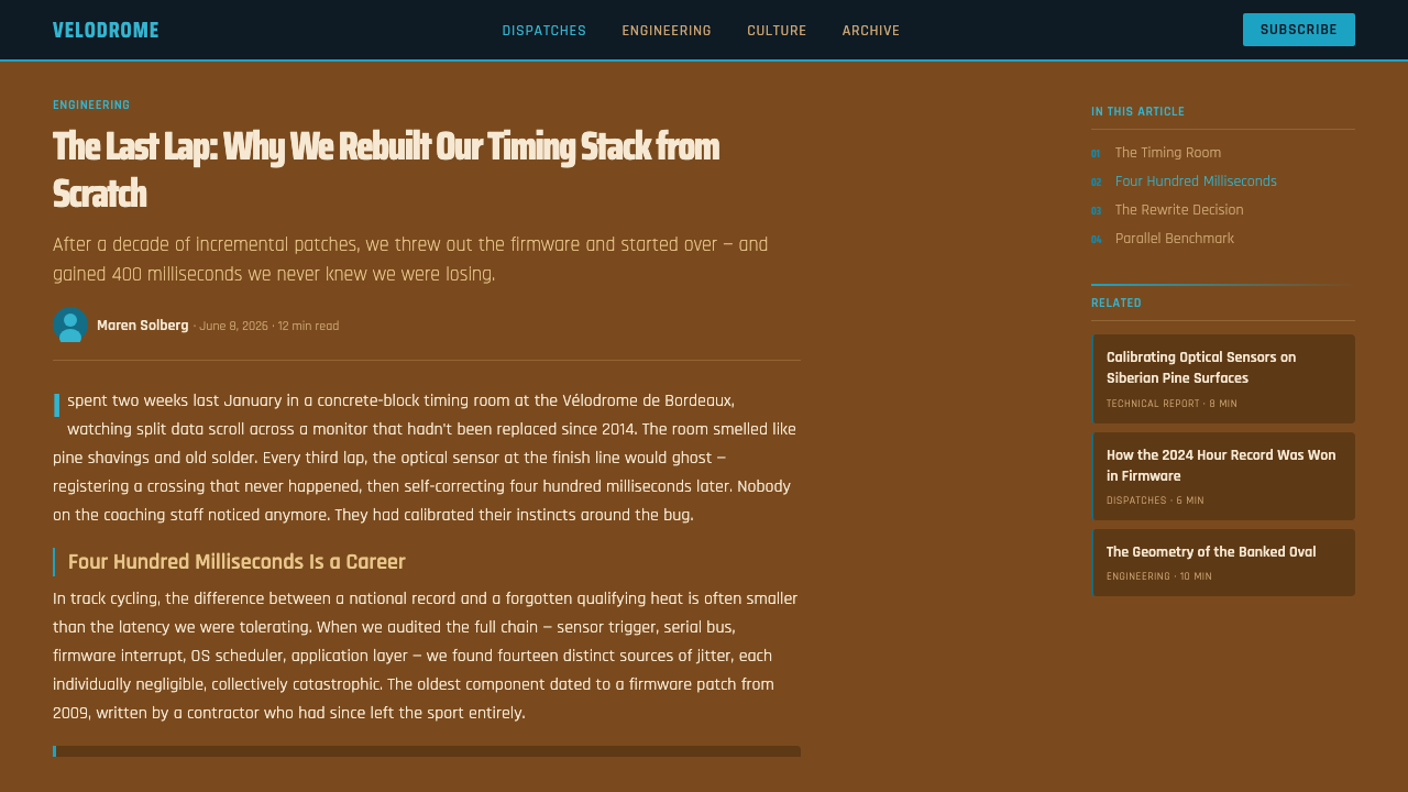
Track cycling on purpose-built ovals dates back to the nineteenth century, but the aesthetic this system draws from is specifically the modern indoor timber velodrome that became the standard venue for elite competition roughly between 1990 and 2010. In that period, the sport's governing body, the Union Cycliste Internationale (UCI), consolidated its technical regulations around a 250-meter indoor track with a steep, consistent banking profile, replacing a patchwork of differently sized outdoor and indoor tracks with a single competition standard used at world championships and the Olympics alike.
Meeting that standard required a very specific building material. Velodrome surfaces are built from Siberian pine, prized for its density, tight and consistent grain, and near-total absence of knots — qualities that let thousands of narrow strips be cut, laid edge to edge, and bent into a steep banking without splitting or warping under the repeated impact of racing bicycle tires. Sourcing and installing that timber to the tolerances elite competition demands became a specialist trade of its own, and Finnish pine-track builders in particular became known internationally for the craftsmanship this kind of construction requires — nail by nail, strip by strip, over months of work for a single track.
One individual designer is closely associated with popularizing this modern velodrome type worldwide: the Australian track designer Ron Webb, credited across a career spanning several decades with designing or building dozens of velodromes on multiple continents, including tracks used at Olympic Games and world championships. Alongside Webb's design work, the UCI's own technical commissions set and enforced the exacting geometry — banking angle, radius, straight length — that gives every modern velodrome its family resemblance despite being built independently, in different cities, by different contractors.
The track's markings and the timing systems layered onto it are their own precision discipline. The cyan measurement line near the inner rail exists to establish the track's official shortest rideable distance for record purposes, black datum and lane lines define sprinters' and pursuit lanes, and elite meets are timed by professional sports-timing engineers — Swiss Timing, operating under the Omega brand, has served as official timekeeper for the Olympic Games, including track cycling, using photo-finish and split-timing technology capable of resolving a race down to fractions of a second. Every one of those markings and instruments is drawn from a discipline where the smallest imprecision is a competitive failure, which is exactly the sensibility this design system tries to carry over.
What defines the Velodrome Track look?
Color
A warm, deeply shadowed pine tone functions as the ground for nearly everything, standing in for the timber surface itself rather than a neutral backdrop. One saturated cyan band is the system's sole cool accent, always used the way the real measurement line is used — as a single, deliberate rule rather than a general-purpose color — while black is reserved for datum lines and structural marks.
Timber surface
Large flat areas carry a subtle directional grain, as if built from thousands of narrow strips laid edge to edge rather than a single continuous material. This grain is quiet rather than decorative — it reads as structure, the way a real track's surface is literally assembled piece by piece to withstand repeated impact.
Datum lines
Thin black lines trace key distances and boundaries the way surveying marks or lane lines do on a real track, always drawn with consistent weight and never decorative flourish. Their placement communicates measurement and structure directly, functioning as information architecture rather than ornament.
Banked geometry
Curves lean and bank rather than sitting flat, echoing the steep incline of a real velodrome's turns, and compositions favor diagonal, speed-implying lines over static horizontals and verticals. This is one of the few design systems where a curved, tilted line reads as more precise and engineered, rather than more casual, than a straight one.
Typography
Numerals lean condensed and high-impact, built to be read in an instant the way a split time is read off a finish-line clock, while supporting labels stay compact and technical rather than expressive. The contrast between bold, large lap-timer-style numbers and small, quiet labels mirrors how a scoreboard prioritizes the number over any explanatory text.
Restraint and precision
Nothing appears without a functional justification drawn from the track itself — no decorative texture, no color introduced purely for variety. The system's entire visual vocabulary is drawn from things a rider or timing official actually needs to see, which keeps every surface feeling engineered rather than styled.
Rhythm and repetition
Elements repeat at a steady, mechanical interval — the way timber strips repeat around a banking or lap markers repeat around a track — giving the system a sense of measured cadence rather than free composition. This repetition is treated as a feature, communicating consistency and reliability rather than monotony.
Who shaped Velodrome Track?
The Australian velodrome designer is credited across a career spanning several decades with designing or building dozens of indoor and outdoor tracks worldwide, including venues used at Olympic Games and world championships. His work did more than almost any single individual's to spread the modern timber-banked velodrome standard internationally.
Cycling's international governing body consolidated technical regulation around the modern 250-meter indoor track and its steep banking profile roughly between 1990 and 2010, replacing a patchwork of inconsistent venues with a single standard used from world championships to the Olympics — the exacting geometry that gives every modern velodrome its family resemblance.
Specialist timber-track contractors, particularly from Finland, became internationally known for the exacting craftsmanship velodrome construction demands — cutting, fitting, and nailing thousands of individual pine strips into a banked surface able to withstand years of high-speed racing without splitting.
The professional sports-timing operation, running under the Omega brand, has served as official timekeeper for the Olympic Games including track cycling, developing photo-finish and split-timing technology capable of resolving results to fractions of a second — the precision culture the system's condensed, split-time-style numerals are drawn from.
The elite athletes who race sprint, keirin, and individual and team pursuit events are the reason the track's geometry and markings exist at all — every line, band, and banking angle answers to what these riders need to see and follow at speeds that can exceed seventy kilometers per hour on a banking steep enough to require momentum simply to stay upright.
How do you use Velodrome Track today?
On a presentation cover, the style works well as a full banked-timber field with the cyan band running low across the composition like a horizon line, and a condensed, high-impact title set the way a lap record is announced on a scoreboard. Content slides should let black datum lines organize the layout the way lane lines organize a track, with bullet points reading as compact, technical annotations rather than casual prose. Data slides are a natural fit for anything about performance, speed, or record-breaking — a line chart tracking improvement over time reads well against the shadowed-timber ground with the cyan band marking a target or record threshold, echoing how the real measurement line marks an official distance.
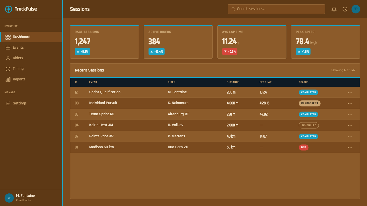
In web interfaces, the combination of warm timber ground and one cool accent suits performance dashboards, fitness and sports products, and anything built around tracking a metric against a target over time. A pricing page can use the cyan band as a single rule marking the recommended tier, the way the measurement line marks the track's defining distance, while other tiers stay within the quieter timber-toned surface. Tables and data grids benefit from the same disciplined datum-line treatment used on the track itself — thin, consistent black rules, condensed numerals for values, and no decorative color beyond the one cyan accent reserved for what actually matters most on the page.
For editorial and marketing pages, the style suits content about athletic performance, engineering precision, or competitive culture more broadly. A marketing hero section can commit to the full banked-timber composition with a single confident headline, while an editorial layout benefits from treating pull-quotes or key statistics the way a scoreboard treats a split time — bold, condensed, and set apart from the surrounding body copy rather than blended into it.
Photography works best when it shows genuine texture and structure — timber grain, a real curve, a line converging toward a vanishing point — rather than flat, evenly lit studio shots that could belong to any generic sports brand. An image that could be cropped from directly above a real banked track, with its lines and grain doing the compositional work, will always sit more naturally in this system than a posed portrait shot against a plain backdrop.
The most common mistake is treating this as a generic 'sports' theme and reaching for a wider palette of team colors or bright accent hues to make it feel more energetic. That instinct works against the system's actual source: a real velodrome earns its intensity from precision and restraint, not from color variety — one cyan band, one shadowed timber ground, and black datum lines doing all the structural work. Adding a second bright accent color, or softening the timber ground into a generic neutral gray, erases the specific engineered-speed identity that separates this from a generic athletic aesthetic.

Velodrome Track — FAQ
Why is Siberian pine specifically used for velodrome tracks?
Siberian pine is prized for its density, its tight and unusually consistent grain, and its near-total absence of knots — qualities that let thousands of narrow strips be cut, fitted edge to edge, and bent into a steep banking without splitting or warping under the repeated, high-force impact of racing bicycle tires. Few other timbers combine those properties at the scale and consistency elite track construction requires.
What does the cyan band near the inner rail actually mark?
It is the track's traditional measurement line, used to establish the official shortest rideable distance around the track for record-keeping and competition purposes. Its color has earned it an informal nickname among track cyclists referencing the blue of the French Riviera coastline, and this design system treats that band as its single defining accent color rather than one option among several.
Why does this style favor banked, diagonal lines over flat horizontals?
Because a real velodrome's steep banking is functional, not decorative — the incline is engineered so a bicycle's momentum, rather than the rider's balance alone, keeps it on the surface at racing speed. Carrying that lean into interface composition is what gives the style its sense of speed as something structural, rather than merely suggested through motion effects or arrows.
Is this style specific to track cycling, or does it apply to other precision sports?
Its specific vocabulary — banking, pine grain, a single measurement band, split-time numerals — comes directly from the velodrome, but the underlying discipline it represents (precision, engineered speed, minimal color used purely for measurement rather than decoration) generalizes well to other timing-driven, high-precision sports contexts, provided the specific timber-and-cyan-band vocabulary is kept intact rather than diluted into a generic 'sporty' look.
Who actually determines a modern velodrome's exact shape and dimensions?
The sport's international governing body, the UCI, sets and enforces the technical regulations — track length, banking angle, radius — that every venue used for elite international competition must meet, which is why velodromes built independently in different cities by different contractors still share a strong family resemblance. Individual designers, most notably the Australian Ron Webb across a decades-long career, then apply that regulatory framework to each specific site.
Related design styles
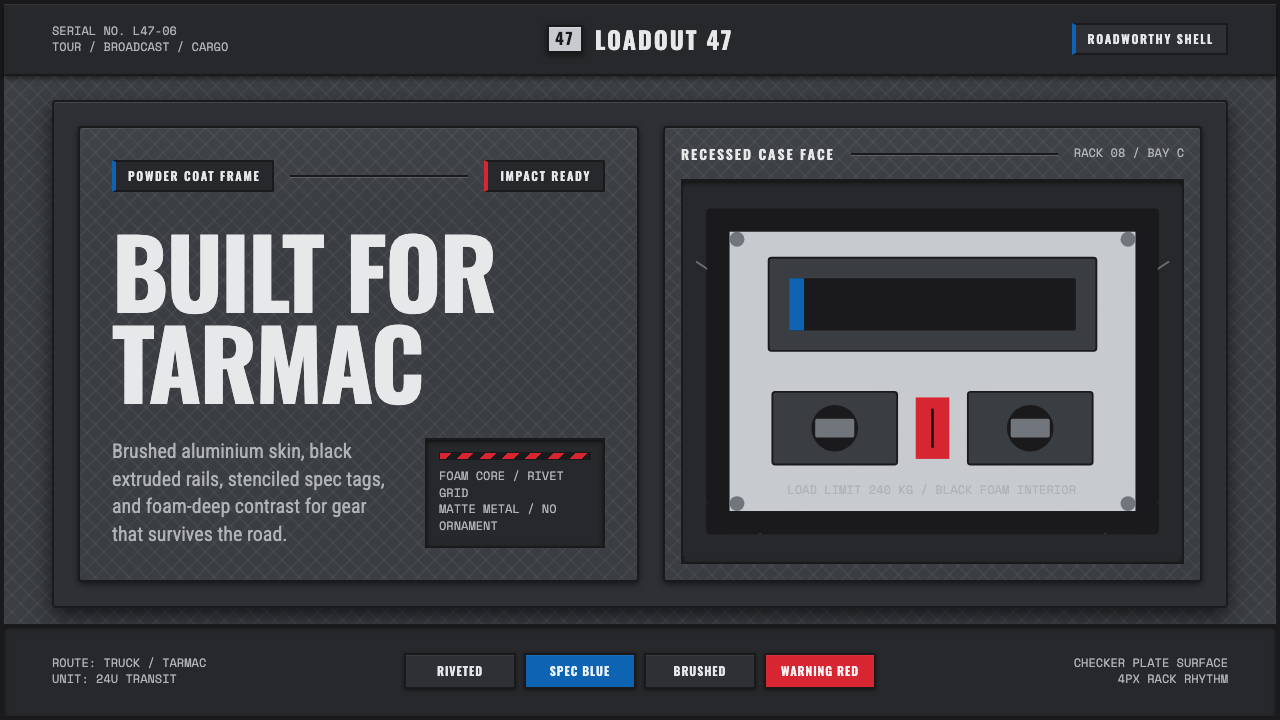 Aluminium Flight CaseRoadproof and exact. Diamond-plate gray, stencil type, black frames, blue-red…
 Amazon Web Services (AWS)Enterprise cloud made legible. Orange-on-navy service tiles lock to an 8px gr…
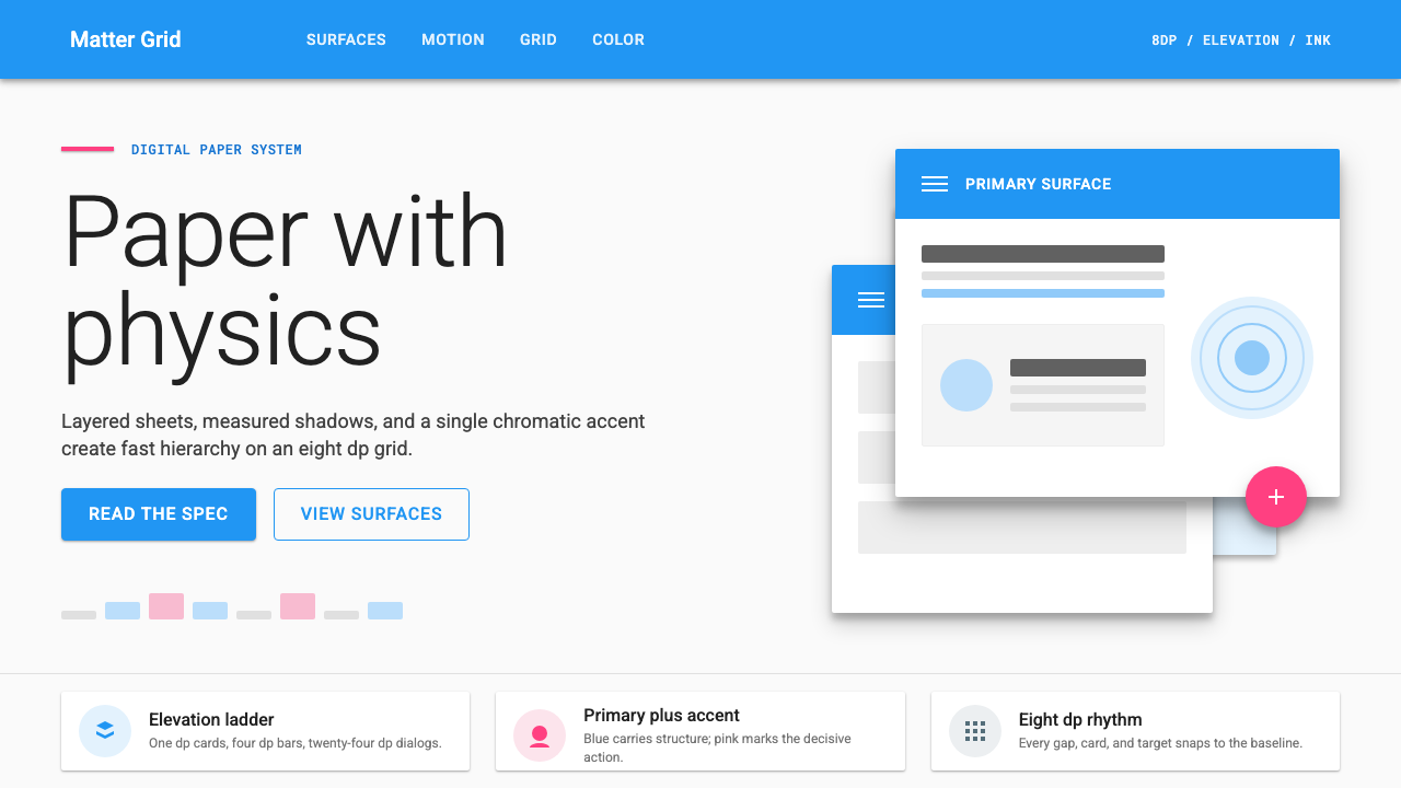 Material Design 1.0Depth made flat usable. Blue app bars, pink FABs, 8dp grids, and crisp paper…
 Montserrat StartupSeries-A on a projector. Black Montserrat on charcoal-teal, lit by one bright…
 Dropbox ModernFriendly SaaS gets loud. Electric blue and Sharp Sans drive a structured geom…
 Shake Shack (Green-Chartreuse)Friendly premium, never loud. Chartreuse on warm cream with tight modernist t…