What is Cyber Sigilism?
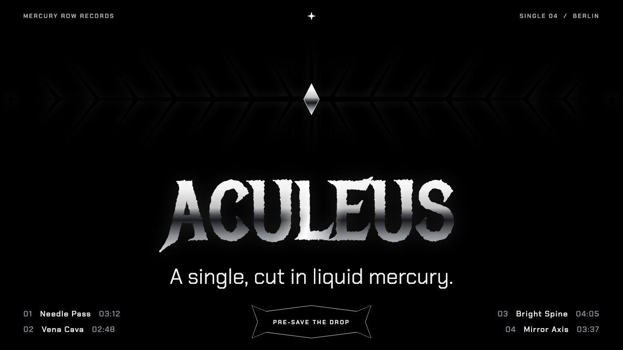
Cyber sigilism hangs liquid chrome thorns in pure black: needle-thin symmetric sigils, spiked metal lettering and a palette that is nothing but silver.
Cyber Sigilism in brief
Cyber sigilism is a graphic style that began on skin and moved to screens. In its first form it is blackwork tattooing: very fine black lines that taper to spear points, branch symmetrically from a central axis and look like veins, thorns or circuit traces. In its second form, those same sigils are rendered as three-dimensional liquid chrome floating on a pure black ground.
The visual vocabulary is narrow and consistent. Everything is black and silver. Hairline spikes supply structure and rhythm. Full-range mercury highlights, running from near-white to deep shadow, are saved for the few places that need to shine. Names and titles are set in spiked blackletter lettering, in which strokes end in sharp points and letters seem to bristle.
The mood is cold, ornate and slightly menacing, the opposite of friendly. It reads as nightclub, album cover, couture lookbook and underground fashion drop. Because the palette has no colour, form carries everything: symmetry, sharpness and the contrast between a delicate line and a heavy glossy surface.

Where does Cyber Sigilism come from?
The style's roots are in the club scene of Berlin in the late 2010s, where tattooists working in fine blackwork developed a distinctive line language. The marks were thin, high-contrast and symmetrical, ending in spear-like tapering points and branching outward like plants or neural networks. They were often placed along the spine, lower back or arms, following the body's own axis. This is the point where the sigil, an old word for a symbolic mark with magical intent, was recycled as a name for a modern ornament.
Two lineages feed the look. The first is HR Giger, the Swiss artist whose biomechanical work fused spines, ribs and machinery into a single skeletal landscape; his repeated vertebrae and tube-like forms are the ancestors of the style's spiky structure. The second is Christophe Szpajdel, the logo artist whose symmetrical, thorny band lettering defined the look of extreme metal logos, with letters that grow branches and spikes. Cyber sigilism takes the symmetry and bristle from the second and the cold anatomy from the first.
The style belongs to several wider currents. Blackwork tattooing supplied the technique of using only black ink and negative space. Neo-tribal, a tattoo movement of the late twentieth century, supplied the idea of bold ornamental marks that follow the body. The Y2K revival of the early 2020s supplied the chrome, the glossy three-dimensional rendering and the fascination with a turn-of-the-millennium image of the future.
Around 2021 to 2024, the graphics moved from skin into fashion, rap and electronic-music imagery. Designers lifted the line work into posters and album covers and rebuilt it as floating liquid chrome in three dimensions, set on pure black. That transition from fine ink to molten metal is what makes the digital version of the style distinct from its tattoo ancestor.
What defines the Cyber Sigilism look?
Color
The palette is pure black and a single silver ramp that runs from almost white highlights down to deep, near-black shadow. There is no accent colour. Variety comes from how much of the ramp is used: fine lines may stay in a mid silver, while hero shapes use the full range to look like polished mercury.
Sigil linework
Lines are hairline-fine, mirror-symmetric and end in sharp, tapering points. They branch from a central axis like veins or circuit traces and always follow a clear balance between left and right. Empty black space around the lines is as important as the lines themselves.
Liquid chrome
Hero forms are rendered as reflective, rippling metal with sharp specular highlights and dark pools in the reflection. They look as if they are floating in void, casting no shadow on any ground, which gives the images a weightless, uncanny quality.
Spiked lettering
Names and titles use blackletter-derived forms whose terminals extend into thorns and mirrored flourishes. Legibility is traded for presence, so the lettering is used for short names and logos rather than long sentences. Body text elsewhere stays in a plain, neutral sans-serif.
Symmetry and composition
Compositions are centred, mirrored and vertical. A single large sigil or chrome object usually sits at the centre of a black page. The strict symmetry makes the style feel ritual, even architectural, rather than casual.
Mood
Cold, ornate and slightly threatening, with a touch of gothic romance. It addresses an audience that likes subculture, club nights and fashion with an edge, and it deliberately avoids warmth or friendliness.

Who shaped Cyber Sigilism?
Swiss artist whose biomechanical spines and machinery are a main ancestor of the style's skeletal, thorned structure.
Logo artist whose symmetrical, thorny band lettering defined the look of extreme metal logos and shaped the style's lettering.
A collective, largely anonymous group of blackwork artists in the late 2010s who developed the fine tapering sigil line the style takes its name from.
How do you use Cyber Sigilism today?
In slides, cyber sigilism is a strong choice for fashion, music, nightlife and creative-studio presentations. A cover slide can be a pure black page with a single chrome sigil at the centre and a spiked wordmark below. Content slides should stay sparse, with one idea, one silver heading in a clean sans-serif and large areas of black. Data slides work best with very few numbers, set in silver on black and framed by hairline rules.
In web interfaces it suits portfolio sites, label and artist pages, fashion drops, ticketing for events and experimental landing pages. Use the sigil as a hero object and the thin line work as dividers, frames and cursor effects. Interactive controls should be minimal and silver, with clear hover states, such as a brighter highlight or a thin outline. Avoid using the spiked lettering for navigation or long labels, where legibility matters.
In editorial and marketing work, the style is made for album covers, lookbooks, festival posters and teaser campaigns where mood matters more than information. Centred compositions and large black fields give a poster instant presence. Pair a chrome object with one short phrase and let the silence do the rest.
The common mistake is to add colour. A single neon accent tends to turn the style into generic cyberpunk and loses its cold, metallic purity. The second mistake is clutter: this look depends on negative space, and filling the page with several competing sigils or chrome objects kills the symmetry. Finally, do not use the spiked blackletter for paragraphs; it is for names, not sentences.

Cyber Sigilism — FAQ
What is cyber sigilism?
It is a black-and-silver graphic style that started as fine, symmetric blackwork tattoos in Berlin's club scene and became floating liquid chrome thorns on pure black in digital design.
Where does the style come from?
It emerged from late-2010s Berlin blackwork tattooing and drew on HR Giger's biomechanical spines and Christophe Szpajdel's thorny metal band logos, before reaching mainstream graphics around 2021 to 2024.
Which projects suit it?
Album covers, fashion lookbooks, club and festival posters, artist portfolios and experimental landing pages. It is a poor fit for warm, family-oriented or text-heavy products.
Can I add a colour accent?
It is better not to. The style relies on pure black and a single silver ramp; a neon accent usually turns it into generic cyberpunk and weakens its cold metallic identity.
How should I handle body text?
Keep paragraphs in a plain, neutral sans-serif in silver or light grey on black, and use the spiked lettering only for names and logos, because it trades legibility for presence.
Related design styles
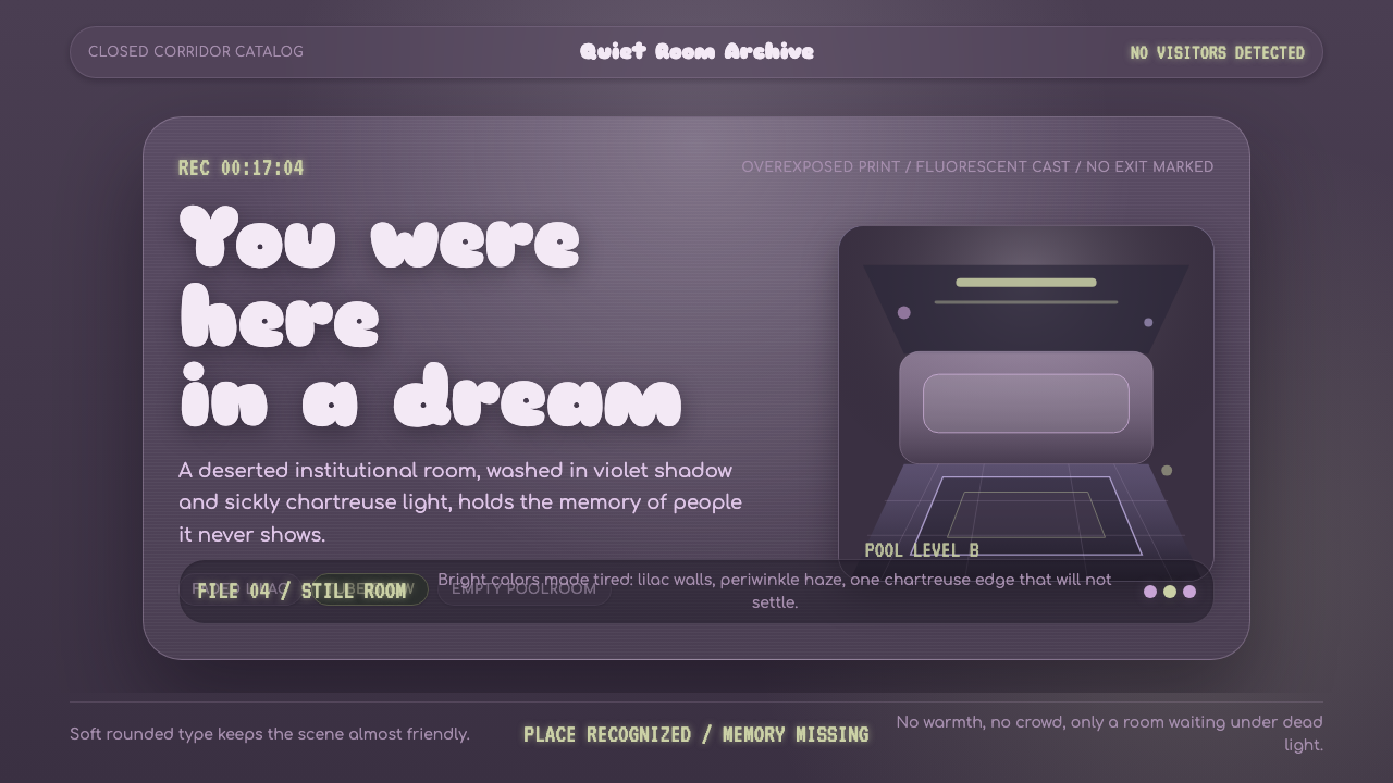 Dreamcore LiminalEmpty rooms feel remembered. Washed violet, Sniglet curves, and chartreuse tu…
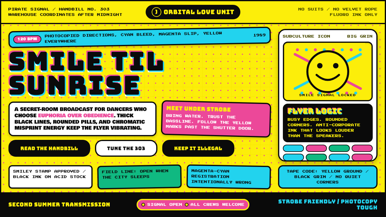 UK Acid House (1989)Euphoria on paper. Acid yellow, Bungee type, and cyan-magenta misregistration…
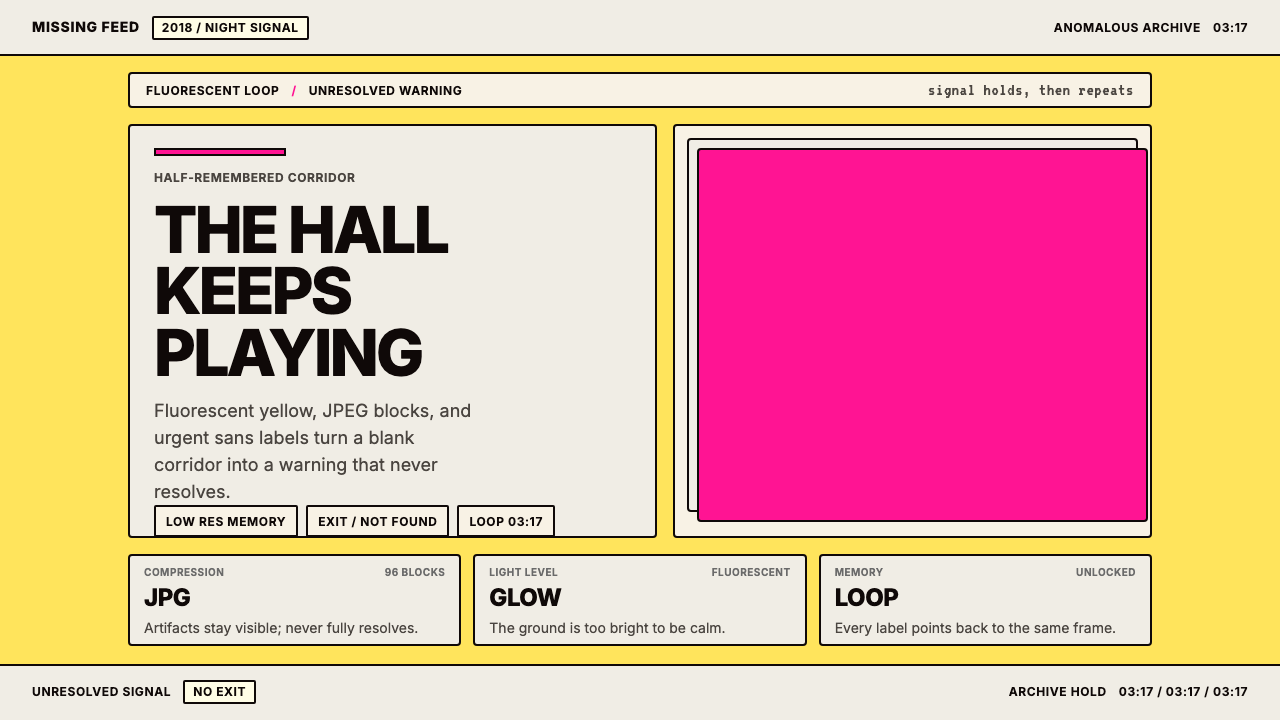 Weirdcore Internet (2018)Wrongness in fluorescent yellow. JPEG blocks and warning labels do the damage.
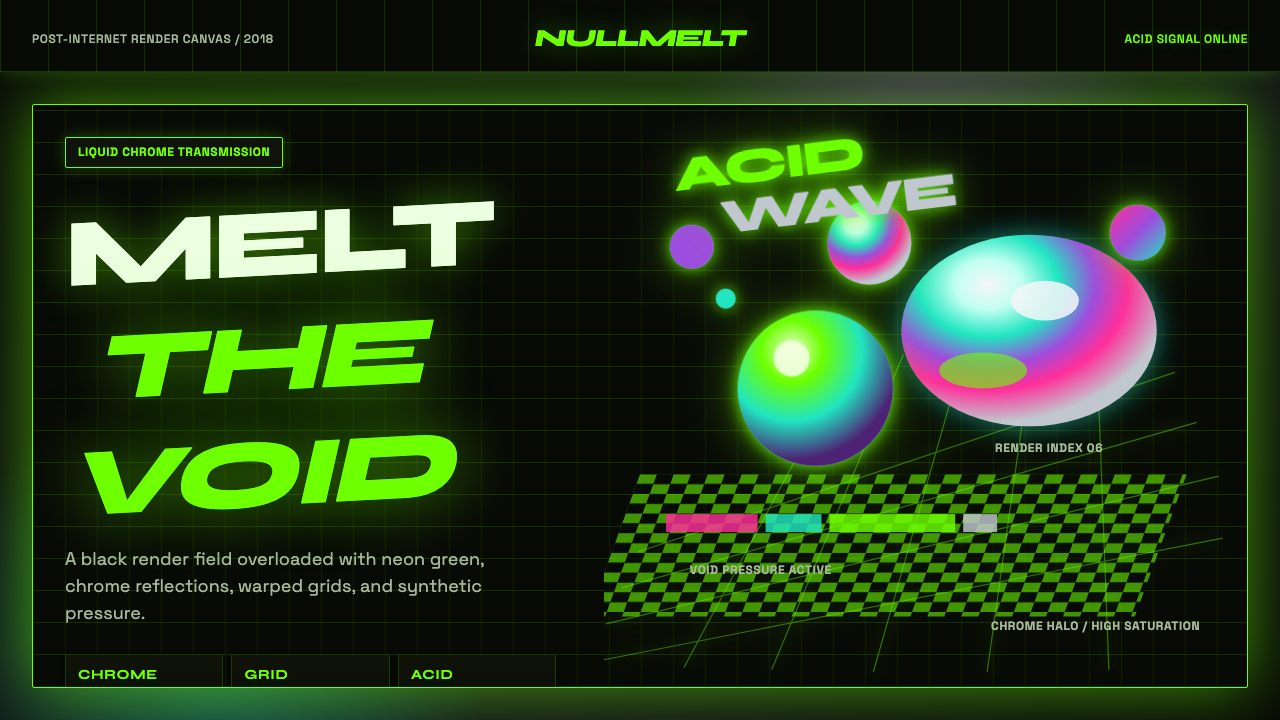 Acidwave 3D RenderPsychedelia hits the render engine. Neon green, chrome orbs, and warped grids…
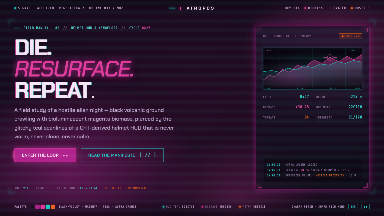 ReturnalNever warm, never clean, never calm. Magenta biomass on a violet night, pierc…
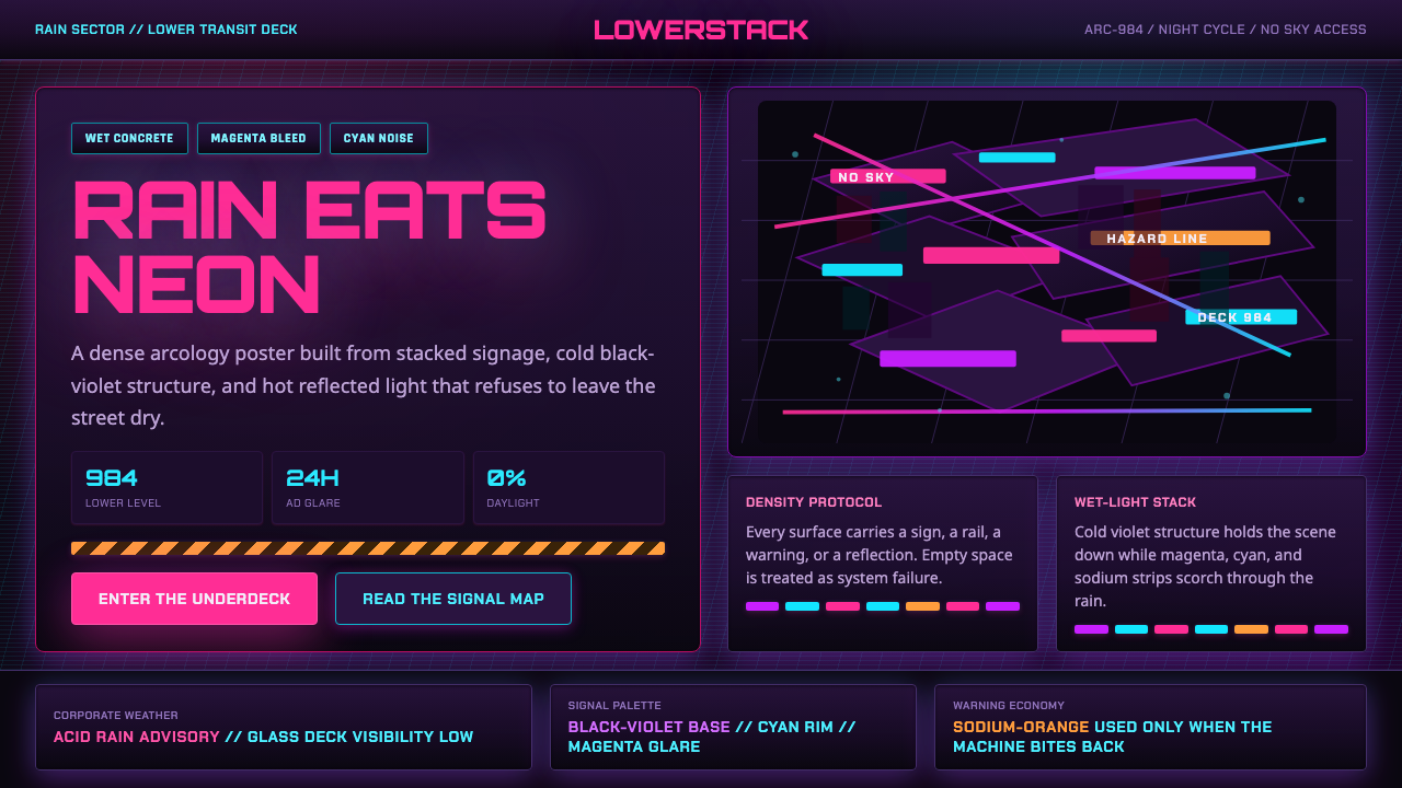 The Ascent ArcologyNeon suffocates the dark. Magenta and cyan signage stacks over wet black-viol…