What is Corridos Tumbados?
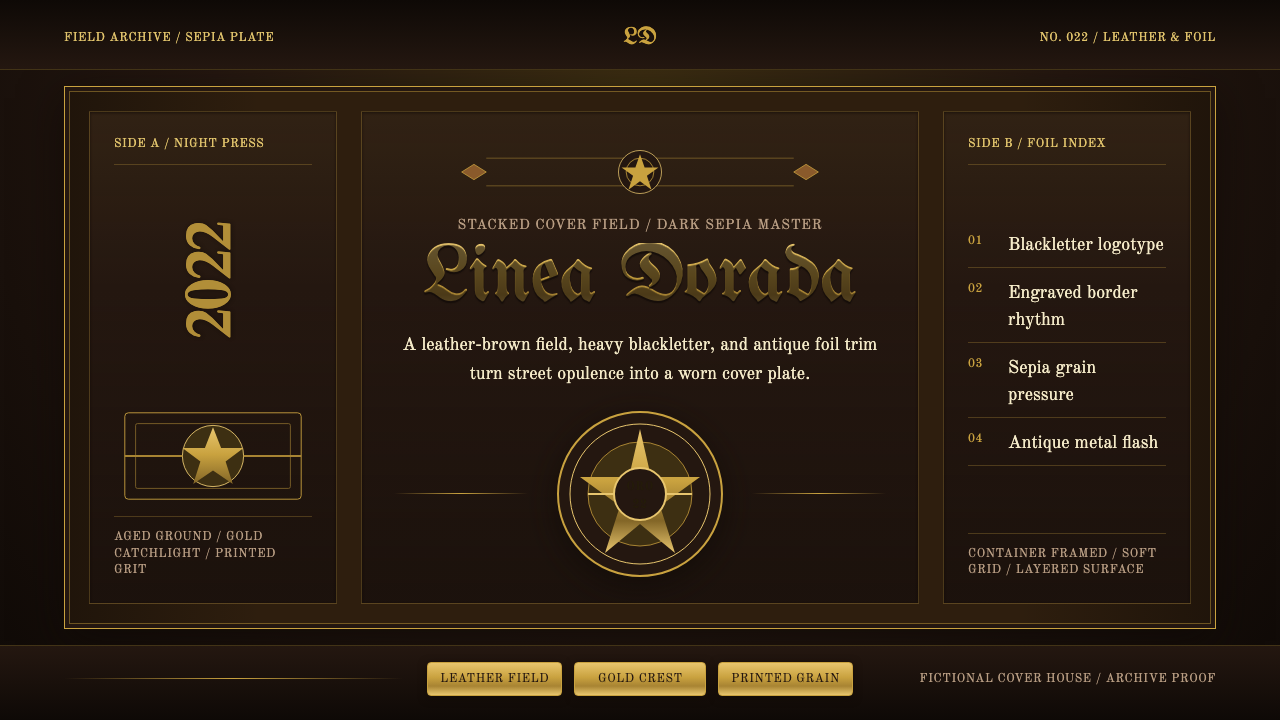
Corridos tumbados dresses every album cover in the same aged sepia and antique gold that a century-old Mexican storytelling ballad tradition and a very modern trap sound now share.
Corridos Tumbados in brief
Corridos tumbados is the visual identity attached to the Mexican regional-trap wave associated with artists such as Peso Pluma and Natanael Cano, and it dresses cover art, merchandise, and stage graphics in a consistent, aged luxury register: a leather-brown, deep sepia ground rather than clean paper white; grainy, desaturated photography of sierra-cowboy figures, horses, and rural landscapes; and chunky antique-gold ornament layered over all of it — crests, foil borders, emblems that look stamped rather than printed.
Typography does the work of announcing genre before a single note plays. Wordmarks lean on Old English blackletter, the same dense, angular lettering associated with tattoo culture and streetwear logotypes, while supporting text often shifts to an engraved, old-style Western serif — the kind of letterform associated with wanted posters and saloon signage. Nothing in the system is clean or contemporary in the flat-design sense; every surface carries visible grain, wear, or metallic sheen.
The result reads as opulence with dust still on it — gold that has clearly traveled, leather that has clearly been worn, photography that looks pulled from an old negative rather than a phone camera. It is a deliberate collision of two registers that don't normally share a page: the rural, documentary austerity of ranch photography, and the loud, conspicuous-wealth signaling of modern hip-hop and reggaetón cover art.
Where does Corridos Tumbados come from?
The corrido is a Mexican narrative ballad form with roots reaching back well over a century, traditionally built around accordion, guitar, and bajo sexto, and organized around a simple, durable purpose: telling a true or true-feeling story in song, often about revolution, migration, injustice, or a particular person's rise and fall. Through the twentieth century a specific branch of the tradition, the narcocorrido, turned that same storytelling structure toward figures in the drug trade — a documented and often controversial subgenre that has, at various points, faced radio bans and public performance restrictions in parts of Mexico for what critics describe as glorifying trafficking and violence.
"Tumbado" is Mexican slang loosely meaning laid-back, sprawled-out, or thrown-down — a tonal description as much as a musical one. Around 2019, largely credited to the young Sonoran artist Natanael Cano, corrido songwriting and instrumentation began fusing with the drum patterns, cadence, and attitude of hip-hop and trap music, producing something that sounded simultaneously like a traditional Mexican ballad and a contemporary trap track. The subgenre broke into global mainstream visibility around 2022 and after, when Peso Pluma's collaborations and global chart presence carried it far outside its Mexican and Mexican-American base.
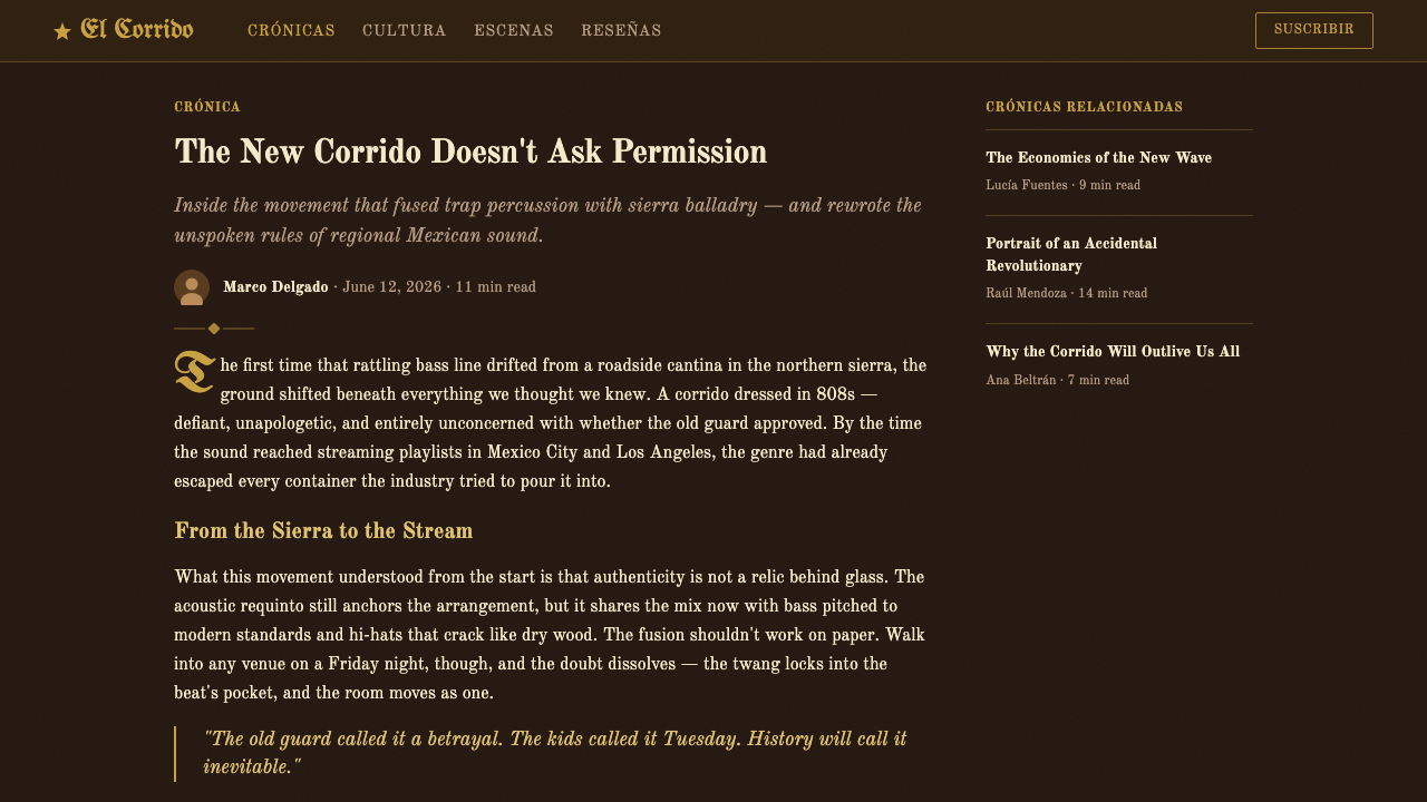
The visual identity that grew up around the sound draws from two distinct, older lineages and fuses them rather than choosing between them. One is the documentary austerity of sierra ranch photography — desaturated, sun-bleached images of horses, cowboy hats, and rural Sinaloa and Jalisco landscapes, the same visual vocabulary long associated with regional Mexican music generally. The other is the loud, conspicuous-wealth visual language shared with hip-hop and streetwear: gold, crests, and heavy blackletter lettering, the last of which has its own separate, well-documented lineage in Chicano and hip-hop tattoo and logotype culture going back decades before this genre adopted it.
Reading the two lineages together is the point: the cover art insists that its subjects are simultaneously rooted in a specific rural tradition and fluent in a modern, transnational language of status and wealth. That deliberate tension — old ballad tradition dressed in new-money gold — is what distinguishes this visual system from either straightforward Western nostalgia or straightforward hip-hop luxury branding on its own; it belongs fully to neither.
What defines the Corridos Tumbados look?
Sepia Leather Ground
The base of the system is a deep, warm sepia-brown rather than paper white or true black — closer to the color of aged, worn leather than to any neutral studio backdrop. This ground is what makes gold read as precious rather than gaudy: it sits in the same warm family, so the metallic accents feel excavated from the same world rather than pasted on top of it.
Antique Gold Ornament
Gold appears as chunky, dimensional ornament — crests, emblems, foil-stamped borders — never as a thin decorative line. It behaves like metal that has aged: slightly muted rather than blindingly bright, closer to old coin or worn jewelry than to fresh foil. Gold is always used as accent and never as a dominant field; it frames and crowns the composition rather than filling it.
Grainy Sierra Photography
Photography is desaturated, sun-bleached, and visibly grainy, drawing on the documentary look of ranch and rural sierra imagery — horses, cowboy hats, dust, open land. The grain is not an accidental artifact but a deliberate signal of age and authenticity, positioned against the polish of typical modern music marketing photography.
Blackletter Wordmarks
Primary logotypes and artist names lean on Old English blackletter — dense, angular, high-contrast strokes with sharp serifs — the same lettering tradition long used in Chicano and hip-hop tattoo and streetwear culture. It reads as heavy, formal, and slightly outlaw all at once, and it is the single fastest way the system signals its genre before any imagery is even parsed.
Engraved Western Serif
Secondary and supporting text shifts register to an engraved, old-style serif reminiscent of nineteenth-century Western signage and printed ephemera — wanted posters, saloon signs, ranch-brand lettering. Where blackletter announces the genre loudly, this serif carries the quieter, more legible supporting information without breaking the aged, historical mood.
Film Grain and Wear
A consistent layer of visible texture — grain, scratches, faint vignetting — sits across photography and even flat color fields, simulating the physical wear of an aged print or an old photograph rather than a clean digital file. This texture is what keeps the palette from reading as merely "brown and gold" and instead reading as specifically old and handled.
Frame and Crest Composition
Compositions favor formal, centered framing — a portrait or crest placed within an ornamented border, echoing devotional imagery, cigar-box labels, and heraldic emblems more than casual snapshot photography. This formality reads as respect and gravity, positioning its subjects the way a portrait or a coat of arms would.

Who shaped Corridos Tumbados?
The artist most responsible for carrying corridos tumbados to global mainstream chart visibility from 2022 onward, whose cover art and stage graphics popularized the sepia-and-gold, blackletter-and-crest visual template internationally beyond its original Mexican and Mexican-American audience.
The young Sonoran artist widely credited with pioneering the fusion of traditional corrido songwriting with trap and hip-hop instrumentation around 2019, giving the subgenre its name and its founding sound — the musical shift that the visual identity was subsequently built to match.
A key figure in the same wave alongside Cano and Peso Pluma, whose releases helped establish the genre as a sustained movement rather than a single breakout moment, reinforcing the shared cover-art vocabulary of sepia photography, gold ornament, and heavy display lettering across multiple artists.
A prominent Mexican-American group within the same regional-trap wave, whose commercial success alongside Cano, Peso Pluma, and Junior H helped establish the sepia-and-gold, Western-luxury cover template as a genre convention rather than any one artist's individual branding choice.
The broader, older visual and lyrical tradition of songs and imagery depicting drug-trade figures that corridos tumbados descends from and reworks. It is documented cultural history rather than folklore, and its influence here is aesthetic and narrative lineage — the visual system inherits its gravity and outlaw mystique without this article endorsing or glamorizing the trade it historically depicted.
How do you use Corridos Tumbados today?
Corridos tumbados carries genuine emotional weight — pride, defiance, hard-won status, a specific regional identity — and it applies best to work that wants to sound serious and grounded rather than light or playful. It is not a neutral decorative palette; using it signals a deliberate cultural and tonal reference, so it belongs where that reference is intended and appropriate rather than reached for casually as a generic "gold and brown" scheme.
On slides, the style suits a cover page built around a single formally framed image — a portrait, an emblem, a landscape — bordered in gold with a blackletter title sitting above or below it, exactly like an album cover. Content slides should keep body text in the quieter engraved serif rather than blackletter, since blackletter becomes illegible at small sizes and body-text weights; reserve the heavy display lettering for section titles only. Data slides are the weakest fit for this system: its grain, warm ground, and ornamental gold actively work against the clean legibility that charts and tables need, so a deck that must present real data is better served by simplifying to the palette's plainest elements — sepia ground, gold rule lines — and dropping the texture and ornament entirely on those specific pages.
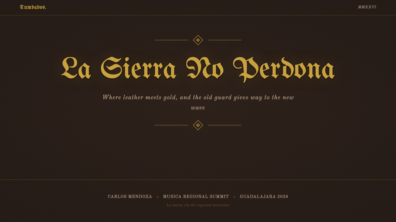
For web interfaces, the aesthetic works best on artist or brand pages, merchandise storefronts, and event or ticketing pages where mood and identity matter more than dense functional interaction — a hero section with a framed portrait, gold hairline dividers, and blackletter section headers can carry a landing page well. It is a poor match for a working dashboard or a pricing comparison table, where users need to scan numbers quickly; the ornamental gold and grain texture add visual noise exactly where clarity is required, and blackletter type is fundamentally unsuited to interface labels, buttons, or any UI text that needs instant legibility.
In editorial and marketing contexts, the style suits feature stories, artist profiles, tour posters, and any content that wants the reader to feel like they are handling something old and valuable — an engraved-serif pull quote inside a gold-bordered frame reads immediately as considered rather than templated. Marketing material for products entirely unrelated to the genre's cultural roots should generally avoid it, since the visual language carries a specific, recognizable cultural reference that reads as borrowed or hollow when applied without connection to the music or region it comes from.
The most common mistake is treating this as generic "Western" or "rustic" styling and losing the tension that makes it work — pairing the sepia-and-gold palette with a plain contemporary sans-serif instead of blackletter drains the identity down to a nonspecific brown color scheme. A second common mistake is overusing gold as a fill rather than an accent, which flattens the metallic effect into a flat mustard-yellow color and loses the sense of dimensional, aged ornament that gives the system its jewel-like weight.
Corridos Tumbados — FAQ
What does "tumbados" mean, and where does the genre's name come from?
"Tumbado" is Mexican slang for laid-back, sprawled-out, or thrown-down — describing the relaxed, drawling cadence the fused sound has compared to a traditional corrido's brisker delivery. The full genre name, corridos tumbados, literally means something like "laid-back corridos," pointing to how traditional ballad songwriting was slowed and reshaped around trap music's rhythmic feel.
Is corridos tumbados the same thing as narcocorridos?
They overlap but are not identical. Narcocorrido specifically describes ballads whose lyrics center on figures in the drug trade, a subgenre with its own decades-long, often controversial history within Mexican regional music. Corridos tumbados is a broader term for the trap-fused sound and its visual identity; some corridos tumbados songs are narcocorridos in content, but the term describes a musical and visual fusion, not a lyrical subject matter on its own.
Why gold and sepia specifically, rather than any other luxury color combination?
The pairing lets the system claim two things at once. Sepia and leather-brown read as aged, rural, and rooted — connecting the imagery to ranch photography and a specific regional history. Gold reads as wealth and status without needing to be bright or modern about it; an antique, slightly worn gold suggests earned or inherited wealth rather than flashy new money. Together they let a cover argue that its subject is both authentically rooted and undeniably successful, which is precisely the dual identity the genre's lyrics also project.
Can this style be applied respectfully outside of music, or does it risk appropriating a specific cultural movement?
It can be applied outside music, but it works best when the connection to its origin is acknowledged rather than erased — using the palette and typography as a conscious reference to Mexican regional-trap culture, not as an anonymous "rustic luxury" template stripped of context. Applying it to content with no relationship to Mexican culture, migration, or regional identity risks reading as a hollow costume rather than a considered aesthetic choice; the style's specificity is exactly what gives it power, and that specificity is lost the moment the reference is scrubbed out.
Does this style suit a light background instead of the canonical dark, sepia-toned ground?
It resists inversion more than most historical styles. The dark, warm sepia ground is what makes the gold ornament glow and gives the photography its documentary weight; on a light or white ground, the same gold reads as thin and decorative rather than substantial, and the grain texture that signals age instead reads as dirt or noise on a clean surface. A version intended for a lighter context is better served by keeping the dark, textured ground as a contained panel or frame within an otherwise lighter layout, rather than inverting the whole system to white.
Related design styles
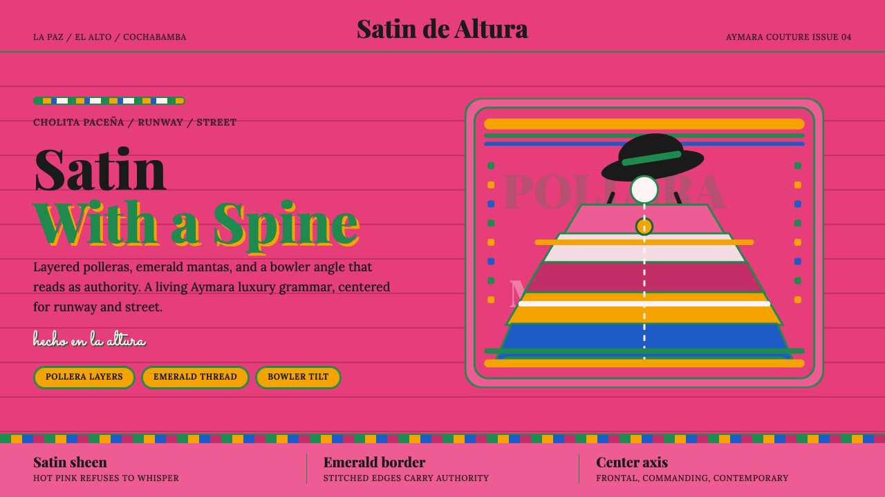 Bolivian Cholita FashionUnapologetic satin power. Hot pink fields, emerald stitches, centered pollera…
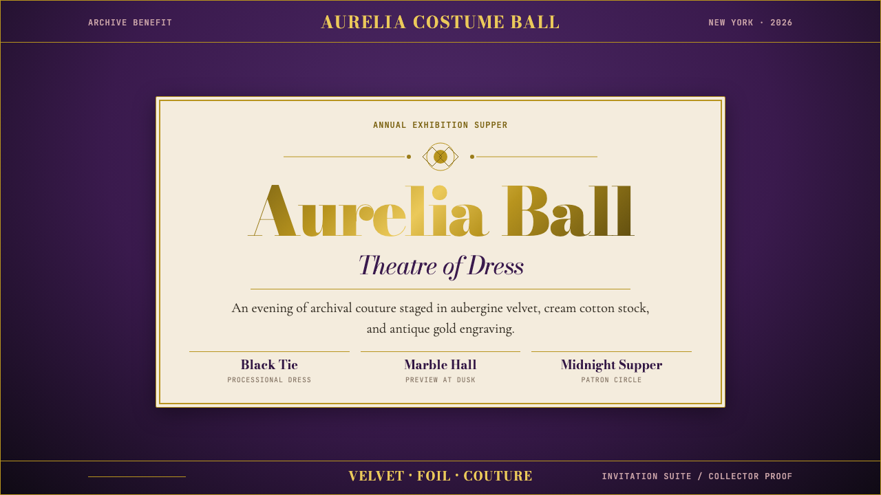 Met GalaTheatrical reverence. Aubergine velvet, cream stock, and Bodoni gold foil fra…
 Qatar World Cup 2022Desert spectacle in gold. Maroon fields, Reem Kufi scale, and eightfold star…
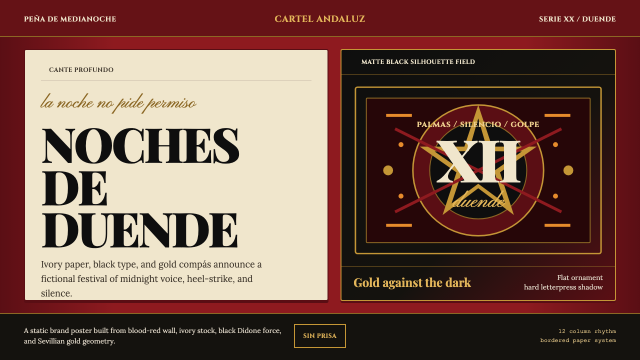 Spanish Flamenco PosterPassion printed as ritual. Blood red, ivory paper, Didone type, and flat gold…
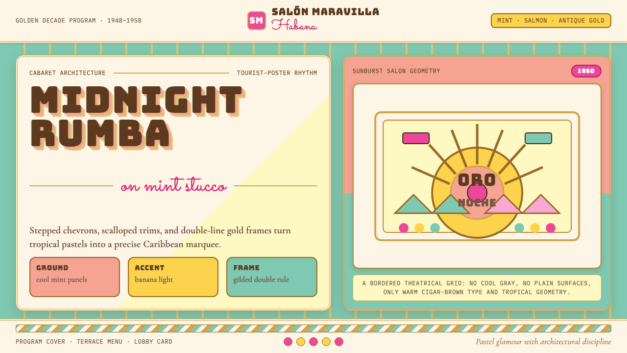 Cuban Art Deco (Havana 1950)Tropical Deco goes theatrical. Mint and salmon panels, gold double rules, Bun…
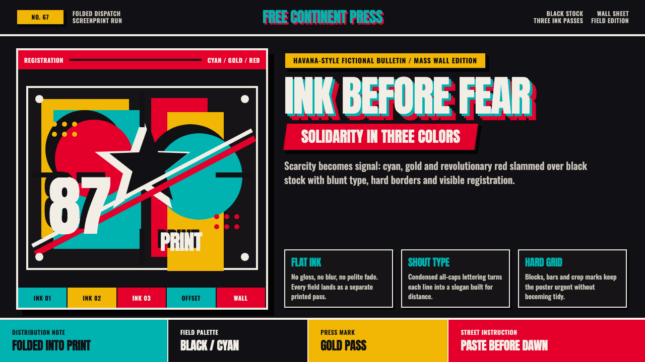 Cuban OSPAAAL Tricontinental PosterUrgency from scarcity. Cyan, gold and red slam over black in blunt silkscreen…