What is Clash Royale?
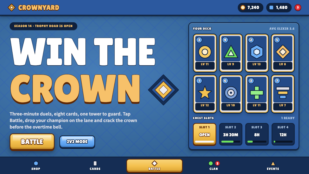
Clash Royale's interface is built to be tapped: a gold Battle slab, thick-outlined white capitals and royal-blue diamond tiles that feel like toys sitting on the glass.
Clash Royale in brief
Clash Royale is Supercell's 2016 real-time card battler for phones, made in Helsinki and set in the same chunky cartoon world as Clash of Clans. Its interface is a portrait-mode lobby: royal-blue diamond-patterned tiles, puffy bevelled buttons rimmed in thick brown outlines, chests counting down in their slots, and gold-edged cards that look as though they could be picked up off the screen.
The system is governed by a strict colour code. Gold is reserved for the single most important action, the Battle button. Green means give or improve: Donate, Upgrade, Buy. Sky blue marks secondary modes such as team battles. Red is used only for notification badges. A player learns this grammar in minutes and then reads every screen at a glance, which is the real function of the style.
Type is equally disciplined. Every label is white, heavy and set in capitals, wrapped in a thick dark outline and pressed with a drop shadow so it lifts off the surface like a sticker. Surfaces are glossy and rounded; edges are bevelled; nothing is flat. The overall effect is loud, friendly and unmistakably tactile, a user interface that behaves like a toy shelf.

Where does Clash Royale come from?
Supercell is a Finnish studio headquartered in Helsinki, led by chief executive Ilkka Paananen, and it built its reputation on a small number of free-to-play mobile games. Clash Royale was first released in a limited soft launch in January 2016 and reached a worldwide release on 2 March 2016. It drew on the characters and the visual world of Clash of Clans, the studio's earlier hit, but changed the format: instead of building a village over days, a player fought a match lasting a few minutes against another person.
The game fused three families of play. It borrowed from collectible card games the idea of a deck you build and a collection you upgrade. It borrowed from tower defence the idea of protecting a structure while pushing toward an enemy's. And it borrowed from the multiplayer arena genre the idea of real-time contests between two sides, here compressed to fit a phone held in one hand. John Roshell is among the names associated with the game's art direction in public accounts of the project.
The visual style that surrounds this design is the Clash of Clans house look: chunky three-dimensional cartoon figures, saturated colour, thick outlines, and a clear stylistic preference for shapes that look soft and heavy rather than precise. On the interface side, the free-to-play model shaped everything. Buttons had to be large enough to hit without thought, rewards had to be visible and shiny, and the next step always had to be obvious, because a player's session might last only a few minutes.
Between 2016 and 2024 the visual identity received seasonal updates, with new arenas, event banners and themed chest art layered on the same core palette and component set. That continuity is the point. The colour code and the bevelled, outlined button language stayed stable while the decoration around them changed, which is how a game keeps a mass audience fluent in its interface for years.
What defines the Clash Royale look?
Color
A royal-blue field forms the stage, and a handful of saturated signal colours sit on top of it with fixed meanings: gold for the one primary action, green for giving and upgrading, sky blue for alternate modes, red for notification badges. Colour is a language here rather than decoration, and it is never reassigned from screen to screen.
Typography
A single rounded, heavy display face is used for almost everything, always in capitals, always white. A dark thick outline and a drop shadow wrap each letter so that the text stays readable against gold, green or patterned blue alike. The words feel like stickers rather than print.
Buttons and bevels
Buttons are puffy slabs with a highlight along the top, a darker lip along the bottom and a thick brown outline. They look pressed from soft plastic and invite a thumb. Size signals priority: the Battle button is the largest object on the screen.
Pattern and ground
The blue background is tiled with diamond shapes that give the lobby texture without competing with the foreground. Panels sit on this pattern like cards on a table, with their own outlines and a slight sense of depth.
Cards and rewards
Cards carry a gold rim, a rarity-coloured frame and a small cost marker in the corner. Chests and rewards are drawn with extra gloss and sparkle. Everything the player earns is made to look physical and worth picking up.
Motion and feedback
Elements bounce, pop and glint. Counters tick down visibly, buttons squash when pressed, and rewards burst open. Motion is used to celebrate and to guide the eye toward the next action rather than to be subtle.

Who shaped Clash Royale?
Helsinki mobile games studio that released Clash Royale in 2016 and defined the Clash visual world.
Chief executive and co-founder of Supercell, associated with its small-team, free-to-play approach.
Associated in public accounts with the art direction of the Clash games.
How do you use Clash Royale today?
In slides, Clash Royale is a natural choice for gaming events, esports recaps, community updates and anything with a playful, rewarding tone. A cover slide can use the blue diamond field with a single gold banner and a heavy outlined title. Content slides work best as a few large panels, each with one headline, since the style makes every element loud and does not reward dense text. Data slides can present numbers as chunky score badges, with colour following the system's meanings: green for gains, red for alerts.
In web and app interfaces, it suits reward screens, season passes, battle-pass trackers, event landing pages and onboarding for casual games. Keep one gold primary action per screen, make all interactive controls large and bevelled, and use the green, sky blue and red signal colours only for their fixed meanings. Dashboards in this style should stay short and chunky; it is not a language for dense data tables.
In editorial and marketing work, the style fits campaign banners, store listings, social posts and promotional emails for mobile games or youth-oriented products. The outlined capitals carry well at small sizes on a phone feed. Pair them with bright, glossy illustration, and let one object, a chest or a card, dominate each composition.
The most common mistake is to dilute the colour code. Using gold on three buttons, or red as decoration, removes the meaning that makes the interface fast to read. The second mistake is thinning the style: small light text, hairline borders and flat panels belong to a completely different system. Clash Royale only works when everything is heavy, outlined, rounded and unashamedly large.

Clash Royale — FAQ
What is the Clash Royale visual style?
It is a chunky, glossy mobile-game interface: royal-blue diamond-patterned backgrounds, puffy bevelled buttons with thick outlines, white capital labels with dark outlines and shadows, and a strict colour code where gold means the primary action.
When was Clash Royale released?
It entered a soft launch in January 2016 and was released worldwide on 2 March 2016. Its visual identity has been refreshed seasonally since, while the core colour and button language stayed stable.
What do the colours mean in this style?
Gold marks the main action such as Battle, green marks giving and improving such as Donate or Upgrade, sky blue marks alternate modes, and red is reserved for notification badges.
Which projects suit this style?
Game event pages, reward screens, season passes, casual-game onboarding and youth-oriented promotions. It is poorly suited to dense, text-heavy or data-heavy interfaces.
Why is every label outlined?
The heavy outline and drop shadow keep white capitals readable on gold, green and patterned blue alike, and make text look like a sticker lifted off the surface. It is both a legibility device and the signature of the style.
Related design styles
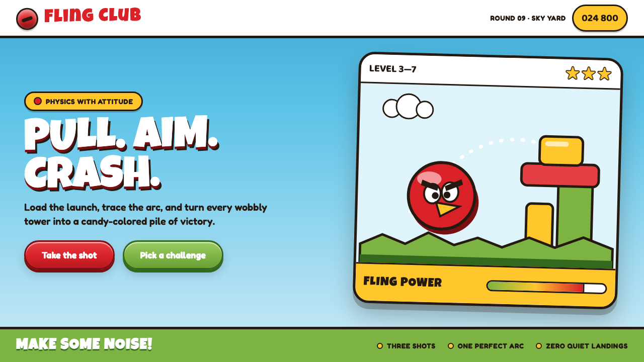 Angry Birds (2009)Adorable aggression takes flight. Candy primaries, chunky outlines, and a dot…
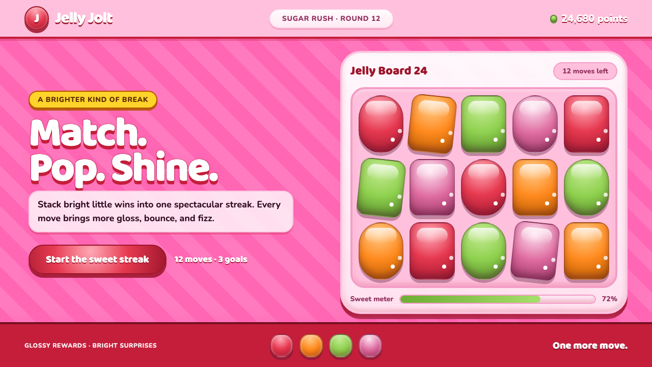 Candy Crush (2012)Sugar rush without restraint. Glossy candy tiles pulse across a striped bubbl…
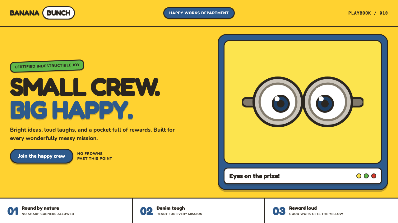 Minions (Despicable Me, 2010)Indestructibly cheerful. Minion yellow, denim blue, and chunky goggle geometr…
 Barbie DreamhousePink is the whole world. Hot magenta ground, Pacifico script, scallops and gl…
 Brazilian Samba School (2000s Carnaval)Parade at floodlight volume. Royal blue asphalt, sequin gold type, pink ribbo…
 Club PenguinA snow-white island that talks like a kid. Sky-blue panels, navy outlines on…