What is Chermayeff & Geismar?
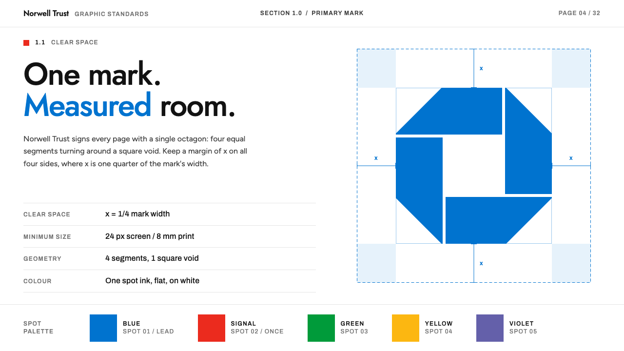
Chermayeff & Geismar style is the logic of the corporate trademark: a few flat shapes, a white page, measured clear space and one meaningful dab of colour.
Chermayeff & Geismar in brief
Chermayeff & Geismar style is a design language drawn from the trademark and identity work of the New York studio founded in 1957. It is built the way the studio built logos: a few flat geometric shapes, a white page, a manual that measures everything, and colour used with precision. One mark per page, shown with the clear space it is owed.
Colour follows a rule of rank. A deep bank blue leads as the primary colour, a bright red marks the single thing that matters, and a handful of small, bright hues, taken from a famous broadcast feather mark, appear only in deliberate doses. Corners are square, shadows are absent and decoration is not allowed to compete with the mark.
The style is as much about documentation as about appearance. Spec tables, correct and incorrect usage examples, colour chips and spacing diagrams are part of the visual vocabulary, so the page itself behaves like a brand manual. It suits brand guideline sites, studio portfolios and corporate reports.

Where does Chermayeff & Geismar come from?
The studio was founded in New York in 1957 and became one of the defining names of American corporate modernism. Its early partnership included Robert Brownjohn alongside Ivan Chermayeff and Tom Geismar, and its approach grew out of postwar New York graphic design, with a Swiss-influenced taste for grid-based typography and clear structure.
Its best known works are trademarks. The Chase octagon dates from 1960 to 1961, a bold geometric shape that fixed the bank's identity. The Mobil identity followed in 1964, with a red letter o that became its signature detail. The PBS mark appeared in 1984 and the NBC peacock in 1986, each reducing a complex idea to a handful of flat shapes. In 2013 the firm was renamed CG&H, a sign of its continuing evolution.
What set the studio apart was the manual. Each identity was accompanied by a guideline document, with white pages, plenty of clear space, colour standards, and right and wrong examples, one mark per page. That systematic habit is the heart of the design system: it treats consistency as a form of design.
Among the people connected to the practice are Ivan Chermayeff, Tom Geismar, Robert Brownjohn and, in the later era, Sagi Haviv. As a design system, the style sits within American corporate modernism and postwar New York graphic design, with the Swiss-influenced grid as its structural backbone.
What defines the Chermayeff & Geismar look?
Color
The page is white, and colour is spent by rank. A deep bank blue is the lead, used for primary marks and key surfaces. A bright red marks the single most important detail, in the way a red letter marks a famous oil brand. A few small bright hues of green, yellow and violet, drawn from the broadcast feather, appear in tiny, planned doses, never as a rainbow.
Typography
A geometric sans-serif carries wordmarks and display lines, with clean round shapes that echo trademark lettering. A second grotesque sets manual headings and spec tables, giving a technical, documentary voice. A friendly, neutral sans-serif handles interface text and body copy. Three voices, each with a clear job, and none of them decorative.
Flat shapes
Marks are made of flat, solid shapes: octagons, circles, bars and simple letterforms, without outlines, gradients or textures. The same flatness governs the interface. Buttons, tags and containers are plain solid areas, which keeps the page legible at any scale and easy to reproduce in any medium.
Clear space
White space is measured, not leftover. Each mark is given a protected zone, and layouts demonstrate it with guide lines and dimension marks. In practice this means generous margins, one primary object per view, and an insistence that nothing crowd the mark. Space is treated as part of the logo.
Right and wrong examples
A characteristic device is the paired example: a correct use of a mark beside an incorrect one, labelled plainly. This turns design rules into visible comparisons. It can be reused in interfaces for tutorials, style guides or onboarding, wherever clarity of instruction matters.
Square and shadowless
Corners are square and surfaces carry no shadows. Hierarchy is built by size, weight and position instead of depth effects. The overall impression is of a printed specification sheet, calm and exact, which communicates reliability before a single word is read.

Who shaped Chermayeff & Geismar?
Chermayeff is one of the two founders of the studio. His name is tied to the playful yet disciplined approach to trademarks, in which a mark is reduced to its essential shapes and then explained through a rigorous guideline.
Geismar is the other founding partner, and his work shaped many of the studio's most durable identities. Together with Chermayeff he established the rule that a trademark should be simple, memorable and supported by a clear system of use.
Brownjohn appears in the early history of the firm, which in its first years included his name. He represents the experimental graphic sensibility of postwar design that fed into the studio's early direction.
Haviv is a later partner associated with the practice's continuing identity work, through the renaming to CG&H in 2013. His presence shows that the system of flat marks and rigorous manuals has continued to evolve beyond its founders.
How do you use Chermayeff & Geismar today?
In slide decks, the cover is a white page with one flat mark, a title in the geometric display face and ample clear space. Content slides use grid-aligned layouts, spec tables and colour chips. Data slides lean on flat bars in the lead blue, with the single red used to mark the key figure. A deck in this style suits brand strategy presentations, identity pitches and annual reports.
In web interfaces, the style makes strong brand guideline sites, design studio portfolios and corporate pages. Navigation is simple and square, buttons are solid blocks of the lead blue, and the red appears only once per view. Pricing and comparison tables work well because the style already loves spec tables: use thin rules, plain labels and no shadows.
In dashboards, flat shapes and measured spacing suit clean, reliable data displays. Use the lead blue for primary series, grey for context and the red only for the one metric that needs attention. The shadowless, square look keeps charts legible and printable, which is helpful for reports that will be exported or shared.
In editorial and marketing work, the style supports case studies, brand histories and design-focused publications. Show one mark per page, set it in generous clear space, and add a caption in the second grotesque that explains its logic. Let the layout demonstrate the idea of restraint rather than describing it.
The most common mistake is to treat the colours as a palette to fill every space. The system works by rank, so the red must stay rare and the small bright hues must remain tiny. Another mistake is adding shadows, rounded corners or gradients, which immediately turn the identity into a generic product look. A third is cramming marks together and ignoring clear space, which defeats the whole point.

Chermayeff & Geismar — FAQ
What is the Chermayeff & Geismar design style?
It is a corporate-modernist style based on the studio's trademark and brand manual work: flat geometric shapes, a white page, measured clear space, a blue lead colour, a single red detail, square corners and no shadows. It is meant for brand guideline sites, portfolios and corporate reports.
Which well-known marks did the studio design?
The origin record names the Chase octagon from 1960 to 1961, the Mobil identity from 1964, the PBS mark from 1984 and the NBC peacock from 1986. Each reduces a complex idea to a few flat shapes and was supported by a thorough usage manual.
Why does the style use so much white space?
Because clear space is treated as part of the mark. Each logo is given a protected zone, and the layouts show it with guide lines. In an interface this becomes generous margins and one main object per view, which makes the page feel confident rather than empty.
How should the three colours be balanced?
By rank. The lead blue carries primary marks and surfaces, the red marks the one detail that matters, and the small bright hues appear in tiny, deliberate amounts. If every colour appears at equal weight, the hierarchy collapses and the page stops looking like a disciplined identity.
Is it suitable for a modern app interface?
Yes, particularly for tools that value clarity and trust, such as documentation, analytics or brand management. Its flat surfaces, square corners and clear hierarchy translate well to digital screens. It is less suited to playful consumer apps that rely on rounded forms and depth effects.
Related design styles
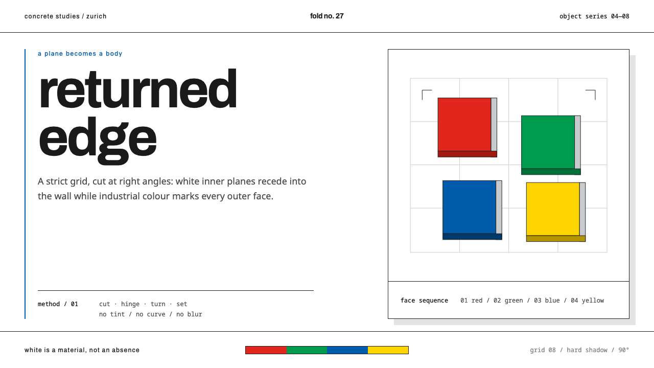 Nelly Rudin ConcreteFlat planes gain force. Archivo grids stage four industrial colours with hard…
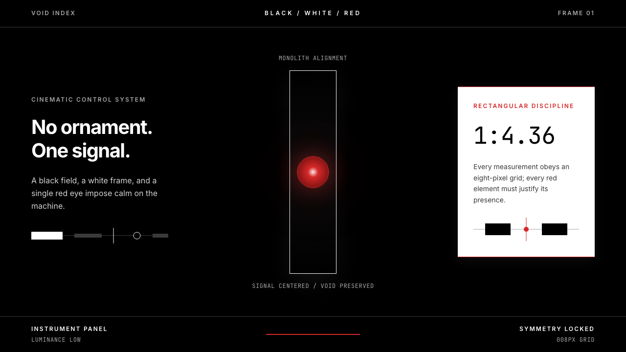 2001 — A Space OdysseyAbsolute restraint. Black void, white monolith geometry, one HAL-red signal.
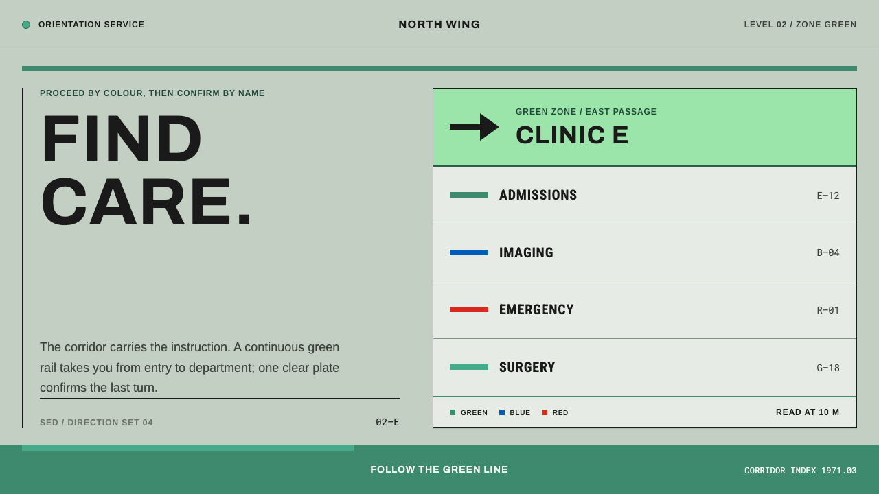 Hospital Wayfinding 1970Colour removes hesitation. Enamel green rails and open grotesque plates lead…
 Massimo Vignelli NYCClarity becomes infrastructure. Black rules and route stripes lock the white…
 Niemeyer Brasília CurvesEmptiness makes the monument. Concrete-white arcs cut across a saturated coba…
 NYC Subway VignelliThe city as a circuit diagram. Flat trunk-line color on black, angles locked…