What is Chang'e 4?
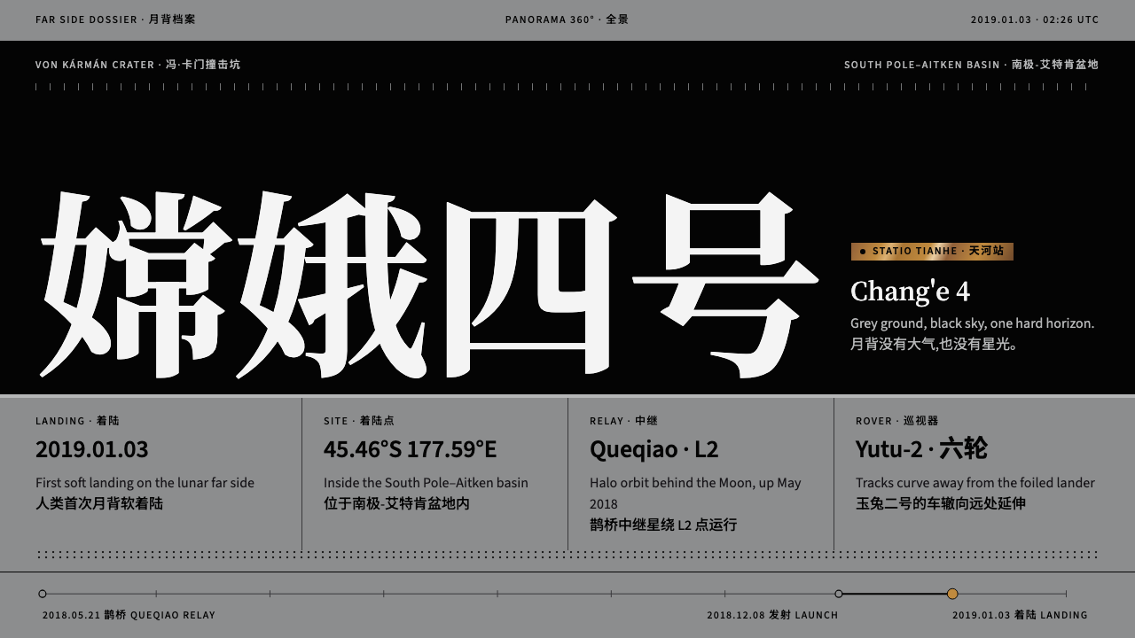
Chang'e 4 style is a grey ground, a black sky and one hard horizon, a design language of mission imagery in which a single fleck of gold foil is the only warmth.
Chang'e 4 in brief
Chang'e 4 style is a restrained, scientific design language drawn from the first panorama captured on the lunar far side by China's Chang'e 4 mission. Its palette is nothing more than mid-grey regolith, a pure black airless sky and the hard, straight horizon where they meet. Type, rules and rover tracks are all drawn in that same black, so the page has the stark simplicity of the place it describes.
Warmth appears exactly once. The lander is wrapped in gold foil, and that single reflective fleck becomes the system's only warm accent. Everything else is grey tone, hairlines and tabular readouts. Chinese and English captions are set side by side, the way mission imagery is published in bulletins and archives, which gives the pages a calm, documentary and bilingual quality.
The result is a style of silence and distance. There is no atmosphere to soften light, no colour to distract, and no decoration. It is well suited to research reports, space exhibitions and long, data-dense pages that need to feel precise and sober.

Where does Chang'e 4 come from?
The source is the Chang'e 4 mission, part of the Chinese Lunar Exploration Program, the Chang'e series. Because the far side of the Moon never faces Earth, a direct radio link is impossible. The mission therefore first launched a dedicated relay satellite, Queqiao, in May 2018, positioned beyond the Moon so that signals could be passed around it. This is the defining engineering idea of the mission: far-side exploration through a purpose-built relay.
On 3 January 2019 the lander touched down in the Von Kármán crater on the lunar far side, the first soft landing in that region. The rover, Yutu-2, rolled off and began moving across the surface, leaving two tracks behind it. Imagery returned from the lander and rover, including a panoramic image covering the full circle of the horizon, is the direct visual source of the design system.
The mission was operated from Beijing, and Yutu-2 continued to send traverse imagery in the following years. People associated with the programme include Wu Weiren, Sun Zezhou and Ye Peijian, who appear in the origin record of this style as key figures of Chinese lunar exploration.
As a design system, Chang'e 4 sits within the tradition of mission-panorama science imaging, where pictures are published as evidence as much as illustration. It belongs to the Chinese lunar programme as a cultural moment, and to the broader history of far-side exploration, in which every image arrives through a relay chain and carries the weight of distance.
What defines the Chang'e 4 look?
Color
The ground is a mid-grey tone taken from lunar regolith, neither bright white nor dark. Above it sits a pure black, since there is no atmosphere to scatter light. All type, rules and tracks use that same black, so the page reads as two tones with a hard line between them. Gold, from the lander foil, is the single warm accent, used in tiny amounts. Colour is information here, never decoration.
Typography
Headlines use a black serif, giving the pages the authority of a published report or a catalogue of record. Captions, coordinates and readouts are set in a restrained, tabular manner so that numbers align and can be scanned. Chinese and English are placed side by side at equal weight, which is how mission imagery is typically captioned and archived.
The horizon line
A hard, straight horizon is the system's central compositional device. Without atmosphere there is no haze, so the line between ground and sky is razor sharp. In layout this becomes a firm division: a full-width rule or a change from grey to black that anchors the page and tells the reader where the world ends and the dark begins.
Hairlines and tracks
Structure is drawn with hairlines, thin and precise, like survey marks. The two parallel tracks of the rover become a recurring motif: a pair of lines that can run across a page, linking sections and suggesting a path travelled. These lines replace boxes, shadows and fills, which keeps the surface flat and uncluttered.
Tabular readouts
Data is presented as readouts: coordinates, dates, distances and states set in neat rows. This echoes mission bulletins and telemetry displays, and gives even small facts a sense of verification. Tables are open and ruled with thin lines, not boxed in, so the page remains light despite being data-heavy.
Silence and distance
Space around elements is generous, and motion, if used, is slow and minimal. There are no glows, textures or lighting effects, because the Moon has none to give. The overall impression is of a long-distance signal received and recorded faithfully, without embellishment.

Who shaped Chang'e 4?
Wu Weiren is listed among the key figures of the Chinese lunar exploration programme. His name is associated with the overall engineering leadership of the Chang'e series, the institutional backdrop against which the far-side mission was achieved.
Sun Zezhou is associated with the Chang'e 4 spacecraft itself, the lander and rover pair whose imagery is the source of this style. His role represents the hardware engineering behind the first soft landing on the lunar far side.
Ye Peijian is another central name of the Chinese lunar programme, recognised as a senior figure of the Chang'e series. His inclusion in the origin record places the style within a lineage of long-term, cumulative space engineering rather than a single event.
How do you use Chang'e 4 today?
In slide decks, the cover can be a grey ground split by a hard horizon, with a black title in serif capitals and a thin pair of parallel lines. Content slides stay mid-grey with black type and hairline rules, and use bilingual captions under images. Data slides become readout tables, with one number marked in gold. This is a natural fit for research summaries, space science talks and institutional reports.
In web interfaces, use the grey ground and black type for documentation, archives and data portals. Navigation is plain text with hairline dividers. Primary actions are black rectangles with grey text, and gold appears only for a single highlight, such as the current selection. Pricing pages are an uncomfortable fit, but a spec or comparison table in this style reads clearly and calmly.
In dashboards, the style is at its best. Tabular readouts, thin rules and a two-tone palette suit telemetry-like displays, where precision matters more than excitement. Use black for all data, grey for the ground, and gold for the one status or value that needs attention, so the single warm note retains its meaning.
In editorial and marketing contexts, the style serves exhibitions, science communication, museum pages and long-form features on exploration. Use full-width panorama images, restrained serif headlines and paired Chinese and English captions. Let the horizon line structure the page and let silence do the rest.
The most common mistake is adding colour. Blue skies, glowing gradients or neon accents contradict a place with no atmosphere and make the page look like a generic sci-fi theme. A second mistake is spending the gold too freely, which removes the only warm note. A third is crowding the page: the style depends on space and hairlines, and heavy boxes or shadows ruin its calm.

Chang'e 4 — FAQ
What is the Chang'e 4 design style?
It is a restrained, two-tone design language based on the first panorama from the lunar far side: mid-grey regolith, a pure black sky, a hard horizon, black serif type and hairlines, with a single touch of gold from the lander foil. It is designed for reports, exhibitions and data-dense pages.
Why does the far side matter to the design?
The far side never faces Earth, so a relay satellite, Queqiao, was needed to carry signals. That idea of distance and mediated communication shapes the style: sparse, quiet, unembellished and precise. The mission's landing in the Von Kármán crater in January 2019 is the visual origin.
Why are Chinese and English captions set side by side?
It follows the way mission imagery is typically published, with parallel language captions of equal weight. In the design system it also adds a documentary tone and suits international audiences, such as science communication or exhibition materials.
How should gold be used?
Treat it as the one warm note, echoing the foil on the lander. Use it for a single highlight per view, such as the key value in a readout or the current selection. If gold appears everywhere, it stops signalling anything and the austerity of the system is lost.
Does it work for consumer products?
It can, if the product wants a precise, calm and scientific feel, such as measurement tools, analytics or educational content. It is less suitable for playful or promotional products that need warmth and energy, because the system deliberately removes both.
Related design styles
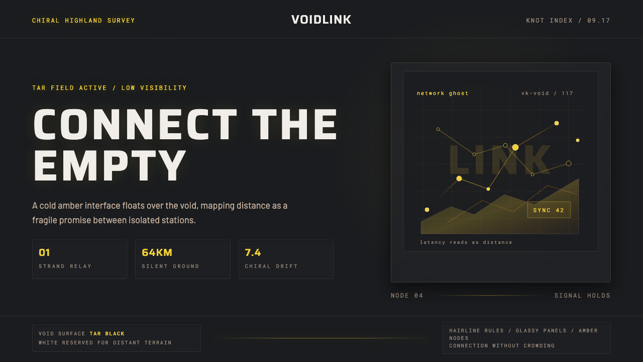 Death StrandingLonely connection, made visible. Amber HUD lines hover over a tar-black void.
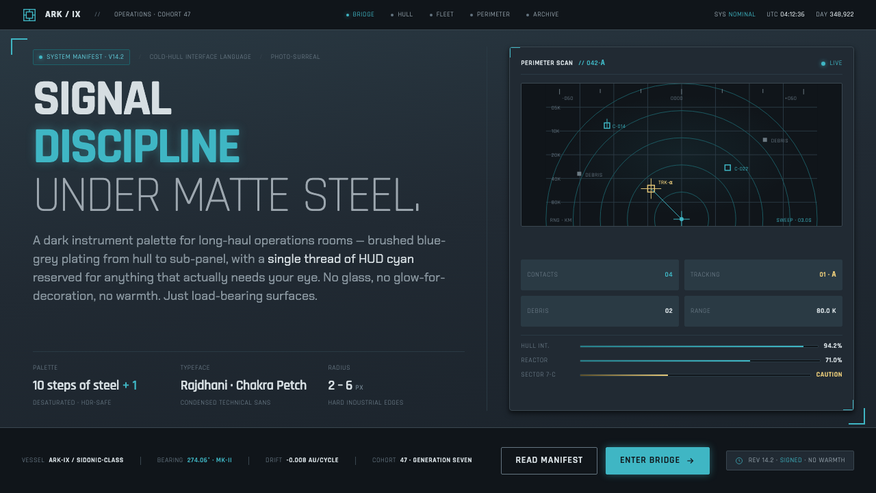 Knights of SidoniaSignal discipline under matte steel. Blue-grey hull, condensed Rajdhani, one…
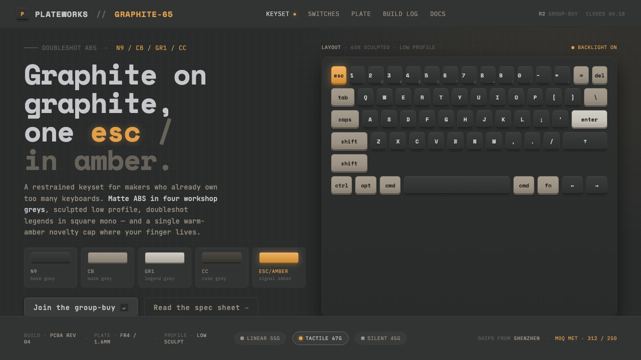 Mechanical KeyboardGraphite on graphite, one key in amber. Doubleshot ABS in GMK greys with mono…
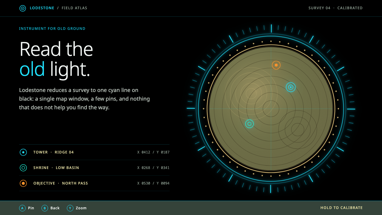 Sheikah SlateCalm light on black. Cyan hairline rings frame one sepia map disc inside a go…
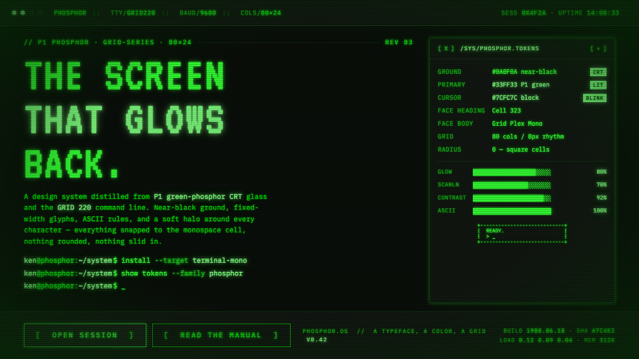 Unix Terminal MonoNear-black CRT glass that glows back. P1 phosphor green, VT323 mono, ASCII ru…
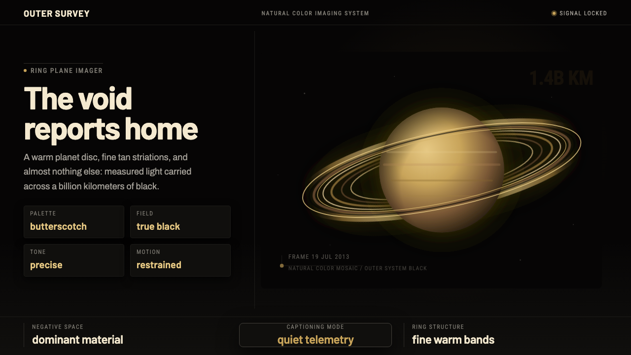 Cassini Saturn ImagingDeep space feels exact. Butterscotch Saturn floats in black with fine tan rin…