What is Sao Terracotta?
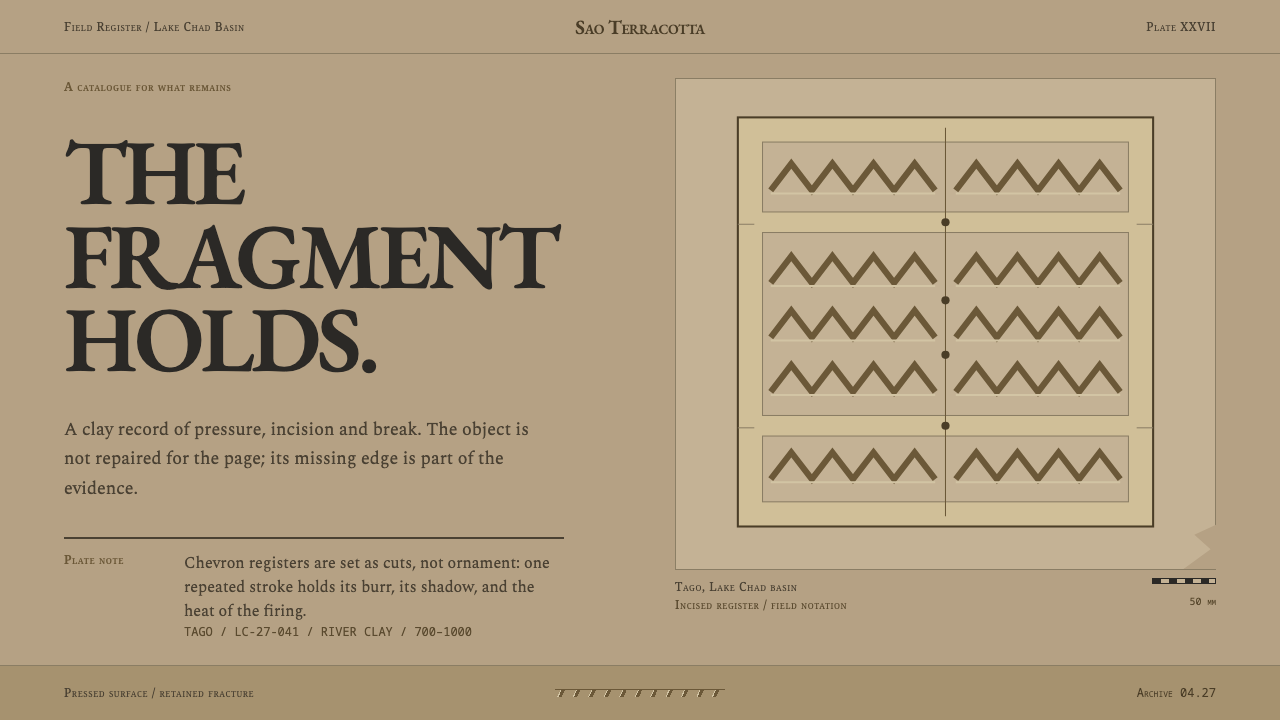
Sao terracotta is an art of fragments: hand-pressed river clay, deeply scratched chevrons, and a surface that keeps both the modelling and the break.
Sao Terracotta in brief
Sao terracotta names the clay figures made in the Lake Chad basin by the people archaeologists call the Sao, in a tradition that runs from about 1000 BC to about 1400 AD. The figures were built up in coils from river clay, low-fired, and pressed into shape by hand: bulging eyes, a shelf of a mouth, ears thrown outward, small bosses of clay for nipples and necklace beads, and chevron bands scratched deep across the shoulders and chest.
Almost none survived whole. What reaches us are torsos without heads, busts without arms and lower bodies snapped at the waist, and they come to us through twentieth-century French archaeological publication, catalogued by site, by date and by inventory number. The design system keeps both halves of that inheritance: the pressed clay surface of the original, and the break that archaeology made visible.
As a style, Sao Terracotta is light, earthen and documentary. The ground is a buff, unevenly fired ochre; the type is a scholarly old-style serif of the kind French publishers used for plates and captions; and the layout is an archaeological plate of object, caption and inventory line. Cards and tiles in this system may be missing a corner, because incompleteness here is not a bug to be repaired but the shape of the material.
Where does Sao Terracotta come from?
Sao material comes from the Lake Chad basin, where excavated sites include Tago and Gaoui in Chad and Woutio in northern Cameroon. The tradition spans a very long time, from about 1000 BC to about 1400 AD, and it is a regional one rather than a single workshop's output. A statuette from Tago is dated to somewhere between the years 700 and 1000, which places a good part of the surviving sculpture in the centuries before the later medieval period of the Sahel.
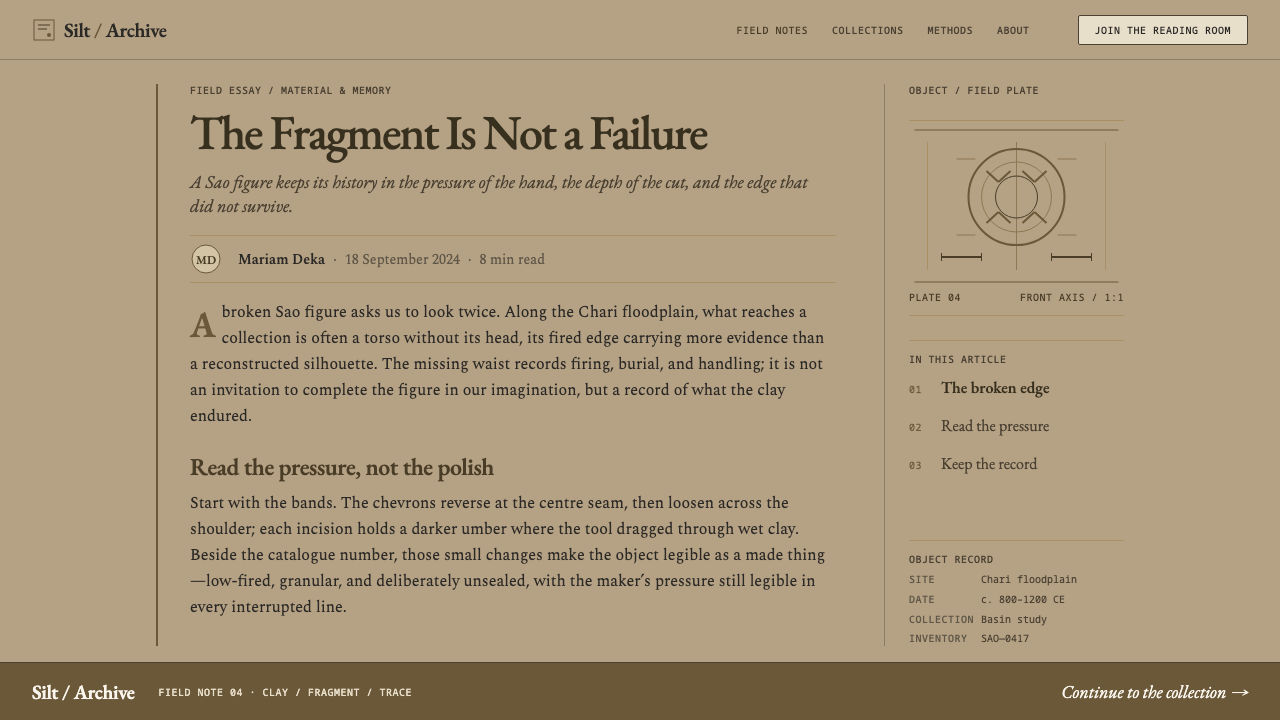
The making technique belongs to a wider Sahelian tradition of coil-built ceramic sculpture. A potter builds a form ring by ring, smooths and presses it by hand, and finishes with applied and incised detail before a low firing. Low firing leaves the clay porous, fragile and unevenly coloured, which helps explain both the warm, patchy ochre of surviving surfaces and why so few figures lasted whole through centuries of burial. The deepest incisions often show the heaviest firing colour, while the rest of the body stays a paler buff stained by long contact with earth.
Most of what we know of the figures comes through French Africanist archaeology, with excavation and publication running from the 1930s to the 1960s. Marcel Griaule, Jean-Paul Lebeuf and Annie Masson Detourbet are the names most closely tied to that work. Their reports gave the fragments the format in which we still meet them: plates and captions with site names, dates and inventory numbers, set in the typography of mid-century French scholarly printing. That documentary frame is not incidental to this style. It is half of it.
The decision that defines the system is to treat damage as form rather than error. Excavated sculpture is almost never perfect, and a style that restored every missing arm would be telling a different story. So containers may be notched or cut at a corner, the rough pressed surface is paired with a quiet academic layout, and the scratched chevron, the one decorative gesture the clay allows, carries the energy. The restraint comes from the archaeologist's page; the force comes from the clay.
What defines the Sao Terracotta look?
Clay Ground
The base colour is a buff ochre, a pale earthen yellow-brown that looks unevenly fired. It is never a clean flat tint: there are warmer patches, paler patches and faint earth stains, as though the surface had been buried and then lifted. This keeps large areas of the page warm and quiet and gives every other element a mineral ground to sit on. Dark tones come from burnt clay and shadow, never from pure black.
Pressed, Thumb-Made Forms
Features are pushed into the clay rather than drawn on it: bulging eyes, a thick shelf of a mouth, ears thrown out to the sides. In interface terms this means shapes that are heavy, rounded and slightly irregular, with soft but confident corners and no hairline precision. Forms look pressed into place by a hand, and proportions favour mass over elegance. Crisp vector perfection is the wrong register for this material.
Incised Chevron Bands
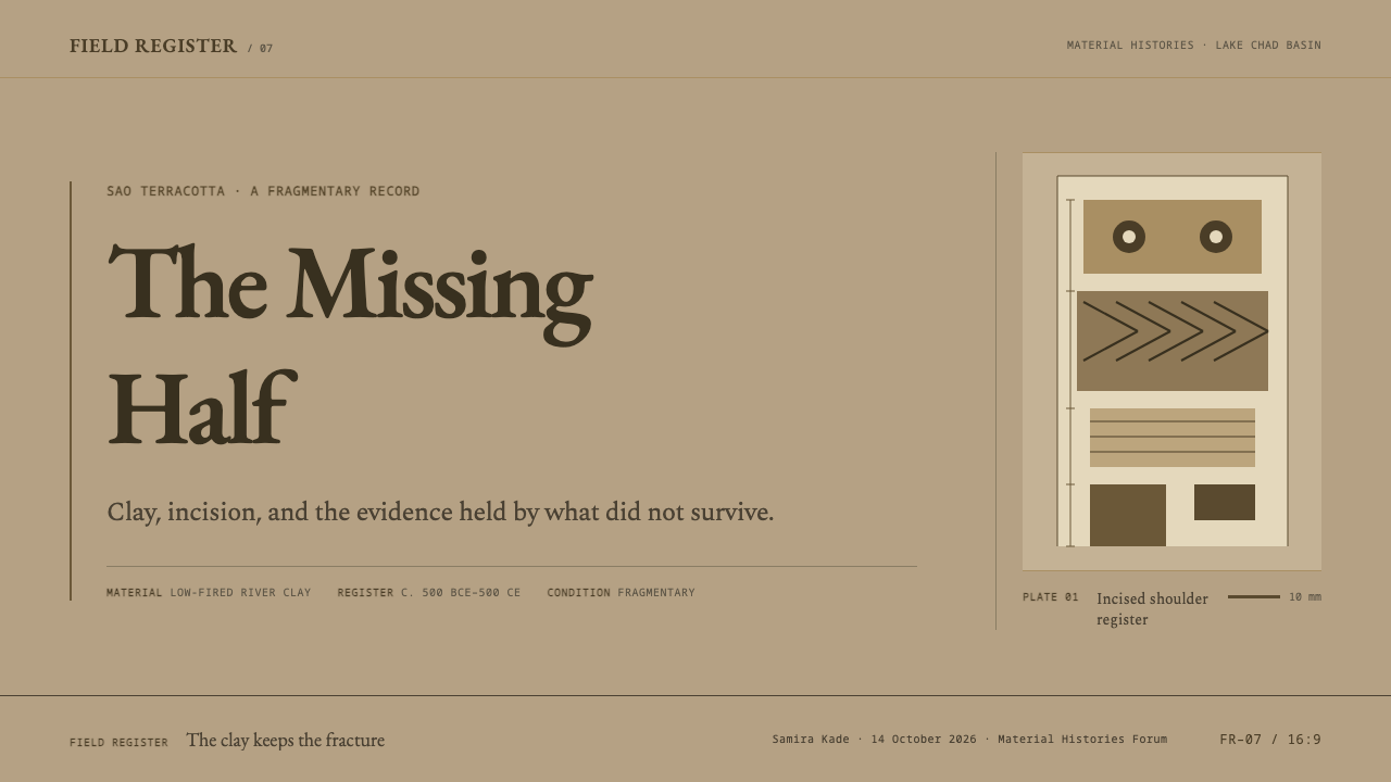
The signature ornament is the chevron: a V-shaped mark scratched in rows across shoulders, chest and arms. It is cut deep, so the grooves read as dark, directional and slightly ragged. Used as a divider, a header band or a repeated edge, it becomes the system's single decorative gesture. One band, placed with intent, does more than a pattern spread everywhere; the incised line should feel carved, never printed.
Bosses and Beads
Small round bosses of clay stand for nipples and necklace beads, and they supply the style's second motif: the pressed dot. A single dot or a short string of them works as a bullet, a marker, a pagination cue or a bead-like divider. They sit slightly raised, small against large masses, and keep the language tactile. Dots should stay few and spaced, like a necklace, not tiled like wallpaper.
The Break
Because almost no figure survives whole, incompleteness is part of the form. Cards, tiles and image frames may be cut off at a corner or along one side, with a rough, uneven edge instead of a clean one. The break is not a rendering glitch; it is a statement that the fragment is the true object. The rule is restraint: a missing corner on a few elements reads as archaeology, while damage on everything reads as a broken page.
Archaeological Plate Layout
The page is organised like a plate in a scholarly publication: one object, a short caption naming the site and date, and an inventory line. Information sits in a calm, ruled column beside or below the image, with plenty of margin and a documentary tone. This gives the style an unusual strength for catalogues, collections and any content that needs provenance. Labels should be exact and unembellished.
Scholarly Old-Style Serif
Type is an old-style serif in the tradition of French scholarly printing: humane, slightly calligraphic, set at a comfortable reading size with generous leading. It plays the part of the archaeologist's caption, so it stays quiet and lets the clay speak. Headings may be larger and set in the same family rather than a contrasting face. Pairing the roughness of the object with the refinement of the page is the heart of the style.
Who shaped Sao Terracotta?
Griaule was a French ethnologist whose name is attached to the early twentieth-century French expeditions in Africa, and whose work sits at the start of the fieldwork through which Sao figures became known in Europe. His name stands for the 1930s phase of French Africanist archaeology and for the documentary habits that grew out of it: site names, dates and inventory numbers attached to every piece. Those habits became the visual frame this system inherits.
Lebeuf is one of the key names in the excavation and publication of Sao material, and the work attached to him spans the decades from the 1930s toward the 1960s. His reports presented the clay figures as dated, sited, numbered objects, and that mode of presentation is what the system quotes: a documentary column of captions beside objects that are shown as found, broken and incomplete.
Masson Detourbet is another of the French archaeologists associated with the study and publication of Sao sculpture. Her name belongs with Lebeuf's in the record of mid-twentieth-century fieldwork around Lake Chad. Together, the three scholars named here explain why Sao figures reach us in the form of plates and captions, and why a faithful design style must carry the voice of the scholarly catalogue alongside the voice of the clay.
The makers of the figures are anonymous, and they are the real authors of the style: potters in the Sahelian coil-built tradition, building each figure from river clay ring by ring and pressing the features by hand. No signature survives, only the repeated vocabulary of bulging eyes, thick mouths, outward ears and incised chevrons. For a designer, this anonymity argues for credit given to the tradition and to the sites, never to an invented author.
How do you use Sao Terracotta today?
Sao Terracotta is a style of material and provenance, and it works best where content has a source worth citing. Think of it as a collections-and-catalogue aesthetic: the warm clay ground and quiet serif do the work, while a few deliberate breaks and incised bands carry character. The important discipline is to let the fragment be a fragment.
On slides, a cover can be built as an archaeological plate: a large clay-ochre field, a single heavy shape or image set to one side, a short caption line with a number, and one chevron band along an edge. Content slides should stay calm and left-weighted, with serif headings, narrow captions and plenty of margin. Data slides work well when presented as findings: a labelled chart in earth tones, a plain table styled like an inventory list, and a one-line source note under each exhibit.
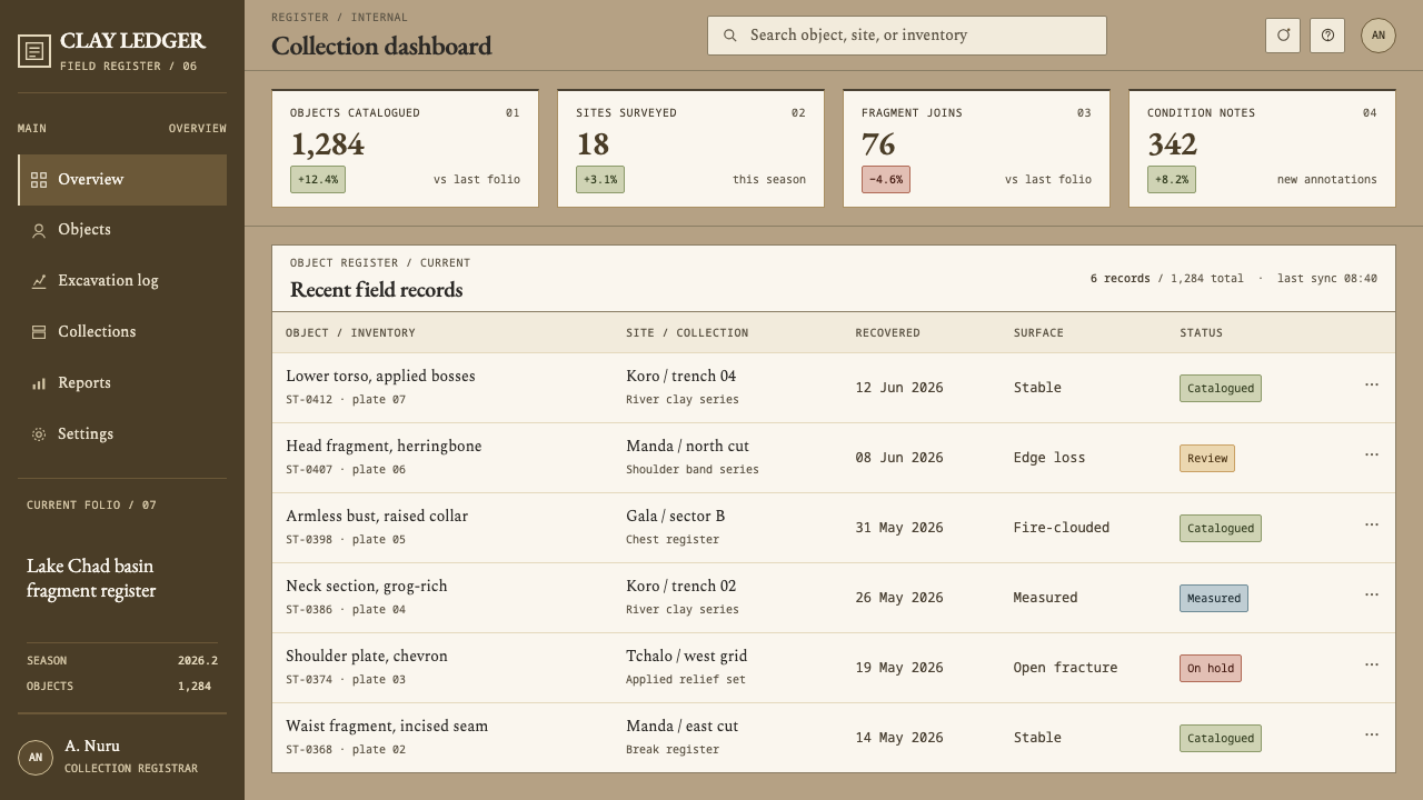
For web interfaces, the style suits museum and archive sites, catalogue and collection browsers, cultural-heritage products, education tools and reading apps. Use the clay ground for pages and a slightly deeper ochre for cards; mark selection and focus with a deep, burnt-clay tone; and cut a corner off a few key cards instead of adding drop shadows. Pricing or plan pages should use rough-edged panels and a short chevron rule, with one plan flagged by a bold border rather than a glow.
In editorial and marketing work, the style supports slow, informed storytelling: heritage brands, ceramics and craft products, long features on history and place. Photography should be raw and closely cropped, showing surface, break and tool marks, and be toned toward warm ochre so it belongs on the clay. Captions are part of the design, not an afterthought: give each image a site, a period and a short note in the manner of a plate.
The most common mistake is to treat the break as a decorative effect. Torn edges everywhere, fake cracks over text or a cracked-texture overlay make a page look damaged rather than documented. A second mistake is polishing the style until it becomes generic beige minimalism: the chevron, the pressed forms and the caption line are what give it identity. A third is using the figures as free exotic imagery; they are archaeological material with a record, and the record should travel with them.
Sao Terracotta — FAQ
Why does this style intentionally include broken or incomplete elements?
Because the source material is almost never whole. Sao figures reach us as torsos without heads, busts without arms and lower bodies snapped at the waist, and that incompleteness is how archaeology presents them. The style treats the break as part of the object's shape rather than something to restore. In practice that means notched corners and rough edges on a few elements, used sparingly, so the page reads as documented rather than damaged.
What is the difference between Sao Terracotta and other earthy or beige styles?
Earth-tone styles often rely on soft, warm neutrals for comfort. Sao Terracotta is more specific: its warmth is the unevenly fired colour of clay, its decoration is a deeply incised chevron and its structure is the archaeological plate with a caption and inventory line. The break and the scholarly serif are also essential. Without those, it collapses into generic beige minimalism, which is exactly what the style is meant to avoid.
Does the style need dark colours?
It is a light style, but depth comes from burnt-clay and shadow tones rather than pure black. Use a deep, warm brown for text, a darker ochre for emphasis and a deeper fired tone for the incised grooves. If you need a dark mode, treat it as an inverted museum vitrine: a deep earthen ground with the clay ochre as the lit object, while keeping the chevron and caption layout unchanged.
How should imagery work with this style?
Keep images raw, close and honest: objects photographed as found, with surface, tool marks and breaks visible. Avoid polished studio gloss and heavy filters. Tone photographs toward warm ochre so they sit naturally on the clay ground, and always pair an image with a short plate-style caption giving site, period and a note. Illustration should be sparing, and where used it should echo the pressed, incised forms of the originals.
Which products is it a good fit for?
It suits anything where provenance and substance matter: museum and archive sites, collection and catalogue tools, education and history products, ceramic and craft brands, and long-form editorial. It struggles in contexts that need speed, glossy novelty or high-energy colour, such as gaming, fintech dashboards or children's apps. The style asks the viewer to slow down and read the caption, so choose it where that is a virtue.
Related design styles
 Bosnian Stećak Medieval TombstoneStone remembers quietly. Lichen green and Cinzel cuts sit on weathered limest…
 Cook Islands Tangaroa CarvingOne-material gravity. Warm browns, sawtooth rows, and raking light carve hier…
 Emirati Bait Al Naboodah Coral HouseFeels built, not styled. Coral ochre, teak brown, and a sky-square courtyard…
 Samoan Siapo MamanuBeaten bark, never white. Five natural dyes paint freehand grids of fish, she…
 Seychellois Vanilla TakamakaBotanical apothecary in shadow. Deep green, brass hairlines, and copperplate…
 Shaker Furniture 1850Utility becomes beauty. Bone plaster, iron black, smoke pine, and one smoke-t…