What is Kinngait Stonecut Print?
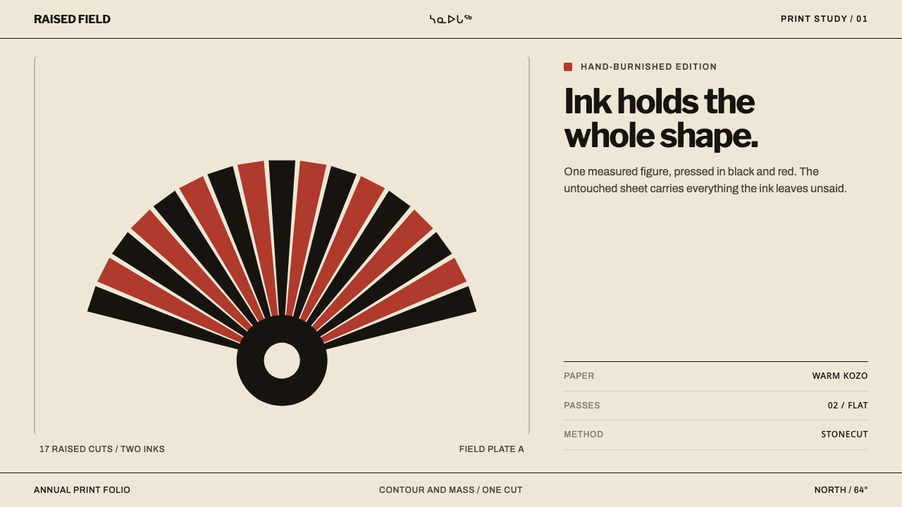
Kinngait stonecut puts one strong shape on a warm, mostly empty sheet: flat black and red ink, cut from stone and pressed by hand into Japanese paper.
Kinngait Stonecut Print in brief
Kinngait stonecut is the print tradition that grew out of the West Baffin Eskimo Co-operative in Kinngait, on Baffin Island in Nunavut (the settlement long known in English as Cape Dorset), beginning in 1959. The method is physical and direct. A drawing goes onto a flat stone block; the areas that should stay blank are cut away; ink is rolled across the raised face that remains; and a sheet of Japanese kozo paper is burnished by hand until the image lifts from the stone. What comes out is not a painting reproduced but a drawing converted into a different kind of object, in which every edge is a cut and every colour is a single flat layer.
The look that results is among the most recognisable in northern printmaking: one transformed creature filling the sheet, ink laid down flat with no shading, no horizon and no ground, and a great deal of untouched warm paper doing the rest of the work. The system described here uses two or three inks, black and red above all, and treats them as hard-edged fields of colour. Nothing is modelled with light. Form is entirely a matter of what was cut away and what was left.
As a design style, Kinngait stonecut is a lesson in letting one shape govern a page. Emptiness is not leftover space but the second half of the composition, because the sheet itself carries colour and warmth. Interfaces built on this logic use a very small number of inks, one dominant form, and a generous quantity of bare paper.
Where does Kinngait Stonecut Print come from?
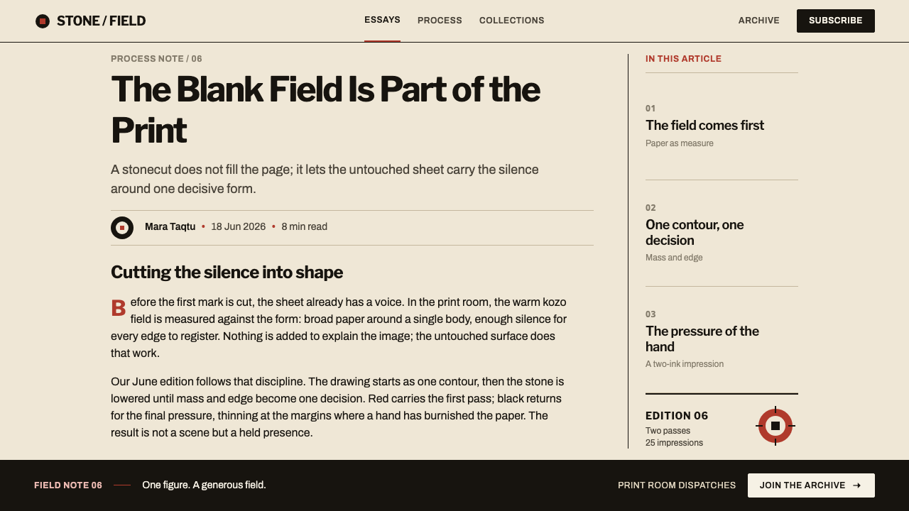
The tradition begins in 1959, when the West Baffin Eskimo Co-operative in Kinngait turned Inuit drawing into a print tradition. Kinngait, formerly Cape Dorset, lies on Baffin Island in Nunavut, Canada; the co-operative's name is a historical one and is preserved here as such. What the co-operative did was institutional as much as artistic. It created a working place where drawings could be converted into stonecut editions and issued as annual print collections, and the founding collections of the 1960s are the reference period from which this design system takes its look.
The process explains the aesthetic. Stone is a dense, flat, unforgiving matrix. Cutting away the negative areas leaves the image as a raised surface, and a raised surface can carry ink only as a single flat layer; there is no way to model a tone on it. Burnishing onto kozo, a paper made from the inner bark of the paper mulberry, keeps the hand-pressed character of the print even though the colour itself is flat. The style's references pair stonecut with stencil, a sister technique that also depends on cut openings and unmodulated colour, which is why the two share a visual grammar.
Kenojuak Ashevak's The Enchanted Owl, from 1960, set the terms for what a Kinngait print could be. It shows one transformed creature filling the sheet, with ink that is flat and unmodulated, no horizon and no ground, so the figure floats on the paper itself. The untouched warm paper does the rest. Almost everything the design system borrows is already present in that single image: scale, flatness, restraint, and a willingness to let emptiness hold the composition.
Other names that anchor the tradition in the style's references are Iyola Kingwatsiak, Eegyvudluk Pootoogook and James Houston, set beside the co-operative itself. The movement labels attached to the style are Inuit printmaking, stonecut and stencil, and the West Baffin Eskimo Co-operative print collections. Together they describe a collective, workshop-based practice with a recognisable house character, and not the work of one isolated hand. A design system that borrows the character should also credit the structure that produced it.
What defines the Kinngait Stonecut Print look?
One Shape, Whole Sheet
A single transformed shape commands the sheet and radiates its force outward across the paper. Supporting forms, if any, are few and subordinate. Hierarchy is not a ladder of five sizes of text but a question of one thing that is unmistakably first. The strength of the image comes from refusing to share the page with anything of comparable weight.
Flat Ink
Two or three inks, black and red above all, lie down as flat, unmodulated fields. There is no gradient inside a shape, no soft transition at its edge and no suggestion of light falling across it. A colour is either present or absent at any point on the sheet. This is a direct consequence of printing from a raised stone face, and the discipline that results is what makes the image read as bold rather than decorative.
Warm Paper as Ground
The ground is not white but the warm tone of the kozo sheet itself, untouched wherever ink was not applied. The paper counts as one of the colours in the composition: black and red are read against it, and its warmth is what stops the starkness of two strong inks from turning cold. The sheet is a material with character, not a blank screen waiting to be filled.
No Horizon, No Ground
The creature does not stand on anything. There is no horizon, no landscape, no surface it casts a shadow onto. This removes the usual cues of scale and place and lets the figure exist as pure shape. In interface terms it means no scenic backgrounds, no floor line, no drop shadow anchoring the element to a plane. The shape floats on the paper, and the paper is enough.
Cut Edges
Because the image is made by cutting away what should not print, every edge is the trace of a decision. The outlines are confident and slightly irregular, never feathered or airbrushed, and they hold their shape where ink meets paper. Edges that look cut rather than drawn give the print its physicality, and they ask for crisp, hard boundaries wherever the style is translated to a screen.
Emptiness as Force
Large areas of the sheet carry nothing at all, and that emptiness is where the print's power is held. The unprinted paper gives the single shape room to push outward and gives the viewer's eye somewhere to rest. Filling the empty areas, however tastefully, would turn a print about one thing into a print about several, and the force would drain away.
Who shaped Kinngait Stonecut Print?
The artist behind The Enchanted Owl of 1960, the print that set the terms for the whole tradition. Its single transformed creature fills the sheet, in flat ink, with no horizon and no ground. Her image is the clearest statement of what this design system is after: a single form strong enough to be the entire composition, and paper left alone to do everything else.
The Kinngait institution that in 1959 turned Inuit drawing into a print tradition. It is preserved here under its historical name. As a workshop and publisher of annual print collections, it supplied the structure that moved drawing onto stone, into ink and onto kozo, and the visual character of the style is as much a product of that shared process as of any single artist.
Houston's name sits in the style's reference list beside the artists and the co-operative. What carries over into design is the partnership model it points to: individual artists whose drawings are strong enough to be the whole image, and a shared workshop that reduces them to cut stone and flat ink. This article keeps to what the listing supports and does not attempt a biography.
Both are listed among the key figures of Kinngait printmaking in the style's references. Their presence beside Kenojuak Ashevak matters for one reason: it shows the look is a shared one. The flat ink, the single dominant shape and the warm empty sheet belong to a community of artists and a workshop, not to one signature hand, which is why the style generalises so well.
How do you use Kinngait Stonecut Print today?
Kinngait stonecut is a strongly poster-like style, and it works best when you let it be bold and sparse. Applying it well means treating the sheet as a material, the ink as flat colour and the single dominant shape as the point of the composition, rather than laying a black and red palette over an otherwise busy layout.
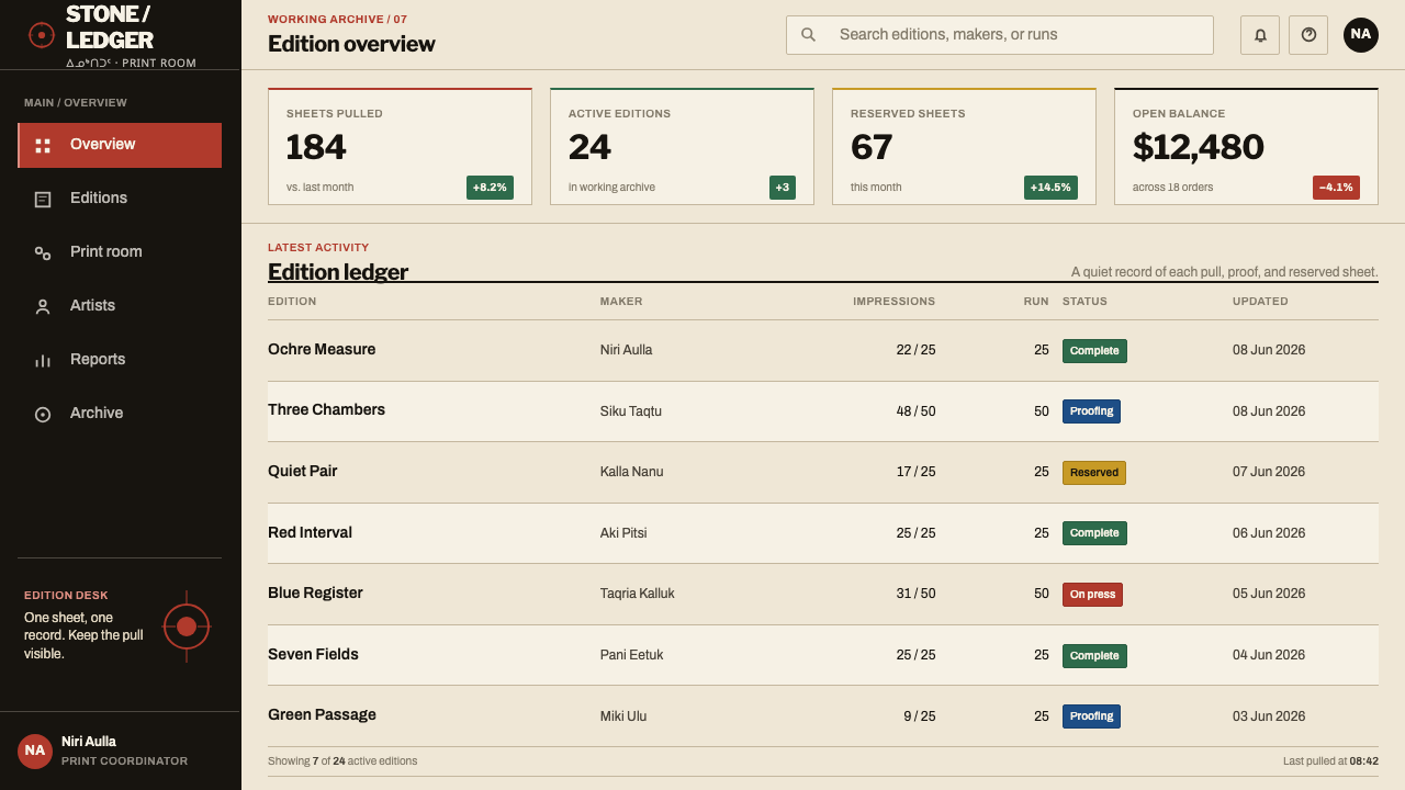
On a presentation cover, give the slide to one large shape in black, with red used sparingly as a second ink, set against a warm, paper-toned ground, and keep the title small and quiet. Content slides should carry one idea and one form each, with a lot of empty ground. A data slide becomes a print: emphasise a single bar, segment or number in red, let the rest sit in black or recede into the paper, and avoid gridlines, tinted panels and legends that compete with the one thing you want seen.
For web interfaces, the style suits landing pages, campaigns, portfolios, cultural and gallery sites and anything that wants a single memorable image above the fold. Use a warm paper-like background rather than pure white, limit the palette to two or three flat inks, keep buttons and cards as flat shapes with hard edges, and remove shadows. Dense dashboards are a poor fit, because the style relies on emptiness; if it is used there, restrict it to a hero area or a status panel where one thing deserves to dominate.
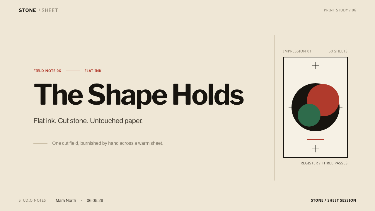
In editorial and marketing work the style behaves like a screen-printed poster or a limited-edition print. A cover, an announcement or a campaign page can be one image with a short line of type; long copy sits on the bare paper with generous margins, and any additional image is treated as a second, smaller print rather than a competing hero. Captions and credits should be quiet, since the strength of the layout comes from how little it says.
The most common mistake is crowding the sheet: adding supporting illustrations, panels or ornaments until the single shape no longer commands anything. The second is smoothing the ink with gradients, glows or soft shadows, which contradicts the flat, cut quality of the process. A third is switching to a pure white screen background, which loses the warmth of the paper that holds the whole palette together.
Kinngait Stonecut Print — FAQ
What is a stonecut print, and how does the process shape the look?
A drawing is transferred to a flat stone block and the negative areas are cut away, leaving the image as a raised face. Ink is rolled across that face and a sheet of kozo paper is burnished by hand until the image lifts. Because a raised surface carries only one flat layer of ink, the finished look is hard-edged, unshaded and bold, and the paper left untouched becomes part of the picture.
Why use warm paper instead of a pure white background?
In the prints the ground is the kozo sheet itself, and its warmth is part of the palette. Black and red are read against it, and it softens the starkness of two strong inks without adding any decoration. On a screen, a warm off-white keeps that relationship alive; pure white tends to make the same inks feel colder and more clinical.
Can I use more than two or three colours?
You can, but each extra ink dilutes the central idea of one shape commanding the sheet. If another colour is genuinely needed, treat it with the same discipline as the others: a flat field with hard edges and a clear job, used rarely, never as a gradient or tint. The most convincing work in this style is usually the one that does more with fewer inks.
Does the style work with a dark background?
It is a light-ground style: the warm sheet is part of the palette and the empty areas are meant to feel open. A dark ground turns that emptiness heavy, and the dark ink loses the contrast that gives it its authority. If a dark variant is needed, treat it as a different print altogether, with its own limited inks, instead of a simple inversion of the light one.
How should I use this style respectfully outside its home context?
Borrow the method, not the pictures. Flat ink, one dominant shape, no horizon and a generous warm sheet are design principles that travel well; the creatures and motifs of Kinngait artists are not clip art. Credit Kinngait and its printmaking tradition where the style is named, avoid imitating specific images, and use your own subject matter inside the discipline the process teaches.
Related design styles
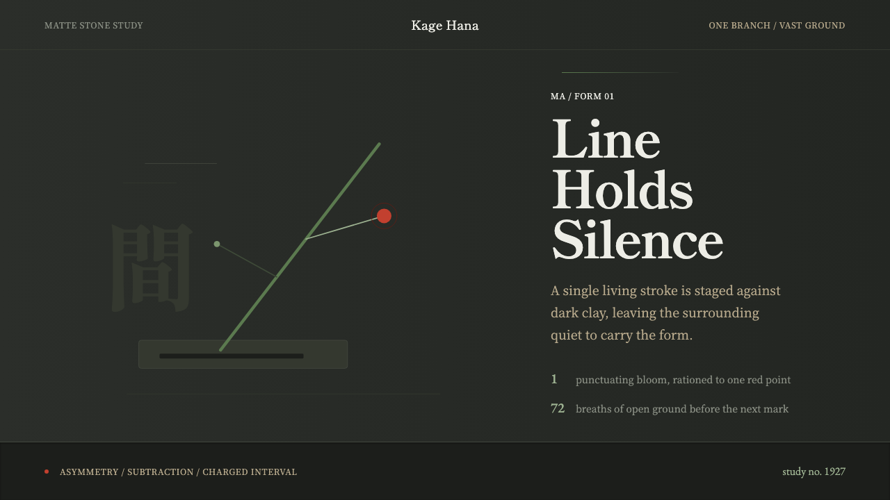 Ikebana SōgetsuQuiet becomes form. Dark stone, Mincho type, one green line and a single red…
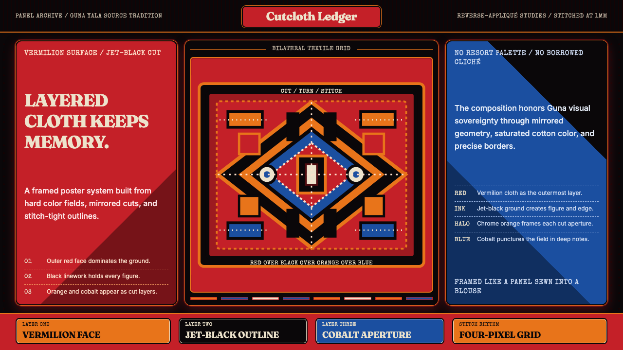 Panamanian Mola Kuna AppliquéSewn sovereignty. Vermilion panels reveal black, orange, and cobalt stitch-gr…
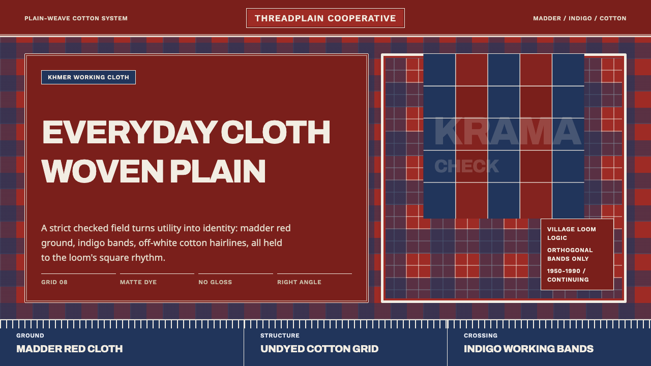 Cambodian Krama CheckPlain cloth has authority. Madder red, indigo bands, and cotton grid lines do…
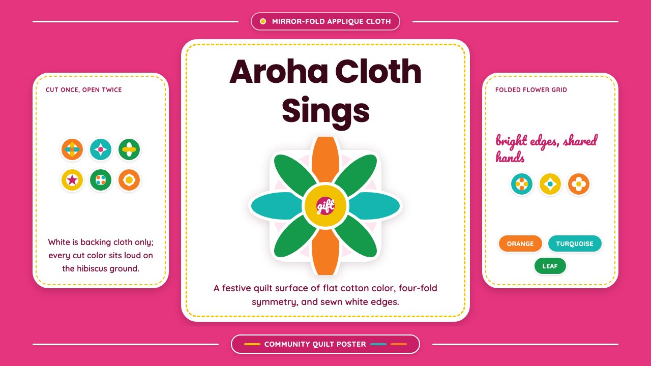 Cook Islands TivaevaeSaturated craft sings. Hibiscus pink carries mirror-fold florals in flat appl…
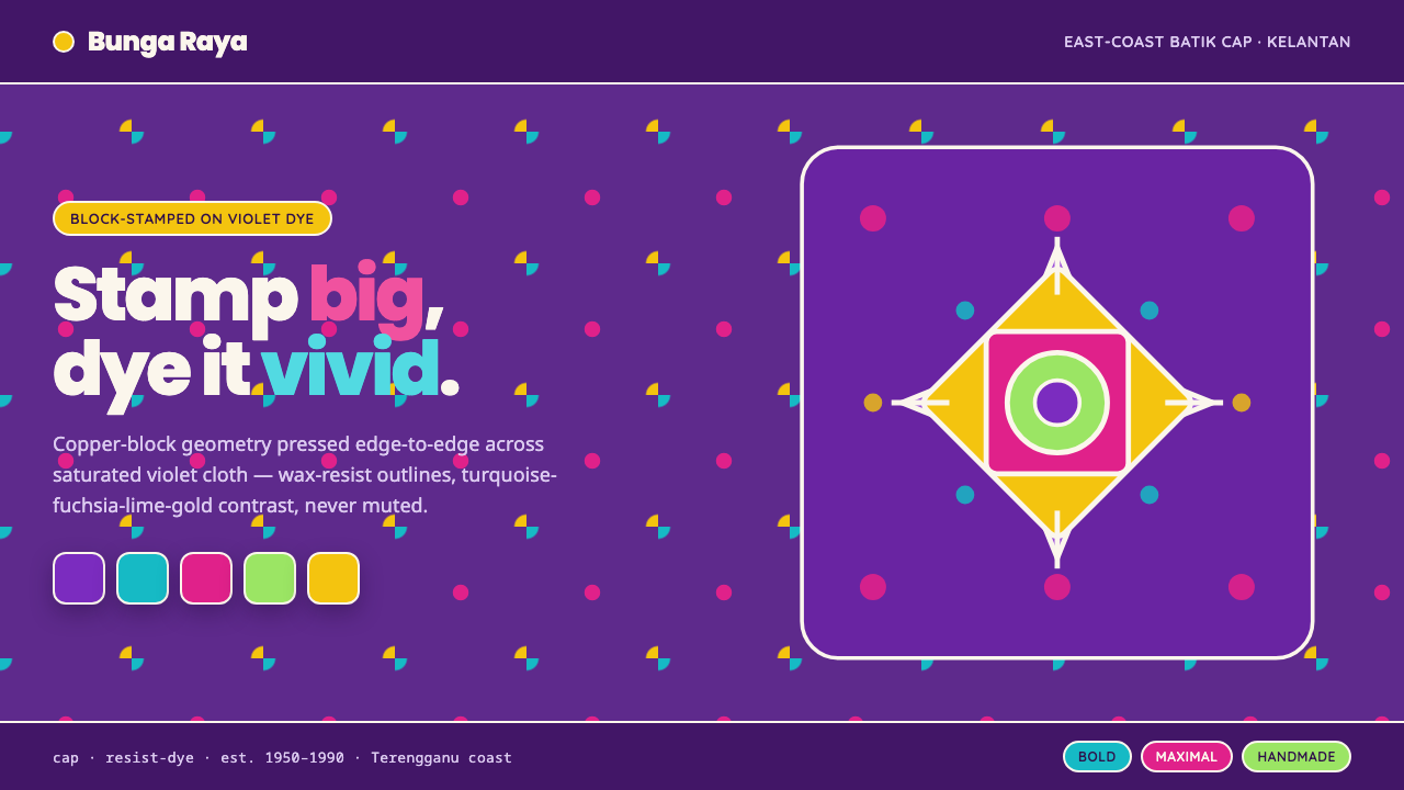 Kelantan Block BatikBright Malay batik, not Javanese brown. Oversized hibiscus stamped turquoise-…
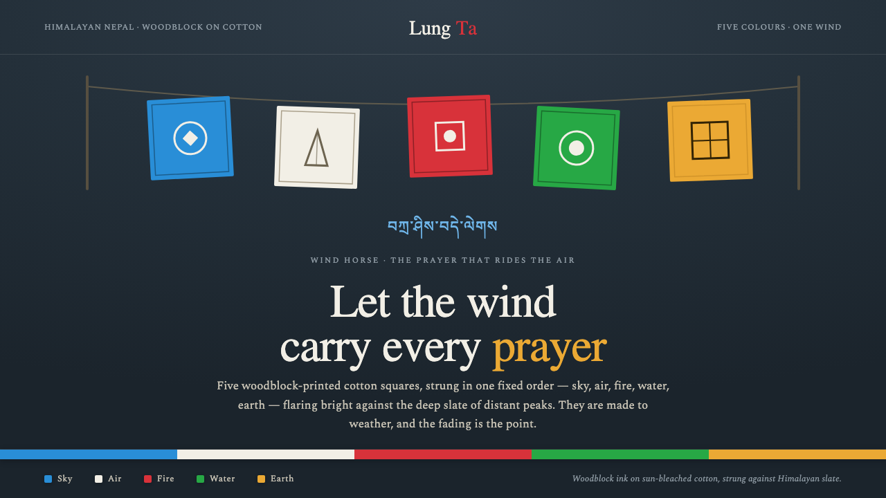 Nepali Lungta Prayer FlagsLet the wind carry the prayer. Five woodblock flags flare in fixed order agai…