What is Black Myth: Wukong?
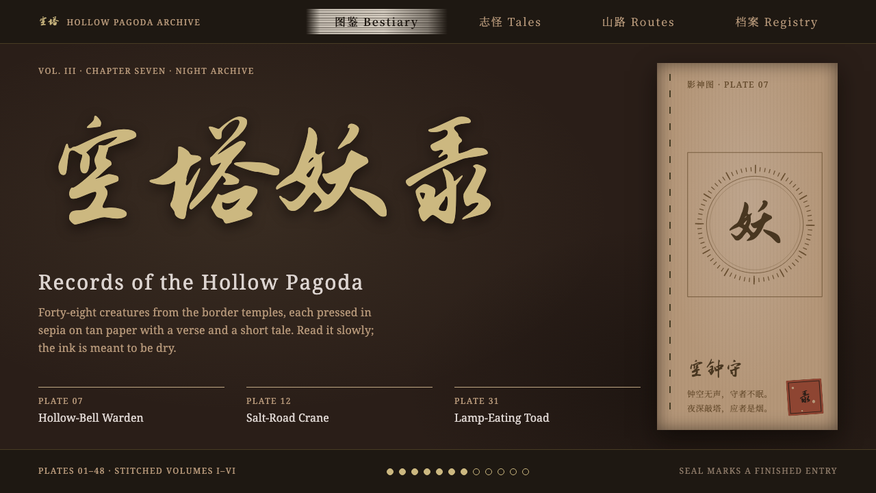
Black Myth: Wukong reads like a temple archive by incense light: pale gold running script on dark umber, tan woodblock plates, and a single cinnabar seal.
Black Myth: Wukong in brief
The Black Myth: Wukong style is the interface language of Game Science's 2024 action role-playing game, drawn from the classic novel Journey to the West. It does not rely on glittering gold or lavish ornament. Its mood is closer to a temple archive at night: a dark umber ground, selection bars brushed on in dry ink, pale lacquer-gold titles in running script, and a cinnabar seal that marks what is finished.
The heart of the system is the Journal of Shadows, a book in which every yaoguai, or spirit-monster, receives a sepia portrait and a short tale. The pages look stitched and woodblock-printed, on tan paper that seems handled and aged. Portraits are drawn in earthy ochre, text is set in brush-flavoured type, and the whole surface behaves like a manuscript instead of a screen.
Three rules keep it disciplined. Ink must be thin and pale. Gold must be matte rather than shiny. And the seal is stamped only once. When those rules are followed, the style is perfect for lore sites, cultural archives, museum-like catalogues and long-form storytelling that should feel old, handled and quietly reverent.

Where does Black Myth: Wukong come from?
Black Myth: Wukong was revealed in 2020 and released on 20 August 2024. It was developed by Game Science, a studio working between Hangzhou and Shenzhen, with Feng Ji and Yang Qi among the names most closely associated with the project. From its first trailer, the game stood out as a large-scale action title built on Chinese mythology rather than on borrowed fantasy, and its release made it one of the most discussed Chinese games ever.
A defining feature of its visual identity is the use of real places. Many of the ancient temples and pagodas that appear in the game were captured by photogrammetry at actual sites in Shanxi province, so that the stone, timber and weathering come from the real world. This grounding gives the game's atmosphere its weight, and it explains why the interface does not read as fantasy gold but as dusty, tactile heritage.
The interface also draws on contemporary Chinese calligraphy and type design. Titles use a pale gold running script, flowing and slightly irregular, in contrast to the formal rigidity of printed regular script. Selection is shown not by glowing frames but by bars of brushed ink that look as though they were wiped across the page. The cinnabar seal, a long tradition in Chinese painting and calligraphy, serves as the one concentrated spot of red.
The Journal of Shadows adds a bookish layer. Stitched binding, woodblock printing and tan paper evoke traditional printed books, and the yaoguai portraits on them recall illustrated bestiaries. The design thereby connects a modern action game with a long Chinese tradition of strange-tale collections, in which monsters, spirits and gods are catalogued with equal care. The style we describe is that catalogue, rendered as an interface.
What defines the Black Myth: Wukong look?
Dark umber ground
The base is a deep, warm brown rather than pure black. It feels like old lacquer, smoke-stained timber or the interior of a temple hall. Because it is warm, light elements glow softly instead of glaring.
Pale lacquer-gold running script
Titles are set in a muted gold with calligraphic movement. The gold is matte and dusty, never metallic or glossy. The brush-like rhythm gives headings human warmth and a sense of handwriting.
Brushed-ink selection bars
The active item is indicated by a dry-brush bar of dark ink, not by a bright outline. The edges look uneven, as if wiped by a loaded brush, which gives the interface a physical, painted quality.
Tan woodblock paper
Content panels take the look of aged paper in a yellow-brown tan, with printed lines and stitched edges. Portraits on them are rendered in a single ochre ink. The effect is of turning pages in an old book.
One cinnabar seal
Red appears as a small square or round seal, stamped once to mark completion, collection or approval. Its power comes from its rarity. A second seal in the same view would weaken the first.
Sepia portraits and short tales
Each entry pairs one portrait with a brief written tale. This pairing, one picture and a short paragraph, is the content unit of the whole system, and it scales from a single card to an entire bestiary.

Who shaped Black Myth: Wukong?
Feng Ji is one of the principal names behind Game Science and Black Myth: Wukong. The project's decision to build a modern action game on Chinese myth, rather than on borrowed fantasy, is closely associated with his leadership.
Yang Qi is another key figure tied to the project at Game Science. The game's reveal in 2020 and its release on 20 August 2024 are part of the creative effort he helped carry through.
The studio, active in Hangzhou and Shenzhen, is the institutional author of the style. Its use of photogrammetry at Shanxi temples and pagodas anchors the interface's sense of real, handled heritage.
How do you use Black Myth: Wukong today?
For slides, this style is ideal for cultural, historical and narrative presentations: museum talks, lore decks, game worldbuilding, heritage brand stories. A cover can use the dark umber ground with a pale gold title in a calligraphic face and a single cinnabar seal in the corner. Content slides can switch to tan paper panels with a sepia image on one side and a short tale on the other.
For data slides, restraint matters. Charts should use ink-like strokes in muted gold and ochre on the dark ground, with thin lines and little decoration. Annotations can be set like marginal notes in a manuscript. This style is not designed for dense dashboards, so keep data pages simple and give each one a single message.
For web interfaces, think archives, wikis, encyclopedia entries, museum collections, interactive fiction and long-form reading sites. Selection can use a brushed-ink bar, section dividers can look like stitched edges, and a completed or bookmarked state can receive the seal. Navigation should stay quiet, because the content is the point.
For editorial and marketing work, the style gives gravity to cultural releases, tea, incense, publishing and craft brands, and to any story that benefits from the feel of a hand-printed book. Pair it with illustrations rendered in a single earthy ink rather than with bright photography.
The most common mistake is making the gold shiny and the ink thick, which turns the style into generic fantasy luxury. Another is stamping seals everywhere as decoration. Keep the ink thin and pale, the gold matte, and the seal singular.

Black Myth: Wukong — FAQ
What is the Black Myth: Wukong interface style?
A dark umber, archive-like look: pale matte gold running script, brushed-ink selection bars, tan woodblock-printed paper panels with sepia portraits, and a single cinnabar seal. It evokes an old stitched book of strange tales, not a flashy fantasy screen.
Who developed Black Myth: Wukong and when was it released?
It was developed by Game Science, working between Hangzhou and Shenzhen, with Feng Ji and Yang Qi among the key names. It was revealed in 2020 and released on 20 August 2024, based on Journey to the West.
What is the Journal of Shadows?
It is the game's in-world book of yaoguai, a stitched, woodblock-printed volume on tan paper where each creature has a sepia portrait and a short tale. The style takes this book as its central metaphor.
Why is the seal used only once?
The cinnabar seal is the one concentrated spot of red, and its meaning is completion or approval. Repeating it would turn it into decoration and dilute that meaning, so the style stamps it once per view.
Where does this style work best?
Lore sites, cultural archives, museum-style catalogues, heritage brands and long-form storytelling. It is less suited to dense dashboards or bright, playful consumer products, where its dim, bookish mood would feel heavy.
Related design styles
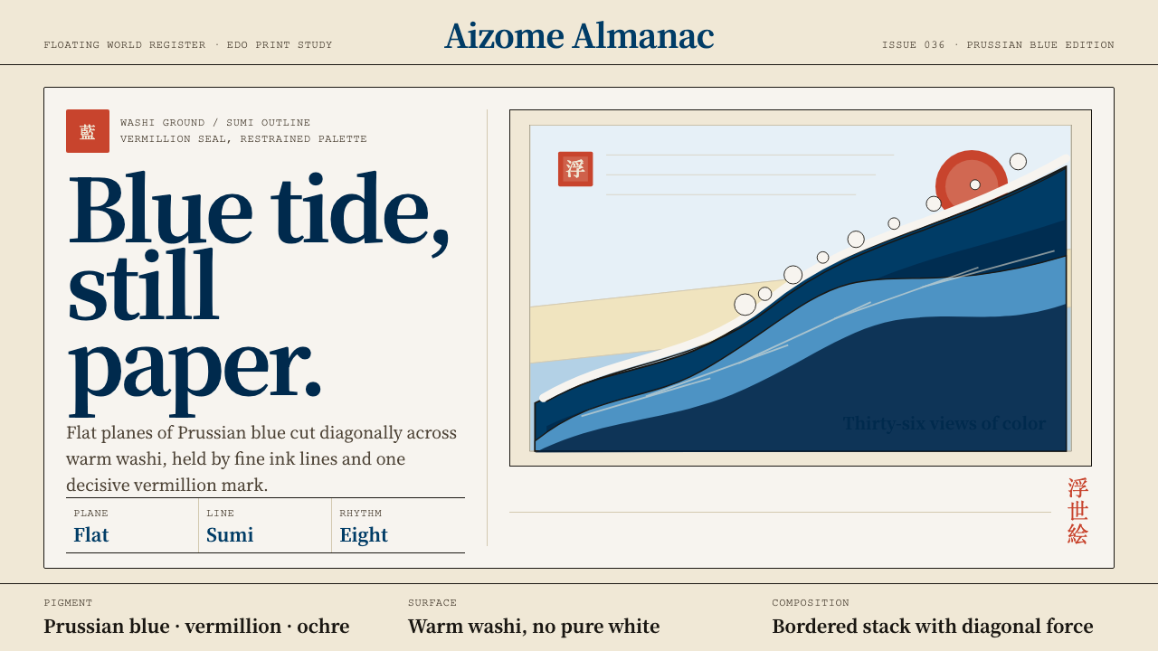 Edo Ukiyo-e (Hokusai)Flat power on paper. Prussian blue diagonals and vermillion seals cut across…
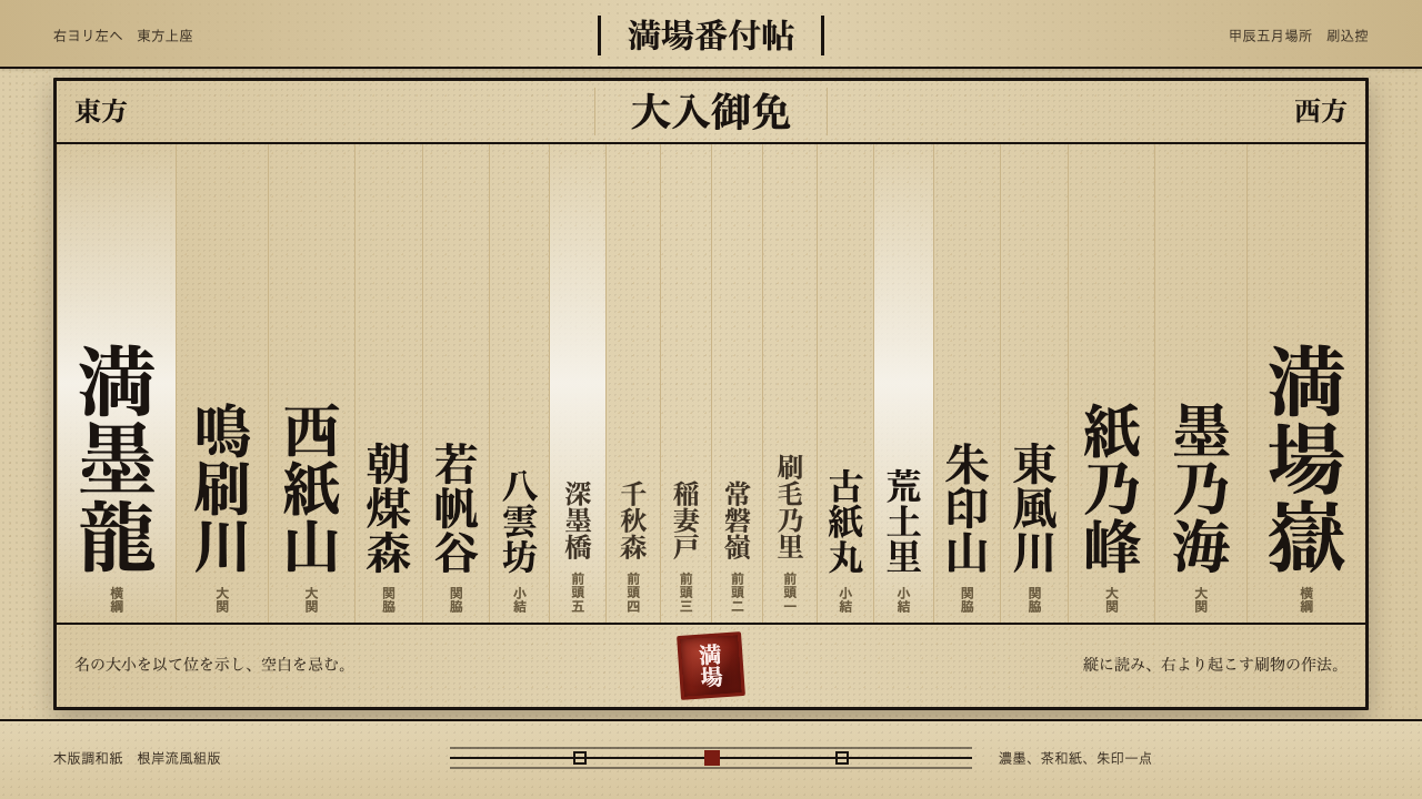 Sumo BanzukeCeremonial density. Sumi columns crowd tan washi; rank-scaled type meets one…
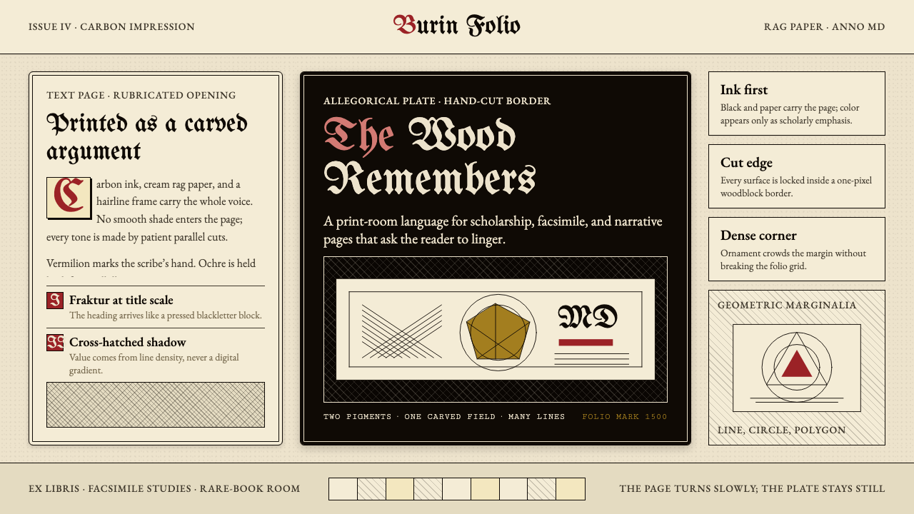 Dürer WoodcutInk remembers everything. Fraktur titles, rag-paper cream, and cross-hatched…
 Elden Ring (2022)A kingdom mourns in gilt. Aged gold hairlines and Roman capitals glow in warm…
 Herbal PharmacopoeiaSlow scholarship of the apothecary folio. Foxed tan parchment, sap-green wash…
 Jujutsu KaisenCrimson only at impact. Ink-black night, purple cursed glow, brush kanji and…