What is BioShock?
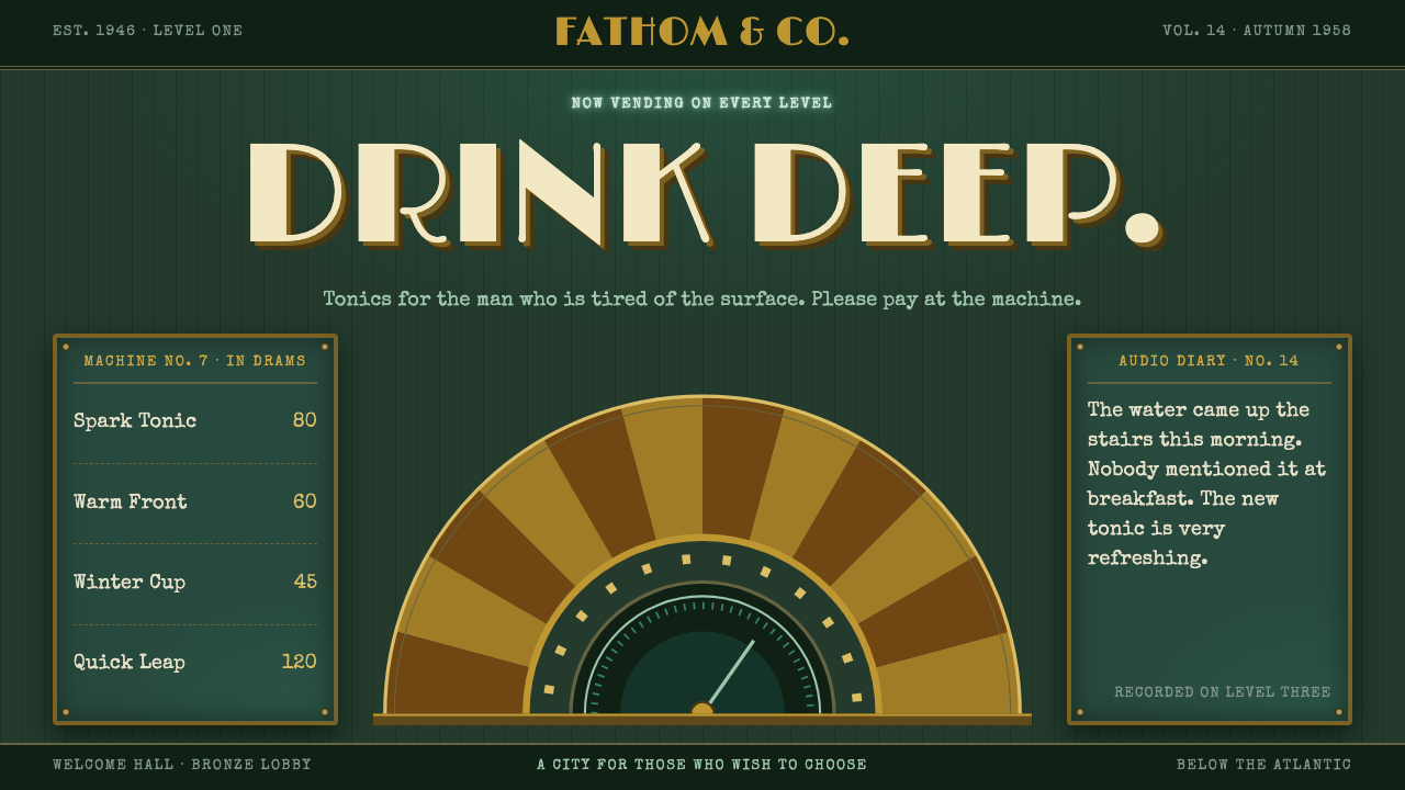
The BioShock Rapture style is Art Deco that has been drowned: tarnished brass sunbursts on murky sea-green, cheerful period advertising copy, and typewritten diary pages.
BioShock in brief
The BioShock Rapture style is a design language drawn from the 2007 video game BioShock by Irrational Games. The game takes place in Rapture, an undersea city built in the Art Deco taste of the 1920s and 1930s and found in ruins in 1960. The style takes that world as it is: gold Deco metalwork gone to rust and verdigris, bronze, brass and glass halls glowing sea-green through windows that look out onto the ocean, and walls that sell something at every turn.
As an interface style it is dark, ornate and deliberately damaged. The ground is a murky sea-green, almost black in the corners. Frames are tarnished brass with rivets, stepped outlines and fan-shaped sunburst rays that radiate behind headings. The typography splits into two voices: a sunny, period-style display face for advertisements and posters, and a typewriter face for the diary entries that make up the body text.
What defines the style is the contradiction between its surface and its state. The copy is bright and confident, the way post-war advertising was, while the materials have corroded and the light is flickering. The result is ornate, but it is drowned. The more cheerful a line of copy is, the more unsettling it feels against this ground, and that gap is the whole point of the design.

Where does BioShock come from?
BioShock was released in August 2007 by Irrational Games, a studio based in Boston, Massachusetts. It is a first-person shooter, but it became known above all for its setting. The player arrives by bathysphere in 1960 at Rapture, a city that had been founded in 1946 as a refuge beneath the Atlantic. By the time the player sees it the city is leaking, rusted and badly lit, its population turned against itself. The game was reissued as BioShock Remastered in 2016, which kept its visual identity in front of a new audience.
Rapture's architecture draws on Art Deco and its later Streamline Moderne cousin. Art Deco is the style of the 1920s and 1930s skyscraper lobby: stepped silhouettes, geometric ornament, sunburst and fan motifs, polished brass and bronze, and an optimistic faith in machinery and luxury. Streamline Moderne softened the angles into curves. The game takes these motifs and places them in an environment where they have lost the context of wealth and optimism and are instead being slowly digested by seawater.
The second source is 1950s American print advertising. Posters in Rapture advertise Plasmids, the genetic enhancements that drive the game's story, in the sunny voice of a household product advertisement. Vending machines offer menus priced in ADAM, the game's biological currency. The tone is chipper, the illustrations are neat and wholesome, and the effect on the player is chilling because the product being sold is horrific. The style keeps this register of cheerful commercial copy as its main rhetorical device.
A third element is the audio diaries scattered through the city, which tell the story in voices recorded on tape. The visual equivalent in the design system is the typewritten page: monospaced, a little uneven, as if transcribed from a recording. The game's creative team included Ken Levine, Scott Sinclair, Nate Wells and the composer Garry Schyman, among others, whose combined work set the tone. The design system translates their world into a rule set: ornament first, but ornament that is corroded, and a smiling voice speaking over a dark, wet background.
What defines the BioShock look?
Murky sea-green ground
The page ground is a dark, murky green, the colour of light passing through deep seawater, fading almost to black at the corners. It is not a clean dark mode; it has the muddiness of water that has stood still for years. Content sits in lit pockets against it, as if windows were glowing onto the ocean.
Tarnished brass and verdigris
Frames, rules and ornaments use brass and bronze that have lost their shine, shading toward rust and a blue-green patina in the recesses. The metal is never polished and never bright. This is what separates the style from a clean Art Deco revival: the gold is present, but it has been in the water for a long time.
Sunburst rays and stepped outlines
Fan-shaped rays radiate behind headings and badges, and outlines step inward at the corners in the manner of a skyscraper crown. These are the signature Art Deco gestures, and here they work as framing devices that give a title the importance of a monument. Used with restraint, a single sunburst behind a heading is enough to set the period.
Riveted frames
Panels are edged with a thick metal border held together with visible rivets, like the plating of a submerged structure. The rivets tell the reader that this is built to withstand pressure, and they are one of the few details that suggest an industrial rather than a purely decorative origin.
Cheerful period advertising copy
Headlines and posters speak in the bright, confident voice of 1950s print advertising: friendly, reassuring, and a little too eager. The disconnect between the tone and the corroded surface is the design's central device. Copy should sound like it is selling you something wholesome, even when the context suggests otherwise.
Typewritten diary body text
Body text is set in a typewriter face, with the slightly uneven rhythm of a transcribed audio recording. It reads as a personal document, intimate and a little unsettling, and it contrasts with the polished advertising display type. Line lengths stay short, and entries are dated or titled like log entries.

Who shaped BioShock?
The creative lead of BioShock at Irrational Games and the writer most closely associated with the game's story. His concept of a hidden utopia gone wrong supplied the premise that every visual choice in Rapture serves.
A member of the game's art team whose work helped define the look of Rapture's Art Deco interiors, with their brass, glass and sea-lit halls. His contribution is part of why the city feels both grand and ruined.
An artist on the BioShock team associated with the game's environments and posters. The advertising and signage that give the style its cheerful, unsettling voice owe much to this kind of art direction.
The composer whose score gave Rapture its sound, shaping how the era's elegance and its decay are felt together. Although this style is visual, its tone of faded glamour is inseparable from the music that surrounded it.
How do you use BioShock today?
On slides, the style works for narrative and exhibition-style presentations. A cover can place a brass frame and a sunburst behind a title on the sea-green ground. Content slides use one riveted panel per idea, with a typewriter-style paragraph. Data slides need care: keep charts in brass and pale green on the dark field with plenty of space, and use period-style captions for callouts. The style rewards storytelling more than dense analysis.
In web interfaces, it suits game sites, narrative experiences, retro exhibitions, themed restaurants, escape rooms and brand pages with a taste for dark humour. Navigation can be styled as a vending machine or a directory plaque, and cards as framed posters. Forms and checkout pages should be simplified so that legibility is never sacrificed to ornament, and primary buttons should be clear brass plates with plain labels.
For editorial and marketing work, the style is excellent for event posters, book and film campaigns, long-form features on mid-century culture and any piece that wants the feel of a ruined golden age. The slogan in a poster should be cheerful and the picture slightly wrong, and the more specific the product being advertised, the stronger the effect. A diary-style long read in typewriter type is a natural format.
The most common mistakes are to make the style too clean and to make it too grimy. A polished brass frame on a bright background is simply Art Deco, with no drowned quality, while excess grime and noise on every surface turns it into generic horror and kills legibility. The third mistake is mixing in modern flat icons or soft rounded buttons, which break the period. Keep the ornament sharp, the metal tarnished, the ground dark and the voice smiling.
A last note concerns origin. The style quotes a specific commercial game, so it suits fan, educational, parody and homage uses, or projects that borrow the structure of corroded Deco and cheerful advertising rather than the game's logos, characters and posters. Apply it as a mood system with your own names and copy, and it offers a rare, well-defined way to make a dark interface feel gracious rather than merely gloomy.

BioShock — FAQ
What is the BioShock Rapture design style?
It is a dark, ornate design language drawn from the 2007 game BioShock: tarnished brass sunbursts and riveted frames on a murky sea-green ground, cheerful 1950s-style advertising copy and typewritten diary text. It is Art Deco that has been drowned and left to corrode.
Which design movements does it draw on?
Art Deco and its later cousin Streamline Moderne for the architecture, with stepped outlines, sunbursts and brass, plus 1950s American print advertising for the cheerful posters and menus. The combination of the two gives the style its unsettling charm.
Why does the copy sound so cheerful?
The contrast is deliberate. Posters in Rapture advertise unsettling products in the sunny voice of a household advertisement, and the gap between a smiling tone and a corroded surface is what makes the style feel eerie. Remove the cheerfulness and the effect disappears.
What projects suit this style?
Narrative game sites, retro exhibitions, themed venues, event posters, book and film campaigns, and long-form features on mid-century culture. It suits brands with a taste for dark humour more than everyday utility interfaces.
How do I keep it readable?
Keep body text in the typewriter face with short lines and strong contrast against the dark ground, and confine ornament to frames and headings. Never let grime, noise or rust textures run under the text itself.
Related design styles
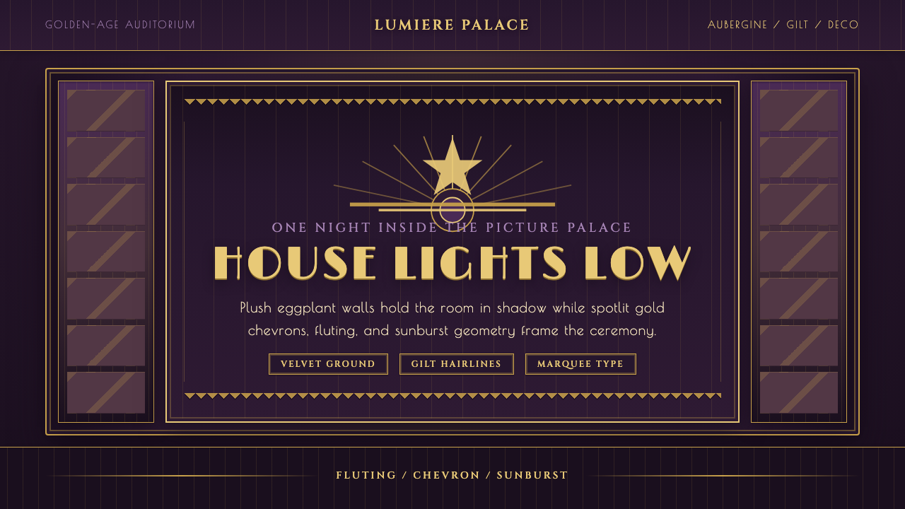 Velvet Cinema DecoDark theater opulence. Aubergine velvet and gilt Deco geometry stage every su…
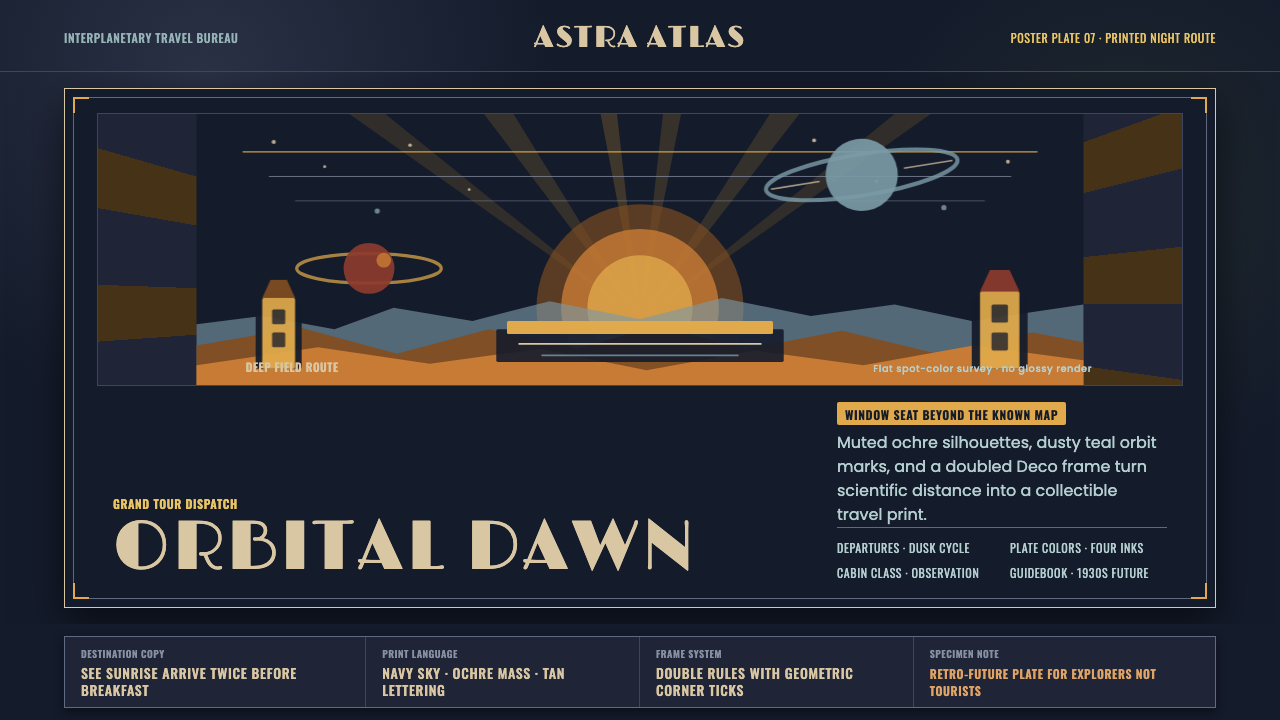 JPL Visions of the FutureSpace travel as print craft. Burnt orange silhouettes and Deco tan type on na…
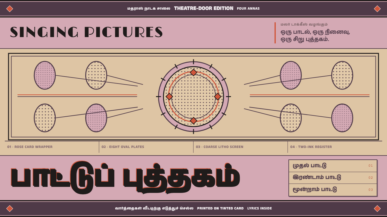 Tamil Talkie Song BookEvery paid inch sings. Rose card, violet-black rules and coarse halftone meda…
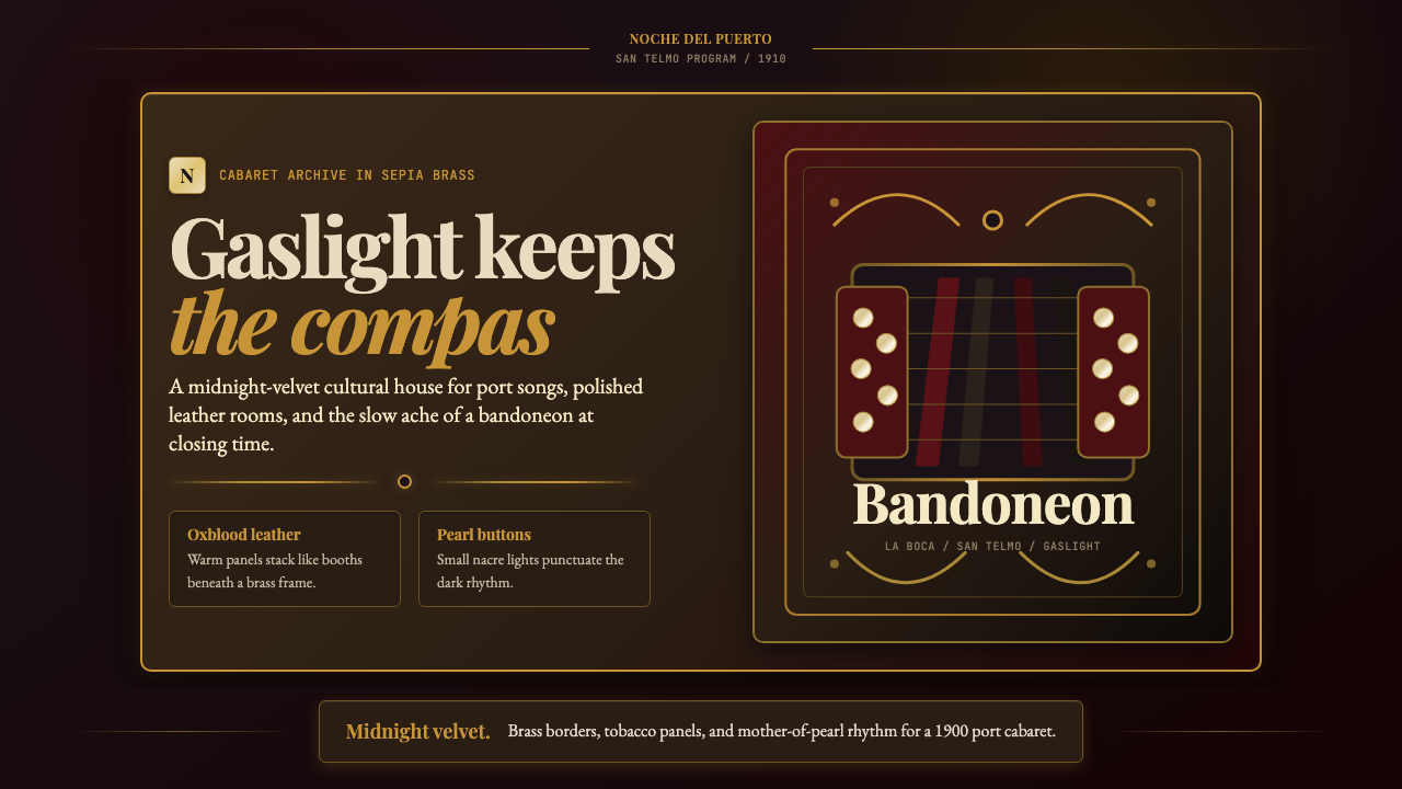 Argentine Bandoneón 1900 (Tango)Gaslit tango luxury. Midnight velvet, brass fileteado, and pearl-button geome…
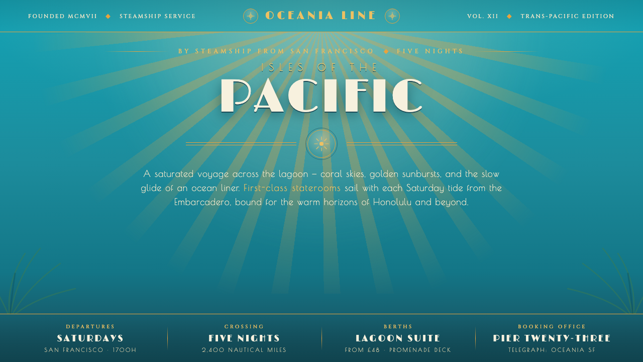 Matson Liner Travel PosterCruise-poster paradise. Lagoon-turquoise ground, coral-and-gold sunbursts, ai…
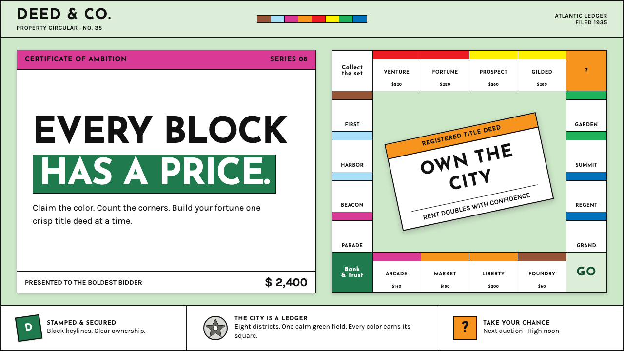 Monopoly (1935)Everything is ownable. Candy-bright deed bands snap across a calm sage board.