What is BSL-4 Biohazard Lab?
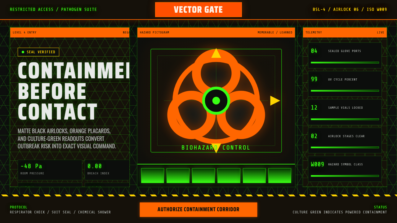
Biosafety Level 4 signage turns the world's deadliest pathogens into a design problem: warn instantly, explain nothing until trained, and never let anyone mistake which door is safe to open.
BSL-4 Biohazard Lab in brief
The BSL-4 aesthetic is the visual grammar of the highest tier of biological containment science, the level reserved for pathogens with no available vaccine or treatment. It is built from a handful of recurring elements: matte black airlock doors and corridor walls, hexagonal pressure-panel grids covering ceilings and bulkheads, fluorescent-orange hazard placards marking every transition point, and the eerie glow of green culture media visible through the sealed glass of specimen storage. None of these elements exist for their own sake — every one of them is a real signage or architectural convention drawn from actual containment-lab design, simply concentrated and intensified.
The system's anchor symbol is the international biohazard trefoil — three overlapping circular lobes arranged around a central circle, all rendered in high-contrast fluorescent orange or magenta against a plain ground. The trefoil is not meant to be intuitively readable; unlike a skull-and-crossbones, it carries no built-in meaning and has to be taught. That deliberate meaninglessness is precisely why it works as a universal hazard mark: it cannot be confused with an unrelated symbol from another visual tradition, and once learned, it is unmistakable.
This design system channels the atmosphere of outbreak-thriller signage — the kind of high-tension containment interiors familiar from pandemic film and fiction — into an interface language. Hazard type is treated as stencil-cut lettering, as if it had been sprayed through a physical template onto a door or crate. Data readouts borrow the flat, evenly spaced rhythm of a technical monospace terminal font. Borders run in diagonal hazard-stripe patterns. And the ground is always containment-black — this system never lightens to cream or white, because a BSL-4 facility never does either.
Where does BSL-4 Biohazard Lab come from?
The system's central icon has a documented birth date. In 1966, the Dow Chemical Company needed a standardized symbol to mark biological materials during shipping and handling, replacing the inconsistent, ad-hoc labels different facilities had been using. The task fell to Charles Baldwin, a member of Dow's environmental health engineering staff, who led a small internal design study specifically aimed at solving the problem of hazard communication across a workforce that could not be assumed to share a language or a cultural background.
The brief Baldwin's team worked against reads like a masterclass in signage design constraints: the symbol had to be memorable enough to recall after a single viewing, yet meaningless enough that it would not be confused with any existing symbol carrying unrelated associations; it had to be quickly recognizable at a glance and reproducible cheaply in a single color; it needed to look identical and legible when rotated to any angle, since a label might be viewed from any direction in transit or storage; and it had to test as culturally neutral rather than resembling a symbol already loaded with meaning for some group. The design was published in the journal Science in 1967, placed deliberately outside of trademark or patent restriction, and adopted rapidly by public health agencies including the CDC.
Parallel to the symbol's development, the containment-level framework this system depicts — BSL-1 through BSL-4 — was being formalized by American public health institutions. The Centers for Disease Control and the National Institutes of Health jointly codified these levels in the manual Biosafety in Microbiological and Biomedical Laboratories, first published in 1984, defining BSL-4 as the tier reserved for the most dangerous pathogens: agents with high risk of life-threatening disease, for which there is no available vaccine or therapy. Real BSL-4 protocol requires positive-pressure suits, air-locked entry sequences, and chemical shower decontamination on exit — the architectural logic this system's airlocks and hex-panel corridors are built to evoke.
Beyond the laboratory, the trefoil and the architecture of containment took on an independent cultural life. Outbreak films, techno-thrillers, and video games repeatedly staged their tensest scenes inside fictionalized BSL-4-style facilities, reinforcing a shared visual shorthand — black corridors, glowing specimens, orange warnings — that most people now recognize from fiction long before, or instead of, ever encountering an actual containment lab. This system deliberately draws on that popular, dramatized version of the aesthetic rather than attempting a sterile, literal reproduction of a real facility's interior.
What defines the BSL-4 Biohazard Lab look?
Containment Black
The ground is a deep, matte, near-black that never lightens toward cream or white anywhere in the system, echoing the low-light, sealed-off interior of a real containment facility. This is a fixed structural rule rather than a stylistic preference: introducing a light background anywhere breaks the sense of being sealed inside a controlled environment that the whole aesthetic depends on.
Hazard Orange
A saturated, high-visibility orange is reserved for warnings, primary calls to action, and anything that demands immediate attention — mirroring the fluorescent orange used on real biohazard placards, which is chosen specifically because it reads as urgent under artificial light and at a glance. Orange should never be used decoratively; every appearance of it should function as an instruction or an alert.
Culture Green
A cooler, glowing green is used sparingly, standing in for the light of specimen vials seen through sealed glass — the one organic, faintly living note against an otherwise industrial, mineral palette. Because it represents something contained and observed rather than something ambient, this green should appear as a source of light within the interface rather than as a flat background fill.
The Biohazard Trefoil
The three-lobed trefoil is the system's single most important iconographic anchor and should be used exactly once, at high visual weight, rather than scattered as a repeating decorative motif. Its power comes from being learned rather than obvious — a single, unmistakable mark carries more authority in this system than any number of smaller repeated hazard icons.
Hex-Grid Paneling
Ceilings, bulkheads, and large background surfaces take on a subtle hexagonal grid pattern, evoking the pressure-rated paneling used in real containment architecture. The grid should stay low-contrast and structural — a texture felt in the background rather than a foreground pattern competing with content or with the hazard orange accents.
Stencil and Terminal Type
Two distinct typographic registers do different jobs: hazard labeling and headline warnings take on the blocky, gapped look of lettering sprayed through a physical stencil template, while data readouts and system status text take on the flat, evenly-spaced rhythm of a technical monospace terminal display. The two should never blend into one voice — the stencil register shouts, the terminal register reports.
Who shaped BSL-4 Biohazard Lab?
An environmental health engineer at Dow Chemical, Baldwin led the internal design study that produced the international biohazard trefoil in 1966, working against a demanding brief that required the symbol to be memorable, meaningless until taught, unambiguous, symmetrical from any viewing angle, and culturally neutral. His symbol remains the single most recognized hazard icon in science, decades after its creation.
Baldwin did not design the trefoil alone; it emerged from a small internal Dow Chemical study group tasked with solving hazard-labeling confusion across a large, multilingual industrial workforce. The team's decision to publish the finished symbol in the open scientific literature rather than protecting it as proprietary is a large part of why it became a universal standard rather than a company-specific mark.
ISO 7010 is the international standard that formally catalogs safety signs, including the biohazard symbol registered as W009 within its warning-sign series. Its existence is why a biohazard placard looks essentially identical whether encountered in a lab in Tokyo, Berlin, or Atlanta — the standard fixes proportion, color, and form so the symbol functions identically across every jurisdiction and language.
The joint CDC and NIH authorship behind Biosafety in Microbiological and Biomedical Laboratories, first published in 1984, formally defined the four-tier BSL system and the specific engineering and procedural controls required at each level. Their BSL-4 definition — no available vaccine or treatment, highest containment architecture required — is the institutional backbone this design system's atmosphere is built to represent.
How do you use BSL-4 Biohazard Lab today?
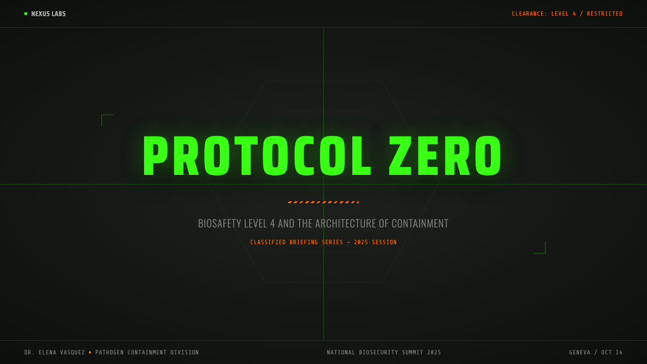
On presentation slides, this system is most effective for material that genuinely needs to convey risk, urgency, or restricted access — security briefings, incident reports, technical audits. A cover slide can run full containment-black with the trefoil or a single hazard-orange rule as the only accent, letting the near-total darkness do the work a bright cover image would do in a friendlier system. Content slides should keep hazard orange strictly for headers or callouts, never for body text, and data slides suit the terminal-readout register well: numerals in a flat monospace rhythm against the dark ground read as instrumentation rather than as decoration.
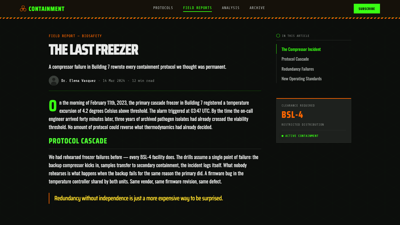
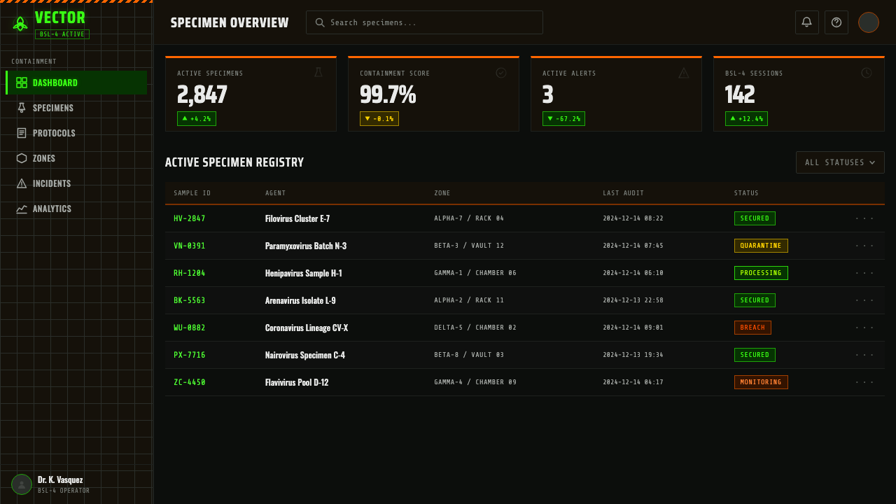
For web interfaces, dashboards and status pages are the natural fit — anything where the product's job is to monitor a system and flag when something needs attention. Hazard orange should be reserved for genuine alert states and primary actions, culture green for a smaller set of positive or 'active and healthy' indicators, and the hex-grid texture kept to large background surfaces rather than small components, where it would just read as visual noise. Pricing pages can work if the product itself has a technical, high-stakes character, with tier differentiation carried through stencil-versus-terminal typographic contrast rather than through added color.
In editorial and marketing contexts, the system suits any story about risk, containment, security, or crisis response — its atmosphere does real narrative work rather than sitting as neutral decoration. A feature article can open with a full-bleed dark section using stencil type for the headline, then shift into calmer terminal-style typography for the analytical body copy, letting the typographic register itself signal the shift from alarm to explanation.
The most common mistake is over-using hazard orange until it stops reading as a warning at all — spreading it across navigation, body accents, and decorative flourishes until the one color meant to signal 'pay attention now' becomes simply the brand color. In real hazard signage, orange works because it is rare and reserved; the same discipline has to carry over into an interface, or the entire system's sense of urgency collapses into ordinary branding.
BSL-4 Biohazard Lab — FAQ
Why is the biohazard symbol designed to be meaningless rather than intuitive?
Because an intuitive symbol risks carrying unintended associations — a skull might read as poison rather than infectious material, for instance, or might not translate the same way across cultures. A meaningless geometric mark has no competing associations to strip away; once it is taught once, universally and deliberately, it means exactly one thing and nothing else. That deliberate blankness is what made it possible to standardize globally.
Is the containment-black ground purely aesthetic, or does it reflect anything real about these facilities?
It exaggerates something real. Actual high-containment labs are not literally painted black, but they are sealed, windowless, artificially lit environments engineered to control airflow and prevent contamination from escaping — a controlled, enclosed atmosphere very different from an ordinary office or clinical space. This system takes that real sense of sealed enclosure and pushes it to its most dramatic visual extreme rather than attempting a literal, muted reproduction.
Can this system work for a product that has nothing to do with science or safety?
It can, but only if the product genuinely benefits from a tone of urgency, restriction, or high stakes — security tools, incident-response software, competitive or high-pressure applications. Applying it to a consumer product with a casual, friendly tone creates a mismatch: the system's entire visual vocabulary is built to say 'proceed with extreme caution,' and that message will feel out of place anywhere the underlying product does not actually warrant it.
Why does culture green get used so sparingly compared to hazard orange?
Because the two colors represent different things and different quantities in the real environment this system draws from. Hazard orange marks doors, panels, and instructions — it is meant to be everywhere danger might be. Culture green represents something rarer and more contained: a specimen sealed behind glass, observed but never touched. Using it as sparingly as the orange is used liberally preserves that distinction — green should feel like a glimpse of something contained, not an ambient wash.
What's the most common mistake when applying this system?
Softening it. Rounding the corners, lightening the black toward a friendlier charcoal, or adding a bright accent color to make the interface feel more approachable all undermine the point. This is a system built on severity and restraint — every softening choice chips away at the sense of genuine hazard the aesthetic depends on, until what remains is just a generic dark theme with an orange button.
Related design styles
 Fluorescent Antifreeze GreenCoolant becomes hazard signal. Fluoro green burns through steel-gray label gr…
 Air Traffic Control RadarOperational gravity. Phosphor green rings, sweep wedges, and monospace blips…
 Oscilloscope WaveformBrightness is meaning. One P31 phosphor trace glowing across an etched gratic…
 Wind TunnelMakes darkness feel measurable. Cyan-white streamlines and monospace ticks gl…
 NASA EMU SpacesuitEngineered white, never warm. Quilt seams, blue ID stripes and worm red mark…
 Trinidad Steelpan ChromeSound made visible. Brass and copper grooves strike cold chrome on an oil-dru…