What is Battery Gigafactory?
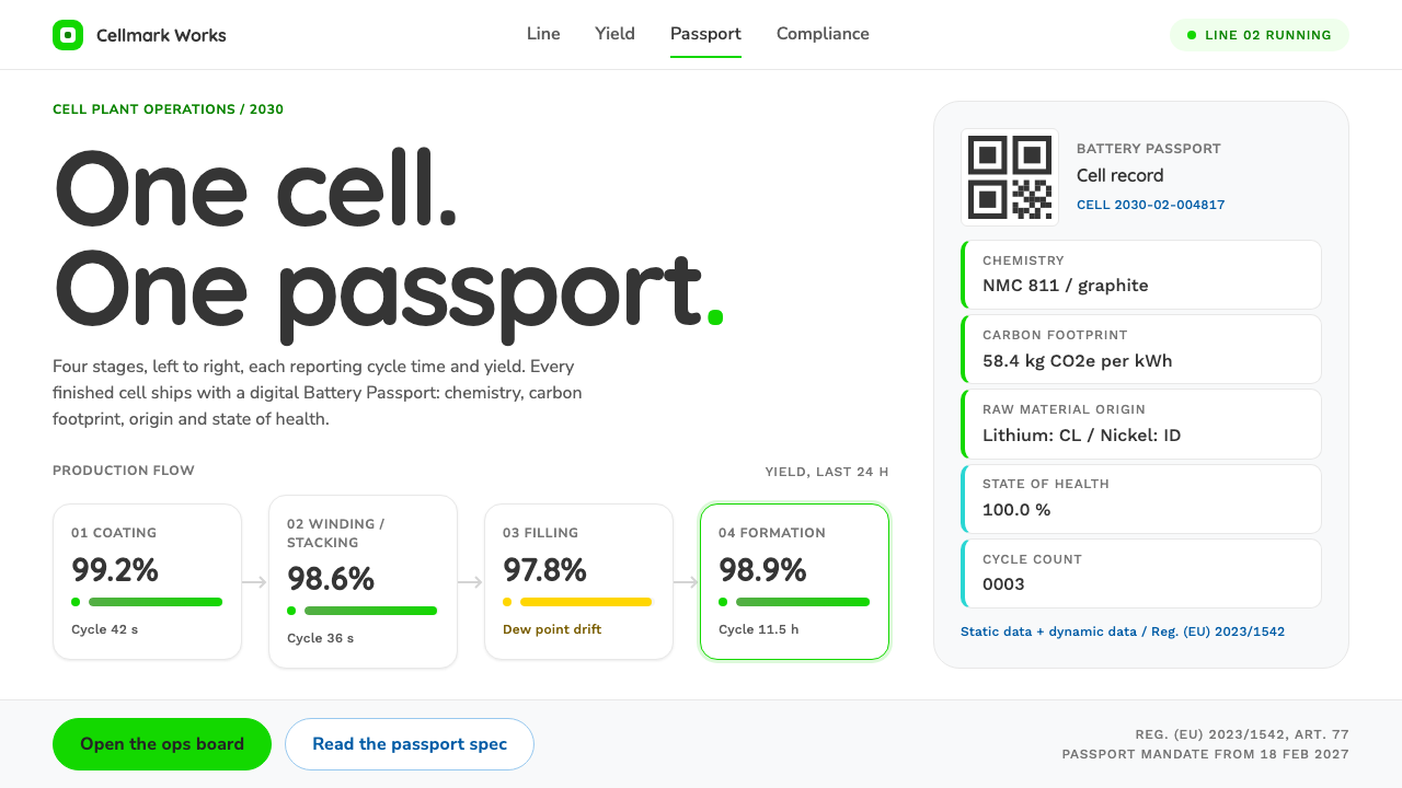
The Battery Gigafactory style makes a production board read like a passport: a plain white canvas, soft rounded tiles, bright green for yield, and data you could hand to a regulator.
Battery Gigafactory in brief
The Battery Gigafactory style is a design language for the operations board of an imagined battery plant around 2030. Battery cells move from left to right through four stages: electrode coating, winding or stacking, electrolyte filling, and formation. Each stage is a soft rounded tile that reports its cycle time and its yield. Dry-room dew point, formation progress and pass rate are told with green progress bars and small status dots, so the state of the line can be read in a second.
What gives the style its character is that every finished cell leaves the factory with a digital Battery Passport, a record reachable by scanning a code that tells you the cell's chemistry, carbon footprint, raw-material origins and state of health. The interface borrows its look from the two real passport initiatives: the bright green and rounded Quicksand headings associated with the Global Battery Alliance, and the cyan, yellow and Work Sans data sheets of the German Battery Pass consortium, all on a plain white ground.
The result does not look like a science-fiction control room. There are no glowing grids, no dark mode and no neon. It looks like a production report that could be given to an auditor without embarrassment: light, friendly, orderly, and above all legible. It is a light theme whose personality comes from rounded corners and a single confident green rather than from decoration.

Where does Battery Gigafactory come from?
The style rests on a real regulatory and industrial shift. Batteries are among the most scrutinised products of the energy transition, and the question of where their materials come from, how much carbon went into them and how much life they have left has moved from sustainability reports into law. A digital product passport is the proposed answer: a record that travels with the product through manufacture, use, repair and recycling, so that anyone along that path can look up what is inside it.
Two projects shaped what such a passport should look like. The Global Battery Alliance, a multi-party initiative focused on a sustainable battery value chain, showed a Battery Passport proof of concept at Davos in January 2023. The Battery Pass consortium, a German research and industry project, worked in parallel on the content and data structure that a passport should carry. Industry names such as Audi and Tesla appear in the surrounding conversation because carmakers are where the demand for traceable batteries is most acute. Together these efforts gave the passport both a visual identity and a data model.
The regulatory clock matters here. Under European Union rules, a battery passport becomes mandatory from 18 February 2027, which is why the factory in this style is imagined around 2030, when the passport has stopped being a pilot and become ordinary plant paperwork. The design system takes that scene and asks a practical question: if the operations board in such a plant had to serve both the line supervisor and the compliance officer, what would it look like?
The answer is shaped by three traditions meeting in one screen. Industry 4.0 line monitoring supplies the logic of stages, cycle times and yield tiles. Traceability and circular-economy reporting supply the habit of showing provenance and footprint next to each product. Digital product passports supply the final look, friendly and document-like, closer to a travel document than to a console. The movement of ideas from heavy industry into the visual language of a passport is the core of the style.
What defines the Battery Gigafactory look?
White canvas
The page ground is plain white, with pale grey panels to separate regions. White tells the reader this is a document, not a screen of ambient light. It also leaves the green and the data carrying all of the colour work, so the board stays calm even when it is full of numbers.
Rounded green yield tiles
Each process stage is a rounded tile in a bright, confident green, reporting cycle time and yield. Rounded corners soften an industrial subject and make the tiles feel approachable, while the green carries the meaning of go and good. A tile that drifts out of tolerance changes state through a status dot rather than turning the whole board red.
Rounded Quicksand headings
Headlines use Quicksand, a soft rounded sans associated with the Global Battery Alliance's passport. The rounded terminals match the rounded tiles, and the voice is warm rather than technical. Headings are kept short and plain, such as the name of a stage, so the board reads like a set of labelled sections of a form.
Work Sans data sheets
Numbers and tables are set in Work Sans, a clean, sturdy sans that is used by the Battery Pass consortium. Tables are generous, with clear column alignment and restrained row rules, because the purpose is verification rather than impression. Cyan and yellow appear as supporting accents on labels and chart series, never as the main colour.
Progress bars and status dots
Dry-room dew point, formation progress and pass rate are shown as slim green progress bars and small round status dots. This is a deliberately small vocabulary: bar for how far, dot for whether it is fine. A reader who has never seen the board can learn it in a glance, which matters in a plant where several people share the same screen.
Passport-like data records
Where a cell or a lot is detailed, the layout becomes a record page: chemistry, carbon footprint, material origin and health are listed as clearly labelled fields, often with a scannable code. The format borrows the calm, bureaucratic order of an identity document, which is exactly what a regulator expects to see.

Who shaped Battery Gigafactory?
A multi-stakeholder initiative focused on a sustainable battery value chain. Its Battery Passport proof of concept, shown at Davos in January 2023, is the source of the bright green and the rounded Quicksand headings that give this style its friendly face.
A German research and industry project that worked on the content and structure of the battery passport. Its cyan and yellow accents and Work Sans data sheets give this style its documentary, reference-sheet side.
A carmaker named in the surrounding passport conversation. Automotive buyers are where demand for traceable batteries is strongest, so the manufacturer stands in this style as an example of the customer a battery passport must satisfy.
Another carmaker whose scale in battery manufacturing makes it a natural reference for the gigafactory idea. It stands here for the high-volume plant that the whole operations board is designed to monitor.
How do you use Battery Gigafactory today?
On slides, the style suits operations reviews, sustainability briefings and compliance updates. A cover can be nearly empty: white ground, a green tile and a rounded heading. Content slides work as a row of stage tiles with one headline metric each. Data slides are its strongest suit: tables in a sturdy sans, one green series for the main metric, and cyan or yellow only when a second series is unavoidable.
In web interfaces, it is a natural fit for operations dashboards, supplier portals, traceability lookups and any screen that reports status to non-engineers. A good layout puts the stages in a horizontal sequence, shows one headline figure per tile, and keeps secondary data in a table beneath. Pricing pages and marketing pages also work if the brand wants to feel trustworthy and calm rather than loud: use the tile, the green and the rounded heading as the entire visual vocabulary.
For editorial and marketing work, it suits reports, explainers, product passports and environmental and social governance reports. It lends a document-like honesty to any content about supply chains, carbon, recycling or materials. Because it does not rely on photography, it is also a reliable choice for diagrams and infographics where the data must remain the visual centre.
The most common mistake is to push the style toward science fiction by adding dark backgrounds, glow, neon or sharp corners, which loses the idea that the board is a document. The second is to use green decoratively, so that it no longer means good yield. The third is to crowd the white canvas: the calm of the style comes from space, and a tile with six metrics is no longer a tile. Keep one headline figure and one supporting line per card.
A final point concerns honesty. The style is built to look trustworthy, so the data it carries should be true. Use it for real numbers, with sources and dates where possible, and do not let the soft, friendly look be a cover for figures that cannot be audited. The look of a passport is only worth borrowing if the content can survive being checked.

Battery Gigafactory — FAQ
What is the Battery Gigafactory design style?
It is a light, document-like design language for the operations board of an imagined battery plant around 2030. White canvas, rounded green yield tiles, Quicksand headings and Work Sans data tables give production data the calm look of a passport.
What is a Battery Passport?
It is a digital record that travels with a battery and lets people look up its chemistry, carbon footprint, raw-material origins and state of health, typically through a scannable code. Under European Union rules it becomes mandatory from 18 February 2027.
Why is the style white and green rather than dark and neon?
Because it is meant to read like a report that can be handed to a regulator. The look comes from the Global Battery Alliance and Battery Pass projects, which favour plain grounds, bright green and clear data sheets, not from the sci-fi control-room tradition.
Where does the style work best?
Operations dashboards, supplier and traceability portals, sustainability and compliance reports, and slide decks where numbers must stay readable. It is also good for brands that want to look calm and trustworthy rather than flashy.
How do I avoid making it look generic?
Keep one headline number per tile, use green only for good status, and let rounded headings and white space do the work. Real stage names, real units and real sources make it feel specific, while extra decoration makes it generic.
Related design styles
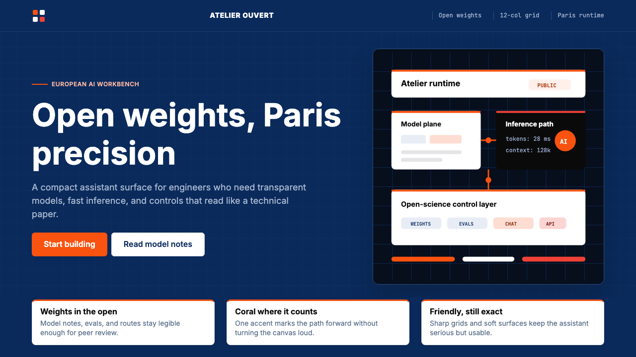 Mistral Le Chat French AIOpen science feels engineered. Navy panels, Inter grids, and coral stripes ke…
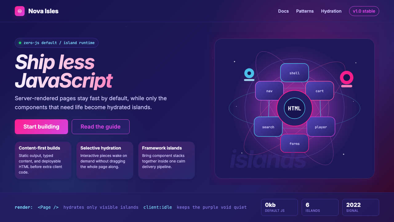 Astro Islands Architecture 2022Warm cosmic devtools. Deep violet, magenta glow, Inter clarity, and island ge…
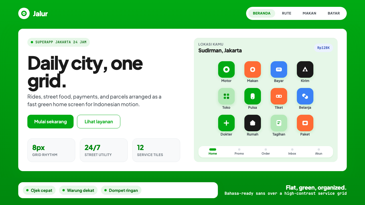 Gojek SuperappCity speed, ordered. Electric green tile grid turns rides, food, and pay into…
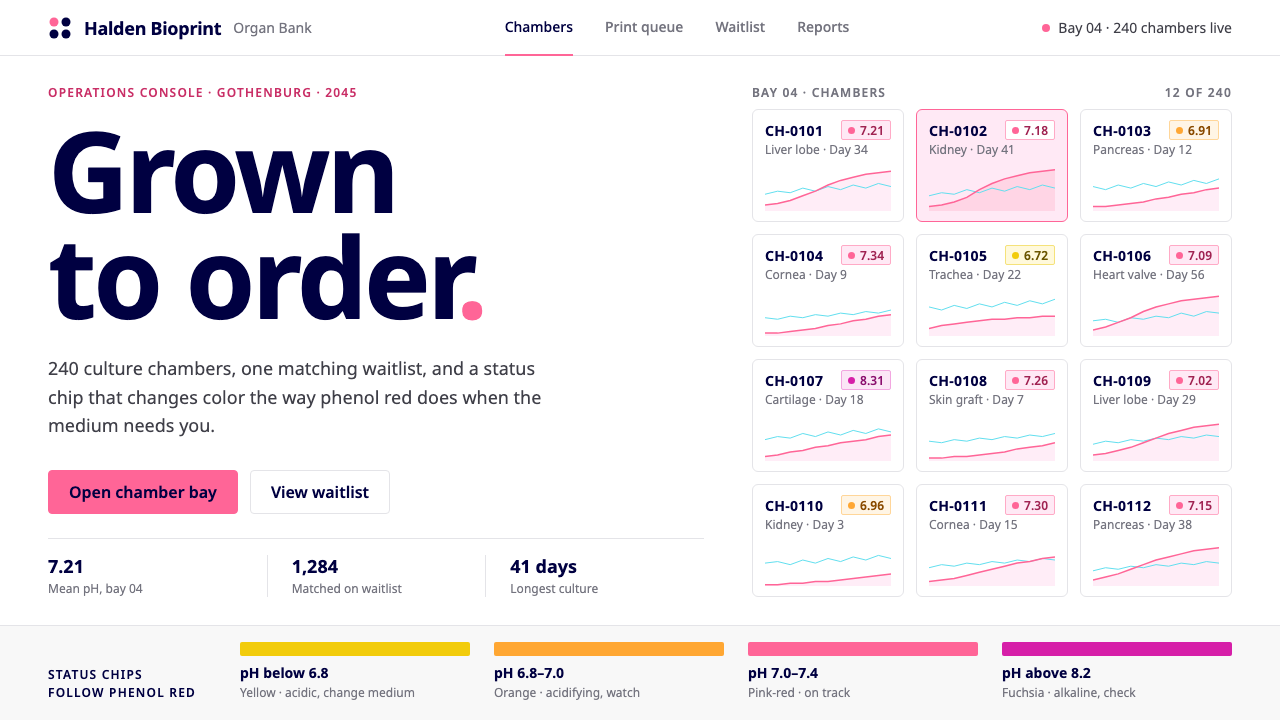 Organ Bioprint BankClinical white, one saturated pink. Status chips drift pink to orange like ph…
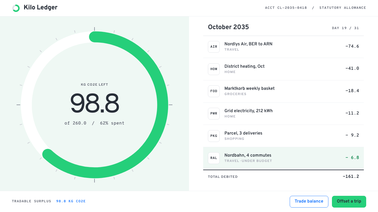 Personal Carbon LedgerEmissions kept like a current account. One green quota ring on white, debits…
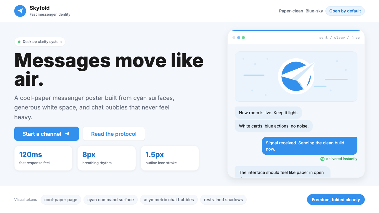 Telegram Blue Paper PlanePaper-clean speed. Cyan planes, white cards, and chat bubbles carry the ident…