What is Avatar: The Last Airbender?
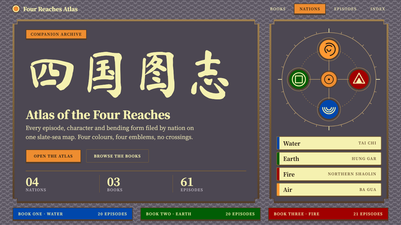
Avatar: The Last Airbender turned its opening title map into a visual language: a slate sea, parchment land, four nations that never share a colour, and a carved bronze frame around it all.
Avatar: The Last Airbender in brief
The Avatar: The Last Airbender style is a design language drawn from the animated series that ran on Nickelodeon from 2005 to 2008. Its source is not a character or a battle but a single recurring image: the world map that opened every episode. On that map a dark grey-violet sea is scored with stylised wave lines, pale parchment continents sit upon it, four nation medallions stand at the corners of the world, and two calligraphy plaques frame the title, all enclosed in a carved bronze border.
Translated into an interface, the map becomes a rulebook. The slate sea is the page. Parchment is the paper that holds cards and body copy. Saffron orange, the colour of Aang's robes, is reserved for action: buttons, title plaques and the few things a reader is meant to press. Each of the four nations, Fire, Earth, Water and Air, keeps its own colour and its own emblem, and the system's firmest rule is that those colours are never blended or borrowed across nations.
The result reads as a hand-drawn archive from a fictional continent: warm, dignified, a little martial, and rooted in East Asian visual culture without pretending to be historical. It is a dark theme, but a soft one, where the darkness feels like deep water rather than a screen switched off. It suits anything that wants the weight of an illustrated atlas, a character codex, or an episode guide, and it is easiest to recognise by its parchment cards floating on a slate-violet field inside a stepped metal frame.

Where does Avatar: The Last Airbender come from?
Avatar: The Last Airbender premiered on Nickelodeon in 2005 and ran for three seasons, which the series calls Books, through 2008. They are named for the elements the young hero Aang must master in turn: Water, Earth and Fire. It was created by Michael Dante DiMartino and Bryan Konietzko, produced in Burbank, California, and animated together with Korean studios. That mix of an American writers' room and Korean production craft is part of why the show looks the way it does: it draws on the grammar of Japanese anime, yet it was made as American television, with its own pacing and its own visual discipline.
The series built its world from Asian sources with unusual care. Its title card and its in-world writing lean on Chinese brush calligraphy, and the lettering for the show was brushed by the calligrapher Siu-Leung Lee. The bending of the elements is not an invented gesture vocabulary: each of the four disciplines was tied to a real martial art, with the choreography developed with the martial arts consultant Sifu Kisu. Tai Chi, Hung Gar, Ba Gua and Northern Shaolin each gave one nation its movement, which is why a fight in this show looks like the style it belongs to rather than a generic action sequence.
The title sequence is where the visual identity was concentrated. Every episode opened on the same map: the sea, the continents, the four medallions, the two plaques. Because viewers saw it hundreds of times across the run, that image became the show's logo in all but name. The plaques carry a pair of four-character phrases in Chinese, one about the four peoples divided and one about the world made whole again, which states the series' whole arc in a single glance at the top of the frame.
The design system here is built from that map rather than from the characters. It takes the map's palette, its framing device and its calligraphic voice and turns them into rules for a page: slate as ground, parchment as surface, saffron as the active colour, a nation colour and emblem for each category, and a stepped bronze border that makes any panel feel like a plate in an atlas. The choice is deliberate. A map is a structure, and structure is what a design system needs. It is also why the style can sit beside a modern interface without becoming cosplay: it borrows the show's organising logic, not its costumes.
What defines the Avatar: The Last Airbender look?
Slate sea ground
The page background is a grey-violet that sits between slate and deep water. It is cool and slightly desaturated, scored with faint wave lines in the spirit of the opening map, and it gives the whole design its dark, quiet foundation. Because the ground is not pure black, parchment and saffron lift off it gently instead of glaring, and long reading sessions stay comfortable.
Parchment surfaces
Cards, panels and reading areas are a pale, warm parchment yellow, the colour of the continents on the map. Text on parchment is dark and sits at generous size. Parchment is the only large light surface in the system, so it automatically becomes the place where the reader's eyes land, which is exactly how the map's land masses work against the sea.
Saffron as the action colour
A warm saffron orange, the colour of Aang's robes, marks what can be pressed or what titles a section. It is used sparingly: title plaques, primary buttons, a few highlights. Keeping it rare is what keeps it meaningful, so a reader learns within seconds that orange means go, and nothing decorative is allowed to borrow it.
Four nations, four colours, never mixed
Fire, Earth, Water and Air each own a colour and an emblem, and the system treats that ownership as a hard rule. A category tagged with a nation carries its colour and its medallion everywhere it appears and nowhere else. This works like a legend on a map: you can filter, sort or colour-code content by nation, and the reader never has to relearn what a colour means.
Stepped bronze frame
Panels are wrapped in a carved bronze border with stepped corners, echoing the frame that held the title map. The frame is decorative, but it is also structural: it tells the reader where one plate ends and the next begins, and it gives flat parchment cards the depth of a printed atlas page without any soft blur or drop shadow.
Brush calligraphy plaques and a serif body
Headline plaques use brush-written Chinese calligraphy, the same family of lettering that titled the series, while body text is set in a calm Song-style serif that holds up in both Chinese and Latin. The pairing gives the page two voices, one ceremonial and one editorial, and keeps long passages readable without losing the show's hand-brushed character.

Who shaped Avatar: The Last Airbender?
Co-creator of the series, with Bryan Konietzko. His role was the show's world and story: the four nations, the logic of bending, and the three-Book structure that gave each season an element. The map that opens every episode is the visual form of that structure.
Co-creator and the series' visual lead. His drawing sensibility is responsible for how anime grammar was absorbed into American broadcast animation, and for the unified look that lets the map, the medallions and the plaques all feel like parts of one object.
The calligrapher whose brushwork lettered the show's Chinese writing. His characters are the reason the plaques and titles in this style read as genuinely written rather than as a typeface, and they give the system its ceremonial voice.
The martial arts consultant who helped tie each of the four bending styles to a real discipline: Tai Chi, Hung Gar, Ba Gua and Northern Shaolin. His influence shows in the design's underlying principle that each nation has its own identity and should not be mixed with another.
How do you use Avatar: The Last Airbender today?
On slides, the style works best as an archive or briefing deck. A cover can show the slate sea with a single parchment plaque and a title in brush lettering, framed in bronze. Content slides sit parchment cards on the dark field, one idea per card, with saffron used only for the heading plaque. Data slides benefit from the nation colours: assign each series or category one nation colour and its emblem, keep a legend in a corner as a map would, and the chart becomes a readable atlas of the data rather than a rainbow.
In web interfaces, it suits catalogues, wikis, character or episode indexes and fan reference sites. A dashboard can place parchment panels on the sea background, group items by nation, and use saffron only on primary actions. Pricing or plan pages are harder, because the style does not naturally call for competing highlights, but a single saffron plate for the recommended plan, with the others in plain parchment, works well. Navigation should stay plain and legible; the bronze frame belongs around content, not around every control.
For editorial and marketing work, the style gives a storyteller's tone. A long-form article about a fantasy world, a tabletop campaign page, a martial-arts school's website or a launch page for an illustrated book all fit. Use brush lettering for the masthead and section plaques, the serif for the story, and let the wave-line texture sit quietly in the background. The look carries an East Asian martial-arts-adventure feeling, so match the subject matter to it.
The most common mistake is to treat the four nation colours as a free palette. They are signals, and using fire red or water blue as decoration breaks the legend and makes the page feel like a children's theme park. The second is to put saffron on everything, which erases the action colour. The third is to render the parchment as a flat beige box with no frame or wave texture, which loses the map. Keep the ground dark, the paper warm, the frame stepped and the orange rare.
A final caution concerns tone and rights. The style quotes a specific commercial series, so it belongs in fan, educational or homage-style contexts, or in projects that borrow the structure of a map and nation legend rather than the show's logos and character art. Used as a structural language, with its own copy and its own emblems, it makes a compelling, original-feeling archive.

Avatar: The Last Airbender — FAQ
What is the Avatar: The Last Airbender design style?
It is a design language based on the opening world map of the 2005 animated series: a grey-violet sea, parchment-coloured cards, saffron orange for actions, four nation colours with their own emblems, and a stepped bronze frame. It is a dark but soft theme with a hand-brushed, East Asian adventure feel.
Why are the four nations never mixed in this style?
Because the colours work as a legend. Each of Fire, Earth, Water and Air owns one colour and one emblem, so a reader can tell the category at a glance. Mixing them would turn signals into decoration and break the map-like logic the whole system comes from.
What kinds of projects suit this style?
Animation archives, character and episode indexes, fantasy atlases, tabletop campaign pages, martial-arts themed sites and illustrated-book launch pages. It works wherever the content has categories and a sense of a world, and where an atlas-like, narrative tone is welcome.
Where does the calligraphy in this style come from?
It follows the brush calligraphy used for the series' Chinese lettering, which was written by the calligrapher Siu-Leung Lee. In the design it appears on title plaques, while a calm serif handles the body text so long passages stay readable.
Can I use this style for a commercial product?
Use it as a structural language rather than a copy of the show. Borrow the slate ground, parchment surfaces, nation-colour legend and bronze frame, but supply your own emblems, names and artwork, and avoid the series' logos or characters unless you hold the rights.
Related design styles
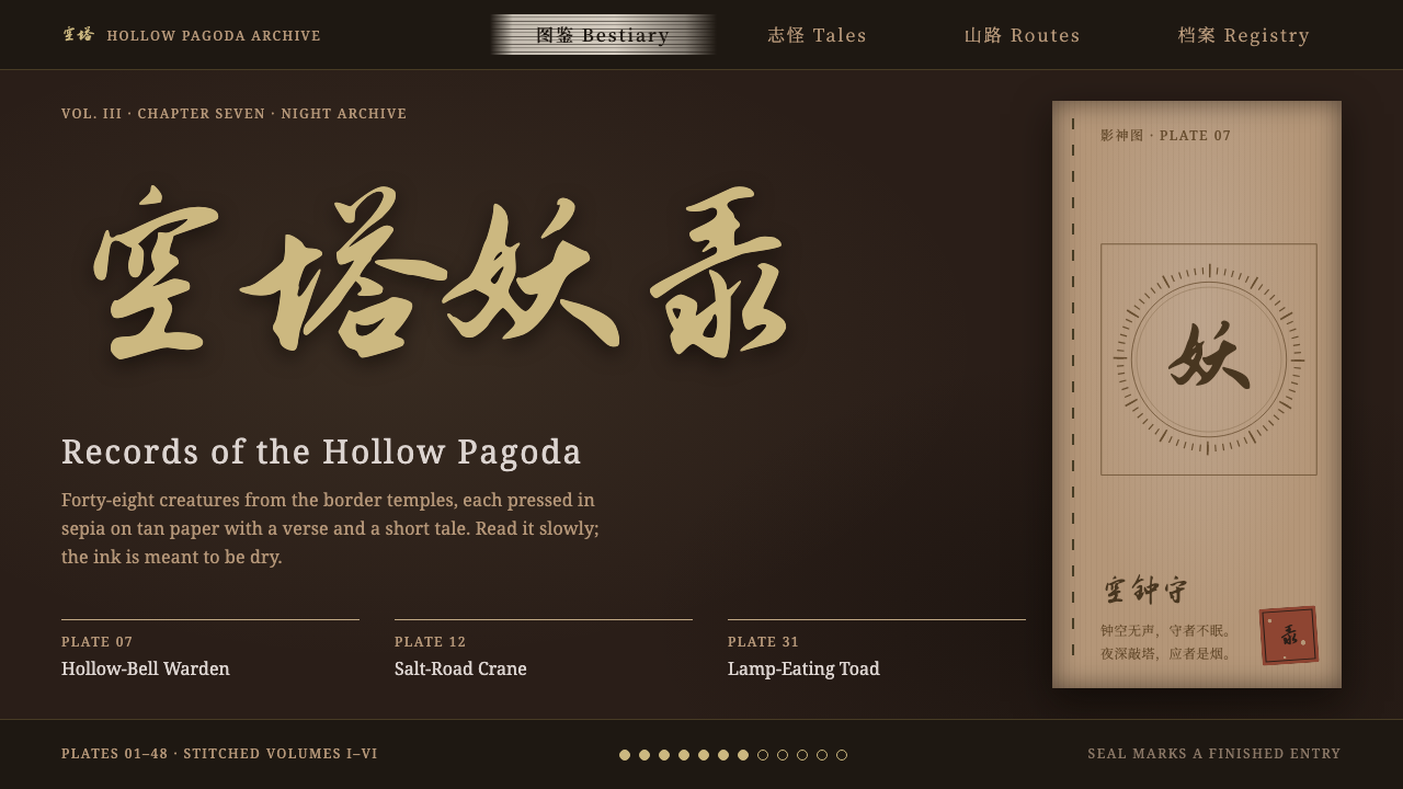 Black Myth: WukongRead by incense light. Gold running script on dark umber, tan woodblock plate…
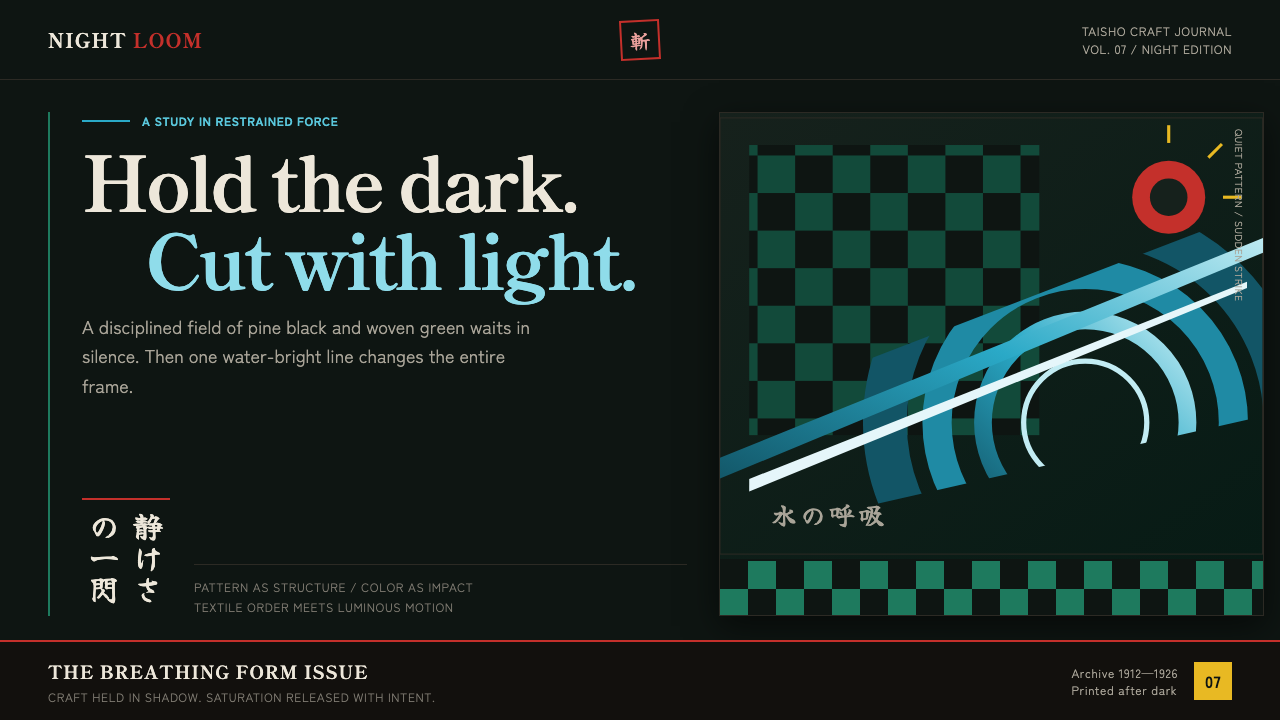 Demon Slayer (2019)Quiet craft, sudden force. Pine-black checks split beneath a water-teal strik…
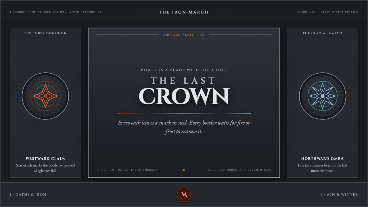 Game of Thrones (2011)Power is forged cold. Chiseled Roman capitals divide ember from glacial ice o…
 Haitian Vodou VèvèSomber ritual glow. Powder-white lines on violet-black earth, touched by cand…
 Hollow KnightFew pale things in great dark. Bone-white Cinzel capitals and hairline filigr…
 Kung Fu Panda (2008)Ancient calm meets comic momentum. Vermilion, gold and paper-cut peaks glow i…