What is Audition?
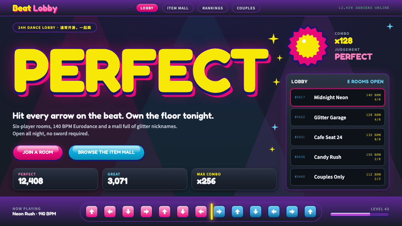
Audition is dance-floor noise turned all the way up: pink bubble letters with a thick navy outline, glossy gel buttons and a row of arrows glowing on a near-black stage.
Audition in brief
Audition is the casual dance online game that T3 Entertainment launched in Seoul in 2004. A year later, the Chinese publisher 9you brought it to mainland China as 劲舞团, where it became the soundtrack and the screen of countless internet cafés. Players faced off on dark 3D club stages, pressing arrow keys in time to K-pop and Eurodance, and every correct step popped up a sparkling PERFECT.
The visual language is the whole package of that world. The stage is a near-black navy. The logo is hot-pink candy lettering with a thick navy outline, as if inflated. Buttons are glossy gel shapes with a bright highlight. Arrow bars run across the screen in saturated colours. Item-mall screens show grids of outfits, hairstyles and accessories, and players' nicknames appear in glittering, multicoloured text, next to couple rings and other status ornaments.
It is loud, bright and a little kitsch, and it was meant to be. Everything about the interface says that this is a place to have fun, to show off and to be seen. The style has no interest in restraint. It rewards confidence, saturation and a sense of play, and it feels like a late-night internet café turned into a dance floor.

Where does Audition come from?
T3 Entertainment launched Audition in Seoul in 2004, as part of a wave of Korean free-to-play online games built around item malls. Instead of charging for play, such games sold cosmetic items, such as outfits, hairstyles and accessories, which players bought to stand out. A dance and rhythm game suited this model perfectly, because the avatar was always on stage and the look of the dancer was the point.
In 2005, 9you published the Chinese edition, 劲舞团. Its popularity peaked from roughly 2005 through 2010, in the era of the Chinese internet café. Those rooms were full of young players, headphones and shared screens, and the game's music and bright interface became part of the atmosphere. A separate publisher, Redbana, appears in the game's international history. The common thread across editions is the same visual identity: a dark stage, a candy-coloured logo and a very busy item mall.
The aesthetic belongs to a strand of Korean online game design in the early 2000s that borrowed from pop music, fashion and cute character culture. Its bubbly lettering, glossy highlights and saturated colour owe more to teen magazine and arcade conventions than to any single design school. T3 Entertainment, 9you and Redbana are the organisations whose names are attached to the game's life across Korea, China and the West.
The game's cultural weight in China is large. For many players, it was a first experience of online identity: a dancer with a chosen nickname, a bought outfit and a partner on the floor. That is why the look can still trigger strong memories, and why this system keeps the whole package, from the navy stage and pink logo to the sparkle-ringed PERFECT pops and the item-mall grid.
What defines the Audition look?
Color
The stage is a very dark navy, close to black, so that every colour on it glows. Against it the accents are hot pink, candy colours and bright highlights. The logo pairs a pink fill with a thick, deep-navy outline, and that two-colour pairing is the signature. Rainbow and gradient effects appear in nicknames and sparkles. The palette is deliberately overheated, with colour used for excitement rather than information.
Typography
Display type is bubble lettering: fat, rounded, inflated letters with a thick outline in a contrasting dark colour. It is used for the logo, big callouts and scores. Smaller interface text is a clean rounded sans, with white or light type on dark panels. Nicknames get the most decoration, in glittering or multicoloured text. The mix of puffy display lettering and tidy small type keeps the screen readable despite the noise.
Gel buttons
Buttons are glossy gel shapes, fully rounded, with a bright highlight along the top and a deeper tone beneath, so they look like glass candy. They are large, inviting and easy to hit. Hover and pressed states change the brightness or push the highlight, keeping the sense of a soft physical object. This is the opposite of a flat button: surface is the point.
Arrow bars and rhythm UI
The core of the game screen is a bar of arrows that the player must hit in time. Arrows are large, saturated and clearly directional, each with its own colour, and they glow against the dark stage. A PERFECT pop, ringed with sparkles, appears when a step lands. The interface is built to be understood in a fraction of a second, so shape and colour are doing the work of text.
Item mall grid
The shop is a grid of equal tiles, each showing an outfit, hairstyle or accessory on a glossy card, with a price and a buy button. The tiles are bright and busy, and sale tags and new-item badges add more colour. This is where the game makes its money, and the visual design is made to make every item look worth wearing on the dance floor.
Sparkle and ornament
Stars, sparkles and glints appear around scores, nicknames and couple rings. They are small, bright and frequent, and they give the screen a festive, slightly excessive feeling. Ornament here is a feature, not a flaw, but it needs a dark ground to work, as sparkles on a pale surface lose all their effect.

Who shaped Audition?
The Korean studio that launched Audition in Seoul in 2004 and shaped its look and item-mall model.
The publisher that brought the game to mainland China in 2005 as 劲舞团, where it became part of internet-café culture.
A publisher associated with the game's international history outside Korea and China.
How do you use Audition today?
On slides, the style is best suited to gaming, entertainment, youth culture, music and retro-internet themes. A cover slide can be a near-black navy field with a large pink bubble-letter title and a thick navy outline. Content slides can use gel-button labels, arrow bars as section markers and sparkles around key numbers. For data, bright, thick bars and glowing numbers on a dark ground work better than thin lines, and each series should have its own saturated colour.
In web UI, it fits game launchers, item shops, avatar editors, fan sites, music and rhythm apps, and any product that celebrates play and self-expression. Components include a dark stage background, rounded gel buttons, bubble headings, tile grids with price tags, and bright pop-ups for rewards. It is not a good fit for serious, information-dense, or accessibility-critical products, because contrast and noise are tuned for excitement, not calm reading.
In editorial and marketing work, it carries strong nostalgia for the 2000s Chinese internet café and for Korean online games. It suits retro campaigns, features on gaming culture and youth memories, and playful brand work that wants to be loud on purpose. Sparkles and bubble lettering give instant visual impact for social images, but they should be placed on a dark ground to keep the glow.
The most common mistake is to tame it. Making the stage mid-grey, thinning the outline on the lettering or flattening the buttons removes the candy quality and leaves a generic dark theme. The second mistake is a pale background: the glow of the arrows and sparkles depends on a near-black ground. Keep the pink and the thick navy outline, and let the gel buttons keep their highlight.
A third error is to apply the whole package everywhere. The style is loud by design, and when every element is glittering, nothing stands out. Reserve the sparkle for the moments that matter, such as a score, a nickname or a reward, and keep body text clean, rounded and easy to read.

Audition — FAQ
What is Audition?
Audition is a casual dance online game launched by T3 Entertainment in Seoul in 2004. Its Chinese edition, 劲舞团, was published by 9you in 2005 and became very popular in internet cafés through about 2010.
Why does the style use bubble lettering?
Bubble lettering, with fat rounded forms and a thick dark outline, gives the logo a candy-like, inflated look that suits a playful dance game. In this style the hot-pink fill with a deep navy outline is the signature pairing.
Is this a dark or a light theme?
It is a dark theme. The near-black navy stage is essential, because the arrows, sparkles and gel highlights glow against it. On a pale background the effect is lost.
What is an item mall?
An item mall is the in-game shop where players buy cosmetic items such as outfits, hairstyles and accessories. In free-to-play games like Audition it is the main source of revenue, so its grid of tiles is a central part of the interface.
Where does this style work best?
It works best for games, music, youth culture, nostalgia and playful marketing. It is not suited to calm, information-dense or accessibility-critical interfaces, since its contrast and saturation are tuned for excitement.
Related design styles
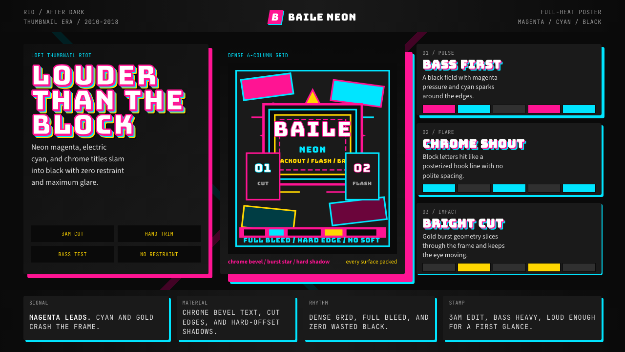 Funk Carioca FavelaMaximalist and unruly. Magenta, cyan, and chrome slam into black at thumbnail…
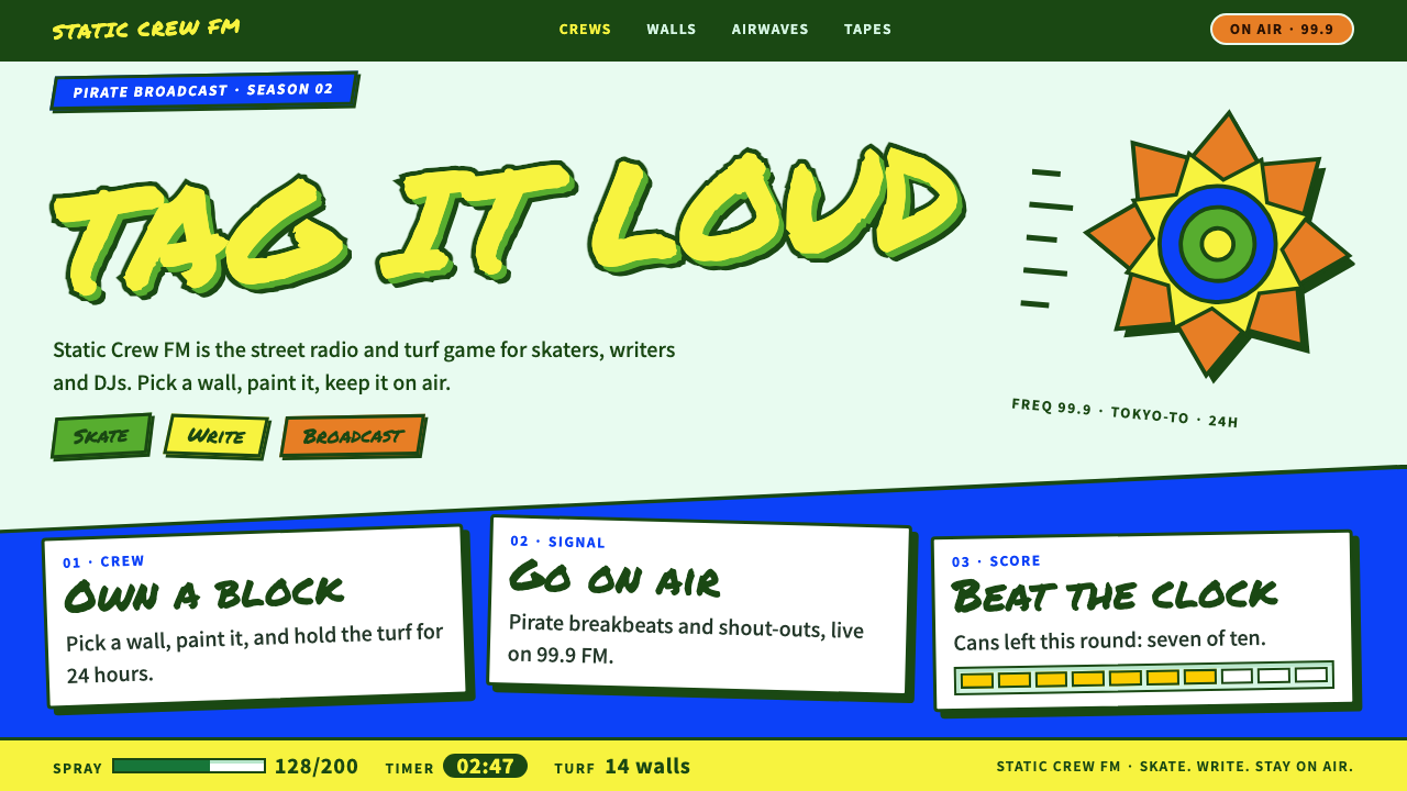 Jet Set RadioCel-shaded street pop. Yellow marker tags, hard green outlines, tilted cobalt…
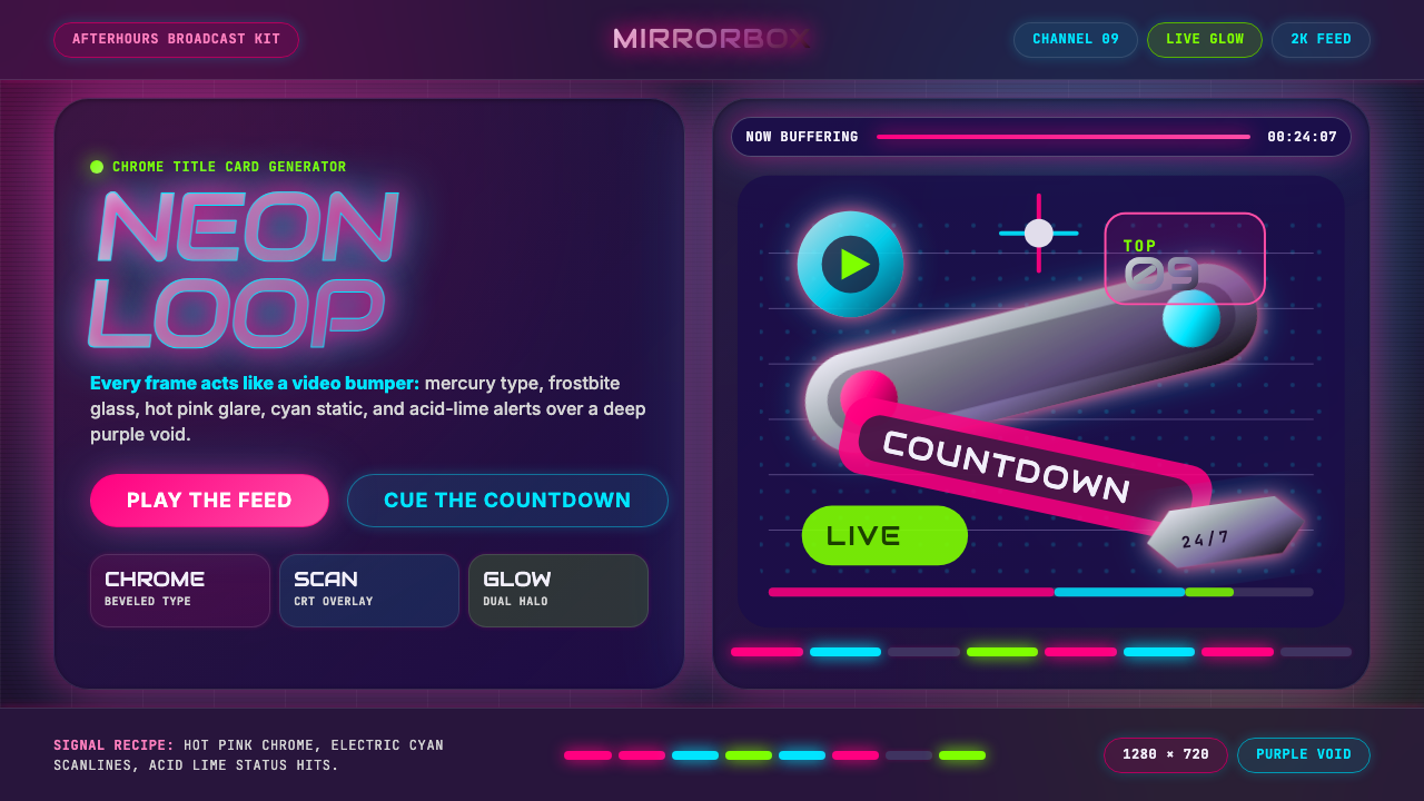 MTV Y2K (2000s)Maximum-volume Y2K. Hot pink chrome, cyan scanlines, and lime hits burn over…
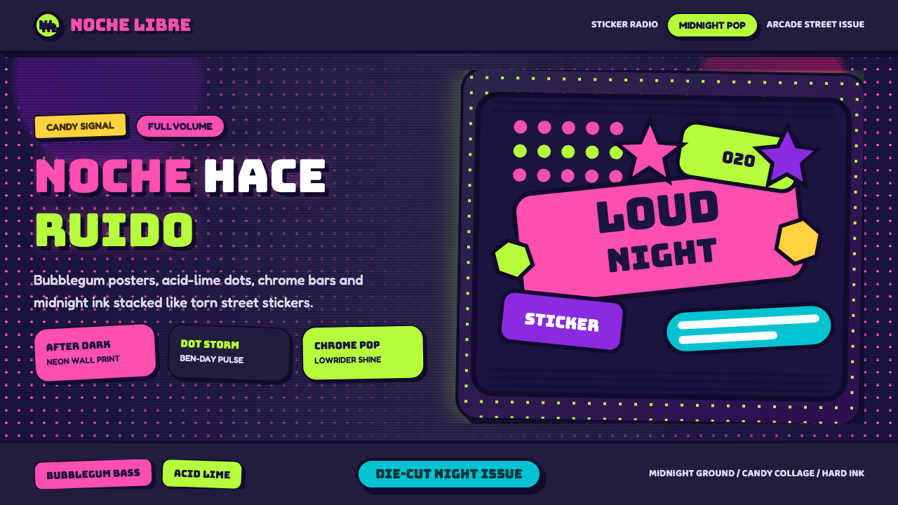 Bad Bunny YHLQMDLGMaximal night-pop collides. Bubblegum pink and acid lime stickers glow on mid…
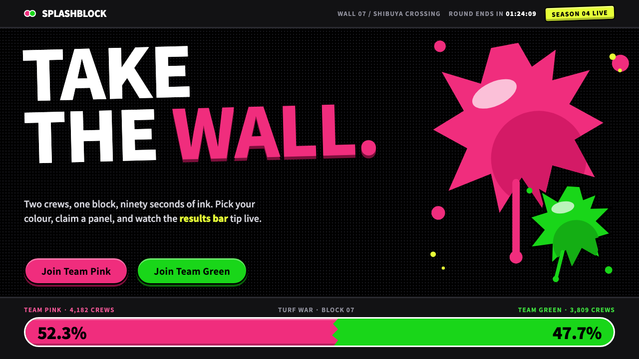 SplatoonTwo inks, one black wall. Fat 900-weight type, glossy ragged splats and tilte…
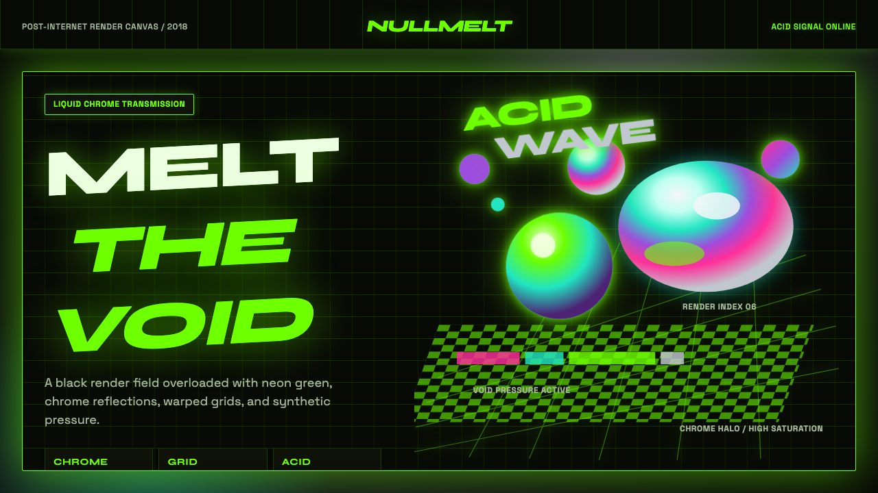 Acidwave 3D RenderPsychedelia hits the render engine. Neon green, chrome orbs, and warped grids…