What is Asteroid Mining Consortium?
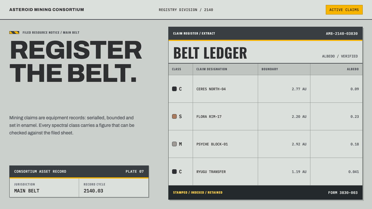
The Asteroid Mining Consortium style imagines deep-space mining the way heavy industry actually looks: enamel-grey plates, hazard yellow, and monospaced ledgers in which every number is meant to be checked.
Asteroid Mining Consortium in brief
Asteroid Mining Consortium is a design style that treats an imagined mining venture in the main asteroid belt, set in the year 2140, as a piece of ordinary heavy industry rather than as science-fiction spectacle. Its visual language is borrowed from machine nameplates, control enclosures, safety markings and claim registries: a pale industrial grey enamel for large surfaces, a darker anthracite for structure, hazard yellow wherever something can crush or cut, and serial-numbered sheets that have to agree with a document on file.
The central idea is verifiability. Where cinematic space design reaches for glowing holograms and curved cockpit glass, this style reaches for the nameplate. A claim is not a marketing card but a registry sheet with a serial header band. A spectral class is not a decorative gradient but a solid swatch chip that sits beside real reflectivity figures. Numbers are set in monospaced type because their job is to be read line by line against a record, not admired.
The result is a light, matte, workmanlike page. It reads like an equipment label crossed with a stamped and filed mining notice: dense with information, calm on the surface, and unusually candid about where each fact comes from.
Where does Asteroid Mining Consortium come from?
The style begins on factory floors rather than in film studios. In 1927 the German RAL institute, whose name comes from the Reich committee for delivery terms, began publishing a standard register of named and numbered colours, so that a buyer in one city and a coating supplier in another could agree on a grey without exchanging painted samples. That register, now known as RAL Classic, stayed in continuous use and became a common language of plant engineering around the world: a control enclosure in a light neutral grey, a structural frame in a darker anthracite, and traffic yellow on anything that can crush, cut or trap. The consortium style takes these conventions literally. Its palette is not an invented science-fiction colour scheme but the paint schedule of a real workshop, which is why it feels credible in a way that neon futurism does not.
Two further traditions shape the details. Machine-tool functionalism, the design attitude of lathes, presses and switchgear, holds that a surface exists to carry information: a model, a serial number, a rating, a warning. A stamped plate is at once the least decorative and the most trusted object on a machine, because it ties the physical thing to a paper record. Safety-marking practice, codified in the international standards for safety colours and signs, adds the rules for hazard yellow: where it goes, and why it must be used sparingly enough to keep its meaning.
The setting comes from a third and very different source, the paperwork of land claims. Under the United States General Mining Law of 1872, a prospector who found valuable mineral could stake a claim and record it with the Bureau of Land Management, a process that still runs on numbered forms, serial numbers and map references. This style takes BLM recording practice as its model (the design cites form 3830-003) and transposes it to a main belt that, in 2140, is staked and filed in much the same way. Mineral claim cartography, with its marked boundaries, numbered corners and location notices, supplies the idea that every claim page needs a header band, an identifier and a named holder.
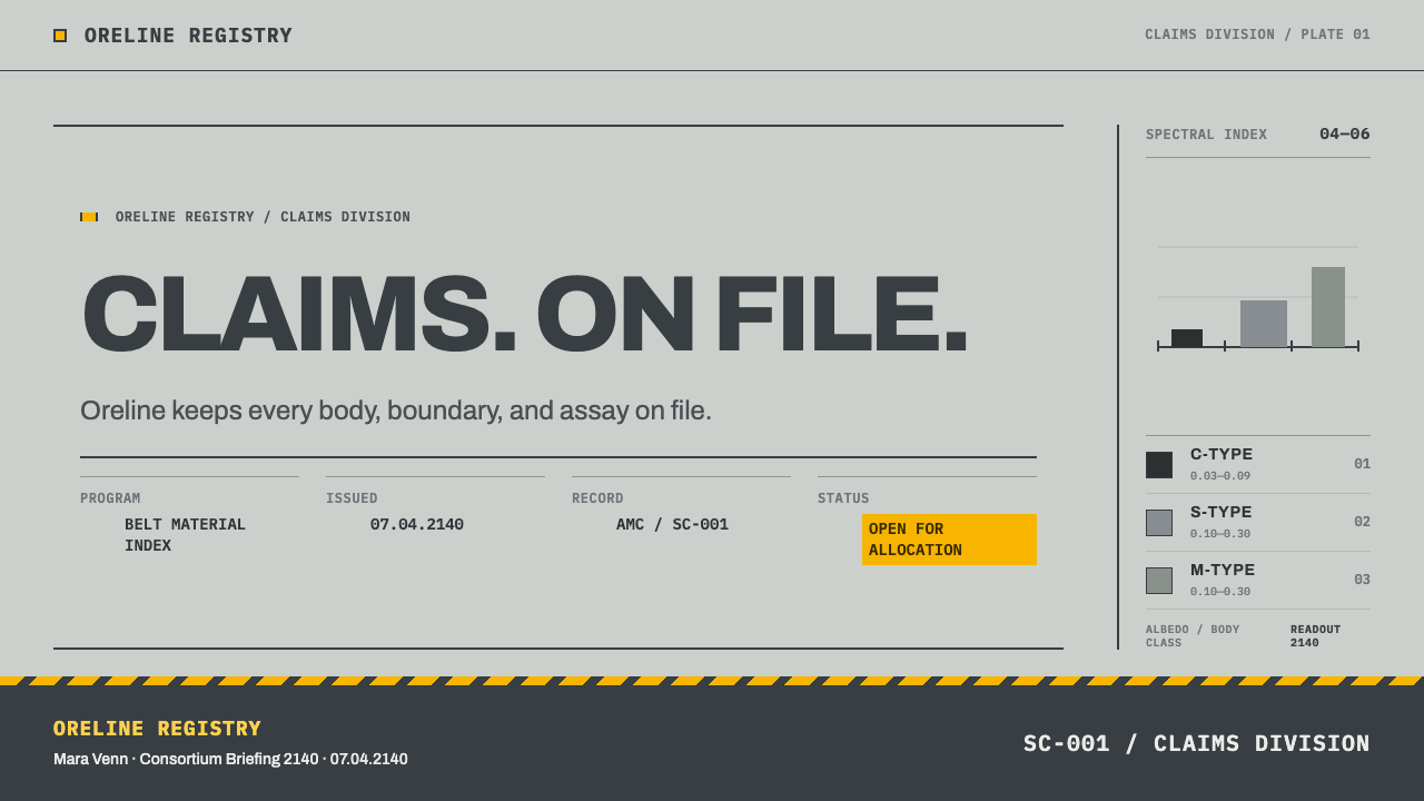
The science layer is the asteroid classification developed in the 1980s. In 1984 David Tholen proposed a taxonomy that sorted asteroids by their spectra and reflectivity into classes, among them the dark, carbon-rich C type, the stony S type and the metal-rich M type. Later spectroscopic surveys by Schelte Bus and Richard Binzel refined the scheme. For a mining consortium these letters are the ledger: they say what a body is probably made of and therefore what a claim on it might be worth. The style turns each class into a solid colour chip that carries its real reflectivity range, a few percent for C-type bodies and roughly a tenth to three-tenths for M-type, so that even the legend of a chart is a measurement rather than a mood.
What defines the Asteroid Mining Consortium look?
Enamel Grey and Anthracite
The page is built from the greys of industrial paint: a pale, slightly cool enamel grey for enclosures and large surfaces, a darker anthracite for structure and frames, and white and near-black for text. The finish is matte and a little worn, like powder-coated sheet metal in a working shop. These neutrals are chosen on purpose. They exist to make everything else, the single warning colour and the data chips, legible by contrast.
Hazard Yellow
Traffic yellow appears where a real machine would be painted with it: on edges that can crush, on warning bands, and on the single item the viewer must not miss. It is used sparingly. In safety-marking practice a warning colour only works when most of the surface around it is quiet, and the style keeps to that discipline, so a patch of yellow always means attention is required.
Registry Sheets with Serial Header Bands
Claims, lots and records are drawn as registry sheets: a dense header band carrying the serial number, then ruled fields beneath it with labels above values and thin lines between rows. The structure looks like a filed form and is deliberately hostile to decoration. The header band is the identity of the page, in the same way that a stamped plate is the identity of a machine.
Spectral Class Swatch Chips
Spectral classes appear as flat, solid swatch chips with the classification letter and its measured reflectivity beside them. Because the chip is both a colour and a data point, the legend and the data become the same object. There are no gradients between classes: a body belongs to one class or another, and the chips sit side by side like paint samples on a colour card.
Monospaced Figures
Every figure that might be checked, including serial numbers, coordinates, masses, reflectivity values and claim areas, is set in monospaced type so digits stack in clean columns and a misplaced character is obvious. Prose around the numbers stays plain and workmanlike. The contrast between ledger and sentence tells the reader which parts of the page are measurements and which are commentary.
Plates, Stamps and Marks of Record
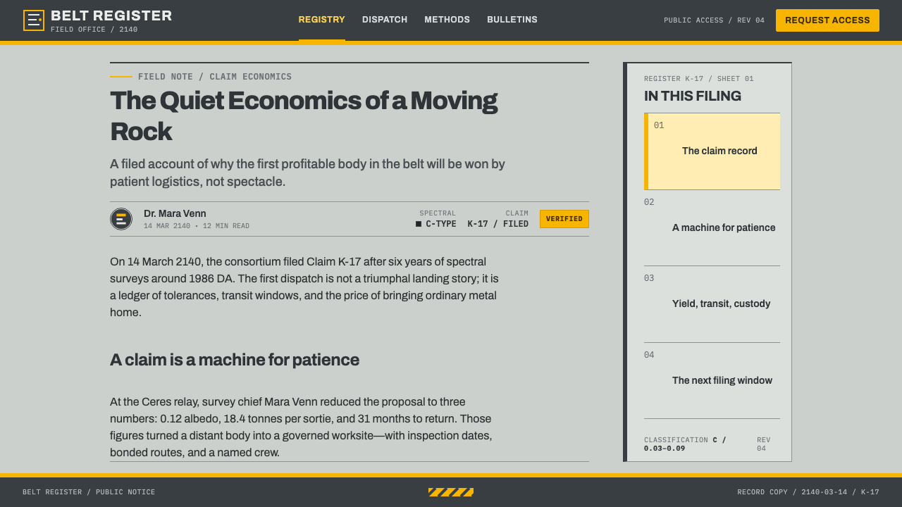
Authority comes from marks of record rather than from glow: plate-like borders, stamped status labels such as filed or registered, and date and signature blocks. A document should look as though it has been through a process, received, numbered, stamped and archived, and every mark of that process doubles as information.
Refusing the Cinema
The style defines itself against the usual screen vocabulary of space: no neon glow, no holographic transparency, no curved cockpit glass, no lens flare. Surfaces are opaque and flat, corners are square, and decisions are made with colour fields and ruled lines. The absence is part of the argument. The page is meant to look like paperwork that has survived a year of use, not like a trailer.
Who shaped Asteroid Mining Consortium?
Tholen is the astronomer who proposed, in 1984, a taxonomy that sorted asteroids by spectrum and reflectivity into lettered classes, including the C, S and M types. The scheme made it possible to say something about the likely composition of a distant body in a single character, which is exactly what a claims ledger needs.
Bus worked with Binzel on a large spectroscopic survey of main-belt asteroids and a refined taxonomy that divided the broad classes into finer subtypes. His work shows how a classification system stays alive: by being checked against better data. That is the same attitude the style takes toward its numbers, which are always presented as something to be verified.
Binzel is a planetary scientist at MIT who collaborated with Bus on the refined asteroid taxonomy. He is also known for the Torino Scale, a colour-coded scale for communicating asteroid impact risk. It is a good example of what the consortium style believes in: a scientific classification that uses colour as a plain, shared signal rather than as decoration.
Elkins-Tanton is a planetary scientist who leads NASA's Psyche mission to a metal-rich asteroid, the real-world counterpart of the M-type class that anchors the consortium's imagined business. Her work is a reminder that metal-rich bodies stop being fiction the moment a spacecraft is sent to measure one, and that the vocabulary of claims and classes may one day be needed for real.
How do you use Asteroid Mining Consortium today?
Asteroid Mining Consortium is at its best when the audience's first question is whether the numbers can be trusted. It is a style for evidence-heavy material such as inventories, registries, audits, logistics, compliance and technical due diligence, and it works whether or not the subject has anything to do with space.
For presentation slides, treat each slide as a filed sheet. A cover works as a registry title block: a pale enamel field, a dark serial header band along the top carrying the document number, the title in plain heavy lettering, and one patch of hazard yellow as the only accent. Content slides should hold to a ruled form, with labels above values, aligned columns and thin dividing lines, and the slide number belongs in the header band like a document serial. Data slides are where the style shines: charts and tables use solid chips for categories, monospaced figures in aligned columns, and a legend that is simply the swatches with their measured values.
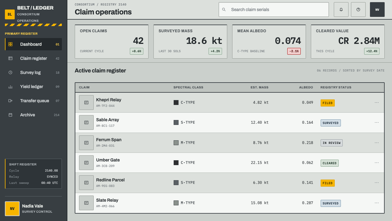
For web interfaces, the style fits operations dashboards, asset registers, status pages and admin tools. Build screens from ruled panels with identifying header bands, keep controls square and quiet, and set every numeric field in monospaced type so columns stay aligned as the data refreshes. Reserve hazard yellow for states that need acknowledgement, such as pending approvals, expiring claims and failed checks, so that it keeps its meaning. Pricing pages work well as spec sheets: tiers as rated plates with serial-like plan codes, and differences listed as ruled rows rather than as marketing bullets.
For editorial and marketing work, lean on the document metaphor. Articles can open with a stamped-style metadata block, giving a reference number, a filing date and a status, before the text begins, and long reports can use numbered sections the way a notice numbers its clauses. Marketing pages benefit from the same restraint: a plain grey field, a few facts set in monospaced figures, and one yellow call to action.
The most common mistake is to add the cinema back in: glowing edges, translucent holographic panels, star fields behind the content or a dark cockpit scheme. These make the page look like a game interface and destroy the audit feel. The second mistake is spreading yellow across headings and decoration until it no longer reads as a warning. A third is setting table numbers in proportional figures, which undermines the premise that numbers are meant to be compared line by line.
Asteroid Mining Consortium — FAQ
Is this a science-fiction style, or can it be used for non-space subjects?
It is set in the future but it is not science-fiction in the cinematic sense. Its visual language comes from real industrial practice: nameplates, safety markings, claim registries and standard colour registers. That is why it transfers well to any subject where trust in the numbers matters, such as logistics, inventory, regulatory filings, infrastructure reporting and technical documentation. The 2140 mining story is a frame; the structure underneath would look at home on a factory wall.
Why are the numbers monospaced?
Because the numbers are meant to be checked against a record, not admired. In a monospaced face every digit occupies the same width, so figures line up in columns, differences in length are visible at a glance, and a mistyped or missing character stands out. The choice also signals the register of the page: it tells the reader that this is a ledger, where what matters is accuracy and comparison, and not a brochure, where what matters is mood.
How is this different from a hacker or terminal-style aesthetic?
Both use monospaced type, but the logic is opposite. Terminal styles usually sit on a dark ground with glowing phosphor-like text and borrow the mood of a command line. Asteroid Mining Consortium sits on a pale matte enamel ground, uses monospace only for figures that will be checked, and borrows the look of paperwork and machine plates.
Can this style work with a dark background?
The system is conceived as a light, matte page, because the enamel-on-metal feel depends on pale grounds and a small amount of yellow reading strongly against them. A dark inversion is possible if you treat the anthracite as the ground and keep the pale grey for panels and plates, but it tends to drift toward the glowing-cockpit look the style is trying to avoid.
Are the spectral classes and reflectivity values real?
The classification letters and the broad reflectivity ranges come from real asteroid taxonomy: dark carbon-rich bodies sit at the low end, while metal-rich bodies are much brighter. The commercial frame around them, a consortium filing claims in the year 2140, is fiction. The design uses the real figures on purpose, because a style built on verifiability would lose its point if its own legends were invented.
Related design styles
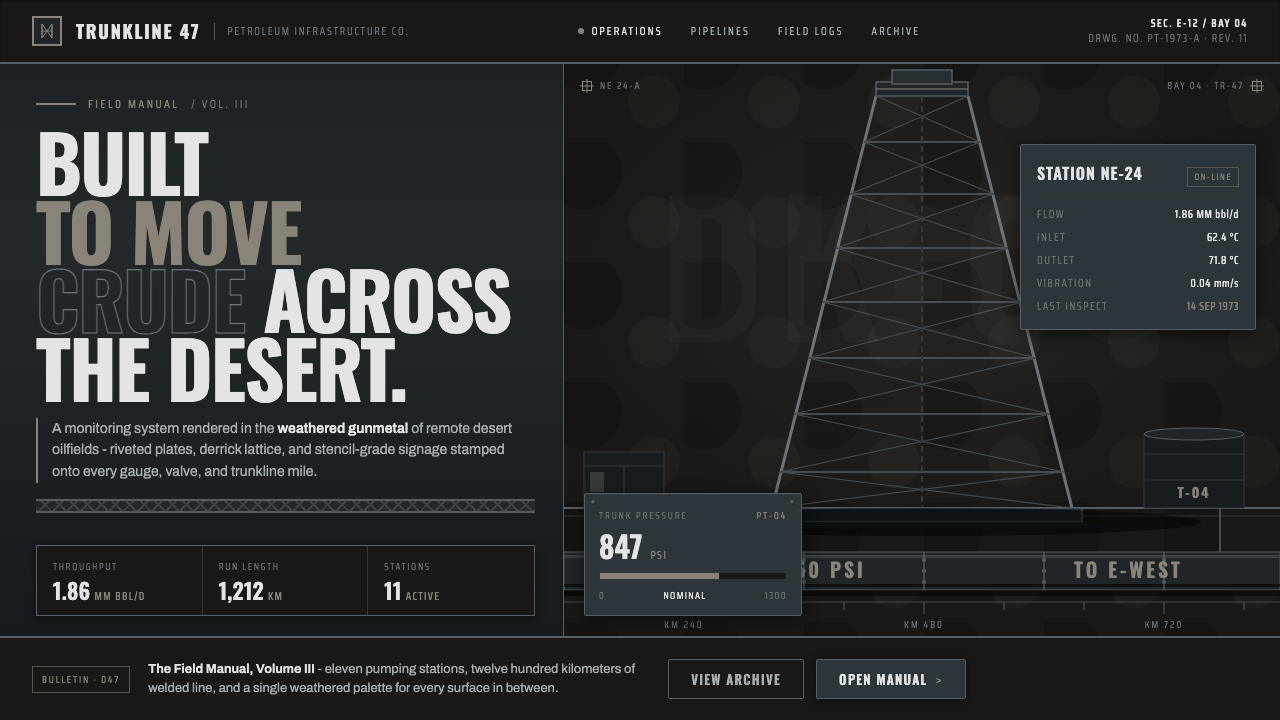 Gulf Oil Derrick IndustrialEngineered, not decorative. Soot-darkened gunmetal, derrick lattice, condense…
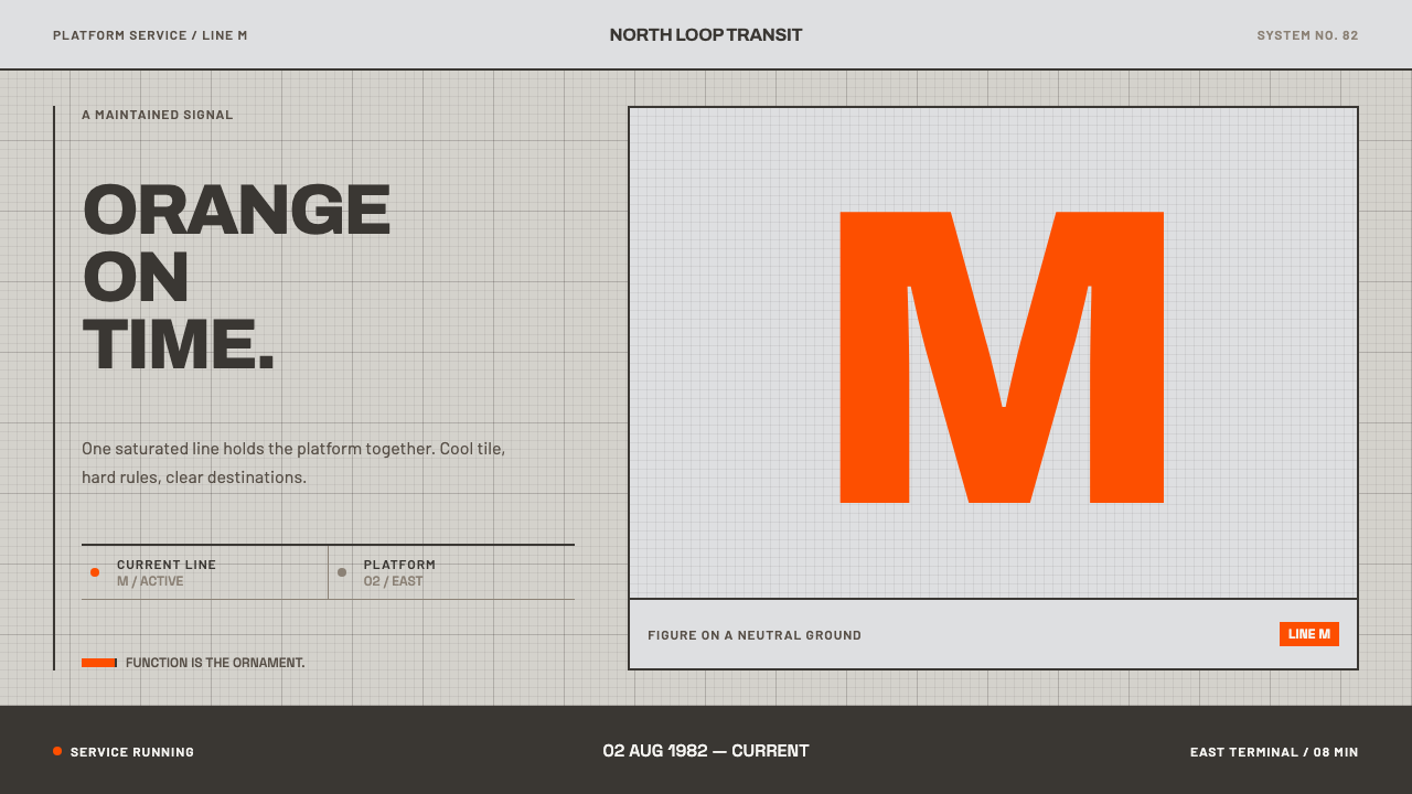 Helsinki Metro OrangeOne orange does the work. Archivo signage cuts across an 8px concrete tile gr…
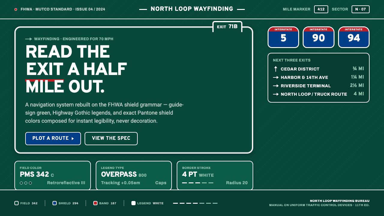 Interstate Highway ShieldEngineered for 70 mph. Guide-sign green, Pantone shield blue and red, Highway…
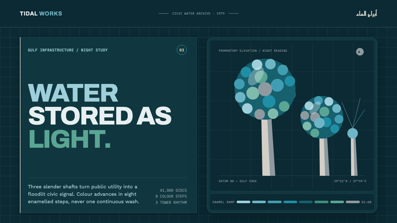 Kuwait Water TowersInfrastructure becomes a night monument. Eight enamel steps spiral across a d…
 Lunar RoverBuilt for the vacuum. Kapton-gold foil and stencil part-numbers against void-…
 Massimo Vignelli NYCClarity becomes infrastructure. Black rules and route stripes lock the white…