What is Arctic Fox Winter Coat?
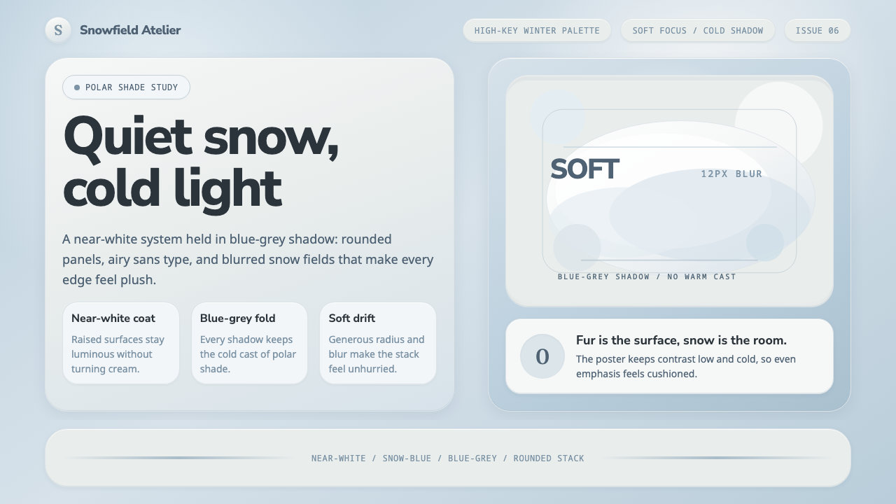
Arctic Fox Winter Coat is softness held at polar temperature: near-white fur, snow-blue shadow, and forms so rounded that nothing feels sharp enough to disturb the quiet.
Arctic Fox Winter Coat in brief
Arctic Fox Winter Coat is a contemporary visual style drawn from the seasonal white fur of Vulpes lagopus, seen close against drifted snow. Its central distinction is temperature. The surfaces may appear white at first glance, but they are never warm, creamy, beige, or sepia-leaning. Their shadows move toward blue-grey, while the surrounding ground carries the blue-white cast of snow held in polar shade. The result is bright and gentle without becoming sunny, domestic, or nostalgic.
The style belongs to the visual world of soft-focus natural-history photography and cool high-key winter imagery. It treats the arctic fox not as a decorative mascot but as a complete material lesson: fur softens contours, snow expands light, and cold shade gives pale surfaces their structure. A successful composition feels airy because the light areas dominate, yet it avoids blank sterility through cool tonal separation and soft photographic depth.
Visually, Arctic Fox Winter Coat combines near-white panels, snow-blue ambient fields, pale blue-grey shadows, rounded containers, and light sans-serif typography. Images are close, plush, and softly focused rather than crisp or dramatic. Edges should appear cushioned, not engineered; depth should feel like fur lifting gently above snow, not like a dark object floating over a page. The atmosphere is slow, clean, and attentive to quiet contrast.
Where does Arctic Fox Winter Coat come from?
Arctic Fox Winter Coat originates in contemporary soft-focus wildlife photography, particularly imagery that observes Vulpes lagopus in its white seasonal coat. The subject matters because the animal supplies both the palette and the spatial logic. White fur is not a flat white field: it collects cool reflected light, breaks into soft directional texture, and darkens only through blue-grey shadow. Drifted snow behind the animal extends that same condition across the frame, producing a world with very little visual heat.
Its geographic imagination joins the circumpolar Arctic with Oceania sub-antarctic winter environments. These are not presented as interchangeable landscapes so much as related visual conditions: cold light, snow-bright ground, pale atmosphere, and a refusal of warm earth tones. The style draws from photographs that let those conditions remain quiet. Rather than using wildlife imagery for spectacle, the reference mode stays close to fur, snow, and softened distance.
Field-guide photographers of Vulpes lagopus and conservation-documentary naturalists provide the source perspective. Their work centers observation: the animal's seasonal adaptation, its place against snow, and the subtle difference between direct brightness and polar shade. Arctic Fox Winter Coat translates that observational restraint into design. It preserves the sense that pale surfaces are alive with cold light, rather than treating white as an empty default.
As a contemporary system, the style does not depend on historical ornament or a named graphic movement. Its continuity comes from a photographic way of seeing: shallow depth of field, softened edges, cool high-key exposure, and patience with nearly monochrome scenes. The design language works when it retains this discipline. It should feel derived from an arctic coat and shaded snow, not merely from a generic pastel interface.
What defines the Arctic Fox Winter Coat look?
Icy Near-White
The dominant surface is near-white, but it must remain optically cold. It should suggest white fur under diffuse winter light rather than paper warmed by indoor illumination. Avoid cream, ivory, beige, yellowed white, or anything that introduces domestic warmth. The tonal field needs enough blue-white presence that even the brightest areas still belong to a snowy environment.
Snow-Blue Shadow
Shadow is the system's main structural contrast. Instead of turning pale surfaces brown or greyed with warmth, it falls into quiet blue-grey and snow-blue tones. These shadows should be gentle and broad, like shade gathering within fur or beneath a snow drift. Their purpose is not drama; it is to give near-white objects separation without breaking the high-key calm.
Plush Rounding
Rounded forms are essential because the visual reference is fur, not ice cut into facets. Panels, image crops, controls, and containing shapes should feel softened at their boundaries. The rounding should communicate cushioning and insulation rather than playful cartoonness. Corners become a way to lower visual tension, making the interface feel as though sharpness has been gently covered by a winter coat.
Airy Sans Type
Typography should be light, open, and unhurried. An airy sans-serif voice suits the broad pale fields because it keeps language from becoming a dark block that overwhelms the visual atmosphere. Hierarchy should come from calm differences in scale, spacing, and placement. Dense, heavy, aggressively condensed, or decorative lettering works against the style by making the page feel louder and warmer than its source imagery.
Soft Focus
The style borrows shallow depth of field from close wildlife photography. Backgrounds, peripheral imagery, and secondary texture may soften into blur so that the primary subject feels close and tactile. Blur must remain restrained and atmospheric, never smeared or foggy. Its role is to imitate the way fur and snow absorb hard visual boundaries, leaving the viewer with a sense of proximity rather than optical spectacle.
Quiet Depth
Depth is present but deliberately shallow. Near-white panels should seem to float over snow-blue ground with soft, cool separation, as though resting lightly on compacted snow. Strong black shadows, harsh edge contrast, metallic gloss, and theatrical elevation would fracture the mood. The preferred depth is almost felt before it is seen: a low, plush distinction between surface, shade, and surrounding air.

Who shaped Arctic Fox Winter Coat?
The Arctic fox is the style's primary visual source. Its pure-white seasonal fur establishes the near-white surfaces, while the cool shade within the coat provides the blue-grey logic that keeps the palette from becoming creamy or warm. The animal also supplies the system's tactile model: contour is softened, detail is quiet, and brightness remains connected to cold surroundings.
Field-guide photographers contribute the close, observational view of the fox in snow. Their perspective emphasizes identifying qualities rather than spectacle: the relationship of fur to reflected light, the pale ground behind the animal, and the softness produced by close focus. This approach informs a design system that values subtle separation and truthful coldness over visual intensity.
Conservation-documentary naturalists anchor the style in attentive natural observation. Their imagery frames winter wildlife as part of a living environment rather than as an isolated decorative subject. That influence encourages spacious compositions, subdued intervention, and an atmosphere where snow, fur, and air remain equally important.
How do you use Arctic Fox Winter Coat today?
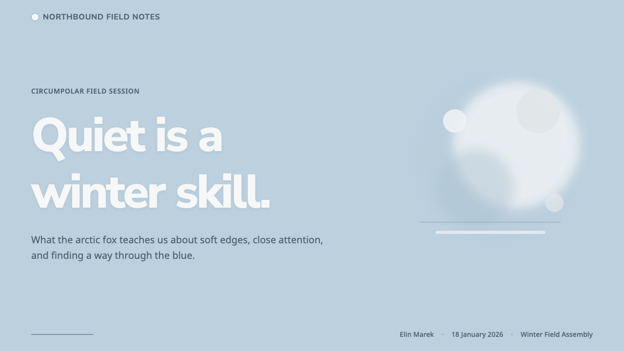
For presentation covers, Arctic Fox Winter Coat works best when the composition has one close, plush visual anchor and substantial pale breathing room. A soft-focus fox-fur or snow-adjacent image can sit against a snow-blue field, while the title remains airy and dark enough to be easily read without becoming severe. The cover should feel like entering winter shade slowly, not like receiving a cold-weather advertisement.
Content slides benefit from the system's quiet hierarchy. Use near-white content panels over a cool blue-white ground, then let blue-grey separation organize groups of information. Headings should remain light and clear, while body text is restrained enough to preserve the open field around it. For data slides, charts should be simplified into a small family of cool tonal relationships. The point is not to make data look decorative, but to make comparison feel as calm and legible as tracks on snow.
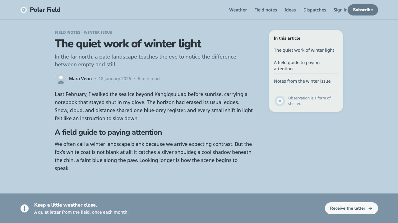
For web interfaces, the style is especially useful for dashboards, profiles, libraries, and pricing experiences that need to feel welcoming without becoming warm-toned or playful. Near-white containers can hold navigation, summaries, and choices above a snow-blue environment. Rounded modules make repeated information feel gentle, while restrained blue-grey depth keeps interactive regions distinct. Strong visual alarms should be introduced carefully because abrupt contrast can overwhelm the soft-focus premise.
In editorial and marketing work, Arctic Fox Winter Coat supports stories about winter landscapes, wildlife, conservation, quiet technology, and products whose value lies in calm clarity. Editorial pages can use generous image-led openings, pale callout panels, and captions that feel like field observations. Marketing pages can alternate between soft close-up texture and open snowy space, using cool contrast to guide attention without turning the composition into a high-pressure sales surface.
The common mistake is confusing cold softness with generic pale minimalism. A pale background alone is not enough, and adding warm off-white, beige photography, sharp black elevation, or overly crisp geometric components immediately shifts the system away from its source. Another mistake is making every surface equally blurred or equally rounded. The style needs a clear subject, gentle but readable layers, and cold shadow that consistently reminds the viewer of fur against polar snow.
Arctic Fox Winter Coat — FAQ
Is Arctic Fox Winter Coat simply a white version of a soft interface?
No. Its defining quality is not whiteness alone but a specific cold-light relationship between near-white fur, blue-grey shade, and snow-blue ground. A generic soft interface can use warm neutrals, cheerful pastels, or decorative depth. Arctic Fox Winter Coat must remain visibly connected to polar shade. If the pale surfaces begin to read as cream, beige, or indoor paper, the style has lost its central condition.
Can the style use dark text and strong contrast?
Yes, but contrast should serve reading and structure rather than visual aggression. Dark text is useful on pale surfaces because the system still needs dependable hierarchy. What should be avoided is turning every boundary into a hard confrontation: dense dark blocks, severe shadows, and repeated high-impact accents can make the layout feel architectural or industrial rather than plush and winter-soft. Let the pale field remain dominant.
Does soft focus mean that images and interfaces should look blurry?
No. Soft focus is selective. It is most useful in background imagery, peripheral texture, or transitions between a close subject and surrounding snow. Information, controls, and primary reading surfaces still need clarity. The intended effect is not reduced legibility; it is the visual sensation that fur and snow naturally soften distance and absorb harsh edges.
Where does Arctic Fox Winter Coat work less well?
It is less suited to work that depends on heat, appetite, loud celebration, dense urgency, or rugged material force. The system's pale, cold, unhurried atmosphere can weaken messages that need to feel fiery, noisy, intensely energetic, or earthbound. It also struggles when a product requires many competing alerts and high-contrast states visible at once, because that complexity disrupts the quiet high-key field.
What is the quickest way to tell whether an application has drifted away from the style?
Look at the shadows and the whites before looking at the decorative details. If white surfaces feel warm, if shadows feel brown, black, or theatrical, or if the environment no longer suggests blue-white snow in polar shade, the design has drifted. Then inspect the edges: if they feel sharp, heavy, or engineered rather than cushioned by fur-like softness, the same conclusion applies.
Related design styles
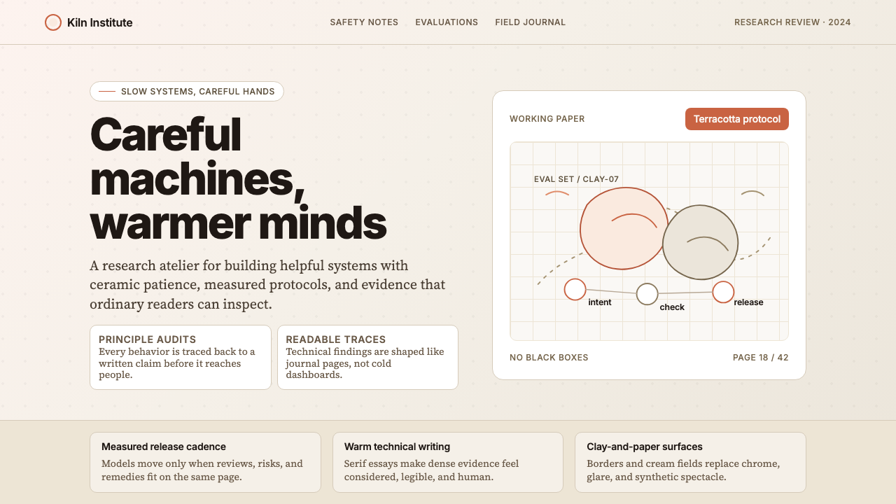 Anthropic ClayAI safety in handmade clay. Sand backgrounds, terracotta accents, serif body…
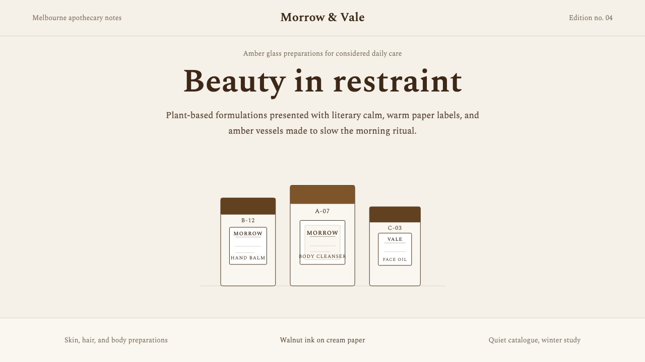 AesopRefuses urgency. Walnut serif on cream paper — every surface paced like a 19t…
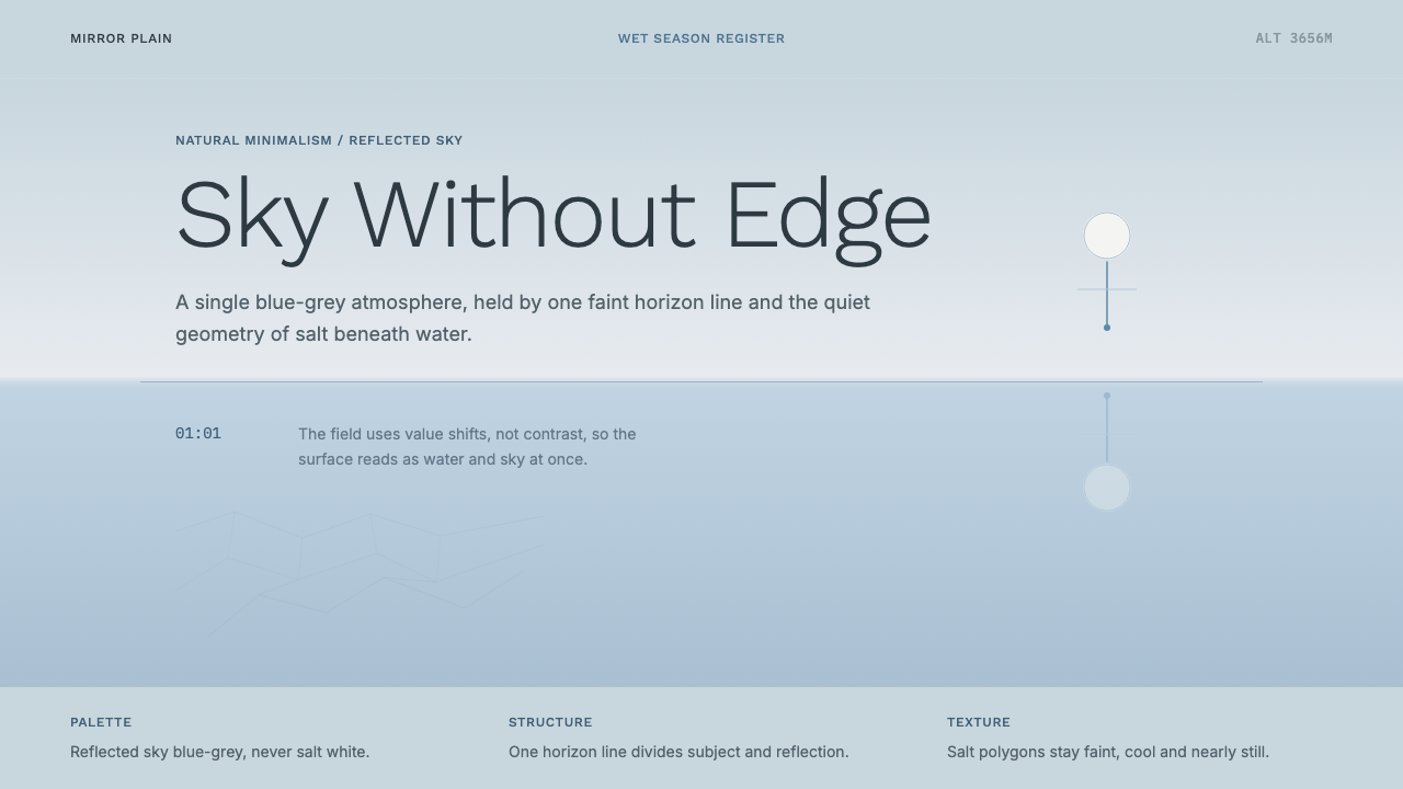 Salt Flat UyuniAtmosphere does the work. Blue-grey space, one horizon line, faint salt polyg…
 Signal Encrypted MessengerCalm privacy, plainly stated. Cobalt Inter type and white space carry the tru…
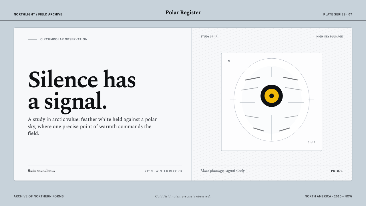 Snowy Owl TundraCold precision, one warm signal. Feather white and charcoal frame a lone lemo…
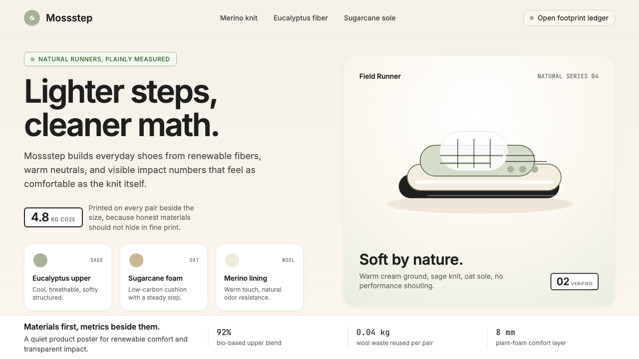 AllbirdsSustainability that breathes. Cream-and-sage tones, carbon labels next to pri…