What is Woodland School — Morrisseau?
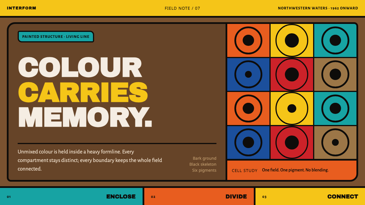
Norval Morrisseau locked pure, unmixed color into heavy black cells — and made an entire visual language out of what was on hand: birchbark, kraft paper, and the memory of a scroll tradition he was never supposed to reveal.
Woodland School — Morrisseau in brief
This style begins with a heavy black formline that divides every figure into distinct cells, and inside each cell sits one unmixed color, taken straight from the tube — never blended, never shaded toward white or black, never softened into a gradient. Organs, spirit lines, and lines of communication between figures are drawn directly onto the bodies and between them, making the interior life of a being as visible as its outline.
The ground beneath this line work is never gallery white. It is warm and mid-dark — the brown of birchbark or kraft paper, the material the earliest works were actually painted on, since Morrisseau used whatever surface was available to him rather than commissioned canvas. The line sits on top of that warm ground the way brush marks sit on bark, and the contrast between dark surface and bright, saturated cells is what gives the work its glow.
Symmetry appears constantly across figures and compositions, but it is never mechanical — the hand wobbles it, so a mirrored form is always slightly, humanly imperfect rather than measured with instruments. Figures are drawn with an X-ray-like transparency, showing what is normally hidden inside a body, and depth is built through layering and overlap rather than through shading or cast shadow, since nothing in the system pretends to simulate real-world lighting.
Where does Woodland School — Morrisseau come from?
Norval Morrisseau, who called himself Copper Thunderbird, was born and raised in the Anishinaabe communities of northwestern Ontario, around Lake Nipigon and the surrounding region of Beardmore, Red Lake, and Thunder Bay. He began painting in earnest with almost no formal art training and no reliable access to conventional artist's materials, which is why his earliest surviving works exist on birchbark, kraft paper, millboard, and moose hide rather than stretched canvas — the ground of the work is a direct record of what was actually available to him at the time.
His visual vocabulary drew on the pictographic and scroll traditions of the Midewiwin, the Anishinaabe medicine society, whose sacred images and teachings were traditionally restricted and passed down only within initiated circles. Morrisseau's decision to render these visual forms in paintings meant to be exhibited and sold publicly was controversial within his own community at the time, seen by some as a serious act of disclosure, and his work is inseparable from that tension between preservation and transgression.
Morrisseau held his first solo exhibition in 1962 at the Pollock Gallery in Toronto, an event now widely regarded as a turning point that brought Indigenous Canadian painting into the commercial and critical gallery system for the first time on anything like equal terms. That exhibition is generally treated as the founding moment of what came to be called the Woodland School — sometimes also called Legend Painting — a movement of Anishinaabe and other Indigenous artists working in a related visual language of heavy formline, unmixed color, and narrative content drawn from oral tradition.
Morrisseau's own palette shifted dramatically over his career: his earlier work in the 1960s favored more muted, earth-derived tones, while his later work, extending into the 1990s, moved toward intensely saturated, almost neon-bright pigments — cadmium orange, cadmium yellow, and phthalo-green among them — a shift that tracks his growing confidence and the increasing availability of vivid commercial paints rather than any single stylistic manifesto.
What defines the Woodland School — Morrisseau look?
Color
Each cell within a formline figure holds a single unmixed color, applied straight from the tube without blending, shading, or gradation. Early work favored earth-derived, muted tones; later work moved toward intensely saturated cadmium and phthalo hues. Regardless of the specific era's palette, colors never blend into one another — each cell is a flat, discrete, fully saturated field.
Heavy Black Formline
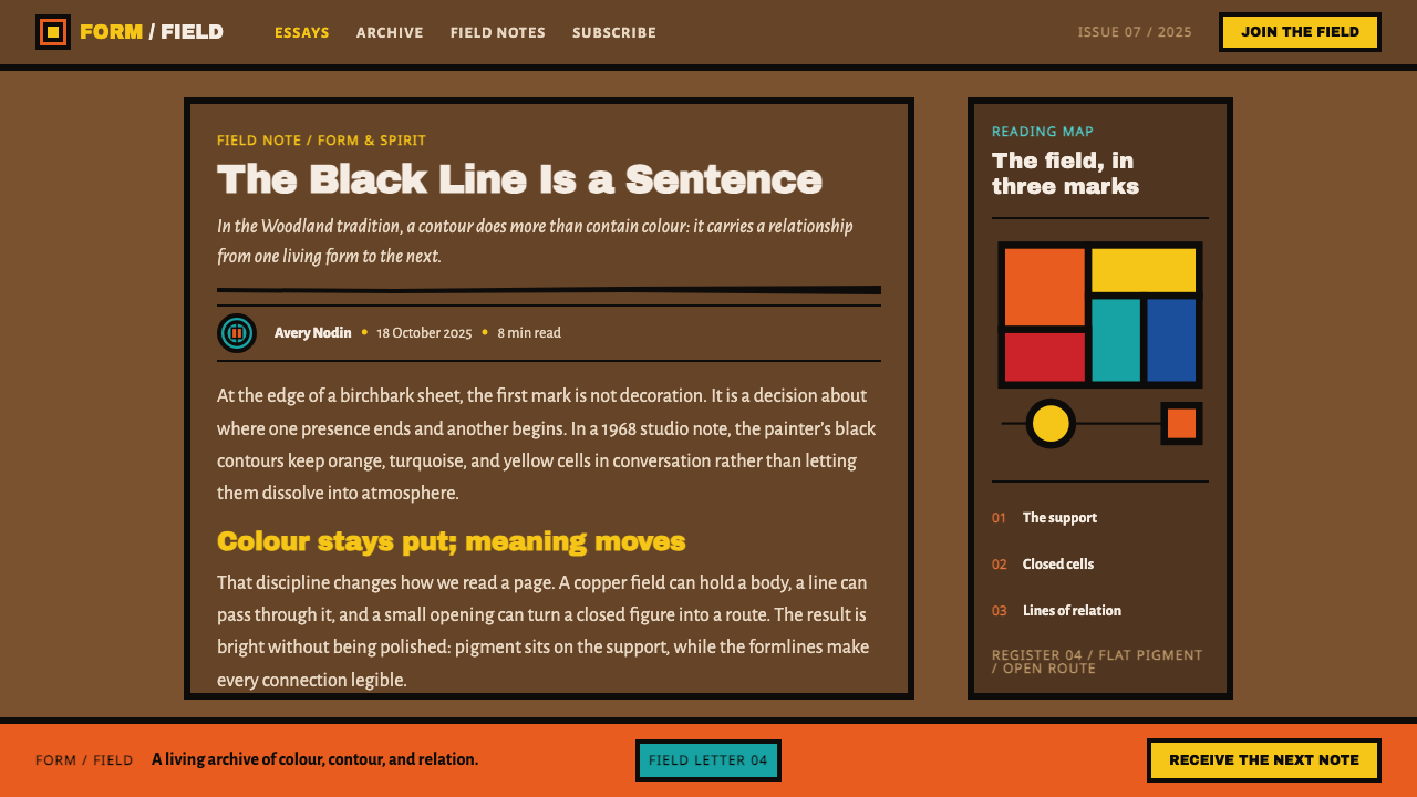
A thick black outline structures every figure and divides it into color cells — the line is not decoration but skeleton, containing every block of color the way a leaded window contains stained glass. Nothing in the composition exists outside this line's authority.
Internal Anatomy and Spirit Lines
Figures are rendered with a kind of X-ray transparency, showing organs and internal structure directly on the body rather than hiding them beneath an opaque surface. Thin lines of communication run between figures, representing spiritual or energetic connection, treated with the same visual weight as physical anatomy.
Warm, Non-White Ground
The surface beneath the line work is a warm, mid-dark tone — the color of bark, kraft paper, or hide — never a neutral gallery white. This warmth is not a stylistic choice made in isolation; it is a direct legacy of the improvised materials Morrisseau actually painted on, and it remains part of the aesthetic even when applied to new surfaces.
Handmade, Wobbled Symmetry
Compositions and individual figures often mirror themselves, but the symmetry is visibly hand-drawn rather than mechanically measured — small variations between the two halves are part of the visual signature, not a flaw. This distinguishes the work sharply from any digitally mirrored or ruler-precise symmetrical design.
Layered Depth Without Shading
Depth comes entirely from figures and forms overlapping and layering across the picture plane, never from cast shadow, gradient, or simulated lighting. A figure in front simply overlaps the cells of a figure behind it — depth is a compositional fact, not an optical illusion.
Connective Dividers
In applied use, a dividing line in this style functions as a connector rather than a separator — it links two figures or two pieces of content the way a spirit line links two beings, rather than cutting them cleanly apart the way a rule typically does in conventional layout.
Who shaped Woodland School — Morrisseau?
Known as Copper Thunderbird, Morrisseau is the founding figure of the Woodland School, developing its heavy formline, unmixed color, and X-ray figuration largely on his own, working on whatever material was at hand. His first solo exhibition in 1962 brought this visual language into the commercial gallery system, and his palette's shift from earth tones toward neon-bright saturation across his career tracks the movement's own visual evolution.
A painter working in a visual language closely related to Morrisseau's, Odjig helped establish the broader Woodland School as a recognized movement rather than a single artist's individual style, extending its formline-and-color vocabulary into her own distinct body of work.
Another key painter associated with the Woodland School, Ray worked in the same formline-and-cell visual system, contributing to the movement's establishment as a shared artistic language among multiple Anishinaabe artists rather than the work of one individual alone.
How do you use Woodland School — Morrisseau today?
This style carries deep cultural specificity and spiritual meaning, so applying it responsibly means treating it as a living visual language tied to a real community and history, not a decorative pattern to be extracted freely — its formline structure, unmixed color, and warm ground are what should transfer, in the same spirit of respectful adaptation any distinctive cultural visual tradition deserves.
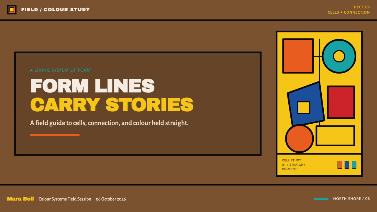
For presentation slides, the heavy formline can structure a cover or section divider as a connective device — a thick black line linking a title to a supporting image or icon the way a spirit line links two figures, set against a warm, non-white ground rather than stark white. Content slides can use color-blocked cells bordered in black as a distinctive alternative to conventional card layouts.
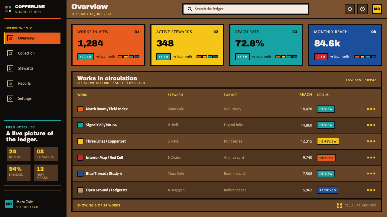
For web interfaces, this aesthetic suits cultural, narrative, or storytelling-driven products where warmth and handmade quality matter more than clinical precision — a warm off-white or tan background, black-bordered content cards standing in for formline cells, and saturated, unblended accent colors for interactive states rather than a gradient-based system.
For editorial and marketing work, the style supports long-form storytelling and narrative content especially well, since the formline tradition itself is fundamentally narrative — built to tell a story about connection between beings. Pull quotes and section breaks can use a thick connective line rather than a plain rule, echoing the spirit-line motif.
The most common mistake is smoothing the hand-drawn wobble out of symmetrical elements, or blending colors into gradients to make them feel more 'modern.' Both changes erase the exact qualities — human imperfection, unmixed saturated color — that give the style its specific identity, flattening it into a generic bold-outline illustration style with no connection to its actual source.
Woodland School — Morrisseau — FAQ
Is this the same as generic 'tribal' or 'indigenous-inspired' pattern design?
No, and treating it that way misses what makes it specific. This is a documented visual tradition founded by an identifiable artist, Norval Morrisseau, drawing on the Midewiwin scroll tradition of a specific community, with a distinct formline structure, color logic, and narrative content. It should be understood and credited as the Woodland School specifically, not folded into a generic catch-all category.
Can this style work on a light background?
It works less convincingly than on its native warm, mid-dark ground. The bright, unmixed color cells derive much of their glow from contrast against a warm brown or bark-like surface; placed on stark white, the same colors read as simply bright rather than luminous, and the material connection to birchbark and kraft paper — central to the style's identity — is lost entirely.
Why is the black line described as a connector rather than a divider?
Because within the formline system, lines running between figures represent spirit lines and lines of communication — active relationships between beings — rather than boundaries keeping them apart. Carrying that logic into applied design means a dividing element should feel like it is joining two pieces of content in relationship, not simply cutting the page into separate zones.
How saturated should the colors be — early muted tones or later neon-bright ones?
Either can be authentic, since both belong to real, documented phases of the same artist's career — muted, earth-derived tones in the 1960s, intensely saturated cadmium and phthalo hues later on. What matters more than which palette is chosen is that colors within a single piece stay unmixed and unblended, whichever intensity level is selected.
Does this style suit clinical, minimal-feeling products?
Not naturally. Its warmth, handmade wobble, and dense color-cell structure work against the cool, sparse quality most minimal products aim for. It suits narrative, cultural, and storytelling-driven contexts, and products that want to feel handmade and warm, far more than anything built around clinical restraint or sparse negative space.
Related design styles
 Coca-Cola ClassicHappiness goes full-bleed. Signature red, white ribbon waves, and warm rounde…
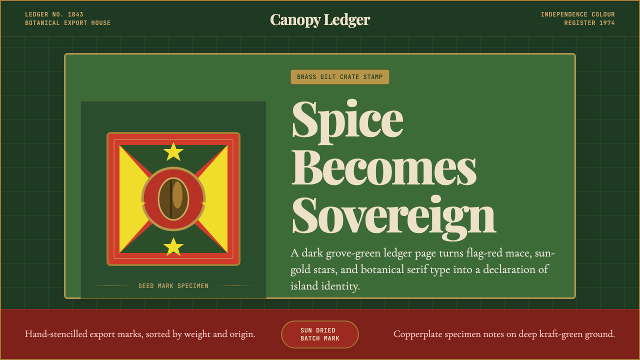 Grenadian Spice & Nutmeg FlagSpice becomes sovereign. Grove green, flag red, brass borders, and serif ledg…
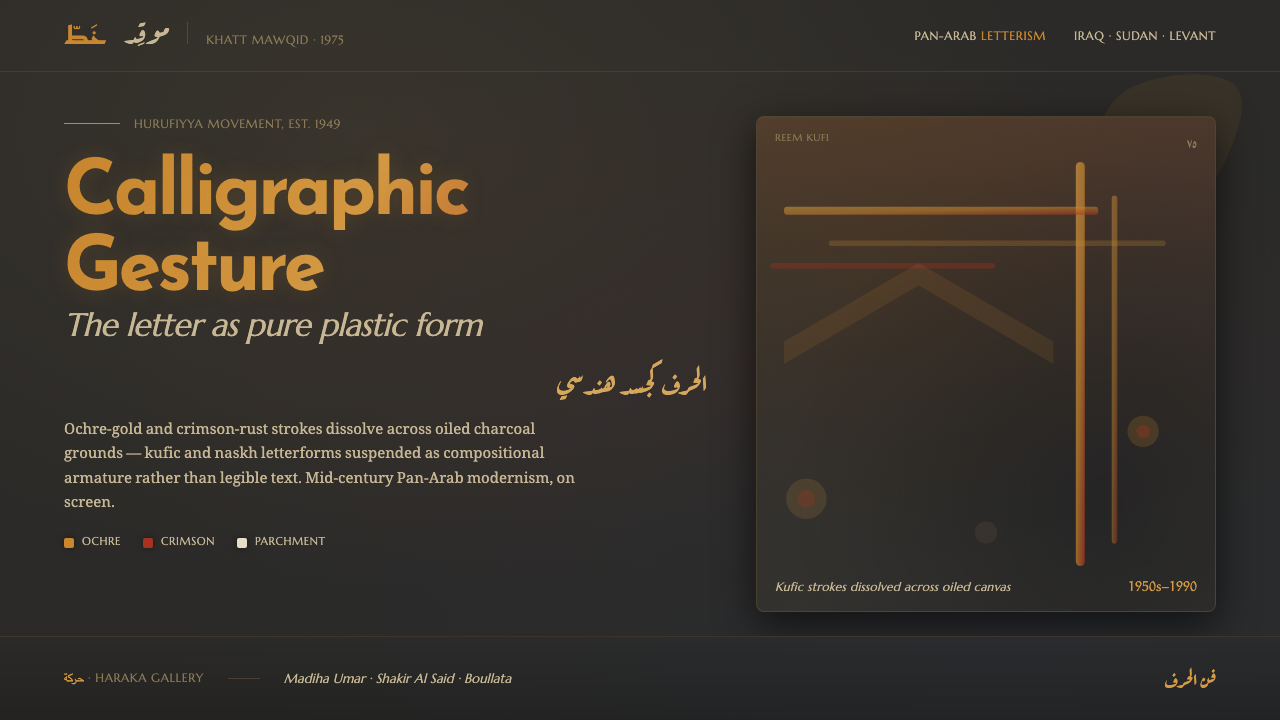 Hurufiyya Letter ArtArabic letters as pure gesture. Ochre and crimson strokes dissolve across oil…
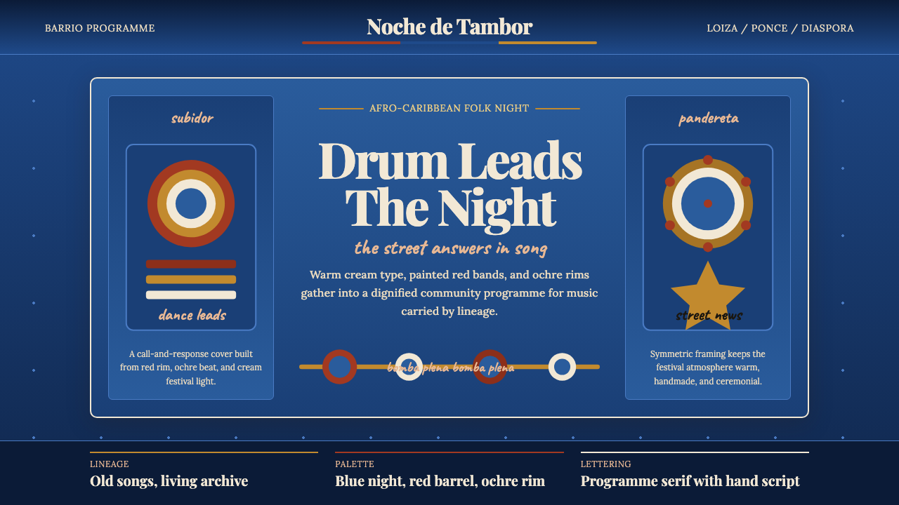 Puerto Rican Bomba & PlenaNight festival dignity. Drum-red stripes and cream Playfair type on deep trop…
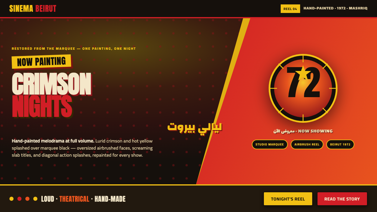 Lebanese Film PosterMelodrama at full volume. Lurid crimson and hot yellow on marquee black, slab…
 Manjusha Anga Snake-ScrollLegend moves in three pigments. Green outline, pink drama, yellow divinity on…