What is Amar Chitra Katha?
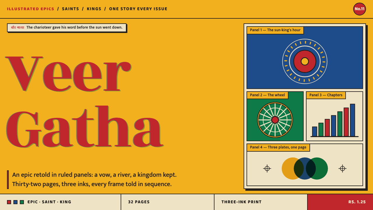
Amar Chitra Katha turns a digest comic cover into a page: marigold ground, vermilion masthead, black keylines and hard ink shadows, with every panel packed to tell a story.
Amar Chitra Katha in brief
Amar Chitra Katha is the digest comic that taught several generations of Indian children their epics, saints and kings. As a design style it takes that publication's look and applies it to screens: a saturated marigold ground, a vermilion masthead and title, a hard black keyline around everything, and the blue and green of the early printing inks holding the rest of the page together. It is a style of confident, warm, densely populated pages.
The system treats the cover as the page and the interior as the surface. A cover shows a painted mythological scene framed under a vermilion title on a marigold field; the inside pages run ruled panels across cheap pulp paper. Together they give the style two registers: a bright, poster-like register for headlines and entry points, and a more modest, panel-based register for the actual reading.
What sets it apart from most modern interface styles is how full it is. Panels are packed, borders are heavy, ink shadows are hard, and no space is wasted. Where many contemporary systems use white space to signal quality, this one uses structure and colour to make every square of the page do narrative work. The result feels like a book you hold in your hands rather than a website you scroll.

Where does Amar Chitra Katha come from?
Anant Pai launched Amar Chitra Katha at India Book House in Bombay in 1967, the year the origin notes give for its founding. The idea was to retell the Ramayana, the Mahabharata, the lives of saints and the histories of kings as a series of small comic books for children. The place matters to the style: Bombay, now Mumbai, is the city the origin notes give as its home, and the look of the series was shaped by what cheap, high-volume printing on pulp paper could produce.
The origin notes mark the 1970s and 1980s as the period of its mass-market peak in digest publishing. In that period the covers became widely recognised: a saturated marigold field, a vermilion masthead at the top, and beneath it a realist painting of crowned gods, warriors and chariots in gouache-like colour. The inside pages, by contrast, were printed on yellowing newsprint. They were modest objects, and their modesty is part of the charm that the design system preserves.
Cost shaped the colour. In the early years the interiors were printed in only a few inks, yellow, blue and green, to save money, and the separate plates often failed to line up precisely, so edges show a slight offset. The source calls this a restricted-ink letterpress tradition, and it is one of the three movements named in the style's origin: Indian comics and digest publishing, Raja Ravi Varma calendar-art realism, and restricted-ink letterpress colour. The design system keeps the blue and green as the colours of that early press and reserves vermilion for the title and the main action.
The second named movement, calendar-art realism, supplies the painted look of the covers: figures rendered in a smooth, realist manner with strong colour and clear outlines, in the tradition associated with Raja Ravi Varma. Ram Waeerkar and C. M. Vitankar are named alongside Pai among the key figures of the series' look. Taken together, these sources explain why the style feels both devotional and commercial: it combines the dignity of painted mythology with the economy of cheap, fast, colour-limited printing.
What defines the Amar Chitra Katha look?
Marigold ground
The page ground is a saturated marigold, borrowed from the cover rather than from the cream of the interior paper. It is warm, bright and unapologetic, and it gives the whole style its identity before any other element appears. White is used only inside panels and cards, where it works as the reading surface, which makes the yellow feel like the cover that holds everything together.
Vermilion masthead and action
Vermilion carries the title and the primary action, and almost nothing else. The masthead sits at the top in vermilion with bold, confident lettering, and the main button on the page uses the same colour. Because red is rationed, it always means the same thing: this is the name of the thing, or this is what to do next. It works as a signal precisely because it is not spread around.
Blue and green early inks
Blue and green are the colours of the early three-ink press, and they are used the way a restricted-ink printer would use them: flat, opaque and slightly rough. They fill secondary panels, tags and chart elements and supply contrast against the yellow ground. The aim is not realistic colour but the pleasing artificiality of a printing process with few inks.
Hard black keyline
A firm black outline wraps every panel, card and button. It is the glue of the style: it closes each unit, separates colours that might otherwise bleed and gives the page the feel of ruled comic panels. The line is confident and uniform rather than delicate, and it should be visible at arm's length. Without it, the saturated colours would lose their structure.
Hard ink offsets
Shadows are solid black or dark-ink shapes offset to one side, like a second impression slightly out of register. They never blur and never fade. This gives cards and buttons a printed, raised look without pretending to simulate light, and it echoes the slight misalignment of cheap multi-plate printing. The shadow is treated as ink, not as atmosphere.
Ruled panels, packed pages
The layout is built from rectangular panels of different sizes, packed edge to edge with narrow gutters. Every panel is expected to tell a piece of the story: an image, a caption, a speech-like block of text. There is little empty space, and hierarchy comes from panel size and colour rather than from white space. The page reads like a sequence, left to right and top to bottom.
Painted cover scene
The hero image is a painted scene, not a photograph or a flat icon: gods, warriors, crowns and chariots rendered in smooth realist colour and framed on the page like a cover illustration. In an interface this means the main visual should look illustrated and narrative, and should sit inside a keyline frame beneath the vermilion title, as it does on the original covers.

Who shaped Amar Chitra Katha?
Pai launched Amar Chitra Katha at India Book House in Bombay in 1967. His idea of retelling epics, saints and kings in comic form for children is the foundation of the whole publication, and thereby of this style. The origin notes list him first among the key figures, and his name is the one most firmly attached to the series.
Named in the origin notes among the key figures of the series' look, together with Pai. In the context of this style, his name stands for the painted-page tradition of the digest: the narrative panels, the clear outlines and the realist treatment of figures that readers recognise as the voice of the publication.
The third key figure named in the notes. Like Waeerkar, he is tied to the look of the series rather than to its business story. His inclusion is a reminder that the style is not the work of a single hand but of a house look carried by several artists, held together by the cover system, the keyline and the shared print constraints.
Not a member of the series' team but the name attached to one of the movements in its origin: Raja Ravi Varma calendar-art realism. The tradition behind that label supplies the smooth, saturated, realist treatment of mythological figures that makes the covers look the way they do, and it is why the painted scene belongs in the style.
How do you use Amar Chitra Katha today?
Amar Chitra Katha suits products that want to feel warm, narrative and culturally rooted: education, children's and family content, publishing, storytelling apps, cultural institutions and campaigns that retell history or myth. It is a loud style by design, so it works best when the content itself has plenty to say, and when the aim is to draw a reader in rather than to look quiet and expensive.
On slides, a cover can reproduce the original structure directly: a marigold field, a vermilion band with the title across the top, and a framed illustration underneath bordered by a black keyline. Content slides become pages of panels: a strong title bar, then a grid of two to four boxed sections with hard offset shadows. For data, bars and areas in blue and green with a black outline and a small offset shadow look like printed plates, and a timeline can be drawn as a strip of comic panels, one event to a frame.
In web interfaces, treat each card as a panel. Give it a firm black outline and a hard offset shadow, set headings in a bold masthead style, and reserve vermilion for the title and the main button. Pricing pages work well as three panels of unequal size, with the recommended option drawing the eye by size and colour. Dashboards can be dense, but they need a clear hierarchy of panel sizes so that the packed layout still has a reading order.
For editorial and marketing work, the style rewards storytelling. Use a numbered series structure for articles, caption boxes in the manner of comic narration, speech-like call-outs for quotations, and a strong cover image under a masthead for landing pages. Campaigns can be built as multi-panel sequences, with one idea per frame. Photography should be treated like a painted scene: framed, outlined and sometimes simplified into flat colour.
The most common mistake is softening it. Soft shadows, gradients, thin outlines and large empty margins all pull the style toward a generic modern look and erase what makes it recognisable. Another is spending the vermilion too freely: if every heading, tag and icon is red, nothing is. A third is drifting from the printing logic by adding extra hues that no restricted-ink press could have produced. Keep the inks few, the lines hard and the pages full.

Amar Chitra Katha — FAQ
What is Amar Chitra Katha, and why is it a design style?
It is a digest comic launched by Anant Pai at India Book House in Bombay in 1967, which retold epics, saints and kings for Indian children. It works as a design style because its look is unusually consistent and unusually legible: a marigold cover, a vermilion masthead, a framed painted scene, ruled panels, hard black outlines and a limited ink palette. Those are all rules, and rules can be turned into a system.
Why is the ground yellow rather than white?
Because the system takes the cover as the page. The saturated marigold of the cover is the first thing a reader recognises, and the style gives that colour the job of ground. White is still used, but inside panels and cards, where it works as a reading surface. This inversion of the usual white-page convention is a big part of why the style looks so different from other interfaces.
Should I imitate misregistered printing on purpose?
A little, and only through the shadows. The early three-ink presses often failed to line up their plates, and the system echoes this with hard offset shadows that sit slightly to one side of an element. Offsetting the text or images themselves would harm legibility. Treat the offset as a deliberate graphic device rather than as a simulated printing defect.
Does the dense layout hurt readability?
It can if the panels are unstructured, but the style supplies its own discipline. Hard outlines give every unit a clear boundary, panel size signals importance, and the reading order runs like a comic strip. The keyline and the limited palette keep the page from turning into noise. The practical rule is to vary panel sizes deliberately and keep one dominant panel on each page.
Where does the style struggle?
It struggles where the aim is quiet luxury, minimal restraint or a clinical tone: high-end fashion, wellness, financial services that depend on understatement, and any product that relies on large amounts of white space. It also does not suit a dark theme, because the marigold ground and ink outlines are central to its identity. It is at its best when warmth, story and energy are the goals.
Related design styles
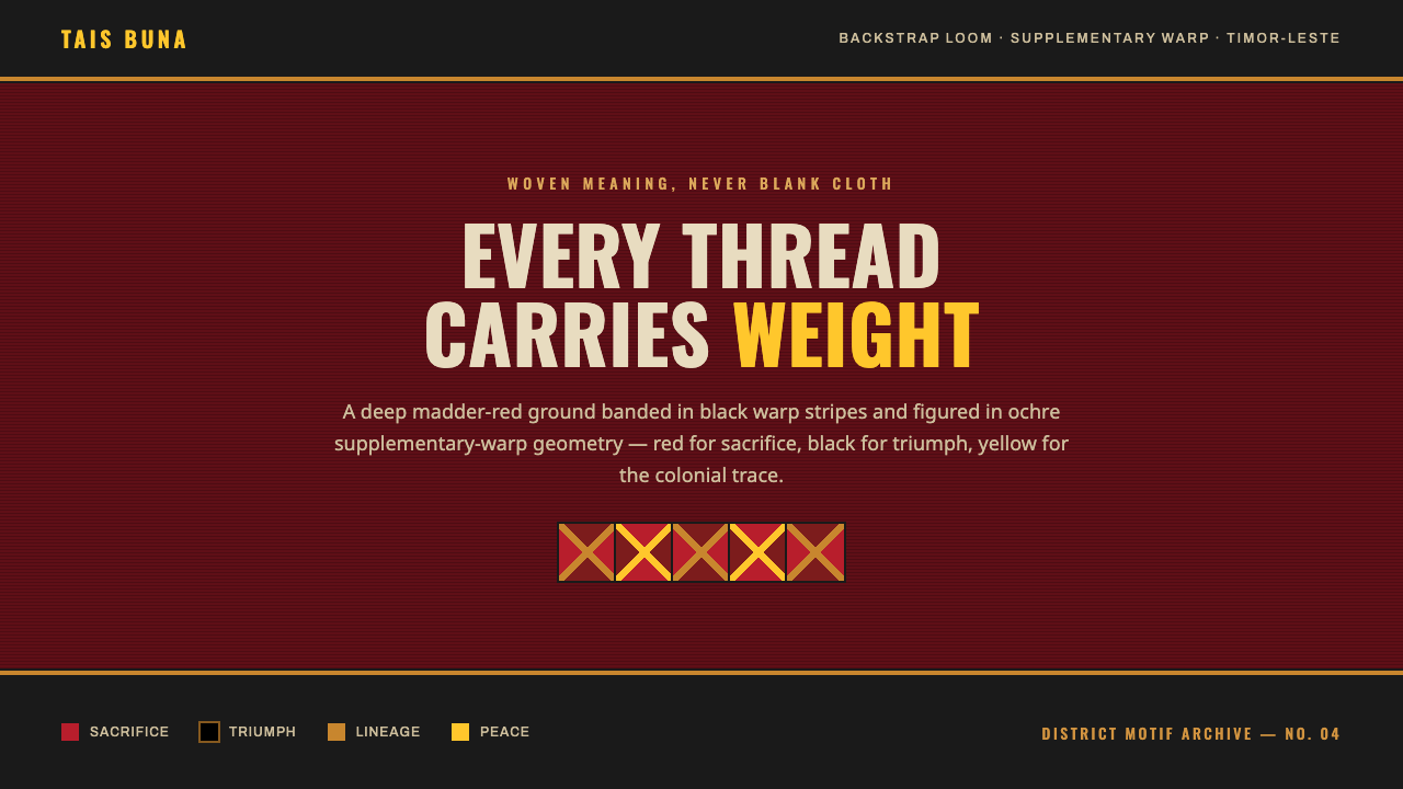 Timor-Leste Tais BunaWoven meaning, never blank cloth. Madder-red ground banded in black, ochre di…
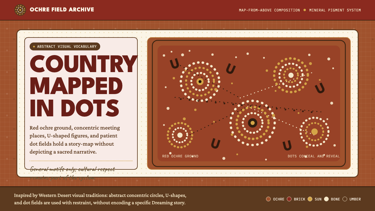 Aboriginal Dot PaintingAncient story-map energy. Red ochre, bone dots, concentric circles, and U-mar…
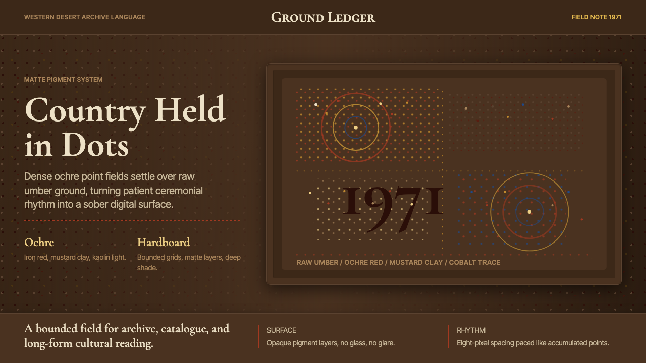 Aboriginal Dot Painting (Papunya 1971)Ochre memory, held steady. Raw umber ground, Cormorant type, disciplined dot-…
 Bhutan Thunder Dragon FlagHeraldry hits like thunder. Marigold and saffron split hard around a white em…
 Bollywood Poster Art (1970s)Subtlety is unaffordable. Saffron fields, Bungee shadows, diagonal hoarding d…
 Buzludzha MonumentMonumentality without repair. Stained concrete frames cobalt tesserae, ruby g…