What is Alipay?
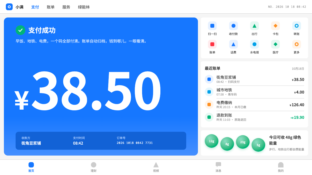
Alipay's interface is quiet utility with one loud number: a blue band, white cards on a grey page, and an amount set bold enough that nothing else needs to shout.
Alipay in brief
Alipay started in 2004 as the escrow layer that let strangers trust each other on Taobao, and grew into the app that most of China opens to pay for breakfast, a metro ride or the electricity bill. Its interface is plain on purpose. At the top sits a blue brand band holding four large entries: scan, pay and collect, travel, and cards. Below that is a grid of services in five columns, and below that a run of white cards on a light-grey page.
The visual language is that of a daily tool rather than a showcase. White cards carry the content. Lists are made of cells separated by hairline dividers. Amounts are the loudest thing on any screen, set large and bold with a small ¥ sign in front, so that the eye lands on the money first and on everything else second. There is almost no ornament, and the blue is used consistently as a signal of trust and as the entry point to action.
There is one place where the app allows itself to play: Ant Forest, where green energy bubbles float above a tree and wait to be collected. That single patch of softness and colour sits against the restraint of the rest, and it is part of why the style feels human instead of merely institutional. This system is useful for Chinese payment, life-service and mini-program interfaces.

Where does Alipay come from?
Alipay was founded in 2004, with its web presence launched in December of that year. Its original job was narrow and essential. Taobao was a marketplace of strangers who had no reason to trust each other, and a payment held in escrow until the goods arrived solved the problem. The product's first visual identity was therefore about reassurance: a clear, calm blue and an interface that made each step of a transaction visible.
The company grew inside the Alibaba group, and the names usually associated with its founding period include Jack Ma, Lucy Peng and Eric Jing. The product moved from a web escrow service into a wallet, and then into a general platform. From the early 2010s, QR-code payment turned the phone into the default way to pay in shops, markets and street stalls, and Alipay became part of the everyday routine of a cashless economy.
As the app broadened, its interface took on the shape of a super-app. Mini programs let third parties offer services inside it, from transit to utilities to government forms. That scope made the visual system even more important: one frame had to hold hundreds of different services without looking chaotic. The answer was the service grid, the white card and the hairline-divided list, supported by a common component language in the Ant Design and Ant Design Mobile families.
The look this system captures belongs to roughly 2020 through 2024. By then the interface had settled into its current character: a blue band with its four large entries, a pay-code card, a bill list, bold amounts, and the playful exception of Ant Forest. It is a mature design, shaped less by any single designer than by the constant pressure of enormous daily use, and its restraint is the result of that pressure.
What defines the Alipay look?
Color
Blue is the brand and the anchor. It fills the top band and marks primary actions, and it reads as trust and calm rather than excitement. The page behind is a light grey and the cards are white, so content always sits on a clean surface. Green appears in one deliberate place, the energy bubbles of Ant Forest, and red is reserved for the occasional promotional or warning accent. The palette is small so that amounts and states stand out.
Typography
Type is a clean system sans suited to Chinese text. Hierarchy is simple: a bold, large amount, medium-weight titles for cells, and lighter secondary text in grey for dates and notes. The small ¥ in front of an amount is the signature detail. It sits at a fraction of the figure's size, which makes the number the hero and the currency a quiet label.
Layout
The home screen is organised from the top down: the blue band with four large entries, a service grid of five columns, then stacked white cards. Inside a card, content runs in cells with hairline dividers between them. Edges are aligned and gutters are consistent, so a hundred different services can share the same frame. Thumb reach matters: the main actions sit at the top and the bottom, not in the middle.
Cards and cells
The white card is the container of choice, resting on the grey page with a very light separation and gentle corners. The pay-code card is the most important example: a QR code framed by a plain, trustworthy surface. Bill lists are built from cells, each with an icon or label, a title, a secondary line and an amount aligned to the right, separated by hairline dividers rather than boxes.
Surface and depth
Depth is minimal. Cards are separated from the page mainly by the contrast between white and grey, with at most a very soft shadow. There is no glass, no heavy gradient and no decorative texture. The interface is built for speed and legibility in all kinds of lighting, at a glance, often with one hand.
Ant Forest as the exception
Ant Forest is the one place where the restraint relaxes. Round, green energy bubbles hover over a tree on a soft scene, each waiting for a tap. The shapes are friendly and slightly playful, in contrast to the square cells elsewhere. Used sparingly, this exception gives the whole system a warmth it would otherwise lack, and it is worth keeping as a single, contained moment.

Who shaped Alipay?
Founder of the Alibaba group, within which Alipay was created in 2004 to build trust between buyers and sellers on Taobao.
One of the names usually associated with the early years of Alipay and its escrow model.
A later leader associated with the company's growth from an escrow service into a broad payment and service platform.
How do you use Alipay today?
On slides, the style fits finance, fintech, consumer-service and product-strategy decks, especially those aimed at a Chinese audience. A cover slide can be a blue band with a short title above a white card on a light-grey field. Content slides can be built from white cards arranged on a grid, each with a bold number and a small label. For data, make the key figure large and bold, with its unit small beside it, and let the rest of the chart be quiet.
In web and mobile UI, it is a natural fit for payment flows, wallet screens, bill and transaction lists, utility and life-service pages, mini programs and any product that handles money or trust. The components are straightforward: a blue header band, a service grid with icons and labels, white cards, hairline-divided list rows and big bold amounts. It also works for dashboards that need a calm, finance-like reading of numbers. Strongly expressive marketing pages are not what it is built for.
In editorial and marketing work, the look signals reliability, everyday convenience and a Chinese digital-payment context. It can frame an article about mobile payments, a campaign for a service that wants to feel familiar, or a case study with money at its centre. A restrained pop of green, in the manner of the energy bubbles, can mark sustainability or rewards, but only once per layout.
The most common mistake is to make the amount timid. If the figure is not the loudest thing on the screen, the style loses its whole point. The second mistake is to add heavy shadows, glossy gradients or a rainbow of accent colours, which turns the quiet utility into a noisy shopping page. Keep blue for trust and action, keep cards white, and keep the grey background plain.
A third error is to overuse the playful exception. The charm of the green bubbles depends on how rare they are. If every section has its own cute illustration, none of them feels special, and the sense of a serious financial tool dissolves.

Alipay — FAQ
What is the blue band at the top?
It is the brand band of the home screen. It holds four large entries: scan, pay and collect, travel, and cards. It is the main use of the brand colour and the primary entry point for action.
Why is the ¥ sign small?
The small currency sign puts the emphasis on the number. The amount is set large and bold, and the sign sits in front of it as a quiet label. It is the most recognisable typographic detail of the style.
What is Ant Forest?
It is a feature inside the app where green energy bubbles float above a tree and are collected by tapping. In this style it is the single place where playful, rounded, colourful shapes are allowed, against the restraint of everything else.
Does this style work for non-Chinese products?
It can, because its structure of a brand band, a service grid, white cards and bold amounts is general. It was built around Chinese text and Chinese payment habits, so it is most natural there, and the components should be adapted when the context changes.
What does the style avoid?
Heavy shadows, glossy gradients, many accent colours and decorative illustration. The look relies on a small palette, a clean grey page, white cards and a single loud number, and it loses its trustworthiness when those are crowded out.
Related design styles
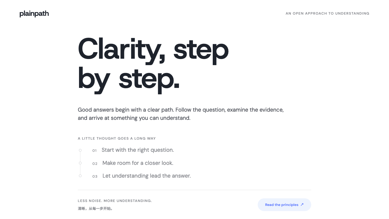 DeepSeekClarity without spectacle. White space, whale blue and a grey trail of though…
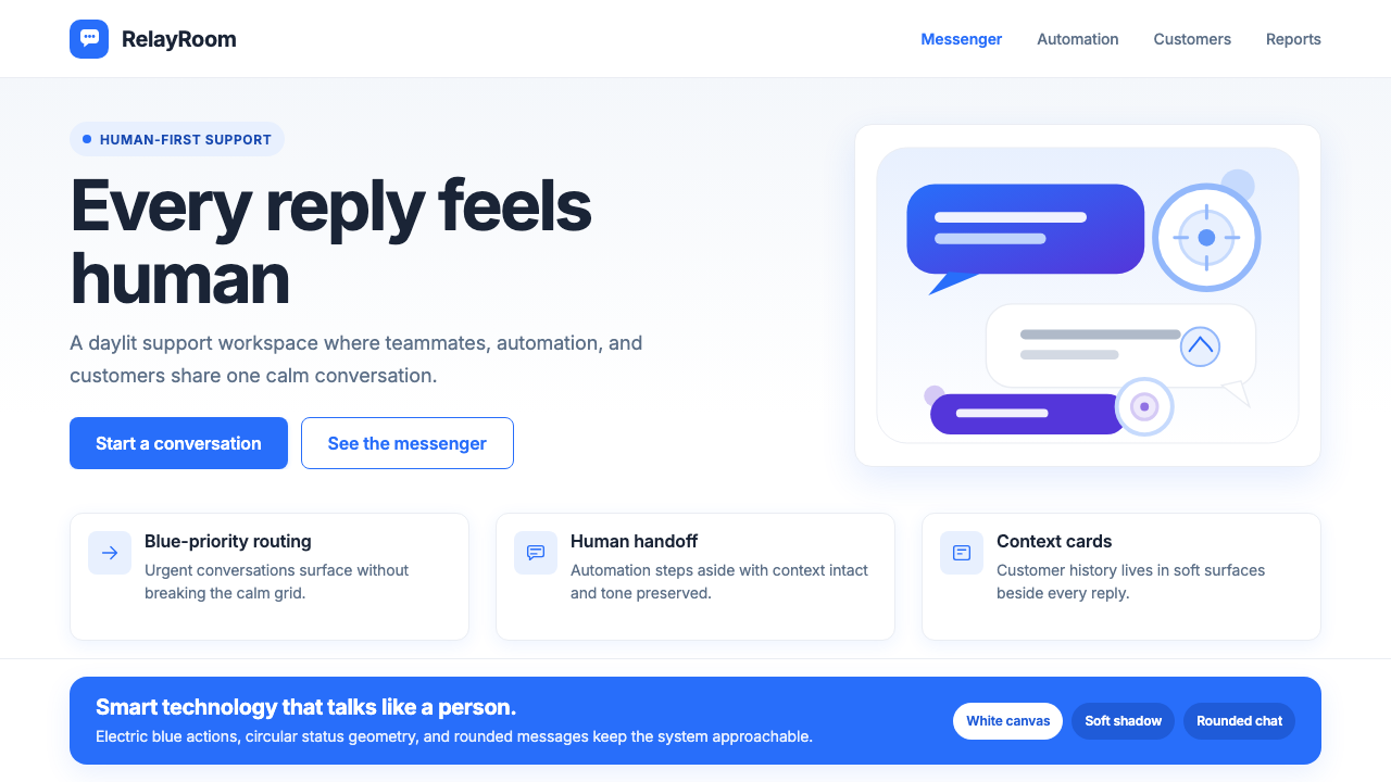 Intercom ModernWarm chat, sharp software. Electric blue bubbles on a daylit white grid.
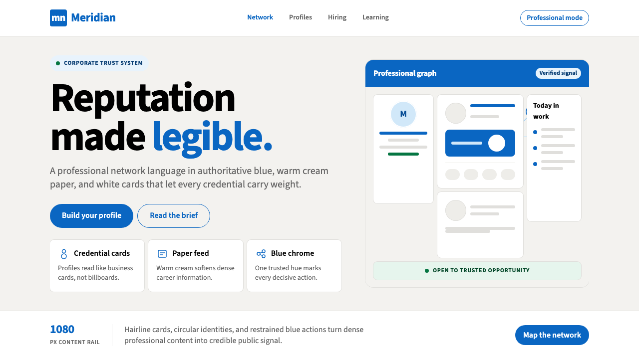 LinkedInCorporate trust, digitized. Authoritative blue frames white cards on warm cre…
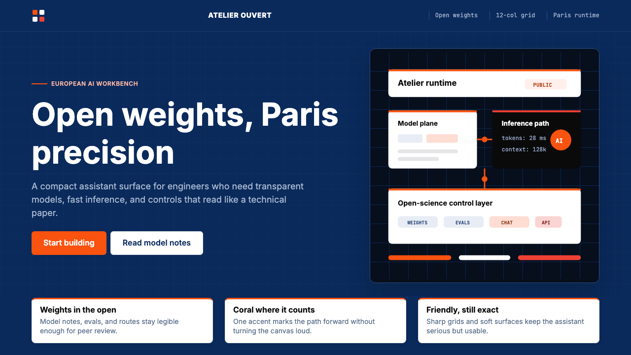 Mistral Le Chat French AIOpen science feels engineered. Navy panels, Inter grids, and coral stripes ke…
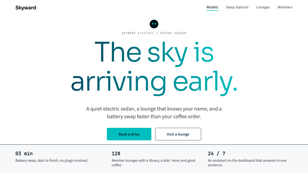 NIOQuiet premium with the sky in the headline. White pages, navy ink, one teal-t…
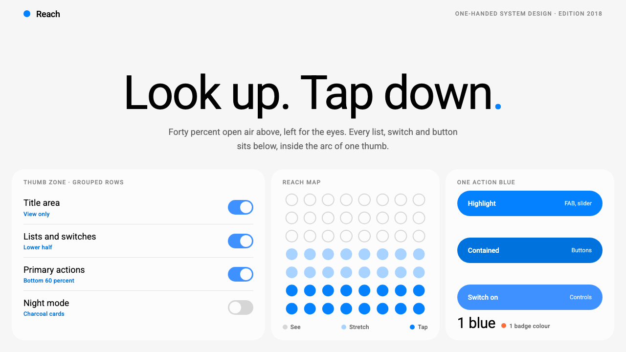 Samsung One UILook up, tap down. Giant Roboto title in open air, white 26px cards on grey,…