What is Independence Stamps 1960s?
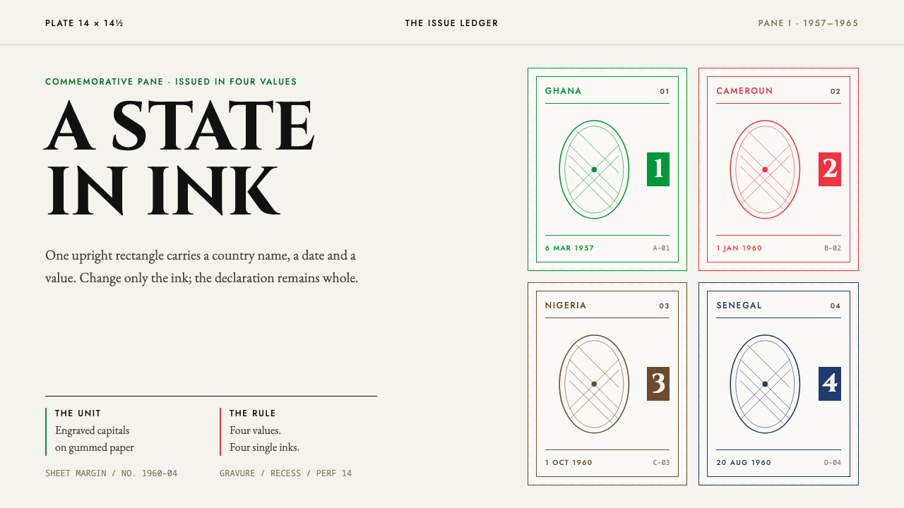
Independence stamps gave new states a face the size of a thumbnail: one upright rectangle, one engraved name, one portrait in an oval, and a separate ink for every price.
Independence Stamps 1960s in brief
The African independence stamp of the late 1950s and 1960s is less a national style than a shared format. Newly sovereign states — Ghana, Nigeria, Cameroun and Senegal among them — each issued small, upright, perforated stamps that followed the same grammar: the country's name across the head, the face value tucked into a cartouche in one corner, and a portrait or emblem held in an oval or beaded frame. The colour of the ink told the postal clerk the denomination; the engraving told everyone else that a country now existed.
What makes it a coherent design language, rather than a period curiosity, is the discipline of the unit. Everything happens inside a single small rectangle ringed by real perforation teeth. Colour never blends across the surface: each value is printed in one flat ink, and the values of an issue differ by hue, not by treatment. Texture comes from mark-making — engraved lines, the fine screen of photogravure — rather than from gradients or effects. The paper is part of the picture too: white, gummed and watermarked, with the sheet's selvedge showing at the margin and, on a used copy, a clean circular postmark.
The style belongs to a particular moment, roughly 1950 to 1990 but concentrated between 1957 and 1965, when stamps were among the most portable pieces of official design a new government could issue. A stamp crosses borders on an envelope, is seen by strangers, and is kept by collectors who will never visit. It had to look dignified at a scale where a misplaced hairline shows, and it had to do so using the printing houses of London and Paris, whose habits shaped the look as much as any national intention.
Where does Independence Stamps 1960s come from?
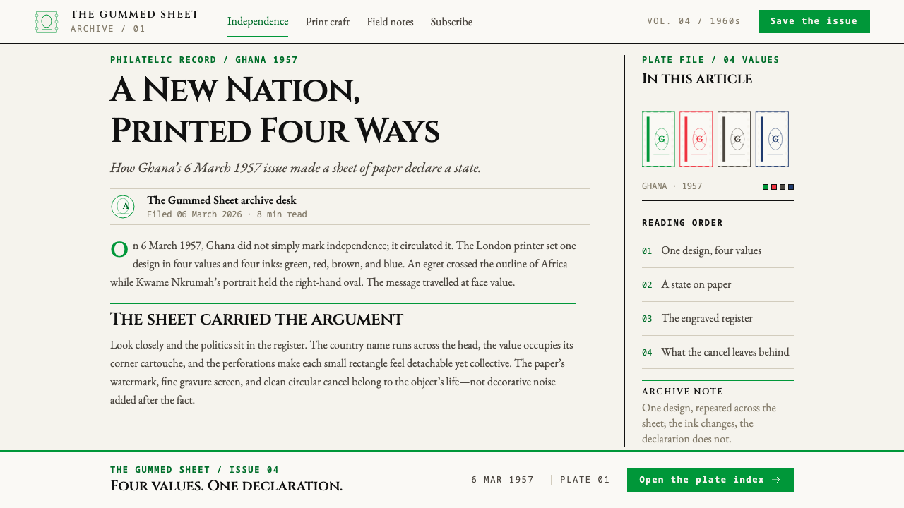
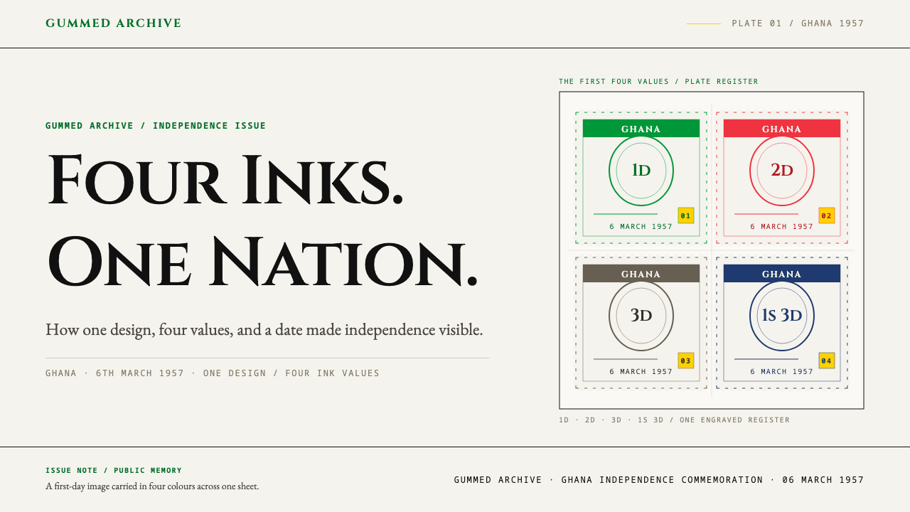
The system begins with 6 March 1957, the day Ghana put itself on gummed paper. The issue was one design in four values and four single inks: an egret flying over the outline of Africa, with Kwame Nkrumah's portrait in an oval at the right. It was printed by photogravure by Harrison & Sons and perforated to a fine gauge. Placing a bird and a continent in the same small frame, beside the leader's profile, set a pattern for how a new state could introduce itself — as a nation, as part of Africa, and as a government with a face, all in one economical rectangle.
Behind the Ghana issue stood a printing tradition that this system's source material calls Commonwealth photogravure commemoratives. Photogravure transfers a photographic image, broken into a fine screen of cells, onto a cylinder or plate; ink collects in the cells and prints as soft, continuous tone built from tiny dots. For a commemorative stamp it meant that a portrait with real modelling could sit beside flat lettering and map outlines, all in one colour. Because the plates were cut and the sheets pulled in London, the designs were conceived within the habits of a British printing house rather than a local studio.
A second tradition arrived through Paris. French taille-douce is recess engraving: lines are cut into a hard plate, ink is wiped into the grooves, and the paper is pressed into them under force, so the image stands very slightly proud of the sheet and every line has a crisp, drawn quality. Three years after the Ghana issue, Jean Pheulpin both drew and engraved the independence stamp for Cameroun in Paris. Designing and cutting with a single hand meant a whole series could carry one personality — a house style that came from a person, not a committee.
The third strand is what the source calls Pan-African state iconography: the repertoire of portraits, maps, birds and emblems with which independence-era states announced themselves. Its range runs from 1950 to 1990, yet it bunches tightly between 1957 and 1965. Seen together, the stamps of Ghana, Nigeria, Cameroun and Senegal show two printing cultures, English-speaking and French-speaking, converging on the same small format. The result is a style with a hybrid pedigree: stamps designed for new countries but produced in the technical vocabulary of the former administering powers — and then, quietly, made the countries' own.
What defines the Independence Stamps 1960s look?
The Perforated Unit
The basic unit is a small upright rectangle with real perforation teeth along every edge. The perforation is not a decorative border but the boundary of the object: the design stops where the paper tears. Proportions stay stable across values, so a sheet reads as a set of siblings. Margins inside the frame are tight and deliberate, and the sheet's own selvedge — the blank paper around the outer edge — is allowed to show.
Fixed Hierarchy
Information sits in fixed positions. The country name runs across the head in capitals; the face value lives in a cartouche in a corner; the portrait or emblem occupies the centre in an oval, often ringed by a beaded or ruled frame. A reader learns where to look after seeing a single stamp. This predictability is what lets an issue of several values behave like a family rather than a collection of strangers.
Colour as Denomination
Colour here is a code, not a mood. Each value in an issue gets its own single ink, laid flat, and the inks are kept apart: no two-colour blends, no gradients between values, no tint that drifts across the page. The restraint makes denomination legible at a glance across a counter, and it is also the source of the style's solemnity — a stamp in one deep colour feels like a seal.
Line and Dot Mark-Making
The surface is built from lines and dots. Recess engraving produces fine hatching, parallel rules and crisp lettering; photogravure produces a soft tonal field from an almost invisible screen. Both are monochrome. Rules are thin and single-coloured, frames are drawn rather than filled, and shading is always hatching or screen — never airbrush, never blur.
Engraved Capitals
Capitals carry the page. Country names and values are set in classical Roman inscriptional capitals — clear contrast between thick and thin strokes, small serifs, generous spacing between letters — which gives the stamp the authority of a carved monument. Lowercase appears rarely, if at all. Because a stamp is read at a glance and at small scale, letters are chosen for stability, not for charm.
The Paper Itself
The material is part of the design. White stamp paper, the faint pattern of a watermark, a layer of gum, selvedge and perforation holes, and a round postmark on a used copy are all treated as legitimate visual elements. The surface is flat: no gloss, no drop shadow, no bevel. The stamp is a printed object that has been through a postal system, and the design admits it.
Who shaped Independence Stamps 1960s?
Pheulpin drew and engraved the independence stamp of Cameroun in Paris, three years after Ghana's issue. That one hand did both jobs — composition and cutting — matters for the style: it explains how a single stamp could set the house style for a whole series, with lettering, frame and portrait engraved in the same quality of line. Within this system he stands for the French recess-engraving tradition, taille-douce, in which the designer is also the craftsman.
Nkrumah's profile, set in an oval at the right of Ghana's 6 March 1957 issue, is the visual anchor of that sheet. Placed beside the egret and the outline of Africa, it ties a national leader to a continental idea — an association that runs through the Pan-African state iconography listed among this system's movements. The oval portrait frame became one of the format's most recognisable devices.
Harrison & Sons printed the Ghana issue by photogravure, in four single inks, with a precise gauge of perforation. The firm stands for the Commonwealth photogravure commemorative tradition: portrait and lettering rendered in a fine screen, sheets pulled in London. Its role is a reminder that the look of independence stamps was made at a meeting point between a new state's ambitions and an established printer's habits.
How do you use Independence Stamps 1960s today?
The independence stamp is a useful model whenever a design must announce authority in a small space. Its lesson is structural: fix the position of every piece of information, give each category its own flat colour, and let texture come from line rather than effect. Applying it well means keeping that discipline, not just wrapping a perforated edge around a rectangle.
For presentation slides, the cover works as a single large stamp: an upright or centred panel with a perforated edge on a plain pale ground, the title in engraved-looking capitals across the head, and the edition, date or section number in a small cartouche at one corner. Content slides can borrow the denomination logic — each section of a deck takes one ink, used consistently in headings and rules, so the audience learns the code. Data slides suit hatched fills and thin single-colour rules; a chart with four series becomes an issue of four values, one flat ink per series, never blended.
For web interfaces, the style fits dashboards and pricing pages in which categories must be told apart quickly. Tier cards can behave like stamps in a set: the same proportions and layout, a different single ink for each tier, the price in a corner cartouche, the plan name across the head. Perforated edges can be drawn with a dotted border or a scalloped mask, but keep them flat. Avoid soft shadows; separation should come from thin rules and the paper-white ground between cards.
For editorial and marketing work, think in sets and series. A commemorative launch, a limited edition, an annual report, a certificate or a membership card all benefit from the stamp's ceremony: a portrait or emblem in an oval frame, a name in capitals, a small date or serial number in the corner. Footers can borrow the sheet selvedge for credits and print information, and a clean circular postmark makes a convincing badge for received, approved or issued-on dates. Longer pages work best when they keep generous paper-white around each unit.
The most common mistake is treating the perforation as decoration and then adding everything the original never had: gradients, drop shadows, gloss, multi-colour illustrations. Equally damaging is mixing inks within one denomination, or choosing colours by mood rather than by function. A third error is crowding the frame; the original works because the unit is small, the hierarchy is fixed and the empty paper is respected. If the layout needs more than a name, a value and a single image, it probably needs a second stamp rather than a busier first one.
Independence Stamps 1960s — FAQ
What is the difference between photogravure and recess engraving, and why does it matter for the look?
Both are monochrome printing methods, but they produce different marks. Photogravure, used on the Ghana issue by Harrison & Sons, holds ink in a fine screen of cells and yields soft continuous tone, which suits a portrait. Recess engraving, or taille-douce, cuts lines into a plate and presses paper into the grooves, giving crisp hatching and lettering with a slight relief. This system borrows from both: soft tonal portraits can sit next to hard engraved rules and capitals, as long as each element stays in one colour and the whole stays flat.
Why does each value get its own ink instead of a gradient or a wider palette?
Because on a stamp colour has a job: it tells you the denomination. In the Ghana issue the four values were printed in four single inks, and the system keeps that logic — colour separates the values and never blends. A gradient would blur the code, and a multi-colour image would compete with it. The restraint also gives the style its seriousness; flat, deep colour feels like an official seal rather than an illustration.
Does the style require a portrait?
No, but it requires a centre of gravity. The source material points to a portrait held in an oval or beaded frame, an egret over the outline of Africa, or similar state emblems. What matters is that one image or emblem occupies the middle, framed, with the name above and the value in a corner. For a product that could be a logo, an object or a photograph reduced to one ink; for a person, a profile. The frame and the hierarchy do the work.
Can the style work on a dark background?
It is a paper-ground system: white stamp paper with inks printed on top, and the paper itself is part of the look. A dark inversion loses the selvedge, the watermark and the sense of ink sitting on a sheet. If a dark layout is required, treat the stamp as a pale object lying on a dark surface — keep the stamp itself light and let the dark surround it — rather than reversing the artwork.
How should perforation and postmark details be handled in digital work?
Treat them as flat, drawn details rather than effects. Perforation is a row of evenly spaced notches or dots on the boundary; the postmark is a clean circle with thin rings, not a smudge. Resist adding ink bleed, creases or wear. The source describes the used stamp as carrying a clean circular postmark, so even the evidence of use stays orderly.
Related design styles
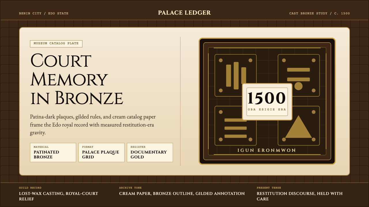 Benin Bronze (Edo, 1500)Royal memory, cast in bronze. Cream plaques and gilded lines carry museum gra…
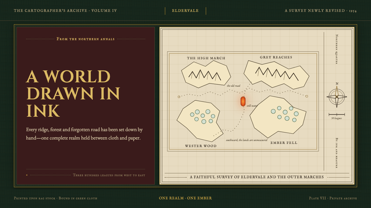 Tolkien Middle-earth (1954)A whole world held in ink. Gilt type and vellum cartography glow against bott…
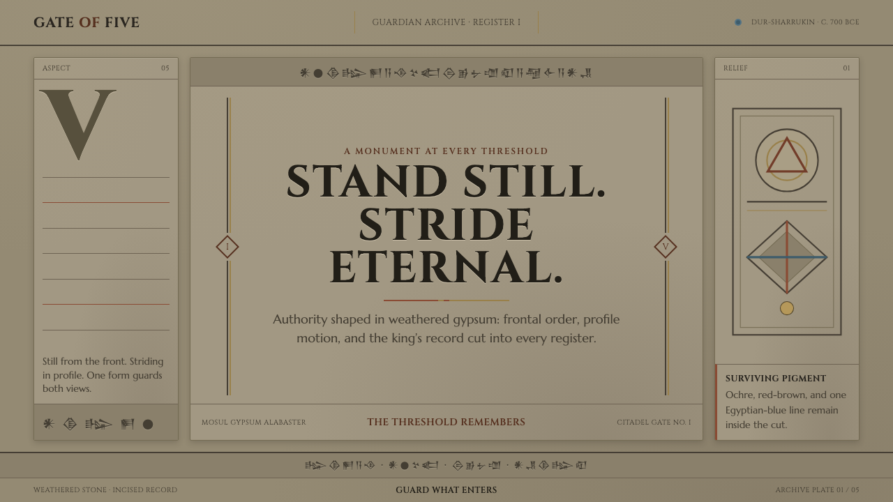 Assyrian Lamassu ReliefAuthority carved into silence. Buff-gray stone, monumental capitals, and cune…
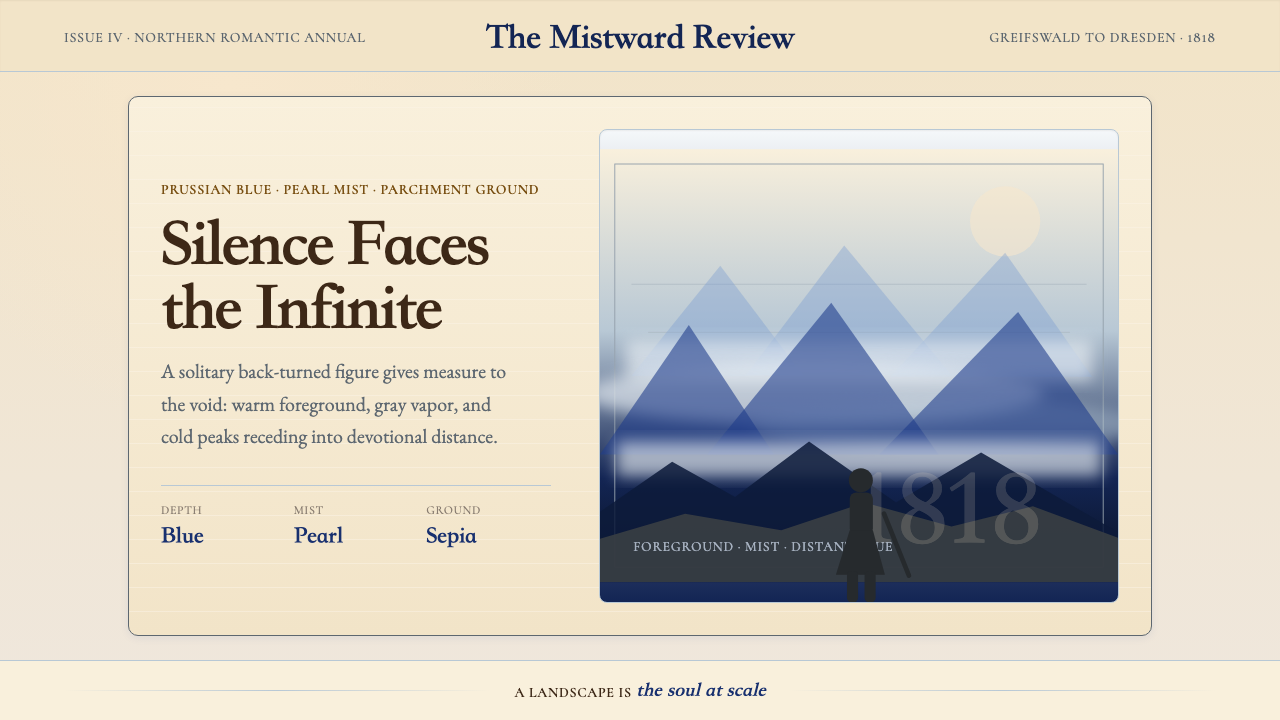 Caspar David FriedrichSilence becomes vast. Prussian blue depth, pearl mist, and parchment framing…
 Colombian Botanical (Triana)Observation becomes ornament. Crimson watercolor specimen breathes on cream r…
 Degas Ballet PastelsBackstage glamour is labor. Jade walls, rose footlights, cropped serifs on cr…