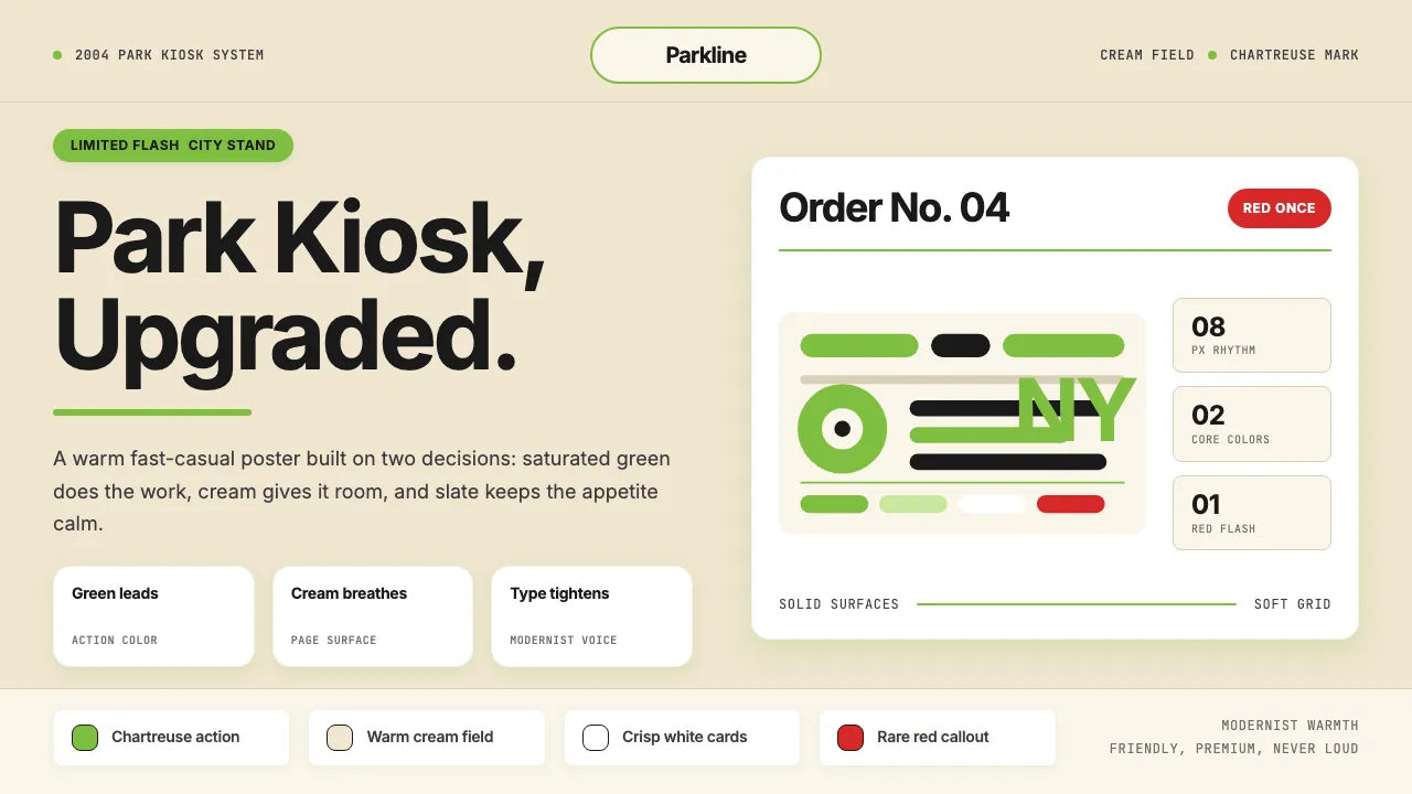
About Shake Shack (Green-Chartreuse)
Shake Shack began in 2004 as a hot-dog cart in Madison Square Park, an outgrowth of Danny Meyer's Union Square Hospitality Group. Pentagram's Paula Scher gave it a chartreuse-green wordmark on warm cream — a "fast-casual upgraded" identity that reads as friendly, premium, and unmistakably New York.
The visual system is a restrained two-color story: saturated chartreuse-green for action, warm cream for surfaces, deep slate for type, with a rare flash of saturated red. The temperament is Pentagram-modernist — generous spacing, tight letter-spacing on display type, hand-warmth in product photography — rather than fast-food shouting.
- Origin
- USA (New York City, originating in Madison Square Park)
- Era
- Founded 2004 (Madison Square Park, NYC); brand identity by Pentagram (Paula Scher); IPO 2015; current visual ~2018–2024
- Key figures
- Danny Meyer · Paula Scher · Mark Rosati
- Movements
- Fast-casual upgraded · Pentagram modernism · Premium-burger 2000s
Shake Shack (Green-Chartreuse) design spec
Colors
Typography
The other 11 sections — buttons, cards, spacing, motion, techniques and more — open once you unlock. Download the DESIGN.md or send it to your AI in one click. Unlock once, yours forever.
Sign up nowStyles similar to Shake Shack (Green-Chartreuse)
Also inspired by brands & products, with a close feel.
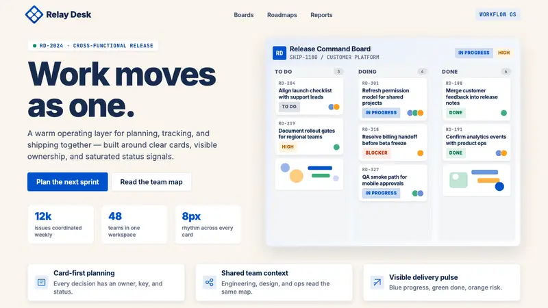 Atlassian Jira BlueWarm enterprise teamwork. Saturated blue cards on cream make status feel human.
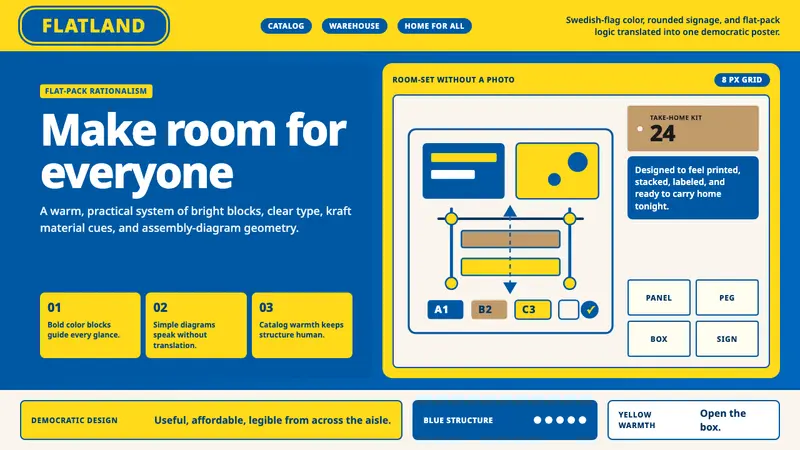 IKEADemocratic warmth in a box. Swedish blue-yellow blocks, Noto Sans, and assembly geometry.
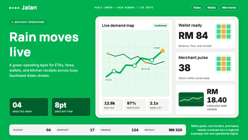 Grab SEA Superapp 2018Operational warmth. Saturated green, Inter numerals, and tight dashboard cards move the brand.
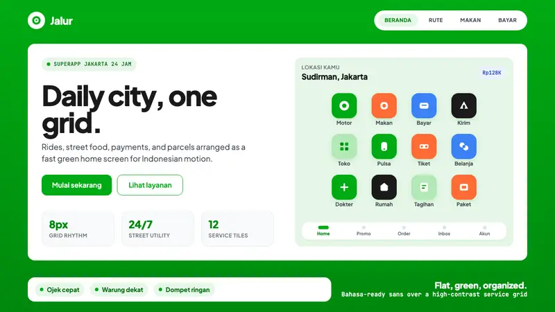 Gojek SuperappCity speed, ordered. Electric green tile grid turns rides, food, and pay into calm flow.