About Sanborn Insurance Map
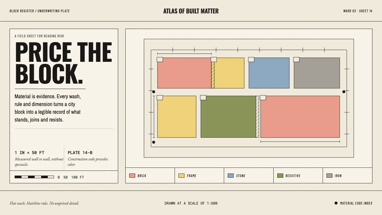
A Sanborn sheet was never meant to be looked at. It was meant to be priced. An underwriter two states away opened a bound folio, found a block at one inch to fifty feet, and read the building off the page: pink meant brick, yellow meant wood frame, blue meant stone, olive meant fire-resistive, grey meant iron cladding. The colour was a material code before it was a colour.
Everything on the sheet earns its place. Storey counts sit at building corners, dimensions run in feet along wall lines, firewalls are cross-hatched in six-inch increments, hydrants are solid black dots. The lettering is fine condensed gothic, tightly set, because a label had to fit inside a footprint. This system takes that discipline literally: flat fills, hairline rules, measured labels, nothing decorative.
- Origin
- United States — some twelve thousand cities and towns
- Era
- 1866 surveying begins; conventions fixed by the 1905 Surveyors' Manual and run through the mid-20th century
- Key figures
- Daniel Alfred Sanborn · Sanborn Map Company field surveyors · Library of Congress
- Movements
- fire underwriting cartography · large-scale urban survey drafting · hand-coloured lithography
Sanborn Insurance Map design spec
Colors
Typography
The other 11 sections — buttons, cards, spacing, motion, techniques and more — open once you unlock. Download the DESIGN.md or send it to your AI in one click. Unlock once, yours forever.
Sign up nowStyles similar to Sanborn Insurance Map
Also inspired by architecture & places, with a close feel.
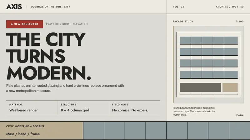 Bucharest Interwar ModernismModernism gathers civic weight. Sooted plaster, strict glazing bands and one red marquee.
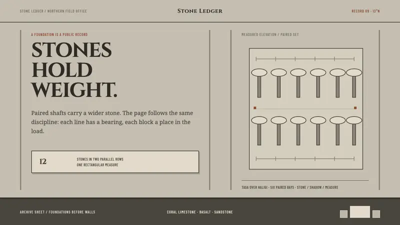 Chamorro Latte StoneNothing survives unless it bears weight. Paired stone rules and hard shadows structure the page.
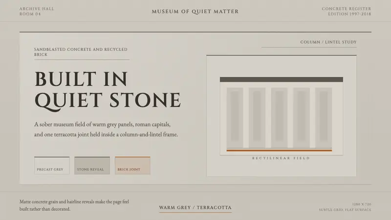 Chipperfield Museum GrayMuseum gravity, rendered quietly. Warm concrete grey, roman capitals, one terracotta joint.
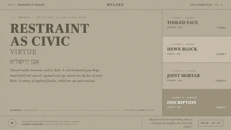 Jerusalem Stone GrayRestraint as civic virtue. Cool dressed-limestone gray-beige, ashlar coursing, engraved serif caps.