What is Warframe Orbiter UI?
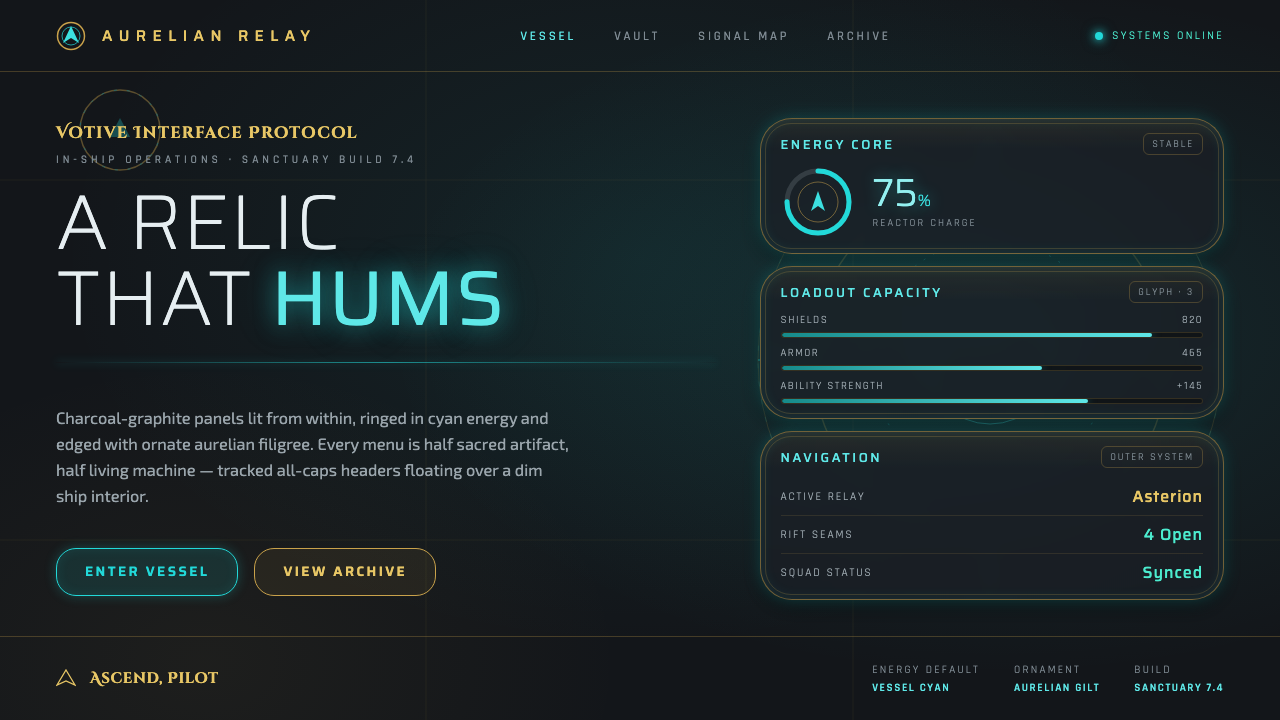
Warframe’s Orbiter UI turns navigation into ritual: cyan energy, Orokin gold, and dark ship panels make every menu feel like an awakened relic.
Warframe Orbiter UI in brief
The Warframe Orbiter UI is the Tenno’s in-ship interface, built for the dim interior of the Orbiter rather than for a neutral application canvas. Its visual language begins with a dark charcoal and graphite field, then introduces cyan and teal energy as an internal illumination. Gold Orokin filigree sits over that darkness as a ceremonial layer. The result is not simply futuristic: it presents technology as something old, revered, and still active.
The style fuses ornate science-fiction interface design with an Orokin baroque-futurist aesthetic. Curved bezels frame menus and HUD elements, while fine ornamental flourishes give otherwise functional surfaces a sense of lineage. Cyan rims and traces suggest energy moving through the interface; gold scrollwork suggests craftsmanship, status, and inheritance. These two systems remain deliberately unlike one another, which is why the interface can feel both engineered and sacred at once.
Typography reinforces the mood through thin, tracked, all-caps headers. Text is treated less like conversational copy and more like a label etched onto a control surface. It appears against dark panels with enough restraint that the luminous cyan edges and gold details retain their authority. Rather than filling every empty area, the Orbiter UI lets darkness act as atmosphere, separation, and visual depth.
Where does Warframe Orbiter UI come from?
The Orbiter UI belongs to Warframe, a live-service work by Digital Extremes in London, Ontario, Canada. Its stated era begins in 2013 and continues to the present, while the current Orokin and Tenno visual expression is associated with the period from 2018 to 2024. That continuing context matters: this is not a closed historical style with a fixed endpoint, but an interface identity that must remain recognizable inside an evolving game world.
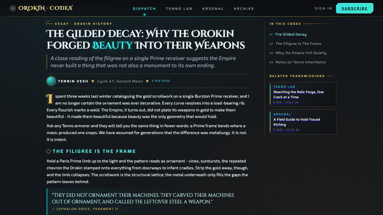
Its central source of meaning is the Orokin and Tenno visual vocabulary named in the material itself. Orokin gold filigree brings an ornate, baroque charge to surfaces that might otherwise read as ordinary science-fiction panels. Tenno-facing cyan and teal energy gives those same surfaces an active, living quality. The style’s core tension is therefore built into its premise: an ancient visual inheritance is not preserved behind glass, but illuminated from within and used as a working system.
Digital Extremes resolves this tension through layered contrast rather than through realism. Charcoal and graphite provide the ship-like substrate; gold suggests relic, ornament, and ceremonial value; cyan energy defines activation and presence. Curves soften the mechanical frame, but tracked all-caps headers retain control and legibility. The interface does not ask the viewer to choose between ornament and machinery. It makes ornament part of the machinery’s identity.
The current expression can be understood as a mature form of ornate sci-fi UI design. It is less interested in sterile futurism than in atmosphere: darkness is inhabited, energy is visible, and every decorative trace appears attached to a larger fictional civilization. The Orbiter UI therefore works as an interface language and as environmental storytelling, extending the feeling of the ship interior into menus, labels, and HUD framing.
What defines the Warframe Orbiter UI look?
Dark Interior Field
Charcoal and graphite panels establish the interface’s dominant field. This darkness is not an absence of design; it is the medium that makes cyan energy and Orokin gold appear embedded, not pasted on. A successful Orbiter-inspired composition keeps the background quiet, deep, and architectural, as though the interface is mounted inside a ship rather than floating over an empty screen.
Cyan Energy Traces
Cyan and teal operate as active energy rather than generic accent color. They gather around rims, edges, and interface boundaries, implying an illuminated system beneath the panel surface. Their job is to reveal activation, connection, and living presence. Because the glow carries so much narrative weight, it works best when it is selective and directional instead of spread evenly across the whole layout.
Orokin Gold Filigree
Gold filigree supplies the sacred-relic half of the system. Scrollwork and gilt flourishes add ceremonial detail without replacing the underlying dark structure. The ornament should feel attached to borders, frames, and significant surfaces, as if it records an inherited craft tradition. It is most convincing when it remains fine and deliberate, allowing the energy glow to remain visibly distinct from the ornamental layer.
Curved Bezels
Curved bezels prevent the interface from becoming a purely industrial panel system. They guide the eye around menus and HUD elements with a controlled, vessel-like contour. The curve is not soft minimalism; it is a framing device that makes controls feel housed within a crafted object. Pairing those curves with thin luminous edges creates the impression of a machine whose surfaces are energized from inside.
Tracked All-Caps Type
Thin, tracked all-caps headers give labels the cadence of technical inscriptions. The expanded letter spacing adds air around short names and turns hierarchy into a matter of rhythm as much as scale. This treatment suits navigation, status, and system headings especially well. It should remain restrained, because the more every text element adopts the ceremonial header voice, the less legible the overall hierarchy becomes.
Sacred Machine Contrast
The defining effect comes from holding sacred ornament and living machinery in the same frame. Gold reads as ceremonial and historical; cyan reads as energized and immediate; dark panels make both believable. This is not decorative sci-fi applied after the fact. The contrast should organize the entire interface, so that each functional control appears to belong to a larger relic-machine rather than to an unrelated visual theme.
Who shaped Warframe Orbiter UI?
Digital Extremes is the named creator of Warframe and of the Orbiter UI context described here. The studio’s role is essential because the interface is not presented as a detached visual reference: its dark ship interior, Orokin ornament, Tenno energy, menu framing, and HUD treatment form one authored in-world language.
The Tenno are the stated users of the Orbiter’s in-ship interface. Their presence gives the UI a practical point of view: it is a system for inhabiting and operating a ship, not merely an ornamental display. The cyan and teal energy language makes that user-facing system feel active, responsive, and integrated with its environment.
Orokin visual language supplies the ornate half of the Orbiter’s identity through gold filigree, scrollwork, and baroque-futurist flourish. It is treated as more than surface embellishment. Against charcoal panels and cyan energy, it explains why the ship interface reads as inherited cultural material as well as advanced machinery.
How do you use Warframe Orbiter UI today?
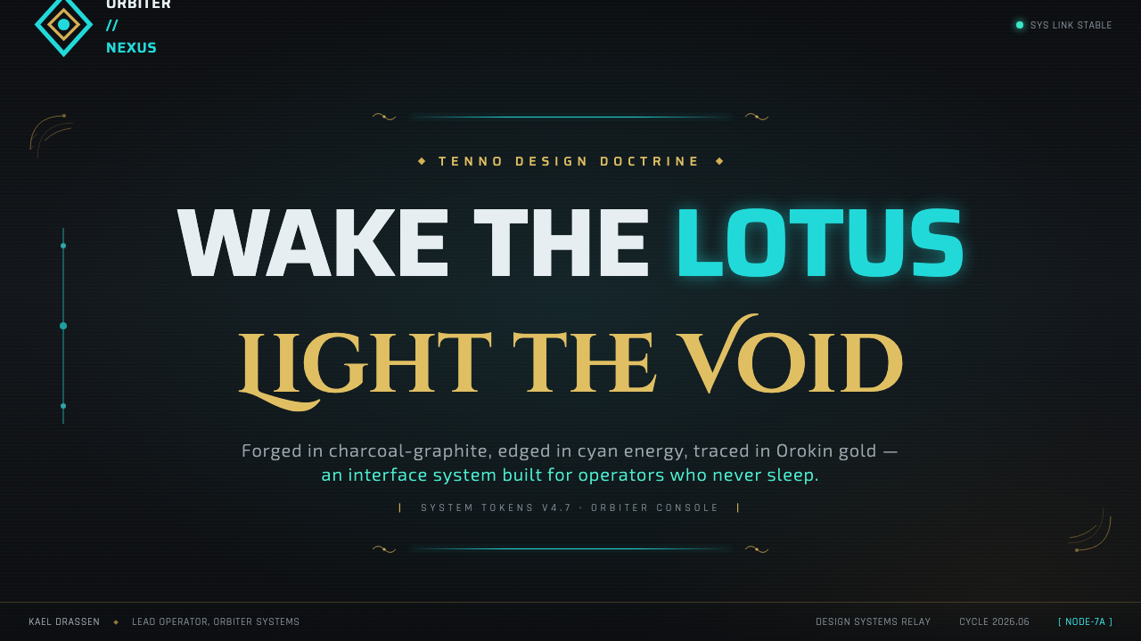
For presentation covers, use the Orbiter language as an atmosphere before using it as decoration. Let a deep charcoal field carry the composition, place a restrained gold ornamental frame or curved bezel around the title area, and use cyan energy along a chosen edge to establish focus. The title should read like a ship-system designation: thin, spaced, and concise. Keep the surrounding darkness intact so the cover retains the feeling of an illuminated interior.
For content slides, treat information as if it lives on segmented ship panels. Use curved frames to group related material, thin tracked headers for section names, and cyan traces to guide attention between major regions. Gold detail should mark important containers or transitions rather than every bullet or rule. The contrast between quiet dark fields and active luminous edges helps dense information remain organized without making the slide feel flat.
For data slides, preserve the difference between structural information and energy. Charts, values, and labels should sit clearly on the charcoal substrate, while cyan can identify the active reading path, selected series, or current status. Gold can distinguish a key threshold or special category when that distinction genuinely matters. Avoid turning every data mark into a glow; the style is strongest when light signals significance rather than mere visual excitement.
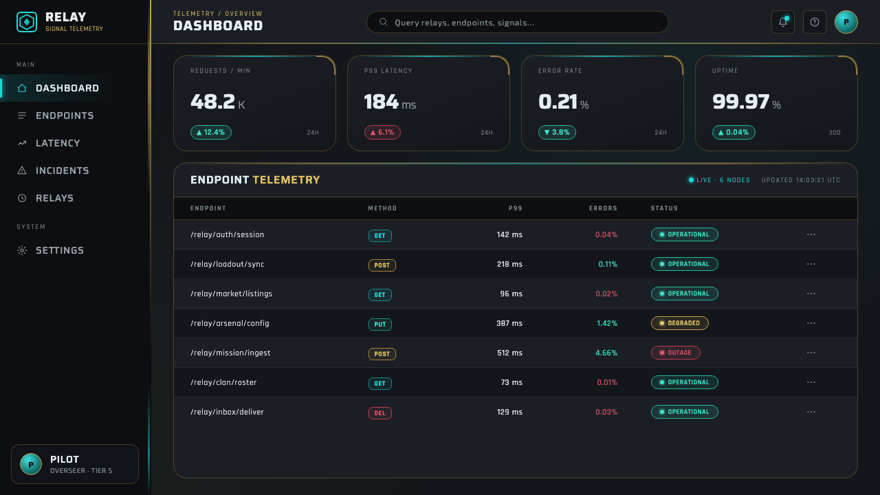
For web interfaces, this language suits dashboards, account areas, mission-like navigation, and pricing or membership pages that benefit from a sense of controlled ceremony. Dark panels can organize modules, curved bezels can frame primary actions, and cyan energy can identify interactive or live states. Gold filigree belongs at moments of status, value, or transition. The interface should still make ordinary tasks clear before it asks the user to admire its atmosphere.
For editorial and marketing work, use the relic-machine contrast to give a campaign or feature page a strong opening mood. Large dark spaces, concise all-caps headings, cyan-lit dividers, and selective gold flourishes can create an immediate sense of worldbuilding. The common mistake is to apply cyan glow and gold ornament everywhere. That collapses the hierarchy and makes the work feel costume-like; reserve energy for action and gold for meaningful framing.
Warframe Orbiter UI — FAQ
Is the Orbiter UI simply a dark sci-fi interface?
No. The dark charcoal and graphite base is necessary, but it is only the setting. The style is defined by the relationship between that darkness, cyan and teal energy, Orokin gold filigree, curved bezels, and technical all-caps labeling. Remove the ornate and sacred dimension, and the result becomes generic futuristic UI rather than an Orbiter-inspired system.
How should cyan energy and Orokin gold be balanced?
Give them different jobs. Cyan and teal should communicate activation, edges, and live presence, while gold should communicate inherited ornament, framing, and ceremonial importance. When both colors appear everywhere with equal intensity, neither reads clearly. The charcoal field is what allows their distinction to remain legible.
Does the style require elaborate ornament on every component?
No. The source material describes filigree and flourishes as part of a larger interface language, not as a compulsory skin for every control. Repeating ornament indiscriminately weakens its sacred-relic quality. Use it to establish important frames and surfaces, then let dark panels, type, and energy traces carry routine navigation and information.
Where does an Orbiter-inspired interface work best?
It works best where an interface benefits from atmosphere, status, controlled navigation, or a strong fictional frame: dashboards, system views, account spaces, presentation covers, and editorial campaigns. It is less appropriate when a product needs an entirely neutral, lightweight, or conversational character. The style carries narrative weight, so it should support the product’s voice rather than overpower it.
Related design styles
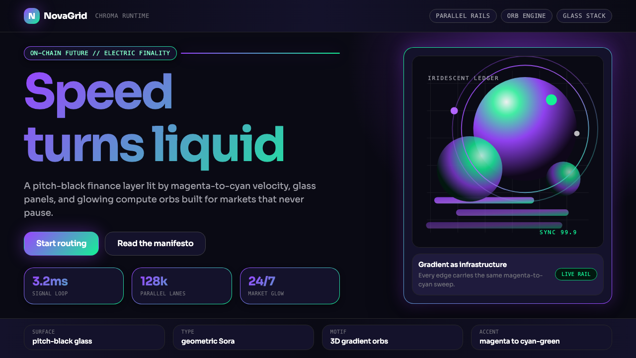 Solana (Magenta Gradient)Fast, black, chromatic. Magenta-to-cyan gradients and 3D orbs make speed glow.
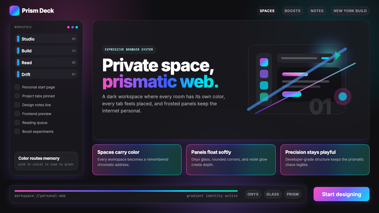 Arc Browser Prismatic (2023)Color is architecture. Pink-violet-cyan ribbons glow over onyx glass and roun…
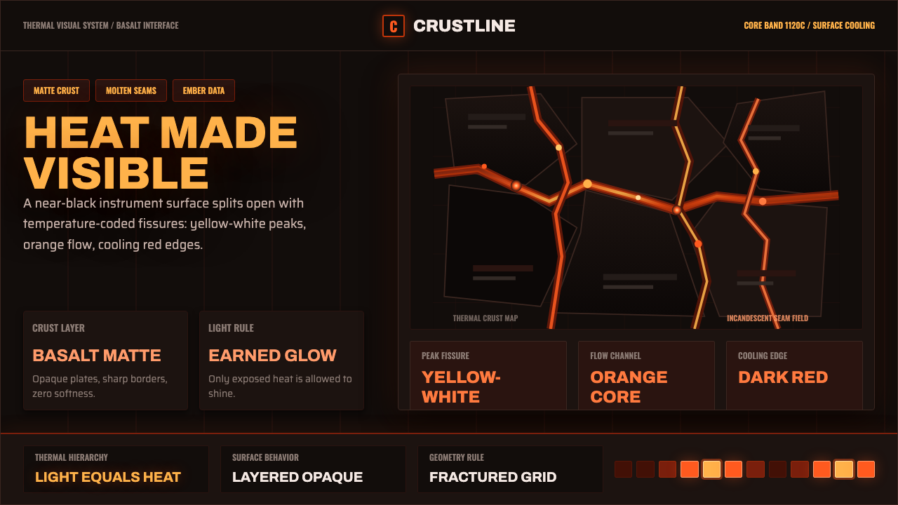 Kīlauea Lava FlowHeat earns its light. Matte basalt grid, molten orange fissures, ember teleme…
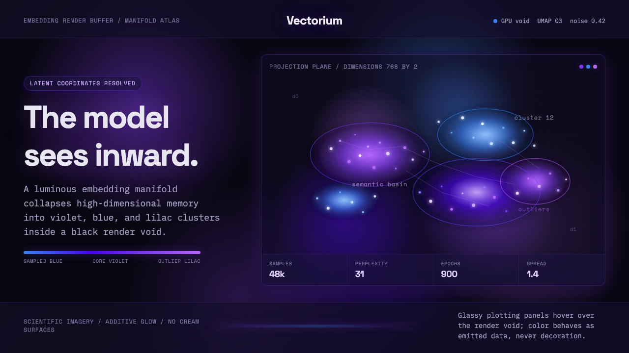 Latent SpaceSees the model from inside. Violet-blue point clouds glow on a black GPU void.
 MidjourneyInvisible chrome, visible art. Pure black grid and Cormorant serif give color…
 Nanopunk Grey GooColdness self-replicates. Chrome gradients and hex lattices spread across a b…