What is Vologda Bobbin Lace?
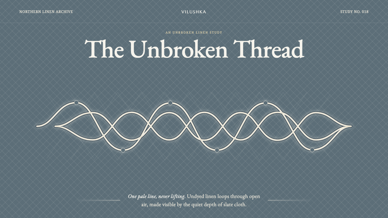
Vologda bobbin lace turns a single unbroken linen braid into a field of pale movement, revealed only when darkness gives its openwork somewhere to breathe.
Vologda Bobbin Lace in brief
Vologda bobbin lace is a northern Russian lace tradition built around continuity. Its defining element is the vilushka: one unbroken linen braid that travels through the composition, bending into vines, rings, and rosette-like centers without appearing to abandon the pattern. Rather than reading as a collection of separate ornaments, the finished lace reads as a single line of thought made visible in thread.
The material language is deliberately restrained. The lace uses undyed linen in a warm white-beige range, while the structure around it remains finely open. The pattern is not made powerful through contrast between many colors or through dense decoration. It becomes legible because the pale braid and its mesh are mounted over a darker cloth, allowing each loop, opening, and turn to emerge.
As a visual style, Vologda lace is quiet but not static. It combines the precision of repeated handwork with the apparent freedom of a wandering line. The design system drawn from it preserves that tension: pale continuous line-work over a slate blue-gray ground, abundant negative space, no bright interruption, and no motif that appears detached from the larger braid.
Where does Vologda Bobbin Lace come from?
The Vologda lace tradition belongs to eighteenth-century Russia and is associated with Vologda in northern Russia, within Eastern Europe. It remains a living craft today. That continuity matters to its visual identity: this is not a historical image language preserved only in an archive, but a textile practice whose essential logic is still worked through linen, open mesh, and the sustained movement of the braid.
Its craft context is Russian bobbin lace. Bobbin lace is especially suited to a visual language made from crossings, turns, and open spaces, because the pattern is constructed through thread rather than drawn and filled afterward. In the Vologda tradition, the result is organized around the pale linen braid and its relationship to the surrounding mesh, so positive form and empty field are inseparable.
The tradition is also identified with continuous-braid lace, known as сцепное lace. This description explains why continuity is more than a decorative preference. The vilushka does not merely outline flowers or vines; it gives the whole composition its internal route. Rings and rosettes feel connected because they are episodes in one passage rather than independent symbols placed beside one another.
The named figures associated with the tradition include Vologda kruzhevnitsy, or lace-makers, Sofia Bryantseva, and Anfia Bryantseva. Together, those names frame the tradition as both collective and authored: an enduring craft carried by makers, with individual practitioners also recognized within its history. For contemporary designers, that distinction is useful. The style should retain the evidence of patient construction rather than becoming a generic floral pattern.
What defines the Vologda Bobbin Lace look?
The Unbroken Braid
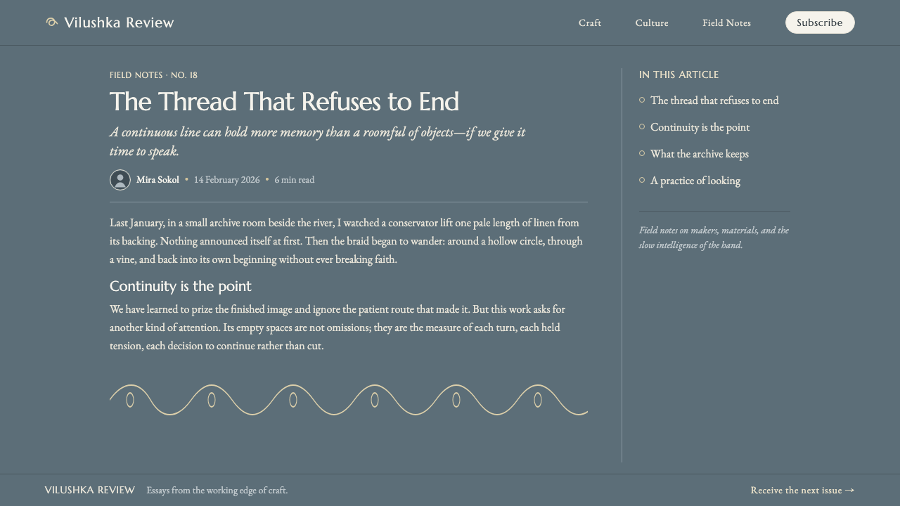
The vilushka is the governing gesture. A line should appear to travel, bend, return, and gather without losing its relationship to the whole. Separate ornaments weaken the effect; each loop should feel like a necessary turn in one ongoing route.
Pale Linen on Dark Cloth
Undyed white-beige linen is the visual foreground, while a dark slate blue-gray backing makes the openwork intelligible. The dark field is not a dramatic stage effect. It is the condition that lets the pale braid and fine mesh be seen.
Openwork and Air
The mesh is active space, not leftover space. Openings between strands create rhythm, reveal the backing, and prevent the lace from becoming a dense surface. A successful composition feels porous, with darkness passing through the pattern rather than sitting behind it.
Vines, Rings, and Rosettes
The motif vocabulary grows from the braid itself: vine-like curves extend its motion, rings hold and redirect it, and rosettes gather it into concentrated centers. These forms should be treated as variations in a continuous syntax, never as a catalogue of decorative icons.
Restrained Contrast
The style depends on a narrow tonal conversation between warm pale thread and cool dark cloth. Bright color would interrupt the material logic and compete with the braid. Contrast comes from visibility, density, and negative space rather than chromatic spectacle.
Patient Repetition
Repeated crossings and loops create consistency without mechanical sameness. The eye follows recurring intervals but keeps discovering small directional changes. In adaptation, repetition should establish a calm field while the continuous line supplies the movement and surprise.

Who shaped Vologda Bobbin Lace?
The Vologda kruzhevnitsy are the lace-makers associated with the tradition. Their presence is essential to understanding the style as a practiced textile craft rather than a detached ornamental image.
Sofia Bryantseva is named among the key figures of the Vologda lace tradition. Her inclusion places an individual maker within a craft history otherwise carried through collective practice.
Anfia Bryantseva is likewise identified as a key figure in the tradition. Alongside Sofia Bryantseva and the wider community of lace-makers, her name connects individual recognition with the continuity of the craft.
How do you use Vologda Bobbin Lace today?
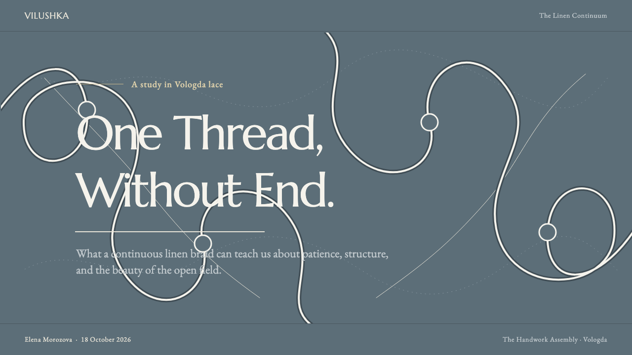
For presentation covers, use the dark slate blue-gray field as a quiet ground and let one pale continuous braid establish the composition. It can enter from an edge, circle a title area, or gather around a central rosette-like form, but it should never behave as a border pasted onto the page. On content slides, preserve large open areas and use the line-work as a subtle route between sections rather than as a dense backdrop.
Data slides benefit from the style when information is treated as a field of connected relationships. A pale path can lead between labels, annotations, or groups, while rings can mark important nodes and open mesh can suggest a supporting layer without competing with the data. Keep the information itself more direct than the lace: the craft reference should organize attention, not obscure comparison.
For web interfaces, the style works best in dashboards, member spaces, and pricing pages that benefit from calm focus and a sense of considered materiality. Use the slate-toned ground consistently, reserve pale line-work for framing and section transitions, and keep controls clear against the open field. The visual system is particularly effective when a user should feel guided through connected content rather than pushed through a sequence of loud calls to action.
In editorial and marketing work, Vologda lace can create an atmospheric identity for essays, collections, invitations, or product stories. Let a continuous braid move across headings, captions, and image areas as a connective device. The most common mistake is turning it into generic floral decoration: scattered flowers, clipped line segments, vivid accents, or overloaded backgrounds all lose the defining logic. If the thread no longer feels unbroken, the style has become costume rather than structure.
Vologda Bobbin Lace — FAQ
Is Vologda lace simply a floral style?
No. Vines, rings, and rosettes are part of its visible vocabulary, but the defining idea is the continuous linen braid that creates them. A floral motif can resemble the surface of the style while missing its essential construction. The path of the vilushka matters more than any individual flower-like form.
Why is a dark backing so important?
The undyed pale linen and fine openwork need a contrasting ground to become legible. Against a similarly light surface, the mesh and the spaces within the braid recede. A slate blue-gray cloth makes the openings visible while preserving the quiet, material character of the lace.
Can the style use bright accent colors?
Its source language does not depend on bright color. The visual force comes from pale undyed linen, a dark backing, and the changing density of line and open space. Strong chromatic accents usually compete with that relationship, so a restrained palette is the more faithful and effective choice.
How can a digital layout keep the craft feeling?
Prioritize continuity, openness, and restraint. Build a line that has a believable route through the composition, allow the dark field to remain visible through generous negative space, and avoid repeating detached ornaments. The result should suggest a thread patiently moving across cloth, not a decorative pattern stamped onto a screen.
Related design styles
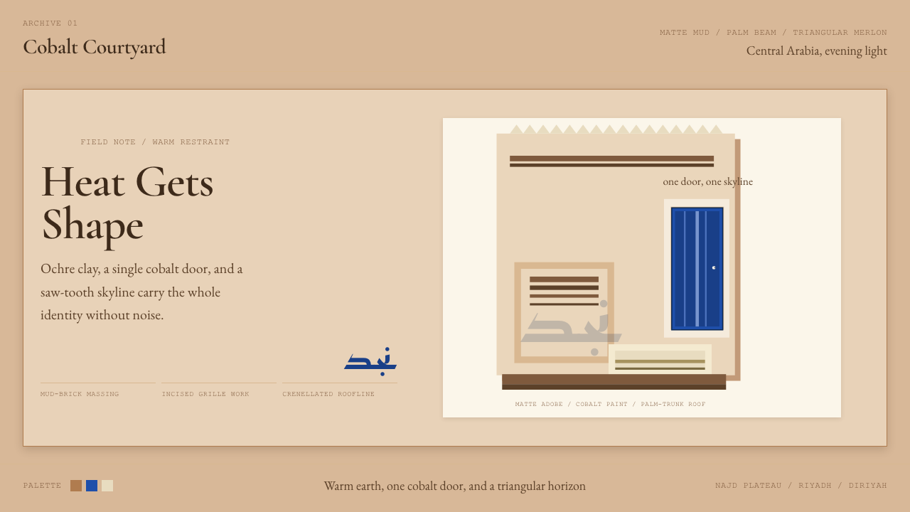 Saudi Najdi Vernacular ArchitectureHeat gets shape. Ochre clay, a single cobalt door, and a saw-tooth skyline.
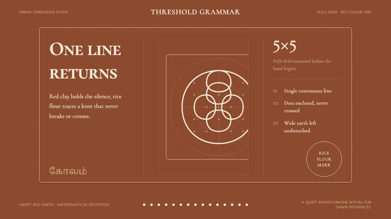 Tamil Kolam (Rice Flour Threshold)Mathematics becomes devotion. Rice-white knots breathe on red-clay negative s…
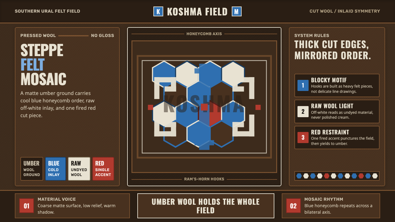 Bashkir Honeycomb Felt OrnamentSteppe craft feels weighty. Umber felt holds blue honeycomb and raw-wool hook…
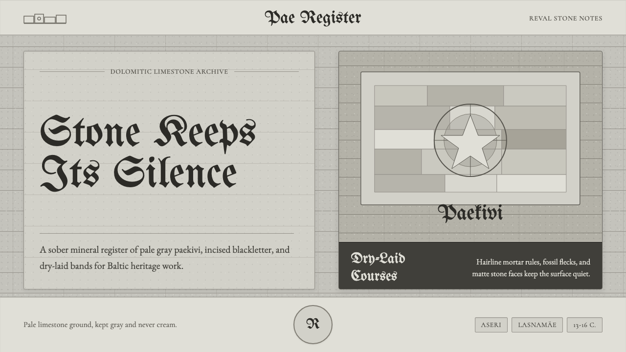 Estonian Limestone GrayStone keeps its silence. Limestone grays, blackletter, and dry-laid bands car…
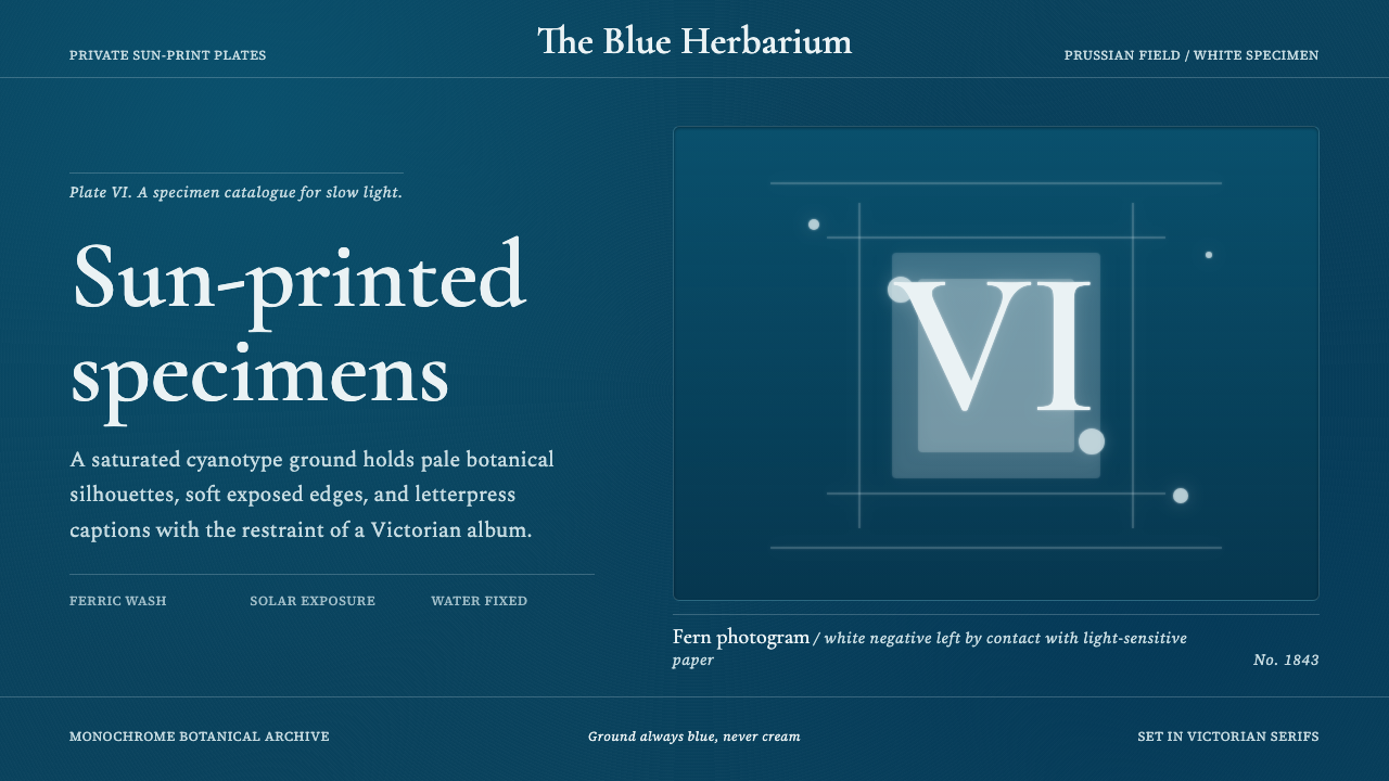 Fern CyanotypeStillness turns scientific. Prussian blue field, white photograms, Victorian…
 Glagolitic ScriptCarved faith in limestone. Cinzel capitals and red rubrics sit in shadowed gr…