What is Toda Pukhoor?
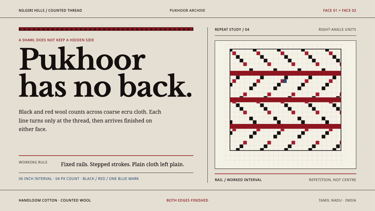
Toda pukhoor is embroidery with no wrong side: counted wool stitches in black and red, stepped at right angles along fixed rails on plain cotton cloth.
Toda Pukhoor in brief
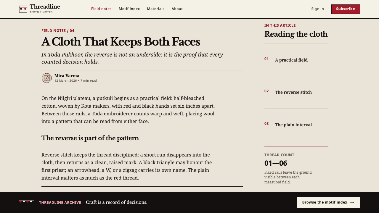
Pukhoor means flower in the Toda language, and it names the embroidery that Toda women work on the putkuli, the shawl of the Toda people of the Nilgiri Hills in Tamil Nadu, India. The putkuli is a coarse, half-bleached cotton cloth woven for the Toda by Kota weavers, with bands of red and black already running through it at regular intervals. The embroidery is worked between those bands, in wool, by counting the threads of the cloth. 'Flower' is a poetic word for what is, in practice, a strict and angular geometry.
As a visual system, pukhoor is defined by constraint. The stitch is counted-thread darning, so every stroke runs along the warp or the weft and every line turns at a right angle, producing stepped contours instead of curves. The embroidery is reversible: both faces are finished, and the shawl can be worn either way out. The motif vocabulary is named and closed. There is no free decoration, no filler and no hidden side.
The look that results is crisp, graphic and unusually calm. Black and red wool stand out against ecru cloth, the cloth is left plain wherever there is no motif, and the bands of embroidery run along rails at fixed positions. Patterns repeat along those rails instead of being centred, which gives the surface a rhythmic, almost musical regularity. Nothing is shaded, outlined or softened, and nothing is hidden on the back.
Where does Toda Pukhoor come from?
The Toda are a pastoral community of the Nilgiri Hills in Tamil Nadu, southern India, whose life has long centred on buffalo herds, dairying and the ritual that surrounds them. Toda embroidery belongs to this pastoral culture, and the source treats it as a tradition that predates 1900. The shawl and its embroidery are not an isolated craft. They sit in a world of named things — the buffalo, the sun and the moon, the priest — and the patterns on the cloth are drawn from the same vocabulary.
The division of labour is part of the story. Kota weavers make the putkuli, weaving the red and black bands into the cloth at intervals, and Toda women then embroider it. The embroidery does not decorate a blank sheet; it responds to a ground that is already structured. The woven bands act as rails, and the women count threads to lay wool between them, moving along warp and weft so that every stroke is a right angle and every line is stepped. Weaving and embroidery therefore form one composition made by two communities.
The motifs are fixed and meaningful. The source names the buffalo horn, the sun and the moon, the zigzag, the arrowhead, the W shape, and the black triangles dedicated to the first priest. Colour carries meaning as well: black stands for maturity, red for youth and blood, and blue, when it appears, is a rare accent. Because the vocabulary is closed, the designs read as a language. One learns which motif is which, and variation comes from arrangement and repetition rather than from invention.
In March 2013 Toda embroidery was registered in India as a Geographical Indication, under application no. 135, a legal recognition that ties the name to a place and a community of makers. The registration confirms what the cloth already shows: this is a living craft with a defined origin, not a generic ethnic pattern. The design language drawn from it keeps the same discipline, which can be summed up as fixed rails, counted units, and plain cloth left plain.
What defines the Toda Pukhoor look?
Ecru Ground, Plain by Choice
The ground is a coarse, half-bleached cotton, a warm ecru rather than white, with the weave visible. It is not decorated everywhere. Between the embroidered bands the cloth is left plain, and that emptiness is part of the composition. White space here reads as material rather than absence: it is the cloth itself, and it makes the pattern legible by contrast.
Black and Red Wool
The embroidery is worked in wool in two principal colours, black and red, with blue as an occasional accent. Black signals maturity and red signals youth and blood, so the two are not interchangeable decorations but a pair with meaning. They sit against the ecru ground at full strength, with no tints, gradients or intermediate shades.
Fixed Rails
The woven red and black bands of the shawl act as rails, and the embroidery lives between them. The horizontal tracks sit at set intervals, and motifs are placed on those tracks. For layout this means a strong set of horizontal lines whose spacing never changes, with content assigned to tracks rather than centred freely on the page.
Counted, Stepped Lines
Because the stitch follows the thread count, diagonals appear as stairs and curves as chains of right angles. Zigzags, arrowheads and the W shape all emerge from stepping. The lines have a graph-paper quality, but without any smoothing: there is no softened edge, and the grid of the cloth is the grid of the drawing. Every unit can be counted, and every count is deliberate.
A Closed Motif Vocabulary
Only a limited set of named motifs appears: buffalo horn, sun and moon, zigzag, arrowhead, the W shape and the black triangles. They are repeated along the rails rather than combined into new pictures. A system that follows this logic keeps a small, named set of repeating marks and resists adding new decorative icons for variety's sake.
Reversible Finish
Both faces of the embroidery are finished. There is no tangled back, no knot to hide, no side that exists only for the maker. Visually it means every element should be complete from every angle, with no orphan details, no leftover guides and no hidden structure. In interface terms it is honesty to the edge: what is shown is what the object is.
Who shaped Toda Pukhoor?
The makers of pukhoor. Toda women count the threads of the putkuli and lay wool along warp and weft between the woven bands, holding the motif vocabulary in practice and deciding its arrangement along each rail. The discipline of this style, with its counted units and stepped lines, is their working method translated into layout.
The weavers of the Kota community in the Nilgiri Hills, who make the putkuli itself. They weave the red and black bands into the half-bleached cotton before any embroidery begins, so that the rails already exist when the first stitch is made. In design terms they supply the grid that the embroidery answers to.
Not a designer but a reference point inside the motif vocabulary. The black triangles are dedicated to him, which is why they are not interchangeable with other shapes. His presence in the pattern is a reminder that this is a named system of meaning, where each mark has a place and a reason, and that borrowing the forms calls for care.
How do you use Toda Pukhoor today?
Toda Pukhoor is a style for craft, honesty and calm structure. It suits subjects that value handmade provenance, such as textiles and fashion, artisan and cooperative brands, cultural heritage, education about indigenous knowledge, and anything that wants to look carefully counted rather than loudly decorated. It is a system of restraint in which emptiness is as deliberate as ink.
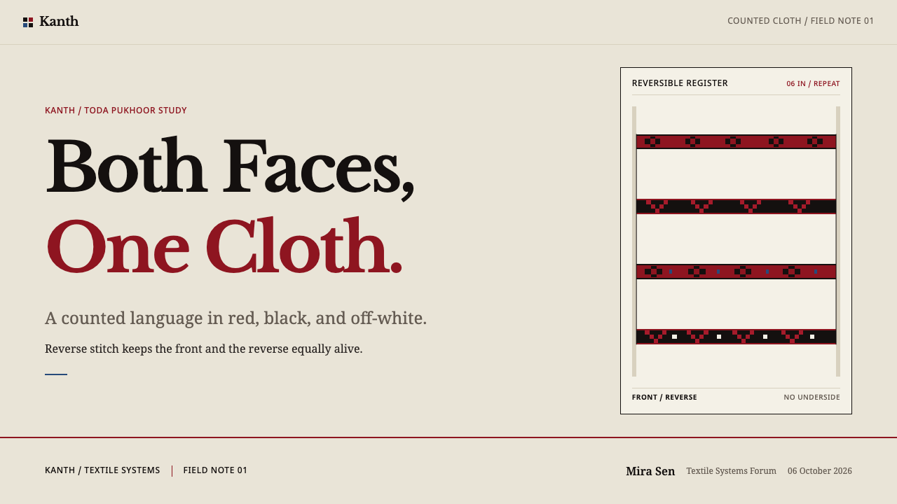
For presentation slides, think in rails. A cover can be an ecru field with one stepped band running across it in black and red, the title sitting in the plain cloth above. Content pages carry two or three horizontal rails at fixed intervals, with text or figures aligned to them. Data slides suit stepped charts well: bars and lines drawn in right angles, a red and black pair for the two key series, and no smoothing anywhere.
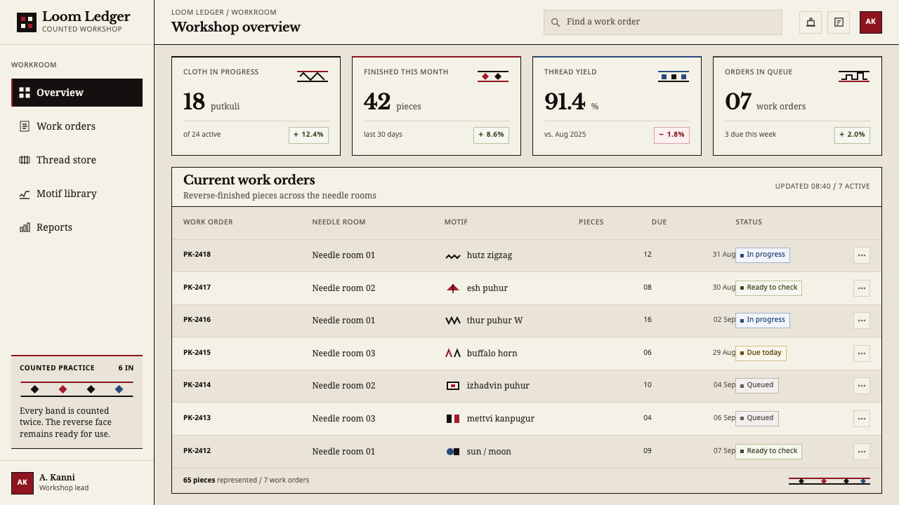
For web interfaces, the rails translate into a strict horizontal rhythm. Section dividers are stepped bands, cards sit between them on plain backgrounds, and buttons are solid black or red rectangles without rounding. Pattern is used as a divider or footer motif and repeats along its rail instead of being centred. Keep the ground ecru and leave generous plain areas. Icons, if needed, should be built from the same stepped geometry so that they feel woven.
In editorial and marketing work, the style gives a quietly authoritative craft voice. Long articles can use a stepped band as a chapter marker, and photography of textiles, hills, herds and handwork pairs naturally with it. Campaign pages for artisans, textile cooperatives and heritage brands benefit from the alternation of plain and pattern: a stretch of empty cloth, then a rail of motifs, then empty cloth again. Captions that name motifs by their proper names continue the logic of a closed vocabulary.
The most common mistake is to treat the pattern as a texture to scatter across the page. In the cloth, motifs sit on rails with discipline and large areas are left plain, so filling the whole surface destroys the contrast that makes the pattern legible. The second mistake is smoothing the geometry: rounded corners, diagonals drawn at clean angles, or soft shadows undo the counted-thread logic. The third is spending the colours. Red and black carry meaning, and adding extra accent hues, gradients or tints dilutes the pairing.
Toda Pukhoor — FAQ
What does 'pukhoor' mean, and what is it a flower of?
Pukhoor means flower in the Toda language. The name is a reminder that the craft's own vocabulary is about meaning rather than literal resemblance: the motifs are angular, named forms such as the buffalo horn, the sun and moon, and the arrowhead, built entirely from counted stitches. None of them is a drawing of a real flower. The poetry of the name sits against the severity of the geometry, and that tension is part of the style.
What does 'reversible' mean in design terms?
It means there is no hidden side and nothing that exists only to support the front. Every element should be finished from every angle and should show its structure honestly. In a layout, that translates into complete edges, no decorative leftovers, no stray guides and a consistent treatment of both sides of any repeated unit. A user should be able to read the design from either direction, just as the shawl can be worn either way out.
Can the style work on a dark background?
The system is built on a light cloth, and its meaning depends on black and red wool standing out against ecru. On a dark ground, black stitches disappear and the pair loses its logic. If a dark treatment is needed, keep the ecru as the working surface and use dark only for framing areas such as headers and footers, or invert carefully with ecru stitches on a deep ground while accepting that the black and red pairing is no longer the main contrast.
Are the motifs free to reuse?
Borrow the logic first and the motifs second. The vocabulary is named and carries meaning for the Toda community, and the embroidery has been registered as a Geographical Indication in India. The disciplines of fixed rails, counted units, plain cloth and a restricted colour pair can be applied to any design without misusing anything. Where actual motifs appear, use them with attribution and with their proper names, and avoid inventing pseudo-traditional symbols that imitate the look.
Which products fit this style, and which do not?
It fits products that sell craft, provenance, structure and calm: textile and fashion brands, cooperatives, museums and cultural archives, educational material, and tools that benefit from a strict horizontal rhythm. It struggles with products that depend on glossy depth, motion-heavy interfaces or a wide, saturated palette, such as entertainment and gaming. It is also a poor match for dense dashboards with many series, because the two-colour discipline limits how much can be encoded at once.
Related design styles
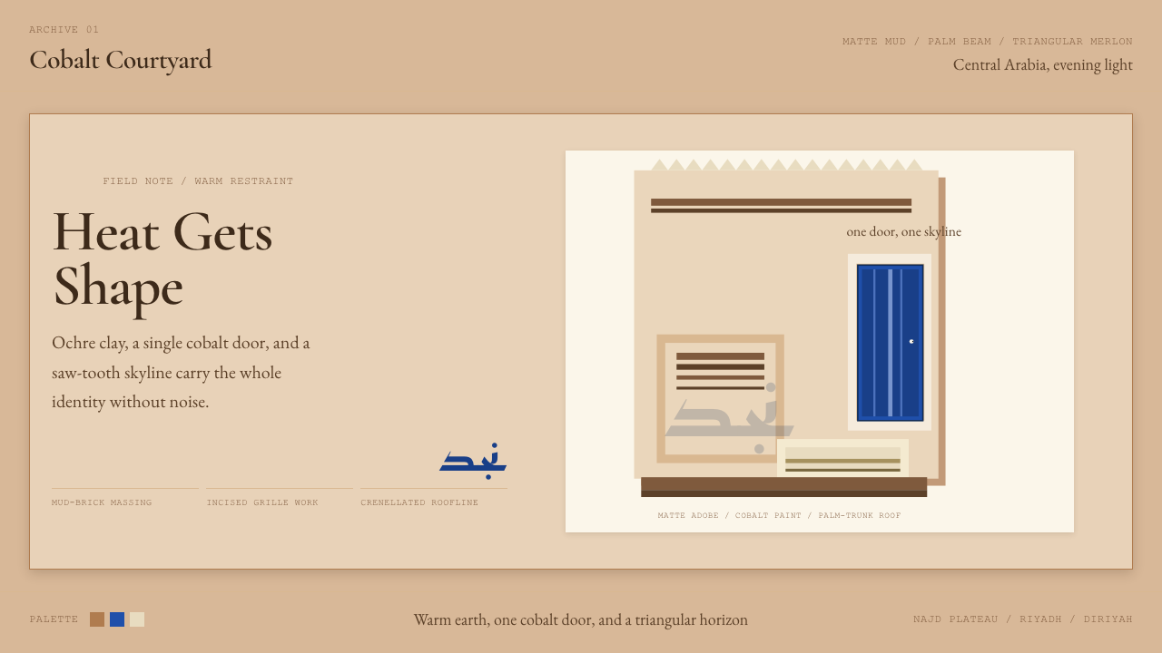 Saudi Najdi Vernacular ArchitectureHeat gets shape. Ochre clay, a single cobalt door, and a saw-tooth skyline.
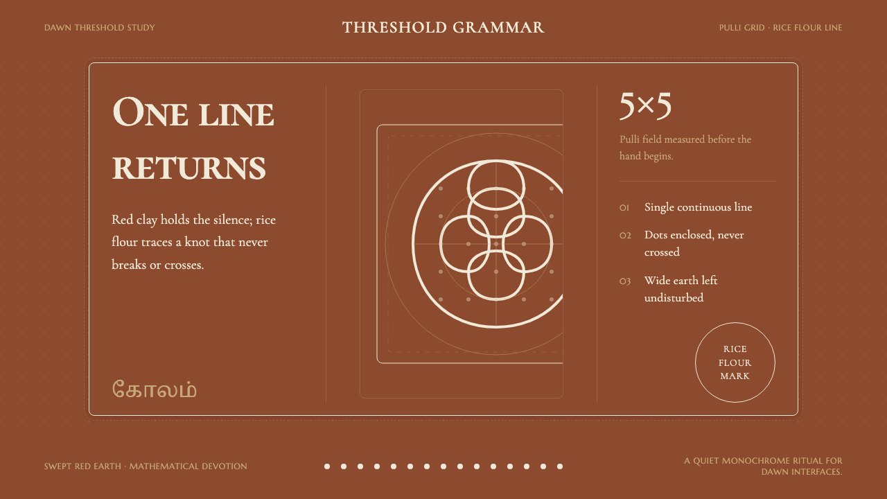 Tamil Kolam (Rice Flour Threshold)Mathematics becomes devotion. Rice-white knots breathe on red-clay negative s…
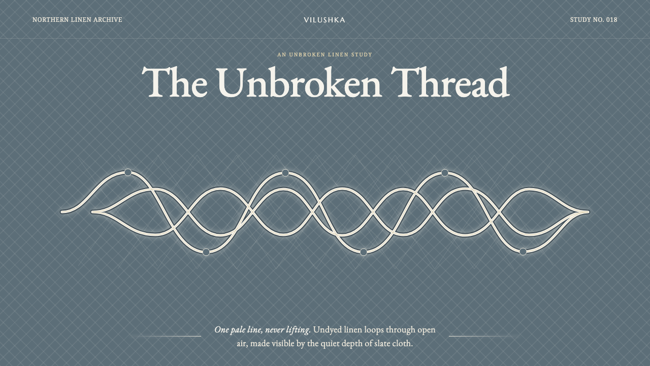 Vologda Bobbin LaceOne thread never lifts. Warm white linen loops glow across a quiet slate-blue…
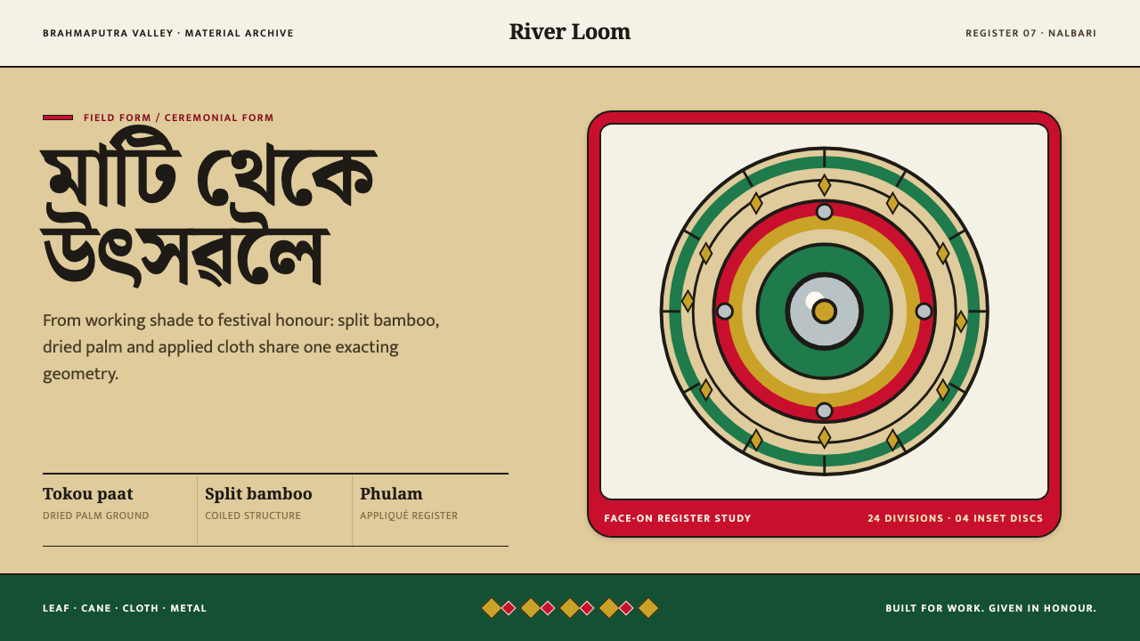 Assamese JapiWork becomes ceremony. Straw-gold rings carry green appliqué, festival red an…
 Bengali Jamdani WeavingLuxury whispers. Pearl cream, tonal buta, and one gold hairline make woven ai…
 Cham My Son TowersWall before ornament. Greyed brick bays recede around cut shadows and sandsto…