Design style guide设计风格指南
What is Tokyo Shibuya Scramble Neon?什么是 Tokyo Shibuya Scramble Neon?
Shibuya Scramble Neon is the design language of Tokyo's most photographed crossroads — maximalist, disciplined, and unapologetically loud.涩谷十字路口霓虹是东京被拍摄最多的路口的设计语言——极致繁复,却有内在秩序,毫不掩饰地喧嚣。
Tokyo Shibuya Scramble Neon in briefTokyo Shibuya Scramble Neon 速览
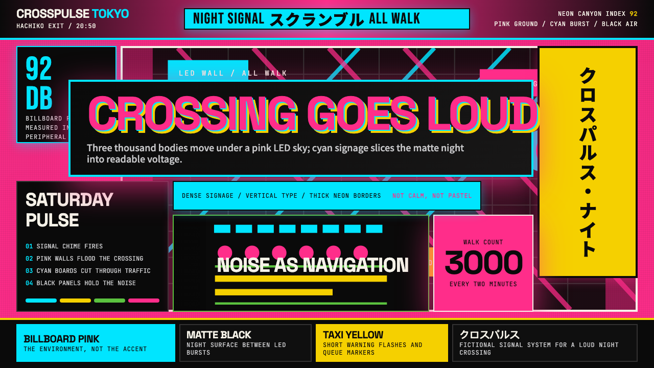
Tokyo Shibuya Scramble Neon is a visual system rooted in the real sensory environment of Shibuya Crossing — the world's busiest pedestrian intersection, where roughly three thousand people cross simultaneously every two minutes beneath a canyon of enormous LED billboards, backlit signage walls, and layered vertical type. It is not a generic cyberpunk fantasy; it is a precise extraction of the pink-cyan-black palette and typographic density that characterize the Q-FRONT tower, the Shibuya 109 fashion building, and the labyrinthine Don Quijote discount store with its signature all-caps katakana stacked from pavement to roofline.涩谷十字路口霓虹是一套视觉系统,植根于涩谷口十字路口——全球最繁忙的行人路口——的真实感官环境。每两分钟约三千人同时穿越,头顶是巨型LED屏幕的峡谷,四周是背光招牌墙与层叠竖排文字。它不是泛化的赛博朋克幻想,而是对Q-FRONT大楼、涩谷109时装大厦和唐吉诃德折扣连锁的粉-青-黑色板与排版密度的精确提炼——后者以从路面叠到楼顶的全大写片假名著称。
The style is defined by contrast at every scale: warm neon pink as a dominant ground fights against electric cyan borders and accents, while matte black panels provide breathing space and structural anchoring between bursts of color. Vertical type — a natural feature of Japanese signage culture — gives compositions a columnar, stacked quality that reads differently from left-to-right Western layouts. The overall effect is maximalist but not chaotic; the competing elements follow an implicit hierarchy of luminosity and scale that emerges from the physical logic of outdoor advertising.这套风格在每个尺度上都以对比为定义:暖霓虹粉作为主导底色,与电光青的边框和点缀形成对抗,而哑光黑色面板在色彩爆发之间提供呼吸空间与结构锚点。竖排文字——日本招牌文化的自然特征——赋予构图一种柱状、堆叠的特质,与从左至右的西方版面读法截然不同。整体效果是极致繁复的,但不是混乱的:相互竞争的元素遵循着一种隐性的亮度与尺度层级,这种层级从户外广告的物理逻辑中自然生长出来。
What distinguishes this system from other neon-inflected aesthetics is its specificity of place and its restraint within excess. The palette is tight: a warm pink ground, a cold cyan edge, near-black surfaces, and occasional white highlights. There is no attempt to include every neon hue; the system captures the actual color temperature of a specific Tokyo neighborhood at a specific hour of the evening. Layering is permitted — even required — but each layer belongs to a clear plane: background, midground type, foreground graphic, overlay glow.将这套系统与其他霓虹美学区别开来的,是它的地域特殊性和繁复之中的克制。色板是精准的:暖粉底、冷青边、近乎纯黑的面、偶尔出现的白色高光。它没有纳入每一种霓虹色调,而是捕捉了东京某个特定街区在特定夜晚时分的实际色温。层叠是被允许的——甚至是被要求的——但每一层都归属于清晰的平面:背景、中景文字、前景图形、叠加光晕。
See the Tokyo Shibuya Scramble Neon design system →查看 Tokyo Shibuya Scramble Neon 完整设计系统 →
Where does Tokyo Shibuya Scramble Neon come from?Tokyo Shibuya Scramble Neon 从何而来?
The physical and cultural roots of this design system stretch back to 1979, when Tokyu Corporation opened Shibuya 109 — a cylindrical fashion complex that anchored the east side of Shibuya Crossing and became a magnet for the gyaru and kogal street-style subcultures of the 1980s and 1990s. Those subcultures were defined by conspicuous decoration, high-contrast color, and an aggressive reclamation of femininity through visual excess — values that filtered directly into the area's signage culture. By the time Q-FRONT, the tower housing the giant video screens, opened in 1999, the crossing had already established its visual grammar of layered, competing, high-luminosity surfaces.这套设计系统的物质与文化根源可追溯至1979年——彼时东急集团开设了涩谷109,这座圆柱形时装综合体锚定了涩谷十字路口东侧,成为1980至90年代辣妹(gyaru)与小妹(kogal)街头时尚亚文化的磁石。那些亚文化以炫目的装饰、高对比度色彩和以视觉过剩重新占领女性气质为特征——这些价值观直接渗透进了该地区的招牌文化。到1999年搭载巨型视频屏幕的Q-FRONT大楼开业时,这个路口已经确立了它的视觉语法:层叠、竞争、高亮度的平面并置。
The aesthetic cannot be separated from the post-bubble period of Japanese culture. After the economic bubble burst in 1991, the 1990s saw a flowering of youth street style that used visual maximalism as a form of cultural defiance. The gyaru aesthetic — platform shoes, bleached hair, dramatically contrasted cosmetics, dense layering of accessories — translated directly into the visual language of the brands and stores that served that community. Shibuya's crossing became an outdoor advertisement for the community itself, each storefront an argument for a particular version of loudness.这种美学无法与日本文化的泡沫经济后时代分割。1991年经济泡沫破裂后,1990年代涌现了蓬勃的青年街头风格,将视觉极致主义作为一种文化反抗形式。辣妹美学——厚底鞋、漂白发、戏剧性对比的妆容、配饰的密集叠加——直接转化进了服务这一群体的品牌与店铺的视觉语言。涩谷的十字路口成了这个社群自我展示的户外广告,每个店面都是对某种喧嚣方式的主张。
Daido Moriyama, the Japanese photographer whose grainy, high-contrast street photography documented Tokyo from the 1960s onward, captured the pre-LED neon era of the crossing in ways that shaped how subsequent artists and designers understood its visual language. His images emphasize blur, grain, and the halation of bright lights against dark wet pavement — qualities that survive in contemporary interpretations of the scramble aesthetic even when the technical rendering is crisp and digital. Sofia Coppola's 2003 film Lost in Translation, though set partly at the Park Hyatt in Shinjuku rather than Shibuya, crystallized the international image of Tokyo-at-night as a place of beautiful, illegible luminosity — and that image drew heavily on the visual reality of Shibuya Crossing.日本摄影师森山大道从1960年代起用粗粒、高对比度的街头摄影记录东京,他在LED时代之前捕捉了这个路口的霓虹面貌,塑造了后来的艺术家和设计师理解其视觉语言的方式。他的图像强调模糊、颗粒与强光在深色湿润路面上的晕染——这些品质即使在当代数字渲染精准清晰的场合,也在涩谷十字路口美学的诠释中留存下来。索菲亚·科波拉2003年的电影《迷失东京》虽然部分取景于新宿的柏悦酒店而非涩谷,却将东京夜晚作为美丽而难以辨读的光晕之地的国际形象凝固下来——而那个形象大量汲取了涩谷十字路口的视觉现实。
The post-2020 era brought significant physical redevelopment to Shibuya, with new tower complexes rising around the station and the scramble crossing gaining new architectural backdrops. This redevelopment introduced a tension the design system explicitly encodes: the collision between the maximalist, organically accumulated neon layer of older Shibuya and the cleaner, more architecturally deliberate surfaces of new development. The pink-cyan-black palette represents the older neon stratum, while the matte black panels and geometric structure in the system's vocabulary acknowledge the newer context pressing in around it.2020年之后,涩谷经历了大规模实体改造,车站周边新塔楼群崛起,十字路口获得了新的建筑背景。这场重建引入了这套设计系统明确编码的张力:旧涩谷极致繁复、有机积累的霓虹层,与新开发项目更干净、更具建筑意图的表面之间的碰撞。粉-青-黑色板代表了旧霓虹地层,而系统词汇中的哑光黑色面板与几何结构则承认了四周逼近的新语境。
What defines the Tokyo Shibuya Scramble Neon look?Tokyo Shibuya Scramble Neon 的视觉特征是什么?
Color Temperature色温
The palette is built around a specific opposition: a warm, saturated pink that reads as artificial and inviting in equal measure, set against a cold, electric cyan that suggests neon tube light or LED edge-lighting. These two hues do not harmonize in the traditional sense — they vibrate against each other, creating the visual tension that characterizes the scramble crossing at night. Near-black and matte-dark surfaces absorb the excess, preventing the composition from becoming illegible. White appears only as highlight or glow, never as a neutral field.色板建立在一种特定对立之上:一种温暖、高饱和的粉色——同时散发出人造感与诱人感——与一种冷峻、电光质感的青色对峙,后者令人联想到霓虹管光或LED边缘照明。这两种色调不以传统意义上的和谐方式共存——它们相互振荡,制造出涩谷十字路口夜晚的特有视觉张力。近乎纯黑的哑光深色面吸收了多余的能量,防止构图陷入难以辨读的混乱。白色只作为高光或光晕出现,从不作为中性底色。
Layered Depth层叠深度
Unlike flat design systems that enforce a single visual plane, Shibuya Scramble Neon explicitly operates in depth. Elements are stacked across a foreground, midground, and background — a graphic motif sits above a color field, which sits above a darker architectural plane, which sits above a near-black void. Glow and halation — the soft spreading of light around a bright source — are used to transition between planes rather than hard edges. This gives the system its characteristic sense of luminous depth without recourse to realistic rendering.与强制单一视觉平面的扁平设计系统不同,涩谷十字路口霓虹明确在深度中运作。元素被堆叠在前景、中景和背景之间——图形母题覆盖在色彩底面上,色彩底面覆盖在更深的建筑平面上,建筑平面覆盖在近乎纯黑的虚空上。光晕与晕染——亮源周围光线的柔和扩散——被用来在各平面之间过渡,取代生硬边缘。这赋予了系统那种发光深度的特有感受,而无需借助写实渲染。
Vertical Typography竖排文字
Vertical text orientation — drawn directly from the tradition of Japanese signage and print culture — is a defining structural device in this system. Columns of type read top-to-bottom and are stacked side by side, creating a grid of vertical rhythm that differs fundamentally from horizontal Western layouts. Even when Latin characters appear (as they frequently do on Shibuya storefronts, in brand names and English taglines), they may be rotated or arranged vertically, subordinating Western typographic convention to the columnar logic of the environment.竖排文字方向——直接取材于日本招牌与印刷文化传统——是这套系统中的标志性结构装置。文字列从上至下阅读,并排堆叠,形成一种从根本上不同于西方横排版面的竖向节律网格。即使出现拉丁字符(在涩谷店铺招牌上常见,用于品牌名称和英文标语),它们也可能被旋转或竖向排列,将西方排印惯例从属于这个环境的柱状逻辑。
Controlled Density受控密度
The system is maximalist in the sense that it accommodates a high information load — multiple type scales, multiple color zones, graphic motifs and text coexisting in the same composition — but it is not random. The density is controlled by a consistent hierarchy of luminosity: the brightest, most saturated elements attract attention first; mid-luminance elements form the readable layer; dark elements recede into structure. This mirrors the actual perceptual experience of the crossing, where the brain automatically sequences the visual input by brightness before processing content.这套系统在接纳高信息量方面是极致主义的——多个文字尺度、多个色彩区域、图形母题与文字在同一构图中共存——但它不是随机的。密度由一套一致的亮度层级所控制:最亮、饱和度最高的元素首先吸引注意;中等亮度元素构成可读层;深色元素退入结构层。这镜像了穿越路口的真实感知体验:大脑在处理内容之前会自动按亮度排序视觉输入。
Signage Logic招牌逻辑
The design language is fundamentally derived from outdoor advertising — from surfaces designed to be read at distance, in motion, in competition with dozens of other surfaces. This origin imposes certain rules: type must be bold enough to read against complex backgrounds; color must hold its identity even when adjacent to competing hues; spatial hierarchy must be legible in a peripheral glance as much as in focused reading. When applied to screen or print contexts, these outdoor-advertising constraints produce designs with unusual visual resilience — they work at small sizes, at low resolution, and in difficult lighting conditions.这套设计语言从根本上源自户外广告——源自被设计为在远处、在运动中、在与数十个其他平面的竞争中被阅读的表面。这一起源强加了特定规则:文字必须足够粗壮以在复杂背景下清晰可读;色彩必须在与竞争色调相邻时保持自身特征;空间层级必须在余光扫视和专注阅读中同样清晰可辨。当应用于屏幕或印刷语境时,这些户外广告约束产生了具有不寻常视觉韧性的设计——它们在小尺寸、低分辨率和困难光线条件下依然有效。
Matte Black Anchoring哑光黑锚点
Against the luminous energy of the pink-cyan palette, matte black panels serve a crucial structural role: they stop the eye, mark spatial boundaries, and give the composition a sense of architectural solidity. These dark zones are not voids or absences — they read as surfaces, as physical panels mounted on a facade or interior wall. The black is matte, not glossy, which prevents it from competing with the neon reflection and halation that surround it. This is the design equivalent of the dark spaces between the buildings that make the crossing's light-canyon effect possible.在粉-青色板的发光能量面前,哑光黑色面板承担着关键的结构作用:它停止视线,标记空间边界,赋予构图一种建筑式的厚重感。这些暗区不是虚空或缺席——它们呈现为表面,如同安装在立面或室内墙体上的实体面板。黑色是哑光的,而非光泽的,这防止了它与周围的霓虹反射和晕染相竞争。这是建筑层面的设计对应物:正是建筑之间的暗空间使路口的光廊效果成为可能。
Glow as Transition光晕作为过渡
Rather than using hard edges or soft drop shadows to separate elements, this system uses luminous glow — the spreading of light from a bright element into its surrounding field — as the primary transition device between layers. Glow belongs to the vocabulary of neon and LED lighting: it is not a graphic trick but a faithful reproduction of how high-luminance sources behave in low-luminance environments. The glow is color-accurate — pink sources produce pink halation, cyan sources produce cyan spreading — which maintains palette discipline even in the transition zones.这套系统不以生硬边缘或柔和投影来分隔元素,而是将光晕——亮元素向周围区域的光线扩散——作为层与层之间的主要过渡装置。光晕属于霓虹与LED照明的词汇:它不是图形技巧,而是高亮度光源在低亮度环境中行为表现的忠实再现。光晕是色彩准确的——粉色光源产生粉色晕染,青色光源产生青色扩散——即使在过渡区域也维持了色板的纪律。
See the Tokyo Shibuya Scramble Neon design system →查看 Tokyo Shibuya Scramble Neon 完整设计系统 →
Who shaped Tokyo Shibuya Scramble Neon?谁塑造了 Tokyo Shibuya Scramble Neon?
The private railway company that developed and continues to anchor much of Shibuya's commercial infrastructure, including Shibuya 109 (opened 1979) and the Shibuya Hikarie tower (opened 2012). Tokyu's long-term investment in Shibuya as a fashion and entertainment destination — and its management of the dense retail environment around the crossing — is directly responsible for the visual density and layered commercial signage culture that defines the scramble area. The visual language of Shibuya Scramble Neon is, in a material sense, the visual language that Tokyu's tenant mix produced.开发并持续锚定涩谷大部分商业基础设施的私营铁路公司,包括涩谷109(1979年开业)和涩谷Hikarie大厦(2012年开业)。东急长期将涩谷作为时装与娱乐目的地进行投资——以及对十字路口周边密集零售环境的管理——直接造就了定义十字路口区域的视觉密度和层叠商业招牌文化。从物质意义上说,涩谷十字路口霓虹的视觉语言,就是东急的租户组合所产生的视觉语言。
The Japanese photographer (born 1938) whose decades of street photography in Tokyo established the visual grammar through which Shibuya's neon environment is understood internationally. His high-contrast, grain-heavy, motion-blurred images of Tokyo streets — shot from the 1960s onward — treated the city's signage, light pollution, and spatial compression as photographic material in their own right. Later photographers and designers working with Shibuya neon imagery return repeatedly to the halation, grain, and tonal compression of Moriyama's vocabulary, even when working digitally.日本摄影师(1938年生),数十年的东京街头摄影确立了国际社会理解涩谷霓虹环境的视觉语法。他从1960年代起拍摄的高对比度、重颗粒、动态模糊的东京街头图像,将城市的招牌、光污染和空间压缩作为摄影素材本身来对待。后来的摄影师和设计师在处理涩谷霓虹图像时,即使在数字工作环境下,也反复回归森山大道词汇中的晕染、颗粒与色调压缩。
The American filmmaker whose 2003 film Lost in Translation crystallized the international aesthetic image of Tokyo-at-night as a place of beautiful, disorienting luminosity. Though the film is set primarily in Shinjuku rather than Shibuya, its cinematography — wide-angle views through hotel windows at night, the compression of neon-dense streetscapes, the foreignness and beauty of illegible signs — became the reference point against which many subsequent visual interpretations of Tokyo neon are measured. Coppola's contribution was essentially curatorial: she selected and framed images of a real visual environment and amplified their emotional resonance for an international audience.美国电影人,其2003年电影《迷失东京》将东京夜晚作为美丽而令人迷失方向的光晕之地的国际美学形象凝固下来。尽管影片主要取景于新宿而非涩谷,其摄影——夜晚从酒店窗口俯瞰的广角视野、霓虹密集街景的压缩感、难以辨读的招牌的陌生与美丽——成为此后许多东京霓虹视觉诠释的参照点。科波拉的贡献本质上是策展性的:她选择并框取了真实视觉环境的图像,放大了它们对国际观众的情感共鸣。
The collective of female-led Tokyo street-style subcultures — gyaru, kogal, and related movements — that flourished in and around Shibuya from the 1980s through the 2000s. These communities used visual excess as a statement of identity and autonomy, combining bleached hair, platform footwear, and dense layering of color and accessories in ways that directly influenced the commercial visual language of the brands and stores that served them. The extreme contrast, high saturation, and layered decoration of the scramble area's signage culture is in large part a commercial expression of the aesthetic values these communities developed.从1980至2000年代在涩谷内外蓬勃发展的以女性为主导的东京街头时尚亚文化群体——辣妹、小妹及相关运动。这些社群以视觉过剩作为身份认同与自主性的表达,将漂白发色、厚底鞋、色彩与配饰的密集叠加组合,以直接影响服务她们的品牌与店铺商业视觉语言的方式呈现。十字路口区域招牌文化的极端对比度、高饱和度和层叠装饰,在很大程度上是这些社群所发展出的美学价值观的商业表达。
The Japanese discount retailer whose Shibuya flagship — and dozens of other urban locations — represents perhaps the most extreme commercial expression of the layered, dense, vertically stacked signage aesthetic. Don Quijote stores are intentionally designed to maximize signage density, with hand-lettered and printed signs covering virtually every surface from floor to ceiling, competing in color and scale. The brand's visual approach has been described as a 'compressed market' aesthetic, and it is one of the clearest living examples of the maximal commercial layering that the Shibuya Scramble Neon system codifies.日本折扣零售商,其涩谷旗舰店——以及数十个其他城市门店——或许代表了层叠、密集、竖向堆叠招牌美学最极致的商业表达。唐吉诃德门店被有意设计为最大化招牌密度,手写和印刷标牌几乎覆盖了从地面到天花板的每一个表面,在色彩和尺度上相互竞争。这个品牌的视觉方式被描述为「压缩市集」美学,它是涩谷十字路口霓虹系统所编码的极致商业层叠最清晰的活体范例之一。
How do you use Tokyo Shibuya Scramble Neon today?今天怎么用 Tokyo Shibuya Scramble Neon?
Shibuya Scramble Neon is a high-commitment style: its visual intensity requires deliberate application and a clear understanding of what contexts it serves well. Used correctly, it communicates energy, cultural specificity, and an urban immediacy that few other design systems can match. Used incorrectly, it reads as noisy, illegible, or culturally appropriative without substance. The baseline question is always whether the content's values — loudness, layering, urban density — align with the system's vocabulary before applying it.涩谷十字路口霓虹是一种高承诺度风格:其视觉强度需要刻意的应用和对其适合语境的清晰理解。正确使用时,它传达的能量、文化特殊性和城市即时感是少数其他设计系统能够匹敌的。错误使用时,它会显得嘈杂、难以辨读,或在缺乏实质的情况下流于表面的文化挪用。基本问题始终是:内容的价值观——喧嚣、层叠、城市密度——是否在应用之前与这套系统的词汇对齐。
For presentation slides and covers, the system works best when the content itself is bold and experiential rather than analytical or technical. A cover slide benefits from a full bleed of the warm pink ground with a single high-contrast title in white or near-white, vertical accent type along one edge, and a geometric black panel anchoring a corner. Content slides should resist the temptation to pack in every element — choose one background plane, one accent color, and maintain generous matte dark zones to let the color breathe. The common mistake is applying the maximalist vocabulary to every slide equally; the system works by contrast, so some slides should carry most of the visual weight while others breathe.对于演示文稿幻灯片和封面,这套系统在内容本身大胆且体验性强(而非分析性或技术性)时效果最佳。封面幻灯片适合以暖粉色底面全出血,搭配白色或近白色的单一高对比度标题,沿一侧边缘配置竖向点缀文字,以几何黑色面板锚定一角。内容幻灯片应抵制将每个元素都塞进去的诱惑——选择一个背景平面、一种强调色,并保留充裕的哑光深色区域让色彩呼吸。常见错误是将极致主义词汇均等地应用于每张幻灯片;这套系统依靠对比生效,因此某些幻灯片应承担大部分视觉重量,而其他幻灯片则需要呼吸。
For web interfaces, Shibuya Scramble Neon is most appropriate for entertainment, nightlife, fashion, or cultural platforms where the audience expects sensory stimulation and where brand distinctiveness is valued over universal legibility. A dashboard or functional tool would be poorly served by this palette's intensity. For fitting contexts, the approach is to designate clear dark zones for navigation and controls — using the matte black vocabulary — and reserve the saturated pink-cyan contrast for hero sections, feature highlights, and interactive calls to action. Glow effects on interactive elements reinforce the neon-tube language without requiring complex animation.对于网页界面,涩谷十字路口霓虹最适合娱乐、夜生活、时尚或文化平台——受众期待感官刺激、品牌独特性优先于普遍易读性的场景。仪表板或功能性工具将无法从这套色板的强度中受益。对于适合的语境,方法是将导航和控件设置在清晰的暗区中——使用哑光黑色词汇——并将高饱和度的粉-青对比保留给英雄区域、功能亮点和交互行动号召。交互元素上的光晕效果强化了霓虹管灯的语言,而无需复杂动画。
For editorial and marketing applications, the style produces strong results in contexts with cultural adjacency to Tokyo, Japanese street fashion, or urban nightlife. Event posters, album packaging, and brand campaigns that want to signal contemporary urban energy in a recognizably Japanese register benefit from the system's layered density and vertical type tradition. In these applications, full-bleed photography treated with high-contrast processing and overlaid with the pink-cyan color palette — rather than photography used naturalistically — maintains the system's graphic integrity. Text should be treated as a graphic element, not just a label: size and weight variations should be dramatic, and the vertical orientation should be considered wherever the language and layout permit.对于编辑与营销应用,这种风格在与东京、日本街头时尚或城市夜生活具有文化邻近性的语境中产生强烈效果。希望以可识别的日本语境传递当代城市能量的活动海报、唱片包装和品牌传播,都受益于这套系统的层叠密度和竖排文字传统。在这些应用中,以高对比度处理并叠加粉-青色板的全出血摄影——而非自然主义使用摄影——维持了系统的图形完整性。文字应被视为图形元素而非仅仅是标签:尺寸和字重的变化应当戏剧性地呈现,并在语言和版面允许的情况下考虑竖向排列。
A common and significant mistake is applying this style without committing to the matte black anchor. Designers attracted to the pink-cyan energy sometimes attempt to run the palette on white or light backgrounds, which destroys the contrast logic that makes the system work. The dark background is structural, not optional: it is what makes the neon colors read as luminous rather than pastel. Similarly, attempting to soften the palette — reducing saturation to make it more 'palatable' — produces an incoherent result that has neither the energy of the original system nor the cleanliness of a minimalist alternative. If the full intensity feels too strong for a given context, the solution is to use it at reduced scope — in a single section or hero element — rather than diluting it across the whole design.一个常见且重大的错误是在没有承诺哑光黑锚点的情况下应用这种风格。被粉-青能量吸引的设计师有时会尝试在白色或浅色背景上运行色板,这破坏了使系统有效运作的对比逻辑。深色背景是结构性的,而非可选的:正是它使霓虹色彩呈现为发光而非粉彩。同样,试图软化色板——降低饱和度使其更「易于接受」——会产生不连贯的结果,既没有原始系统的能量,也没有极简替代方案的干净。如果完整强度对于特定语境感觉过于强烈,解决方案是在较小范围内使用它——在单个区域或英雄元素中——而非将其稀释覆盖整个设计。
See the Tokyo Shibuya Scramble Neon design system →查看 Tokyo Shibuya Scramble Neon 完整设计系统 →
Tokyo Shibuya Scramble Neon — FAQTokyo Shibuya Scramble Neon · 常见问题
Is Shibuya Scramble Neon the same as cyberpunk?涩谷十字路口霓虹和赛博朋克是同一回事吗?
They share some surface features — neon, dark backgrounds, urban density — but differ fundamentally in origin and intent. Cyberpunk is a Western science-fiction aesthetic built around dystopian futures, technological anxiety, and imagined Asian megacities. Shibuya Scramble Neon is rooted in a specific, real neighborhood and a specific cultural history: the gyaru and kogal street styles of the 1980s and 1990s, the commercial architecture of Tokyu Corporation, and the accumulated signage of real retailers. It is descriptive rather than speculative, documentary rather than imaginative. Applying Shibuya Scramble Neon without awareness of this distinction risks producing work that borrows visual trappings from a specific culture while discarding the actual values and history that produced them.两者共享某些表面特征——霓虹、深色背景、城市密度——但在起源和意图上根本不同。赛博朋克是一种西方科幻美学,建立在反乌托邦未来、技术焦虑和想象中的亚洲超大城市之上。涩谷十字路口霓虹植根于一个特定的、真实的街区和特定的文化历史:1980至90年代的辣妹和小妹街头风格、东急集团的商业建筑,以及真实零售商积累的招牌。它是描述性的而非推测性的,是纪实性的而非想象性的。在不了解这一区别的情况下应用涩谷十字路口霓虹,有产生只借用特定文化视觉外衣而抛弃产生这些外衣的真实价值观和历史的风险。
Can this style work for a brand that has no connection to Japan?这种风格能用于与日本毫无关联的品牌吗?
It depends on the level of application and the honesty of the intent. Using the color system — warm pink, electric cyan, matte black — as a palette without claiming cultural authority is a legitimate design choice, in the same way that using Memphis-era geometric patterns does not require an Italian heritage. However, incorporating specifically Japanese typographic traditions — vertical kana text, kanji as compositional elements — without cultural context or native-language speakers involved in the process is more fraught. The most defensible approach is to use the visual energy and color vocabulary of the system while being transparent about the reference and avoiding elements that function as cultural signifiers when used out of context.这取决于应用的层次和意图的诚实性。将色彩系统——暖粉、电光青、哑光黑——作为色板使用,而不宣称文化权威,是合理的设计选择,就如同使用孟菲斯时代的几何图案并不需要意大利背景一样。然而,在没有文化语境或母语人士参与的情况下,将特定日本排印传统——竖排假名文字、汉字作为构图元素——纳入设计则更为复杂。最具说服力的方式是使用这套系统的视觉能量和色彩词汇,同时对参照保持透明,并避免在脱离语境时充当文化符号的元素。
How does this style handle readability at high density?这种风格在高密度情况下如何保证可读性?
Readability in this system is managed through the luminosity hierarchy described in the characteristics: the brightest elements read first, mid-luminance elements form the primary content layer, and dark elements structure without demanding attention. The key discipline is never letting pink and cyan compete at equal luminance and scale for the same reading task — one must always be dominant and the other subordinate. Type on the pink ground should be white or very light; type on dark ground can be pink or cyan. Overprinting light type on the cyan accent color creates illegibility and should be avoided. When density is unavoidable, increasing the size of matte black zones — not reducing color saturation — is the correct correction.这套系统中的可读性通过特征部分描述的亮度层级来管理:最亮的元素最先被阅读,中等亮度元素形成主要内容层,深色元素提供结构而不强求注意力。关键纪律是永远不让粉色和青色在同等亮度和尺度上竞争同一阅读任务——其中一个必须始终居主导,另一个居从属。粉色底面上的文字应为白色或非常浅的颜色;深色底面上的文字可以是粉色或青色。在青色强调色上叠印浅色文字会造成难以辨读,应当避免。当密度不可避免时,增加哑光黑区域的面积——而非降低色彩饱和度——是正确的纠正方式。
Does the vertical type tradition require Japanese text, or can Latin script be vertical too?竖排文字传统是否要求日文文字,或者拉丁字母也可以竖排?
Latin script can and does appear vertically in Shibuya signage culture — brand names, English taglines, and loan words often run vertically on the actual storefronts that inspired this system. In design applications, rotating Latin text ninety degrees is a legitimate device borrowed directly from the source environment. However, Latin letters were not designed for vertical reading in the way Japanese kana and kanji were, so the legibility threshold is lower — vertical Latin works best at large sizes, short strings, and high contrast. Long body text should remain horizontal even in a Shibuya Scramble Neon composition.拉丁字母在涩谷招牌文化中确实可以也确实会竖向出现——品牌名称、英文标语和外来词经常在启发了这套系统的真实店面上竖向排列。在设计应用中,将拉丁文字旋转九十度是直接从源头环境借来的合理手法。然而,拉丁字母并非像日语假名和汉字那样为竖向阅读而设计,因此可读性门槛更低——竖排拉丁文字在大字号、短字符串和高对比度时效果最佳。即使在涩谷十字路口霓虹构图中,长正文段落也应保持横排。
What does the ongoing Shibuya redevelopment mean for the authenticity of this aesthetic going forward?持续进行的涩谷重建对这种美学未来的真实性意味着什么?
Shibuya has been under significant architectural redevelopment since the early 2010s, with several major tower complexes — Shibuya Scramble Square, Shibuya Stream, Shibuya Fukuras — transforming the skyline around the crossing. The new architecture is cleaner, more minimal, and architecturally intentional in ways that the older, organically accumulated signage layer is not. This creates a visible tension at the actual crossing: the legacy neon-and-layered-signage culture coexists with glossier, more restrained surfaces. The design system documented here captures the older stratum — the pink-cyan-black of the Q-FRONT era — which is increasingly a record of a specific moment as much as a living standard. Using the system honestly means acknowledging that it describes a Shibuya that is actively being transformed, not a permanent or unchanging reality.涩谷自2010年代初以来一直处于大规模建筑改造之中,涩谷Scramble Square、涩谷Stream、涩谷Fukuras等多个大型综合体正在改变十字路口周边的天际线。新建筑更干净、更极简,在建筑意图上与旧有的有机积累招牌层截然不同。这在实际的十字路口制造了可见的张力:传统霓虹与层叠招牌文化与更光鲜、更克制的表面共存。这里记录的设计系统捕捉的是旧有地层——Q-FRONT时代的粉-青-黑——这一地层越来越多地成为对特定历史时刻的记录,而非持续更新的现行标准。诚实地使用这套系统意味着承认:它描述的是一个正在被积极改造的涩谷,而非一个永久或不变的现实。
Related design styles相关设计风格
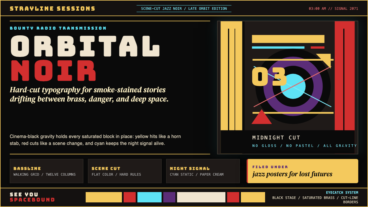 Cowboy Bebop Jazz-NoirCool at 3 AM. Bungee type, jazz yellow, red cuts, and cyan rules hit deep bla…凌晨三点的酷:黑底上 Bungee 字、爵士黄、红切线与青色规则。
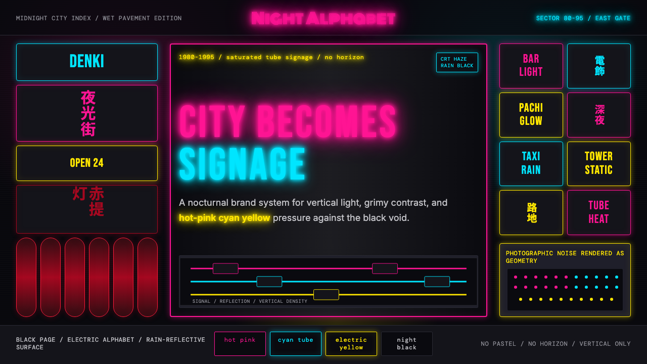 Tokyo Shinjuku Neon (1980)Night turns into alphabet. Hot pink, cyan, and yellow stack as glowing vertic…夜晚化作文字。热粉、青蓝、电黄垂直堆成霓虹峡谷。
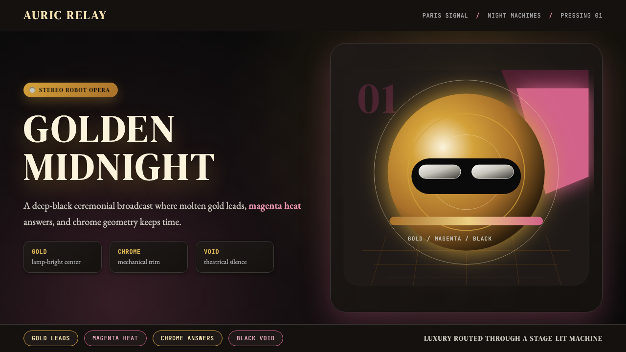 Daft Punk Discovery (Gold-Helmet)Warm sci-fi disco. Gold serif caps orbit a magenta void with chrome-disc geom…温热科幻迪斯科:金色衬线大字环绕品红虚空与铬色圆盘。
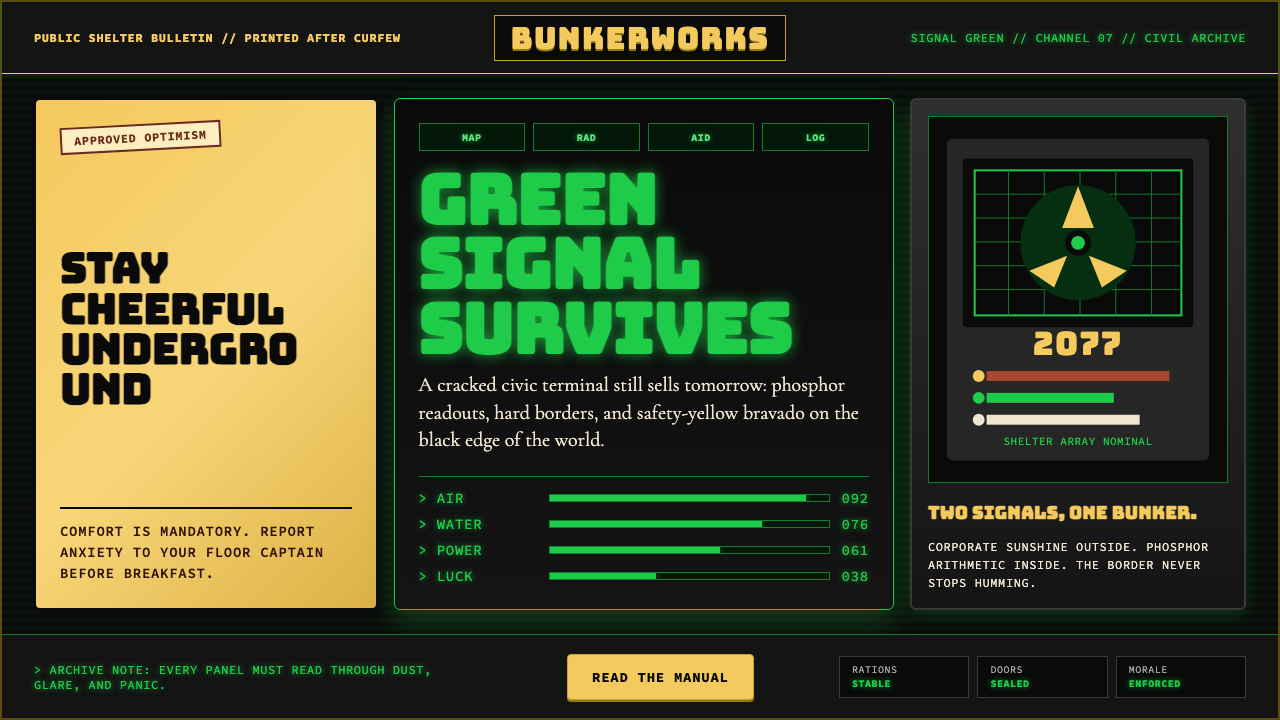 Fallout Vault-Tec Pip-BoyIrradiated optimism. Vault yellow and CRT green lock into a bordered bunker g…辐照乐观主义:避难所黄与CRT绿嵌入硬边地堡网格。
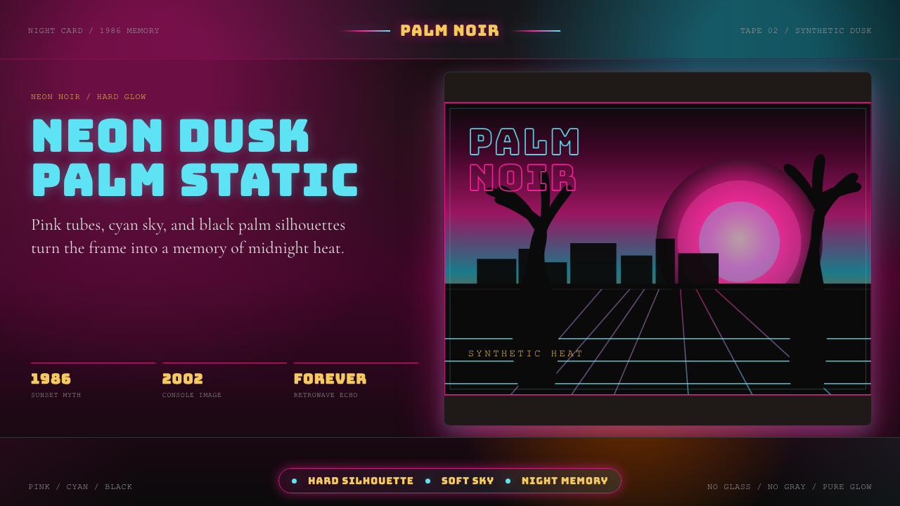 GTA Vice City (2002)Neon-noir nostalgia. Pink-cyan dusk, chunky type, and palm silhouettes.霓虹黑色怀旧。粉青黄昏、粗体字和棕榈剪影。
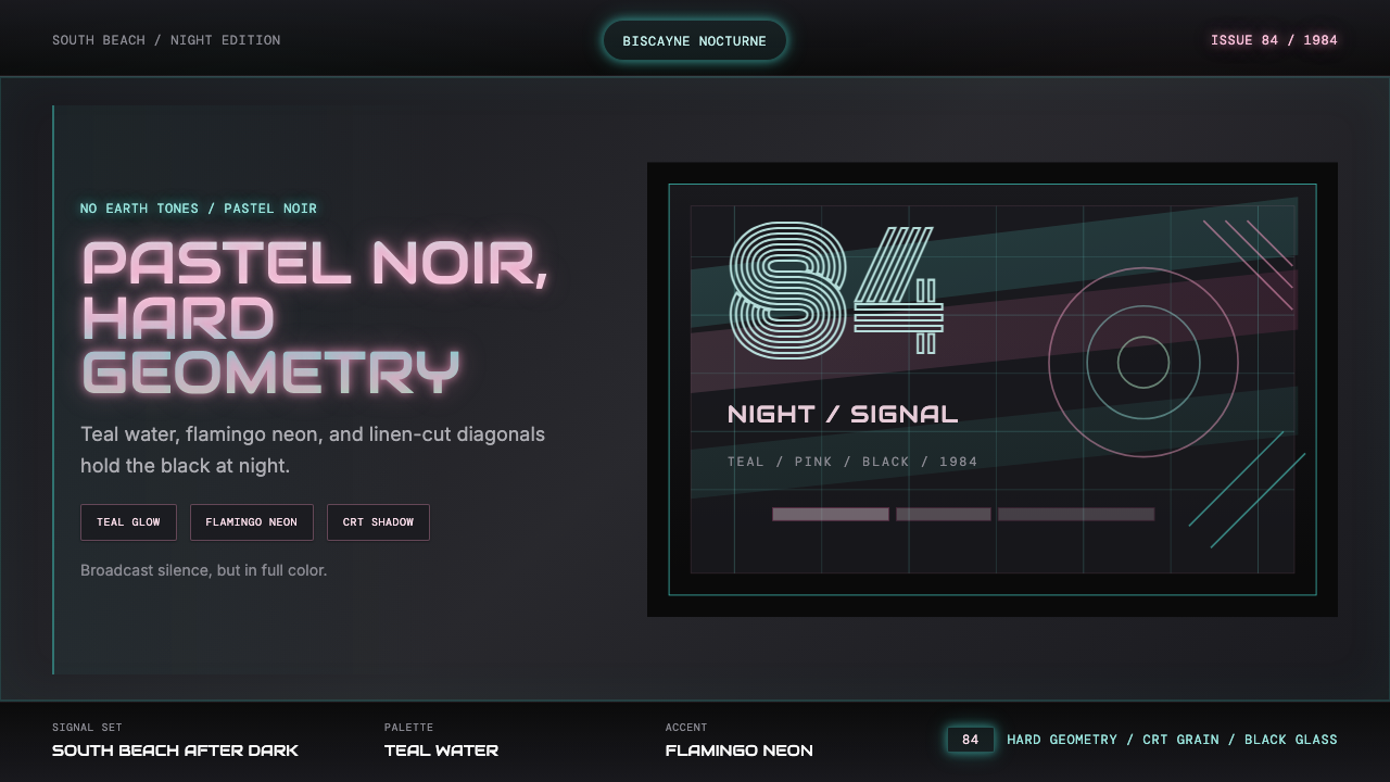 Miami Vice Pastel Teal (1984)Pastel noir, not nostalgia. Teal glow and flamingo pink slice black with geom…不是怀旧,是粉青霓虹。青光与火烈鸟粉切开黑底几何。