What is Soylent Green 1973?
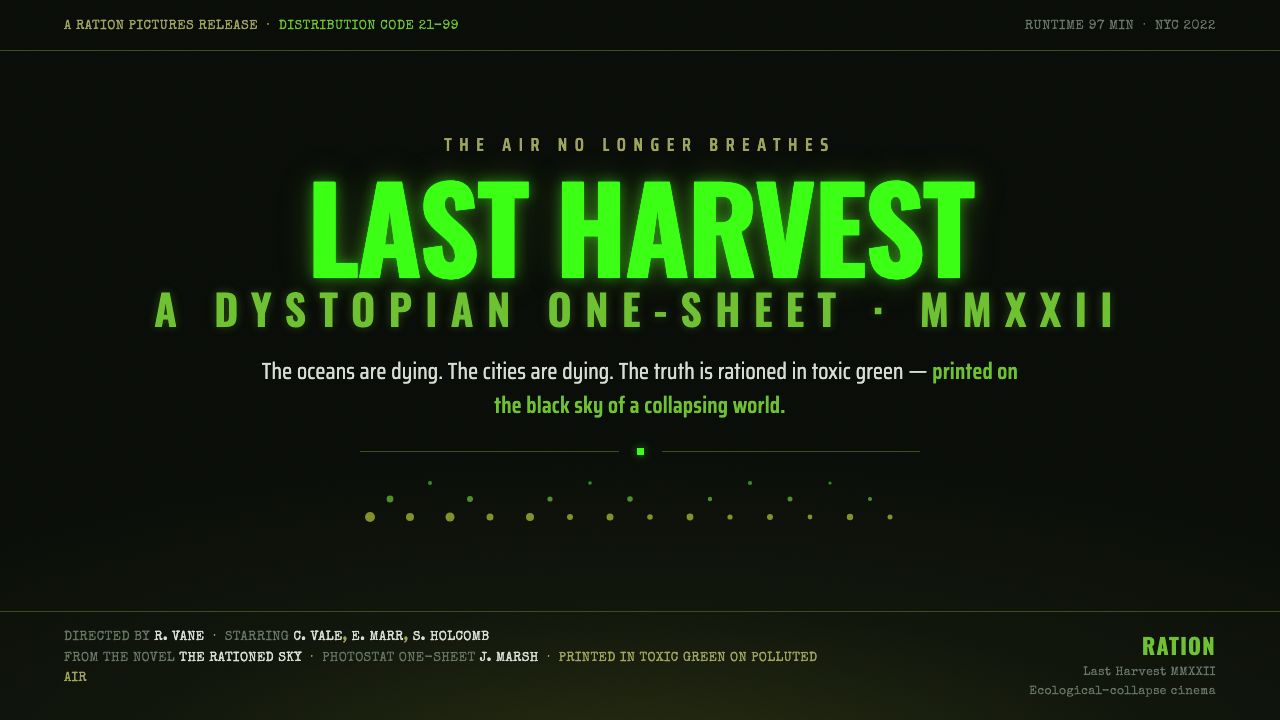
Soylent Green turns ecological collapse into a visual atmosphere: toxic green light struggling through smog, grain, and a world that has forgotten how to breathe.
Soylent Green 1973 in brief
Soylent Green 1973 is the grimy visual language of ecological-collapse cinema, rooted in the original John Solie one-sheet for the MGM theatrical release. Its world is not presented as clean science fiction or polished futurism. It is overheated, polluted, and airless: toxic ecological green presses against a smoggy near-black field, while condensed dystopian titles and degraded print texture make the image feel physically contaminated.
The system's emotional register is grim, foreboding, and suffocating. Green is not a reassuring sign of nature; it is sickly, chemical, and faintly luminous, as if the last trace of life has become a warning signal. Near-black does not function as empty space. It behaves like polluted air, swallowing detail and making every surviving mark feel urgent.
Digitally, the style translates the poster into a dark language of severe hierarchy and controlled deterioration. Headlines carry the strongest visual force, credits recede into a typewriter-like register, and film grain, photostat roughness, and halftone haze prevent the interface from feeling sterile. The result should look exposed to heat, smoke, and age rather than decorated with retro effects.
Where does Soylent Green 1973 come from?
The style is anchored in 1973, when Soylent Green received its MGM theatrical release and John Solie produced the original one-sheet. The source material places the work in North America, specifically the United States tradition of Hollywood dystopian science fiction. That setting matters because the design is built as a public warning image: immediate, theatrical, and legible from a distance, yet degraded enough to suggest that the world it depicts is already failing.
Its historical vocabulary belongs to several overlapping currents named in the source: 1970s dystopian sci-fi, ecological-collapse cinema, and photostat poster illustration. These currents converge in the contrast between a forceful title and a damaged atmosphere. The poster does not need elaborate scenery to establish its world. Pollution is communicated through tonal pressure, haze, and surface erosion, while the green title becomes the most persistent surviving signal.
The visual system's darkness is therefore not merely a contemporary preference for dark mode. It is part of the narrative premise embedded in the poster. The near-black sky suggests an environment that has become hostile, and the toxic green provides a narrow channel of visibility inside it. Grain and halftone haze preserve the physical history of printed reproduction, making the image feel found, circulated, and exposed rather than freshly generated.
The film's named historical constellation includes Richard Fleischer, Charlton Heston, John Solie, and Harry Harrison. For this design system, Solie is the clearest visual anchor because the one-sheet is the direct source of the language. Fleischer, Heston, and Harrison locate the style within the wider film and story world associated with Soylent Green, while the poster remains the decisive reference for its color, typography, atmosphere, and material degradation.
What defines the Soylent Green 1973 look?
Toxic Green
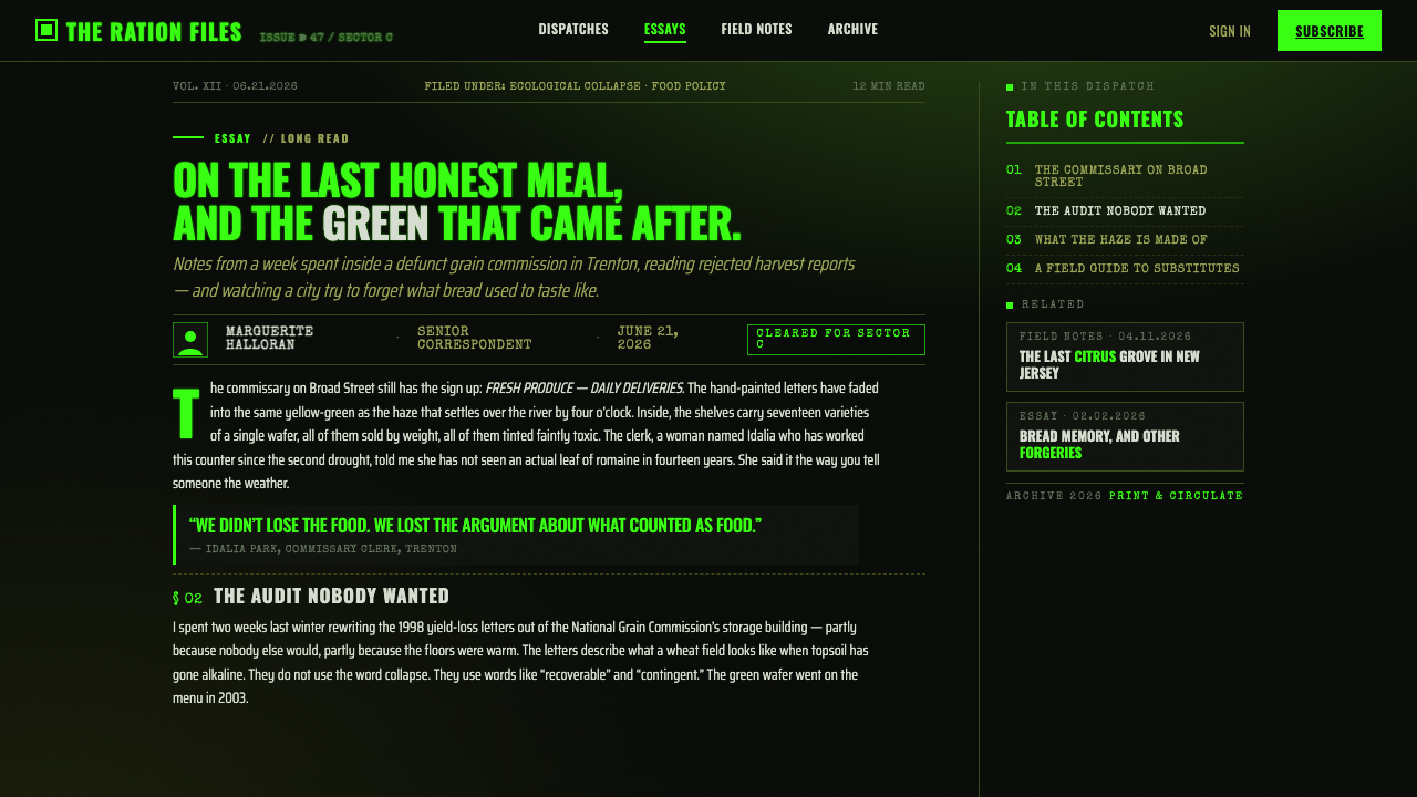
Green is the signature color, but it should feel sickly rather than pastoral. It glows against the near-black field like a chemical residue or a warning signal. Use it to carry the title, key states, or the most consequential information. Its power comes from scarcity and contrast; if every element becomes green, the color loses its ecological dread.
Smoggy Near-Black
The background should read as polluted atmosphere rather than absolute digital black. Near-black creates a dense field where detail is partially withheld, allowing the green title to appear illuminated without relying on polished neon effects. The darkness should feel heavy, overheated, and slightly unstable, with haze softening selected areas while leaving the main type severe.
Condensed Dystopian Type
Headlines use severe condensed sans-serif forms that occupy little width while retaining strong vertical pressure. The letters should feel engineered for a warning, a film title, or a public notice, not for friendly conversation. Tight spacing and tall silhouettes create urgency, while the supporting type can become smaller, quieter, and more documentary.
Typewriter Credits
Credits and secondary information speak in a typewriter-like voice. This register introduces a human and bureaucratic trace beneath the monumental title, as if the system were documenting a crisis after the fact. The texture should remain plain and mechanically legible, creating contrast with the compressed headline without becoming nostalgic office decoration.
Photostat Grain
Grain is structural atmosphere, not a texture pasted over finished work. Photostat roughness, film grain, and halftone haze should interrupt smooth fields and make edges feel reproduced rather than digitally perfect. The degradation must remain controlled: enough to imply heat, smoke, and age, but not so much that hierarchy or reading collapses.
Suffocating Hierarchy
Composition should feel compressed by its environment. The main title needs room to dominate, but surrounding information should appear pressed into the remaining air rather than generously spaced across a calm canvas. Strong contrast, narrow text blocks, haze, and abrupt shifts between visibility and obscurity create a hierarchy that feels like survival under pressure.

Who shaped Soylent Green 1973?
John Solie is the direct visual source for this system through the original Soylent Green one-sheet. His poster supplies the defining relationship between toxic green title lettering and polluted near-black atmosphere, as well as the degraded photostat, grain, and haze that make the image feel physically exposed.
Richard Fleischer is one of the key figures attached to the Soylent Green 1973 historical context. In this design language, his name helps situate the style within Hollywood dystopian science fiction rather than treating the poster as an isolated graphic experiment.
Charlton Heston belongs to the source material's central constellation of Soylent Green figures. His presence reinforces that this is a theatrical film identity, where title, atmosphere, and human stakes must register together in a single public-facing image.
Harry Harrison is named among the work's key figures and helps locate Soylent Green within a broader story tradition of dystopian science fiction. The design keeps that literary and cinematic weight concentrated in atmosphere rather than explanatory ornament.
How do you use Soylent Green 1973 today?
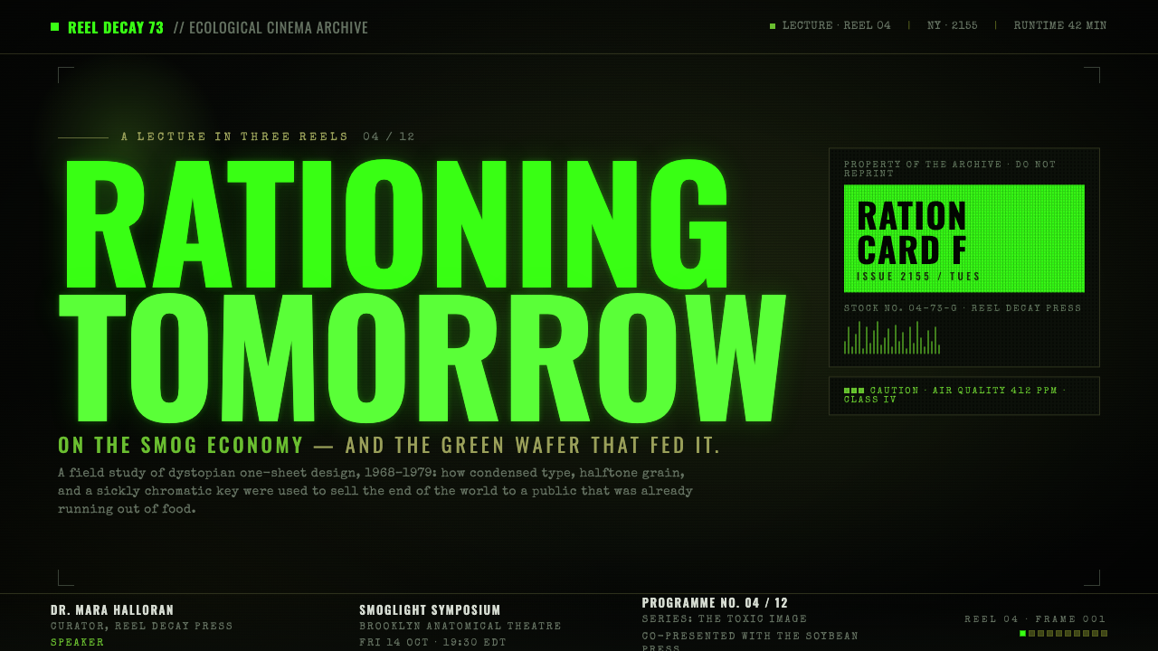
For presentation slides, use the cover as a theatrical warning surface: a near-black atmosphere, a dominant condensed title, and one toxic green signal that establishes the subject immediately. Content slides should preserve the same pressure through narrow text groupings, severe headings, and selective haze. Data slides can treat charts as evidence recovered from a damaged system, keeping labels plain and legible while allowing grain or halftone texture to remain in the surrounding field.
For web interfaces, the style suits dashboards that communicate environmental risk, infrastructure failure, crisis monitoring, or other consequential conditions. Keep the interface dark and reserve green for active states, warnings, or the most important metric. Cards should feel like readable instruments inside polluted air, not glossy product surfaces. A pricing page can use the same logic when the product wants to communicate severity, scarcity, or technical authority, but the green accent should distinguish decisions rather than decorate every tier.
For editorial and marketing work, Soylent Green supports covers, campaign pages, investigative features, and launch materials that need a foreboding cultural charge. Use a large title as the primary image, then let typewriter-like credits, small factual notes, and restrained imagery build a documentary voice beneath it. Marketing sections can alternate between dense near-black fields and damaged green signals, creating the feeling of a public notice transmitted through a failing environment.
The style also works for posters, title cards, cinematic landing pages, and visual identities built around ecological anxiety. Photostat grain and halftone haze should be integrated into the composition so that degradation affects the atmosphere and selected edges, not just the background. The strongest applications leave some information partially obscured while protecting the title, navigation, and calls to action from becoming illegible.
The common mistake is treating Soylent Green as a fashionable black-and-green palette or applying grain as a generic vintage filter. Clean neon green, spacious friendly typography, polished gradients, and evenly distributed texture all weaken the premise. Another mistake is making every element equally distressed. The system needs contrast between severe clarity and contaminated atmosphere: the message must survive, even when the world around it appears to be running out of air.
Soylent Green 1973 — FAQ
Is Soylent Green 1973 just a black-and-green color scheme?
No. The palette is only the most visible layer. The style depends on the relationship between toxic green, polluted near-black, condensed dystopian type, typewriter-like credits, photostat grain, and halftone haze. Remove the material degradation and typographic severity, and the result becomes generic dark branding rather than ecological-collapse cinema.
Why must the green feel toxic rather than natural?
Because the source image treats ecology as a warning, not as comfort. The green represents a sickly surviving signal inside polluted air, so it should feel chemical, strained, and slightly hostile. A fresh or calming green changes the emotional meaning and turns the system toward environmental optimism, which is not the mood established by the material.
Can this style be used for a light-background layout?
It can be adapted, but the dark atmospheric field is central to the identity. A light version would need to preserve the toxic green as a rare warning signal and retain the severe condensed title, documentary credits, and degraded print character. Without those elements, changing the background produces a different style rather than a convincing variant.
How should grain and haze be balanced with usability?
Treat degradation as an atmospheric layer with a clear hierarchy. Let grain disturb broad fields and selected edges, while keeping essential text and controls more stable. Haze can conceal secondary detail, but it should not erase navigation, labels, or the main message. The intended feeling is compromised visibility, not total illegibility.
What products are best suited to this design language?
It is strongest for cinematic identities, ecological campaigns, investigative editorial work, crisis dashboards, speculative interfaces, and marketing that needs dread or urgency. It is less suitable when a product depends on softness, playfulness, freshness, or reassuring warmth. The decision should follow the emotional truth of the product: use the style when pressure, pollution, and warning are part of the message.
Related design styles
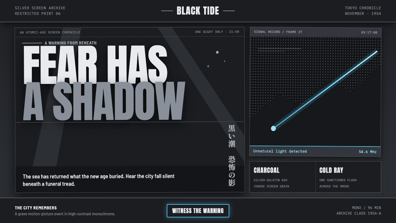 Godzilla (1954 Showa)Fear takes monumental form. Charcoal halftones split under one atomic-blue ra…
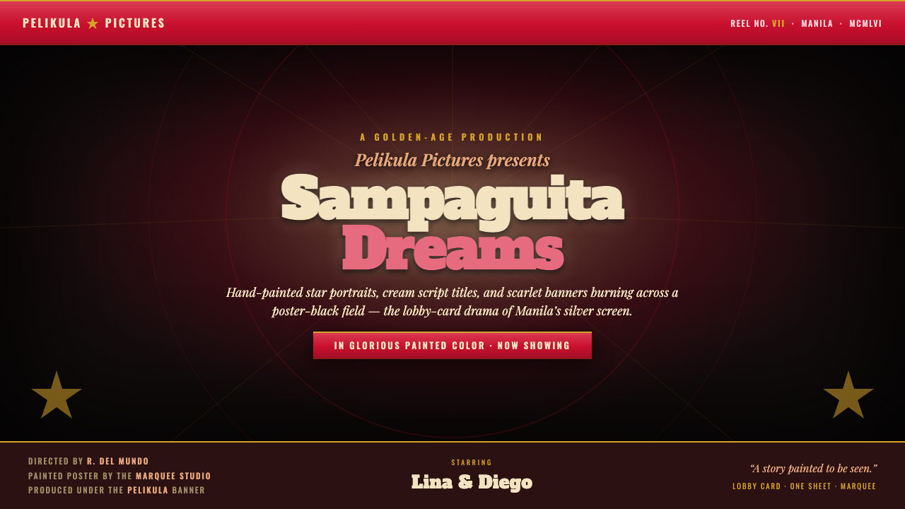 Manila LVN Film PosterLobby-card drama for the screen. Cream slab title on poster-black, scarlet ba…
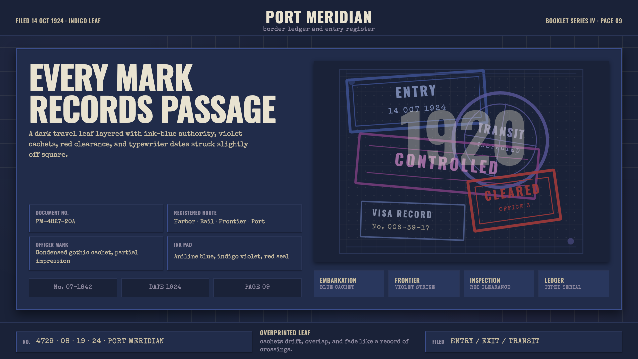 Vintage Passport StampsInk remembers passage. Indigo leaf, blue-violet cachets, red seal, typewriter…
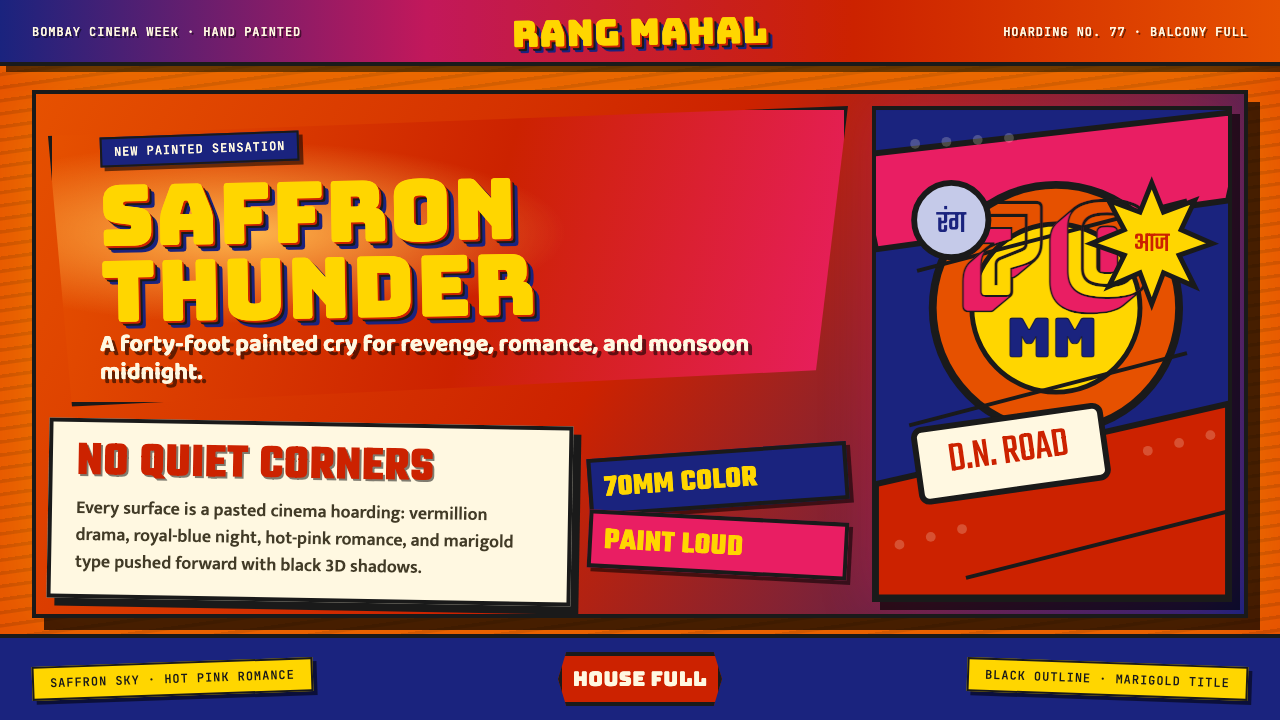 Bollywood Poster Art (1970s)Subtlety is unaffordable. Saffron fields, Bungee shadows, diagonal hoarding d…
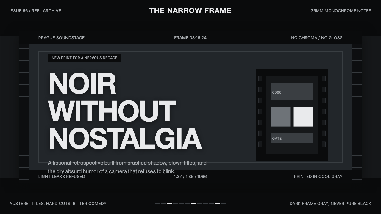 Czechoslovak New Wave CinemaNoir without nostalgia. Letterbox bars, off-white titling, and 35mm grain do…
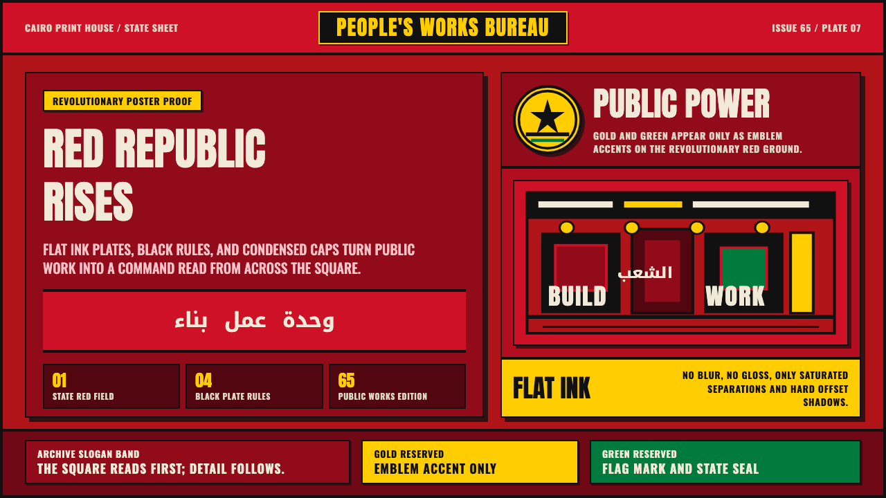 Egyptian Political PosterState power shouts. Red poster grids, black keylines, kufic type, gold-green…