Design style guide设计风格指南
What is Rwandan Imigongo Cow-Dung Relief?什么是 Rwandan Imigongo Cow-Dung Relief?
Imigongo transforms humble cow dung and ash into a bold three-color geometry that has decorated Rwandan walls for three centuries — and now brings that same hard-shadow relief language to digital surfaces.伊米贡戈将牛粪与草木灰化为三色几何浮雕,三百年间装点着卢旺达的墙壁,如今这套硬影浮雕语言同样照亮了数字界面。
Rwandan Imigongo Cow-Dung Relief in briefRwandan Imigongo Cow-Dung Relief 速览
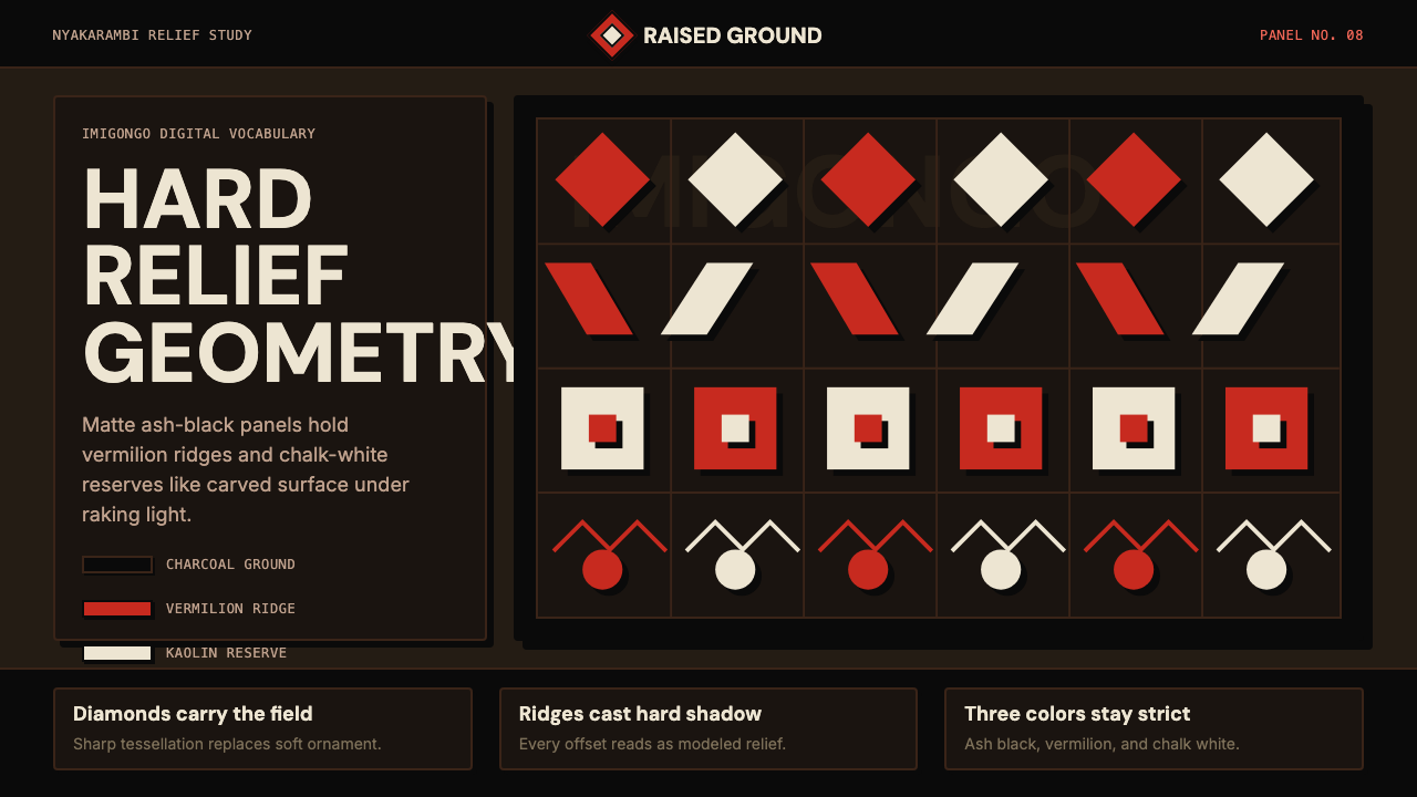
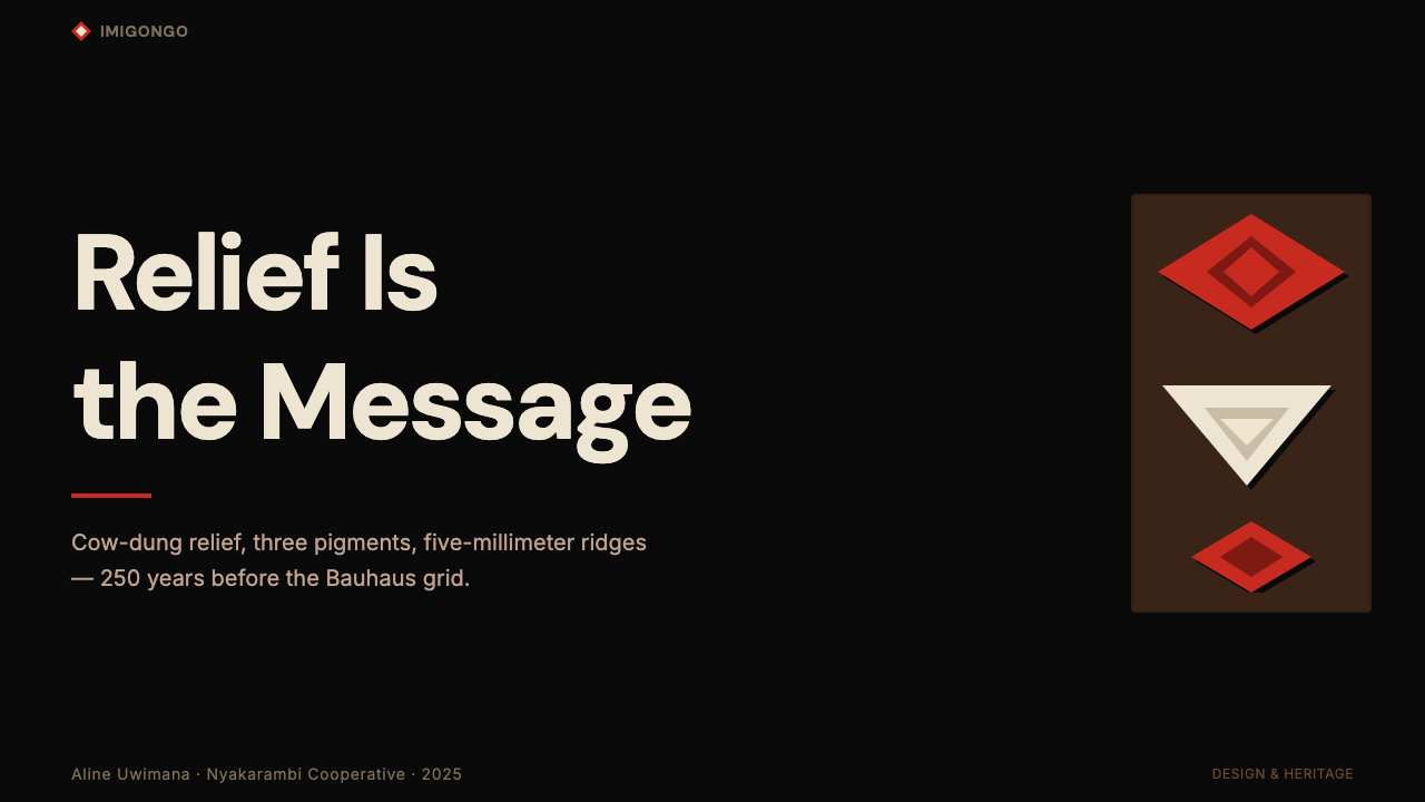
Imigongo is a Rwandan geometric relief art form built from cow dung mixed with volcanic ash, pressed and modeled into raised ridges on wooden panels, then painted in a strict three-color palette of black, deep red, and chalk white. The interplay of raised ridges and recessed fields under raking light produces hard, precise shadows that are inseparable from the visual identity of the style — depth is not an illusion here, it is a physical fact built into the substrate.伊米贡戈是卢旺达独特的几何浮雕艺术,以牛粪混合火山灰为材,在木板上塑出凸起脊线,再以黑色、深红与白垩白三色涂绘。斜射光线下,凸脊与凹槽之间投出硬朗而精准的阴影,这种光影本不是视错觉,而是材质本身的物理事实——深度被烧进了基底之中。
The visual vocabulary is built entirely from interlocking geometric motifs: diamonds, chevrons, stepped spirals, and concentric bands. There is no figurative imagery, no gradation, no decorative flourish outside the geometry itself. Each panel is a tight tessellation where positive and negative space trade roles continuously across the surface, creating an optical rhythm that reads as both static pattern and implied movement.其视觉词汇完全由互锁几何母题构成:菱形、人字纹、阶梯螺旋与同心条带。没有具象图像,没有渐变,几何形之外没有任何装饰花饰。每块面板都是紧密的密铺,正形与负形在整个表面上持续交换角色,产生一种既是静态图案又暗示着运动的视觉节奏。
As a digital design system, Imigongo translates this analog relief language into a vocabulary of matte dark grounds, hard-offset shadows, vermilion accent ridges, and chalk-white reserves. The three-color discipline is absolute: the palette does not expand, the forms do not soften, and depth is created through offset shadow rather than gradient or blur. The result is a surface that feels weighty and tactile even on a flat screen.作为数字设计系统,伊米贡戈将这种手工浮雕语言转化为哑光深底色、硬边偏移投影、朱红脊线与白垩留白的数字词汇。三色铁律从不松动:色板不扩张,形态不柔化,深度由偏移投影而非渐变或模糊来构建。最终呈现在平面屏幕上的,是一个令人感受到重量与触感的视觉表面。
See the Rwandan Imigongo Cow-Dung Relief design system →查看 Rwandan Imigongo Cow-Dung Relief 完整设计系统 →
Where does Rwandan Imigongo Cow-Dung Relief come from?Rwandan Imigongo Cow-Dung Relief 从何而来?
The tradition of Imigongo is credited to Prince Kakira of the Gisaka kingdom, in what is now the Eastern Province of Rwanda, dating to approximately the mid-eighteenth century. Historical accounts describe Kakira decorating the interior walls of royal residences with geometric relief panels made from the most readily available building material in a cattle-herding society: cow dung. Mixed with ash and dried grass, the paste hardened into a durable surface that could be painted and repainted across generations. The practice spread from royal patronage into the domestic sphere, where it became associated particularly with the decoration of newlywed couples' homes.伊米贡戈的传统源于吉萨卡王国的卡基拉王子,吉萨卡位于今卢旺达东部省,创始时间约在十八世纪中叶。历史记载描述卡基拉用当时畜牧社会最容易获得的建筑材料——牛粪——装饰王室居所的内墙,将其塑成几何浮雕面板。牛粪与草木灰、干草混合后,能硬化成经久耐用的表面,可跨世代反复涂绘。这一技艺从宫廷赞助流传至民间,逐渐与新婚居所的装饰礼仪紧密相连。
For over two centuries, the art was sustained almost exclusively by women artisans in the village of Nyakarambi, in the Kirehe district of what is now Eastern Province. The craft was transmitted through female lineages — mothers teaching daughters the proportional systems, the interlocking logic of the motifs, and the discipline of working within the three-color constraint. Each panel required collective effort: one artisan might model the raised ridges while another mixed and applied the pigments, which were derived from natural materials — charred wood for black, iron-oxide-rich clay for red, kaolin for white.两百余年间,这门艺术几乎完全由尼亚卡兰比村(今东部省基雷赫区)的女性匠人守护传承。技艺经由女性血脉代代相传——母亲向女儿传授比例体系、母题的互锁逻辑,以及在三色约束之内工作的纪律。每块面板都需要集体协作:一位匠人负责塑造凸起脊线,另一位混合并涂抹颜料。这些颜料均来自天然材料——炭化木材提供黑色,富含铁氧化物的黏土提供红色,高岭土提供白色。
The genocide of 1994 devastated the communities in which Imigongo had been practiced. In the aftermath, women's cooperatives became one of the central mechanisms of reconciliation and economic reconstruction. The Kakira Imigongo Cooperative in Nyakarambi, named in honor of the tradition's founding prince, brought together survivors from across divided communities and resumed production specifically as an act of cultural recovery. International attention — including that of ethnographers like Margaret Trowell, who had documented the tradition in the mid-twentieth century — helped position Imigongo as a recognized heritage craft rather than a local curiosity.1994年的种族灭绝重创了伊米贡戈的传承社区。此后,女性合作社成为和解与经济重建的核心机制之一。尼亚卡兰比的卡基拉伊米贡戈合作社以传统奠基王子命名,将来自对立社区的幸存者凝聚在一起,将重启生产本身作为文化复原的行动。民族志学者如玛格丽特·特罗韦尔在二十世纪中叶记录了这一传统,这些文献帮助伊米贡戈被定位为公认的文化遗产工艺,而非地方性的奇珍异物。
Post-1994 revival also brought formal institutional recognition. Imigongo panels began appearing in Rwandan government buildings, hotels, and international exhibitions. The cooperative model professionalized production while preserving the traditional motif vocabulary and three-color discipline. Today, Nyakarambi remains the primary center of authentic production, and the cooperative's work is considered the canonical reference for the style's geometric logic and material standards. The translation of Imigongo into a digital design vocabulary is a direct extension of this ongoing revival — an attempt to honor the visual intelligence of the tradition by giving it a contemporary surface to inhabit.1994年后的复兴也带来了正式的制度认可。伊米贡戈面板开始出现在卢旺达政府建筑、酒店与国际展览中。合作社模式在保留传统母题词汇与三色纪律的同时,使生产走向专业化。时至今日,尼亚卡兰比仍是正宗生产的主要中心,合作社的作品被视为这一风格几何逻辑与材料标准的权威参照。将伊米贡戈转化为数字设计词汇,是这场持续复兴的直接延伸——一种让传统视觉智慧在当代表面上安家落户的尝试。
What defines the Rwandan Imigongo Cow-Dung Relief look?Rwandan Imigongo Cow-Dung Relief 的视觉特征是什么?
Palette色板
The palette is confined to three colors: an ash-black ground derived from charred wood and volcanic ash, a vermilion-to-deep-red accent color from iron-rich clay, and a chalk or kaolin white for reserve areas. No fourth color is permitted, no tints or tones, no warm-cool variation within a single hue. The black is not neutral — it carries the warmth of burnt organic material. The red is not decorative — it marks the raised ridge, the structural emphasis. The white is not background — it is an active shape with the same geometric weight as the black and red.色板严格限定在三色之内:炭木与火山灰提炼的灰黑底色、富铁黏土带来的朱红至深红强调色,以及用作留白区域的白垩或高岭土白。不允许第四种色彩,无色调深浅变化,单一色相内也无冷暖分化。黑色并非中性——它携带着有机物燃烧后的暖意。红色并非装饰——它标记凸起的脊线,是结构性的强调。白色并非背景——它是一个主动的形状,与黑色和红色具有同等的几何重量。
Relief and Shadow浮雕与投影
The defining characteristic of Imigongo is its physical relief — ridges raised above the panel surface, casting hard, directional shadows under raking light. In the digital system, this physicality is translated into hard-offset shadows that are flat, opaque, and consistent in direction: no blur, no spread, no ambient glow. The shadow is a geometric shape, not a lighting effect. Depth reads immediately and unambiguously; there is no softness, no atmosphere.伊米贡戈最决定性的特征是其物理浮雕——凸起于面板表面的脊线,在斜射光下投出方向明确的硬朗阴影。在数字系统中,这种实体感被转化为平面、不透明、方向一致的硬边偏移投影:无模糊,无扩散,无环境光晕。投影是一个几何形状,而非光照效果。深度感立即且明确地呈现,没有任何柔和感与氛围感。
Geometric Motifs几何母题
The vocabulary consists of interlocking diamonds, stepped chevrons, concentric bands, and squared spirals. These forms are not decorative in origin — each motif type carries a conventional meaning within Rwandan visual culture, encoding ideas about abundance, protection, and community structure. In the design system, the motifs function as both pattern elements and structural dividers: a diamond grid can serve as a background texture, a chevron band as a section separator, a spiral as a focal-point ornament on a hero panel.词汇由互锁菱形、阶梯人字纹、同心条带与方形螺旋构成。这些形态的起源并非纯粹装饰——在卢旺达视觉文化中,每种母题都承载着约定俗成的含义,编码着有关丰足、庇护与社群结构的观念。在设计系统中,这些母题既是图案元素,也是结构性分隔符:菱形网格可用作背景纹理,人字纹带可用作章节分隔,螺旋可用作英雄面板上的焦点装饰。
Tessellation Logic密铺逻辑
Every Imigongo panel is a complete tessellation — no motif begins or ends at an edge without resolution. The geometric logic is self-closing: the positive shape of one motif creates the negative shape of its neighbor, and the two trade roles continuously across the surface. In digital application, this means layouts have no orphaned elements; every component is part of a larger repeating system, and the grid is never broken by an element that floats free of it.每块伊米贡戈面板都是完整的密铺——没有任何母题在边缘无解地开始或结束。几何逻辑是自闭合的:一个母题的正形创造出相邻母题的负形,两者在整个表面上持续交换角色。在数字应用中,这意味着版面没有孤立元素;每个组件都是更大重复系统的一部分,网格从不被任何自由漂浮的元素打破。
Matte Surface哑光表面
The original medium — dried cow dung and ash — produces a surface that is completely matte, with no reflective quality whatsoever. This material fact translates into a digital constraint: no glass effects, no gloss overlays, no specular highlights, no reflections. Backgrounds are flat opaque fills; interactive states are indicated through hard-shadow shifts or color swap rather than luminance change. The matte discipline gives the system a quality of weight that gloss would immediately undermine.原始媒介——干燥的牛粪与草木灰——产生出完全哑光的表面,毫无任何反光品质。这一材质事实转化为数字约束:无玻璃态效果,无光泽叠加,无高光反射,无镜面反射。背景是平面不透明填充;交互状态通过硬边投影偏移或颜色置换来指示,而非通过亮度变化。这种哑光纪律赋予系统一种光泽感会立即破坏的沉甸甸的品质。
Bilateral Symmetry Within Panels面板内的双轴对称
Individual Imigongo panels are typically organized around one or two axes of symmetry, creating a balanced, contained composition within each unit. At the macro level — when panels are arranged side by side on a wall — the symmetry gives way to a larger additive rhythm. In digital application, this suggests a design approach where individual cards or sections are internally balanced, but the overall page layout can be asymmetric, building visual complexity through the accumulation of ordered units rather than through compositional tension.单块伊米贡戈面板通常围绕一轴或两轴对称组织,在每个单元内形成平衡而自足的构图。在宏观层面——当多块面板并排陈列于墙壁时——对称让位于更大的累加节奏。在数字应用中,这暗示一种设计思路:单张卡片或单个区块在内部保持平衡,而整体页面版面可以是非对称的,通过有序单元的累积来构建视觉复杂性,而非依赖构图张力。
No Gradient, No Blur无渐变,无模糊
Imigongo knows no gradients and no soft transitions. The shift from black to red to white is always a hard edge, a physical ridge, a boundary with no ambiguity. The digital system enforces the same rule: all fills are solid, all shadows are offset hard rectangles or shapes rather than blurred glows, all borders are defined rather than faded. This restraint produces a visual system that is uncompromising in its clarity — every element knows exactly where it ends.伊米贡戈不知道渐变为何物,也没有柔和过渡。从黑到红到白的转换永远是一条硬边、一道物理脊线、一个毫无歧义的边界。数字系统强制执行同样的规则:所有填充均为实心,所有阴影均为偏移的硬边矩形或形状而非模糊光晕,所有边界均是清晰而非渐淡的。这种克制产生了一个在清晰度上毫不妥协的视觉系统——每个元素都精确地知道自己在哪里结束。
See the Rwandan Imigongo Cow-Dung Relief design system →查看 Rwandan Imigongo Cow-Dung Relief 完整设计系统 →
Who shaped Rwandan Imigongo Cow-Dung Relief?谁塑造了 Rwandan Imigongo Cow-Dung Relief?
The eighteenth-century Rwandan prince credited with originating Imigongo as a form of interior wall decoration in the royal residences of the Gisaka kingdom. Historical tradition attributes to him the decisive act of elevating cow dung from a construction material to a vehicle for geometric art — combining it with ash to produce a workable paste and establishing the three-color discipline that has defined the form ever since. The Kakira Imigongo Cooperative in Nyakarambi takes its name directly from him, positioning the post-1994 revival as a continuation of a specifically royal and named cultural lineage.十八世纪卢旺达王子,被认为是伊米贡戈的创始人,他将这一几何浮雕艺术引入吉萨卡王国的王室居所内壁装饰。传统将一个决定性的行为归功于他:将牛粪从建筑材料提升为几何艺术的载体——与草木灰混合制成可塑膏体,并确立了此后一直定义这一艺术形式的三色纪律。尼亚卡兰比的卡基拉伊米贡戈合作社直接以其命名,将1994年后的复兴定位为一脉相承于特定王室谱系的文化延续。
A British art historian and ethnographer who documented traditional African art forms across East and Central Africa in the mid-twentieth century. Trowell's fieldwork brought systematic scholarly attention to Imigongo at a time when its practice was largely confined to Nyakarambi and unknown outside Rwanda. Her documentation of the motif vocabulary, production techniques, and community context provided the archival foundation that later enabled the cooperative revival movement to position Imigongo as internationally recognized heritage rather than a regional folk practice.二十世纪中叶活跃的英国艺术史学家与民族志学者,系统记录了东非和中非的传统艺术形式。特罗韦尔的田野调查在伊米贡戈实践主要局限于尼亚卡兰比、在卢旺达以外几乎无人知晓的时代,将系统性的学术关注带向这一艺术。她对母题词汇、生产技法与社群语境的记录提供了档案基础,使后来的合作社复兴运动得以将伊米贡戈定位为国际公认的文化遗产,而非地区性民间技艺。
The women's collective based in Nyakarambi, Eastern Province, founded after the 1994 genocide as a vehicle for community reconciliation and economic recovery. The cooperative brought together survivors from communities that had been on opposite sides of the violence, using shared craft production as a mechanism for rebuilding social trust. It professionalized Imigongo production — standardizing panel dimensions, preserving the canonical motif vocabulary, and establishing quality standards for export — while ensuring that the social and intergenerational transmission of the craft continued. The cooperative remains the primary living authority on authentic Imigongo practice.位于东部省尼亚卡兰比的女性集体,1994年种族灭绝后创立,作为社区和解与经济复原的载体。合作社将曾处于对立阵营的幸存者凝聚在一起,以共同的工艺生产作为重建社会信任的机制。它使伊米贡戈生产走向专业化——规范面板尺寸,保护经典母题词汇,建立出口质量标准——同时确保这门工艺的社会传承与代际传递得以延续。合作社至今仍是真实伊米贡戈实践的主要活态权威。
A contemporary Rwandan artist and practitioner associated with the revival of Imigongo in the post-genocide period, and a key figure in connecting traditional production techniques with contemporary art contexts. His work helped establish that the formal vocabulary of Imigongo — the hard-edged geometry, the three-color discipline, the relief structure — was not a museum artifact but a living visual language capable of engaging with modern design and fine art practice. His contributions support the ongoing legitimacy of Imigongo's extension into digital and graphic design systems.与种族灭绝后伊米贡戈复兴相关的当代卢旺达艺术家与从业者,是将传统生产技法与当代艺术语境连接起来的关键人物。他的作品有助于确立这一认识:伊米贡戈的形式词汇——硬边几何、三色纪律、浮雕结构——并非博物馆遗物,而是能够与现代设计和纯艺术实践对话的活态视觉语言。他的贡献为伊米贡戈向数字与平面设计系统延伸的持续合法性提供了支撑。
How do you use Rwandan Imigongo Cow-Dung Relief today?今天怎么用 Rwandan Imigongo Cow-Dung Relief?
Imigongo is a high-contrast, high-conviction style — it does not accommodate ambiguity or half-measures. The three-color constraint and the hard-shadow logic mean that every element on a surface must earn its place within that system. This makes Imigongo particularly effective for contexts where visual authority and cultural distinctiveness are priorities: editorial covers, brand identity systems for cultural institutions, and digital surfaces that need to feel both bold and grounded.伊米贡戈是一种高对比度、高确信度的风格——它不容许歧义或半途而废。三色约束与硬影逻辑意味着表面上的每个元素都必须在这套系统内证明自身的存在价值。这使伊米贡戈在视觉权威性与文化独特性是优先考量的语境中尤为有效:编辑封面、文化机构的品牌识别系统,以及需要兼具大胆感与扎实感的数字表面。
For presentation slides, Imigongo works powerfully on cover and divider pages. A cover built on an ash-black ground with a full-width chevron or diamond band in the upper or lower register, a vermilion rule dividing content zones, and a title set in a heavy geometric face in chalk white creates immediate impact without clutter. Content slides should restrain the palette to two colors — black ground, white text — reserving the vermilion exclusively for key data points, highlighted figures, or section markers. Data slides take on the quality of the relief panels themselves: bar charts become stacked horizontal forms with hard black offset shadows; pie charts become segmented disc shapes with no rounded softening at the cuts.在演示文稿中,伊米贡戈在封面页与分隔页上最为有力。在炭黑底色上,上部或下部饰以全宽人字纹或菱形带,朱红直线划分内容区域,标题以白垩白的重磅几何字体排布——这样的封面能产生即时的视觉冲击,却不显繁杂。内容页应将色板收窄至两色——黑底白字——将朱红专用于关键数据点、重点数字或章节标记。数据页本身呈现出浮雕面板的品质:柱状图变成带有硬边黑色偏移投影的叠放水平形块;饼图变成切割处不做圆角软化的分段圆盘形。
For web interfaces, Imigongo is most at home in hero sections, landing page panels, and marketing surfaces that call for visual boldness. A hero built on an ash-black ground with a geometric pattern band — a repeating chevron or diamond in a slightly lighter matte black — provides textural depth without color noise. Vermilion is used sparingly: primary call-to-action buttons, active navigation states, and price-tier highlights. Card components should use hard-offset box shadows rather than diffuse drop shadows; borders, if present, are solid and single-weight rather than hairlines. The style is less suited to dense text-heavy interfaces — its visual weight can overwhelm long-form reading environments.在网页界面中,伊米贡戈最适合英雄区域、落地页面板以及需要视觉大胆感的营销表面。以炭黑底色为基础的英雄区,叠以略浅哑光黑色的重复人字纹或菱形图案带,提供纹理深度而不产生色彩噪音。朱红使用要克制:主要行动召唤按钮、激活导航状态与价格层级高亮。卡片组件应使用硬边偏移盒形投影而非漫射式投影;如有边框,应为实心单一粗细而非细线。这种风格不太适合密集文字型界面——其视觉重量可能压迫长文阅读环境。
For editorial and marketing applications, Imigongo's relief logic translates directly into print and poster contexts. Full-bleed panels alternating between ash-black with white type and chalk-white with black type create a strong rhythm across a multi-page document. Pull quotes can be framed in vermilion rule borders — solid, single-weight — rather than decorative ornaments. Marketing materials for cultural events, museums, or social-enterprise brands benefit particularly from the style's combination of visual forcefulness and narrative depth: the geometric vocabulary signals order and intelligence without the cold rationalism of purely Swiss or Bauhaus approaches.在编辑与营销应用中,伊米贡戈的浮雕逻辑可直接转化为印刷与海报语境。在多页文档中,炭黑底白字与白垩底黑字的满版面板交替出现,形成强烈节奏。引用语可用实心单一粗细的朱红边框而非装饰性花饰来标记。文化活动、博物馆或社会企业品牌的营销材料从这种风格的视觉力量与叙事深度组合中获益尤多:几何词汇传递秩序感与智识感,却不像纯粹的瑞士风格或包豪斯那样显得冷漠理性。
A common mistake when applying Imigongo is using the three-color palette at full saturation simultaneously across a surface. In the original craft, the three colors are never visually equal — black always dominates as ground, white opens relief areas, and red appears as accent on the raised ridges. The digital application should maintain this hierarchy: black should occupy the largest share of any composition, white the second, and vermilion the least. When vermilion is over-used, the surface becomes visually chaotic and loses the taut clarity that makes the style effective. Similarly, softening the shadows — adding blur or reducing opacity — collapses the relief logic that is the style's defining characteristic.应用伊米贡戈时最常见的错误,是在整个表面上同时以满饱和度使用三色。在原始工艺中,三种颜色从不处于视觉上的平等地位——黑色始终作为底色主导,白色开辟留白区域,红色仅作为凸起脊线上的点缀出现。数字应用应维持这一层级:黑色应占据任何构图的最大面积,白色其次,朱红最少。朱红过度使用时,表面在视觉上会变得混乱,丧失使这种风格奏效的那种紧绷清晰感。同样,柔化投影——添加模糊或降低不透明度——会瓦解浮雕逻辑,而浮雕逻辑正是这种风格的决定性特征。
See the Rwandan Imigongo Cow-Dung Relief design system →查看 Rwandan Imigongo Cow-Dung Relief 完整设计系统 →
Rwandan Imigongo Cow-Dung Relief — FAQRwandan Imigongo Cow-Dung Relief · 常见问题
Is Imigongo only suitable for dark-background designs?伊米贡戈只适合深色背景设计吗?
The canonical Imigongo palette is dark-ground: ash-black backgrounds with white and red working against them. A light inversion — chalk-white ground with black and vermilion — is possible and produces a very different reading: cooler, more graphic, less physically weighty. The inversion works when the three-color discipline and hard-shadow logic are preserved exactly. What breaks the system is not the choice of dominant ground color, but any softening of the edges or introduction of a fourth color. A light-ground Imigongo-derived system reads more like a printed woodblock than a relief panel, which may suit editorial or packaging contexts where maximum legibility matters more than textural weight.典范的伊米贡戈色板是深底色:炭黑背景,白色与红色在其上起伏。浅色翻转——白垩底色配黑色与朱红——是可行的,产生出截然不同的阅读感:更冷静、更平面化、在物理感上更轻盈。只要三色纪律与硬边投影逻辑得以完整保留,这种翻转就能奏效。破坏系统的不是主导底色的选择,而是任何对边缘的柔化或第四种颜色的引入。浅底色的伊米贡戈衍生系统读起来更像印刷版画而非浮雕面板,这可能更适合最高可读性比纹理重量更重要的编辑或包装语境。
How strictly must the three-color rule be followed in a digital product?在数字产品中,三色规则需要被多严格地遵守?
The three-color discipline is the core structural principle of Imigongo, not an aesthetic preference. Introducing a fourth color — even a neutral gray, even a lighter tint of one of the three — immediately dilutes the visual logic and moves the system toward generic dark-mode design rather than Imigongo. Within the three colors, however, there is more latitude than the constraint might suggest: the black can range from near-charcoal to near-neutral, the white can carry a slight warm or cool cast, and the red can shift from vermilion toward rust or deep carmine depending on the surface being served. The discipline is about maintaining the number of distinct color identities, not about locking each to a single precise value.三色纪律是伊米贡戈的核心结构原则,而非美学偏好。引入第四种颜色——哪怕是中性灰,哪怕是三色之一的浅色调——会立即稀释视觉逻辑,将系统推向通用深色模式设计,而非伊米贡戈。然而在三色内部,可操作的余地比这一约束所暗示的更大:黑色可以从接近炭色到接近中性色的范围内变化,白色可以带有轻微的暖调或冷调,红色可以根据所服务的表面在朱红、锈红与深胭脂红之间偏移。这一纪律是关于维持三个不同色彩身份的数量,而非将每种颜色锁定在单一精确值上。
What is the relationship between Imigongo and other African geometric traditions?伊米贡戈与其他非洲几何传统有何关联?
Imigongo belongs to a broad family of Great Lakes African geometric visual traditions that include Kuba textiles from the Democratic Republic of Congo, Ethiopian cross-pattern embroidery, and East African kanga and kitenge printed cloths. What distinguishes Imigongo within this family is its three-color constraint, its relief medium, and its exclusive association with a single geographic and cultural community. The interlocking diamond and chevron motifs are shared with other traditions, but the specific combination of material, color limitation, and relief structure is unique to the Rwandan context. Designers applying Imigongo should be careful not to conflate it with other African geometric traditions — the motif vocabulary looks superficially similar, but the principles governing its use are specific.伊米贡戈属于大湖区非洲几何视觉传统的广泛家族,这个家族还包括刚果民主共和国的库巴纺织品、埃塞俄比亚十字图案刺绣,以及东非的坎加和基滕格印花布。在这个家族内,使伊米贡戈独特的,是其三色约束、浮雕媒介,以及它与单一地理和文化社群的专属关联。互锁菱形与人字纹母题与其他传统共享,但材料、色彩限制与浮雕结构的特定组合在卢旺达语境中是独一无二的。应用伊米贡戈的设计师应注意不要将其与其他非洲几何传统混为一谈——母题词汇表面上看起来相似,但支配其使用的原则是特定的。
How does the style handle typography?这种风格如何处理文字排印?
Imigongo has no indigenous typographic tradition — it is a pre-typographic visual language. When text is introduced into an Imigongo-derived design system, the guiding principles are the same as those governing the geometry: hard edges, high contrast, no ornamentation. A heavy geometric sans-serif in chalk white on black, or in black on white, aligns naturally with the motif vocabulary. Condensed or extended letterforms can echo the proportions of the chevron and diamond shapes. Script typefaces and humanist sans-serifs introduce a warmth and fluidity that works against the system's material logic. Avoid any typeface that relies on optical illusions, ink traps, or calligraphic stroke variation — the type should read as cut, not drawn.伊米贡戈没有本土的文字排印传统——它是一种前印刷时代的视觉语言。当文字引入伊米贡戈衍生的设计系统时,指导原则与支配几何形态的原则相同:硬边、高对比、无装饰。黑底白垩白的重磅几何无衬线字体,或白底黑色的同类字体,与母题词汇自然对齐。窄体或宽体字形可以呼应人字纹与菱形的比例关系。手写体与人文主义无衬线字体带来一种与这套系统的材质逻辑相悖的温暖感与流动感。应避免任何依赖视错觉、墨陷或书法笔触变化的字体——文字应读起来像被刻制的,而非被描绘的。
Can Imigongo work alongside photography or illustration?伊米贡戈能否与摄影或插画并用?
Photography and illustration can coexist with Imigongo, but they require strict treatment to avoid undermining the system's visual logic. Photography should be converted to high-contrast black-and-white, then masked or framed within geometric shapes — a diamond crop, a chevron-shaped cutout — so that it behaves as a flat geometric element rather than a naturalistic window. Avoid photographic gradients, soft bokeh, or any tonal range that introduces atmospheric depth incompatible with the relief flatness. Illustration should be reduced to flat geometric forms in the three-color palette; any illustrative element that uses more than three colors, blends, or rounded organic shapes will appear foreign to the system. The rule of thumb: anything that cannot be reproduced as a woodblock print probably does not belong in an Imigongo-derived layout.摄影与插画可以与伊米贡戈共存,但需要严格处理,以免破坏系统的视觉逻辑。摄影应转换为高对比度黑白,然后在几何形状内遮罩或取景——菱形裁切、人字形镂空——使其表现为平面几何元素而非自然主义窗口。避免摄影渐变、柔和背景虚化或任何引入与浮雕平面性不相容的大气深度的色调范围。插画应简化为三色色板内的平面几何形;任何使用三色以上、使用混合或使用圆润有机形状的插画元素,都会在这套系统中显得格格不入。经验法则是:任何无法以木版画形式再现的东西,大概都不属于伊米贡戈衍生版面。
Related design styles相关设计风格
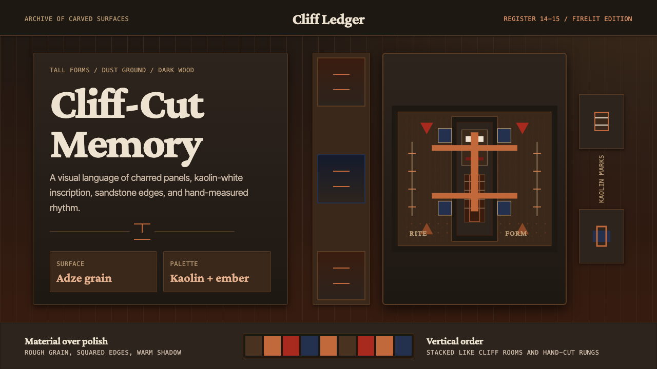 Dogon Bandiagara Cliff MaskHand-hewn gravity. Charred wood, kaolin type, and sandstone geometry stack li…手凿般沉稳:炭木底、高岭土字与砂岩几何层层堆叠。
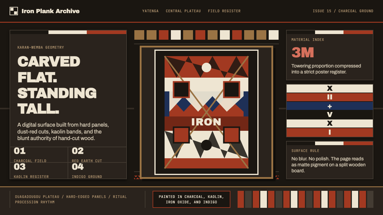 Mossi Burkina Plank MaskCarved, not rendered. Charcoal fields, dust-red cuts, and kaolin bands stack…像雕凿而非渲染:炭黑底、尘红切面与白土色带层叠成板。
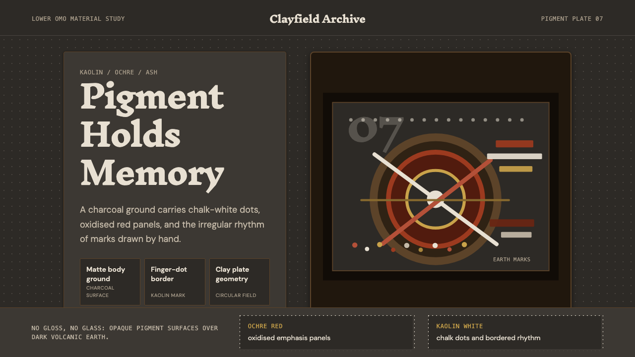 Mursi Omo Valley Lip Plate PaintRaw dignity, matte and proud. Kaolin dots and ochre rings sit on charcoal gro…粗粝而有尊严:炭灰底上,高岭土点阵与赭石圆环。
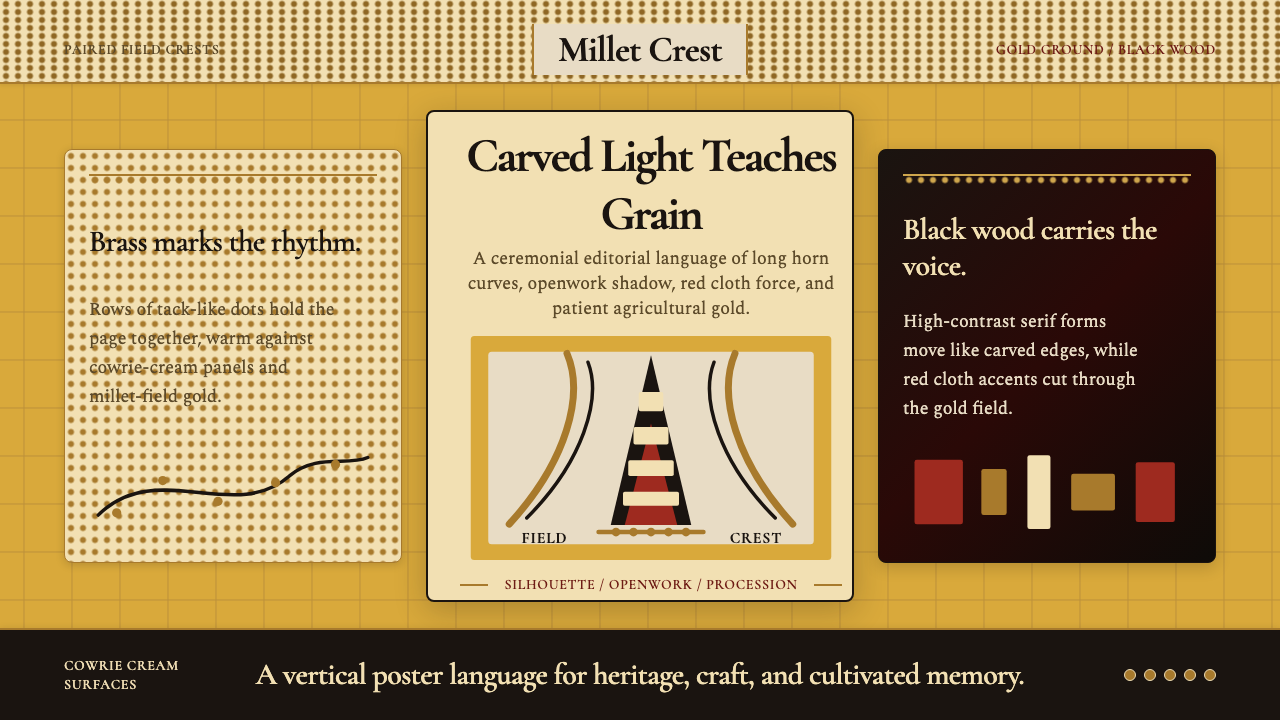 Bambara Chi Wara AntelopeCarved memory in gold. Black serif silhouettes and brass-dot borders carry th…金色中的雕刻记忆。黑色衬线剪影与黄铜点边框承载田野仪式。
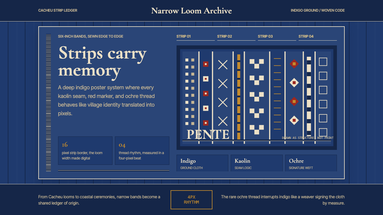 Bissau-Guinean Pano de PenteIndigo remembers. Narrow bands and kaolin seams turn weave grammar into pixel…靛蓝会记忆。窄幅竖带与瓷白缝线,把织纹语法变成像素。
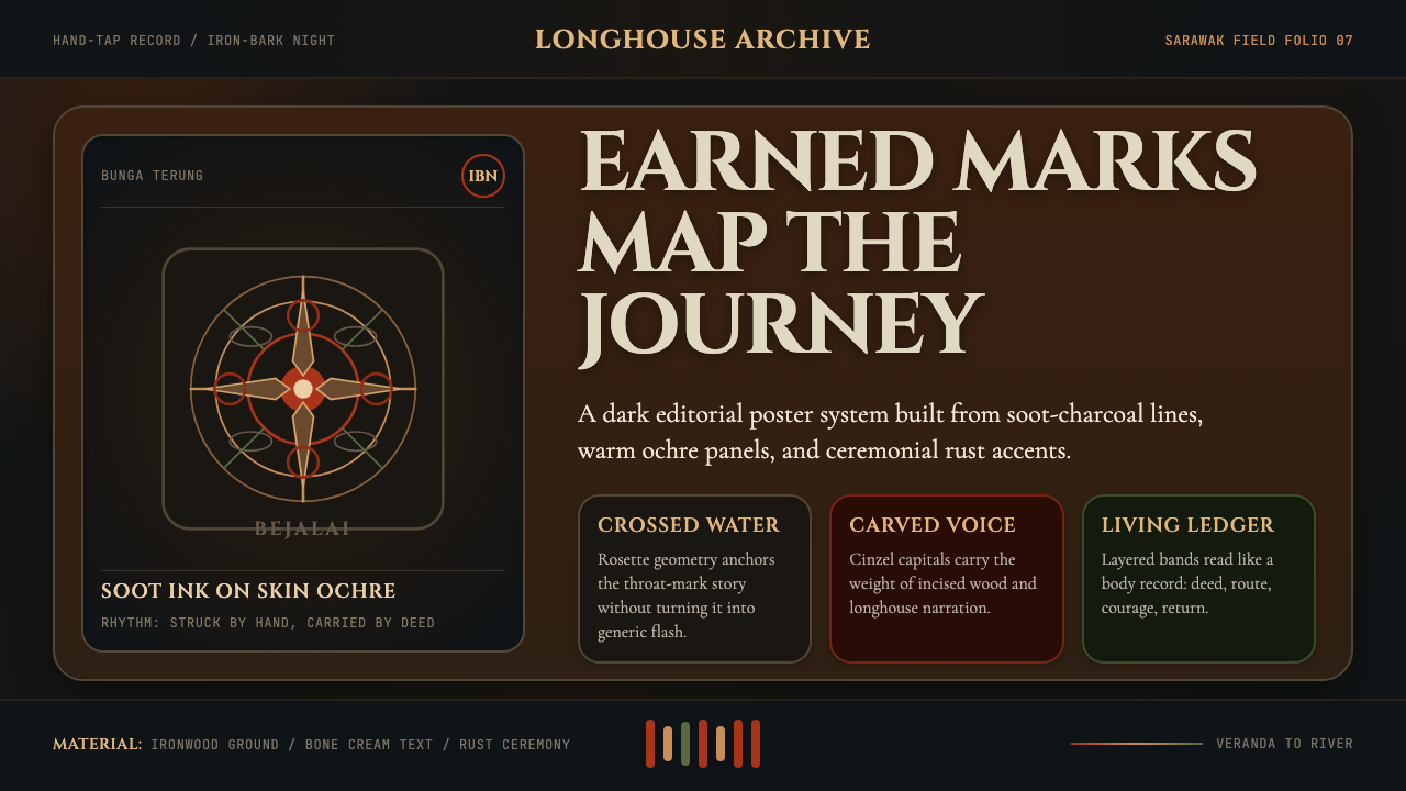 Dayak Borneo Tattoo (Iban)A living journey ledger. Soot lines, ochre panels, and rust rosettes feel han…身体成旅程账本。炭线、赭面与锈红莲座如手敲入肤。