What is Msheireb Doha?
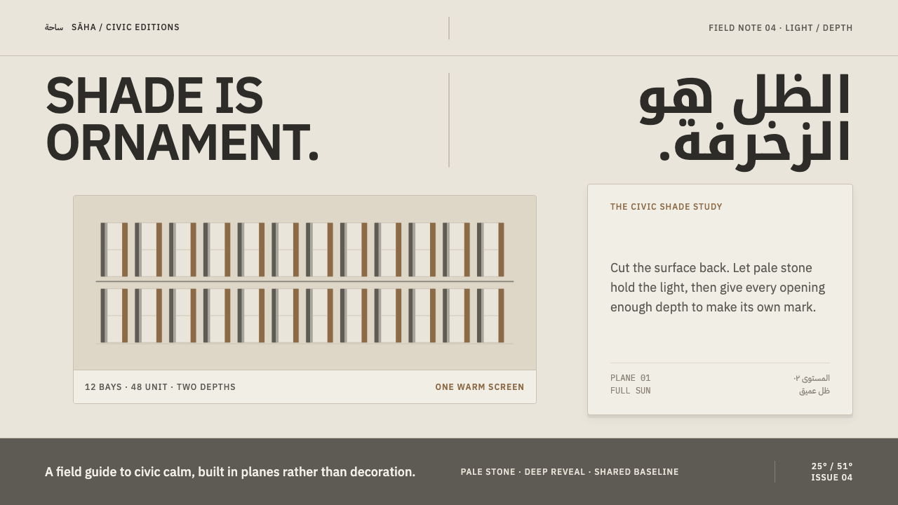
Msheireb Doha is a city cut from warm limestone: its calm comes from depth, hard-edged shadow and Arabic and Latin set at equal weight, never from applied decoration.
Msheireb Doha in brief
Msheireb Doha is the visual language of Msheireb Downtown Doha, a thirty-one-hectare district in the old commercial centre of Doha, Qatar, rebuilt as a single low-rise, walkable, shaded neighbourhood and clad end to end in regionally sourced limestone and lime render. Masterplanned from 2009 and opened in phases from 2016 onward, it sits beside Souq Waqif. From a distance the district reads as one pale warm stone standing in full Gulf sun. This style is the translation of that stone into a design system.
Its central idea is that detail lives in depth, not in surface. Windows sit back in deep reveals. Streets run beneath colonnades. Glazed terracotta screens hang off facades and balconies. The hard shadow those layers cast across the stone is the ornament: nothing is applied, everything is cut. The grey you see on a Msheireb elevation is cast by the sun, not painted on the wall.
Two further commitments complete the language. Arabic and Latin text are set at equal weight throughout, so neither script is a footnote to the other. And the overall mood is calm: low, even, horizontal and sheltered. Moving this onto a screen means letting surfaces recede, giving edges thickness, and trusting light and shadow to carry the hierarchy.
Where does Msheireb Doha come from?
Doha's old commercial centre was a place of trade and daily life long before the Gulf's skylines became known for towers. Msheireb Downtown Doha took thirty-one hectares of it and rebuilt it as one coherent, low-rise district, planned from 2009 on a very different logic from the glass towers elsewhere in the city. It is deliberately walkable, deliberately shaded and deliberately modest in height, and it sits next to Souq Waqif, which gives it an older neighbour to answer to.
The architecture is best described as climate-responsive and regionalist. Under a fierce sun, the answer is shade, mass and thick edges, not a thin glass skin. Every elevation is clad in regionally sourced limestone and lime render, which gives the district its single warm pale tone. Deep reveals keep direct sun off the glazing, colonnades turn pavement into a shaded route, and screens filter the light before it reaches a room. These are practical moves, and they also produce the characteristic image: crisp light and shadow shapes on a pale, even stone. Contemporary Gulf regionalism, climate-responsive urbanism and low-rise walkable blocks are the three currents the district sits within.
The names most closely attached to the district are Msheireb Properties, the company behind the project, and the architecture practices Allies and Morrison and Eric Parry Architects. The principal phases opened from 2016 onward, so the district is recent enough that its design language is still easy to see whole: one palette of materials, one language of openings, one attitude to the street. That consistency is what makes it translatable. A design system needs a few strong rules applied everywhere, and Msheireb supplies them.
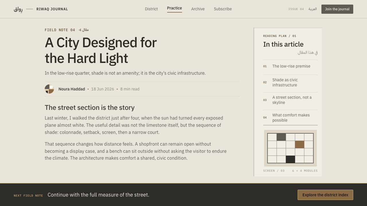
The bilingual stance is part of the language too. Arabic and Latin are set at equal weight throughout, so neither script is treated as primary. Equal weight means comparable size, contrast and prominence, with layouts that can mirror for right-to-left reading without losing their balance. As a design principle it asks for a type system conceived in two scripts from the start, rather than a Latin system with Arabic bolted on afterwards.
What defines the Msheireb Doha look?
Limestone Warmth
The ground is a warm, pale stone tone, closer to sunlit limestone than to white paper. Lime render adds a soft, matt, slightly irregular surface. Everything else, shadow included, is read against this one calm field, so it should dominate the page and stay free of gradients and decorative tints.
Depth Over Decoration
Detail is made by recessing, not by adding. Windows sit back in deep reveals, panels step inward, and edges have visible thickness. A Msheireb page asks how deep an element sits, not how much ornament it wears, and the answer shows up as a cut and a shadow.
Hard-Edged Shadow
Shadow is crisp, directional and consistent, the way Gulf sun draws it on stone. It has a sharp edge and a clear angle, and it behaves like a shape on the page rather than a blur. This is the style's main decoration, so it should be used with confidence and with a single light direction.
Equal-Weight Bilingual Type
Arabic and Latin share the page at matched weight, contrast and presence. Neither is a caption for the other. Because Arabic often needs a little more size to look equal to Latin, the pairing is judged by eye, not by matching raw type sizes, and layouts are built to mirror cleanly for right-to-left reading.
Colonnade Rhythm
Streets run beneath colonnades, and the repeated vertical supports give the district its measured pace. In layout this becomes evenly spaced columns, regular intervals and a shared baseline, with each bay holding one idea. The rhythm is steady rather than syncopated, which is what makes the whole feel sheltered.
Glazed Terracotta Screens
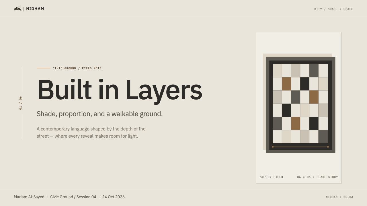
Screens of glazed terracotta hang off facades and balconies, filtering light and casting patterned shadow. In a design system they are the only place pattern is welcome, and only as a filter at an edge or a frame, never as wallpaper. The glaze adds a controlled accent against the stone, used sparingly.
Low, Calm Horizontality
The district is low-rise, even and sheltered, with no tower asking for attention. The page follows: broad horizontal bands, steady spacing, no dramatic scale jumps. Hierarchy comes from depth and weight, not from shouting size, so a Msheireb layout feels settled and civic rather than energetic.
Who shaped Msheireb Doha?
The company named as the organisation behind Msheireb Downtown Doha. A sustained brief across many buildings and phases is the reason the language holds together from street to street, which is exactly the quality a design system tries to reproduce.
A London-based architecture practice named among the district's key figures. Its place in the story shows how a shared vocabulary of stone, reveal and colonnade can be carried across a whole district rather than concentrated in one landmark.
Also a London-based practice, and also among the named key figures. Having more than one practice work under a shared material and spatial discipline is what the design system imitates: many components, one stone.
How do you use Msheireb Doha today?
Msheireb Doha is a style for calm authority. It suits products and presentations that want to feel civic, shaded, deliberate and grounded, and that may need to speak in two scripts at once. Its strength is hierarchy through depth. Its risk is heaviness, which appears when every surface is treated as a thick slab. A useful test is to ignore the colour and look only at the shadows: if the page still reads as a calm, layered stone elevation, the system is working. Reserve the deepest recesses for the one or two elements that deserve them, and let everything else stay shallow.
A slide cover works like an elevation: a warm limestone field, a title set with real weight, and one deep recess or a crisp shadow shape standing in for a window reveal. For bilingual decks, put Arabic and Latin titles side by side at visually equal size, mirroring the layout rather than demoting one script. Content slides can use colonnade rhythm, with evenly spaced columns on a shared baseline, each holding one idea. Data slides keep the charts themselves flat and let the panels around them carry the hard shadow.
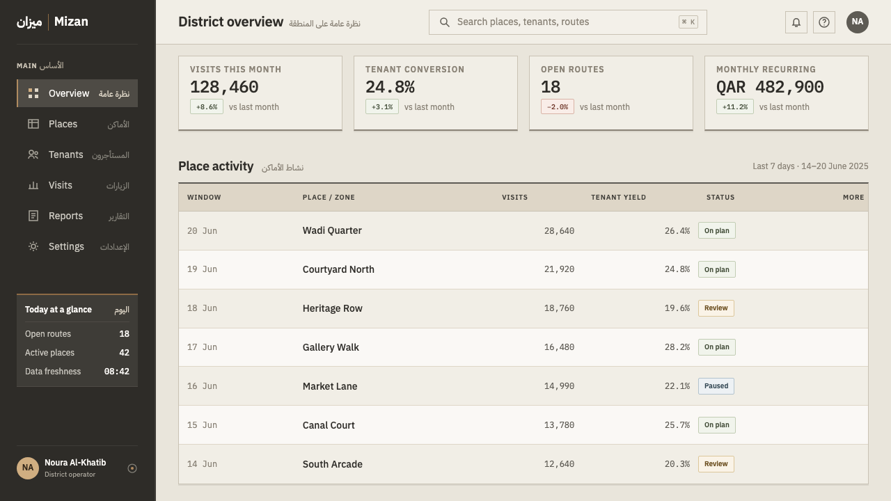
In dashboards and product interfaces, surfaces step back into the page: panels have visible thickness, inputs sit slightly recessed, and elevation is shown with a crisp, single-direction shadow instead of a blurred glow. Pricing pages can use a row of equal-weight columns like a colonnade, with the featured plan set deeper into the page rather than painted a loud colour. Keep one accent, a glazed-terracotta tone, for the interactive element that matters most, and make right-to-left layouts first-class, properly mirrored and tested. Motion, where it exists, should be slow and settled, with panels sliding into place along a horizontal line rather than bouncing, so the interface keeps the unhurried feel of a shaded street.
For editorial and marketing work, the style supports slow, confident pages: broad horizontal bands, stone-coloured grounds, photography of architecture and craft, and captions set in both scripts at equal weight. Pattern, when it appears, belongs to a screen-like motif at the edge of a layout, not to wallpaper behind text. Long reading text keeps a calm measure, and the depth lives in frames and margins.
The most common mistake is imitating the colour and skipping the depth. A beige page with soft blurred shadows reads as generic warm minimalism, not Msheireb: the shadow has to be hard-edged and the recess has to be visible. A second mistake is treating the Arabic as a translation, set smaller or lighter than the Latin; equal weight is a rule, not a courtesy. A third is decoration. If a flourish is applied rather than cut, it does not belong.
Msheireb Doha — FAQ
Is this the same as Islamic geometric pattern design?
No. Msheireb Doha is driven by depth, shade and material, not by surface pattern. Its terracotta screens are the one place where pattern appears, and there it acts as a light filter at an edge, not as a repeating ground. If a layout is covered in repeat motifs, it has left the style behind.
Why hard shadows rather than soft ones?
Because hard shadow is what the Gulf sun actually draws on stone, and it is the district's ornament. A soft, blurred shadow suggests diffuse indoor light and turns the stone into generic cards. A hard edge with a single light direction keeps the surface looking cut, solid and calm.
How do I set Arabic and Latin at equal weight?
Choose two typefaces with matching colour and contrast, then judge size by eye, since Arabic often needs a little more size to appear equal to Latin. Give both scripts the same position in the hierarchy, and build layouts so they mirror cleanly for right-to-left reading rather than shrinking one language into a caption.
Does it work in dark mode?
It is built on a pale stone ground, because hard shadow reads best against light stone. A dark version is possible but less faithful: you lose the sunlit quality that gives the shadows their meaning. If you need one, treat it as a night street, keep the recesses and edge thickness, and let a single warm light direction rebuild the depth.
Where does the style struggle?
It struggles with playful, high-energy or loudly saturated products. Its calm, low, civic character makes it right for institutions, finance, culture, hospitality and tools meant to feel dependable, and wrong for anything that wants to be loud, glossy or constantly moving.
Related design styles
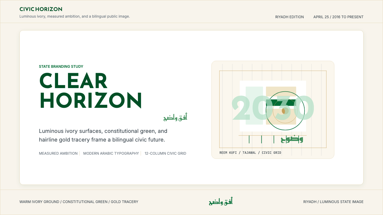 Saudi Vision 2030Measured ambition, made luminous. Ivory, green, and gold tracery on a civic g…
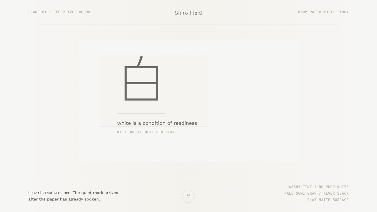 Kenya Hara «White»Emptiness is the subject. Warm washi white holds one pale sumi-gray mark.
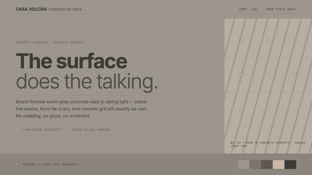 Mexican Concrete BrutalismThe surface does the talking. Board-formed warm-grey concrete, plank seams an…
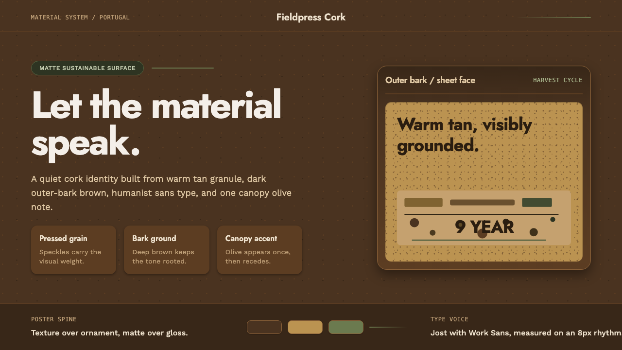 Portuguese CorkGrounded by texture. Cork tan speckles on bark brown, with one olive rule.
 Succulent CactariumQuiet desert order. Sage rosettes and terracotta rings rest on dark warm soil.
 Aalto Finnish ModernModernism made humane. Birch fields, canary yellow, and soft plywood curves b…