What is Poison Mushroom Color Chart?
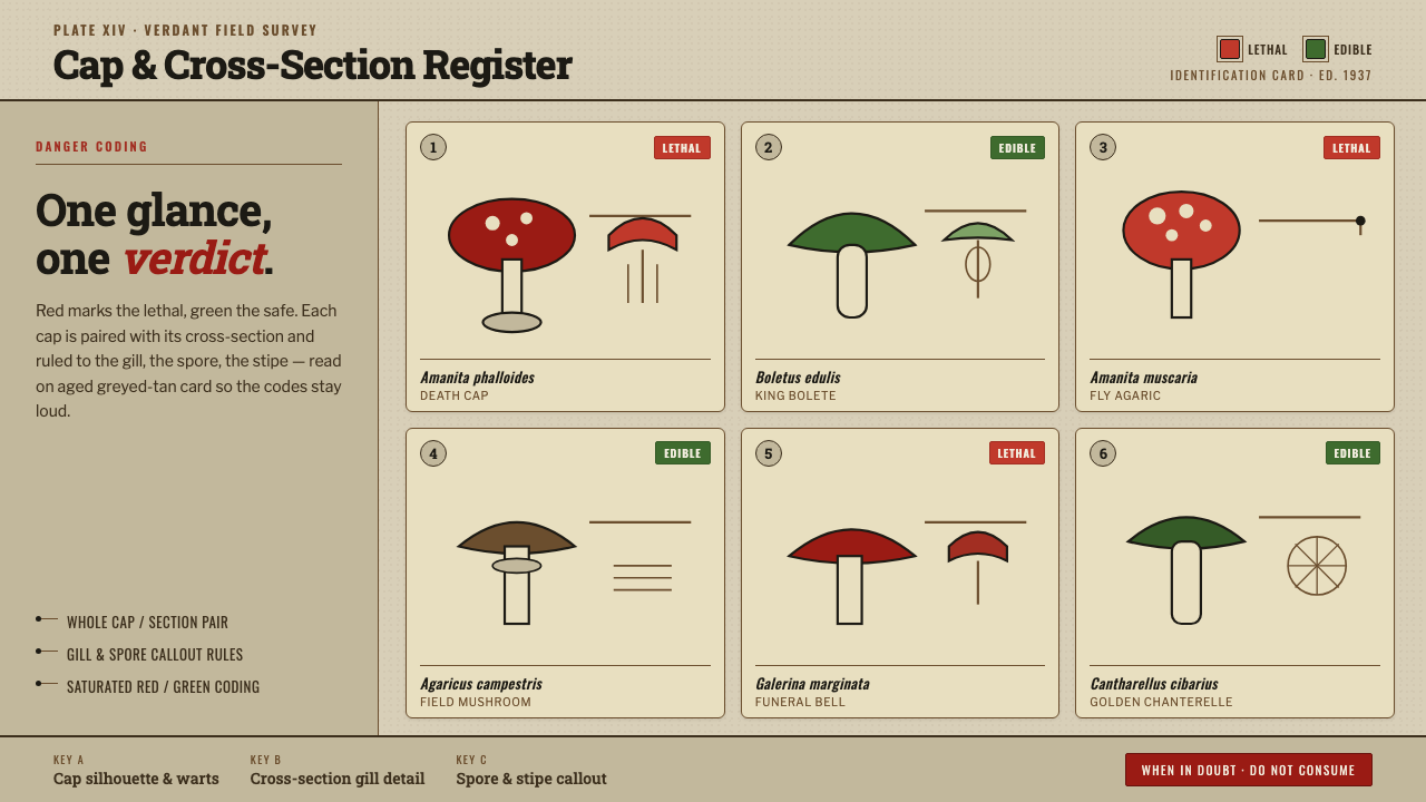
Poison Mushroom Color Chart turns field identification into an immediate visual judgment: danger-red, safe-green, and the sober authority of an aged natural-history plate.
Poison Mushroom Color Chart in brief
Poison Mushroom Color Chart distills the visual language of Eastern European fungi identification plates from the first half of the twentieth century. Amanita and Boletus specimens are presented as observed subjects rather than decorative motifs: the cap is shown whole, its interior is shown in section, and gills, spores, and other identifying details are separated by clear callouts. The result feels like a plate removed from a practical public field guide, meant to be consulted under uncertain conditions rather than admired at leisure.
Its central device is categorical color. Saturated danger-red marks warning information; safe-green marks the contrasting condition. Against an aged greyed-tan card, these colors read quickly without losing the restrained atmosphere of printed natural history. The field is deliberately darker than cream, so the warning system appears embedded in an archival document instead of floating on a clean contemporary canvas.
The style is documentary, not rustic decoration. Condensed species captions, functional chart labels, slab-serif keys, rules, swatches, and reference numbers create an information hierarchy that resembles a working identification tool. Every visual component must answer a practical question: what specimen is this, which feature matters, where should the eye look, and what verdict does the plate communicate?
Where does Poison Mushroom Color Chart come from?
The style belongs to the world of scientific field-guide illustration in Eastern Europe, especially the fungi identification charts associated with the period from 1900 to 1950. Its source is not a named art school or an individual signature, but a public-facing visual practice: translating careful observation into a plate that could guide recognition. That origin explains its restraint. The image must be descriptive enough to distinguish a specimen and direct enough to support a decision.
Natural-history chart illustrators supplied the plate logic. A specimen is not treated as one isolated picture; it is broken into useful views. The whole cap establishes silhouette and surface character, while the cross-section reveals what cannot be seen from above. Detail callouts for gills and spores turn the page into an evidence sheet. Lines do not ornament the composition; they connect a visible form to the information that makes it legible.
Field mycologists shaped the priority of the content. Mushroom identification depends on close comparison, so the chart privileges paired views, labels, and compact captions over scenic setting or expressive atmosphere. This is why empty space remains calm and controlled: it is not a luxury margin but a working interval that prevents neighboring specimens and annotations from being confused with one another.
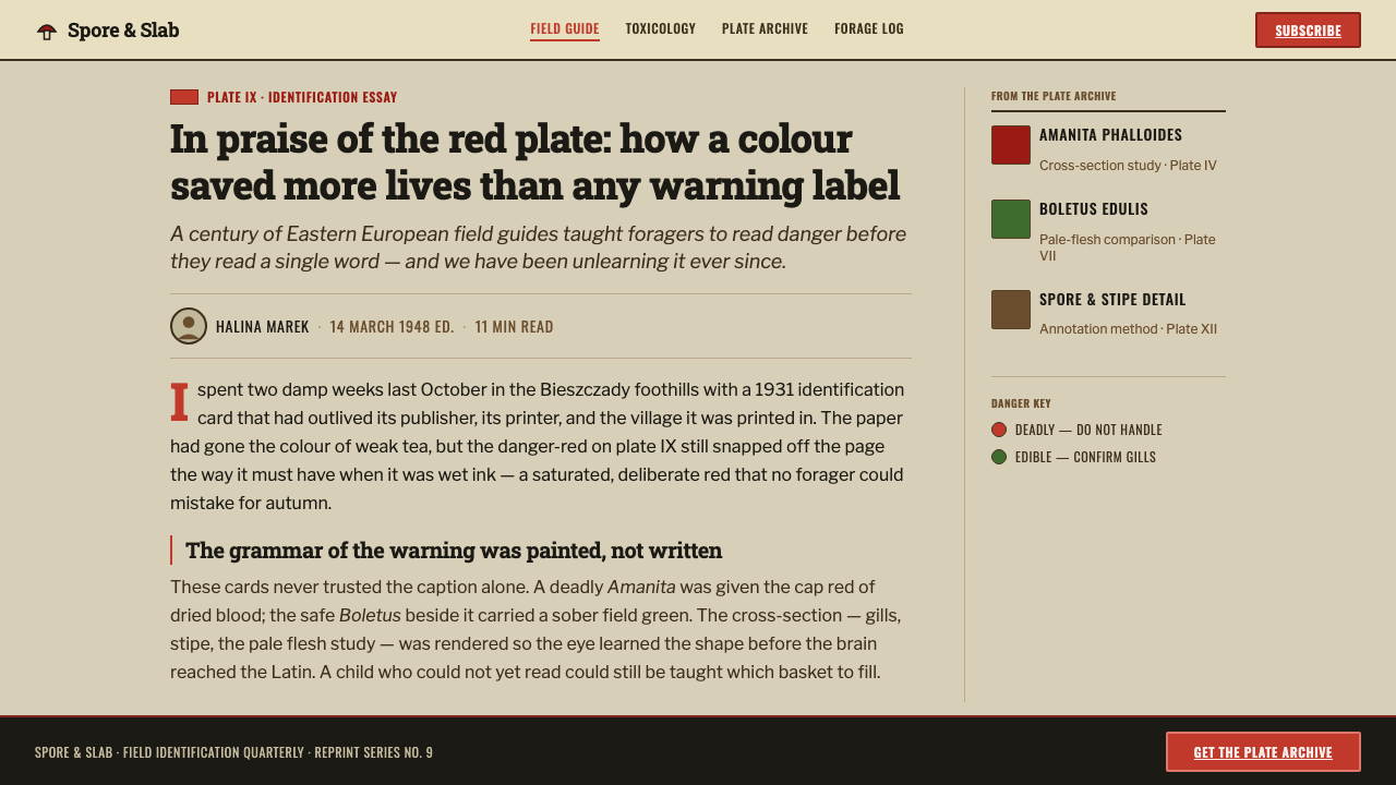
Public-safety guide authors added the urgency of danger coding. Red and green are not general mood colors here; they operate as compressed verdicts within an otherwise sober document. The aged greyed-tan field acts as a stabilizing ground, allowing warnings and safe markers to remain saturated and readable while preserving the seriousness of an archival guide. The combined language is scientific, civic, and quietly alarming.
What defines the Poison Mushroom Color Chart look?
Aged Field Card
The base is an aged greyed-tan field-guide card, visibly darker than cream. It establishes the plate as a document with use and history, while giving saturated red and green enough contrast to carry their verdicts. The surface should feel quiet and paper-like, never glossy, luxurious, or nostalgically distressed for its own sake.
Danger Coding
Danger-red and safe-green are functional categories, not interchangeable accents. Their saturation is what permits a quick scan across an otherwise muted plate. Red should gather warning attention; green should identify the contrasting safe condition. Other colors should not compete with this binary reading or weaken the chart's immediate clarity.
Paired Specimen Views
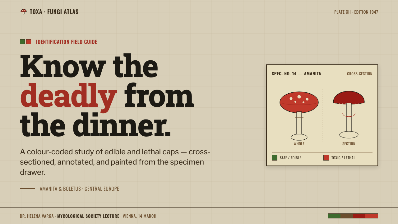
Whole-cap and cross-section pairs are the compositional core. The external view establishes the mushroom as a recognizable specimen; the cut view supplies the comparative information required for identification. Their pairing should feel methodical rather than symmetrical, with enough separation that each view remains independently readable.
Callout Anatomy
Gills, spores, and other features are clarified through fine ruled callouts. These connectors are deliberate paths of attention, moving from the illustrated form to a concise observation. They should remain orderly and detached enough to preserve the specimen drawing, never crossing the page as decorative tangles.
Chart Typography
Condensed species captions conserve space and reinforce the practical tone. Slab-serif keys provide a firmer voice for headings, categories, and reference information. Together they create a useful contrast: captions behave like data, while keys behave like stable signposts. The typography should read as printed guidance, not branding copy.
Earned Structure
Swatches, rules, labels, and numbers appear only when they classify, separate, or direct interpretation. This is what keeps the style documentary. Decorative flourishes, loose botanical framing, and unlabelled color patches make the plate feel theatrical rather than useful. The strongest composition is dense with evidence but never crowded with noise.
Who shaped Poison Mushroom Color Chart?
Field mycologists are the knowledge source implied by the chart. Their observational priorities determine why the plate isolates specimens, compares whole and cut views, and gives gills and spores explicit attention. In this style, scientific observation is not background research; it is the structure that decides what deserves to be drawn and labelled.
Natural-history chart illustrators transform observation into a readable plate. Their role is to preserve recognizable form while arranging views, lines, captions, and reference marks as one coherent system. The visual authority of the chart comes from this disciplined mediation between specimen and reader, not from painterly display.
Public-safety guide authors give the identification plate its decisive communicative purpose. The red-and-green system is meaningful because the reader needs a fast, legible distinction under practical conditions. Their influence turns a natural-history image into a guide that can warn, orient, and make the stakes of recognition visible.
How do you use Poison Mushroom Color Chart today?
For presentation slides, use the style as an evidence-led information system. A cover can place a single specimen pair on the greyed-tan field, with a slab-serif title functioning like a catalogue key and one danger-coded marker carrying the visual alert. Content slides should preserve the plate logic: short captions, ruled labels, grouped observations, and generous intervals between concepts. Avoid turning every slide into a full illustrated chart; the style is strongest when each page has one clear verdict.
Data slides can borrow the chart's comparison method without pretending that modern data is mycology. Treat categories as specimens, use paired states when comparison matters, and reserve danger-red and safe-green for conditions that truly require interpretation. Supporting annotations should behave like callouts, leading from a mark to a precise observation. The goal is not a botanical costume for charts, but the same disciplined link between visual evidence and conclusion.
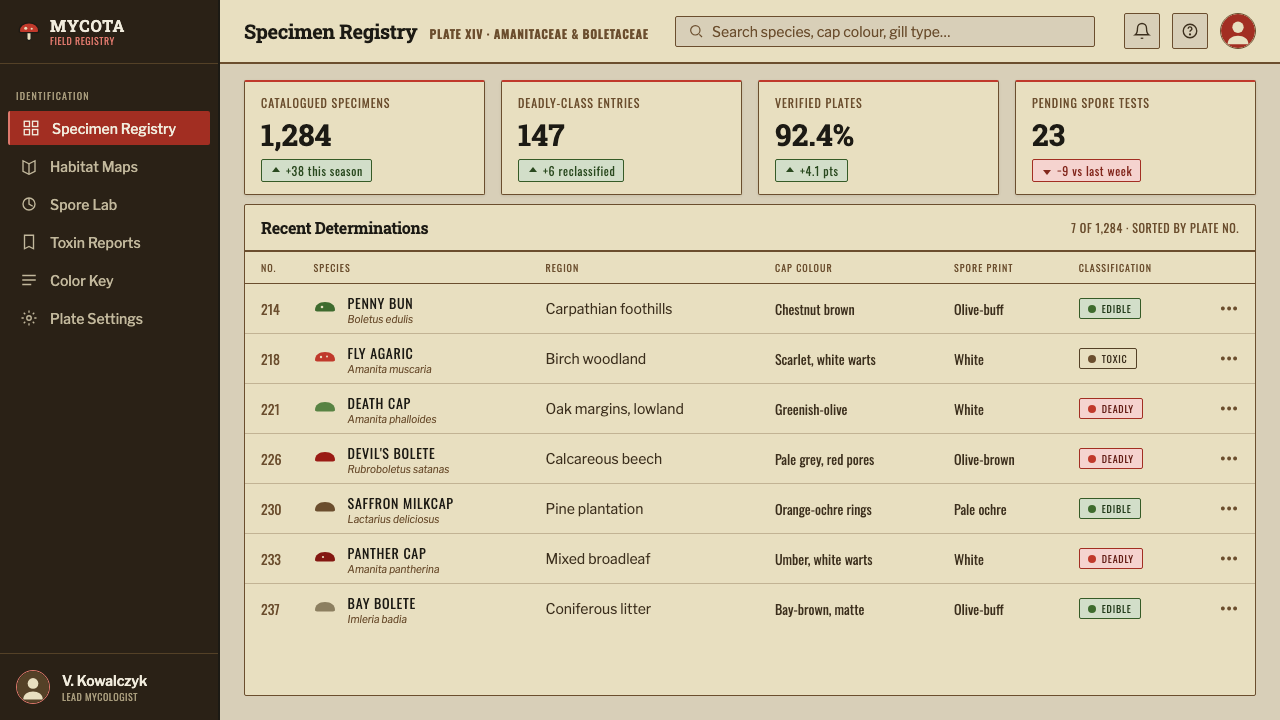
For web interfaces, the approach suits dashboards, review queues, compliance surfaces, and pricing or plan comparison pages where status must be legible at a glance. Use the subdued paper-like ground for the working canvas, slab-serif treatments for major keys, condensed labels for dense metadata, and the red-green coding only for real states. Panels should resemble ordered plate zones rather than soft lifestyle cards, with rules and headings making the reading path explicit.
Editorial and marketing applications work best when the subject already has an observational or cautionary dimension: guides, collections, product comparison, safety education, archival stories, or curated catalogues. Lead with a specimen-like hero image and build sections as labelled findings. Marketing language should remain measured, almost cataloguing in tone, so that the visual system's sober authority is not contradicted by exuberant sales copy.
The common mistake is treating the style as a generic vintage mushroom aesthetic. Loose watercolor, cottage imagery, ornamental foliage, and arbitrary red-and-green accents erase its real purpose. Another mistake is labeling every object until the page becomes a puzzle. Preserve the hierarchy: a limited number of specimens, concise captions, meaningful callouts, and color reserved for verdicts. The design succeeds when it feels useful before it feels nostalgic.
Poison Mushroom Color Chart — FAQ
Is Poison Mushroom Color Chart simply a vintage botanical style?
No. Its reference point is a functional fungi identification plate, not botanical nostalgia. The defining elements are the comparison of specimen views, the gill and spore callouts, the compact chart typography, and the danger-coding system. A vintage surface alone cannot reproduce the style, because the style's authority comes from how each visual element supports recognition and judgment.
Can the red-and-green coding be used as ordinary brand color?
It can appear in a branded application, but it should retain categorical meaning. Red works as a warning or danger signal, while green marks the contrasting safe condition. If both are distributed decoratively across headlines, buttons, and backgrounds without a clear status logic, the chart loses its quick-read quality and begins to resemble a costume rather than a guide.
Why is the background darker than cream?
The aged greyed-tan field makes the plate feel archival and practical, while separating it from clean modern interface white. More importantly, it gives the saturated warning and safety markers a stable, legible ground. The darker field is not there to simulate dirt or age dramatically; it is a compositional device that supports the hierarchy of the chart.
Does the style work for subjects unrelated to mushrooms?
Yes, when the subject benefits from identification, comparison, public guidance, or consequence-aware classification. It can transfer to product analysis, safety education, collections, and review interfaces because its core is a visual method: isolate the subject, show meaningful evidence, label the relevant feature, and make the status clear. It is less suitable when a product depends on softness, luxury, spontaneity, or purely emotional storytelling.
Related design styles
 Herbarium SheetArchive, not interface. Manila stock, olive specimen marks, typewritten ruled…
 Golgi Neuron Silver StainA century-darkened specimen. Near-black dendrites branch across an aged amber…
 Medal Ribbon BarDiscipline worn as color. Crimson, sky-blue and gilt bars lock onto black woo…
 Peruvian Nazca Lines (Geoglyph)Vastness holds the line. Gypsum ground, pebble-brown strokes, and survey-grid…
 An-Nahar Beirut PressDense authority. Aged newsprint, black naskh columns, and one red rule hold t…
 Anglerfish Lure BioluminescenceLight is scarce. Old serifs and hairline rules frame one cold green-cyan lure.