What is Origami Folded Paper?
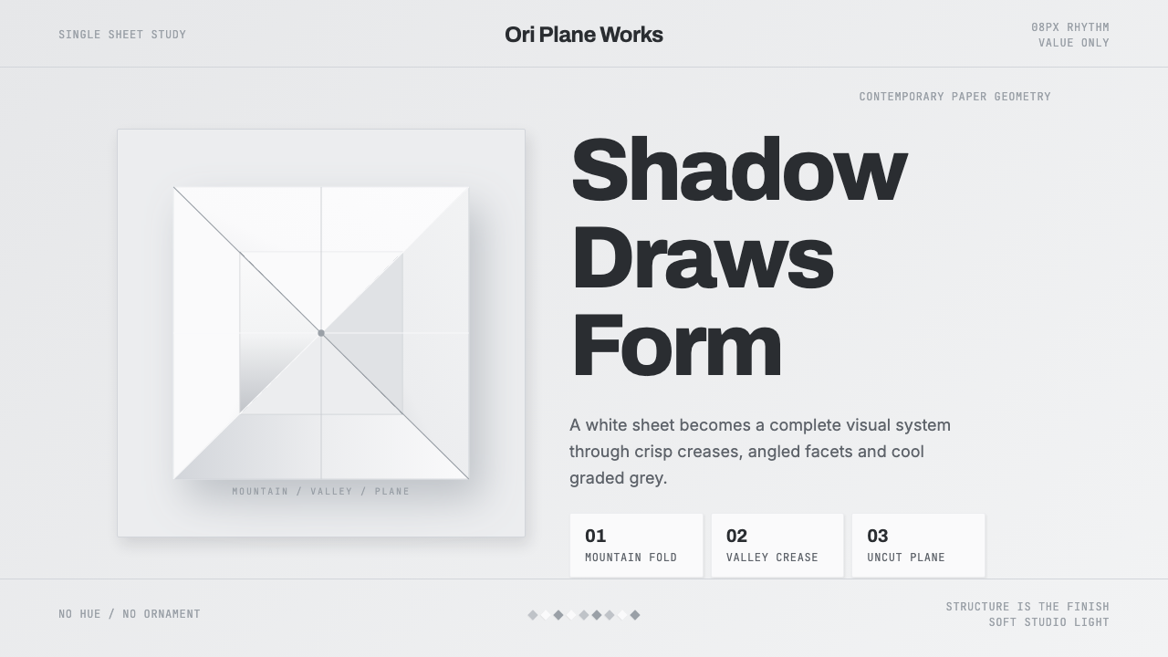
Origami Folded Paper turns a single sheet of white kami under studio light into an entire visual language, where the real subject is never the paper's whiteness but the cool geometry of shadow that a crisp fold throws across it.
Origami Folded Paper in brief
Origami Folded Paper is a design system built from the physical, three-dimensional object rather than any technical diagram of it: a single sheet of folded paper, photographed or rendered as if lit in a calm studio setting, where every visual cue comes from how light falls across a real folded surface rather than from any drawn or printed pattern.
The entire system is rendered in strict monochrome, running from white through a range of cool greys with no hue at all. Where color would normally carry information — hierarchy, mood, category — here that job falls entirely to shadow: the graded, cool-toned darkness cast by a mountain or valley crease as it catches and blocks studio light. A steep fold throws a hard, deep shadow; a shallow fold throws a faint, soft one. Depth and structure are communicated purely through this play of light and geometry.
Composition favors sharp angular fold lines, triangular facets catching light at slightly different angles, and hard diagonal edges where one folded plane meets another. Generous negative space surrounds these folded forms, letting the viewer's eye rest on the surrounding blank paper before returning to the geometry. Nothing here reads as illustration or pattern — every mark is a real physical consequence of a real fold, and structure itself is the only ornament the system allows.
Where does Origami Folded Paper come from?
Origami as a paper-folding tradition has ancient and distributed roots, but the specific visual language of Origami Folded Paper — a single unadorned sheet photographed under considered studio light to foreground shadow and geometric form rather than color or narrative subject matter — is a contemporary development, taking shape over the 2010s and into the present as geometric paper art and modern origami studio photography matured as a genre in their own right.
The twentieth-century figure most responsible for the deeper tradition this contemporary style draws on is Akira Yoshizawa, the Japanese origami master who spent decades elevating paper folding from a casual pastime into a rigorous artistic and technical discipline, developing wet-folding techniques that allowed paper to hold soft, sculptural curves rather than only sharp geometric creases, and insisting that a folded model should express a living quality rather than merely demonstrate a clever technique. Yoshizawa's insistence on paper as a legitimate sculptural medium — worthy of careful lighting and photographic presentation in its own right — underlies the contemporary practice of treating a folded sheet as a complete studio subject.
Later origami artists pushed the form toward greater geometric and structural complexity. Robert J. Lang, working from a background in physics and mathematics, demonstrated that origami could achieve extraordinarily intricate, densely faceted structures when designed computationally, expanding what a 'folded form' could visually contain. Tomoko Fuse, a Japanese origami artist known especially for modular origami — models built by folding and combining many identical simple units into larger geometric and architectural structures — extended the tradition toward abstract, repeating geometric form rather than representational figures, an emphasis on pure geometry that resonates directly with this style's focus on facet and structure over subject matter.
The specific photographic treatment — soft, even studio lighting; a neutral background; a tight focus on a single folded object rather than a scene — reflects broader trends in contemporary minimalist product and object photography that matured alongside modern origami's rise as a gallery and design-object practice, treating a folded sheet with the same considered, shadow-attentive presentation a designer might give to a piece of furniture or sculpture.
This treatment also owes something to a long-standing Japanese aesthetic sensibility around plain, unpainted materials — an appreciation for washi and kami paper valued for its texture and behavior under light rather than for surface decoration. Carrying that sensibility into a studio-photography context, where a single folded sheet is lit and composed with the same care given to a finished sculpture, is what allows the system to feel considered and gallery-worthy rather than like a simple product shot of a paper craft.
What defines the Origami Folded Paper look?
Strict Monochrome
The entire system runs from white through cool grey with absolutely no hue present anywhere. This is not merely a restrained palette but a total commitment: any hint of color would compete with shadow for the job of carrying visual information, which this system reserves exclusively for light and geometry.
Shadow as Information
Graded cool-grey shadow does the work color would normally do elsewhere — establishing hierarchy, depth, and focal points. A deep, hard shadow marks a steep fold and a point of emphasis; a faint, soft shadow marks a shallow fold and a quieter, receding element.
Sharp Fold Lines
Every crease reads as a hard, decisive edge rather than a soft transition — the visual signature of paper, a material that holds a crisp line once folded, unlike fabric or clay. This sharpness is what distinguishes the system from any generic soft-shadow minimalism.
Triangular Facets
Folded surfaces break into triangular and angular planar facets, each catching studio light at a slightly different angle from its neighbors. This faceting is what turns a single flat sheet into a three-dimensional, almost crystalline object once folded.
Generous Negative Space
Folded forms sit within large areas of untouched blank paper or ground, never crowding the frame. This restraint gives the geometry room to be read clearly and lets the eye register shadow gradients without competing visual noise nearby.
Studio Lighting
Light is soft, even, and considered, the way a photographer would light a single object for a portfolio shot rather than a busy scene. This calm, controlled lighting is what allows the graded shadows to read clearly as the system's primary carrier of meaning.

Who shaped Origami Folded Paper?
The Japanese origami master who spent decades elevating paper folding into a serious artistic discipline, developing wet-folding techniques that gave folded paper soft, sculptural qualities and insisting a folded model express a living presence — a philosophy that underlies treating a single folded sheet as a complete, considered visual subject in its own right.
An American physicist whose computational approach to origami design expanded the geometric and structural complexity a folded sheet of paper could achieve, demonstrating that extraordinarily intricate faceted forms were possible from a single continuous sheet.
A Japanese origami artist known especially for modular origami — models built from many identical folded units combined into larger geometric structures — whose emphasis on abstract, repeating geometric form resonates directly with this style's focus on pure facet and structure.
How do you use Origami Folded Paper today?
Origami Folded Paper reads as structure made visible through light rather than color, and applying it well means letting shadow do all the work that color, texture, or illustration would normally do elsewhere — resisting the urge to add any hue at all.
On presentation slide covers, the style suits a composition built around a single large folded-paper form lit from one consistent direction, with generous surrounding white space and a title set in restrained, quiet type so it does not compete with the geometry. Content slides should use graded grey shadow to indicate hierarchy — a slightly deeper shadow behind a more important block of text — rather than color or bold weight changes. Data visuals suit the system well when rendered as faceted, folded-looking forms themselves: a bar chart's bars can read as small folded planes catching light at different angles rather than flat colored blocks.
For web interfaces, the strict monochrome and shadow-driven hierarchy suit portfolio sites, architecture and design studio pages, and premium minimalist product interfaces where restraint itself signals quality. A white-to-grey dashboard ground with hierarchy carried entirely by shadow depth, rather than by accent color, keeps interactive states legible without ever introducing hue — a hover or active state can simply deepen its shadow rather than changing color.
In editorial and marketing contexts, the system suits content about design process, architecture, minimalist product photography, or origami and paper art themselves, where the reader benefits from a calm, considered visual pace. Long-form layouts should let generous white space separate sections rather than rules or dividers, and marketing pages should feature a single striking folded-paper image per section rather than a grid of many competing shapes.
The most common mistake is treating the system as simply 'grey minimalism' and losing the sharp, faceted fold lines that give it its paper-specific identity — soft gradients or blurred shadow read as generic modern minimalism rather than as folded paper. Every shadow in the system should correspond to a plausible hard crease, the way light actually behaves on a real folded sheet, not to an arbitrary soft vignette.
Origami Folded Paper — FAQ
Is Origami Folded Paper the same style as Origami Crease Pattern?
No, they represent two very different stages and mediums of origami design. Crease Pattern is a flat, technical diagram — the mountain-and-valley-line blueprint drawn before folding begins, rendered in red, blue, and black on a drafting-grey ground. Origami Folded Paper is the opposite end of the process: the actual three-dimensional folded object itself, photographed under studio light in strict monochrome, where the entire visual language comes from real shadow falling across real folded planes rather than from any drawn notation.
Why does the system reject color entirely instead of using a muted, desaturated palette?
Because even a muted color still competes with shadow for the job of signaling hierarchy and depth, and the system's entire identity rests on shadow doing that job alone. A folded sheet of plain white paper genuinely produces no color of its own — any color introduced would be an addition on top of the real object rather than something the object itself produces, breaking the system's grounding in an actual physical material and its actual behavior under light.
Can this style incorporate the red-and-blue fold notation from crease patterns?
It should not, because that notation belongs specifically to the flat, pre-fold diagram stage of origami design, and introducing colored lines onto a photographed folded object would blur two distinct systems together. Origami Folded Paper's entire premise is that structure is communicated only through the physical consequences of folding — light and shadow — not through drawn symbols overlaid afterward.
What kind of content should avoid this style?
The style is a poor match for anything that needs color to carry meaningful category or brand information, since introducing hue directly contradicts the system's monochrome premise. It also struggles for content requiring dense data display with many simultaneous categories, since shadow depth alone can only distinguish a small number of hierarchy levels clearly before the differences become too subtle to read at a glance.
Related design styles
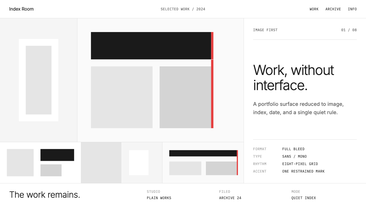 Cargo Collective PortfolioInterface disappears. White space, full-bleed blocks, mono metadata and hairl…
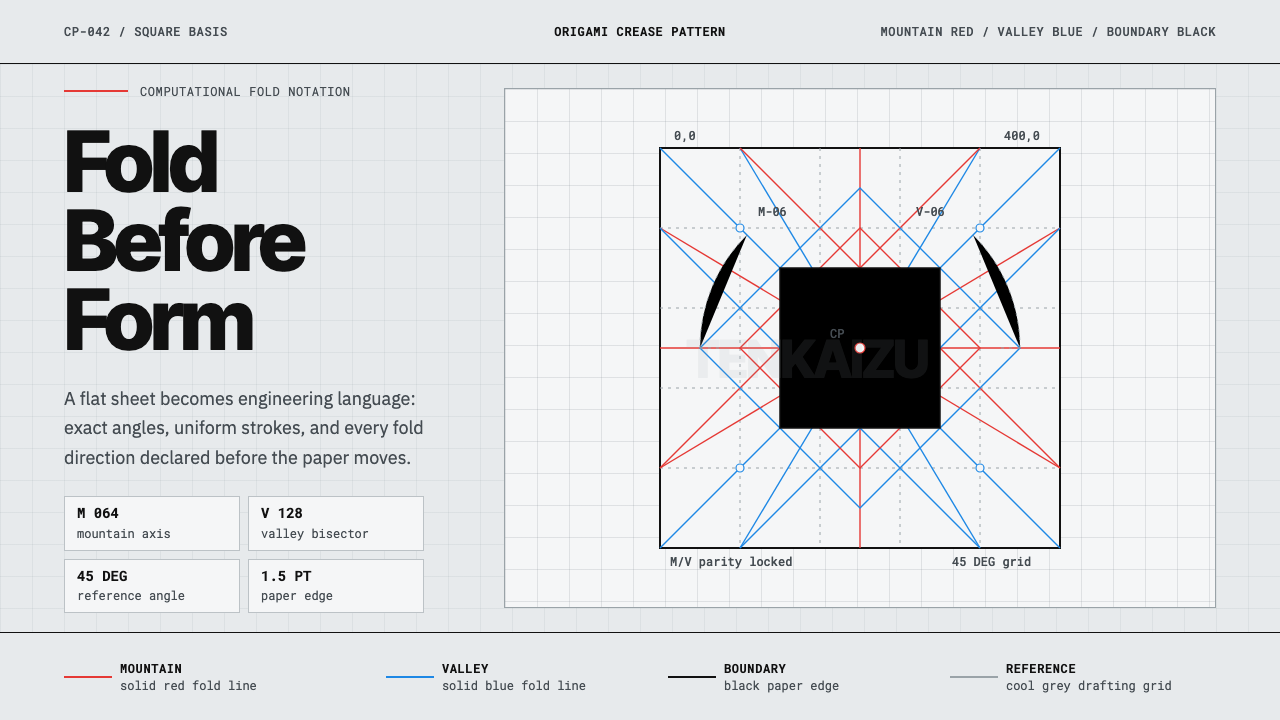 Origami Crease PatternPrecision is the brand. Red and blue fold lines map a cool grey drafting latt…
 White Cube GalleryEmptiness is the medium. Cormorant labels and one terracotta plane hold the w…
 Arc'teryx Technical OutdoorEngineered, never ornamental. Glacier silver grid, mono specs, one acid-green…
 Awwwards Swiss PortfolioCinema, not interface. Black canvas, huge condensed type, and one lime signal…
 Caliper MachiningPrecision refuses drama. Steel-gray grid, mono tolerances, one bronze swarf a…